Imaginary levels: fair price aka valueIntro
So called "value" or fair price is like limits in math, can be infinitely approached but never reached. We can model it, anticipate it, imagine it , but it doesn't make it real. In double/dual auctions fair price is an idea.
We can surely say that some prices are too cheap and too expensive, these are real levels that can proved with evidence. The only thing we can surely say about value is that it's somewhere in middle between these 2, everything else ain't better than just making projections or extrapolations. Neither time nor volume profile won't magically calculate you a fair price buy finding mode of the distribution, it's not better (and probably worse) than just taking an average. None can prove a price to be fair for both buyers and sellers.
It cannot even consistently exist due to the nature of double/dual auction. We have bid & asks, not just bids. A simple illustration is GE futures, that can trade at 2 neighboring ticks for ages, in order for a fair price to even appear for a second, bid should move one tick down or ask should move one tick up, so a free space will be created, only at this point a fair price starts to exist. But guess what? You can't make a trade at this price while it's fair, because in in order for a trade to happen there some1 should place a bid or ask at this free space, at this point the fair price disappears.
You're automatically quoting CL futures at 19:00 Chicago time, BBO is 89.56-89.57. An imaginary fair price of 89.565 can't neither exist nor be traded due to tick size of 0.01.
There's a buy action and a sell action, there's no action in the middle. You can place either bid or ask, the're no "in the middle".
We can go for ages logically proving that fair price is always imaginary, but what we know 2 things: it's in the middle between cheap & expensive, and it appears when there's widening of prices.
The same principle applies to all the resolutions due to the fact that recorded trading activity is quasi-fractal (quasi because fractals go infinitely in both directions, it's not our case exactly).
Howto
After an exhaustion/overexertion a wave should stop and produce another wave in the opposite direction, whatever the size. Sometimes due to other factors it does not happen, and an already overextended/exhausted wave continues to go much further. This wave can be called an overridden wave because this kind of event happens due to an exogenous (not in the data analyzed) event. This event "overrides" the exhausted wave and fuels it to continue. In every overridden wave, its middle aka fair price aka value is an imaginary level that can be used.
A wave that started at 337.89 became overextended/exhausted in both price and time when it reached ~450. After hitting 450 it didn't stop but continued and went really far. It has finally stopped in year 2000 and a sell wave emerged. Knowing that we witness an overridden wave, we start to consider value as a temporary legit level. Imaginary, but still a level, ain't no options aye? And again, we use imaginary levels when there's nothing else, but a decision has to be made.
Statistically, overridden waves are the structural breaks. A serious change. Fair price is supposed to become new cheap or new expensive.
Supply and Demand

How To Choose High Probability OBHello traders
- In this example, we will explain how to choose a high probability OB for your entry. And what you need to pay attention to.
- If you want to choose a good OB, you must read every detail on the chart and take into account everything you see so that you can determine whether your OB is the high probability or not.
- One of the most important things we need to have with a high probability OB is the present momentum. When we see momentum, we know that the price has the potential to continue in the same direction.
- Here you can see 2 examples. In one example, we have high probability OB, and in the other, low probability OB.
- High probability example:
On the left, we see a high probability example. Momentum is present, and the price is making strong BOS. When the price impulsively breaks through the high, as in this case, we know that the price has a great potential to continue in that direction. In the end, we see a good closing of the candle, the price did not leave a big wick and filled the entire bullish candle. In this situation, we have a high probability OB.
- Low probability example:
On the right side, we see a low probability example. Momentum is not present, and the price makes BOS weak. When the price weakly breaks through the high with wick, we know that the price no longer has momentum and will most likely change direction. We see a low candle close and a large wick which tells us that the price has no momentum. In this situation, we have low probability OB.
If this example helped you better understand low probability and high probability OB, leave a like and follow us for more content like this.

📊How to use HORIZONTAL VOLUMES? Tutorial with examples!Horizontal Volume Indicator or Volume Profile is a simple indicator that helps to identify: value areas (support or resistance zones) and liquidity gaps. In this idea I will explain how to use the indicator and mark these areas to make trades and why it works.
Let's start at the beginning.
💹What are value areas (support and resistance zones)?
🔶The value zone is the price range at which the most trades are made. On the chart we can mark the value zones: 33600-41000, 46000-49500, 54600-58200. I also marked how these zones were support or resistance to price. The value zone becomes a support for price if the price, when it is tested, does not continue its downward movement. A value zone becomes a resistance if price does not continue to rise above that zone. The zone simply doesn't let the price go higher because there aren't enough buyers.
🔶Liquidity gaps are called that way because no trades were made in that zone and there is no liquidity for traders (buyers or sellers), and price, as we know, goes from liquidity to liquidity (from one zone to another). On the chart I have marked for you the liquidity gaps and we can see that the price can' t stay in these zones for a long time.
✅Why do horizontal volumes work? Price reacts to these zones for a simple reason. Many traders pay attention to these areas and put their limit orders to buy or sell or when the area is tested, so the price moves up or down. If there are more sellers than buyers, the price will go lower and lower ; if there are more buyers, the price goes higher and higher.
🚩How can I add this indicator to my chart?
3 steps to add the indicator to your chart:
1. open "prediction and measurement tools" at the left part of chart
2. choose the "Fixed Range Volume Profile"
3. choose the price range from some date till another date. I chose from Dec 10, 2021 till May 6, 2022.
So now you can see and mark all areas on your chart.
🏁This indicator helps to identify areas and can suggest stop points or price reversal, but it should be used with different methods. If the market is in a strong rising trend (UPTREND), it is unlikely to be stopped by a local zone of value, but a global zone may stop it. Also, the support zones can be good entry point. Be more tricky than the market and use different tools. You can use the indicator on different timeframes for scalping or swing trading and with different ALTCOINS. Also, pay attention to the volume indicator, trend lines and key levels that I show in my ideas.
💻Please write in the comments if you still have questions about Horizontal volumes! I`ll try to explain you additional tips 🎇
Press the "like"👍 button, write comments and share with your friends - it will be the best THANK YOU.
P.S. Personally, I open an entry if the price shows it according to my strategy.
Always do your analysis before making a trade.

🔥🚩POINT OF CONTROL: THE MOST USEFUL TOOL FOR TREND TRADER🔥 Hi friends! Point of control is a part of volume profile indicator and very useful tool to identify upcoming BTC or any other asset move. I will explain you how to use this tool in your trading and make a good profit in this idea.
💹 Horizontal Volume Indicator or Volume Profile is a simple indicator that helps to identify: value areas (support or resistance zones), points of control and liquidity gaps.
📊 HOW TO USE POINT OF CONTROL
Point of control (red line on the chart) is the place of the largest accumulation of liquidity. We can say that this is the place of "the biggest battle between bulls and bears":
🔥the point of control becomes a resistance in case of "bears' victory" and crypto start to fall
🔥the point of control becomes a support in case of "bulls' victory and crypto start to grow
🚩 When one of the sides wins the "battle", this is the best time to enter the trade in short or long.
✅ No matter how complicated this tool looks, it is very easy to use:
1. extend the volume profile indicator from the lows to the highs. The indicator automatically shows the largest accumulation of liquidity showing POC (red line).
2. wait until the price tests the POC as support or resistance . From time to time the price can consolidate directly on the POC, which indicates the "battle" of long and short traders.
Pay attention to the chart. I have selected for you 4 cases of using POC on the volume profile:
1. Bitcoin just touched the POC at $39,700 and bounced up 72%.
2. the price tested the POC as resistance at $61,100 after which the price fell by 45% from the absolute highs.
3. Bitcoin consolidated around the POC at $39,000 for some time. The price fell by 31%.
4. POC is at the price of $19,150 per Bitcoin. Now you have to expect the price to return to this level and carefully watch the price reaction on POC.
🔥If the POC is tested as resistance , then it is very likely that we will see the level of $13,000-14,000 for BTC.
🔥If the POC is tested successfully as support , then the price will be able to make higher highs and start a bullish trend for Bitcoin. I talked about this scenario in previous ideas.
🚩 HOW TO ADD VOLUME PROFILE INDICATOR WITH POC TO YOUR CHART?
3 steps to add the indicator to your chart:
1. open "prediction and measurement tools" at the left part of chart
2. choose the "Fixed Range Volume Profile"
3. choose the price range from some date till another date.
So now you can see all important value areas and point of control.
✅ Point of control help you to identify the power of bulls or bears on different timeframes and make the right trading decision in the most of cases. Personally, I use this tool effectively for swing trading and scalping as well.
Traders, do use this indicator and such tools as POC in your trading? What is your favorite idicator for trading? Let me know in the comments.
💻Friends, press the "boost"🚀 button, write comments and share with your friends - it will be the best THANK YOU.
P.S. Personally, I open an entry if the price shows it according to my strategy.
Always do your analysis before making a trade.

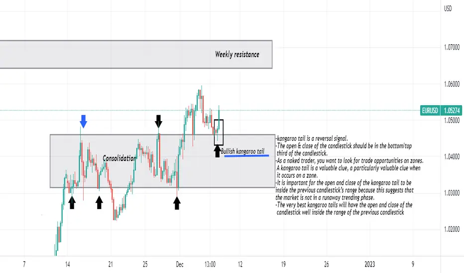
Kangaroo tails-kangaroo tail is a reversal signal.
-The open & close of the candlestick should be in the bottom/top
third of the candlestick.
-As a naked trader, you want to look for trade opportunities on zones.
A kangaroo tail is a valuable clue, a particularly valuable clue when
it occurs on a zone.
-It is important for the open and close of the kangaroo tail to be
inside the previous candlestick’s range because this suggests that
the market is not in a runaway trending phase.
-The very best kangaroo tails will have the open and close of the
candlestick well inside the range of the previous candlestick
The Last Kiss trade. Eurusd The first step of the last-kiss trade is to identify the consolidation zone. One way to visualize a consolidation zone is to draw a box on the chart.
This box will contain the choppy movements of the directionless market. This box should encompass the market movement during the choppy,
drifting-market phase. It should be obvious that the market is stuck between both of the zones. Typically, there will be several touches on either side of the zones.
The last-kiss trade is based on the retouch principle. The market will often come back to a significant zone once the market has expanded beyond the zone, and the last-kiss trade is designed to take advantage of this typical market behavior. The reason for waiting for the
market to come back to the consolidation box is to confirm that the market will, indeed, respect the boundaries that were formed by the consolidation box. In this way, the trader will jump on the trade only when the market comes back to kiss a consolidation box.
Once the market returns to the edge of the consolidation box, it must print a strong candle in the direction of the breakout. Therefore, if the breakout is a bullish breakout (up), then the retouch candlestick must be a strong bullish candlestick. A buy stop is placed above the high of this
bullish candlestick.

GOLDEN ZONE - FibonacciHello guys! Take a look at how smoothly the market respects the Golden Zone on Fibonacci retracement levels. The Golden Zone or Golden Ratio is the area between 50% and 61.8% on retracement levels, which acts as a strong support zone. After an impulse, on the correction the price usually gets rejected by this zone and it continues its previous trend. However, if it is broken, there is a high change of a trend reversal, as we can see in this chart.

Using Put options in SPXU to trade the SPXDisclaimer
All TRADING involves high risk and YOU can LOSE a substantial amount of money, no matter what method you use. All trading involves high risk; past performance is not necessarily indicative of future results.
For Educational Use Only – Not To Be Utilized As Trading Advice
Strategy
-----------
SPXU is inversely correlated to the SPX.
Trade SPXU weekly put options for cheaper premiums and expecting a larger move.
Purchase the weekly SPXU put options contract to trade upside in SPX. (A short term trading strategy to reduce capital outlay)
Use Level 2 Tape Reading to see the supply/demand of the market, including the
Pros
-----
Less capital outlay so much more efficient
There is a tracking error in the SPXU which can help in getting a better price into the put option (the option pricing will change based on the buyers and sellers in the options market). This can help in time delay for trade setup before the move comes into the SPXU instrument.
SPXU provides (-3x) exposure to a market-cap weighted index of 500 large- and mid-cap US companies selected by the S&P Committee. This -3x exposure can help speed up the change in price of the underlying, which can help move faster towards breakeven and above into profitability in the options contract.
Cons
------
Options have an expiry date so some timing does come into question.
There could be a change in the negative correlation between SPXU and SPX due to tracking error.
The trade does not move enough in the direction of the put in SPXU over and above the breakeven that the premium
Premium decay in the option for short-term options which can result in Theta decay.
Put options tend to move slower (shorter deltas) than call options (larger deltas).
Summary
------------
This strategy is only meant for reducing the capital required to get exposure to the SPX via leveraged instrument such as option.

How to trade using Value Areas and POC?A few key concepts when using Market Profile in your trading:
1) Point of Control (POC) acts as price magnets, as they represent the price level where most time was spent during a trading day. Price tends to gravitate towards them.
2) Naked (Not visited) POC acts as stronger magnets than visited POCs.
3) When price enters / breaks into a Value Area, which represents a range of "fair value", price tends to visit the other end of the Value Area. For example above, the price breaks up from the Value Area Low before end of day yesterday, hit the Value Area High this morning.
You definitely won't find these key levels and ranges with traditional support and resistance lines drawing methods. Using Market Profile will give you the edge to become a better trader.
See my previous 2 posts:

Educational How Beat Retailers. Mostly Retailers Trap with SMC Traders. Please Carefully all education is good for you and beneficial for you.
if you want to Trap Retailers then you can learn SMC Trade Setup.

Do not get caught in this trap!Good time of the day, friends! Rushing into trades is definitely among the top #3 common mistakes done by relatively newer market participants who we would call early sellers in this context.
The chart/infographic above is pretty self explanatory, but let’s still cover some aspects of it by considering a following scenario:
Market was moving sideways the whole week, you almost lost hope to finish the month in profits and now you see the up-trending channel with already 2 lower trend-line touches. You instantly get excited and set a long position in the area of a third touch. Well, next thing you know it plummets right past through it. Lesson learned, but what can be done to avoid that?
Well, first of all “look for multiple confluences”. Does the third touch coincide with a potential support zone? If not, that already weakens the point. Was there any signs of bottom forming and reversal? Another strike if not. Did it coincide with any Fibonacci levels, for instance? No? You’re out.
Going over mistakes is easy, as there are always so many things that can go wrong, but what’s an alternative then, you may ask. On the chart above, we also indicated a point where we would consider entering the mentioned trade. Patient execution with a proper Risk-Reward is a way to do it.
Hope this helps, and tune in for more content for us!

its all about survival in the market survive as long as uh can
YOU NEED MONEY TO MAKE MONEY
Sorry to burst your bubble, but you need money to
make money in this business. Here’s why.
Let’s say you make an average of 20%/year.
• On a $1,000 account, you’ll make $200/year.
• On a $100,000 account, you’ll make $20,000/year.
• On a $1M account, you’ll make $200,000/year.
Now, you might think that 20% a year is too low and
that you can make 100% a year.
Sure, that’s possible by taking huge risks. But I’m
talking about making consistent returns, not “gobig-or-go-home” kinds of returns.
Don’t believe me? Then ask yourself, why do hedge
funds raise millions (or even billions) of dollars?
Why don’t they just trade their own money without
having anyone to answer to? It’s because they want
you to be rich and make this world a better place

How to Pick the next Winners? CAN-SLIMA successful trading strategy starts with sound stock selection criteria. Our JS-TechTrading strategy combines the timeless and success proven principles of Mark Minervini's SEPA (R) analysis and William O'Neils' CAN-SLIM (R) methodology.
This tutorial describes the CAN-SLIM (R) methodology in detail:
CAN-SLIM refers to the acronym developed by the American stock research and education company Investor's Business Daily (IBD). IBD claims CAN-SLIM represents the seven characteristics that top-performing stocks often share before making their biggest price gains. It was developed in the 1950s by Investor's Business Daily founder William O'Neil. The method was named the top-performing investment strategy from 1998-2009 by the American Association of Individual Investors.
CAN-SLIM is a growth stock investing strategy formulated from a study of stock market winners dating back to 1953 in the book How to Make Money in Stocks: A Winning System In Good Times or Bad. This strategy involves implementation of both technical analysis and fundamental analysis.
The objective of the strategy is to discover leading stocks before they make major price advances. These pre-advance periods are "buy points" for stocks as they emerge from price consolidation areas (or "bases"), most often in the form of a "cup-with-handle" chart pattern, of at least 7 weeks on weekly price charts.
The strategy is one that strongly encourages cutting all losses at no more than 7% or 8% below the buy point, with no exceptions, to minimize losses and to preserve gains. It is stated in the book, that buying stocks of solid companies should generally lessen chances of having to cut losses, since a strong company (good current quarterly earnings-per-share growth, annual growth rate, and other strong fundamentals) will usually shoot up—in bull markets—rather than descend. Some investors have criticized the strategy when they didn't use the stop-loss criterion; O'Neil has replied that you have to use the whole strategy and not just the parts you like.
O'Neil has stated that the CANSLIM strategy is not momentum investing, but that the system identifies companies with strong fundamentals—big sales and earnings increases which is a result of unique new products or services—and encourages buying their stock when they emerge from price consolidation periods (or "bases") and before they advance dramatically in price.
The seven parts of the acronym are as follows:
1. C stands for Current quarterly earnings. Per share, current earnings should be up at least 25% in the most recent financial quarter, compared to the same quarter the previous year. Additionally, if earnings are accelerating in recent quarters, this is a positive prognostic sign.
2. A stands for Annual earnings growth, which should be up 25% or more over the last three years. Annual returns on equity should be 17% or more
3. N stands for New product or service, which refers to the idea that a company should have continuing development and innovation. This is what allows the stock to emerge from a proper chart pattern and achieve a new price. A notable example of this is Apple's iPhone.
4. S stands for Supply and demand. A gauge of a stock's demand can be seen in the trading volume of the stock, particularly during price increases.
5. L stands for Leader or laggard? O'Neil suggests buying "the leading stock in a leading industry." This somewhat qualitative measurement can be more objectively measured by the Relative Price Strength Rating of the stock, designed to measure the price performance of a stock over the past 12 months in comparison to the rest of the market based on the S&P 500 (or the S&P/TSX Composite Index for Canadian stock listings) over a set period of time.
6. I stands for Institutional sponsorship, which refers to the ownership of the stock by mutual funds, banks and other large institutions, particularly in recent quarters. A quantitative measure here is the Accumulation/Distribution Rating, which is a gauge of institutional activity in a particular stock.
7. M stands for Market Direction, which is categorized into three - Market in Confirmed Uptrend, Market Uptrend Under Pressure, and Market in Correction. The S&P 500 and NASDAQ are studied to determine the market direction. During the time of investment, O'Neil prefers investing during times of definite uptrends of these indexes, as three out of four stocks tend to follow the general market direction.

Learn "Smart Money" TA - Let All Other TA Go - A Case by BXWToday I posted a GBPUSD idea and it was my first Idea posted that hit my stop loss first before I was able to secure profit. All of my ideas dating back to may are hit the target almost every time. If it doesn't, it will usually hit a couple take profit levels that I will have prepared, Or it may not hit the entrance yet the idea is there and price goes to the area I expect it and I still get in on the trade and update my idea as to when and how My trade was changed.
I cannot give financial advice as I am not a licensed by the SEC for taking the series 7 exam. I'm studying to be a financial advisor and The series 7 is primarily on how to use option on equities (or indices) for your clients and how to protect them from losing a lot of money.
Your taught the straddle strategy, the point of the straddle strategy in options is due expecting volatility but you don't know which direction the market will go.
What if theres a technique out there that will provide you with information to study the price action and you'll be able to know the direction already? You wouldn't need a straddle option for equities. You'll just need to move that principle to futures trading and move away from equities, (Or you can still use options, just buy a call or a put if you know the direction and don't straddle, waste of money on buying the premium for the options contract)
Being Privately mentored in "Smart Money" It has been months since I have had to guess the direction on a trade. I may not have the perfect entrances to trades (Although I'm working on it and getting really close)
I have used "Smart Money" In the Forex Markets, (You can see my recent ideas on EURUSD that took two days to hit the take profit, but I barely got the full take profit ()
I have used it in the Crypto market and have kept the same principles and profited
Ripple hit two take profit levels
()
Ripple Switches directions - Chart Updated
()
Chart for the above idea
Counter Trade within this current trade
Also, Used the same principles on a Commodity such as Gold
()
Current Futures Chart for the Above Idea that was called with Smart Money
If things don't go your way always remember two smart money principles.
1) price will want to attack liquidity
2) (more importantly what helped me out of the red on todays GBPUSD trade) Price will look to fill imbalances.
Therefor you have an advantage as to knowing the direction. But it's much more complicated.
What's an Imbalance?
A fair value gap is an imbalance, a regular gap in price between candles is an imbalance (if you trade equities, you know that those gaps need to be filled), a liquidity void is an imbalance (when bodies of two consecutive candles don't touch, when you get a candle with a large wick, it's close and the next candles open has a sizeable gap) These are all forms of imbalances. Some do not fill immediately. Especially if you see a liquidity void on the monthly chart and you 400 pips away. (But if you have a sizeable one on the 15 minute chart and it's been a few hours, I would start looking for order blocks or breakers that price maybe moving to and reject back to the liquidity void)
The rest of the Tutorial is an example of why learning Smart Money is of utmost importance
(Monthly GBPUSD Chart where there are two liquidity voids, after two, the price moves towards them and fills them but now we have a monthly fair value gap and another liquidity void, this was 1985 and 1986, price is now below this aiming for that monthly fair value gap as rice neared it)
Understand that it will fill at some point, mark it on your chart, but as you move down the smaller time frames (weekly, daily, 4 hour, 1 hour, 15 min Dont use odd time frames like 10 mins or 3 days, the institutions do not think like this, they use the monthly, weekly ,daily to p [lan and the hour and 15 min when executing a trade) Look for these gaps, rectangle them, color coordinate them, make sure you know which one is which because by the time you get to the 15 min chart you could have a monthly weekly and daily overlapping, you need to know which is which, look for areas where liquidity will build (equal lows/highs, Multiple same price level hits)
You see this on your monthly chart
Expect price to break those lows because that's not support, that's where a lot of buy limits will release a lot of money into the market when price nears it. Retail is taught to "BUY" at these lows. But if people buy at support and price goes against what you've been taught and sells through to your stop loss, the money is then transferred from your account to those that shorted. Look below it's the 1986 Monthly fair value gap
You could get lucky and buy at Support, for probably 15 minutes to an hour, after that, I would personally look to bail and get out. In Fact, I wouldn't even be looking to buy. Because price is going to pierce A lot of stop losses.
This is the daily chart buying into 3:1 ratio with 100 pip stop loss, you got slaughtered (I just lost 200 so I can't say anything, but I gained it back so there's that)
Now 4 hour
You had less than 4 hours to try and catch the "Support long" After price buried into the monthly FVG (Now this was during covid) However, I feel as if it was going to do this anyway at some point just based on the 1985/86 price action. I want you to look at the bottom Indicator. That is the Commitment of Traders. it provides information on 3 classification of traders based on their account sizes. Retail Traders (us using this site mostly), Large Traders, and Commercial Hedgers (I'll explain them in a minute)
Now, You wouldn't have seen theses numbers ahead of time but I encourage you to look up the same chart and add the same indicator, because if you trade anything that is on the Futures Market, it has to be reported to the CFTC and they create a report out of it. And when see a chart with a similar formation, you can expect the same reaction by each of the classification of traders.
Who are the Large Traders and Commercial Hedgers?
It is not very clear who is who, the law was made to be more transparent. However, a brief overview can be found on the CFTC website here: (For Financial Futures - This includes things like Bitcoin, The S&P 500, and the Japanese Yen www.cftc.gov )
Website all inclusive: www.cftc.gov
During my private mentorship this is how the 3 categories were described to me.
The Large Traders (could be a single person that is considered an accredited investor with a lot of money to small money management firms that have been given permission by their client(s) to trade forex. It says on the website it depends on the form 40 that is completed by a broker/dealer. Usually this a small company that find and/or teach people how to trade. They then trade with money given to them by the owners. If they prove themselves to the owner or who's money they are trading with then they get more money to trade and a commission deal is created between them. These guys are taught by technical analysis via another human what they have learned in the basics from the the series 7 test prepared by the SEC (WHERE THE LARGEST BANKS INFLUENCE BUT THE SEC DOES NOT GOVERN) However, these people usually trade in the equities markets and trade single stock options. Not Forex or Crypto. At the time of the above chart, where price came down below "Support" that week the Large Traders added .5k long contracts. This shows me they were thinking it would go long at the level of support.
The Commercial Hedgers are usually in the Asset Managers/Institutions section of the CoT report. These are certified Series 7 completed asset managers that can work for Edward Jones, Scwab, TD Ameritrade, etc. Except they usually focus on long term and manage other peoples 401k's on ETF's and mutual funds. Every once and a while you'll get an accredited investor who asks their asset manager to be more aggressive. At that poin again, they focus on stock option strategies. Forex has the most liquidity of all markets with more that 7 trillion USD$ a day.The reason this number is so big is due to the institutions. Also called Market Makers, they are the traders employed by central mostly banks and other larger banks such as Deutsche Bank, The Federal Reserve, The Bank of England, The Bank of Japan, Credit Suisse, Reserve Bank of Australia, European Central Bank, International Monetary Fund, etc. These are the institutions because currency is their commidity and they want to protect it. (The banks that have endless amounts of money vs. an asset manager like Schwab) In the trade above where price is moving toward "Support", the commercial Hedgers have added 20,000 net short contracts. And those short contracts were probably coordinated on the futures market right at that time between all of the privately owned central banks. These bankers created modern day Technical Analysis.
Here on Tradingview, nearly 99.5% of every chart that is created and shared as an Idea originally was from an institutional trader. They created retail and taught the masses the same. If they know how you trade. And they have much more money than you, then they know how to trade against you.
This is why smart farmers short their trade their crop they grow if they know the yiekld for the year is not going to to be a high yield for most of the U.S. on the futures market, if they probably know that the price is going down then they will move with the commercials like we see in GBPUSD. The following week when price goes up,
the Large Traders (The ones who don't think outside the box and think that they're catching a breakout down, by selling at "Resistance" after it broke "support" because they're just doing what they were taught by the banks. The Large Traders add 10k net short contracts that week. As you can see it does not go down it instead co es back up and is now losing money, Do you have a money manager? Could be your money. Commercial Hedgers? They control the chart so they add 10k net long contracts making the money that the large traders lost. And the Chart moves up past the "Resistance" Into a new level, finding price levels From previous months that need to be filled.
You want your money in the hands of asset managers? As I'm studying to become a asset manager, again, the series 7 required by FINRA, to be an asset manager, is very options heavy. They focus on options Spend large amounts on the premium just to gain a little on a covered call or short. It drives me mad studying for this. Additionally, Yet the Commercial Hedgers (aka large institutional banks) banks only give you 1%-3% annual yield on a savings account or a Cash Deposit (aka "CD"). Whose getting screwed on this deal? (you) Give your money to a licensed money manager? They're going to lose it for you, or at best, grow it very slowly for you you. Whose getting screwed on this deal (You)?
I wanted to learn technical analysis because I wanted to retire earlier. After my first year being taught by a Multi Level Marketing Company, I lost thousands of dollars.
Then by accident, someone mentioned the name of the godfather of smartmoney in the chatroom of the previous scam company I was learning from. At the time I was learning Wyckoff method, (en.wikipedia.org) which really only explains what is typical during consolidation phases and to understand when the chart could ready itself for distribution, and suggests that there's an "operator" in the market manipulating it. Wyckoff is a good thing to know. I took the time to look up who the person named and realized he did not live in the world we all live in. It was a breathe of fresh air. His trades had a meaning to them, a meaning to why the direction was going where it was going, how to measure certain things, when to expect these things, and I was lucky enough to be in his last mentorship program that he will do in private. He has one on youtube now that's free for the public but it's nowhere near as detailed as what he taught us with 3-4 videos a week. Core Lesson Videos along with Current Market Price Reading Videos. For a full year, I stopped trading, I studied instead, I studied what he told us to stuudy and I would do it for hours. There are others that were mentored by him on here as well. They are rare to find. My mentor was innercircletrader, a former computer programmer turned institutional trader. Trading since the 80's, He wanted to learn so he could learn an algorithm and program a robot to trade for him. There were many times he thought he had the market figured out. A combination of a moving average and the commitment of traders, with an overlay of the Commodities index and he thought that was it in his 20's, now in his 50's, I can say I've never seen anyone predict price with such precision, He could get it within 1-2 pips from entry to exit most times. He did say that after so many years there's no way he could program a robot to trade for him even though he knew so much. And that's because the market's algorithm changes every 24 hours.
And by looking at the Commitment of Traders report, seeing this evidence of the so called "Support" your supposed to trust, and see it get obliterated (By institutional traders), I can't trust my money with just anyone and expect to be ok when I retire. I need to take it into my hands. And I did, slowly built up an account lost some trades, but I kept practicing, kept my head in the charts, and I now have a sizeable account myself as you can probably imagine with the ideas posted that I have consistently profited from for the past 6 months. If you're technical analysis is not " Smart Money", and it doesn't have a narrative, you're burning your money.
Are you making the money you want? Would you consider yourself successful? Be honest with yourself. According to statistics, most people quit after 1-2 years because they've lost way more than they should've (money they could've spent on buying a house ,cars, vacations etc... and I was on my way). I was told in the beginning that technical analysis will be easy. Well it's not, it takes time and a lot of work. I can spend hours on one chart.
Are you being consistent with your trading? Do you only trade on certain days? Are their webasites you can go to to see if they will release information that will create market volatility? T
here are a lot of people on here that have very pretty charts, but their analysis is way off, and they offer no explaination as to why they think that price is going to move in the way their chart suggests. I just see "Looks like We're going down!" C'mon, put some effort into it. Yet they are featured by the Tradingview Team.
I remember being feature for my analysis a few times, and it was when I did not know how to trade. Ever since I have learned how to trade, have consistent earnings, and my students that I teach privately have shaared a few consistent winning trades on here, and they haven't been featured on here, yet. I hope one day that it will get recognized and start winning charts with "Smart Money" Principles, and they have yet to be featured. Why? Tradingview wants "Pretty Charts." If you've got a cool looking indicator and you have a channel and use the channel feature in the drawings section, Also ad some solid boxes where you think the "Supply" and "Demand" zones are and boom. Your front and center of everybody. Then you click on their play button on their Idea and you see it go the opposite way. No reflection on the idea after the loss. How are you supposed to learn if you don't opine on the loss? This entire tutorial is has been my reflection on my GBPUSD loss today. Which I actually didin't lose in the end. My mentor would've told me to walk away and not rage trade to try and get my money back. I didn't, Instead, I calmly remembered my training, and what price does, and had a few scalps and earned my money back thast I had lost plus more and I surprised myself that he was spot on what price would do as far as filling imbalances.
After you read this, and you see the evidence I have presented hardening my case for "Smart Money", and if you look at my last 10-12 ideas I have posted here, hit play, and see some charts nail the entrance and exit, some make good profit, but I mmay have not have hit the whole target (But you always have 2 prior targets prior to your final profit that wauy in case you do lose, you'll gain something and add a win to that W column. My charts maybe ugly because I use three features (Horizontal line, Fibonacci that has been altered (specifically for Smart Money trading), and rectangles/boxes featjre), When price finally has a narrative as to where it's going, that's the only things you need.
The Reason I thought about Bodies And Wicks as a name had to do with Smart Money Trading, in a 3 candlestick motion, if he wicks don't touch the bodies on each side, it leaves a gap called the Fair Value GapAnd these gaps need at least halfway filled 95% Of the time. Based on that information alone, Where is Bitcoin going?
Learn Smart Money Technical Analysis

How Does Forex Market Work?How does Forex market work?
As a trader, you decide if you would like to buy or sell. The broker finds someone who would like to do the opposite and they introduce the two of you. The broker then takes a small cut (spread) of the transaction price for arranging the connection. Foreign exchange is largest liquid market in world, but what does that mean? Has a daily roll over of 6.6 trillion dollars. It means that the broker can always find "the other side" very easily and quickly. This is good if you want to enter a trade immediately and great if you wan to get out of a trade very quickly.
Best thing about Forex is:
Markets which are not liquid, or have low trading volume, can be difficult to trade. Imagine you were in a losing trade and you wanted to get out of it. If the broker can't find "the other side" then you are stuck! That will not happen when trading FX. There is always someone on the other side- a major benefit.
Forex exchange is essentially for international business. Forex markets include governments, businesses & investors. Forex, also known as foreign exchange or FX trading, is the conversion of one currency into another. It is one of the most actively traded markets in the world, with an average daily trading volume of $6.6 trillion. Forex, or foreign exchange, can be explained as a network of buyers and sellers, who transfer currency between each other at an agreed price. It is the means by which individuals, companies and central banks convert one currency into another – if you have ever travelled abroad, then it is likely you have made a forex transaction. While a lot of foreign exchange is done for practical purposes, vast majority of currency conversion is undertaken with the aim of earning a profit. The amount of currency converted every day can make price movements of some currencies extremely volatile. It is this volatility that can make forex so attractive to traders: bringing about a greater chance of high profits, while also increasing the risk.
Unlike shares or commodities, forex trading does not take place on exchanges but directly between two parties, in an over-the-counter (OTC) market. The forex market is run by a global network of banks, spread across four major forex trading centers in different time zones: London, New York, Sydney and Tokyo. Because there is no central location, you can trade forex 24 hours a day. Most traders speculating on forex prices will not plan to take delivery of the currency itself; instead they make exchange rate predictions to take advantage of price movements in the market.
What moves Forex markets?
The forex market is made up of currencies from all over the world, which can make exchange rate predictions difficult as there are many factors that could contribute to price movements. However, like most financial markets, forex is primarily driven by the forces of supply and demand, and it is important to gain an understanding of the influences that drives price fluctuations here. Central banks, News reports, Market sentiment, Economic data, Credit ratings.

NAS100 TECNICAL ANALYSIS WITH UNCLNRBZ - PART 4This is a knowledge oriented video and I hope someone gains a bit of something from it.

NAS100 TECNICAL ANALYSIS WITH UNCLNRBZ - PART 2This is a knowledge oriented video and I hope someone gains a bit of something from it.

NAS100 TECNICAL ANALYSIS WITH UNCLNRBZ - PART 1This is a knowledge oriented video and I hope someone gains a bit of something from it.

🔥Almost 1 month after the MERGE! WHY ETH DOESN'T PUMP?!Hi friends! Almost a month has passed since the Merge, and Ethereum still has not grown. What is the reason? What are my targets for Ethereum?
✅ As i mention in the last idea, the merge is like the Halving for BTC. A lot of retailers expect the HUGE pump with x10-100 profit. But in the real life it doesn't work.
✅ If a lot of people expect something, it has lower chance to happen. Take a look on BTC after the Halving. Usually BTC start to consolidate for 2-3 month or DUMP for 20-30% after this. The same happen now. It's force weak hodlers to sell their ETH and it's good for the future growth.
✅ My recommendation is to be prepared for strong price movements in the near future.
📊 Preconditions to open a long:
🔥 squeeze to the trendline
🔥 bullish BTC pull the altcoins to the new highs and it`s highly expected. At least local pump to $25-32k
🔥 whales orders to buy on DOM and Footprint scalping tools. They help me to identify the big g uys and open a trade with them
🚩 According to second scenario that shown on the chart, the volumes should grow if the liquidity collection will happen. Pay your attention to this scenario too.
📊 The targets for the long:
1. $1540-1650 - the closest value area
2. $2030 - the key level, vale
🔥 Usually, I recommend you to book at least 50% of profit but according to the fundamental expectations, you can hold this long trade a little bit longer. Especially, if BTC become local bull market.
💻Friends, press the "boost"🚀 button, write comments and share with your friends - it will be the best THANK YOU.
P.S. Personally, I open an entry if the price shows it according to my strategy.
Always do your analysis before making a trade

🔥THE VOLUME PROFILE: HOW TO IDENTIFY THE BOTTOM ON BTC?Hi friends! Today i explain you the method that gives you another confirmation that the bottom of BTC is already reached. You will be well prepared for the next BTC bullrun using this method.
📊 What is volume profile?
Volume profile is the indicator that show us how many trades (volume) were made at some price. If the common volume indicator show us how many trades were made through the time, the volume profile show us how many trades were made at some price (10-12k, 58-60k etc.).
It help to identify the largest support and resistance areas, as well as liquidity gaps where the price PUMP/DUMP🔥 the most. Here is the educational idea with detailed explanation and instruction to the volume profile!
📊 How to identify the bottom of Bitcoin using Volume Profile?
This is what we need:
1. volume profile from the ATH to the bottom
2. point of control or POC
Point of control or POC is the area where the most trades were made. We marked it as the yellow line at the volume profile.
3. BTC dump for >-50%
If the price fell by 50% from the place where the most margin trades on Bitcoins were opened, it means that most marginal traders even with x1 leverage were liquidated.
🚩 Traders with x10 leverage were liquidated at a 10% drop, with x20 leverage were liquidated at a 5% drop.
✅ As you can see it was in 2015, 2018 and it`s happening now. After the 4-6 months consolidations (yellow areas) the small bullruns begin. Will it happen this time? Write your thoughts in the comments.
📊 Why are liquidations important for the growth of crypto?
This way the market becomes "healthier" and is cleared of weak hands. At this time, whales can accumulate a large position in Bitcoin or in another crypto. Liquidity at the bottom allows you to buy 10,000-20,000 Bitcoins. For example, over the past week, 60,000 Bitcoins were withdrawn from exchanges.
🏁 How to open the Volume profile?
1. Look at the left side tools in the TradingView chart
2. Choose the "Prediction and Measurment Tools"
3. Tap on "Fixed range Volume Profile"
That's it.
✅ Traders, every strategy has it's win rate. This one have the 100% win rate. If some patterns work very good for the couple of cycles, it can be changed with the times and market sentiment. So be carefully. Now the world economy has a not the best market conditions, but we get a lot of positive signals. Take a look at the Greenwhich indicator which also already confirm the bottom. Previously it help to sell BTC at 60-63k!
💻Friends, press the "boost"🚀 button, write comments and share with your friends - it will be the best THANK YOU.
P.S. Personally, I open an entry if the price shows it according to my strategy.
Always do your analysis before making a trade

🔥The LAST hope for crypto: why DXY may pump BTC soon❓Hi friends! This educational idea about the dollar index and entire crypto market will be really usefull for the beginners and the experienced traders also.
I`ll explain you several fundamental and technical reasons why and when BTC ans other crpyto will start rise. You can also use it in your trading to identify the global trend and open more succesfull trades.
As far as you may know, ✅the stronger the dollar index (DXY) the weaker all global assets and vice versa. This means that when the index rises, most stocks, cryptocurrencies fall. When the index falls the most assets grow very fast, especially such volatile ones as 🔥crypto: Bitcoin, altcoins
and 🔥shares of technology companies: Tesla, Meta, Apple, etc.
But when actually BTC and other crypto will start it's rise and you can open your best long trades❓ I explain you this in the both chapters about fundamental and technical analysis.
✅ Fundamental analysis
Now the dollar index is strengthening amid the Fed rate hike. This means that we have to wait until the trend reverses and the dollar index starts to fall. After that BTC and altcoins might start it`s new BULL MARKET.
📊 When the dollar index (DXY) starts to fall? The dollar has strengthened significantly against other currencies in the world (pound, euro etc.). This is caused by the latest rate hike to 3.25% and expectations for an increase to 4.4-4.75% by the end of 2022.
The stats for traders who want to understand how the growth of dollar index (DXY) affects other assets and currencies:
🚩The Euro is at 20 year lows.
🚩The Yen is at 24 year lows.
🚩The Pound is at 37 year lows.
📊 Do not be surprised that Bitcoin fell so much🔥, because according to the latest data, even the institutionals (big players) also scared and opened the biggest hedge positions since 2008.
🚩 It can be assumed that from the end of 2022 or early 2023 we can see a global reversal of ALL markets, including crypto depends on FEDs rate hicking end.
✅ Technical analysis
📊 14 year channel on DXY
Pay attention to point #4 on the dollar index chart. This is where the global uptrend for DXY and global downtrend for BTC began. The strongest dependence!
📊 When to open a long trade on Bitcoin❓
The end of the rate hike by the end of 2022 coincides with the technical analysis on the dollar index chart. The index is now at point #5, which is the upper boundary of the channel and the srongest resistance for the dollar index.
It is worth adding that this is not just a channel on the 5 min chart, which globally has no significance. This is a huge 14 year channel (‼️) on the weekly chart, which the price will test for the 5th time! This is a powerful signal for a reversal and resistance for the price.
🚩 The higher the timeframe, the more traders see it and, accordingly, the greater the price reaction on it. Montly>Weekly>Daily>4h>1h>...
🔥We can expect the index to fall from point #5 or at least partially consolidate at these levels before falling, as it was back in 2017 (or point #3). This can pull the price assest including BTC and altcoin to the new ATH.
📊 BTC global bottoms.
In addition, the reversal of the dollar index coincides with the formation of Bitcoin's global bottom. Bitcoin began 3/4 of its bull markets with consolidation at the bottom, which is happening now.
🚩 Of course, local manipulations with the collection of liquidity below $17,000 are very likely, but even now you can start to look for a good entry point in the trend reversal. For example, it may be the pattern of higher lows and higher highs, which is characteristic of a bullish trend.
✅ I use much more advanced trading systems to identify the best entry points and open trades either short or long, about which I write my ideas on TradingView, but this pattern will definitely help both beginner and experienced trader to earn more.
Traders, will you use this analysis in your trading❓ When exactly do you expect the global bottom on Bitcoin❓ Let's discuss it in the comments.
💻Friends, press the "boost"🚀 button, write comments and share with your friends - it will be the best THANK YOU.
P.S. Personally, I open an entry if the price shows it according to my strategy.
Always do your analysis before making a trade.

Learn How to Trade | Why to Analyse Multiple Time Frames 📚
Hey traders,
In this educational video, we will discuss why Top-Down Analysis
is so important and how to apply it in practice.
The video includes important theory and real market examples.
❤️Please, support this video with like and comment!❤️

📊How to use BTC reversal to open 1:20RR trades❓Hi friends! Today i`ll show you the new NEW Bitcoin pattern which appear 1-2 years ago. You will see how it works and be able to use this pattern in your trading. It seems that you will need this knowledge soon, so read to the end and write comments if it was useful for you.
As we can see on the chart this pattern appear when the clear trend is come to an end and some consolidation starts.
✅ When bulls or bears start to lose their strength and liquidity collection starts to more and more often.
📊 What is the liquidity collection❓
Liquidity collection is a deliberate manipulation of whales (big players) when they push the price above or below local highs/lows in order to trap the traders who open the trades on the breakout of these levels (high or low) with limit pending orders.
Liquidity collection can be either a "spike" or a false breakout of the key level.
✅ The examples of liquidity collection:
🔥 $62 000, 14 Apr 21 - short
🔥 $30 000, 21 Jul 21 - long
🔥 $67 000, 9 Nov 21 - short
🔥 $17 600, ??? 22, long
🚩 A lot of local examples on lower timeframes, but i showed you only most clear of them.
📊 How to open a trade and get a max profit?
Look at the examples on the chart.
1️⃣ You need to identify local highs or lows and wait for a false breakout.
2️⃣ Open the trade after the price closes above the level (if long) or below the level (if short) and place a short stop loss above or below this key level.
3️⃣ Close a trade with 1:20-40RR.
🚩 Sometimes you can get 2-3 sl but in 1 trade you can make 2-3x and cover all loses.
✅ Now the BTC close to it`s local lows and liquidity collection below the $17 500 key level is highly expected. For example because of today FED meeting.
📊 On what timeframes can you use this pattern?
You can use this pattern on larger (1h-1d) and smaller (5-60m) timeframes. For example, you don't need to wait long for local highs or lows to use this liquidity collection.
I use the liquidity collection for scalping on smaller timeframes (5-60 min). Also, use it for the swings on 1-4h. So you can also earn using this pattern on different timeframes.
🚩 DOM and Footprint are the tools that helps me to identify the big BUY and SELL limit orders of the whales. Especially it helps to open a profitable trade on such false breakouts, when i see the huge limit wall above or below the key levels.
🔥Traders, is this idea was usefull for you? Write in the comments!
💻Friends, press the "boost"🚀 button, write comments and share with your friends - it will be the best THANK YOU.
P.S. Personally, I open an entry if the price shows it according to my strategy.
Always do your analysis before making a trade.
