Using Bands to define the stages according to WeinsteinAlways hard to see which stage a stock is in. This is a tentative way to define it
Trend Analysis

Power of trendline + support/resistanceI would like to show the power of combining trendlines and support & resistance on your chart work. As we all know in order for a trendline to be effective it must be used with key major points and the trend must be clear whether it's an uptrend or downtrend, cause if the trend is neither then that would lead to false signals that would cause people to get stopped out.
If used with S&R it can give us way better entries and more accurate with high probability of winning, We all know if for example an Uptrend trendline is broken then that would mean we have sellers active and that means the trend will go down, however that is not entirely true if it was then we would all be millionaires lol. So in order to fix this and know for sure the trend is changing for real we need to combine both our Trendlines and S&R, as you can see from the chart our uptrend trendline was broken and those who entered immediately after the breakout would have been trapped by professional traders when the price pulled back to their entry points, but to avoid this and get a much better entry that has high accuracy like mine you would also need to use your "visible" support and resistance.
As the uptrend line was broken that gave us a sign sellers are active and might push the price down but that is not enough confirmation to sell, unless you want to make a loss obviously💀,If you noticed I also marked my Visible Support(CHANGE OF TREND), since this is the lowest point in the uptrend then we know if price breaks below it then it's a clear confirmation that sellers will overpower buyers and push the price down, our first confirmation was Price breaking the uptrend(not enough to sell), our second powerful confirmation was price breaking below the CHANGE OF TREND, now this shows that bears overpowered bulls causing a CHANGE OF TREND and a much higher winning probability and a much better R:R.
I know most people would see this as a late entry, but it's not trust me there's no better entry you can get better than this that has higher chance of winning and a better R:R also less risky. Most people chase the trend instead of waiting for the trend to come to them, that's also why they make many losses because they enter with few confirmations that have low probability

How to Trade Descending Channels Like a Pro!
🚀 TRON (TRX) is stuck in a descending channel! But how can you trade this setup effectively? Let’s break it down:
📌 What is a Descending Channel?
A descending channel forms when price makes lower highs and lower lows, staying between two parallel trendlines. It shows a downtrend, but it also creates trading opportunities!
🔥 How to Trade It?
✅ Breakout Strategy: If price breaks above the channel and retests, it could signal a bullish move! (Potential target: $0.29)
✅ Breakdown Strategy: If price drops below the key level, it might dump to the next support ($0.19).
✅ Mid-Range Trades: You can short at resistance and long at support inside the channel – but only with strong confirmations!
💡 Pro Tip: Always wait for confirmation candles before entering a trade to avoid false breakouts!
📊 What do you think? Will TRX break out or dump? Comment below! 👇👇
🔄 Tag a trader who needs to learn this! 🚀 #CryptoEducation #TradingTips #TRX #TradingView
#Miracle #TradeWithMky #MegaAltseason 2025

Trading Is Not Gambling: Become A Better Trader Part III'm so thankful the admins at Tradingview selected my first Trading Is Not Gambling video for their Editor's Pick section. What an honor.
I put together this video to try to teach all the new followers how to use analysis to try to plan trade actions and to attempt to minimize risks.
Within this video, I try to teach you to explore the best opportunities based on strong research/analysis skills and to learn to wait for the best opportunities for profits.
Trading is very similar to hunting or trying to hit a baseball... you have to WAIT for the best opportunity, then make a decision on how to execute for the best results.
Trust me, if trading was easy, everyone would be making millions and no one would be trying to find the best trade solutions.
In my opinion, the best solution is to learn the skills to try to develop the best consistent outcomes. And that is what I'm trying to teach you in this video.
I look forward to your comments and suggestions.
Get some.
#trading #research #investing #tradingalgos #tradingsignals #cycles #fibonacci #elliotwave #modelingsystems #stocks #bitcoin #btcusd #cryptos #spy #gold #nq #investing #trading #spytrading #spymarket #tradingmarket #stockmarket #silver

Let's Explore Swing Trading !Hello, Trading Community!
I'm excited to share my 100th publication with you all! Grateful for the support and learning from this journey. To mark this milestone, I’m sharing an educational post on Swing Trading—hope it adds value to your trading.
Thank you for being a part of this! Let’s keep growing together.
Happy trading!
Introduction-:
Swing trading is a powerful trading strategy that allows traders to capture market fluctuations over a period of several days to weeks. Unlike day trading, which requires constant monitoring of charts, swing trading enables traders to take advantage of medium-term price movements without being glued to the screen all day.
This guide explores the fundamentals of swing trading, key indicators, strategies, risk management, and common mistakes traders should avoid. By the end of this article, you’ll have a solid foundation to approach swing trading effectively and improve your trading success.
Have you ever wondered how professional traders capitalize on market swings without constantly watching the charts? Let's break it down.
🔹What is Swing Trading-:
Swing trading is a trading style that focuses on capturing short- to medium-term price movements in financial markets. Traders hold positions for several days or weeks, aiming to profit from price swings within a trend.
Unlike day traders, who enter and exit positions within the same day, or long-term investors who hold assets for months or years, swing traders take advantage of short-term fluctuations while aligning with the broader trend.
A key principle in swing trading is identifying trends and trading in their direction. For instance, in an uptrend, a trader looks for pullbacks to enter at a favorable price, while in a downtrend, they may look for rallies to enter short positions.
A well-structured chart example showing an uptrend with higher highs and higher lows can help illustrate this concept effectively.
🔹Key Indicators and Tools for Swing Trading-:
Swing traders rely on technical analysis to find high-probability trade setups. Some of the most commonly used indicators and tools include:
1. Moving Averages (50 & 200 EMA) – Helps identify the overall trend. A price above the 50-day EMA indicates an uptrend, while a price below suggests a downtrend.
2. Relative Strength Index (RSI) & MACD – Used for entry confirmation. RSI helps identify overbought and oversold conditions, while MACD provides trend direction and momentum shifts.
3. Fibonacci Retracement – Useful for identifying pullback levels within a trend. Traders use Fibonacci levels (38.2%, 50%, 61.8%) to anticipate where price might find support or resistance.
4. Support and Resistance Levels – Key price areas where reversals or consolidations often occur. Identifying these levels helps traders find entry and exit points.
A well-annotated chart with these indicators applied can illustrate their importance in real trading scenarios.
🔹Swing Trading Strategies with Examples-:
Trend-Following Swing Trading
This strategy involves entering trades in the direction of the prevailing trend.
Traders wait for pullbacks to enter a position rather than buying at the peak.
Moving averages and RSI are commonly used to confirm the trend and entry points.
Example: A stock in an uptrend retracing to the 50-day moving average with RSI bouncing from the 40 level can be an ideal entry point.
🔹Breakout Swing Trading-:
This strategy focuses on trading breakouts from consolidation patterns such as triangles, flags, and channels.
Traders use volume and MACD to confirm the breakout’s strength before entering.
Example: A stock breaking out from a flag pattern with increased volume signals a strong continuation. A stop-loss is placed below the breakout level to manage risk.
🔹Mean Reversion Swing Trading-:
This approach involves buying oversold conditions and selling overbought conditions.
Bollinger Bands and RSI divergence help identify potential reversals.
Example: If the price touches the lower Bollinger Band and RSI is below 30, traders anticipate a reversal and enter a long position.
Charts illustrating each strategy with proper entry, stop-loss, and target levels can significantly enhance the reader’s understanding.
🔹Risk Management in Swing Trading-:
Successful swing trading isn’t just about finding the right setups—it’s also about managing risk effectively.
1. Risk-Reward Ratio (Minimum 1:2) – Ensuring that potential profits outweigh potential losses. If a trade has a stop-loss of 10 points, the target should be at least 20 points.
2. Stop-Loss Placement – Placing stop-loss orders below swing lows for long trades and above swing highs for short trades to limit downside risk.
3. Position Sizing – Avoiding excessive exposure by ensuring no more than 2% of total capital is risked on a single trade.
4. Using ATR (Average True Range) – A dynamic way to set stop-loss levels based on market volatility.
An example chart demonstrating a well-placed stop-loss and take-profit target can reinforce these concepts.
Common Mistakes to Avoid in Swing Trading-:
1. Overtrading – Entering too many trades based on impulse rather than solid setups.
2. Ignoring Market Context – Trading against the trend or ignoring macroeconomic factors.
3. Not Using Stop-Loss Orders – Holding onto losing trades in the hope that the market will reverse.
4. FOMO (Fear of Missing Out) Trades – Entering trades too late, after the move has already happened.
Understanding these common pitfalls can help traders refine their strategy and improve long-term success.
🔹Conclusion: Becoming a Profitable Swing Trader-:
Swing trading offers an excellent balance between short-term trading and long-term investing. By using technical indicators, proper risk management, and well-defined strategies, traders can capitalize on price movements while minimizing risk.
Before implementing these strategies in a live market traders should backtest them using TradingView to see how they perform over historical data.
Best Regards-: Amit

THE IMPORTANCE of Multiple Time Frame Analysis in Forex Gold
In my daily posts, I quite frequently use multiple time frame analysis.
If you want to enhance your predictions and make more accurate decisions, this is the technique you need to master.
In the today's post, we will discuss the crucial importance of multiple time frames analysis in trading the financial markets and forex gold in particular.
1️⃣ Trading on a single time frame, you may miss the important key levels that can be recognized on other time frames.
Take a look at the chart above. Analyzing a daily time frame, we can spot a confirmed bullish breakout of a key daily resistance.
That looks like a perfect buying opportunity.
However, a weekly time frame analysis changes the entire picture, just a little bit above the daily resistance, there is a solid weekly resistance.
From such a perspective, buying GBPUSD looks very risky.
2️⃣ The market trend on higher and lower time frames can be absolutely different.
In the example above, Gold is trading in a bullish trend on a 4h time frame.
It may appear for a newbie trader that buyers are dominating on the market. While a daily time frame analysis shows a completely different picture: the trend on a daily is bearish, and a bullish movement on a 4H is simply a local correctional move.
3️⃣ It may appear that the market has a big growth potential on one time frame while being heavily over-extended on other time frames.
Take a look at GBPJPY: on a weekly time frame, the market is trading in a strong bullish trend.
Checking a daily time frame, however, we can see that the bullish momentum is weakening: the double top pattern is formed and the market is consolidating.
The sentiment is even changing to a bearish once we analyze a 4H time frame. We can spot a rising wedge pattern there and its support breakout - very bearish signal.
4️⃣ Higher time frame analysis may help you to set a safe stop loss.
In the picture above, you can see that stop loss placement above a key daily resistance could help you to avoid stop hunting shorting the Dollar Index.
Analyzing the market solely on 1H time frame, stop loss would have been placed lower and the position would have closed in a loss.
Always check multiple time frame when you analyze the market.
It is highly recommendable to apply the combination of at least 2 time frames to make your trading safer and more accurate.
❤️Please, support my work with like, thank you!❤️
I am part of Trade Nation's Influencer program and receive a monthly fee for using their TradingView charts in my analysis.

About the Volume OBV indicator...
Hello, traders.
If you "Follow", you can always get new information quickly.
Please click "Boost" as well.
Have a nice day today.
-------------------------------------
I think TradingView is attractive because users can create charts as they want.
However, since the number of indicators that can be added to the chart is limited depending on the plan, you have to add indicators that fit your plan.
As a result, I ended up integrating multiple indicators into one indicator.
-
The HA-MS indicator in this chart is a public indicator.
If you search the Internet, you can find detailed explanations on how to interpret the OBV indicator.
I expressed it as follows to make this interpretation method more realistic.
The body color of the candlestick is indicated by the 4-stage OBV indicator.
The OBV indicator is distinguished in the same way as the Price Channel indicator.
You can interpret it like the Bollinger Band.
That is, if the middle line that divides 2 and 3 rises by more than 3, you can interpret that the buying force is increasing.
1: It means below the lower line of the Price Channel and is indicated in dark red.
If you enter this section, there is a high possibility of a sharp decline.
You should check the support and resistance points because it is likely to stop falling soon and rise to 2.
2: It means between the lower line and the middle line of the Price Channel and is indicated in red.
This section is likely to show a weak downward sideways movement.
Therefore, if it rises from 1->2, there is a possibility of a short rise. However, if it fails to rise to 3, it is likely to fall back to 1, so it is recommended to make short trades.
3: It means between the middle line and the upper line of the Price Channel and is displayed in green.
This section is likely to show a weak upward sideways movement.
If it rises from 2 -> 3 and shows a sideways movement, you should focus on finding a buying point.
4: It means above the upper line of the Price Channel and is displayed in dark green.
If it enters this section, there is a high possibility of a sharp rise.
Since it is likely to stop rising soon and fall to 3, you should check the support and resistance points.
-
What we should pay attention to is when it changes from 1 -> 2, 4 -> 3.
As explained above, 1 is a section located below the lower line of the Price Channel, so there is a high possibility of a sharp fall.
4 is a section located above the upper line of the Price Channel, so there is a high possibility of a sharp rise.
Therefore, you can proceed with an aggressive buy when it changes from 1 -> 2, and you can proceed with a sell when it changes from 4 -> 3.
In the case of futures, it can be used as reference information for entering and liquidating LONG and SHORT positions.
-
They say that the only things you need on a chart are price and trading volume.
However, it is not easy to interpret this in reality.
To compensate for this, we hid the colors of the existing candles and displayed them in 4 stages of OBV so that you can intuitively see which stage the current price is at.
-
Thank you for reading to the end.
I hope you have a successful transaction.
--------------------------------------------------

A much easier way to use Anchored VWAPs: a BandI created this indicator to make life easier when using anchored VWAPs and ended up finding out that it's a no brainer.

Enhance Your Trading with Dual MACD OverlaysBy using two MACD overlays—one based on the current timeframe and another on a higher timeframe—you gain a more comprehensive view of market momentum. This approach helps identify short-term opportunities while aligning trades with the broader trend, reducing false signals. As seen in my chart, combining multiple MACD perspectives can improve decision-making and trade timing.
Try it out and refine your strategy with better trend confirmation!

SMART MONEY FOOTPRINT ON NIFTY CHART, REVERSAL SIGN APPEAR ?Today on 21/03/2025 with upward rally, on hourly chart I found similarity or smart money footprint (sign of weakness) at the time of closing bell same as (sign of strength) on 28 February 2025. what was that? Let's try to Dig....
previous days when market was forming lower low, that was downtrend look at the time on 28 February 2025 that was 14.15 pm on hourly chart an ultrahigh volume rejection candle appear which volume was around164 M. thereafter short seller trapped to see big red candle and market move toward upward.
:
:
Today on 21/03/2025 also market gave a rejection candle on hourly chart with around 164 M ultrahigh volume Exact at 14:15 Pm so conclusion is that market may give correction after trapping Buyers or it may go downtrend again if fundamental don't support.
what is similarity?
: Same Time 14:15
: Same Volume
: same Candle body Size
: appear after strong moment
REVERSAL INDICATION:
Nifty may Facing resistance of downtrend channel on Daily Chart.
Away from 50 EMA on hourly chart.
Smart money Ultra High volume on Rejection candle indicating selling zone there
:
SO, INVESTOR NO NEED TO TRAP TO JUST SEE NEXT BIG GREEN CANDLE

Where are high probable trades are found?High probable trades and high quality set ups are found in your premium and discount levels.

Machine Learning Algorithms for Forex Market AnalysisMachine Learning Algorithms for Forex Market Analysis
Machine learning is transforming the currency trading landscape, offering innovative ways to analyse market trends. This article delves into how machine learning algorithms are reshaping forex trading. Understanding these technologies' benefits and challenges provides traders with insights to navigate the currency markets potentially more effectively, harnessing the power of data-driven decision-making.
The Basics of Machine Learning in Forex Trading
Machine learning for forex trading marks a significant shift from traditional analysis methods. At its core, machine learning involves algorithms that learn from and provide signals based on data. Unlike standard trading algorithms, which operate on predefined rules, these algorithms adapt and improve over time with exposure to more data.
Machine learning forex prediction algorithms analyse historical and real-time market data, identifying patterns that are often imperceptible to the human eye. They can process a multitude of technical and fundamental factors simultaneously, offering a more dynamic approach to analysing market trends.
This capability can allow traders to make more informed decisions about when to buy or sell currency pairs. The increasing availability of market data and advanced computing power has made machine learning an invaluable tool in a trader's arsenal.
Types of Machine Learning Algorithms in Forex Trading
In the realm of forex trading, various machine-learning algorithms are utilised to decipher complex market patterns and determine future currency movements. These algorithms leverage forex datasets for machine learning, which encompass historical price data, economic indicators, and global financial news, to train models for accurate analysis.
- Support Vector Machines (SVMs): SVMs are particularly adept at classification tasks. In forex, they analyse datasets to categorise market trends as bullish or bearish, helping traders in decision-making.
- Neural Networks: These mimic human brain functioning and are powerful in recognising subtle patterns in market datasets. They are often embedded in forex forecasting software to determine future price movements based on historical trends and fundamental data.
- Linear Regression: This straightforward approach models the relationship between dependent and independent variables in forex data. It's commonly used for its simplicity and effectiveness in identifying trends.
- Random Forest: This ensemble learning method combines multiple decision trees to potentially improve analysis accuracy and reduce overfitting, making it a reliable choice in the forex market analysis.
- Recurrent Neural Networks (RNNs): Suited for sequential data, RNNs can be effective in analysing time-series market data, capturing dynamic changes over time.
- Long Short-Term Memory (LSTM) Networks: A specialised form of RNNs, LSTMs are designed to remember long-term dependencies, making them effective tools for analysing extensive historical forex datasets.
Benefits of Machine Learning in Forex Trading
Machine learning offers significant advantages for forex analysis. Its integration into forex prediction software may enhance trading strategies in several key ways:
- Real-Time Data Analysis: Algorithms excel in analysing vast amounts of real-time data, which is crucial for accurate forex daily analysis and prediction.
- Automated Trading: These algorithms automate the buying and selling process, which may increase efficiency and reaction speed to market changes.
- Enhanced Market Understanding: It helps in dissecting historical market data, providing a deeper understanding for informed decision-making.
- Accuracy in Analysis: Software powered by machine learning offers superior analysis abilities, leading to potentially more precise and timely trades.
- Risk Reduction: By minimising human error and maintaining consistency, machine learning may reduce trading risks, contributing to a safer trading environment.
Challenges and Limitations
Machine learning in currency trading, while transformative, comes with its own set of challenges and limitations:
- Data Quality and Availability: Accurate machine learning analysis depends on large volumes of high-quality data. Forex markets can produce noisy or incomplete data, which can compromise the reliability of the analysis and signals.
- Complexity and Overfitting: Developing effective algorithms for forex trading is complex. There's a risk of overfitting, where models perform well on training data but poorly in real-world scenarios.
- Interpretability Issues: Machine learning models, especially deep learning algorithms, can be "black boxes," making it difficult to understand how decisions are made. This lack of transparency can be a hurdle in regulatory compliance and trust-building.
- Regulatory Challenges: Currency markets are heavily regulated, and incorporating machine learning must align with these regulatory requirements, which can vary significantly across regions.
- Cost and Resource Intensive: Implementing machine learning requires significant computational resources and expertise, which can be costly and resource-intensive, especially for smaller trading firms or individual traders.
The Bottom Line
Machine learning represents a paradigm shift in forex trading – it may offer enhanced analysis accuracy and decision-making capabilities. While challenges like data quality, complexity, and regulatory compliance persist, the benefits of advanced algorithms in understanding and navigating market dynamics are undeniable. For those looking to trade forex, opening an FXOpen account could be a step towards a wide range of markets, lightning execution and tight spreads.
This article represents the opinion of the Companies operating under the FXOpen brand only. It is not to be construed as an offer, solicitation, or recommendation with respect to products and services provided by the Companies operating under the FXOpen brand, nor is it to be considered financial advice.

(Part 2) TUTORIAL: How To Use Open Interest to Find Pivot PointsIn this video I demonstrate directly why VARA network is NOT diluted. This is open for discussion as you may prove me wrong, I just am not seeing it.

Engulfing Candles: The Power ShiftIf there’s one candle pattern that represents an immediate shift in balance between buyers and sellers it is the engulfing candle.
Today we take a deep dive into some of the key nuances of this pattern and explain how context and confirmation are essential elements to making this pattern a useful tool in your trading toolkit.
Understanding the Engulfing Pattern
The Engulfing candle pattern occurs when a single candlestick completely engulfs the body of the previous candle. In a bullish engulfing, a large bullish candle fully covers the smaller previous bearish candle, while in a bearish engulfing, a large bearish candle engulfs the previous bullish one.
Within the space of a signal candle, the market has completely erased the previous candles price action and sometimes multiple prior candles price actions. This step change in momentum, is why it is often known as the ‘power shift pattern’ – when it is identified correctly can represent a key inflection point.
Bullish Engulfing: A bullish engulfing suggests that after a period of selling, buying pressure has taken over, overpowering the bears in one strong move. This may indicate a potential reversal, from a bearish trend to a bullish one.
Bearish Engulfing: A bearish engulfing indicates that after a period of buying, selling pressure has overwhelmed the bulls. This could signal a shift from an uptrend to a downtrend.
Example: Nvidia Daily Candle Chart
In this example, we see bullish and bearish engulfing candles form at the parameters of a range that formed on Nvidia’s daily candle chart.
Past performance is not a reliable indicator of future results
The Importance of Location and Context
Like any chart pattern, the Engulfing candle is most effective when it occurs in the right context. Its location is crucial to its reliability. Trading the pattern within a range or consolidation zone can be misleading, as there may not be a clear prevailing trend for the pattern to reverse.
For a bullish engulfing to be meaningful, it should ideally appear near a key support level, where buyers are likely to step in. In contrast, a bearish engulfing is more reliable when it appears near a key resistance level, where selling pressure may be about to take control.
In short, location is everything. An engulfing pattern at a support or resistance level holds more weight than one formed in the middle of a range or without a clear market direction.
Example: USD/CAD Daily Candle Chart
In this example, we see small bearish engulfing candles form within a consolidation range. These are not significant signals as the location and context is sub-optimal. We then see a large engulfing candle form at the parameter of resistance – creating a clear bearish signal.
Past performance is not a reliable indicator of future results
Confirmation: The Next Candle is Key
A major element to watch for with the Engulfing candle is confirmation. The next candle after the engulfing one should trade in the direction of the engulfing candle.
For a bullish engulfing, the next candle should ideally close above the high of the engulfing candle. This confirms that the buying momentum is likely to continue.
For a bearish engulfing, the next candle should ideally close below the low of the engulfing candle. This suggests that selling pressure is likely to persist.
Without this confirmation, the pattern can be less reliable, and the initial move may not hold. The following candle helps validate whether the momentum shift is real or just a short-term fluctuation.
Stop Placement
Stop placement is a crucial aspect of trading the Engulfing pattern. Stops should generally be positioned just beyond the high or low of the engulfing candle, depending on the direction of the trade.
For a bullish engulfing, place the stop below the low of the engulfing candle to allow for some movement without being stopped out prematurely.
For a bearish engulfing, place the stop above the high of the engulfing candle to protect against any potential reversal or false breakouts.
Placing stops in these locations helps manage risk while giving the trade enough room to develop, without exposing the position to unnecessary losses.
The Engulfing Pattern Across Timeframes
One of the advantages of the Engulfing candle is its versatility. It can be used effectively on any timeframe, from short-term intraday charts to long-term daily or weekly charts.
On shorter timeframes, the Engulfing pattern may act as a signal for intraday trades, indicating a quick shift in momentum.
On longer timeframes, the pattern could signal a larger, more sustained trend change, suggesting a longer-term move in the market.
Regardless of the timeframe, the Engulfing candle remains an important pattern because it highlights a significant change in market sentiment, whether on a micro or macro scale.
Final Thoughts
The Engulfing candle is an effective pattern for identifying a shift in market momentum, either from bullish to bearish or vice versa. However, its effectiveness is heavily influenced by location and confirmation. When the pattern forms at a key support or resistance level and is followed by confirmation from the next candle, it can offer valuable insight into where the market may be headed. By combining these elements with good stop placement, traders can better manage risk and increase the reliability of the signals this pattern provides.
Disclaimer: This is for information and learning purposes only. The information provided does not constitute investment advice nor take into account the individual financial circumstances or objectives of any investor. Any information that may be provided relating to past performance is not a reliable indicator of future results or performance. Social media channels are not relevant for UK residents.
Spread bets and CFDs are complex instruments and come with a high risk of losing money rapidly due to leverage. 83% of retail investor accounts lose money when trading spread bets and CFDs with this provider. You should consider whether you understand how spread bets and CFDs work and whether you can afford to take the high risk of losing your money.

Revenge Trading vs. Roaring Comeback: How to Tell the Difference“I’m going to get even with the market and I’m going to get even today!” We’ve all been there. You take a loss—maybe a small one, maybe an account-crushing one—and something inside you snaps.
Logic leaves the chat, and a new trader takes over: the vengeful, angry version of you who’s out to "get back" at the market.
Welcome to the world of revenge trading, where decisions are fueled by frustration, and the market does what it always does: punishes impatient and emotional traders.
But what if there’s a better way? What if instead of spiraling into self-destruction, you could channel that energy into a thoughtful and strategic comeback? That’s the difference between revenge trading and a true trader’s rebound. Grab your hot coffee and let’s talk about it.
💥 Revenge Trading: The Fastest Way to Financial Self-Sabotage
Revenge trading isn’t a trading strategy—it’s an emotional response masquerading as a quick-witted reaction. The thought process goes like this: "I just lost money. I need to make it back—fast."
So you double down, size up, stretch out the leverage ratio and ignore your usual risk management rules. Maybe you trade assets you don’t even understand because the price looks juicy. Maybe you jump into a leveraged position without a stop loss because, hey, you’re in it to win it. What could go wrong?
Everything. Everything can go wrong.
Revenge trading is the financial equivalent of trying to punch the ocean. The market doesn’t care that you’re mad. It doesn’t owe you a winning trade. And when you start making impulsive decisions, the only thing that may get hurt is your trading mindset.
📢 Signs You’re Revenge Trading
You’re taking trades you wouldn’t normally take.
You’re increasing position sizes irrationally.
You’re ditching risk management (stop losses, position sizing, logic, etc.).
You feel desperate to "make it back"—right now.
You’re ignoring your trading plan, assuming you had one to begin with.
Recognizing these signs is the first step to stopping the cycle. But avoiding revenge trading is only half of the battle—you need to know how to stage a real comeback.
🦁 Staging the Roaring Comeback
A roaring comeback isn’t about making back your losses in one dramatic trade. It’s about recalibrating, reassessing, and regaining control. Here’s how traders who actually recover from losses do it:
📌 Recognize the Signs Early
If your heart rate spikes and your fingers are itching to “fix” a bad trade immediately, stop. That’s not a setup. That’s an emotional reaction.
📌 Set Daily Loss Limits
If you hit your max loss for the day, you’re done. No exceptions. Your best decision at that point is to fight another day with a clear head.
📌 Step Away from the Screens
Revenge trading thrives on impulsivity, and the best way to kill that impulse is to take a break. Go outside. Breathe. The market isn’t going anywhere. Now touch that grass.
📌 Post-Loss Review: What Actually Happened?
Was the loss due to a bad strategy, poor execution, or just market randomness? Pull up your trading journal ( you do keep one, right ?) and break it down.
📌 Reaffirm Your Strategy (Tweak if Necessary)
If your loss came from a solid trade setup that just didn’t work, then there’s nothing to change. If it came from a mistake, figure out how to prevent that mistake from repeating.
📌 Reduce Risk for the Next Trades
After a loss, the worst thing you can do is over-leverage. Instead, cut your position size and take smaller, high-probability trades to rebuild confidence. Howard Marks, a firm believer in market psychology, always reminds investors that the biggest risk is emotional overreaction. Stay disciplined.
📌 Trust the Process
The best traders understand that one trade does not define them. They trust their system, stick to their edge, and take losses as part of the game. Trading is a long-term play, not a single battle to be won or lost.
💚 Turning Losses into Lessons
Losses are tuition fees for the market’s greatest lessons. Every great trader has taken hits—what separates them from the rest is how they respond. The thing is this can happen anywhere—from an ill-fated trade in the crypto market (it’s wild out there) to an account-battering reaction to anything that pops out of the earnings calendar .
How do you deal with a trading loss? And when’s the last time you had to stiffen that upper lip and make your comeback? Share your experience in the comments!

A Triple Top Pattern: Signals and StrategiesA Triple Top Pattern: Signals and Strategies
Traders are always on the lookout for reliable analysis tools that can help them make informed trading decisions. One such tool is the triple top trading pattern. It is a bearish reversal formation that can help traders identify potential trend reversals and take advantage of market opportunities.
In this FXOpen article, we will explore what the triple top pattern is, what it indicates, and how to identify it on price charts. Keep reading to find examples that will help you understand how to use it in a trading strategy.
What Is a Triple Top Pattern?
A triple top is a technical analysis pattern that signals a potential reversal in a trend. Is the triple top bullish or bearish? It’s a bearish formation. The pattern occurs when the price of an asset hits the same resistance level three times, failing to break above it on each occasion. This indicates that buyers are losing strength and sellers are starting to dominate the market. It is often seen after a sustained uptrend.
Identifying a triple top involves spotting three distinct peaks at roughly the same price level, separated by two troughs. The peaks are formed when the price hits resistance but fails to push through, while the troughs occur when the price retraces after each failed attempt.
To confirm a valid triple top, the peaks should be close in height, and the troughs should create a roughly horizontal neckline. The pattern is confirmed when the price breaks below the neckline, signalling that sellers have overtaken buyers.
Triple Top Chart Pattern Trading Strategy
Once traders have identified the triple top formation, they can use various trading strategies to take advantage of it. However, there are common rules that are used as the basis:
- Entry: Traders enter a short position when the price breaks below the neckline, which is the level that connects the two troughs that separate the peaks. This level is a critical support level, and when it is broken, it confirms the triple top candlestick pattern and indicates that the trend is reversing.
- Stop Loss: To manage risk, traders place a stop-loss order above the neckline. If the price starts to rise again, the stop-loss order will limit potential losses. The theory states that traders can place a stop-loss on the neckline. However, the price often retests the support level after a breakout, so the risk of an early exit rises.
- Take Profit: There are several ways of determining a profit target. The most common technique is to measure the distance between the tops and bottoms and subtract it from the triple top breakout point.
Another strategy is to identify the target based on the closest support levels. However, this may limit potential returns if the support is too close to the entry point. Therefore, traders sometimes use trailing stops to lock in potential profits as the price continues to fall.
Trading Example
In the chart above, the price formed the triple top. We could have entered a short position once the price broke below the neckline and closed it either at the point equal to the distance between the peaks and the neckline or at the closest support level, as the levels are almost equal. However, selling volumes were low (1) at the breakout level, so we could have expected an upcoming bullish reversal. Therefore, we wouldn’t have kept the position beyond the initial take-profit target.
How Traders Confirm the Triple Top
To confirm the triple top pattern and ensure its validity, traders use a combination of technical tools and indicators. These help confirm that the trend is indeed reversing and not just experiencing a temporary pullback. Here are the key methods traders use:
- Neckline Break. The most important confirmation comes when the price breaks below the neckline, which is the horizontal level connecting the lows between the peaks. A clean break suggests a stronger reversal.
- Volume Analysis. Volume plays a crucial role in confirming the triple top. Traders look for a surge in selling volume when the price breaks the neckline. If the volume is low during the breakout, the pattern may not be reliable, and a bullish reversal could follow.
- Momentum Indicators. Traders often use momentum indicators like the Stochastic Oscillator or Moving Average Convergence Divergence (MACD). When these indicators show bearish divergence, it signals a potential downward reversal. A negative crossover in the MACD or Stochastic adds further confirmation.
- Retest of Neckline. Sometimes, after breaking the neckline, the price may retrace and retest this level as resistance. A failed retest, where the price does not move back above the neckline, confirms that sellers are in control.
Triple Top vs Triple Bottom
It is important to distinguish between the triple top and the triple bottom chart patterns, as the former is the bearish setup, while the latter is a bullish reversal formation. The triple bottom setup forms when the price hits a particular support level three times and fails to break through it. It suggests that the sellers have lost their strength, and the buyers are starting to take control. The bottoms are separated by two peaks, which occur when the price retraces some of its gains from the support level.
Traders use the same principles to trade the triple bottom as they would the triple top but vice versa. They enter a long position when the price breaks above the neckline and set a stop-loss order below it. The take-profit target might equal the distance between bottoms and peaks or be set at the closest resistance level.
Triple Top Challenges
While the triple top pattern is a valuable tool for spotting reversals, it has its limitations. Traders should be aware of the following challenges:
- False Breakouts. The price may break below the neckline only to quickly reverse back, leading to a false signal. This can cause traders to enter losing positions if they act too quickly without further confirmation.
- Extended Sideways Movement. Sometimes, the price can stay near the neckline after a breakout, leading to indecision and uncertain market behaviour. This sideways movement can make it difficult to determine if the trend has truly reversed.
- Retests Leading to Reversals. After the initial breakout, the price may retest the neckline and move back above it, invalidating the triple top pattern. Traders need to be cautious and set appropriate stop-loss orders to help potentially mitigate risk.
Final Thoughts
The triple top pattern offers traders a powerful tool for identifying potential market reversals. However, it’s crucial to confirm the pattern and integrate it with other forms of analysis to avoid false signals. Ready to put these insights into action? Open an FXOpen account today, and trade with a broker offering tight spreads, low commissions, and advanced trading platforms.
FAQ
What Does a Triple Top Mean in Trading?
The triple top pattern meaning refers to a bearish reversal formation indicating a potential end to an uptrend. It forms when the price reaches the same resistance level three times without breaking through, suggesting weakening buying momentum and increasing selling pressure. This pattern signals that the asset's price may soon decline.
How Do You Confirm the Triple Top Pattern?
To confirm a triple top pattern, traders watch for a decisive break below the neckline, which connects the lows between the peaks. Increased trading volume during the breakout strengthens the confirmation, indicating strong seller interest. Technical indicators like the Stochastic Oscillator showing bearish divergence can provide additional validation.
Is a Triple Top Bullish?
No, a triple top is not bullish; it is a bearish reversal pattern. It signifies that the asset's price has repeatedly failed to surpass a resistance level, indicating diminishing upward momentum. Traders see this as a cue to consider short positions or to exit existing long positions.
Is a Triple Top Stronger Than a Double Top?
A triple top is generally considered stronger than a double top pattern because the price has failed to break resistance three times instead of two. This extra failed attempt reinforces the strength of the resistance level and increases the likelihood of a significant reversal. However, both patterns are important and should be analysed with other market factors.
This article represents the opinion of the Companies operating under the FXOpen brand only. It is not to be construed as an offer, solicitation, or recommendation with respect to products and services provided by the Companies operating under the FXOpen brand, nor is it to be considered financial advice.

Liquidity Grab eurusd Supply & Demand Zones:
🔻 A major supply zone (resistance) is marked above 1.09618, where institutional selling pressure may appear.
🔹 A demand zone (support) is established below 1.09064, providing potential entry opportunities.
📈 Trading Plan & Targets:
✅ Expecting a bullish move from the demand zone as price reacts positively.
🎯 Target 1: 1.09064 – Mid-level liquidity area.
🎯 Target 2: 1.09618 – Major resistance & supply zone.
📌 Smart Money Concept (SMC):
🔹 Price is forming a liquidity sweep before a potential bullish push.
🔹 The structure suggests an accumulation phase, with a breakout confirmation above key levels.
💡 Key Takeaways:
🔹 Bullish bias unless price invalidates the demand zone.

Trading Is Not Gambling : Become A Better Trade Part IOver the last few weeks/months, I've tried to help hundreds of traders learn the difference between trading and gambling.
Trading is where you take measured (risk-restricted) attempts to profit from market moves.
Gambling is where you let your emotions and GREED overtake your risk management decisions - going to BIG WINS on every trade.
I think of gambling in the stock market as a person who continually looks for the big 50% to 150%++ gains on options every day. Someone who will pass up the 20%, 30%, and 40% profits and "let it ride to HERO or ZERO" on most trades.
That's not trading. That's flat-out GAMBLING.
I'm going to start a new series of training videos to try to help you understand how trading operates and how you need to learn to protect capital while taking strategic opportunities for profits and growth.
This is not going to be some dumbed-down example of how to trade. I'm going to try to explain the DOs and DO N'Ts of trading vs. gambling.
If you want to be a gambler - then get used to being broke most of the time.
I'll work on this video's subsequent parts later today and this week.
I hope this helps. At least it is a starting point for what I want to teach all of you.
Get some.
#trading #research #investing #tradingalgos #tradingsignals #cycles #fibonacci #elliotwave #modelingsystems #stocks #bitcoin #btcusd #cryptos #spy #gold #nq #investing #trading #spytrading #spymarket #tradingmarket #stockmarket #silver

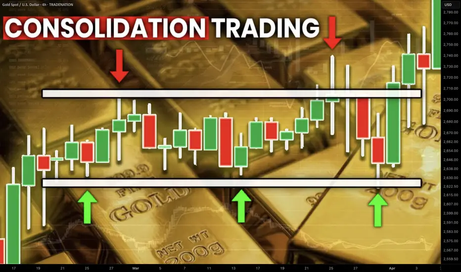
Best GOLD XAUUSD Consolidation Trading Strategy Explained
In article , you will learn how to identify and trade consolidation on Gold easily.
I will share with you my consolidation trading strategy and a lot of useful XAUUSD trading tips.
1. How to Identify Consolidation
In order to trade consolidation, you should learn to recognize that.
The best and reliable way to spot consolidation is to analyse a price action.
Consolidation is the state of the market when it STOPS updating higher highs & higher lows in a bullish trend OR lower lows & lower highs in a bearish trend.
In other words, it is the situation when the market IS NOT trending.
Most of the time, during such a period, the price forms a horizontal channel.
Above is a perfect example of a consolidation on Gold chart on a daily.
We see a horizontal parallel channel with multiple equal or almost equal highs and lows inside.
For a correct trading of a consolidation, you should correctly underline its boundaries.
Following the chart above, the upper boundary - the resistance, is based on the highest high and the highest candle close.
The lowest candle close and the lowest low compose the lower boundary - the support.
2. What Consolidation Means
Spotting the consolidating market, it is important to understand its meaning and the processes that happen inside.
Consolidation signifies that the market found a fair value.
Growth and bullish impulses occur because of the excess of demand on the market, while bearish moves happen because of the excess of supply.
When supply and demand find a balance, sideways movements start .
Look at the price movements on Gold above.
First, the market was rising because of a strong buying pressure.
Finally, the excess of buying interest was curbed by the sellers.
The market started to trade with a sideways range and found the equilibrium
At some moment, demand started to exceed the supply again and the consolidation was violated . The price updated the high and continued growth.
Usually, the violation of the consolidation happens because of some fundamental event that makes the market participants reassess the value of the asset.
At the same time, the institutional traders, the smart money accumulate their trading positions within the consolidation ranges. As the accumulation completes, they push the prices higher/lower, violating the consolidation.
3. How to Trade Consolidation
Once you identified a consolidation on Gold, there are 2 strategies to trade it.
The resistance of the consolidation provides a perfect zone to sell the market from. You simply put your stop loss above the resistance and your take profit should be the upper boundary of the support.
That is the example of a long trade from support of the consolidation on Gold.
The support of the sideways movement will be a safe zone to buy Gold from. Stop loss will lie below the support zone, take profit will be the lower boundary of the resistance.
AS the price reached a take profit level and tested a resistance, that is a short trade from that.
You can follow such a strategy till the price violates the consolidation and establishes a trend.
The market may stay a very extended period of time in sideways, providing a lot of profitable trading opportunities.
What I like about Gold consolidation trading is that the strategy is very straightforward and completely appropriate for beginners.
It works on any time frame and can be used for intraday, swing trading and scalping
❤️Please, support my work with like, thank you!❤️
I am part of Trade Nation's Influencer program and receive a monthly fee for using their TradingView charts in my analysis.
The Ultimate Guide to Price Action TradingIntroduction to Price Action
Price action trading is a powerful method that relies solely on analyzing price movements without using indicators. Instead of following lagging signals, traders use historical price movements to predict future market behavior. This approach helps in making informed decisions based on real market sentiment.
Why Use Price Action?
Many traders prefer price action because it simplifies trading by focusing only on the movement of price rather than complex technical indicators. Here are some key advantages:
Eliminates reliance on lagging indicators: Indicators often generate signals after the price has already moved significantly. Price action provides real-time insights.
Provides a clearer picture of market sentiment: By analyzing candlestick formations and key levels, traders can assess where the market is likely to move next.
Works across all timeframes and markets: Whether you trade stocks, forex, or crypto, price action techniques remain relevant.
Market Structure & Trend Analysis
Understanding market structure is key to recognising trends and making profitable trades. Price moves in patterns, forming trends, consolidations, and reversals.
Identifying Trends
A trend is a general direction in which the price is moving. Identifying trends early can give traders a significant edge.
Uptrend: Characterized by higher highs (HH) and higher lows (HL). This indicates strong buying pressure.
Downtrend: Identified by lower highs (LH) and lower lows (LL). This signals dominant selling pressure.
Ranging Market: Occurs when price moves sideways, forming equal highs and lows, showing indecision.
Using Market Structure to Trade
Follow the dominant trend for higher probability trades rather than trading against the market direction.
Look for breakouts from consolidation zones, which often lead to explosive moves in the market.
Identify trend reversals by observing changes in market structure, such as a break of previous highs or lows.
Key Support & Resistance Levels
Support and resistance levels help traders identify where price might react, leading to potential trade opportunities.
Types of Support & Resistance
Horizontal Levels: These are static price levels where the price has reversed multiple times, acting as strong barriers.
Trendlines: These dynamic levels move with price and act as diagonal support or resistance.
Psychological Levels: Round numbers like 100, 200, or 1.0000 in forex often act as key psychological barriers for traders.
How to Use Support & Resistance
Buying near support and selling near resistance is a classic strategy used by traders.
Breakout trading: If the price breaks a key level with strong momentum, it often continues in that direction.
Retest confirmation: After a breakout, the price may return to test the level before continuing its move. This offers a high-probability entry.
Candlestick Patterns & Their Meaning
Candlestick patterns provide insights into market sentiment and potential reversals or continuations.
Single Candlestick Patterns
Pin Bar (Rejection Candlestick): A pin bar has a long wick and a small body, showing strong rejection at a price level. It signals a potential reversal.
Doji: A candlestick with a small body and wicks on both sides, indicating indecision in the market.
Hammer & Shooting Star: The hammer forms at the bottom of a downtrend, signaling reversal, while the shooting star appears at the top, suggesting a potential sell-off.
Multi-Candlestick Patterns
Engulfing Pattern: A bullish engulfing pattern occurs when a large green candle completely engulfs the previous red candle, signaling a strong upward move. The opposite is true for bearish engulfing patterns.
Morning Star & Evening Star: These three-candle patterns indicate a shift in momentum, either bullish or bearish.
Head & Shoulders: A reversal pattern that suggests a shift from an uptrend to a downtrend or vice versa.
Price Action Strategies
Breakout Trading
Breakout trading involves identifying key price levels where a breakout is likely to occur. This can be from a range, a pattern like a triangle, or a resistance level.
Identify consolidation zones where price has been trading in a tight range.
Enter a trade when the price breaks above resistance or below support with strong volume.
Use stop-losses to avoid false breakouts, placing them just outside the consolidation zone.
Reversal Trading
Reversal trading focuses on identifying trend exhaustion and potential reversals.
Look for exhaustion at key levels, where price struggles to move further.
Confirm reversals with candlestick patterns such as pin bars, engulfing patterns, or head & shoulders formations.
Use risk-reward ratios of at least 1:2 to maximize profits on successful reversals.
Trend Continuation Trading
Enter on pullbacks within an established trend, rather than chasing breakouts.
Look for price bouncing off moving averages or trendlines as confirmation.
Ride trends until momentum weakens, using trailing stop-losses to lock in profits.
Trading Without Indicators
Analysing raw price action helps traders understand market movement without distractions.
Key Steps for Chart Analysis
Identify the overall market trend by checking higher highs or lower lows.
Mark key support and resistance levels to find potential trade areas.
Observe candlestick formations that provide confirmation for entries.
Wait for confirmation before entering a trade to avoid false signals.
Risk Management & Psychology in Price Action Trading
A strong mindset and risk management strategy are crucial for long-term success.
Risk Management Tips
Use stop-losses to limit risk and prevent large drawdowns.
Risk no more than 1-2% of capital per trade, ensuring longevity.
Always aim for a favorable risk-reward ratio, such as 1:2 or 1:3.
Psychological Tips
Stay disciplined and avoid emotional trading, as emotions can lead to impulsive decisions.
Accept losses as part of the process and learn from them.
Stick to a well-defined trading plan, reducing uncertainty in decision-making.
Final Thoughts & Next Steps
Mastering price action trading takes time, patience, and consistent practice. Here’s how you can improve:
Continuously analyze charts and refine your strategy by backtesting historical data.
Keep a trading journal to track progress and identify areas for improvement.
Stay updated with market conditions, as price action can behave differently in different market environments.
By applying these techniques, you can develop a strong foundation in price action trading and make more informed trading decisions. Stay disciplined, keep learning, and happy trading!
__________________________________________
Thanks for your support!
If you found this idea helpful or learned something new, drop a like 👍 and leave a comment, I’d love to hear your thoughts! 🚀
Make sure to follow me for more price action insights, free indicators, and trading strategies. Let’s grow and trade smarter together! 📈

Popular Hedging Strategies for Traders in 2025Popular Hedging Strategies for Traders in 2025
Hedging strategies are key tools for traders seeking to potentially manage risks while staying active in dynamic markets. By strategically placing positions, traders aim to reduce exposure to adverse price movements without stepping away from potential opportunities. This article explores the fundamentals of hedging, its role in trading, and four hedging strategies examples across forex and CFDs.
What Is Hedging in Trading?
Hedging in trading is a risk management strategy that involves taking positions designed to offset potential losses in an existing investment. This concept of hedging in finance is widely used to reduce market volatility’s impact while maintaining the potential opportunity for returns. Rather than avoiding risk entirely, traders manage it via hedging strategies, meaning they have protection against unexpected market movements.
So, what are hedges? Essentially, they are investments used as protective measures to balance exposure. For example, a trader holding a CFD (Contract for Difference) on a rising stock might open a position on a correlated asset that moves in the opposite direction. If the stock’s price falls, returns from the offsetting position can potentially reduce the overall impact of the loss.
Hedging is common in forex trading, where traders may take positions in currency pairs with historical correlations. For instance, a trader exposed to EUR/USD might hedge using USD/CAD, as these pairs often move inversely. Similarly, traders dealing with indices might diversify into different sectors or regions to spread risk.
Importantly, hedging involves costs, such as spreads or holding fees, which can reduce potential returns. It’s not a guaranteed method of avoiding losses but rather a calculated approach to navigating uncertainty.
Why Traders Use Hedging Strategies
Different types of hedging strategies may help traders manage volatility, protect portfolio value, or balance short- and long-term goals.
1. Managing Market Volatility
Markets are unpredictable, and sudden price swings can impact even well-thought-out positions. Hedging this risk may help reduce the impact of unexpected volatility, particularly during periods of heightened uncertainty, such as geopolitical events, economic announcements, or earnings reports. For instance, a forex trader might hedge against fluctuations in a currency pair by taking positions in negatively correlated pairs, aiming to soften the blow of adverse price movements.
2. Balancing Long- and Short-Term Goals
Hedging allows traders to pursue longer-term strategies without being overly exposed to short-term risks. For example, a trader with a bullish outlook on an asset may use a hedge to protect against temporary downturns. This balance enables traders to maintain their primary position while weathering market turbulence.
3. Protecting Portfolio Value
Hedging strategies may help investors safeguard their overall portfolio value during market corrections or bearish trends. By diversifying positions or using opposing trades, they can potentially reduce significant drawdowns. For instance, shorting an index CFD while holding long positions in individual stocks can help offset sector-wide losses.
4. Improving Decision-Making Flexibility
Hedging provides traders with the flexibility to adjust their strategies as market conditions evolve. By mitigating downside risks, they can focus on refining their long-term approach without being forced into reactive decisions during volatile periods. This level of control can be vital for maintaining consistency in trading performance.
Common Hedging Strategies in Trading
While hedging doesn’t eliminate risks entirely, it can provide a layer of protection against adverse market movements. Some of the most commonly used strategies for hedging include:
1. Hedging with Correlated Instruments
One of the most straightforward hedging techniques involves trading assets that have a known historical correlation. Correlated instruments typically move in alignment, either positively or negatively, which traders can leverage to offset risk.
For example, a trader holding a long CFD position on the S&P 500 index might hedge by shorting the Nasdaq-100 index. These two indices are often positively correlated, meaning that if the S&P 500 declines, the Nasdaq-100 might follow suit. By holding an opposing position in a similar asset, losses in one position can potentially be offset by gains in the other.
This approach works across various asset classes, including forex. A well-planned forex hedging strategy can soften the blow of market volatility, particularly during economic events. Consider EUR/USD and USD/CAD: these pairs typically show a negative correlation due to the shared role of the US dollar. A trader might hedge a EUR/USD long position with a USD/CAD long position, reducing exposure to unexpected dollar strength or weakness.
However, correlation-based hedging requires regular monitoring. Correlations can change depending on market conditions, and a breakdown in historical patterns could result in both positions moving against the trader. Tools like correlation matrices can help traders analyse relationships between assets before using this strategy.
2. Hedging in the Same Instrument
Hedging within the same instrument involves taking opposing positions on a single asset to potentially manage risks without exiting the original trade. This hedging strategy is often used when traders suspect short-term price movements might work against their primary position but still believe in its long-term potential.
For example, imagine a trader holding a long CFD position in a major stock like Apple. The trader anticipates the stock price will rise over the long term but is concerned about an upcoming earnings report or market-wide sell-off that could lead to short-term losses. To hedge, the trader opens a short position in the same stock, locking in the current value of their trade. If the stock’s price falls, the short position may offset the losses in the long position, reducing overall exposure to the downside.
This is often done with a position size equivalent to or less than the original position, depending on risk tolerance and market outlook. A trader with high conviction in a short-term movement may use an equivalent position size, while a lower conviction could mean using just a partial hedge.
3. Sector or Market Hedging for Indices
When trading index CFDs, hedging can involve diversifying exposure across sectors or markets. This strategy helps reduce the impact of sector-specific risks while maintaining exposure to broader market trends.
For example, if a trader has a portfolio with exposure to technology stocks and expects short-term declines in the sector, they can open a short position in a technology-focused index like Nasdaq-100 to offset potential losses.
Another common approach is geographic diversification. Traders with exposure to European indices, such as the FTSE 100, might hedge with positions in US indices like the Dow Jones Industrial Average. Regional differences in economic conditions can make this a practical strategy, as markets often react differently to global events.
When implementing sector or market hedging, traders should consider the weighting of individual stocks within an index and how they contribute to overall performance. This strategy is used by traders who have a clear understanding of the underlying drivers of the indices involved.
4. Stock Pair Trading
Pair trading is a more advanced hedging technique that involves identifying two related assets and taking opposing positions. This approach is often used in equities or indices where stocks within the same sector tend to move in correlation with each other.
For instance, a trader might identify two technology companies with similar fundamentals, one appearing undervalued and the other overvalued. The trader could go long on the undervalued stock while shorting the overvalued one. If the sector experiences a downturn, the losses in the long position may potentially be offset by gains in the short position.
Pair trading requires significant analysis, including fundamental and technical evaluations of the assets involved. While this strategy offers a built-in hedge, it can be risky if the chosen pair doesn’t perform as expected or if external factors disrupt the relationship between the assets.
Key Considerations When Hedging
What does it mean to hedge a stock or other asset? To fully understand the concept, it’s essential to recognise several factors:
- Costs: Hedging isn’t free. Spreads, commissions, and overnight holding fees can accumulate, reducing overall potential returns. Traders should calculate these costs to ensure the hedge is worth implementing.
- Market Conditions: Hedging strategies are not static. They require adaptation to changing market conditions, including shifts in volatility, liquidity, and macroeconomic factors.
- Correlation Risks: Correlations between assets are not always consistent. Unexpected changes in relationships driven by fundamental events can reduce the effectiveness of a hedge.
- Timing: The timing of both the initial position and the hedge is critical. Poor timing can lead to increased losses or missed potential opportunities.
The Bottom Line
Hedging strategies are popular among traders looking to manage risks while staying active in the markets. By balancing positions and leveraging tools like correlated instruments or partial hedges, traders aim to navigate volatility with greater confidence. However, hedging doesn’t exclude risks and requires analysis, planning, and regular evaluation.
If you're ready to explore hedging strategies in forex, stock, commodity, and index CFDs, consider opening an FXOpen account to access four advanced trading platforms, competitive spreads, and more than 700 instruments to use in hedging.
FAQ
What Is Hedging in Trading?
Hedging in trading is a risk management approach where traders take offsetting positions to potentially reduce losses from adverse market movements. Rather than avoiding risk entirely, hedge trading aims to manage it, providing a form of mitigation while maintaining market exposure. For example, a trader with a long position on an asset might open a short position on a related asset to offset potential losses during market volatility.
What Are the Three Hedging Strategies?
The three common hedging strategies include: hedging with correlated instruments, where traders take opposing positions in assets with historical relationships; hedging in the same instrument, where a trader suspects a movement against the direction of their original position and opens a trade in the opposite direction; and sector or market hedging, where a trader uses indices or regional diversification to reduce exposure to specific market risks.
What Is Hedging in Stocks?
Hedging in stocks involves taking additional positions to offset risks associated with holding other stocks. This can include shorting related stocks, trading negatively correlated indices, or using market diversification to reduce exposure to sector-specific downturns.
How to Hedge Stocks?
To hedge stocks, traders typically use strategies like short-selling correlated equities, diversifying into other asset classes, or opening opposing positions in related indices. The aim is to limit downside while maintaining some exposure to potential market opportunities.
This article represents the opinion of the Companies operating under the FXOpen brand only. It is not to be construed as an offer, solicitation, or recommendation with respect to products and services provided by the Companies operating under the FXOpen brand, nor is it to be considered financial advice.

How To Properly Read Open Interest (OI) Identify Trends $VARAIn crypto, especially when trading shit coins, measure OI on BTC, ETH, and any other asset that has futures up against whatever you are trading.
Most importantly identify positive or negative correlation between the asset pair and TRADE accordingly.
i.e. if you are measuring OI for USDX or DXY know that it will have negative correlation toward your risk asset whatever it is.
Open Interest and Volume ARE NOT THE SAME THING!
Volume is the measure of contracts settled in a trading session (hourly, daily, monthly, etc.)
Open interest (or OI for short) is the total number of contracts still outstanding.
OI and order wall size are correlated.
OI is charted.
Increasing OI means an increase in liquidity i.e. open contracts.
Decreasing OI means that there is a decrease in liquidity i.e. liquidity is leaving the market either cash or asset.
Open Interest can help you identify trend shifts. Use it along with order flow the compliment each other.
OI Rising - Market trends up - Volume increasing - Trend will continue
OI Falling - Market trends up - Volume decreasing - Trend will turn bullish
OI Rising - Market trends down - Volume rising - Strong bearish continuation
OI Falling - Market trends down - Volume falling - Bearish bias is lessening
Notice in the above simplified examples that volume MUST be paired with OI to be useful.
One might mistake that volume on it's own can be used to judge trends.
Open interest will increase as more traders enter the market which means often that money is coming into the market.
OI will decrease as traders exit the market or as contracts are closed. This means that money is leaving the market i.e. less buyers

Behind the DCA Strategy: What It Is and How It WorksWho invented the Dollar Cost Averaging (DCA) investment strategy?
The concept of Dollar Cost Averaging (DCA) was formalized and popularized by economists and investors throughout the 20th century, particularly with the growth of the U.S. stock market. One of the first to promote this strategy was Benjamin Graham , considered the father of value investing and author of the famous book The Intelligent Investor (published in 1949). Graham highlighted how DCA could help reduce the risk of buying assets at excessively high prices and improve investor discipline.
When and How Did Dollar Cost Averaging Originate?
The concept of DCA began to take shape in the early decades of the 20th century when financial institutions introduced automatic purchase programs for savers. However, it gained popularity among retail investors in the 1950s and 1960s with the rise of mutual funds.
Overview
The core principle of DCA involves investing a fixed amount of money at regular intervals (e.g., every month. This approach allows investors to purchase more units when prices are low and fewer units when prices are high, thereby reducing the impact of market volatility.
Why Was DCA Developed?
The strategy was developed to address key challenges faced by investors, including:
1. Reducing Market Timing Risk
Investing a fixed amount periodically eliminates the need to predict the perfect market entry point, reducing the risk of buying at peaks.
2. Discipline and Financial Planning
DCA helps investors maintain financial discipline, making investments more consistent and predictable.
3. Mitigating Volatility
Spreading trades over a long period reduces the impact of market fluctuations and minimizes the risk of experiencing a significant drop immediately after a large investment.
4. Ease of Implementation
The strategy is simple to apply and does not require constant market monitoring, making it accessible to all types of investors.
Types of DCA
Dollar Cost Averaging (DCA) is an investment strategy that can be implemented in two main ways:
Time-Based DCA → Entries occur at regular intervals regardless of price.
Price-Based DCA → Entries occur only when the price meets specific criteria.
1. Time-Based DCA
How It Works: The investor buys a fixed amount of an asset at regular intervals (e.g., weekly, monthly). Entries occur regardless of market price.
Example: An investor decides to buy $200 worth of Bitcoin every month, without worrying whether the price has gone up or down.
2. Price-Based DCA
How It Works: Purchases occur only when the price drops below a predefined threshold. The investor sets price levels at which purchases will be executed (e.g., every -5%). This approach is more selective and allows for buying at a “discount” compared to the market trend.
Example: An investor decides to buy $200 worth of Bitcoin only when the price drops by at least 5% compared to the last entry.
Challenges and Limitations
1. DCA May Reduce Profits in Bull Markets
If the market is in an bullish trend, a single trade may be more profitable than spreading purchases over time or price dips.
2. Does Not Fully Remove Loss Risk
DCA helps mitigate volatility but does not protect against long-term bearish trends. If an asset continues to decline for an extended period, positions will accumulate at lower values with no guarantee of recovery.
3. May Be Inefficient for Active Investors
If an investor has the skills to identify better entry points (e.g., using technical or macroeconomic analysis), DCA might be less effective. Those who can spot market opportunities may achieve a better average entry price than an automatic DCA approach.
4. Does Not Take Full Advantage of Price Drops
DCA does not allow aggressive buying during market dips since purchases are fixed at regular intervals. If the market temporarily crashes, an investor with available funds could benefit more by buying larger amounts at that moment.
5. Higher Transaction Costs
Frequent small investments can lead to higher trading fees, which may reduce net returns. This is especially relevant in markets with fixed commissions or high spreads.
6. Risk of Overconfidence and False Security
DCA is often seen as a “fail-proof” strategy, but it is not always effective. If an asset has weak fundamentals or belongs to a declining sector, DCA may only slow down losses rather than ensure future gains.
7. Requires Discipline and Patience
DCA is only effective if applied consistently over a long period. Some investors may lose patience and leave the strategy at the wrong time, especially during market crashes.
