War , Bitcoin , and the Myth of Safe Havens...Hello Traders 🐺
"You think Bitcoin is digital gold? Wait until the bombs drop."
Everyone talks about Bitcoin as a hedge. A hedge against inflation. Against fiat. Against banking failures.
But let me ask you this:
Is Bitcoin a hedge against war?
I’m not here to give you a yes or no. I’m here to make you uncomfortable —
Because if you think BTC always pumps when chaos hits,
you're trading dreams, not reality.
Let’s dissect this. No fluff.
⚔️ 1. Real Wars. Real Charts.
Let’s test your assumptions against actual history:
Feb 2022 (Ukraine invaded):
BTC dumps hard. Then... recovers.
Was it a hedge? Or just the market gasping for liquidity?
Oct 2023 (Middle East escalates):
BTC spikes. Why?
Was it fear of fiat instability? Or just algo-driven momentum?
April 2024 (Hormuz Strait tensions):
Whipsaws. No clear direction.
So again: what exactly is BTC reacting to?
👉 Are you reading price? Or just feeding a narrative you want to believe?
🧠 2. Bitcoin = Fear Thermometer?
In war, people flee. Banks freeze. Censorship rises. Panic spreads.
Some run to gold.
Some run to the dollar.
A few... run to BTC.
But don’t forget:
Most retail investors panic sell. Institutions vanish. Liquidity dies.
So here’s the punchline:
BTC isn't a safe haven.
It's a sentiment mirror — brutally honest and totally unstable.
Still wanna call it "digital gold"?
💣 3. War Doesn’t Create Trends. It Exposes Bias.
Most of you are trying to fit BTC’s price into a geopolitical event.
Wrong approach.
You should be asking:
What kind of war is this?
Does it shake the dollar?
Does it cause capital controls?
Does it threaten global liquidity?
BTC doesn’t care about explosions.
It cares about trust.
Break trust in fiat? BTC might thrive.
Spike short-term fear? BTC might collapse.
Simple enough?
📉 4. The Hard Truth: Most of You Can’t Read War
No offense — but most retail traders don’t understand geopolitics.
They just look at headlines and wait for a green candle.
So here’s your challenge:
Next time war breaks out, ask yourself:
“Is this bullish for BTC — or just loud?”
Be honest. Don’t just copy Twitter takes.
🔍 5. If You're Long BTC Because of War — You Better Know Why.
BTC might go up.
BTC might tank.
But if your reason is just “the world is collapsing” —
you’re gambling, not investing.
Ask the deeper questions:
Are people losing faith in centralized systems?
Are borders tightening?
Are currencies being weaponized?
BTC shines only when sovereignty collapses.
Not just when missiles fly.
🧠 Final Thoughts
War doesn't pump BTC.
Distrust does.
Learn the difference — or keep trading headlines.
💬 Your move.
Would you hold Bitcoin during a war?
Why?
Drop the cliché answers. Give me logic.
👇 Let’s debate.
Fundamental Analysis

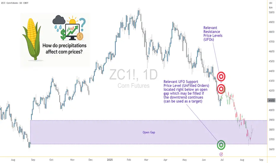
Weather and Corn: Understanding the Precipitation Factor1. Introduction: Rain, Grain, and Market Chain Reactions
In the world of agricultural commodities, few forces carry as much weight as weather — and when it comes to corn, precipitation is paramount. Unlike temperature, which can have nuanced and sometimes ambiguous effects depending on the growth stage, rainfall exerts a more direct and consistent influence on crop performance. For traders, understanding the role of rainfall in shaping market sentiment and price behavior isn't just an agricultural curiosity — it's a trading edge.
This article unpacks the relationship between weekly rainfall levels and corn futures prices. By leveraging normalized weather data and historical returns from Corn Futures (ZC), we aim to translate weather signals into actionable market insights. Whether you're managing large agricultural positions or exploring micro futures like MZC, precipitation patterns can provide vital context for your trades.
2. Corn’s Moisture Dependency
Corn is not just sensitive to water — it thrives or suffers because of it. From the moment seeds are planted, the crop enters a delicate dance with precipitation. Too little moisture during the early stages can impair root development. Too much during germination may lead to rot. And during pollination — particularly the tasseling and silking stages — insufficient rainfall can cause the plant to abort kernels, drastically reducing yield.
On the other hand, excessive rainfall isn't necessarily beneficial either. Prolonged wet periods can saturate soil, hinder nutrient uptake, and encourage fungal diseases. Farmers in the U.S. Corn Belt — particularly in states like Iowa, Illinois, and Nebraska — know this well. A single unexpected weather shift in these regions can send ripple effects across global markets, causing speculators to reassess their positions.
For traders, these weather events aren’t just environmental footnotes — they are catalysts that influence prices, volatility, and risk sentiment. And while annual production is important, it's the week-to-week rhythm of the growing season where short-term trades are born.
3. Our Data-Driven Approach: Weekly Rainfall and Corn Returns
To understand how rainfall impacts price, we collected and analyzed decades of historical weather and futures data, aligning weekly precipitation totals from major corn-growing regions with weekly returns from Corn Futures (ZC).
The weather data was normalized using percentiles for each location and week of the year. We then assigned each weekly observation to one of three precipitation categories:
Low rainfall (<25th percentile)
Normal rainfall (25th–75th percentile)
High rainfall (>75th percentile)
We then calculated the weekly percent change in corn futures prices and matched each return to the rainfall category for that week. The result was a dataset that let us measure not just general trends but statistically significant shifts in market behavior based on weather. One key finding stood out: the difference in returns between low-rainfall and high-rainfall weeks was highly significant, with a p-value of approximately 0.0006.
4. What the Numbers Tell Us
The results are striking. During low-rainfall weeks, corn futures often posted higher average returns, suggesting that the market responds to early signs of drought with anticipatory price rallies. Traders and institutions appear to adjust positions quickly when weather models hint at below-normal moisture during key growth stages.
In contrast, high-rainfall weeks displayed lower returns on average — and greater variability. While rain is essential, excess moisture raises fears of waterlogging, planting delays, and quality issues at harvest. The futures market, ever forward-looking, seems to price in both optimism and concern depending on the volume of rain.
Boxplots of these weekly returns reinforce the pattern: drier-than-usual weeks tend to tilt bullish, while wetter periods introduce uncertainty. For discretionary and algorithmic traders alike, this insight opens the door to strategies that incorporate weather forecasts into entry, exit, and risk models.
📊 Boxplot Chart: Weekly corn futures returns plotted against precipitation category (low, normal, high). This visual helps traders grasp how price behavior shifts under varying rainfall conditions.
5. Strategy: How Traders Can Position Themselves
With the clear statistical link between rainfall extremes and price behavior in corn futures, the logical next step is applying this insight to real-world trading. One straightforward approach is to incorporate weather forecast models into your weekly market prep. If a key growing region is expected to receive below-normal rainfall, that could serve as a signal for a potential bullish bias in the upcoming trading sessions.
This doesn’t mean blindly buying futures on dry weeks, but rather layering this data into a broader trading thesis. For example, traders could combine weather signals with volume surges, technical breakouts, or news sentiment to form confluence-based setups. On the risk management side, understanding how price behaves during extreme weather periods can inform smarter stop-loss placements, position sizing, or even the use of option strategies to protect against unexpected reversals.
Additionally, this information becomes particularly valuable during the planting and pollination seasons, when the corn crop is most vulnerable and the market reacts most strongly. Knowing the historical patterns of price behavior in those weeks — and aligning them with current forecast data — offers a clear edge that fundamental and technical analysis alone may not reveal.
🗺️ Global Corn Map Screenshot: A world map highlighting major corn-growing regions with weather overlay. This helps illustrate the geographic variability in rainfall and how it intersects with key production zones.
6. Corn Futures Contracts: Speculating with Flexibility
For traders looking to act on this kind of seasonal weather intelligence, CME Group provides two practical tools: the standard-size Corn Futures contract (ZC) and the Micro Corn Futures contract (MZC).
Here are some quick key points to remember:
Tick size for ZC is ¼ cent (0.0025) per bushel, equating to $12.50 per tick.
For MZC, each tick is 0.0050 equating to $2.50 per tick.
Standard ZC initial margin is approximately $1,000 and MZC margins are around $100 per contract, though this can vary by broker.
Micro contracts are ideal for those who want exposure to corn prices without the capital intensity of full-size contracts. They’re especially helpful for weather-based trades, where your thesis may rely on shorter holding periods, rapid scaling, or position hedging.
7. Conclusion: Rain’s Role in the Corn Trade
Precipitation isn’t just a farmer’s concern — it’s a trader’s opportunity. Our analysis shows that weather data, especially rainfall, has a statistically significant relationship with corn futures prices. By normalizing historical precipitation data and matching it to weekly returns, we uncovered a clear pattern: drought stress tends to lift prices, while excessive moisture creates volatility and downside risk.
For futures traders, understanding this dynamic adds another layer to market analysis.
As part of a broader series, this article is just one piece of a puzzle that spans multiple commodities and weather variables. Stay tuned for our upcoming releases, where we’ll continue exploring how nature’s forces shape the futures markets.
When charting futures, the data provided could be delayed. Traders working with the ticker symbols discussed in this idea may prefer to use CME Group real-time data plan on TradingView: www.tradingview.com - This consideration is particularly important for shorter-term traders, whereas it may be less critical for those focused on longer-term trading strategies.
General Disclaimer:
The trade ideas presented herein are solely for illustrative purposes forming a part of a case study intended to demonstrate key principles in risk management within the context of the specific market scenarios discussed. These ideas are not to be interpreted as investment recommendations or financial advice. They do not endorse or promote any specific trading strategies, financial products, or services. The information provided is based on data believed to be reliable; however, its accuracy or completeness cannot be guaranteed. Trading in financial markets involves risks, including the potential loss of principal. Each individual should conduct their own research and consult with professional financial advisors before making any investment decisions. The author or publisher of this content bears no responsibility for any actions taken based on the information provided or for any resultant financial or other losses.
When Charts Lie: How Fundamentals Rescued My Forex TradingEvery trader knows the frustration: your analysis is technically flawless, but the market moves against you. I learned this brutally in Q1 2024 when my USD/CAD short—backed by textbook bearish divergence and order block rejection—got steamrolled by a 190-pip rally after Canada’s surprise oil export announcement.
The Blind Spot in Pure Technicals
Price action traders often dismiss fundamentals as "noise," but three scenarios consistently break chart-based systems:
Policy Surprises (SNB removing EUR/CHF floor)
Geopolitical Shocks (Rubles during Ukraine invasion)
Structural Shifts (BOJ abandoning YCC)
These events share one trait: they change the market’s fundamental DNA, invalidating historical patterns.
A Practical Filter
I need to train myself to do something like this: To overlay two fundamental checks before technical entries:
Central Bank Calendar
No trades 12 hours before scheduled meetings
Monitor yield spreads (10YR US vs. DE)
Commodity Links
AUD/USD: Iron ore inventories
USD/CAD: WTI backwardation
Case Study: April 2024 GBP/USD
Technicals suggested continuation above 1.2700
Fundamental red flag: UK real wages shrinking
Outcome: False breakout, 140-pip drop
Your Turn
Try this today: On your next trade, ask:
Is there scheduled event risk?
Does this align with rate expectations?
Are commodities/equities confirming?
The goal isn’t perfection—it’s avoiding obvious mismatches.
For me, I read my own words on what should be done, and most probably, I won't do it. I think the above is too much. I believe there must be an easier way to merge Technical and Fundamental Analysis.

How to Trade When Buy/Sell Alerts Conflict with Market StructureQuestion:
If we have a buy/sell alert and an opposing Market Structure, how can we tell which will prevail or is heavier?
Answer (VX Algo System perspective):
In the VX Algo system, both the alert signals (buy/sell) and the market structure are crucial, but they serve different roles:
Alerts are dynamic triggers based on price action, momentum, or specific algorithmic conditions. They indicate potential entry or exit points.
Market Structure reflects the broader trend and underlying order flow, indicating the prevailing direction of the market (e.g., higher highs and higher lows for bullish structure, or lower highs and lower lows for bearish structure).
When an alert contradicts the prevailing market structure, the heavier factor is usually the Market Structure because it represents the dominant order flow and sentiment. In other words, alerts give you tactical timing, but market structure provides strategic context.
How to tell which prevails:
Confirm with Market Structure: If the market structure is bullish (uptrend), a buy alert aligns with it and is more likely to succeed. A sell alert against that structure is a warning sign that the alert may be weaker or a potential false signal.
Volume and Momentum: Use volume or momentum indicators (built into VX Algo or complementary tools) to see if the alert has strength behind it. A strong sell alert with high volume during an uptrend may indicate an imminent structure shift.
Multiple Timeframe Analysis: Check if the opposing alert is supported or rejected on higher timeframes. A buy alert on a lower timeframe against a bearish higher timeframe structure is less likely to prevail.
Risk Management: If you trade against structure alerts, reduce position size and tighten stops until the structure confirms the shift.
Summary: Market structure is heavier and more reliable for directional bias. Alerts provide tactical entry timing. When they conflict, lean on structure for bias but watch for alert strength as early signals of possible structure changes.

Anatomy of a Breakout: How to Spot It Before It Fakes You OutFew things in trading are as appealing as a breakout. The chart tightens, volume starts to stir, headlines align, your alerts start going off , and suddenly — boom! Price explodes above resistance. Your adrenaline spikes and you pop open that long.
But just as often, that breakout turns out to be nothing more than an expensive head fake. Price stalls. Sellers swoop in. Your stop gets clipped. And now you’re sitting there, blinking at your screen, “Welp… that was quick.”
Welcome to the bittersweet world of breakouts — where opportunity and deception dance like partners at a high-stakes poker table.
📢 What Is a Breakout, Really?
Let’s get the basics out of the way: A breakout happens when price pushes beyond a key support or resistance level that’s been holding for a while.
That level could be a previous high, a consolidation range, a trendline, or a psychological number that traders obsess over because humans love round numbers (did someone say Bitcoin BITSTAMP:BTCUSD at $120,000 ?).
The logic is simple: Once price clears a well-watched level, trapped shorts have to cover, new longs pile in, and momentum feeds on itself. That’s the dream scenario.
But markets aren’t always that generous. For every clean breakout, there are a few fakeouts lurking — luring in overeager traders with the promise of easy money before slamming the door shut.
⚠️ Why Breakouts May Fail
If breakouts were easy, we’d all be rich. The problem is that breakouts attract a special kind of crowd: late-to-the-party momentum chasers, breakout algorithm bots, and retail traders who read one blog post about technical analysis.
The moment price nudges above resistance, FOMO kicks in. Volume surges. But if the move isn’t backed by genuine institutional buying (you need lots of billions to move the needle nowadays), it quickly becomes what seasoned traders call a “liquidity vacuum” — thin air where the only participants are you, a few equally optimistic Reddit threads, and market makers more than happy to take the other side.
Sometimes breakouts fail because:
The move lacked volume confirmation.
Macro headlines shifted mid-breakout.
A key level was front-run, and the real buyers have already taken profit.
It was a deliberate trap set by larger players to hunt stops before reversing.
Or — more often — the market just needed an excuse to shake out weak hands before resuming the actual move later.
🍸 Volume: The Truth Serum
Let’s be very clear: Breakouts without volume are like dating profiles without photos — you should be suspicious.
When real breakouts occur, you’ll usually see strong accompanying volume. That’s your proof that big players — funds, institutions, serious money — are committing to the move. No volume? Maybe the summer vibes are already here .
Smart traders wait for confirmation:
Is volume above average relative to recent sessions?
Is price holding above the breakout level after the initial pop?
Are follow-through candles printing convincingly?
Are we seeing continuation across related sectors or instruments?
Without these signs, that breakout candle may just be a cruel joke.
🤯 Breakout Psychology
Breakouts prey on two of the most dangerous emotions in trading: greed and urgency. The market whispers, “If you don’t get in now, you’ll miss it.”
This is where breakout psychology becomes more dangerous than the chart itself. Once a breakout happens, most traders are no longer analyzing — they’re reacting. They buy late, set tight stops below the breakout level, and become easy prey for stop-hunting algorithms.
✨ Types of Breakouts
Not all breakouts are created equal. Here’s the lineup you should be watching for:
Clean Breakouts:
The rarest and most beautiful. Strong move, high volume, sustained momentum. You’ll know it when you see it — or after you’ve hesitated and missed it.
Fakeouts (a.k.a. False Breakouts):
Price nudges just past resistance, triggers breakout orders, then swiftly reverses. Designed to shake out breakout traders before resuming the original trend.
Break-and-Retest Setups:
Often the highest-probability trades. Price breaks out, then pulls back to retest the former resistance (now support). If buyers defend this retest, you’ve got confirmation.
News-Driven Breakouts:
Triggered by earnings, economic data, or political events. Volatile, fast, and often unsustainable unless backed by real fundamental shifts.
📈 The “Pre-Breakout Tell”: Reading the Tape
Good breakout traders aren’t just watching levels — they’re watching how price behaves near those levels in advance.
Tight consolidation? Lower volatility into resistance? Declining volume as price grinds higher? That often signals an impending breakout as supply dries up.
Conversely, choppy action with large wicks and erratic volume often signals indecision — ripe conditions for failed breakouts and fakeouts.
Tape-reading matters. The cleaner the structure before the breakout, the better your odds.
💰 Breakout Traders Need Thick Skin
Even with perfect analysis, breakout trading requires accepting that many will fail. That’s the game. Your job isn’t to nail every breakout — it’s to size your positions properly , keep losses small when faked out, and let the clean breakouts run when you catch one.
Stop-loss discipline is everything. Breakouts are binary events: you’re either right quickly, or you’re cutting the trade quickly. There’s no room for “maybe it’ll come back.”
The most painful breakouts are the ones that fake out, stop you, then continue in your original direction. Every breakout trader has lived that nightmare. Accept it. Build it into your risk plan.
👉 Takeaway: Prepare the Setup, Anticipate the Fakeout
Breakouts will always be part of every trader’s playbook. But they require discipline, experience, and an iron stomach. The market loves to tempt you with early signals — your job is to separate signal from noise.
Pro tip: Start your day by checking the Economic calendar and browsing the latest news — staying informed (and witty) helps you build better context for smarter decisions.
So before you chase that next breakout candle, ask yourself:
Is volume there?
Is the broader market supportive?
Have I managed my risk before clicking buy?
Because in trading, the only thing worse than missing a breakout… is getting faked out and blowing up your account chasing it.
Now over to you : Are you a breakout trader or a fakeout victim? Share your best (or worst) breakout stories — we’ve all been there.

FED, rate cut possible on July 30? With the US Federal Reserve (FED) meeting on July 30 fast approaching, the markets are scrutinizing the slightest signals likely to indicate an inflexion in monetary policy. While a rate cut seems unlikely in the short term, it cannot be ruled out altogether. Despite Chairman Jerome Powell's firm stance, some influential members of the Monetary Policy Committee (FOMC) are actively pushing for monetary easing this summer.
1) Jerome Powell is not the only decision-maker on the FOMC, and there is pressure for a rate cut in July
Jerome Powell adopts a very cautious stance, making any monetary easing conditional on clear convergence towards the 2% inflation target. His main concern is the potentially inflationary impact of the tariffs currently under negotiation. However, Powell does not have absolute power. The FOMC has 12 voting members, including 7 permanent governors, the president of the New York Fed and 4 rotating regional bank presidents.
Although each vote is worth as much, the Chairman largely shapes the agenda and guides the discussions. Some members, such as Michelle Bowman and Christopher Waller, appointed under the Trump presidency, are pushing for a cut as early as July. Donald Trump's implicit support for this option adds political pressure, even if his direct influence is limited.
Below is a table showing the current balance of power between the voting members of the FOMC.
2) There will be a rate cut on July 30 if and only if the unemployment rate becomes worrying
On the fundamentals side, inflation measured by the PCE index, the FED's benchmark, remains slightly above target, but several key components are showing signs of normalization. Oil, which accounts for around 11% of the basket, is not showing any alarming technical signals with the geopolitical calm in the Middle East. The real estate sector and healthcare spending, also heavily weighted, are showing positive indications in favor of further disinflation. Moreover, tariffs are only marginally affecting services, which account for 67% of the PCE.
Despite this, Powell remains concerned about the risk of exogenous inflationary resurgence, especially if the universal 10% tariff were to apply to all US trading partners, with an expected impact on core PCE of +0.2% to +0.3%.
Markets are anticipating a first decline in September, but a July changeover cannot be ruled out if employment data, notably the NFP report of July 3, show a marked weakening of the labor market.
3) The S&P 500 index will need the FED's pivot to go higher, as it has returned to its all-time high
On the financial markets, a FED pivot would be a decisive bullish catalyst, especially for US equities, Bitcoin and other high-beta assets. Technical analysis of the S&P 500 shows a favourable technical configuration since the beginning of April, with a V-shaped recovery. But with the market now in contact with its all-time high, very positive fundamentals will be needed to consider going higher.
In short, the decision on July 30 will depend on a subtle trade-off between political pressures, inflation dynamics and the health of the job market. A status quo remains the central scenario, but a reversal is conceivable in the event of a sharp deterioration in macroeconomic data, good inflation figures or positive surprises on trade diplomacy.
DISCLAIMER:
This content is intended for individuals who are familiar with financial markets and instruments and is for information purposes only. The presented idea (including market commentary, market data and observations) is not a work product of any research department of Swissquote or its affiliates. This material is intended to highlight market action and does not constitute investment, legal or tax advice. If you are a retail investor or lack experience in trading complex financial products, it is advisable to seek professional advice from licensed advisor before making any financial decisions.
This content is not intended to manipulate the market or encourage any specific financial behavior.
Swissquote makes no representation or warranty as to the quality, completeness, accuracy, comprehensiveness or non-infringement of such content. The views expressed are those of the consultant and are provided for educational purposes only. Any information provided relating to a product or market should not be construed as recommending an investment strategy or transaction. Past performance is not a guarantee of future results.
Swissquote and its employees and representatives shall in no event be held liable for any damages or losses arising directly or indirectly from decisions made on the basis of this content.
The use of any third-party brands or trademarks is for information only and does not imply endorsement by Swissquote, or that the trademark owner has authorised Swissquote to promote its products or services.
Swissquote is the marketing brand for the activities of Swissquote Bank Ltd (Switzerland) regulated by FINMA, Swissquote Capital Markets Limited regulated by CySEC (Cyprus), Swissquote Bank Europe SA (Luxembourg) regulated by the CSSF, Swissquote Ltd (UK) regulated by the FCA, Swissquote Financial Services (Malta) Ltd regulated by the Malta Financial Services Authority, Swissquote MEA Ltd. (UAE) regulated by the Dubai Financial Services Authority, Swissquote Pte Ltd (Singapore) regulated by the Monetary Authority of Singapore, Swissquote Asia Limited (Hong Kong) licensed by the Hong Kong Securities and Futures Commission (SFC) and Swissquote South Africa (Pty) Ltd supervised by the FSCA.
Products and services of Swissquote are only intended for those permitted to receive them under local law.
All investments carry a degree of risk. The risk of loss in trading or holding financial instruments can be substantial. The value of financial instruments, including but not limited to stocks, bonds, cryptocurrencies, and other assets, can fluctuate both upwards and downwards. There is a significant risk of financial loss when buying, selling, holding, staking, or investing in these instruments. SQBE makes no recommendations regarding any specific investment, transaction, or the use of any particular investment strategy.
CFDs are complex instruments and come with a high risk of losing money rapidly due to leverage. The vast majority of retail client accounts suffer capital losses when trading in CFDs. You should consider whether you understand how CFDs work and whether you can afford to take the high risk of losing your money.
Digital Assets are unregulated in most countries and consumer protection rules may not apply. As highly volatile speculative investments, Digital Assets are not suitable for investors without a high-risk tolerance. Make sure you understand each Digital Asset before you trade.
Cryptocurrencies are not considered legal tender in some jurisdictions and are subject to regulatory uncertainties.
The use of Internet-based systems can involve high risks, including, but not limited to, fraud, cyber-attacks, network and communication failures, as well as identity theft and phishing attacks related to crypto-assets.

Your investor profileEach investor has unique characteristics:
The amount of their current investments and savings
Their capacity to generate future income and allocate it to savings
Their personal and financial circumstances that may condition their liquidity needs
Their motivations and objectives for saving
Their discipline
Their willingness to learn
The time available for monitoring
Their knowledge and experience
Their risk aversion
All these characteristics are called investor profile .
Unless all these characteristics of your profile change, you must stay true to your investor profile. Bullish market environments are a temptation to take on more risk than we should.
It is also important to keep in mind that your investor profile changes with your life cycle .
While it’s great to share experiences, your investor profile is unique . When making your decisions, take advice based on your individual characteristics.
It is very important that you seek advice from trusted platforms and professionals and pay special attention to ensure that there is no clear commercial bias that could lead you to certain products or operations that may not suit your investor profile.
It is not a wise decision to copy from others : friends or forums created by entities with an obvious commercial bias, because your investor profile is unique.
Did you like it? Share with your friends.
by HollyMontt

Mechanical rangesMany traders will talk about things like "Smart Money Concepts" (SMC) and think they have found something new.
The truth is, everything in trading stems back to Liquidity.
There is no "Algo" nobody is out to get you specifically. The market is always right, where you position yourself is your own choice.
I have written several posts on mechanical trading, recorded a number of streams. The more mechanical you can make the process, the less the emotions have a chance to kick your ass.
Let me give you a very simple method of being able to identify the ranges. Ignore the timeframes as this will work on any of them, on most instruments. (I say most, as some behave differently due to how it attracts liquidity). Lets assume high end crypto such as Bitcoin (BTC) and of course Forex in the general sense, stocks, commodities etc.
This is simple - only 2 rules.
You start by zooming out and giving yourself a general feel for the trend.
Let's say this looks to be an uptrend - we now need to understand the rules.
An opposing candle can simply be defined by a different colour. If the trend is up (Green) and we see a red candle - then it's an opposing candle.
The inverse is true, if we are down and the trend is Red. Then a Green candle would be opposing.
This is only half of the story. The second rule is a pullback candle or even a sequence of candles. This simply means either the very same opposing candle that doesn't make a new high or low (depending on the trend up not making fresh highs or down not taking new lows).
In this image, you can see we have in one candle both an opposing and pullback in one candle. This means we can now mark the high of the range. Working backwards to identify the swing range low.
This easy method means I can draw a range exactly the same and mechanically every single time.
Giving me a mechanical range.
We could then get a lot more technical by looking for liquidity, 50% of the range or places such as supply or demand areas.
But these are all for other posts.
For now, getting a range on the higher timeframes means you can work down and down into a timeframe you are likely to want to trade on.
These ranges will give clues to draws and runs of liquidity.
This will also help identify changes in the character and fresh breaks of structure.
Here's another post I posted on the mechanical structures and techniques.
More in the next post.
Have a great week!
Disclaimer
This idea does not constitute as financial advice. It is for educational purposes only, our principal trader has over 25 years' experience in stocks, ETF's, and Forex. Hence each trade setup might have different hold times, entry or exit conditions, and will vary from the post/idea shared here. You can use the information from this post to make your own trading plan for the instrument discussed. Trading carries a risk; a high percentage of retail traders lose money. Please keep this in mind when entering any trade. Stay safe.

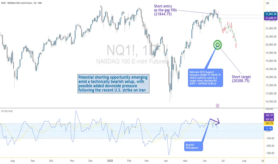
US–Iran Conflict Triggers a Potential Nasdaq Bearish Setup🟣 Geopolitical Flashpoint Meets Technical Confluence
The U.S. weekend airstrike on Iranian nuclear facilities has reignited geopolitical instability across the Middle East. While broader markets often absorb news cycles quickly, high-beta assets like Nasdaq futures (NQ) tend to react more dramatically—especially when uncertainty meets existing technical vulnerability.
Monday’s session opened with a notable gap to the downside, reflecting immediate risk-off sentiment among futures traders. While the initial drop is being retraced intraday, historical patterns suggest that such gap-fills can often serve as ideal shorting zones—particularly when other bearish signals confirm the narrative. The backdrop is clear: this is no ordinary Monday open.
🟣 Bearish Divergence on CCI Builds the Case
From a technical standpoint, the setup gains weight through a clear bearish divergence on the Commodity Channel Index (CCI) using a 20-period setting. While prices recently pushed higher, momentum failed to follow—an early indication that buyers may be running out of steam. This divergence appears just as price approaches the origin of Friday’s gap, a level that frequently acts as a resistance magnet in such contexts. This confluence of weakening momentum and overhead supply aligns perfectly with the geopolitical catalyst, offering traders a compelling argument for a potential reversal in the short term.
🟣 Gap Origin: The Line in the Sand
The origin of the gap sits at 21844.75, a price level now acting as potential resistance. As the market attempts to climb back toward this zone, the likelihood of encountering institutional selling pressure increases. Gap origins often represent unfinished business—zones where prior bullish control was suddenly interrupted. In this case, the added layer of global tension only strengthens the conviction that sellers may look to reassert dominance here. If price action stalls or rejects at this zone, it could become the pivot point for a swift move lower, especially with bearish momentum already flashing caution signals.
🟣 Trade Plan and Reward-to-Risk Breakdown
A potential short trade could be structured using 21844.75 as the entry point—precisely at the gap origin. A conservative stop placement would rest just above the most recent swing high at 22222.00, offering protection against a temporary squeeze. The downside target aligns with a prior UFO support area near 20288.75, where demand previously showed presence. This sets up a risk of 377.25 points versus a potential reward of 1556.00 points, resulting in a reward-to-risk ratio of 4.12:1. For traders seeking asymmetrical opportunity, this ratio stands out as a strong incentive to engage with discipline.
🟣 Futures Specs: Know What You’re Trading
Traders should be aware of contract specifics before engaging. The E-mini Nasdaq-100 Futures (NQ) represent $20 per point, with a minimum tick of 0.25 worth $5.00. Typical margin requirements hover around $31,000, depending on the broker.
For smaller accounts, the Micro Nasdaq-100 Futures (MNQ) offer 1/10th the exposure. Each point is worth $2, with a $0.50 tick value and much lower margins near $3,100.
🟣 Discipline First: Why Risk Management Matters
Volatility driven by geopolitical events can deliver fast gains—but just as easily, fast losses. That’s why stop-loss orders are non-negotiable. Without one, traders expose themselves to unlimited downside, especially in leveraged instruments like futures. Equally critical is the precision of entry and exit levels. Acting too early or too late—even by a few points—can compromise an otherwise solid trade. Always size positions according to your account, and never let emotion override logic. Risk management isn’t a side-note—it’s the foundation that separates professionals from those who simply speculate.
When charting futures, the data provided could be delayed. Traders working with the ticker symbols discussed in this idea may prefer to use CME Group real-time data plan on TradingView: www.tradingview.com - This consideration is particularly important for shorter-term traders, whereas it may be less critical for those focused on longer-term trading strategies.
General Disclaimer:
The trade ideas presented herein are solely for illustrative purposes forming a part of a case study intended to demonstrate key principles in risk management within the context of the specific market scenarios discussed. These ideas are not to be interpreted as investment recommendations or financial advice. They do not endorse or promote any specific trading strategies, financial products, or services. The information provided is based on data believed to be reliable; however, its accuracy or completeness cannot be guaranteed. Trading in financial markets involves risks, including the potential loss of principal. Each individual should conduct their own research and consult with professional financial advisors before making any investment decisions. The author or publisher of this content bears no responsibility for any actions taken based on the information provided or for any resultant financial or other losses.
The Midyear Mindset Reset: Reboot Your Trading Before Q3Because nothing says "trader growth" like admitting you’ve been winging it for six months.
👋 Welcome to Halftime — How’s Your P&L Looking?
June’s closing bell isn’t just a date on the calendar — it’s that awkward moment where traders stare into the middle distance, coffee in hand, and quietly whisper: “Well… that went differently than I expected.”
Whether you’ve been racking up wins, nursing drawdowns, or simply surviving market whiplash, midyear is nature’s way of handing you a clean slate. Before Q3 throws its inevitable curveballs, now’s your chance to pause, reset, and actually look at what the heck you’ve been doing. And, of course, prepare for the next batch of earnings reports .
Spoiler: if your trading strategy this year has involved equal parts hope and caffeine, you’re not alone.
🔥 The Year So Far: Markets Kept It… Interesting
Let’s quickly recap 2025 so far (because trauma processing is healthy).
The Magnificent Seven? More like the Magnificent Two-And-A-Half. Meta NASDAQ:META and Microsoft NASDAQ:MSFT ran victory laps while everyone else tripped over AI headlines or regulatory landmines.
Nvidia NASDAQ:NVDA moonwalked into trillion-dollar territory, then stumbled after export bans — but somehow still has every fund manager whispering “Blackwell” like it’s a secret password.
Bitcoin BITSTAMP:BTCUSD set new highs north of $110K (who needs fiat when you can have memes?).
The Fed teased cuts, inflation teased persistence, and Trump teased… well, everyone.
And summer trading arrived with its usual low-volume traps, giving us breakouts that break hearts and liquidity that disappears faster than your broker’s customer support.
In short: volatility? Check. Opportunity? Absolutely. Discipline? That depends on whether you’re still following your rules or trading on vibes.
By June, most traders have crafted elaborate narratives in their heads. You know the type: "This breakout is different," "The Fed has to cut next month," and "There’s no way Nvidia can keep running like this."
The problem is, markets don’t care about your narrative. They care about price, volume, sentiment — and sometimes, absolute chaos. That beautifully clean chart setup? It’s not asking for your prediction. It’s begging you to respond with discipline, not bravado.
The traders who thrived in the first half didn’t win by forecasting every twist in the macro plotline. They won by following the tape. The breakout happened? They took it. The stop-loss hit? They respected it. That’s not luck — that’s execution.
🫶🏻 Emotional Capital: The Real Balance You Should Be Watching
P&L tells one story. Emotional capital tells another.
By June, a lot of traders aren’t out of money — they’re out of discipline. They’ve been revenge trading after a string of losses, chasing AI headlines that already ran, and convincing themselves they can “make it all back” on the next oversized position.
Do you know that feeling?
Resetting your trading mindset at midyear means recalibrating that emotional bankroll. Start by reviewing your trading journal (yes, you’re supposed to have one ). Revisit the trades that made sense and the ones that make you cringe. Recognize your patterns — your strengths, but also your weaknesses. Success leaves clues and there are lessons in failures.
💭 Clean Up the Clutter
There’s a special type of fatigue that sets in after six months of consuming too much trading content. You start layering on indicators like toppings at a frozen yogurt bar — RSI, MACD, Stochastics, VWAP, Fibonacci, Elliott Waves, Gann fans... until your charts light up like the billboards in Times Square.
The truth is, the best traders heading into Q3 are simplifying. They’re not chasing complexity; they’re chasing clarity. They know their setups, they trust their process, and they wait for clean signals.
Summer trading especially demands this discipline. Liquidity gets thinner, breakouts fail more often , and the tape gets choppy.
Complex systems may amplify the noise. Strip it down. Focus on price structure. Simplify your strategy so you can execute when real opportunities appear — not when your 12th oscillator blinks green.
⚾ You Don’t Need a Home Run
At this stage of the year, many traders fall into what we’ll call the desperate hero phase. They feel behind. They want to make up for drawdowns. They want “the trade” that fixes everything. If you’ve missed making bank over the first half of the year, chances are, you want to catch up — and fast.
Here’s a secret: The best traders aren’t always looking for grand slams. They’re playing small ball too — consistent singles, tight risk, controlled losses, steady gains.
Q3 isn’t about doubling your account. It’s about staying alive long enough for your edge to show up and play out. The traders who make it to year-end consistently profitable aren’t the ones chasing massive wins. They’re the ones compounding quiet, boring, disciplined trades.
Midyear Reset: Your Q3 Trading Checklist
Here’s your brutally simple plan for the back half:
✅ Journal your biggest mistakes from H1
✅ Cut your watchlist in half
✅ Size smaller than feels exciting
✅ Trust clean setups over crowded trades
✅ Stay curious — but stay selective
✅ Leave the FOMO trades to the TikTok influencers
So the real question heading into Q3 isn’t whether markets will go up or down. It’s whether you will trade better or keep winging it.
Happy midyear reset. Trade smarter, not harder.

Your Liquidation can be Exchanges Business & Profit Ever feel like the market is designed to move against you ?
That your stop-loss is a magnet for price action?
What if it’s not just in your head? Behind every liquidation wave lies a structure and maybe even a strategy.
In this post, we dive deep into how exchanges might be benefiting from your losses and most importantly, how to flip the script in your favor.
Hello✌
Spend 3 minutes ⏰ reading this educational material.
🎯 Analytical Insight on XRP:
XRP is approaching a major daily support zone, aligned with the psychological level of $2.00. This area has historically provided strong buying interest. A potential rebound from this level could lead to a minimum upside of 16%, with a medium-term target around $2.50 . 📈
Now , let's dive into the educational section,
💣 Liquidation as a Business Model
In crypto derivatives markets, liquidation isn’t just a risk it’s a revenue stream. When your position gets liquidated, your funds don’t just vanish into thin air they become someone else’s gain. Often, the exchange itself.
Remember, exchanges control:
Price data
Order book matching
Access to retail trading behavior
That means they can anticipate and even design market conditions that favor liquidations . Especially from retail traders who overleverage or place their stops in obvious spots.
Scary? Maybe.
Avoidable? Absolutely.
📊 Why TradingView Is Where Your Survival Starts
When it comes to defending yourself against liquidity traps, your best weapon is data real data. Not gut feelings, not Telegram signals. TradingView offers a range of tools that help you detect the footprints of large players before they run over your position. Here’s how to use them:
Liquidity Zones: These zones highlight areas where most stop-losses cluster perfect for identifying where big players are likely to push price. Use community indicators like “Liquidity Grab Zones” or manually plot key levels.
Volume Profile: Shows you exactly where the highest traded volumes occurred. These “high interest” areas often become magnets for price and are favorite playgrounds for liquidity raids.
Order Blocks: Smart money often enters the market through order blocks. Tools like “SMC Tools” or custom scripts in TradingView help you mark these institutional footprints.
Open Interest & Funding Rates (via external data plugins): Watch for spikes in funding or sudden OI drops these can be early signs of liquidation sweeps.
Replay Tool: Rewind the market to any date and simulate price movement in real time. An amazing way to train your eyes on how liquidity hunts usually play out.
Bottom line? TradingView isn’t just a charting tool it’s your radar system in a market full of traps. But only if you use it the right way.
🧠 Market Psychology: Your Fear Is Their Fuel
Exchanges and the whales who partner with them thrive on predictable retail emotion:
Fear of missing out (FOMO)
Fear of liquidation
Greed for fast gains
They don’t need to fake anything your emotions are enough. They just need to let the herd run into the slaughterhouse. Your best defense? Awareness, logic, and a data-first mindset.
⚠️ How to Avoid Becoming Their Target
Stop following noise; start tracking smart data.
Never use stop-losses at obvious round levels or under candle wicks these are classic sweep zones.
Watch funding rates if it looks too bullish or bearish, get cautious.
Don’t enter trades when you feel too confident that’s often when traps are most effective.
Aim for higher-timeframe setups and avoid scalping in manipulated zones.
Most importantly: Treat every chart as a trap until proven otherwise.
🧭 Final Take
In crypto, knowledge isn’t power it’s protection. If you’re still hoping the market plays fair, it’s time to change perspective. Use TradingView to out-think and outlast the systems designed to exploit you. You don’t have to be a genius just informed.
✨ Need a little love!
We put so much love and time into bringing you useful content & your support truly keeps us going. don’t be shy—drop a comment below. We’d love to hear from you! 💛
Big thanks ,
Mad Whale 🐋
📜Please remember to do your own research before making any investment decisions. Also, don’t forget to check the disclaimer at the bottom of each post for more details.

CME FedWatch : the essential tool to consult before the FedThe CME FedWatch Tool is a free and widely used resource offered by CME Group. It has become a key reference in the financial industry for tracking, in real time, market expectations about upcoming interest rate decisions by the U.S. Federal Reserve (Fed). Frequently cited in financial media, this tool allows traders and analysts to assess the likelihood of a rate hike, hold, or cut ahead of each scheduled FOMC meeting.
How does it work?
At the core of the FedWatch Tool lies data derived from 30-day Fed Funds Futures, which reflect the average federal funds rate expected for a given month. These contracts follow a simple rule:
Implied Rate = 100 – Futures Price
So if a futures contract trades at 95.67, the implied average rate is 4.33%. This is then compared not just to the Fed’s current target range (4.25% to 4.50%), but more specifically to the Effective Federal Funds Rate (currently around 4.33%) to estimate the market-implied probability of a rate hike, hold, or cut.
The FedWatch Tool then distributes these probabilities across expected scenarios for each upcoming meeting, allowing users to see, for instance, a 99.9% probability of a hold or a 0.1% chance of a cut. This makes it a real-time barometer of monetary policy expectations.
The Historical section: analyze and backtest
Beyond the live probabilities, the tool also features a Historical section. This shows how rate expectations evolved ahead of past FOMC meetings and what the Fed ultimately decided.
Users can download this data for further study, enabling a better understanding of how market sentiment shifted over time, particularly in reaction to speeches, inflation data, or jobs reports. This is especially valuable for those looking to backtest trading or hedging strategies tied to rate decisions.
The “Dot Plot”: insight into the Fed’s own outlook
Another key feature of the tool is the Dot Plot, which displays individual FOMC participants’ rate projections over time. Each dot represents a member’s view of where the fed funds rate should be by the end of a given year.
The Dot Plot is only updated four times per year, in March, June, September, and December, during the Fed’s so-called “summary of economic projections” meetings. These quarterly meetings are particularly market-sensitive because they are accompanied by updated economic forecasts and a press conference. While the dots do not reflect a formal voting commitment, they offer valuable insight into the Fed’s collective sentiment and long-term bias.
How to Interpret the Data?
A key takeaway for traders: don’t confuse the direction of interest rates with the overall message. A rate cut may not be “dovish” if paired with cautious language or projections. Conversely, holding rates steady may be interpreted as “hawkish” if the market was expecting a cut.
What really moves markets is the difference between expectations and what the Fed actually says or does. That includes the language of the statement, any changes in the dot plot, and Chair Powell’s comments in the post-decision press conference. These factors often matter more than the rate move itself.
The situation on Wednesday, June 18, 2025: what to expect?
The June 18 meeting is one of the quarterly meetings, meaning it will come with a press conference and a release of a new dot plot. As of now, the FedWatch Tool shows an extremely high probability (99.9%) of a rate hold within the current 4.25% to 4.50% range.
However, what matters most on this occasion is the guidance for the second half of the year. As of now:
The market assigns a 56% probability to a first rate cut by September,
A 41% chance to two cumulative 25 bp cuts (down to 3.75–4.00%) and a 21% chance of a more aggressive easing path (3.50–3.75%) by December.
This means the market still expects some policy easing later in the year, but not aggressively. If Powell opens the door more clearly to cuts, or if the new dot plot shows a downward shift in the median rate projection for 2025, the dollar could weaken and rate-sensitive assets might rally. On the other hand, if the Fed maintains a cautious stance and the dots remain unchanged, markets may interpret that as hawkish.
This is why knowing what the market has already priced in before the announcement is essential: the reaction depends not on the raw decision, but on how it compares to expectations.
In short…
For all these reasons, I believe the FedWatch Tool is a simple yet extremely powerful resource for anyone interested in U.S. monetary policy. It allows users to track market expectations and compare them with official Fed communications. It’s definitely a key part of my trading arsenal.
To go deeper, other tools can complement this analysis—especially implied volatility data from rate options markets. These don’t signal directional bias, but rather how large a move the market expects. That will be the focus of an upcoming article.

Short overview of monetary policyIt's a busy week for central bank monetary policies with the BoJ, FED, BoE and SNB all due this week.
Current probabilities are as follows:
Federal Reserve - 98.8% Hold @ 4.5%
Bank of England - 88.3% Hold @ 4.25%
Swiss National Bank - 100% Cut from 0.25% to 0.00%
The FED will also be realising their economic projections and forward guidance including the updated dot plot, so market attention will be drawn towards this and accompanying press conference.
As always, the BoE will be releasing their MPC votes so focus will shift towards these and comments made in policy summary.
Both the FED and BoE may struggle to make a more dovish tilt with sticky inflation and uncertainty around geopolitical tensions and tariff negations.
If any comments come for a more hawkish stance such as a higher revision for inflation or reduction in future rate cuts will promote and stronger USD and pairs such as USDCAD or USDCHF (whilst keeping safe haven plays in mind) could provide some good moves.
Any surprise dovish comments likely hold a bigger potential for stronger initial moves in USD weakness. For this potential US equity upside such as the S&P or NASDAQ could provide good opportunity.

What is Dollar Cost Averaging (DCA)?🔵 What is Dollar Cost Averaging (DCA)?
Dollar Cost Averaging (DCA) is a timeless investment strategy that involves investing a fixed amount of money at regular intervals, regardless of the asset's price. It’s one of the most effective ways to build a position over time while minimizing the impact of market volatility.
The term "Dollar Cost Averaging" was popularized in the early 20th century by Benjamin Graham — the father of value investing and mentor to Warren Buffett. Graham advocated DCA as a way to remove emotions and guesswork from investing. By spreading out purchases, investors could avoid mistiming the market and reduce risk exposure.
Today, DCA remains a core strategy for retail investors, especially in volatile markets like cryptocurrencies and growth stocks.
🔵 How Does DCA Work?
The concept is simple: instead of investing a lump sum all at once, you break your total investment into smaller, equal parts and invest them over time — for example, weekly or monthly.
Invest $100 every week into Bitcoin.
Keep buying consistently — regardless of whether price goes up or down.
Over time, this smooths out your average entry price.
You buy more when price is low, and less when price is high.
Example:
If BTC is at $30,000 one month, you buy a small amount.
If BTC drops to $25,000 the next month, you buy more units with the same $100.
Over time, your entry price averages out — reducing the risk of buying at a peak.
🔵 Why Use DCA?
DCA offers both psychological and mathematical advantages:
Reduces timing risk: You don’t need to predict market tops or bottoms.
Builds discipline: Encourages consistent investing habits.
Prevents emotional mistakes: Avoids FOMO buying and panic selling.
Smooths volatility: Especially useful in crypto or fast-moving assets.
🔵 Smart DCA: Buying Into Market Bottoms
While classic DCA is powerful on its own, it becomes even more effective when combined with market structure. A popular approach is to only DCA when the asset is trading below its long-term average — such as the 200-day Simple Moving Average (SMA) or using RSI (Relative Strength Index).
What is the 200-day SMA?
It’s the average closing price over the last 200 days — a key indicator of long-term trend direction.
Why DCA Below the 200 SMA?
Historically, many market bottoms occur below the 200 SMA. Using this as a filter helps you avoid accumulating during overvalued or overheated conditions.
SDCA with RSI
The Relative Strength Index (RSI) helps identify momentum exhaustion. When RSI drops below 30, it often marks deeply oversold conditions — especially on the daily chart for BTC.
How to use it:
Only DCA when price is below the 200-day SMA.
You accumulate during crashes, fear, and corrections.
Avoid buying when price is extended far above long-term value.
🔵 Scaling DCA Based on Undervaluation
To further optimize the strategy, you can scale your DCA amounts depending on how far below the 200 SMA the price is.
Example:
Price is 5% below 200 SMA → invest normal amount.
Price is 15% below → double your investment.
Price is 25% below → triple your investment.
This creates a dynamic DCA system that responds to market conditions — helping you build larger positions when prices are truly discounted.
🔵 When DCA Doesn’t Work
Like any strategy, DCA has limitations. It’s not magic — just a system to reduce timing errors.
In strong uptrends, a lump sum investment can outperform DCA.
In declining assets with no recovery (bad fundamentals), DCA becomes risky.
DCA works best on quality assets with long-term growth potential.
Always combine DCA with research and risk management — don’t blindly accumulate assets just because they’re down.
🔵 Final Thoughts
Dollar Cost Averaging isn’t about buying the exact bottom — it’s about consistency , discipline , and risk control . Whether you’re investing in Bitcoin, stocks, or ETFs, DCA offers a stress-free approach to enter the market and smooth out volatility over time.
Smart traders take it one step further: using moving averages and structure to focus their DCA efforts where value is highest.
DCA won’t make you rich overnight — but it will help you sleep at night.
This article is for educational purposes only and is not financial advice. Always do your own research and invest responsibly.

Soybeans and Heat: Subtle Signals in a Volatile Market1. Introduction
Soybeans aren't just a staple in livestock feed and global cuisine—they’re also a major commodity in futures markets, commanding serious attention from hedgers and speculators alike. With growing demand from China, unpredictable yields in South America, and increasing climatic instability, the behavior of soybean prices often reflects a deeper interplay of supply chain stress and environmental variability.
Among the many weather variables, temperature remains one of the most closely watched. It’s no secret that extreme heat can harm crops. But what’s less obvious is this: Does high temperature truly move the soybean market in measurable ways?
As we’ll explore, the answer is yes—but with a twist. Our deep dive into decades of data reveals a story of statistical significance, but not dramatic deviation. In other words, the signal is there, but you need to know where—and how—to look.
2. Soybeans and Climate Sensitivity
The soybean plant’s sensitivity to heat is well documented. During its flowering and pod-setting stages, typically mid-to-late summer in the U.S., soybean yields are highly vulnerable to weather fluctuations. Excessive heat during these windows—particularly above 30ºC (86ºF)—can impair pod development, lower seed count, and accelerate moisture loss from the soil.
The optimal range for soybean development tends to hover between 20ºC to 30ºC (68ºF to 86ºF). Within this window, the plant thrives—assuming adequate rainfall and no pest infestations. Go beyond it for long enough, and physiological stress builds up. This is precisely the kind of risk that traders price into futures markets, often preemptively based on forecasts.
Yet, trader psychology is just as important as crop biology. Weather alerts—especially heatwaves—often drive speculative trading. The market may anticipate stress well before actual yield reports come out. This behavior is where we see the beginnings of correlation between temperature and market movement.
3. Quantifying Weather Impact on Soybean Futures
To test how meaningful these heat-driven narratives are, we categorized weekly temperatures into three buckets:
Low: Below the 25th percentile of weekly temperature readings
Normal: Between the 25th and 75th percentile
High: Above the 75th percentile
We then calculated weekly returns of Soybean Futures (ZS) across these categories. The results?
Despite the modest visual differences in distribution, the statistical analysis revealed a clear pattern: Returns during high-temperature weeks were significantly different from those during low-temperature weeks, with a p-value of 3.7e-11.
This means the likelihood of such a difference occurring by chance is effectively zero. But here’s the catch—the difference in mean return was present, yes, but not huge. And visually, the boxplots showed overlapping quartiles. This disconnect between statistical and visual clarity is exactly what makes this insight subtle, yet valuable.
4. What the Data Really Tells Us
At first glance, the boxplots comparing soybean futures returns across temperature categories don’t scream “market-moving force.” The medians of weekly returns during Low, Normal, and High temperature periods are closely clustered. The interquartile ranges (IQRs) overlap significantly. Outliers are present in every category.
So why the statistical significance?
It’s a matter of consistency across time. The soybean market doesn’t suddenly explode every time it gets hot—but across hundreds of data points, there’s a slightly more favorable distribution of returns during hotter weeks. It’s not dramatic, but it’s reliable enough to warrant strategic awareness.
This is where experienced traders can sharpen their edge. If you’re already using technical analysis, seasonal patterns, or supply-demand forecasts, this weather-based nuance can serve as a quiet confirmation or subtle filter.
5. Why This Still Matters for Traders
In markets like soybeans, where prices can respond to multiple fundamental factors—currency shifts, export numbers, oilseed competition—small weather patterns might seem like background noise. But when viewed statistically, these small effects can become the grain of edge that separates average positioning from smart exposure.
For example:
Volatility tends to rise during high-heat weeks, even when average return shifts are small.
Institutional players may rebalance positions based on crop health assumptions before USDA reports arrive.
Weather trading algos can push prices slightly more aggressively during risk-prone periods.
In short, traders don’t need weather to predict price. But by knowing what weather has historically meant, they can adjust sizing, bias, or timing with greater precision.
6. Contract Specs: Standard vs. Micro Soybeans
Accessing the soybean futures market doesn’t have to require big institutional capital. With the launch of Micro Soybean Futures (MZS), traders can participate at a more granular scale.
Here are the current CME Group specs:
📌 Contract Specs for Soybean Futures (ZS):
Symbol: ZS
Contract size: 5,000 bushels
Tick size: 1/4 of one cent (0.0025) per bushel = $12.50
Initial margin: ~$2,100 (varies by broker and volatility)
📌 Micro Soybean Futures (MZS):
Symbol: MZS
Contract size: 500 bushels
Tick size: 0.0050 per bushel = $2.50
Initial margin: ~$210
The micro-sized contract allows traders to scale into positions, especially when exploring signals like weather impact. It also enables more nuanced strategies—such as partial hedges or volatility exposure—without the capital intensity of full-size contracts.
7. Conclusion: A Nuanced Edge for Weather-Aware Traders
When it comes to soybeans and temperature, the story isn’t one of obvious crashes or dramatic spikes. It’s a story of consistent, statistically measurable edges that can quietly inform better trading behavior.
Yes, the return differences may look small on a chart. But over time, in leveraged markets with seasonality and fundamental noise, even a few extra basis points in your favor—combined with smarter sizing and timing—can shift your performance curve meaningfully.
Using tools like Micro Soybean Futures, and being aware of technical frameworks, traders can efficiently adapt to subtle but reliable signals like temperature-based volatility.
And remember: this article is just one piece in a multi-part series exploring the intersection of weather and agricultural trading. The next piece might just provide the missing link to complete your edge. Stay tuned. 🌾📈
When charting futures, the data provided could be delayed. Traders working with the ticker symbols discussed in this idea may prefer to use CME Group real-time data plan on TradingView: www.tradingview.com - This consideration is particularly important for shorter-term traders, whereas it may be less critical for those focused on longer-term trading strategies.
General Disclaimer:
The trade ideas presented herein are solely for illustrative purposes forming a part of a case study intended to demonstrate key principles in risk management within the context of the specific market scenarios discussed. These ideas are not to be interpreted as investment recommendations or financial advice. They do not endorse or promote any specific trading strategies, financial products, or services. The information provided is based on data believed to be reliable; however, its accuracy or completeness cannot be guaranteed. Trading in financial markets involves risks, including the potential loss of principal. Each individual should conduct their own research and consult with professional financial advisors before making any investment decisions. The author or publisher of this content bears no responsibility for any actions taken based on the information provided or for any resultant financial or other losses.

Trading at the Market OpenTrading at the Market Open
The market open marks a critical juncture in the financial world, presenting a unique blend of opportunities and challenges for traders. This article explores the essence of trading at the open across stocks, forex, and commodities. It delves into the heightened volatility and liquidity characteristic of this period, offering insights and strategies to navigate these early market hours effectively, setting the stage for trading opportunities.
What Does the Open Mean in Stocks, Forex, and Commodities?
The open signifies the start of the trading day for various financial markets. It's a time when trading activity surges, marked by a rush of orders that have accumulated since the previous close. In stock markets, this includes shares, indices, and Exchange-Traded Funds (ETFs). The influx of orders often leads to significant price movements as the market absorbs overnight news and global economic developments.
For forex and commodity markets, the open can vary by region, reflecting their 24-hour nature. This period is crucial for setting the tone of the trading day, offering insights into sentiment and potential trends. Traders closely watch the market open to gauge the strength of these movements, which can indicate broader market trends or sector-specific shifts.
Volatility and Liquidity at Market Open
Trading at the open is often marked by enhanced volatility and liquidity. Heightened volatility is primarily due to the influx of orders accumulated overnight, reacting to various global events and news. As traders and investors assimilate this information, rapid price movements are common, especially in the first few minutes of the session. These price fluctuations can present both opportunities and risks for traders.
Increased liquidity, which refers to the ease with which assets can be bought or sold without causing significant price movements, is also a characteristic of the open. A higher number of market participants during this period may result in better order execution and tighter bid-ask spreads, particularly in highly liquid markets like forex and major stock indices.
What to Know Before the Market Opens
In terms of things to know before the stock market opens, it's essential to review the overnight and early morning news that can affect stocks. This includes company earnings reports, economic data releases, and geopolitical events. Traders also check pre-market trading activity to gauge sentiment and potential opening price movements.
For forex and commodities, understanding global events is crucial. Developments in different time zones, like policy changes by central banks or shifts in political scenarios, can significantly impact these markets. Additionally, reviewing the performance of international markets can provide insights, as they often influence the US open.
It's also vital to analyse futures markets, as they can indicate how stock indices might open. Lastly, around the forex, commodity, and stock market openings, indicators and other technical analysis tools applied to the previous day can also offer valuable context for the day ahead.
Market Open in Different Time Zones
Market open times vary globally due to different time zones, significantly impacting trading strategies. For instance, the New York Stock Exchange (NYSE) opens at 9:30 AM Eastern Time, which corresponds to different times in other parts of the world. For traders in London, this translates to an afternoon session, while for those in Asian markets like Tokyo, it's late evening.
Forex, operating 24 hours a day during weekdays, see overlapping sessions across different regions. For example, when the Asian trading session is concluding, the European session begins and later overlaps with the North American session. Such global interconnectivity ensures that forex markets are active round the clock, offering continuous trading opportunities but also requiring traders to be mindful of time zone differences and their impact on liquidity and volatility.
Strategies for Trading at Market Open
Trading at market open requires strategies that can handle rapid price movements across all markets. Here are some effective approaches:
- Pay Attention to Pre-Market Trends: This helps traders assess how a stock might behave at the market open. If a stock is fading from post-market highs, it might be wise to wait for a trend change before entering.
- Gap and Go Strategy: This involves focusing on stocks that gap up on positive news at market open, an indicator of potential further bullishness. Traders look for high relative volume in pre-market and enter trades on a break of pre-market highs. This strategy is fast-paced and requires quick decision-making.
- Opening Range Breakout (ORB): The ORB strategy uses the early trading range (high and low) to set entry points for breakout trades across all types of assets. The breakout from this range, typically the first 30 to 60 minutes of the session, often indicates the price direction for the rest of the session. Time frames like 5-minute, 15-minute, and 30-minute are commonly used for ORB.
- Gap Reversal: The gap reversal method is used when the price creates a gap, but then the range breaks in the opposite direction. If the gap is bullish and the price breaks the lower level of the opening range, it signals a gap reversal. The same concept applies to bearish gaps but in reverse.
The Bottom Line
In essence, understanding unique features of market open trading is vital for those participating in stock, forex, and commodity markets. The opening moments are characterised by heightened volatility and liquidity, driven by global events and sentiment. However, savvy traders may capitalise on these early market dynamics with effective strategies.
This article represents the opinion of the Companies operating under the FXOpen brand only. It is not to be construed as an offer, solicitation, or recommendation with respect to products and services provided by the Companies operating under the FXOpen brand, nor is it to be considered financial advice.

Bitcoin Or Gold? Real Safe Haven In Middle East tension When the world shakes, where does money go— Bitcoin or gold ?
You may think crypto is the ultimate safe haven… but data tells a different story.
This breakdown compares digital dreams vs. physical trust —with charts, tools, and the psychology behind every move.
Hello✌
Spend 3 minutes ⏰ reading this educational material.
🎯 Analytical Insight on Bitcoin:
Contrary to common expectations, Bitcoin has shown relative resilience amid recent geopolitical tensions, refraining from a sharp sell-off.
This price behavior signals a potential shift in market psychology—something I’ll explore further in an upcoming educational post.
Based on my previous analyses, I continue to anticipate an upward breakout above the $110K resistance zone in the current structure.
Now , let's dive into the educational section,
📌 Gold: The Legacy of Trust
For thousands of years, gold has been the go-to safe asset. In wars, inflation, sanctions, and crashes—it remains the mental anchor of value. Tangible, historic, and out of government control.
🪙 Bitcoin: Revolutionary but Unstable
Bitcoin promises freedom, decentralization, and anti-inflation. But during actual crises, trust wavers. High volatility, regulatory risk, and lack of a long history make investors hesitate when fear hits hard.
🛠️ TradingView Tools That Reveal Where Smart Money Flows
One reason TradingView stands out is its wide set of tools that help you track market psychology—not just price action. When it comes to analyzing the Bitcoin-vs-Gold battle during global crises (like the Iran-Israel war), these tools are essential:
Correlation Coefficient: This shows how closely BTC and gold move together. In panic moments, it helps reveal where the real trust is flowing.
On-Balance Volume (OBV): Key for spotting where big money is headed. If OBV on gold rises while BTC’s falls, smart money isn’t betting on crypto just yet.
Fear & Greed Index Logic (DIY): While not a native TradingView tool, you can mimic it by combining volatility and volume indicators to reflect market emotion.
Overlay XAUUSD and BTCUSD: Place both on a single chart with “percentage scale” enabled. You’ll see exactly which one holds up better during chaos.
Marking Geo-Political Events: Tag key events (like missile strikes or sanctions) on your charts. Track how Bitcoin and gold react immediately after.
📊 How Investors React in Crisis
During events like an Iran-Israel war, data shows money often flows into gold—not BTC. When panic peaks, people run toward the “known,” not the “new.”
🧠 The Illusion of Crypto as Safe Haven
We want to believe BTC is the new gold. But the human mind—under threat—defaults to ancient instincts. Fear doesn’t innovate. It runs to what it knows: shiny, physical, historical gold.
💡 When Will Bitcoin Truly Compete?
When the next generation fully embraces digital assets. When institutions store BTC alongside gold. When BTC no longer crashes on scary headlines—that’s when the shift becomes real.
⚠️ Lessons from War
Wars reveal that markets don’t behave rationally in fear. Even if Bitcoin makes sense on paper, emotion drives flows. Right now, that flow still favors gold.
🔍 What to Watch Next
If, during a future conflict, Bitcoin drops less—or even rises while gold does—you may be witnessing a turning point. Until then, keep tracking both with your TradingView setups.
🧭 Final Takeaway
Gold still owns the trust game in a crisis. Bitcoin is on its way but hasn’t crossed that psychological line. If you’re a smart trader, know how to read both—and move before the herd does.
✨ Need a little love!
We put so much love and time into bringing you useful content & your support truly keeps us going. don’t be shy—drop a comment below. We’d love to hear from you! 💛
Big thanks,
Mad Whale 🐋
📜Please remember to do your own research before making any investment decisions. Also, don’t forget to check the disclaimer at the bottom of each post for more details.

when Jerome says spike, the markets asks how low/high"Watch what they do, but also how they say it."
In the high-stakes world of central banking, few things move markets like the subtle wording of a Fed statement, But beyond the headlines and soundbites, one market absorbs this information faster—and with greater clarity—than almost any other: the bond market.
💬 What Is "Fed Speak"?
"Fed speak" refers to the nuanced and often deliberately vague language used by U.S. Federal Reserve officials when communicating policy expectations. It includes:
FOMC statements
Dot plot projections
Press conferences
Individual speeches from Fed officials
nerdy tip: the Fed aims to influence expectations without committing to specific outcomes, maintaining flexibility while steering market psychology.
📈 The Bond Market as a Decoder
The bond market, particularly the U.S. Treasury market, is where real-time interpretation of Fed policy plays out. Here's how it typically reacts:
1. Short-Term Yields (2Y, 3M) = Fed Expectation Barometer
These are the most sensitive to near-term interest rate expectations. If the Fed sounds hawkish (more rate hikes), short-term yields jump. If dovish (hinting cuts), they fall. At the May 7, 2025 FOMC meeting, the 2-year Treasury yield (US02Y) experienced a modest but clear reaction:
Just before the release, yields were hovering around 3.79%.
In the first hour following the 2:00 PM ET (20:00 UTC+2) statement, the yield ticked up by approximately +8 basis points, temporarily reaching about 3.87%.
Later that day, it eased back to around 3.79%, ending the day roughly unchanged—a sharp, immediate spike followed by a reversion.
2. Long-Term Yields (10Y, 30Y) = Growth + Inflation Expectations
Longer-dated yields reflect how the market sees the economy unfolding over time. After a Fed speech:
Rising long-term yields = stronger growth/inflation expected
Falling yields = fears of recession, disinflation, or policy over-tightening
3. The Yield Curve = Market's Policy Verdict
One of the best tools to read the bond market's verdict is the yield curve—specifically, the spread between 10Y and 2Y yields.
Steepening curve → Market thinks growth is picking up (Fed may be behind the curve)
Flattening or Inversion → Market believes the Fed is too aggressive, risking a slowdown or recession
📉 Example: After Jerome Powell’s hawkish Jackson Hole speech in 2022, the 2Y-10Y spread inverted deeply—markets were pricing in recession risks despite a strong Fed tone.
🧠 Why Traders Must Watch Bonds After Fed Speak
🪙 FX Traders:
Higher yields = stronger USD (carry trade advantage)
Falling yields = weaker USD (lower return for holding)
📈 Equity Traders:
Rising yields = pressure on tech/growth stocks (higher discount rates)
Falling yields = relief rally in risk assets
📊 Macro Traders:
The MOVE Index (bond volatility) often spikes around FOMC events
Forward guidance shifts = big rotation opportunities (e.g., bonds > gold > dollar)
(BONUS NERDY TIP) 🔍 How to Analyze Fed Speak Through Bonds
✅ Step 1: Watch the 2Y Yield
First responder to new rate expectations.
✅ Step 2: Check the Fed Funds Futures
Compare market pricing pre- and post-statement.
✅ Step 3: Look at Yield Curve Movement
Steepening or inversion? That’s the market’s macro take.
✅ Step 4: Track TLT or 10Y Yield on Your Chart
Bond ETFs or Treasury yields reveal sentiment instantly.
🧭 Final Nerdy Thought : Bonds React First, Talk Later
When the Fed speaks, don't just read the words. Read the yields. The bond market is often the first to interpret what the Fed really means—and the first to price in what comes next.
So next FOMC meeting, instead of watching only Powell’s facial expressions or CNBC pundits, open a chart of the 2Y and 10Y. That’s where the smart money’s listening.
put together by : @currencynerd as Pako Phutietsile
courtesy of : @TradingView
Re-defining Trading Psychology: A Functional ApproachRethinking Trading Psychology: A Functional Definition
Trading psychology is often misunderstood or overly simplified in trading discourse. Psychology, by definition, is the scientific study of the mind and behavior. When applied to trading, trading psychology should be defined as the study of how our mental processes directly influence market structure through behavior—specifically through the act of placing trades.
The Facts: How Humans Influence the Market
Traders interact with the market in only a few meaningful ways:
Placing entries
Setting stop losses
Setting take-profit (target) levels
Though external variables such as news events can impact decision-making, they only affect where we choose to interact with the market—they do not directly move price. Price only responds to order flow , and all order flow originates from trader decisions. Therefore, these three actions—entries, stops, and targets—are the only real mechanisms through which psychology influences price action.
Entry: The Initiator of Market Movement
Entries are typically based on structural cues like engulfing candles or order blocks —price zones where a shift in momentum is visible. These areas act as high-probability triggers that prompt traders to take action in a particular direction.
When enough buy orders are placed at a bullish signal, we see that reflected in the strength and size of bullish candles. Conversely, strong bearish signals generate concentrated sell-side pressure. This collective order flow initiates price movement—entries are the impulse drivers of the market.
Stop Losses: The Creation of Liquidity Pools
Once a position is opened, traders generally place stop losses behind significant structure—often just beyond the order block or engulfing pattern that prompted the entry. These zones become liquidity pools —clusters of pending orders that, when triggered, cause mass exits and reallocation of capital.
When price returns to these zones, it forces traders out of the market, often resulting in sharp movements or false breakouts. This behavior is not coincidental; it is a byproduct of shared psychological behavior manifesting as clustered risk management.
Take-Profits: Delayed Exit Pressure
Alongside stop losses, traders also define target levels where they plan to close their trades. These levels can be calculated based on fixed R-multiples (2R, 3R, etc.) or drawn from contextual zones like previous highs/lows or supply and demand areas.
As price moves into profit and hits these levels, traders begin to exit en masse. This diminishes order flow in the direction of the trade, often leading to hesitation or minor reversals—much like stop losses do when they are hit.
Conclusion: Market Movement vs. Market Stalling
To summarize:
Entries drive market movement
Stop losses and target levels stall or reverse movement
This dynamic defines how human behavior—guided by psychological patterns—actually shapes price. In this framework, engulfments represent entry logic , while liquidity zones represent collective exit logic .
Redefining Trading Psychology
Contrary to popular belief, trading psychology isn’t just about “staying disciplined” or “keeping emotions in check.” While emotional control matters, it’s secondary to understanding how trader behavior creates cause-and-effect loops in price action.
Having a trading plan is important—but deviating from that plan is not always due to emotion alone. It can stem from overconfidence, impulsivity, cognitive bias, or poor conditioning. These are psychological behaviors that affect execution, and thus, affect market movement.
What’s Next
In my next writing, I will explore how the sheer volume of market participants leads to herding behavior —the collective patterns that emerge from mass psychology and their role in creating consolidation zones, liquidity traps, and false breakouts.

Iran-Israel Political Tension & End of Crypto marketDo geopolitical tensions truly cause markets to crash or pump?
In a world where financial safety is more fragile than ever, how do traders react?
This analysis dives deep into how pro traders think and act during critical moments.
Hello✌
Spend 3 minutes ⏰ reading this educational material.
🎯 Analytical Insight on Bitcoin:
Bitcoin is experiencing a fear-driven shock amid escalating geopolitical tensions, triggering potential downside volatility toward the $98K level 📉. Despite this risk-off sentiment, the broader market structure remains intact, and I maintain a bullish bias. A recovery from key support zones could pave the way for a renewed breakout above $100K in the mid-term .
Now , let's dive into the educational section,
🧠 Fear, Safety or Opportunity? Trading Psychology in Crisis 🧨
Markets don’t move based on headlines—they move based on how the crowd feels about those headlines. Political tension triggers emotional responses, especially panic selling.
However, experienced traders spot opportunities while others flee.
In such moments, two emotional extremes dominate:
🔸 Fear of losing capital (FUD)
🔸 Greed to seize a rare opportunity (FOMO)
Both are dangerous if uncontrolled. Tools like RSI and Fear & Greed Index (via external APIs) can provide rough estimates of market sentiment and potential turning points.
📊 Practical TradingView Tools for Analyzing Crisis-Driven Markets 🔍
When global tension spikes, the markets reflect collective emotion like a mirror. During uncertain times, smart traders rely on tools that turn raw data into sharp insights. TradingView provides several features that become extremely useful in times of high uncertainty:
1. Crypto Volatility Index Proxy (using ATR + Bollinger Bands)
These indicators help detect when the market is driven more by fear than logic. They show increasing volatility levels as tensions rise.
2. Sentiment Indicators – Funding Rate & Long/Short Ratios
These metrics, pulled from major exchanges, show whether traders are overly bullish or bearish. A sudden imbalance usually hints at insider expectations or fast-breaking news.
3. DXY and Gold (XAUUSD) Side-by-Side with BTC
Analyzing Bitcoin’s performance alongside USD and gold gives insight into whether investors are going risk-off or seeking crypto as a hedge.
4. Volume-Based Indicators – OBV & Volume Profile
While headlines can lie, volume doesn’t. These tools highlight areas of serious buying/selling interest and help identify where smart money enters or exits.
5. Multi-Chart Layout Feature
TradingView allows you to analyze multiple assets together—BTC, gold, oil, and stock indices like S&P 500—on one screen. Perfect for understanding macro capital flow during geopolitical events.
💣 Interconnected Markets During Regional Conflict 🌍
Crypto often acts like a risk-on asset during global crises. If traditional markets fall, Bitcoin may follow—unless it’s being viewed as a safe haven.
That’s why watching DXY, gold, and oil charts alongside BTC is crucial.
Understanding these correlations using TradingView’s comparison features gives you a better sense of where capital is flowing during uncertain times.
⏳ What Traders Should Focus on in Crisis Mode 💼
1. Focus on chart confirmations, not news hype.
2. Use multi-dimensional analysis with TradingView.
3. Prioritize risk management more than ever.
4. Cash is a position. Sometimes the best move is no move.
5. Always have a backup scenario—no analysis is guaranteed.
📌 Final advice:
When headlines play with your nerves, data becomes your best ally.
With the right tools and a disciplined mindset, traders can navigate even the stormiest markets with confidence.
The market rewards the calm, not the reckless.
✨ Need a little love!
We put so much love and time into bringing you useful content & your support truly keeps us going. don’t be shy—drop a comment below. We’d love to hear from you! 💛
Big thanks,
Mad Whale 🐋
📜Please remember to do your own research before making any investment decisions. Also, don’t forget to check the disclaimer at the bottom of each post for more details.

Minimize Big Losses by Managing your EmotionsHow many times have your emotions taken control in the middle of a trade? Fear, greed, or stress can be a trader’s worst enemy.
This analysis teaches you how to manage your emotions to avoid big losses and look at the crypto market with a more professional eye.
Hello✌
Spend 3 minutes ⏰ reading this educational material.
🎯 Analytical Insight on PEPE :
PEPE is testing a strong daily trendline alongside key Fibonacci support, signaling a potential upside of at least 30%, targeting 0.000016 . Keep an eye on this confluence for a solid entry point.
Now , let's dive into the educational section,
💡 Market Psychology and Emotional Management
Crypto markets are highly volatile, which triggers strong emotions in traders. Fear of missing out (FOMO) and greed are two of the biggest enemies of any trader. Without emotional control, it’s easy to fall into bad trades.
The first step in managing emotions is recognizing your behavioral patterns. Once you know when fear or greed kicks in, you can adjust your trading plan accordingly.
Second, stick to a clear trading plan. Whether the market is crashing or pumping hard, stay loyal to your strategy and make decisions based on logic and analysis—not feelings.
🛠 TradingView Tools and Indicators to Manage Emotions
First off, TradingView tools aren’t just for technical analysis—they can help you control emotions and impulses in your trades. One of the best indicators is the Relative Strength Index (RSI), which clearly shows whether the market is overbought (extreme greed) or oversold (extreme fear).
Using RSI, you can spot moments when the market is too emotional—either overly optimistic or fearful—and avoid impulsive decisions. For example, when RSI rises above 70, the market may be too greedy, signaling you to hold back from jumping in hastily.
Besides RSI, indicators like MACD and Bollinger Bands help you better visualize trends and volatility, allowing you to avoid emotional entry or exit points.
The key is to combine these indicators with awareness of market psychology, making them powerful tools to manage your feelings while trading crypto.
📊 Practical Use of Indicators to Avoid Big Losses
Imagine you entered a Bitcoin long position. By watching RSI and MACD, you can pinpoint better entry and exit points.
If RSI is above 70 and MACD shows a reversal signal, a price correction is likely. In such cases, trade cautiously or consider exiting to avoid significant losses.
Additionally, setting stop-loss orders based on support/resistance levels identified by Bollinger Bands is another key risk management strategy. This keeps your losses controlled and within acceptable limits, even if the price moves suddenly.
⚡️ The Psychology of Loss and Greed — Two Big Trader Traps
After losing, it’s natural to want to recover quickly, but that’s where greed often leads to risky, poorly thought-out trades. To break this harmful cycle:
Focus on the size of your losses, not just your profits
Take a break from trading after a loss to calm your emotions
Use TradingView tools for thorough analysis and never let feelings drive your decisions
🔍 Final Advice
Managing emotions is the backbone of successful trading in highly volatile crypto markets. Smart use of technical indicators like RSI, MACD, and Bollinger Bands, combined with self-awareness and strict adherence to your trading plan, can drastically reduce big losses and maximize gains. Always remember to view the market through a logical lens, not an emotional one.
✨ Need a little love!
We put so much love and time into bringing you useful content & your support truly keeps us going. don’t be shy—drop a comment below. We’d love to hear from you! 💛
Big thanks,
Mad Whale 🐋
📜Please remember to do your own research before making any investment decisions. Also, don’t forget to check the disclaimer at the bottom of each post for more details.

How can I use PEGs to trade Forex?Hello everyone,
On May 6, we brought you a technical update on the USD/HKD rate (US dollar VS Hong Kong dollar), as the exchange rate was testing the PEG level of 7.75, defended by the Hong Kong monetary authorities. The PEG therefore provided solid support, and the exchange rate rebounded strongly. It is now under resistance. We'd like to take this opportunity to offer you an educational update on the notion of the PEG in Forex. The link to our May 6 article is just below.
What is a PEG and why use it?
A PEG, or fixed-rate exchange rate regime, consists of a central bank maintaining its currency at a stable value against a foreign currency, often the US dollar or the euro. This system aims to reduce exchange rate volatility, and is advantageous for a country's trade and investment. It promotes economic stability, particularly in countries that are heavily dependent on a stable currency. PEGs survive thanks to the considerable reserves mobilized by monetary authorities to support the target exchange rate. PEGs can thus create technical supports or resistances that can be worth exploiting, but caution is sometimes called for, as history has shown that some central banks can abruptly stop defending a PEG.
1) Interesting PEGs currently in force
Many countries, particularly in the Middle East, Africa and the Caribbean, maintain a fixed rate against the dollar:
Bahrain (BHD), Kuwait (KWD), Oman (OMR), Qatar (QAR), Saudi Arabia (SAR), United Arab Emirates (AED), Panama (PAB). The CFA franc (XOF/XAF), used in 14 African countries, is pegged to the euro at 655.957 CFA per euro.
Some PEGs use a currency board or fluctuation band, such as the Hong Kong dollar (HKD) via a band of 7.75-7.85 HKD per USD. This is the support we shared with you on May 6, and the price rebounded strongly.
The case of the Singapore dollar (the USD/SGD rate) illustrates yet another sophisticated form of intermediate exchange rate regime. Unlike a fixed-rate policy or a free float, the Monetary Authority of Singapore (MAS) steers the value of the SGD through a regime based on a basket of weighted commercial currencies, the exact composition of which remains confidential. This system is based on an unannounced fluctuation band around a central rate, also unpublished.
2) Historical and discontinued PEGs (the landmark episode of the 1.20 PEG on the EUR/CHF rate)
The 1.20 PEG between the euro (EUR) and the Swiss franc (CHF) is one of the most significant episodes in the recent history of European exchange rate policies. Here is a detailed summary of this PEG and its spectacular abandonment in January 2015.
In September 2011, the Swiss National Bank (SNB) set a floor of CHF 1.20 to EUR 1, i.e. a unilateral PEG (not a classic fixed rate, but a floor rate). On January 15, 2015, the SNB abandoned the PEG without notice, citing the growing divergence between the monetary policies of the ECB (falling rates) and the United States. The immediate result: a historic crash on the Forex market.
The EUR/CHF rate dropped instantly from 1.20 to around 0.85-0.90, before stabilizing at around 1.00. The Swiss franc appreciates by almost 30% in a matter of minutes, causing forex intermediaries to go bankrupt, Swiss exporting companies to suffer huge losses and, above all, retail investors who had staked a lot on preserving the CHF 1.15 support level to suffer huge trading losses.
3) The case of the Yuan exchange rate against the US dollar
Another emblematic example is that of China, whose exchange rate regime against the US dollar is not a classic PEG, but a hybrid system often referred to as managed floating. Prior to 2005, the yuan (CNY) was firmly pegged to the dollar at a fixed rate of 8.28, maintained since 1994. In 2005, Beijing decided to make this mechanism more flexible, allowing the yuan to appreciate gradually. However, in the face of the global financial crisis, the People's Bank of China (PBoC) once again froze the rate at around 6.83 until 2010. Since then, the regime has evolved towards a more sophisticated system: every morning, the central bank publishes a USD/CNY reference rate, around which the currency is allowed to fluctuate within a narrow band of plus or minus 2%. This daily fixing is based both on recent market movements and on a basket of strategic currencies. Although this system is not a formal PEG.
DISCLAIMER:
This content is intended for individuals who are familiar with financial markets and instruments and is for information purposes only. The presented idea (including market commentary, market data and observations) is not a work product of any research department of Swissquote or its affiliates. This material is intended to highlight market action and does not constitute investment, legal or tax advice. If you are a retail investor or lack experience in trading complex financial products, it is advisable to seek professional advice from licensed advisor before making any financial decisions.
This content is not intended to manipulate the market or encourage any specific financial behavior.
Swissquote makes no representation or warranty as to the quality, completeness, accuracy, comprehensiveness or non-infringement of such content. The views expressed are those of the consultant and are provided for educational purposes only. Any information provided relating to a product or market should not be construed as recommending an investment strategy or transaction. Past performance is not a guarantee of future results.
Swissquote and its employees and representatives shall in no event be held liable for any damages or losses arising directly or indirectly from decisions made on the basis of this content.
The use of any third-party brands or trademarks is for information only and does not imply endorsement by Swissquote, or that the trademark owner has authorised Swissquote to promote its products or services.
Swissquote is the marketing brand for the activities of Swissquote Bank Ltd (Switzerland) regulated by FINMA, Swissquote Capital Markets Limited regulated by CySEC (Cyprus), Swissquote Bank Europe SA (Luxembourg) regulated by the CSSF, Swissquote Ltd (UK) regulated by the FCA, Swissquote Financial Services (Malta) Ltd regulated by the Malta Financial Services Authority, Swissquote MEA Ltd. (UAE) regulated by the Dubai Financial Services Authority, Swissquote Pte Ltd (Singapore) regulated by the Monetary Authority of Singapore, Swissquote Asia Limited (Hong Kong) licensed by the Hong Kong Securities and Futures Commission (SFC) and Swissquote South Africa (Pty) Ltd supervised by the FSCA.
Products and services of Swissquote are only intended for those permitted to receive them under local law.
All investments carry a degree of risk. The risk of loss in trading or holding financial instruments can be substantial. The value of financial instruments, including but not limited to stocks, bonds, cryptocurrencies, and other assets, can fluctuate both upwards and downwards. There is a significant risk of financial loss when buying, selling, holding, staking, or investing in these instruments. SQBE makes no recommendations regarding any specific investment, transaction, or the use of any particular investment strategy.
CFDs are complex instruments and come with a high risk of losing money rapidly due to leverage. The vast majority of retail client accounts suffer capital losses when trading in CFDs. You should consider whether you understand how CFDs work and whether you can afford to take the high risk of losing your money.
Digital Assets are unregulated in most countries and consumer protection rules may not apply. As highly volatile speculative investments, Digital Assets are not suitable for investors without a high-risk tolerance. Make sure you understand each Digital Asset before you trade.
Cryptocurrencies are not considered legal tender in some jurisdictions and are subject to regulatory uncertainties.
The use of Internet-based systems can involve high risks, including, but not limited to, fraud, cyber-attacks, network and communication failures, as well as identity theft and phishing attacks related to crypto-assets.

Everything Looks Fine Until You're Liquidated Ever felt like the market is calm and steady, then boom — everything crashes?
Everything seems fine … until one liquidation candle slaps you awake.
This analysis explores how the illusion of safety can destroy your capital — and how to use TradingView tools to stay ahead.
Hello✌
Spend 3 minutes ⏰ reading this educational material.
🎯 Analytical Insight on Dogecoin:
If Dogecoin fails to gain at least 30% in the next two weeks—while Bitcoin continues to rally—this divergence could signal a broader market weakness. When BTC outperforms and altcoins lag, it often reflects declining risk appetite and potential capital rotation out of speculative assets. A move toward the $0.25 target is key for confirming bullish continuation across the altcoin sector. 📉
Now , let's dive into the educational section,
🧠 The Illusion of Safety: Silent Capital Killers
The biggest risk in trading is when things “seem fine.” A quiet chart is often the calm before the liquidation storm. Don't get cozy.
📍 TradingView Tools That Could Save You 🛠️
When the market feels safe, that’s exactly when danger starts brewing.
This is where TradingView’s tools come into play as your best defense.
First up: Volume Profile V isible Range. It reveals exactly where big players entered and where liquidity is building up.
Right near these zones, you’ll often find fake breakouts and whale traps.
Next: Fixed Range Volume Profile — great for identifying volume clusters within specific price ranges. If volatility shrinks while nearing a high-volume zone, get ready: a shakeout may be coming.
Don't just use price alerts. Go deeper — set alerts for EMA crossovers, sudden RSI shifts, or breaks through low-volume areas . That’s where silent moves become violent moves.
One underrated gem: Long/Short Position Tool . Use it to simulate your liquidation points before you open a trade. It’s like pre-visualizing your own death — so you can avoid it.
These tools aren’t just fancy widgets. They’re how you read the silent signals of the market before it slaps.
🐍 Whales Hunt Your Comfort Zone
The market doesn’t wait for you to be ready. Whales wait until you feel safe. Then they hit, wiping retail traders to create room for entry.
🚩 Trades Without a Plan Are Liquidation Invitations
Opening a position without mapping your liquidation zone? That’s like flying blind into a hurricane. Always have Plan A — and a backup Plan B.
🔍 Quiet Crashes Begin With Fake Breakouts
The market won’t warn you. It teases with one green candle, maybe a soft pump... and then drops like a rock. That’s the trick.
🧮 Moving Averages: When Smooth Means Scary
When EMA 21 and 55 flatten out too much, it’s not peace — it’s buildup. Flat EMAs = warning. Don’t be fooled by “smooth” charts.
⚠️ Liquidation Data = Psychological Red Flag
Liquidation spikes on sites like Coinglass aren’t just stats — they’re signs of herd slaughter. Use them as sentiment analysis. It's not just what got liquidated — it's who and why.
🧪 Post-Liquidation Analysis: Recovery or Spiral?
After liquidation, many rush to “make it back.” That's when more destruction happens. You need a post-liquidation plan, not just a pre-trade strategy.
🔐 The Best Trades Are Sometimes Early Exits
Exiting a trade that looks “fine” is a pro move. When everything feels stable, the market may be prepping to flip the table.
🧊 Cold-Minded Trading Saves Accounts
Pros stay ready during calm markets. Amateurs dive in when it’s “finally safe.” That mindset difference defines survival.
🧭 Final Takeaway
If there’s one thing to remember from this analysis, it’s this:
Never trust the market. Trust your tools. Trust your strategy.
The market is never safe — it only pretends to be.
✨ Need a little love!
We put so much love and time into bringing you useful content & your support truly keeps us going. don’t be shy—drop a comment below. We’d love to hear from you! 💛
Big thanks,
Mad Whale 🐋
📜Please remember to do your own research before making any investment decisions. Also, don’t forget to check the disclaimer at the bottom of each post for more details.
