what is the most effective indicator?There isn’t a single "most effective" trading indicator that works for everyone, as effectiveness depends on your trading style, strategy, and the market conditions. However, some indicators are considered more versatile or reliable when used correctly. Here's a breakdown to help you choose:
Most Effective for Trends:
Moving Averages (EMA or SMA):
Simple and effective for identifying trends.
Works well in trending markets but less reliable in sideways or choppy markets.
Pro Tip: Combine short-term and long-term moving averages for crossovers.
Ichimoku Cloud:
A comprehensive indicator that provides trend direction, support/resistance, and momentum.
Effective but requires practice to interpret correctly.
Most Effective for Overbought/Oversold Levels:
Relative Strength Index (RSI):
One of the most popular and effective indicators for spotting overbought or oversold conditions.
Works well in both trending and range-bound markets when combined with other tools.
Stochastic Oscillator:
Similar to RSI but includes %K and %D lines for crossovers.
Effective for momentum confirmation.
Most Effective for Volatility:
Bollinger Bands:
Great for identifying periods of high or low volatility and potential breakout zones.
Useful for sideways (range-bound) markets and trend reversals.
Average True Range (ATR):
Excellent for setting stop-loss levels and identifying market volatility trends.
Works well in conjunction with trend indicators.
Most Effective for Momentum:
Moving Average Convergence Divergence (MACD):
Ideal for spotting trend reversals and momentum shifts.
Effective when used with a confirmation indicator like RSI.
Parabolic SAR:
Simple for identifying trend direction and potential exit points.
Works best in trending markets.
Combination for Higher Effectiveness:
Trend + Momentum: Combine EMA with MACD to identify trends and entry/exit points.
Overbought/Oversold + Volume: Use RSI with Volume Indicators (e.g., OBV) to confirm breakouts or reversals.
Volatility + Trend: Use Bollinger Bands with Ichimoku Cloud to spot breakout opportunities with clear trend guidance.
Fundamental Analysis

Market Volatility: The Trade That Taught Me PatienceEarly on, I thought I could outsmart market volatility. I’d jump into trades during big moves, hoping to catch the wave. But one day, it caught me instead.
The Day Volatility Got Me
I remember trading during a news event. The market spiked in my direction, and I got excited. I moved my stop-loss higher to give the trade “room to run.” Then, out of nowhere, the market reversed. My gains disappeared, and I ended up with a bigger loss than I could afford.
That trade taught me that volatility is unpredictable—and dangerous if you’re not prepared.
What Volatility Did to Me
-Tempted me to chase moves: I couldn’t resist jumping in, even when it wasn’t smart.
-Shook my confidence: The wild swings made me doubt my plan.
-Made me emotional: I panicked when things didn’t go as expected.
How I Fixed It
I stopped trading during news events unless it fit my strategy. I started using stop-losses and stuck to them, no matter what. And I reminded myself that no single trade is worth blowing my account.
What I Learned
-Volatility is part of trading—embrace it, but don’t let it control you.
-A solid strategy and risk management are your best defenses.
-Patience pays off when the market gets wild.
Struggling with market volatility? DM me—I’ve been there and can help. I also have a webinar this Sunday to help you tackle this challenge and stay grounded.
Kris/Mindbloome Exchange
Trade What You See

Trading Under Pressure: When Emotions Take OverThere was a time when the pressure of trading got to me. The market moved fast, and I felt like I had to act quickly or miss out. Fear, greed, and panic ruled my decisions instead of logic.
The Day Emotions Took Over
I remember one trade vividly. I jumped in because I didn’t want to miss what looked like a sure win. It turned against me, and instead of cutting my losses, I froze. I held on, hoping it would turn around—it didn’t.
By the end of the day, I wasn’t just frustrated with the loss. I was frustrated with myself.
What Emotional Trading Did to Me
-Clouded my thinking: Fear stopped me from taking good trades.
-Chased losses: Greed pushed me into setups that weren’t part of my plan.
-Made everything feel heavier: Every loss hit harder, and I felt stuck.
How I Turned It Around
I started journaling my trades to identify patterns. When I felt fear or greed, I’d take a moment to breathe and refocus. Slowly, I learned to trust my strategy, not my emotions.
What I Learned
-Trading is as much mental as it is technical.
-Reacting emotionally doesn’t work—it’s a fast track to mistakes.
-Staying calm and focused leads to better decisions.
If trading feels overwhelming or your emotions are taking control, you’re not alone. DM me—I’ve been there and can help. I also have a webinar this Sunday that will help you tackle this challenge.
Kris/Mindbloome Exchange
Trade What You See

Episode 16 <<Non-Farm Payrolls>>"3-Minute Mini Class"
Sharing basic financial knowledge every day, guiding you from beginner to expert.
Follow me and improve a little bit every day!
Financial freedom is getting closer to you!

How to manage emotions and the great problems that this generateThere is something that must be understood when entering the market: the risks, manipulation, trading with poor-quality assets, not managing risk, among other things. However, the most important one, and the one no one wants to address, is the psychological aspect. Why do I say this? 85% of traders do not control their emotions when trading. Letting ourselves be driven by emotions can be, and I’m not sure if it’s the worst, in a market like the financial one. We may be the best at analyzing, but what’s the point if we make 1,000 USD and then lose it by trying to make another 1,000? Over trading is one of the main issues. Over the years, it has been something I struggled with a lot, but today, 5 years later, I can say that I have overcome it.
How can I control my emotions?
Addressing these aspects takes time and patience, as we are talking about changing a pattern that may have existed for a long time, and it may not even be directly related to trading but to something internal within each person. Sometimes, professional help is even necessary. My method, which helped me a lot to control this, is the future blocking every certain number of days (I trade, generate profits, and block). 48 hours is an important timeframe. It’s essential to use exchanges that offer this option; it’s the only way to control our anxiety when trading.
How do I control my emotions when facing losses?
It’s not only about losses; gains and greed can also play a role. Many times, after a winning streak, we believe the market can’t defeat us or that we’re invincible. And that’s when we get knocked down, and the dreaded losses arrive. When that happens, a big part of a trader’s mind is overwhelmed by the thought of: “Now I need to recover!” And that’s when the problems begin: one loss leads to another, creating a never-ending chain. The best thing in these cases, whether it’s a loss or gain, is also blocking. Why do I talk about blocking? Because it’s the only way for someone with a problem to truly step away from the market. Emotions and feelings in weak individuals create an explosive combination that leads nowhere.
It’s important to work on your mindset so that you don’t become just another person giving money away to the market. Work intelligently: enter the market when there’s an opportunity, not when you want or can. It’s the only way you will be able to achieve or at least attempt profitability. Be sharp and focus more on the mindset than on the analysis.
CriptoSolutions
My Crazy Trading Story and How I Fixed ItHey everyone! I want to tell you about this one time when trading made me feel like I was on a wild rollercoaster. I made some money with a trade, and I got so excited that I thought I could do it again, but even bigger. But guess what? I lost a lot of that money back because I was too greedy.
I know you guys have felt this too:
- Fear: When your trade starts going down, and you get scared, selling it too early. Then, you see it going up the next day, and you're like, "Oh no, why did I do that?"
- Greed: When you win big, you want more, right? But sometimes, that makes you keep a trade too long or do another one without thinking, and then you lose.
-Worry: Those nights where you can't stop thinking about your trades. You're either scared to lose more or afraid you'll miss out if you don't trade. It's so hard to decide what to do.
It's super frustrating when you mess up because you're letting your feelings control your trades. But I found a cool trick that helped me a lot:
My Trick: The Chill-Out Break
When I start feeling all those big emotions - like greed or worry - I set a timer for 15 minutes. I go outside, take a walk, or play with my dog. Anything to get my mind off trading for a bit. When I come back, I'm calmer, and I can think better about what to do next. It's like taking a timeout in a game, but for your brain.
This little break has stopped me from making bad choices just because I was feeling too much. It's not just about making more money; it's about being happy while trading.
Have you ever felt like this when you're trading? What do you do to calm down? Let's talk about it! Ever felt this way? Send me a DM, I'm more than happy to help or even join my webinar this Sunday.
Kris/Mindbloome Exchange
Trade What You See

Episode 15 <<U.S. Unemployment Rate>>"3-Minute Mini Class"
Sharing basic financial knowledge every day, guiding you from beginner to expert.
Follow me and improve a little bit every day!
Financial freedom is getting closer to you!

Investment Strategies for 2025: Insights from 2024 As we embark on 2025, the investment horizon is shaped by the remarkable performance of various asset classes in the previous year. In 2024, global stock markets soared, largely driven by advancements in artificial intelligence (AI), while precious metals, base metals, and other sectors also yielded impressive returns. With the constant evolution of market dynamics, it is crucial to analyze the key factors influencing investments as we transition into 2025. This article outlines significant takeaways from 2024's performance and identifies the upcoming trends and opportunities in the financial markets.
A Review of Investment Performance in 2024
The landscape of 2024 was characterized by commendable gains across multiple asset classes. Major stock indices saw extraordinary growth, heavily influenced by the fervor surrounding AI technology. Precious metals, base metals, soft commodities, and alternatives also reported substantial returns.
In the United States, the S&P 500 index increased by an astounding 27%, crossing the 6,000-point mark for the first time. Similarly, the UK’s FTSE 100 index demonstrated robust performance, delivering noteworthy returns, especially when accounting for dividends. Elevated interest rates ultimately bolstered bond market performance, further enhancing investment possibilities.
S&P500 2024 Performance
FTSE 2024 Performance
Dow Jones 2024 Performance
However, it is vital to acknowledge that even the most successful investments do not maintain uninterrupted growth. Historical performance does not guarantee future results, highlighting the importance of exercising caution in investment strategies.
Certain timeless investment principles endure. Market timing remains a challenging endeavor, with the prevailing wisdom advocating for consistent market participation rather than chasing the ideal entry points. Maintaining a long-term outlook, diversifying investment portfolios, and establishing effective risk management strategies prove beneficial for investors.
Given that nearly all asset classes thrived in 2024, maintaining a level-headed approach is more critical than ever. It is essential to avoid emotional trading driven by FOMO (fear of missing out), as this can hinder a successful investment journey.
⭐️ Read Also:
Key Factors Influencing Financial Markets in 2025
As we step into 2025, several pivotal themes are anticipated to affect financial markets. These include shifts in U.S. economic policies, technological advancements, and changing dynamics in global trade. Below, we explore the critical factors expected to shape market conditions in the coming year.
**1. U.S. Tariffs and Tax Reforms**
The administration under President Donald Trump has signaled significant economic shifts, including the potential implementation of tariffs and tax cuts. Proposed tariffs of 10% or more on imports, particularly from China, could influence numerous sectors, including automotive, electronics, agriculture, and retail.
Additionally, a reduction in the corporate tax rate from 21% to 15% may enhance corporate earnings, benefiting shareholders. However, higher import costs could ultimately drive consumer prices up, potentially stifling spending. While some analysts predict a balanced effect, caution is warranted given the potential for increased market volatility stemming from these changes.
**2. Federal Reserve Interest Rate Policy**
It is widely anticipated that the Federal Reserve will lower interest rates further in 2025, with projections of a reduction of at least 75 basis points throughout the year. This would make borrowing more affordable and stimulate economic activity.
Historically, interest rate cuts have positively affected sectors such as automotive and retail, as consumers benefit from lower financing costs. However, the actual impact will depend on prevailing global economic conditions and the effectiveness of these monetary policies in fostering growth.
**3. Rise of Blockchain and Cryptocurrencies**
Blockchain technology and cryptocurrencies are expected to gain further traction in 2025. From securing data to streamlining operations in finance, logistics, and real estate, the applications of blockchain continue to expand.
The adoption of digital currencies is likely to provide a boost to crypto exchanges, mining companies, and manufacturers of specialized hardware. As blockchain technology integrates further into traditional economies, it could revolutionize the financial landscape and open up new investment opportunities.
**4. The Continued Advancement of AI and Automation**
Artificial intelligence (AI) and automation are anticipated to catalyze major market transformations. Major technology firms are projected to invest over $200 billion in AI development, enabling businesses to optimize their operations and achieve measurable financial outcomes.
Cloud computing providers and companies focused on high-performance computing stand to gain the most from these technological advancements. As these innovations mature, their ripple effects across different sectors will likely enhance productivity and profitability.
⭐️ Read Also:
Top Investment Picks for 2025
**1. S&P 500 Index Fund: A Road to Diversification**
For investors aiming to navigate the intricate market landscape, broad index funds remain a dependable option. A low-cost S&P 500 index fund offers exposure to 500 of the largest American companies, delivering a consistent performance track record with average annual returns of approximately 10% over time.
For those desiring even greater diversification, total market or global index funds present an attractive alternative, encompassing a blend of U.S. and international equities and capturing a broader spectrum of global economic opportunities.
**2. Microsoft Corp. (MSFT): A Beacon of Innovation**
Microsoft stands out as a leading choice for 2025, showcasing a stock price of $415.29 alongside trailing 12-month revenue of $254 billion. Its 0.8% dividend yield adds an appealing income potential for investors.
The company’s leadership in cloud computing and artificial intelligence positions it strongly amidst technological innovation. With its Azure platform supporting both AI and blockchain initiatives, Microsoft remains integral to the businesses embracing cutting-edge technologies. Recent quarterly revenues from its Intelligent Cloud segment reached $24.1 billion, signifying robust growth.
Microsoft Corp 2024 Performance
Analysts remain optimistic about Microsoft, projecting a consensus price target of $503.43, which suggests potential upside of nearly 22%. As demand for AI-driven solutions escalates, Microsoft solidifies its appeal among investors.
**3. Gold: The Timeless Safe Haven**
Gold has long been acknowledged as a reliable safe-haven asset, particularly during periods of economic volatility. This reputation persisted throughout 2024, with the yellow metal continuing to attract substantial attention from central banks and investors.
According to the World Gold Council, central banks purchased a notable 694 tons of gold in the first three quarters of 2024. While slightly below the record levels of 2023, this figure remains among the highest recorded. Over a rolling four-quarter period, net purchases reached 909 tons, significantly above the historical average.
This shift marks a departure from previous decades characterized by gold-selling practices, with central banks now engaging in a sustained buying spree lasting over two years.
Gold’s enduring allure stems from its independence from any specific government or issuer, serving as a valuable diversification tool. Holding gold enables central banks to diminish their reliance on traditional safe assets like the U.S. dollar or Treasury securities, a strategy gaining prominence amidst ongoing U.S. debt ceiling concerns.
GOLD Futures 2024 Performance
In 2024, gold prices surged beyond $2,600 per ounce, driven by robust demand and strong investor sentiment. While many analysts anticipate further increases in 2025, uncertainties remain, particularly if the incoming U.S. administration leads to sustained high-interest rates that may impact gold’s upward trajectory. Additionally, demand from China will continue to be a critical variable to monitor.
Conclusion
As we look forward to 2025, investors must be agile and informed to adeptly navigate the fluctuating financial markets. The commendable performance of asset classes like stocks, metals, and bonds in 2024 illustrates that while markets can flourish, they remain unpredictable. With economic policies, technological changes, and global trends shaping the investment environment, maintaining a diversified portfolio and focusing on long-term goals will be crucial in managing potential volatility.
Key factors such as U.S. tariffs and tax adjustments, regulatory trends, and the burgeoning growth of AI and blockchain technology are among the variables likely to influence market movement. Savvy investors can leverage these trends by aligning their portfolios accordingly while judiciously managing risks. For those seeking a balanced investment strategy, considerations like S&P 500 index funds, Microsoft, and gold can provide both stability and growth.
In these dynamic times, it is essential to steer clear of emotional decision-making, grounding investment choices in disciplined, research-informed strategies. Whether exploring diversification through broad index funds, capitalizing on AI and energy sectors, or investing in reliable safe-haven assets like gold, 2025 offers a myriad of investment pathways to explore.
✅ Please share your thoughts about this educational post in the comments section below and HIT LIKE if you appreciate! Don't forget to FOLLOW ME; you will help us a lot with this small contribution

The Purchasing Managers’ Index (PMI): What Does It Tell Traders?The Purchasing Managers’ Index (PMI): What Does It Tell Traders?
The Purchasing Managers’ Index (PMI) is a widely watched economic indicator that helps traders assess the overall health of the economy via an early snapshot of business activity. Traders often use this data to analyse potential market movements across different asset classes, from equities to forex. In this article, we’ll explore what the PMI is, how it works, and why it matters for traders.
PMI Definition
The Purchasing Managers’ Index (PMI) is a key economic indicator that offers insight into the business conditions of the manufacturing and services sectors. It’s derived from monthly surveys sent to purchasing managers at various companies, who provide data on several aspects of their business activities. The idea is to get a snapshot of how the economy is performing based on the people making the procurement decisions. PMI data is released in various countries, including majors.
PMI is calculated by analysing five main components:
- New Orders: Measures the level of new orders received by businesses, indicating future demand.
- Inventory Levels: Looks at the stock of goods that companies have on hand, reflecting production expectations.
- Production: Assesses the output levels of companies, showing current economic activity.
- Supplier Deliveries: Tracks the time it takes for suppliers to deliver goods, which can signal supply chain conditions.
- Employment: Monitors hiring levels, providing clues about the labour market.
The PMI is reported as a number between 0 and 100. A reading above 50 suggests that the sector is expanding, while a figure below 50 indicates contraction.
There are different types of PMIs to be aware of:
- Manufacturing PMI: Focuses on the manufacturing sector and is often watched closely because manufacturing is a significant part of many economies.
- Services PMI: Covers the services sector, which includes industries like finance, healthcare, and retail.
- Composite PMI: Combines data from both the manufacturing and services sectors to give a broader picture of overall economic health.
How the PMI Is Calculated
The PMI economic indicator is calculated using survey responses from purchasing managers who report whether conditions have improved, remained the same, or worsened. Each response is assigned a score: 1 for improvement, 0.5 for no change, and 0 for deterioration. The PMI is then calculated using the formula:
PMI = (P1 × 1) + (P2 × 0.5) + (P3 × 0)
Where P1, P2, and P3 represent the percentages of each response.
PMI as a Leading Economic Indicator
The PMI is widely regarded as a leading economic indicator, meaning it often signals shifts in the economy before other data figures catch up. This is because it’s based on real-time data from purchasing managers, who have a front-row view of their companies’ supply chains and business activity.
Early Signals
The PMI often catches shifts in the economy before broader indicators like GDP can reflect them. For example, there may be a multi-month decline in the PMI index, meaning that an economic slowdown is coming, giving traders a chance to adjust their positions before the data is widely recognised.
Global Comparisons
PMI isn’t just available for one country; it’s tracked across the world. Comparing PMI data from different regions allows traders to see how various economies are performing relative to each other. For instance, if the Eurozone PMI is climbing while the US PMI is dropping, it might indicate stronger growth prospects in Europe.
Correlation with Broader Economic Trends
PMI trends are often correlated with other major indicators like GDP growth, inflation, and industrial output. For traders, this makes the PMI a useful tool to anticipate how markets might react to upcoming economic reports. If the PMI has been rising, GDP or job growth numbers are likely to follow suit, offering a way for traders to estimate upcoming economic releases.
Why the PMI Report Matters to Traders
The PMI indicator is a valuable tool for traders because it provides early insight into the state of the economy. Here’s why traders pay attention:
- Economic Sentiment: A rising PMI suggests that businesses are seeing higher demand and increasing production, which can boost confidence in economic growth. On the flip side, a falling PMI can hint at slower activity, creating caution among traders.
- Stock Market Reactions: Traders often see PMI data as a way to gauge how different markets might respond. For instance, if the PMI shows strong expansion, stock markets may react positively, especially in sectors sensitive to economic health like manufacturing or retail. Conversely, a weak PMI could lead to declines as concerns about slower growth set in.
- Currency Impact: Currencies tend to strengthen when PMI data indicates economic expansion, particularly for major economies like the US or the Eurozone. This is because higher economic activity usually leads to higher interest rates, which can make a currency more attractive to investors.
- Commodities: In commodities, a strong PMI often means higher demand for raw materials like oil and metals, while a weaker PMI could signal reduced demand.
If you’d like to see how past PMI releases have impacted markets, head over to FXOpen to explore a world of stocks, currency pairs, commodities, and more.
Interpreting the PMI in Trading
When traders look at PMI data, they’re not just interested in whether the number is above or below 50—they’re looking for trends and context. As mentioned, a PMI above 50 generally signals economic expansion, while below 50 suggests contraction, but the details matter.
Key Thresholds
While 50 is the main dividing line, traders often watch for more specific levels. For instance, if the PMI climbs above 55, it usually points to strong growth. If it dips below 45, it could indicate a deeper economic slowdown. Traders pay attention to these shifts because they can signal changes in market sentiment.
Month-to-Month Changes
It’s not just about the latest PMI reading but how it compares to previous months. For example, a PMI of 52 might still suggest growth, but if it’s down from 57 the month before, traders may see it as a warning sign of slowing momentum. Conversely, an increase over several months can signal improving conditions.
Market Reactions to Surprises
Market expectations play a huge role in how PMI data is received. If the PMI reading is significantly higher or lower than expected, markets can react swiftly. A higher-than-expected PMI might push stock prices up as traders anticipate stronger economic growth. Conversely, a lower-than-expected PMI could spark sell-offs in risky assets.
Sector-Specific Insight
Traders don’t just look at the headline PMI—they break down the numbers by sector. For example, if the manufacturing PMI is rising but the services PMI is stagnant or falling, it could mean that only certain parts of the economy are doing well. This helps traders understand which sectors might perform better in the short term.
Global Context
PMI data from major economies like the US, China, and the Eurozone can influence global markets. For example, strong US PMI data could push equities higher around the world, while weak data from China might affect commodity prices like copper or currencies like the Australian dollar.
The Limitations of Using PMI
While the PMI is a useful tool for understanding economic trends, it’s not without its limitations. Traders need to be aware of potential pitfalls when using this data in isolation.
- Sector-Specific Focus: PMI primarily covers manufacturing and services, which means it might not fully represent the broader economy, especially in economies where other sectors, like technology or agriculture, play a significant role.
- Short-Term Volatility: PMI data can be sensitive to short-term factors, such as seasonal demand fluctuations or temporary supply chain disruptions. These one-off events can distort the numbers, making it tricky to draw long-term conclusions based on a single month’s report.
- External Factors: Sometimes, external factors like geopolitical tensions or sudden policy changes can have a bigger impact on markets than the underlying economic trends reflected in PMI. It’s always wise to consider the broader context.
- Complementary Analysis Needed: Relying solely on PMI data without looking at other economic indicators, like employment figures or consumer spending, can lead to a narrow view. Therefore, it’s usually used as part of a broader economic analysis.
The Bottom Line
The PMI offers valuable insights into economic trends, helping traders analyse potential market movements across various asset classes. While not without its limitations, it's a key indicator for understanding market sentiment. For those looking to take advantage of PMI data in their trading, opening an FXOpen account provides access to more than 700 markets and low-cost, high-speed trading.
FAQ
What Does PMI Stand for in Markets?
PMI stands for Purchasing Managers’ Index. It reflects the sentiment of purchasing managers who are responsible for buying goods and services in various industries. Their responses to monthly surveys form the basis of the PMI data, meaning traders can better understand which sectors are expanding or contracting.
What Does PMI Mean in Trading?
In trading, the PMI meaning refers to the Purchasing Managers’ Index, a key economic indicator that traders use to assess the health of the manufacturing and services sectors. It helps traders gauge economic growth or contraction, which can impact asset prices like equities, currencies, and commodities.
How to Use PMI in Forex Trading?
In forex trading, PMI data is closely monitored because it provides insight into economic strength. A higher PMI typically signals economic growth, which can strengthen a currency. Conversely, a lower PMI may suggest weaker economic activity, potentially putting downward pressure on the currency.
How Does the PMI Index Work?
The PMI index is calculated from monthly surveys of purchasing managers in manufacturing and services. The data covers areas like new orders, production, employment, supplier deliveries, and inventory levels. Readings over 50 demonstrate an expanding economy, while below 50 indicate a contracting economy.
What Is Manufacturing PMI?
Manufacturing PMI focuses solely on the manufacturing sector. It tracks changes in production, new orders, inventories, and more to reflect the overall health of the manufacturing industry.
What Is the Difference Between the ISM and PMI Index?
The ISM PMI index is produced by the Institute for Supply Management and focuses on the US economy, while PMI is a broader term that refers to similar indices in other regions, like IHS Markit’s global PMI.
This article represents the opinion of the Companies operating under the FXOpen brand only. It is not to be construed as an offer, solicitation, or recommendation with respect to products and services provided by the Companies operating under the FXOpen brand, nor is it to be considered financial advice.

Trading in My PJs: How Comfort Turned My Trading AroundI used to think you had to look the part to be a serious trader - suit up, stare at screens in some office-like setting, and wear that intense Wall Street frown. But one chilly morning, I decided to ditch the suit for my pajamas, and guess what? It was one of the best moves for my trading career.
The Day Comfort Clicked Waking up to the cold, I chose to trade from my cozy bed, PJ's on, with a warm cup of tea instead of my usual coffee. Something amazing happened right then. I felt so relaxed, the stress of trading just melted away, and suddenly, my decisions were clearer. I started catching trends I would've missed in my buttoned-up days, and my performance? It just took off.
How Comfort Changed My Trading Trading from the comfort of my own bed or a comfy chair did more than just feel good:
-Stress Vanished: Being in a chill environment made me less worried about market swings, leading to more thoughtful calls.
-Sharper Focus: Without the itch of a stiff shirt or the squeeze of a tie, I could zone in on those charts for hours, picking up on patterns I'd usually miss.
-Smarter Risk Management: Feeling at ease meant I stuck to my trading plan better, dodging those impulsive trades that often left me in the red.
Making Comfort Work for Me It wasn't just about chilling out all day. Here's how I mixed comfort with keeping my game tight:
-My Trading Nook: I made a little corner in my room my trading spot, with all my gear handy, but with that homey, warm feel.
-Sticking to a Schedule: Even in my pajamas, I kept things structured, starting with a quick workout to get my brain going, then trading with the same focus as if I were at work.
-Mindset Shift: I treated my comfy setup like a professional space, ensuring I was not just trading but also learning and growing.
What I Took Away The big lesson? Your surroundings play a huge role in your trading psychology. A bit of comfort can lead to a calmer, smarter approach to the markets. It's not about slacking; it's about setting up the perfect mental space for making wise choices.
Are You Trading Uncomfortably? If you're still in an uncomfortable setup, thinking formality equals seriousness, maybe it's time to reconsider. Comfort could be your trading edge.
Finding That Balance Of course, there's a balance to strike. While trading in PJs can be a game-changer, you still need discipline, to stay informed, and dive into market news.
If you're curious about blending comfort with trading discipline or if your setup's not cutting it, shoot me a DM. I've walked this path, and I'm here to help you find what clicks for you too!
Kris/Mindbloome Exchange

My Fitness Journey: How Hitting the Gym Upped My Trading GameThere was a time in my trading journey when I thought that focusing solely on numbers, charts, and the next big trade was the way to go. But honestly, I was burning out, feeling foggy, and my health was taking a backseat. That all changed when I decided to swap my late-night snacks for a gym membership.
The Day It Hit Me: I'll be real with you; I started working out not for the six-pack but because I needed to clear my head and get some energy back. And wow, did it ever transform my trading game. I've got the charts to prove it - my trading performance before and after getting fit. Before, I was missing opportunities, getting stressed, and making rash decisions. Now, I'm more alert, my timing's spot-on, and my risk management? It's like night and day.
What Being Out of Shape Does to You I did some digging, and there's actual science behind why this works. Exercise gets your brain firing on all cylinders, making you better at those quick, critical decisions we face every trading day. It's not about becoming a bodybuilder; it's about getting your blood pumping to where it counts - especially your brain.
How I Got My Groove Back I'm not saying you need to live at the gym. My routine's simple; I do what I can even while the markets are buzzing. A quick morning workout or some stretches during lunch breaks has made all the difference. It’s all about finding that sweet spot, where you're not just a trader but a healthy human being too.
What I Learned from All This This journey's been an eye-opener. I realized that being a good trader isn't just about knowing the market; it's about knowing yourself. This wasn't just about sharing data; it was about sharing a piece of my life, hoping it echoes with you. It's sparked so many chats because, let's be real, we all struggle with keeping our health in check while chasing those green candles.
Are You Trading While Unfit? The timing was perfect. With everyone talking about burnout and how to stay sharp, my story about how fitness upped my trading game felt like a message that needed to be out there. Whether you're into stocks, crypto, or forex, here's the deal - your health directly impacts your wealth.
If you’re stuck or want to chat about juggling trading with a healthy lifestyle, hit me up with a DM. I’ve walked this path, and I’m here to lend a hand!
Kris/Mindbloome Exchange

Episode 14<<Initial Jobless Claims>>"3-Minute Mini Class"
Sharing basic financial knowledge every day, guiding you from beginner to expert.
Follow me and improve a little bit every day!
Financial freedom is getting closer to you!

How to Analyze a Stock ? Key Questions to Ask Before You InvestShould I invest in this stock ? This is a common question investors face many times
But where do you begin? What should you look for, and what pitfalls should you avoid?
This guide will walk you through the essential steps to analyze a stock, focusing on the business itself rather than the stock chart. Since earnings per share (EPS) growth drives returns, it’s crucial to understand how revenue growth and margin expansion contribute over time.
Before buying any stock, ask yourself these six critical questions:
1.Company: What does the business do?
2.Economics: How does it generate revenue?
3.Opportunities: What are the potential upsides?
4.Risks: What challenges could it face?
5.Financials: What do the numbers reveal?
6.Valuation: Is the price justified?
1.What’s the Business?
- Mission: A clear mission drives long-term success. For example, Google’s mission, “to organize the world’s information and make it universally accessible and useful,” is simple yet powerful. Does the company’s mission align with a growing trend or an unmet need?
- Leadership: Effective leadership, especially from founder-led teams or CEOs with a strong track record, often outperforms. Assess the team’s vision, execution skills, and employee approval ratings.
- Products: Are the company’s offerings essential, innovative, or part of a growing market? Consider their uniqueness, potential obsolescence, and innovation history.
2.How Do They Make Money?
- Revenue Mix: Is the company’s revenue diversified or reliant on a single product or customer? A diverse mix offers stability, while over-reliance can be risky.
- Unit Economics: Examine profitability metrics like gross margin and operating margin. Where does the bulk of profit come from?
- Key Metrics: Identify metrics like annual recurring revenue (ARR) for subscriptions or gross merchandise value (GMV) for e-commerce that best reflect the company’s performance trends.
3.What Could Go Right?
- Market Growth: Does the company operate in a growing industry, such as AI or renewable energy?
-Innovation: Look for ongoing R&D and a track record of successful product launches.
-Moat Expansion: Assess the company’s competitive advantage, whether it’s a strong brand, proprietary technology, or cost leadership.
4. What Could Go Wrong?
-Market Disruption: Is the company prepared for sudden changes, like new technologies or regulations?
-Competition: Strong rivals can erode market share. Analyze customer reviews and competitor benchmarks.
- Moat Erosion: A shrinking competitive edge—such as declining pricing power or poor retention—can signal trouble.
5.What Do the Numbers Say?
- Profitability: Check revenue growth, gross margins, and net income for consistent improvements.
- Solvency: Assess the balance sheet for debt-to-equity ratios, cash reserves, and financial stability.
- Liquidity: Positive and consistent cash flow indicates sustainability and growth potential.
6.Is the Price Right?
- Valuation Metrics: Use Price to Earnings (P/E), Price to Sales (P/S), or other relevant metrics depending on the company’s growth stage. Compare these to peers and market standards.
-Investment Horizon: Longer investment timelines can justify higher valuations if growth potential exists.
-Focus on Fundamentals: Valuation matters only if the business is strong. Avoid being tempted by low prices without underlying value.
By breaking a company into these six dimensions, you can turn complex decisions into actionable insights. Start with the business fundamentals, evaluate opportunities and risks, and finish by assessing valuation.
What stock will you analyze next? Let’s put this framework into action now

Episode 13< <ADP Employment Data>>"3-Minute Mini Class"
Sharing basic financial knowledge every day, guiding you from beginner to expert.
Follow me and improve a little bit every day!
Financial freedom is getting closer to you!

How Can You Trade Silver Online?How Can You Trade Silver Online?
Silver’s dual role as an industrial metal and investment asset makes it a fascinating market for traders. Its price volatility, global demand, and diverse trading options offer exciting opportunities for those looking to diversify their strategies. In this article, we’ll explore how to trade silver online, key market drivers, and what makes it such a unique asset.
What Makes Silver an Attractive Asset?
Silver is a unique asset that appeals to traders for several reasons, particularly its dual demand in industrial applications and silver investing for portfolio diversification. While gold is primarily an investment metal, silver is used in electronics, solar panels, and even medicine, equating to steady demand regardless of market conditions. This industrial relevance adds a layer of complexity to its price movements, which offers opportunities for a comprehensive analysis.
The metal is also known for its market volatility. Prices can swing significantly within short periods, creating numerous trading opportunities for those who monitor its fluctuations. Despite this volatility, silver remains highly liquid, meaning traders can buy or sell substantial amounts without causing major disruptions to the market.
For those trading and investing in silver, affordability is a key aspect that sets it apart. With a much lower price than gold, it’s accessible to a broader range of market participants. This affordability allows traders and investors to hold larger positions, which can help with diversification. Lastly, silver has long been seen as a hedge against economic uncertainty, often serving as a so-called safe-haven asset during periods of instability, alongside other precious metals like gold.
Silver Trading Hours
Silver trading operates nearly around the clock, opening at 11:00 pm GMT on Sunday and closing at 10:00 pm GMT on Friday. However, the market closes for short overnight breaks during the week, usually for around an hour each day between 10:00 pm and 11:00 pm GMT. It’s important to note that trading hours may vary depending on a trader’s location, but the market always follows this GMT schedule.
Key Factors That Influence Silver Value
Silver online trading is influenced by a mix of economic, industrial, and geopolitical factors, making it difficult for traders and investors to analyse silver market movements. Recognising these key factors is vital for anyone exploring how to trade silver.
- Supply and Demand Dynamics: The balance between a metal's availability and its demand significantly impacts its value. Industrial applications, such as electronics and solar panels, drive demand, while mining production and recycling affect supply. Disruptions in mining or shifts in industrial needs can lead to price fluctuations.
- Economic Indicators: Inflation rates, interest rates, and overall economic health play crucial roles. During inflationary periods, it often attracts investors seeking to hedge risks, potentially driving up prices. However, higher interest rates designed to quell inflation can make non-yielding assets like silver less appealing.
- Geopolitical Events: Global uncertainties, such as political tensions or conflicts, can increase its appeal as a so-called safe-haven asset, leading to price surges.
- Currency Strength: Since silver is priced in US dollars, its value often moves inversely to the dollar. When the dollar weakens, silver value typically rises, and vice versa.
- Market Speculation: Investor sentiment and speculative trading can lead to rapid price changes. Large trades or shifts in market sentiment can cause significant volatility, affecting the metal’s market value.
Different Ways to Trade Silver Online
When it comes to trading silver online, there are several ways to access the market, each with its own appeal and considerations.
1. Silver CFDs (Contracts for Difference)
Most traders interact with CFDs on silver. CFDs enable traders to trade based on silver's price movements without needing to own the physical asset. They can trade on both rising and falling prices, making CFDs a flexible option. CFDs also offer leverage, offering a way to control larger positions with a smaller initial investment. However, it’s essential to understand the risks, as leverage amplifies both potential returns and losses.
Silver CFD trading is available at FXOpen. Check the real-time chart on the free TickTrader trading platform.
2. Spot Silver Trading
Spot silver trading refers to the buying and selling of silver at its current market price, known as the "spot price," with settlement occurring immediately. Unlike silver futures or options, where traders agree to buy or sell silver at a predetermined price on a future date, spot trading reflects the present value of silver for direct exchange.
3. Silver Futures
Futures are contracts where traders agree to buy or sell silver at a specified price on a future date. They are ideal for those looking to speculate on longer-term trends. Futures require a margin account and involve high leverage, which can lead to significant returns or losses.
4. Exchange-Traded Funds (ETFs)
Silver ETFs provide exposure to the metal without needing to handle the metal physically. These funds are traded on stock exchanges and offer a more traditional investment route. While they’re less volatile than leveraged products like CFDs, they also lack the flexibility of short-term trading.
5. Silver Mining Stocks
Companies that mine silver are often used to invest in silver online, though they can be an indirect trading avenue. While stock prices often correlate with silver, they can also be influenced by other factors, such as a company’s operational performance or management decisions.
Comparing Silver with Other Precious and Industrial Metals
Silver occupies a unique position in the commodities market, bridging the gap between precious metals like gold and industrial commodities such as copper. Understanding these relationships can be an essential part of a silver trading strategy.
Silver vs Gold
Both are precious metals and often serve as so-called safe-haven assets during economic uncertainty. However, silver is more volatile than gold. This increased volatility stems from silver's significant industrial applications, which account for about 50% of its demand, compared to gold's 10%. Consequently, silver's price is more susceptible to fluctuations in industrial demand.
Additionally, accessibility in silver as an investment is important to note, since it’s more abundant and less expensive per ounce than gold.
Silver vs Platinum and Palladium
Platinum and palladium are also precious metals with substantial industrial uses, particularly in automotive catalytic converters. Palladium has seen a surge in demand due to stricter emission standards, leading to higher prices.
Silver, while used in various industries, has a more diversified application base, including electronics, solar panels, and medical devices. This diversification can lead to different demand dynamics compared to platinum and palladium. Moreover, silver's market is larger and more liquid, offering more trading opportunities.
Silver vs Industrial Commodities (e.g., Copper)
Silver shares some characteristics with industrial metals like copper, as both are essential in the manufacturing and technology sectors. However, silver's dual role as an investment asset and industrial commodity sets it apart.
While copper prices are primarily driven by construction and infrastructure developments, silver's price is influenced by both industrial demand and investor sentiment. This duality can lead to unique price movements not typically observed in purely industrial metals.
Silver Correlation with Other Assets
Silver exhibits some interesting correlations with other assets that can help traders better anticipate market movements.
Gold-Silver Correlation
Historically, silver and gold move in tandem due to their shared status as precious metals. However, silver tends to be more volatile, with sharper price swings during market upheavals. This relationship isn’t always consistent—during periods of intense industrial demand or unique market shocks, silver can diverge from gold, making it harder to analyse its market moves. Still, silver is an exciting trading option.
Equity
Silver often reacts inversely to stock market trends. When equities perform well, silver can lose appeal as investors shift to riskier assets. In contrast, during downturns, silver may gain traction as a defensive asset.
US Dollar
Like many commodities, silver has an inverse correlation with the US dollar. When the dollar strengthens, silver prices typically fall, as a stronger dollar makes it more expensive for foreign buyers and vice versa.
Crude Oil
Silver shares an indirect connection with oil prices, as energy costs significantly impact mining and refining processes. Rising oil prices can increase production costs, potentially influencing the silver supply.
Risks of Trading Silver
Silver trading online comes with its own set of risks, tied to its unique characteristics as both a precious metal and an industrial commodity.
- Volatility Risks: Silver is known for its price swings, which can be more pronounced than gold due to its smaller market size. These sharp movements create opportunities but also expose traders to the potential for significant losses, especially if positions aren’t carefully managed.
- Geopolitical and Economic Uncertainty: While silver often acts as a so-called safe haven, it may be difficult to analyse its price movements. For example, a strengthening US dollar or unexpected global events can cause sudden price drops, catching traders off guard.
- Market Sentiment: Speculation and emotional trading can also drive silver’s price, leading to rapid and sometimes irrational movements. This requires traders to exercise caution and use risk management strategies, such as position sizing and stop-loss levels.
- Market Liquidity: Although silver is generally liquid, certain market conditions can lead to reduced liquidity, making it challenging to execute trades at desired prices. This can result in slippage and losses.
- Regulatory Changes: Changes in regulations, such as margin requirements or trading restrictions, can impact silver markets. For instance, historical events like "Silver Thursday" in 1980 saw regulatory shifts that led to significant market disruptions.
The Bottom Line
Silver’s unique combination of industrial and investment demand, along with its market volatility, makes it an exciting asset for traders. Understanding the factors that influence its price and the different ways to trade it is essential for navigating this dynamic market. If you’re ready to explore silver CFD trading, open an FXOpen account today to access competitive spreads, advanced tools, and a reliable platform for your trading needs.
FAQ
How Can I Trade Silver Online?
Online silver trading can be done through various platforms offering spot markets, futures, exchange-traded funds (ETFs), and Contracts for Difference (CFDs). CFDs are particularly popular for online traders, as they allow speculation on silver’s price movements without owning the metal.
Can You Trade Silver in Forex?
The silver code XAG is typically used for trading against the US dollar as the XAG/USD pair. This pairing allows traders to speculate on silver prices relative to the dollar’s strength, combining commodity and currency market dynamics. However, silver can be traded against other currencies, for example, the euro.
Which Pair Correlates With Silver?
Silver (XAG/USD) is most closely correlated with gold (XAU/USD). Both metals often move in similar directions due to their shared status as so-called safe-haven assets, though silver’s industrial demand adds unique price drivers.
What Is the Best Time to Trade Silver?
The best time to trade silver depends on a trader’s trading strategy. However, the most active trading hours for silver are during the overlap between the London and New York sessions, from 1:00 pm to 5:00 pm GMT (winter time) or from 12:00 am to 4:00 pm GMT (summer time). These times offer high liquidity and volatility, creating more opportunities for traders.
This article represents the opinion of the Companies operating under the FXOpen brand only. It is not to be construed as an offer, solicitation, or recommendation with respect to products and services provided by the Companies operating under the FXOpen brand, nor is it to be considered financial advice.

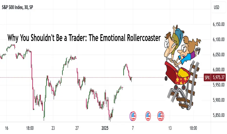
Why You Shouldn't Be a Trader: The Emotional RollercoasterEver thought about diving into trading? Here's the honest truth from someone who's been there. I used to think trading was all about numbers and charts, but boy, was I wrong. It's more like riding an emotional rollercoaster that can make you feel like you've aged years in a single day.
Imagine this: one day you're on top of the world, feeling like you've finally figured it out, and the next, you're down in the dumps, rethinking your entire life. Here's the deal:
-Heart-Stopping Volatility: The market's ups and downs can turn your emotions upside down. One second you're ecstatic with a win; the next, you're in despair over a loss.
-No Off Switch: Unlike most jobs, there's no "clocking out" with trading. Your mind never really stops, even when you're supposed to be chilling.
-The Lonely Trader's Path: It can feel like you're on this journey alone, with no one to share the load or celebrate the victories with.
But here's the twist - I've learned how to navigate this wild ride. With a bit of community and some laughs, trading doesn't have to be a solo act.
If you're feeling the weight of this rollercoaster or just curious about how to keep your emotions in check, why not hit me up? Drop me a DM or check out my profile for more on how we can tackle this together. Give this post a boost, a like, or leave a comment if you've felt the same way. Let's share the journey, not just the journey's lows.
Kris/Mindbloome Exchange
Trade What You See
Trading Anxiety: When Fear Messes Up Your TradesEver had that scary feeling in your tummy before you make a trade? I totally get it. I used to let my worries take over my trading days. Every time the market went down, it felt like it was out to get me, making me sell stuff too fast or miss out on good deals because I was too scared.
Here's what happened:
- Always Scared: I was so afraid of losing money that I kept questioning every move I made, even when it was probably the right one.
- Stuck in Thinking: I'd look at so many charts that I couldn't make up my mind. It was like being stuck because every choice seemed like it could be wrong.
- No Sleep: I thought staying up late to watch the markets would help me, but it just made me super tired and even more worried the next day.
But I learned how to deal with it. I started using stop-losses, like safety nets, so I wouldn't lose too much. I tried mindfulness stuff to keep calm. And I decided no more screens after trading time, so I could get a good night's sleep.
If you're feeling the same kind of worry when you trade, you're not by yourself. We're all in this together. Let's talk about how we can stay chill even when the market gets crazy. Leave a comment or send me a message if you want to chat about dealing with this stress.
Kris/ Mindbloome Exchange
Trade What You See

My FOMO Nightmare: How Missing One Trade Changed My Trading LifeI remember the day like it was yesterday. I was scrolling through X (Twitter), seeing everyone go wild over this one stock. My heart raced as I watched the price skyrocket, but I hesitated. I hadn't done my homework on this one, and something felt off. But the fear of missing out? That was eating at me.
The next day, I woke up to see the stock had crashed. My initial relief turned into regret. Maybe I could've sold at the peak if I had just jumped in like everyone else. That's when FOMO, or Fear Of Missing Out, became my trading nemesis:
-Hasty Actions: I started jumping into trades at the last minute, driven by the buzz on social media, not by my own analysis.
-Screen Addiction: I couldn't step away from my screen, worried I'd miss the next big move. My life began revolving around the market's every twitch.
- Chasing Losses: After missing a few opportunities, I found myself in a dangerous cycle, trying to make up for lost gains with even riskier trades.
But here's the twist in my story. One evening, after a particularly bad day of chasing trends, I sat back and realized how this fear was controlling me, not my strategy. I decided to change. I set strict rules for myself: no trading based on social media hype, sticking to my research, and remembering that every market has its patterns - there's always another chance if you miss one.
Now, I trade with a calm mind, knowing that if I miss one trade, there'll be another. If you've ever felt that burning desire to join the rush, only to regret it later, you're not alone. Let's share our stories and strategies for overcoming FOMO. DM me if you want to chat about how we can keep our heads in the game, not just our eyes on the screen.
Kris/ Mindbloome Exchange
Trade What You See

Crafting the Perfect 2025 Trading Journal: Here’s All You NeedThere’s something about cracking open a brand-new trading journal at the start of the year that feels downright ceremonial. A fresh page (or the blank spaces on your template) unmarred by the scribbles of bad trades or impulsive decisions.
The surge of excitement that goes through your veins as you imagine all potential profits and accumulated knowledge that could end up on that piece of paper (or pixels).
Still, despite all the wisdom and insight that a written record can give you, most trading journals end up looking like forgotten diaries. They get abandoned sometime around February, right next to that half-baked gym membership.
And that’s a bummer! Your trading journal isn’t just a log of wins and losses; it’s the roadmap to better decisions and a more profitable year.
If you’ve ever wondered why seasoned traders swear by this habit, it’s because those scribbles often hold the secrets to what’s working, what’s failing, and which psychological gremlins are hijacking your trades or causing you to miss opportunities.
✍️ Why Every Trade Deserves Ink (or Pixels)
Trading without documentation is akin to sailing without a map or running without setting checkpoints and an end goal. Every trade—good or bad—carries data.
Writing it down transforms fleeting market moments into permanent lessons. It highlights patterns that the eye glosses over in the heat of battle and reveals tendencies you didn’t even know you had.
For example, did you buy Dogecoin DOGE on impulse every time Elon Musk tweeted? Or maybe you overtraded small caps on Fridays because that’s when coffee hits hardest. Or maybe you didn’t bet enough when you had conviction on a forex pair?
These patterns hide in plain sight until they’re laid bare on paper. A journal bridges the gap between emotional trading and methodical refinement.
📖 What to Actually Write Down (Hint: More Than Just Numbers)
If your journal consists of a date, ticker, and a hasty “profit/loss” column, you’re barely scratching the surface. A trading journal should feel like a post-game analysis. Beyond the basic details (entry, exit, size, P&L), the real gold lies in your thought process.
Document why you entered the trade. What did you see? Was there a technical breakout, or were you chasing a Reddit-fueled rocket? Record the emotions that accompanied your trade—nerves, confidence, greed.
Were you following your system, or did you veer off course? Trades aren’t made in a vacuum; understanding the context around them provides clarity.
Even the trades you didn’t take deserve a mention. Hesitation to pull the trigger or missing a setup can reveal psychological patterns that hold back performance.
Here’s a sample set of columns that you may want to add to your template.
💡 Pro tip: make it a monthly template so you can break down the year by the month.
Trading Instrument
Trade direction
Position size
Your entry
Your exit
Your stop loss (yes, add that, too)
Your take profit
Your realized profit or loss
Your risk/reward ratio
Your reason to open the trade
Your state of mind (more on that in the next paragraph)
Transaction costs (fees, spreads, commissions)
Trade rating (e.g., 1-10, or “Good,” “Great,” “Needs More Work”)
Trade notes
Account balance at the start of the month
Account balance at the end of the month
Monthly profit/loss result
Year-to-date profit/loss result
Having a template like this will help you stay organized, improve your trading strategy, and identify patterns in your performance and results. So grab a pen and list (or go to an online graphic design platform) and get creative!
🤫 The Emotional Audit: Your Secret Weapon
A trader’s greatest adversary isn’t the market—it’s themselves. Emotional trades account for some of the most catastrophic losses. One poorly timed revenge trade can undo weeks of careful gains. This is why a portion of your journal should be reserved for emotional audits.
After every trading session, reflect on how you felt. Did anxiety creep in during a drawdown? Were you overconfident after a winning streak?
Emotions, when left unchecked, can drive irrational decisions. Journaling those feelings makes them tangible and easier to manage. It’s like therapy, but instead of lying on a couch, you’re documenting why you YOLO’d into Tesla TSLA .
😮 Spotting Patterns You Didn’t Know Existed
Patterns in trading journals are sneaky. Sometimes, the worst losing streaks aren’t the result of market volatility but bad habits we refuse to notice. Maybe you consistently lose on Mondays or after three consecutive wins. Perhaps you cut winners too soon but let losers run because hope dies last.
Journaling reveals these quirks in brutal detail. Reviewing your trades at the end of each month will expose recurring mistakes (or hidden strengths). Over time, you’ll be able to tighten risk management, adjust strategies, and weed out tendencies that silently bleed your account.
🤑 How to Stay Consistent (Even When You’re Lazy)
Let’s face it: journaling isn’t glamorous, especially when you wake up after a bad trade and you need to face Mr. Market again. But consistency is key. Set a 15-minute window after your trading day to jot down what happened—trades, thoughts, emotions, lessons. It’s short enough to stay manageable but long enough to capture the core of your experience.
🧐 Reviewing the Wreckage: Monthly Reflection Sessions
At the end of each month, conduct a full review of your journal. This isn’t just for performance metrics—it’s about personal growth. Ask the hard questions: What trades did I regret? What big moves did I miss? Where did I second-guess myself? Which trades followed my plan?
You’ll notice themes emerging. Maybe you trade best during certain hours or you lean more to specific assets and markets. This retrospective analysis creates a loop of constant improvement. The goal isn’t to trade more but to trade better.
🧭 Wrapping It Up: Your Trading Journal as a Compass
By the end of the year, your journal will read like a narrative of your trading journey—complete with victories, defeats, and lessons learned.
More importantly, you’ll know yourself better than anyone (except for Google maybe) — you’ll know your trading habits, psychological traits and the written record of your performance in case you want to open up a hedge fund and need the track record for the investors.
So, grab that journal, digital or otherwise, and start logging. Because while the market may be unpredictable, the reflections in your journal will chart the way forward.
And who knows? Maybe next year you’ll flip through it and laugh at the trades you once thought were genius. After all, growth is part of the game.

Episode 12< <Durable Goods Orders>>"3-Minute Mini Class"
Sharing basic financial knowledge every day, guiding you from beginner to expert.
Follow me and improve a little bit every day!
Financial freedom is getting closer to you!

What is Tether Gold (xusdt) and Its Future in Crypto?Hello and greetings to all the crypto enthusiasts, ✌
Personal Insight on Tether Gold and Its Future Potential:
When I analyze a new project, I personally dedicate a significant amount of time to thoroughly studying its various aspects. However, this was the first time that while reviewing a particular project, I found my attention so intensely and inexplicably drawn to it. After careful consideration, I am confident that, in the near future and at the appropriate time, I will be making a personal investment in it. That being said, please take note of the disclaimer section at the bottom of each post provided by the website, this is merely my personal opinion and should not be interpreted as financial advice.
There is something truly captivating about the fusion of the ancient, physical world of gold with the innovative and rapidly evolving realm of cryptocurrency. This, in essence, is the concept behind Tether Gold, and it represents a highly compelling idea with extraordinary growth potential. In the world of cryptocurrency, it is often these unique and forward-thinking ideas that pave the way for significant market breakthroughs. What makes Tether Gold even more intriguing is that it is not just a speculative idea; it has the robust backing of a trusted entity like Tether.
Now, let’s take a closer look at this project and its key features:
What is Tether Gold (XUSDT)?
Tether Gold (XUSDT) is a digital token issued by Tether, and it is backed by physical gold. Each unit of XUSDT is pegged to one troy ounce of gold, with a purity of 99.9%. This gold is securely stored in insured vaults, ensuring both safety and transparency. Tether Gold provides a means for investors to participate in the gold market digitally, without the need for the physical handling or storage of gold.
Tether Gold combines the benefits of cryptocurrencies—such as fast and easy transfers, and decentralized security—with the timeless stability and intrinsic value of gold. This token is tradable on major blockchains, including Ethereum and Tron, and has been positioned as a secure, efficient, and transparent means for digital gold investment.
A Brief History of Tether Gold:
Tether Gold was launched by Tether in January 2020, marking a significant expansion of the company’s product offerings. Tether, which is primarily known for its stablecoin USDT, introduced Tether Gold in response to increasing demand for digital assets backed by physical commodities, particularly gold. The company recognized the growing interest in stable digital assets that combine the safety and value of gold with the flexibility and innovation of blockchain technology.
The Benefits of Investing in Tether Gold:
Investing in Tether Gold presents several key advantages, making it an attractive option for a wide range of investors. This digital asset offers an innovative way to invest in gold, providing greater convenience, flexibility, and lower costs compared to traditional methods of purchasing and storing physical gold.
Some of the most notable benefits of investing in Tether Gold include:
Security and Transparency: Each Tether Gold token is fully backed by physical gold stored in secure vaults, and this backing is regularly audited, ensuring full transparency. Investors can have peace of mind knowing their investments are securely backed by tangible assets.
Efficient Transferability: Unlike physical gold, which can be cumbersome and costly to transfer, Tether Gold can be easily transferred across the globe, quickly and at minimal cost. This opens up the opportunity for investors to access and trade gold in a way that is both convenient and cost-effective.
Accessibility: Tether Gold allows investors to gain exposure to the gold market with relatively small amounts of capital, without the need to buy, store, or insure physical gold. This makes it a highly accessible option for those who may not have the resources or desire to invest in physical gold.
Stability and Value: Gold has long been regarded as a safe-haven asset, maintaining its value even during times of economic instability. By combining the stability of gold with the technological advantages of blockchain, Tether Gold offers a powerful and stable investment vehicle.
From a technical perspective:
Tether Gold is currently positioned for potential significant growth. After experiencing several rounds of declines, it now finds itself in a strong position for an explosive upward movement. This could be an ideal time for investors to consider entering or increasing their positions in Tether Gold, as the market appears poised for a potential surge.
🧨 Our team's main opinion is: 🧨
Tether Gold (XUSDT) is a digital token backed by physical gold, offering the stability of gold with the flexibility of blockchain. It’s an easy, secure way to invest in gold digitally, and with its strong backing from Tether, it has great growth potential in the crypto market.
Give me some energy !!
✨We invest countless hours researching opportunities and crafting valuable ideas. Your support means the world to us! If you have any questions, feel free to drop them in the comment box.
Cheers, Mad Whale. 🐋

Behind the Curtain: Economic Indicators Shaping Corn Futures1: Introduction
Corn Futures (ZC), traded on the CME, play a vital role in global markets, particularly in the agriculture and food industries. As a commodity with widespread applications, Corn Futures are influenced by a multitude of factors, ranging from seasonal weather patterns to broader economic trends. Understanding these influences is critical for traders seeking to navigate the market effectively.
In this article, we leverage machine learning, specifically a Random Forest Regressor, to identify key economic indicators that have historically correlated with Corn Futures' price changes. By analyzing daily, weekly, and monthly timeframes, we aim to provide a clearer picture of how these indicators potentially shape market behavior and offer actionable insights for traders.
The findings are presented through visual graphs highlighting the top economic indicators across different timeframes. These insights can help traders fine-tune their strategies, whether for short-term speculation or long-term investment.
2: Understanding the Key Economic Indicators
Economic indicators provide a glimpse into various facets of the economy, influencing commodity markets such as Corn Futures. Using the Random Forest model, the following indicators emerged as significant for Corn Futures on different timeframes:
Daily Timeframe:
Oil Import Price Index: Reflects the cost of importing crude oil, impacting energy costs in agriculture, such as fuel for equipment and transportation.
Durable Goods Orders: Tracks demand for goods expected to last three years or more, often signaling broader economic activity that can influence commodity demand.
Natural Gas Prices: Critical for the production of fertilizers, which directly impacts corn farming costs.
Weekly Timeframe:
China GDP Growth Rate: Indicates global demand trends, as China is a major consumer of agricultural products.
Housing Starts: Reflects construction activity, indirectly influencing economic stability and consumer behavior.
Corporate Bond Spread (BAA - 10Y): A measure of credit risk that can signal changes in business investment and economic uncertainty.
Monthly Timeframe:
Retail Sales (YoY): Gauges consumer spending trends, a crucial driver of demand for corn-based products.
Initial Jobless Claims: Acts as a measure of labor market health, influencing disposable income and consumption patterns.
Nonfarm Productivity: Indicates economic efficiency and growth, impacting broader market trends.
By understanding these indicators, traders can interpret their implications on Corn Futures more effectively.
3: How to Use This Information
The timeframes for these indicators provide unique perspectives for different trading styles:
Daily Traders: Indicators like the Oil Import Price Index and Natural Gas Prices, which are highly sensitive to short-term changes, are valuable for high-frequency trading strategies. Daily traders can monitor these to anticipate intraday price movements in Corn Futures.
Swing Traders (Weekly): Weekly indicators, such as the China GDP Growth Rate or Housing Starts, help identify intermediate-term trends. Swing traders can align their positions with these macroeconomic signals for trades lasting several days or weeks.
Long-Term Traders (Monthly): Monthly indicators, such as Retail Sales and Nonfarm Productivity, provide insights into overarching economic trends. Long-term traders can use these to assess demand-side factors impacting Corn Futures over extended periods.
Additionally, traders can enhance their strategies by overlaying these indicators with seasonal patterns in Corn Futures, as weather-related supply shifts often coincide with economic factors.
4: Applications for Risk Management
Understanding the relationship between economic indicators and Corn Futures also plays a critical role in risk management. Here are several ways to apply these insights:
Refining Entry and Exit Points: By correlating Corn Futures with specific indicators, traders can potentially time their entries and exits more effectively. For example, a sharp rise in the Oil Import Price Index might signal increased production costs, potentially pressuring corn prices downward.
Diversifying Trading Strategies: Leveraging daily, weekly, and monthly indicators allows traders to adapt their strategies across timeframes. Short-term volatility from energy prices can complement long-term stability signals from broader economic metrics like GDP Growth.
Mitigating Uncertainty: Tracking indicators such as Corporate Bond Spreads can provide early warnings of economic instability, helping traders hedge their Corn Futures positions with other assets or options.
Seasonal Hedging: Combining indicator-based insights with seasonal trends in Corn Futures can enhance risk-adjusted returns. For instance, aligning hedging strategies with both economic and weather-related factors could reduce downside exposure.
5: Conclusion
The analysis highlights how diverse economic indicators shape Corn Futures prices across multiple timeframes. From daily volatility influenced by energy costs to long-term trends driven by consumer spending and productivity, each indicator provides unique insights into market dynamics.
Traders can use this framework not only for Corn Futures but also for other commodities, enabling a more data-driven approach to trading. The combination of machine learning and economic analysis presents opportunities to refine strategies and improve outcomes in the competitive world of futures trading.
Stay tuned for the next article in this series, where we delve into another futures market and its relationship with key economic indicators.
When charting futures, the data provided could be delayed. Traders working with the ticker symbols discussed in this idea may prefer to use CME Group real-time data plan on TradingView: www.tradingview.com - This consideration is particularly important for shorter-term traders, whereas it may be less critical for those focused on longer-term trading strategies.
General Disclaimer:
The trade ideas presented herein are solely for illustrative purposes forming a part of a case study intended to demonstrate key principles in risk management within the context of the specific market scenarios discussed. These ideas are not to be interpreted as investment recommendations or financial advice. They do not endorse or promote any specific trading strategies, financial products, or services. The information provided is based on data believed to be reliable; however, its accuracy or completeness cannot be guaranteed. Trading in financial markets involves risks, including the potential loss of principal. Each individual should conduct their own research and consult with professional financial advisors before making any investment decisions. The author or publisher of this content bears no responsibility for any actions taken based on the information provided or for any resultant financial or other losses.

Trading Forex vs Stock CFDs: Differences and AdvantagesTrading Forex vs Stock CFDs: Differences and Advantages
Forex and stock markets are two of the most popular options for traders, each offering unique opportunities and challenges. While forex focuses on trading global currency pairs, stocks involve buying and selling shares of companies. Understanding their differences—from market size and liquidity to trading costs and risk—can help traders choose the market that best suits their strategy. Let’s break down the key differences between forex and stocks.
What Is Forex Trading vs Stock Trading?
Let us start with some general information that you may already know. The forex market revolves around trading currency pairs, such as EUR/USD, and operates globally, making it the largest financial market with a daily turnover exceeding $7.5 trillion (April 2022). It’s decentralised, meaning transactions occur directly between participants across time zones, with no single central exchange.
In contrast, the stock market involves buying and selling shares of publicly listed companies, like Tesla or Nvidia, through centralised exchanges such as the NYSE or LSE. Trading hours are fixed and tied to each exchange’s location, creating more defined trading windows.
Forex markets are driven by macroeconomic events and international factors, while stocks are mostly influenced by company-specific developments like earnings reports and industry trends.
In this article, we will talk about Contracts for Difference (CFD) trading. To explore live forex and stock CFD trading opportunities, head over to FXOpen’s free TickTrader platform.
Forex vs Stock Trading: Market Accessibility and Trading Hours
One of the most important differences between forex and stock markets is their structure and timings.
Forex: Open 24/5
The forex market operates 24 hours a day, five days a week, cycling through major trading sessions in Sydney, Tokyo, London, and New York. This continuous nature allows traders to react to global events in real-time, whether it’s midday in the UK or midnight in Asia. For example, a trader monitoring the London session can seamlessly transition into the New York session without waiting for markets to reopen.
Stocks: Fixed Timeframes
Stock trading is tied to the operating hours of centralised exchanges. For example, the NYSE runs from 9:30 am to 4:00 pm EST, while the LSE operates from 8:00 am to 4:30 pm GMT. This also applies to stock CFDs. Outside of these hours, activity is limited to pre- and post-market trading, which typically sees lower liquidity and higher spreads.
Conclusion
Forex provides flexibility for traders who value around-the-clock access, while stock traders need to plan their activity within set hours. This makes forex especially appealing to those with unconventional schedules or a need for an immediate market response.
Trading Stocks vs Forex: Market Size and Liquidity
The size and liquidity of a market dictate how efficiently trades are executed and at what cost. Forex and stock trading differs significantly in these areas.
Forex: The $7.5 Trillion Giant
The forex market stands as the largest in the financial world, with daily trading volumes exceeding $7.5 trillion (April, 2022). This immense size ensures high liquidity in many pairs, meaning they can be traded almost instantly with minimal price slippage. Tight spreads—often as low as fractions of a pip—make forex particularly attractive to traders seeking frequent, precise entries and exits.
Stocks: Liquidity Highly Varies
The stock market is smaller and is subject to more complicated factors, therefore, traders may suffer when opening and closing trades. First, stock liquidity highly depends on the company and its trading volume. Blue-chip stocks like Apple or BP typically offer high liquidity, which contributes to smooth transactions with competitive spreads. However, smaller, less-traded stocks may suffer from wider spreads and slower execution, particularly during market volatility. Second, trading hours affect market liquidity, making it challenging to trade before and after market close.
Conclusion
Forex’s unmatched liquidity mainly ensures consistent trade execution across major pairs. In contrast, stock traders must carefully choose assets to avoid issues with low liquidity, especially when trading small caps or during off-peak hours.
Forex vs Stocks: Volatility and Price Drivers
High volatility creates opportunities for traders by producing price swings that can be capitalised on. However, the factors driving these movements differ significantly between forex and stocks.
Forex: Global Events and Macro Trends
Forex volatility is often driven by large-scale economic and geopolitical events. Central bank interest rate decisions, employment data, inflation reports, and geopolitical tensions can cause significant price shifts. For instance, a hawkish Federal Reserve announcement can lead to USD appreciation against other currencies.
Currency pairs also experience varying levels of volatility depending on their classification. Major pairs like EUR/USD tend to be less volatile than exotic pairs such as USD/ZAR, where price swings can be much more dramatic due to lower liquidity and heightened economic risks.
Stocks: Company-Specific Drivers
Stock volatility is more granular, often linked to specific companies. Earnings reports, mergers, leadership changes, or industry news can move a single stock significantly. Broader market trends, such as sector-wide sentiment shifts, can also drive volatility, but these are secondary to company-specific factors. For example, Tesla’s earnings announcement can cause sharp movements in its share price without impacting other automakers.
Conclusion
Forex volatility is broader and influenced by global macroeconomic trends, while stocks are typically driven by isolated, company-specific events. This distinction makes forex appealing for traders focusing on macro analysis and technical patterns, whereas stock traders often blend fundamental company research with broader market trends to identify trading opportunities.
Forex Trading vs Stock Trading: Trading Costs and Leverage
Trading costs and leverage significantly impact a trader’s strategy and potential returns. And choosing between trading stocks or forex is no exception.
Forex: Potentially Low Costs and High Leverage
Forex may provide opportunities for lower-cost trading, with fees paid via commissions and spreads. For instance, forex commissions at FXOpen start at $1.50 per lot, depending on account size. Spreads are usually tight for major pairs like EUR/USD, making costs relatively low. At FXOpen, you can trade with spreads from 0.0 pips.
Forex offers significantly higher leverage compared to stocks. While this allows traders to operate with smaller capital, it requires disciplined risk management to avoid significant losses.
Stocks: Higher Costs, Lower Leverage
Stock trading via CFDs typically incurs higher costs compared to forex, with commissions charged per trade or embedded in spreads. For instance, at FXOpen, US stock CFD traders can see commissions charged from 0.04% to 0.1%, varying by account size, with a minimum commission of $1 per order.
Leverage is also lower—usually capped at 1:5 for retail traders, reflecting the relative instability of stock prices compared to currencies.
Conclusion
Forex CFDs offer lower costs and higher leverage, making it popular among traders with a short-term focus. Stock CFDs, while more expensive, give access to financial instruments for portfolio diversification. Choosing between them depends on the trader’s goals, risk tolerance, and preferred market dynamics.
Forex vs Stocks: Regulation and Market Transparency
Regulation and transparency are critical for traders when choosing between forex and stocks. Both markets are regulated, but their structures create distinct differences in how pricing and trade execution work.
Forex: Decentralised and Broker-Driven
The forex market is decentralised, meaning trades are executed through brokers rather than central exchanges. This structure can lead to variations in pricing and execution quality, depending on the broker. Therefore, traders need to find regulated brokers to avoid issues with unreliable pricing or execution. For example, FXOpen is regulated by the FCA and CySEC to ensure fair practices and client fund protection.
Stocks: Centralised and Transparent
Traditional stock markets operate on centralised exchanges like the NYSE or LSE, where all trades are matched through a regulated order book. This ensures consistent pricing and high transparency, as traders can see bid and ask levels across the market. At the same time, stock CFDs are traded on a broker level.
Conclusion
Forex and stock CFDs’ decentralised nature provides flexibility but relies heavily on broker reliability.
Forex Trading vs Stock Trading: Suitability for Different Trader Types
Deciding between forex trading and stock trading comes down to choosing between each market’s unique characteristics.
Forex: Favouring Short-Term Strategies
Forex is ideal for short-term traders, such as scalpers and day traders. Its high liquidity and round-the-clock trading mean there’s always an opportunity to act on price movements, especially during overlapping sessions like London and New York. The use of leverage, often higher in forex, makes it appealing for those seeking to amplify returns on smaller price shifts (please remember that higher leverage leads to higher risks).
Traders in forex often focus on technical analysis, utilising chart patterns and indicators, and study macroeconomic data to analyse short-term trends. This market tends to suit individuals who are comfortable with frequent decision-making and quick trade execution.
Stocks: A Blend of Short and Medium-Term Trading
Stock trading, particularly via CFDs, is more versatile, attracting both medium-term and swing traders. While day trading is possible, the structured trading hours and broader price swings make stocks particularly appealing for those who prefer holding positions for days or weeks.
Stock traders often lean on company-specific fundamentals, such as earnings reports or sector trends, alongside technical analysis. This market suits individuals who prefer analysing individual businesses or sector dynamics over global macro trends.
Conclusion
Forex trading caters to short-term strategies, attracting traders who thrive on quick decisions and frequent trades, while stock trading offers flexibility, appealing to those who prefer a mix of short- and medium-term strategies with a focus on company fundamentals. Each market has unique characteristics, allowing traders to choose based on their style and objectives.
The Bottom Line
Both forex and stock markets may offer unique opportunities tailored to different trading strategies and goals. Whether you’re drawn to forex’s 24/5 accessibility or the structured transparency of stocks, understanding their key differences is crucial. Ready to explore forex and stock CFD trading? Open an FXOpen account today and take advantage of competitive spreads, fast execution speeds, and a wide range of instruments.
FAQ
Is the Stock Market Bigger Than Forex?
No, the forex market is significantly larger. Forex sees daily trading volumes exceeding $7.5 trillion (April, 2022). This makes forex the largest and most liquid market, popular among traders seeking tighter spreads and fast execution.
What Is the Correlation Between Forex and Stock Markets?
The relationship varies. Commodity-linked currencies like AUD or CAD often correlate with related stocks or indices. Broader market sentiment, such as risk-on or risk-off conditions, can also drive both forex and stocks in similar or opposing directions.
Should I Invest in Forex or Stocks?
It depends on your trading style. Forex could suit short-term traders focusing on global economic trends, while stocks might appeal to those who prefer company analysis or medium-term strategies.
Which May Offer Greater Returns, Forex or Stocks?
Ultimately, potential returns depend on your strategy and discipline. Forex offers higher leverage for short-term trades, but higher leverage leads to higher risks. Stocks may provide better longer-term growth potential, but they are subject to high volatility.
Which Is Riskier, Forex or Stocks?
Forex can be riskier due to leverage and rapid price swings. Stocks also carry risks, particularly from company-specific events, but lower leverage makes losses potentially less amplified. The risk depends on your approach and management.
This article represents the opinion of the Companies operating under the FXOpen brand only. It is not to be construed as an offer, solicitation, or recommendation with respect to products and services provided by the Companies operating under the FXOpen brand, nor is it to be considered financial advice.
