Mastering Stop Losses: How Not to Trigger Them at the Worst TimeThere are few things more humiliating in trading than setting a stop loss… only to have the market tag it by a hair’s breadth before rocketing in the direction you knew it was going to go.
Oftentimes (hopefully not too often), stop losses are the financial equivalent of slipping on a banana peel you placed yourself.
But stop losses aren't the enemy. Their placement, however, could be.
If you’ve ever rage-quit your chart after being wicked out by a fakeout, this one’s for you. Let’s talk about how to master stop losses — without feeling like the market is personally out to get you.
😬 The Necessary Evil: Why Stop Losses Exist
First, let's acknowledge the elephant in the room: stop losses sometimes sting. They're like smoke alarms. Annoying when they chirp over burnt toast, lifesaving when there’s an actual fire.
The purpose of a stop loss isn’t to predict exactly when you’re wrong — it’s to limit how wrong you can be. It's the difference between losing a quick battle and losing the whole war.
Trading without a stop loss is like walking a tightrope without a net — all fine until it’s not.
🤔 The Amateur Mistake: "Where Should I Put My Stop?"
A lot of traders approach stop-loss placement like they're picking lottery numbers: random, emotional, hopeful.
"I’ll just slap it 10 pips below my entry. Seems safe."
But the market doesn’t care about your preferred round numbers. It cares about liquidity, volatility, and structure, regardless if it's the forex market , the crypto space , or the biggest stock gainers out there.
Good stop-loss placement is about logic, not luck. It's about asking:
Where is my trade idea invalidated?
Where does the market prove me wrong?
If you're placing stops based on how much you're "willing to lose" rather than where your setup breaks down, you’re setting yourself up to be triggered — emotionally and financially.
💪 The Art of "Strategic Suffering"
Good stops hurt a little when they’re hit. That’s how you know they were placed properly.
Stops shouldn't be so tight they get hit on routine noise, but they also shouldn't be so far away that you need therapy if it fails. Think of it as strategic suffering: you’re accepting controlled pain now to avoid catastrophic pain later.
Legendary trader Paul Tudor Jones famously said: “The most important rule of trading is to play great defense, not great offense.”
🤓 Where Smart Traders Place Their Stops
Want to know where smart money hides their stops? It's not random. It’s calculated.
Below key swing lows for long trades (how much below depends on the risk-reward ratio they’ve chosen to pursue)
Above key swing highs for shorts (how much above is, again, tied to the risk-reward ratio)
Outside of obvious support/resistance zones (also, risk-reward plays a role)
In other words: start thinking like the market. Where would a big player have to exit because the structure is truly broken? That’s where you want your stop.
👀 Avoiding the Stop-Hunter’s Trap
Is stop-hunting real? Oh yes. And no, it’s not personal. You're just very readable if you park your stops in obvious, lazy places.
The market loves liquidity. Price often pokes below swing lows or above highs because that’s where the money is. Stops create liquidity pockets that big players exploit to enter their trades at better prices.
So how do you avoid becoming easy prey?
Give stops a little breathing room past obvious levels.
Use volatility measures like ATR to set dynamic buffers.
Respect structure, not just random dollar/pip amounts.
A good stop is hidden in plain sight but protected by logic, not hope.
⚖️ Sizing Smarter: Risk per Trade Matters More Than Stop Distance (What’s Risk-Reward Ratio?)
Here’s where many traders mess up: they think tighter stops are always better. Wrong. Your stop distance and your position size are a package deal. If your trade idea requires a wider stop to be valid, your position size should shrink accordingly.
Trying to cram your usual size into a wide stop setup is how small losses turn into account-threatening disasters.
Hedge fund pioneer George Soros once said: “It’s not whether you’re right or wrong that's important, but how much you make when you're right and how much you lose when you're wrong.”
Master your sizing relative to your stop, and you master your survival. In other words, the risk-reward ratio should be playing a key role in placing your stop losses.
🥤 Mental Stops vs Hard Stops: Pick Your Poison
Some traders swear by mental stops: “I'll get out when it hits this level.” Others use hard stops: set-and-forget protective orders baked into the system.
Both have pros and cons:
Mental stops allow flexibility but risk emotional sabotage.
Hard stops guarantee protection but can trigger on sudden, hollow wicks.
Pro tip? Use hard stops if you’re new or undisciplined. You don’t want to be the guy saying “I’ll close it soon...” while watching your unrealized loss grow a second head.
🤯 Stop-Loss Psychology: It’s You, Not the Market
If you find yourself constantly blaming “stop-hunting whales” or “market manipulation” every time you get tagged out... maybe it’s not them. Maybe it's your stop placement.
Discipline in trading isn’t just about clicking buttons at the right time. It’s about planning for the tough times—and sticking to your plan even when it feels bad.
❤️ Final Thought: Love Your Stops (Or at Least Respect Them)
Stop losses aren't your enemy. They're your overprotective friends. Sometimes they’ll throw you out of a trade you "knew" would come back. But more often, they’ll save you from very dangerous outcomes.
Mastering stop losses isn't about never getting stopped out. It’s about getting stopped out properly — with dignity, with minimal damage, and with your account intact.
In trading, pain is inevitable. Wipeouts are optional.
Your move: How do you manage your stops — and have you ever been wicked out so badly you considered quitting trading? Drop your best (or worst) stop-loss stories below.
Fundamental Analysis

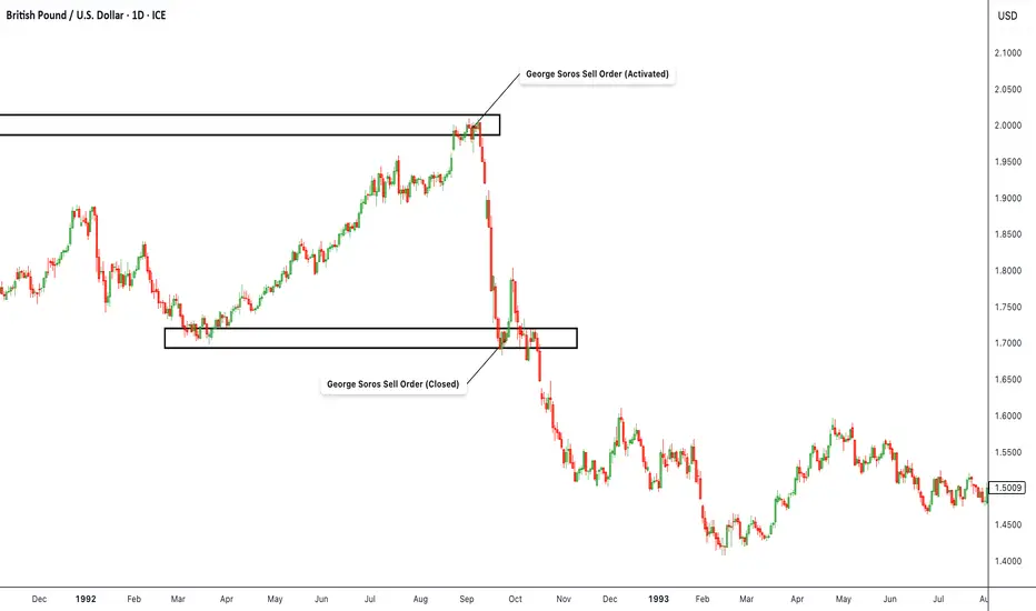
GBP/USD – 1992 Replay | George Soros “Broke the Bank” TradeHistorical Context Summary:
This chart revisits the iconic 1992 short by George Soros against the British Pound, which ultimately forced the UK to abandon its currency peg and exit the European Exchange Rate Mechanism (ERM). The marked zones reflect the approximate levels where Soros reportedly initiated and closed his short position, anticipating a collapse of the GBP against the USD.
Real-time Trade Thesis:
Soros identified that the British economy was fundamentally too weak to sustain a fixed exchange rate against the Deutsche Mark, enforced through the ERM. Inflation was high, the economy was slowing, and the government was hiking rates and burning through reserves to defend the pound. Meanwhile, Germany’s economy was far stronger, making the GBP significantly overvalued relative to its fundamentals.
The Quantum Fund went short over £10 billion worth of GBP using highly leveraged positions, primarily via GBP/USD. On September 16, 1992 ("Black Wednesday") , the Bank of England capitulated after failing to hold the peg, and the pound collapsed—securing Soros one of the most profitable trades in history with over $1 billion in gains.
Technical Analysis Context:
This GBP/USD chart highlights the upper “order activation” zone where Soros began scaling into his short, as price stalled near the artificially defended level. As speculative pressure intensified, the central bank’s interventions failed, leading to a violent breakdown. The lower box marks the approximate range where Soros likely began closing the trade and locking in profit as the peg failed and panic selling set in.
Key Lessons:
Pegged currencies can’t defy economic fundamentals forever.
Macro conviction + tactical timing = asymmetric return.
Central banks can lose to coordinated market pressure.
Use leverage wisely, only when your thesis is airtight.
Liquidity stress often precedes capitulation—watch reserve flows and bond yields.
History leaves patterns—legendary trades repeat in new forms across cycles.
The Gold-Silver Ratio ExplainedCOMEX: Micro Gold Futures ( COMEX_MINI:MGC1! ), Micro Silver Futures ( COMEX_MINI:SIL1! )
The Gold-Silver Ratio is a financial term that measures the relative value of gold to silver. Specifically, how many ounces of silver it takes to buy one ounce of gold.
The Gold-Silver Ratio is an important tool for traders and investors. It has been used to indicate the market sentiment towards these two precious metals. A high ratio suggests that gold is more valued than silver, often seen during economic turmoil or when investors seek safe-haven assets. On the contrary, a lower ratio implies that silver is gaining value relative to gold, which normally occurs during periods of economic growth and strong industrial demand.
The ratio fluctuates over time due to supply and demand dynamics, geopolitical events, and changes in the global economy. By analyzing the ratio, traders can make informed decisions about when to buy or sell. This ratio reflects not only the market’s valuation of these metals but also an instrument for profit-making in the commodities market.
Historical Gold to Silver Ratio
Since 2000, the Gold-Silver Ratio has seen considerable fluctuations, reflecting various economic and market conditions. In the first decade of the 21st century, the ratio hovered around 65:1, meaning it took 65 ounces of silver to buy one ounce of gold.
However, the ratio has spiked during times of economic uncertainty. For example, during the financial crisis of 2008, the ratio reached highs not seen in decades. More recently, in the wake of the COVID-19 pandemic and the ensuing economic turmoil, the ratio surged, at one point exceeding 110:1 in 2020, indicating a strong preference for gold as a safe-haven asset compared to silver.
Over time, the Gold-Silver Ratio has been trending up, meaning gold has gained value at a faster pace compared to silver.
As of last Friday, gold is trading around all-time high at $3,330, while silver is quoted at $33.0. This makes the Gold-Silver Ratio almost exactly at 100.
When to Buy and Sell based on the Gold-Silver Ratio?
The decision to buy or sell the ratio hinges on interpreting its current value in the context of historical trends and market conditions.
When to Buy Silver: A high Gold-Silver Ratio, typically at or above the 90:1 mark, suggests that silver is undervalued relative to gold. This is often interpreted as a buying signal for silver. In such scenarios, silver is cheaper than gold, and investors may see it as an opportunity to purchase silver at a relatively low price. The rationale is that if the ratio decreases, the relative value of silver will increase compared to gold, potentially leading to significant gains.
When to Sell Silver/Buy Gold: Conversely, when the Gold-Silver Ratio is low, say around 50:1, it indicates that silver is relatively expensive, or gold is undervalued. In such situations, investors might consider selling silver and buying gold. The expectation is that the ratio will normalize or increase, meaning that gold’s value could rise relative to silver, offering a favorable return on the gold investment.
The Gold-Silver Ratio can be a valuable indicator of when to buy or sell gold and silver. However, since the ratio is not stable but upward trending over time, we could not use a mean-reversion strategy. The price band for normal, high and low ranges should be updated regularly.
Trade Setup with Micro Gold and Silver
Traders could deploy the Gold-Silver Ratio trading strategy using COMEX Micro Gold Futures ( AMEX:MGC ) and Micro Silver Futures ( AMEX:SIL ). The big advantages of using futures contracts are capital efficiency and leverage.
MGC contracts have a notional value of 10 troy ounces of gold. With Friday settlement price of $3,330.7, each June contract (MGCM5) has a notional value of $33,307. Buying or selling one contract requires an initial margin of $1,500 at the time of writing.
By putting a deposit equivalent to less than 0.5 ounce, traders could gain the full exposure to 10 ounces of gold. If gold prices move up by 5%, a long futures position would double in value (= (33307*0.05) / 1500 = 111%). This futures contract has a built-in leverage of 22:1.
Conversely, Micro Silver (SIL) contracts have a notional value of 1,000 troy ounces of silver. With Friday settlement price of $33.02, each June contract (SILM5) has a notional value of $33,020. Buying or selling one contract requires an initial margin of $3,000 at the time of writing.
By putting a deposit equivalent to 91 ounces, traders could gain the full exposure of 1,000 ounces of silver. If silver prices move up by 5%, a long position in Micro Silver futures would gain 55% (= (33020*0.05) / 3000). This futures contract has a built-in leverage of 11:1.
Micro gold futures (MGC, 10 oz) contracts tap into the deep liquidity of standard-size gold futures contracts (GC, 100 oz). As of last Friday, GC has an open interest (OI) of 447,356 contracts, while the OI for MGC is 44,449, according to data from CME Group.
The OI for standard Silver Futures (SI, 5000 oz) and Micro Silver Futures (SIL, 1000 oz) are 154,276 and 12,345, respectively.
Happy Trading.
Disclaimers
*Trade ideas cited above are for illustration only, as an integral part of a case study to demonstrate the fundamental concepts in risk management under the market scenarios being discussed. They shall not be construed as investment recommendations or advice. Nor are they used to promote any specific products, or services.
CME Real-time Market Data help identify trading set-ups and express my market views. If you have futures in your trading portfolio, you can check out on CME Group data plans available that suit your trading needs www.tradingview.com

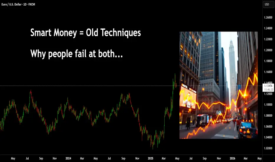
Why does it always go against you? You might be new to trading, you may have several years of experience. But, where a lot of people still seem to go wrong is in not realising the relationships.
I have posted hundreds of educational posts here on Tradingview from cartoons, trying to simplify techniques through to market relationships between technical systems such as Elliott Wave and Wyckoff.
Many new traders fall foul of social media posts covering "SMC - Smart Money Concepts" and are not seasoned enough to appreciate what or why these can work for some and not for others.
You have Elliott Wave traders, there is a saying along the lines of "if you put 10 Elliott traders in a room searching for a wave count you will come out with 11 different answers"
This isn't to say Elliott doesn't work, nor Smart Money.
The market seeks liquidity, it forms seemingly complex patterns that humans try to make sense of. We are great at that, seeing patterns even if they are not there. - Look, there's an upside-down butterfly 1.618 extension!
First, you need to appreciate Elliott Wave counts on smaller timeframe are pointless, especially in the age of algo's and bots. However, sentiment on the larger timeframes can't really be spoofed.
In this first image; you can see a market wave that is straight out of a textbook.
Let's also add some Wyckoff; if you were to visualise this - Wyckoff schematics would be visible on smaller timeframes, the Green boxes represent accumulation and the Red show distribution.
Let's overlay and Elliott Wave count -
Take that to the next level, this count is only part of a higher fractal count.
How does this fit into smart money concepts? well, it's more like - How does Smart Money fit into this?
Elliott waves and Wyckoff have been around for over 100 years. Many of the techniques shown on YT video's today can be traced back to these older concepts.
Now, if you can see how a 1-2 EW count pushes up for a 3. You can zoom in again and start to see what to expect when trading using SMC.
In this image you can see a drop, then a gap as price pushes back up (I haven't bothered drawing wicks for simplicity assume their inside the box)
Many traders would now anticipate a move that looks something like this.
Only to see price do this
Yeah - you're not the only one!
The next issue is where and how Supply and Demand is drawn.
Ok, the gap didn't hold, it must be the demand level there. GO AGAIN!!!
How did that play out? Trade 1, Trade 2 =
What about now?
Price holds the support
This time you are afraid to go in. Then one of two things happens.
1)
Or
2)
In the first image, we can see a sweep of prior liquidity and that creates momentum for a move up. In the second image, price simply melts away.
This is an easy fix. It all comes down to understanding what the charts are trying to tell you.
People love to talk about how "Smart Money" is the banks and institutional players - how they are playing against you on every click of the button.
The truth is, most people don't understand the market.
When larger players enter the market, the can leave a pretty obvious footprint. In addition to that - they leave behind orders they had but were unable to fill. These orders they will be defended with even more buying or selling (if they need to), and this is the premise for a rally and pullback or a drop to pullback.
Now, visualise a 1-2 Elliott Wave move. Why do you think 2 often comes back so deep?
What would you expect the move from 2-3 to do?
Powerful push, yes?
In this image, the move that created demand is simply the opposing colour candle before the power play. The significant move pushed up (showing institutional involvement). Hence, a location they will likely defend.
In addition to the push up, they pushed with so much money - it created a natural gap.
This type of example doesn't always have to be a power play 1-5 up, it could be visualised on pullback moves too.
Here's a great example recently on Euro.
The demand candle 'buy before the sell" is clearly targeted on the way up. Price fails to close above it, drops, goes back to retest - sweeps and drops. If you were to zoom in you will see on smaller timeframes evidence of a Wyckoff schematic with a UTAD.
Add a volume profile there.
As the price breaks above, after it's pullback you can see an acceleration in price and of course the area has the PoC.
Back to where people go wrong.
They will see this GAP created and assume price will come back here to reject and go. However, look closer and the demand that started the move is very near that gap.
Where is the juicy liquidity? PoC is another little clue.
Let's take this to another level.
In this image I have a range, using the prior high just to give the example in this post.
We are in an uptrend = we just broke the high, we expect a Pullback. Where would that likely target?
Zoom in again. This time I have added a fixed range volume tool.
What do you know?!
Anyways, once you get a handle on the bigger picture and understand the relationships, you can zoom into any timeframe you like - the game is always the same.
Have a great week all!
Disclaimer
This idea does not constitute as financial advice. It is for educational purposes only, our principal trader has over 25 years' experience in stocks, ETF's, and Forex. Hence each trade setup might have different hold times, entry or exit conditions, and will vary from the post/idea shared here. You can use the information from this post to make your own trading plan for the instrument discussed. Trading carries a risk; a high percentage of retail traders lose money. Please keep this in mind when entering any trade. Stay safe.
Peace Headlines Are Here — But Markets Have Already Moved OnA Russia-Ukraine peace deal making headlines right now is historic news — politically and emotionally.
But for the forex and commodities markets?
The real money already left this story behind months ago.
🧠 Smart Money Knows: Markets Price in the Future, Not the Past
Two years ago, the war sent shockwaves through oil, gas, wheat, and risk currencies.
By late 2023, price action had already normalized — the "war premium" faded out quietly.
Commodities stabilized. Forex volatility shifted. Safe havens lost their edge.
Traders adapted, recalibrated, and moved on to new battlegrounds.
Bottom Line:
The market already priced in a future where this conflict would eventually fade — peace or no peace.
📊 What Actually Drives Forex Now
While peace headlines grab attention, the real macro drivers today are:
🔥 Tariff escalation and global trade wars
🔥 Sticky inflation battles (core services inflation still high)
🔥 Central bank pivot games (Fed, ECB, BoJ)
🔥 Global growth fears (China slowdown, EU stagnation)
This is where new money is flowing.
Not into a two-year-old headline finally catching up.
🛡️ "Buy the Rumor, Sell the Fact" in Action
For two years, markets have priced in an eventual end (or fade) to the Ukraine conflict.
A peace agreement now?
→ It confirms expectations, not shocks them.
→ It may trigger a short-lived risk-on pop (EUR, AUD, NZD up, gold down) —
→ But unless it unleashes massive new money flows (unlikely), that pop gets sold.
🔥 Final Thought:
If you're still trading the last war, you're already late.
The next major moves won't come from peace headlines — they'll come from tariff escalations, inflation battles, and central bank pivots.
Focus forward.
That's where opportunity lives.
💬 Question for Serious Traders:
Which macro theme are you really watching into summer 2025?
Peace headlines... or the new fires already burning?
Drop your insights below. 👇

How can beginners use ETFs to catch the next 10× quickly?Introduction to Crypto ETFs
How Crypto ETFs Work?
Future Candidates for ETF Inclusion
Advantages of Crypto ETF Listing
Hello✌
Spend 3 minutes ⏰ reading this educational material. The main points are summarized in 3 clear lines at the end 📋 This will help you level up your understanding of the market 📊 and Bitcoin💰.
🎯 Analytical Insight on Bitcoin: A Personal Perspective:
Bitcoin is currently approaching three strong daily support zones, which perfectly align with key Fibonacci support levels. Based on this setup, I anticipate at least another 6% move to the upside, targeting the 99,700 level — very close to the major daily and psychological resistance at 100K.📈
Now, let's dive into the educational section , which builds upon last week's lesson (linked in the tags of this analysis). Many of you have been eagerly waiting for this, as I have received multiple messages about it on Telegram.
Introduction to Crypto ETFs 📈
In the rapidly evolving world of digital assets, Crypto ETFs (Exchange-Traded Funds) provide a bridge between traditional finance and cryptocurrencies. They allow investors to gain exposure to assets like Bitcoin, Ethereum, and a basket of other cryptocurrencies through regulated stock exchanges, without the need for direct ownership or private wallet management.
How They Actually Work 🔍
Instead of holding company shares, a Crypto ETF holds cryptocurrencies or crypto-related assets. You’re tracking coins like BTC and ETH the same way you’d track the S&P 500, but without direct crypto ownership headaches.
Why Crypto ETFs Are a Big Deal 📈
They make crypto accessible to everyday investors, offer easy diversification across multiple coins, and skip the risk of managing private keys. Great for both beginners and institutions looking for safer exposure.
What’s Inside a Crypto ETF? 🛒
Top picks usually include Bitcoin (BTC), Ethereum (ETH), Binance Coin (BNB), Ripple (XRP), and Litecoin (LTC). Some ETFs even mix in other favorites like Cardano (ADA) and Chainlink (LINK) to broaden the basket.
Future Coins That Could Join the Party 🎉
Beyond BTC and ETH, expect to see DeFi giants like Uniswap (UNI) and Aave (AAVE) show up in future ETFs. Even stablecoins like USDC could sneak in to balance out volatility.
What Makes a Coin ETF-Ready? 🧠
It needs high liquidity, broad investor trust, strong security backing, and, most importantly, regulator approval. Only coins that tick all these boxes are likely to be considered.
Examples You Should Know 🏛️
Purpose Bitcoin ETF (Canada), Grayscale Bitcoin Trust (GBTC), and ProShares Bitcoin Strategy ETF (BITO) are a few leaders. They open crypto markets to a whole new class of investors.
Why Being in an ETF Matters 🌟
Landing inside an ETF boosts a crypto project’s credibility, liquidity, and investor demand. It’s almost like getting a stamp of approval from the traditional finance world.
Not Always Smooth Sailing 🌊
Regulations are still tricky. Compliance isn’t easy. Some coins might not make the cut due to legal hurdles or operational risks. It’s a selective process for a reason.
Final Thoughts: Crypto ETFs Are Just Getting Started 🌐
Crypto ETFs are reshaping the market, creating new bridges between blockchain and Wall Street. As more projects mature and regulations catch up, ETFs could become a dominant force in crypto investing.
However , this analysis should be seen as a personal viewpoint, not as financial advice ⚠️. The crypto market carries high risks 📉, so always conduct your own research before making investment decisions. That being said, please take note of the disclaimer section at the bottom of each post for further details 📜✅.
🧨 Our team's main opinion is: 🧨
Crypto ETFs let you invest in Bitcoin, Ethereum, and other coins through regular stock markets, no wallets needed. 🚀 They make crypto investing safer, easier, and more accessible, while giving you diversified exposure. Top coins like BTC, ETH, and even DeFi tokens are in — but only if they’re liquid, trusted, and regulator-approved. 📈 ETFs boost a crypto’s credibility, liquidity, and adoption, though regulation hurdles still exist. 🌐 Overall, Crypto ETFs are a game-changer, connecting traditional finance with the world of digital assets! 🔥
Give me some energy !!
✨We invest countless hours researching opportunities and crafting valuable ideas. Your support means the world to us! If you have any questions, feel free to drop them in the comment box.
Cheers, Mad Whale. 🐋

MEME: HOW THE HUMAN BRAIN WORKSSuper in-depth infographic detailing how the human brain works. Crypto People TOO! 🤣🤣🤣🤣
You can right-click the image below and select "Save As..." to download and share it with your friends.
Have FUN!

Digital Asset Backed by Physical Gold: Gold ownership, redefined
In today’s rapidly evolving financial landscape, PAX Gold (PAXG) stands out as a compelling fusion of traditional asset security and blockchain-enabled efficiency. As an asset-backed token, PAXG represents ownership of real, physical gold — specifically, one fine troy ounce of a London Good Delivery gold bar held in fully insured, professional vault facilities.
What sets PAXG apart is its unique structure: anyone who holds the token has legal ownership rights to the underlying gold, which is securely managed under the custody of Paxos Trust Company — a regulated financial institution based in New York.
This digital asset offers a number of powerful advantages:
🔹 Physical ownership meets digital flexibility
PAXG gives investors the benefits of physical gold ownership with the speed, divisibility, and mobility of a blockchain-based token. Investors can hold fractional amounts of gold — something traditionally difficult or expensive to manage.
🔹 Efficient conversion and reduced settlement risk
Through the Paxos platform, users can seamlessly convert between PAXG, allocated or unallocated gold, and fiat currency. This efficient process significantly reduces settlement risk compared to traditional gold markets.
🔹 Liquidity and accessibility
PAXG is available for trading on Paxos’ itBit exchange and is also being integrated into a wide range of crypto exchanges, wallets, and DeFi platforms — expanding its reach and use cases within the digital asset ecosystem.
🔹 True market value
Since PAXG is fully backed by physical gold, its price is tied directly to the real-time market value of gold. This provides a reliable hedge against market volatility and inflation while maintaining the flexibility of a tokenized asset.
As the lines continue to blur between traditional finance and digital innovation, assets like PAX Gold are pioneering a new standard — one that merges trust, transparency, and technology. For investors seeking the security of gold and the utility of crypto, PAXG may just be the golden bridge.

Navigating Trump Tariffs on the Dow JonesNavigating the movements of the **US30 (Dow Jones Industrial Average)** can be challenging, especially amid shifting economic policies. The Dow, which tracks 30 major U.S. companies, is highly sensitive to trade policies, corporate earnings, and geopolitical risks. Trump’s plan to impose **10% across-the-board tariffs** and **60%+ tariffs on Chinese goods** has sparked concerns about inflation, supply chain disruptions, and retaliatory trade measures. Investors are closely watching how these policies could impact multinational companies within the index, particularly those reliant on global trade, such as **Boeing, Apple, and Caterpillar**.
For everyday Americans, higher tariffs could mean **rising prices on imported goods**, from electronics to household items, worsening inflation. While tariffs aim to protect domestic industries, they often lead to **higher production costs** for businesses that rely on foreign materials, potentially triggering job cuts or reduced consumer spending. The stock market’s reaction—volatility in the US30—reflects these uncertainties, as investors weigh the risks of slower growth against potential benefits for U.S. manufacturers.
Traders navigating the US30 must monitor **Fed policy, corporate earnings, and trade war developments**. If tariffs escalate, defensive stocks (utilities, healthcare) may outperform, while industrials and tech could face pressure. Long-term investors might see dips as buying opportunities, but short-term traders should prepare for turbulence. Ultimately, Trump’s tariff policies could reshape market dynamics, making adaptability key for those trading the Dow.

9 Simple Ratios Every Great Investor Uses - Buffett Included!Forget the hype, headlines, or hope. These 9 financial ratios are what real investors actually use to pick winners, but...
P/E? ROE? EPS? 🧐
- What are they, or better yet, WHO are they? 🤯
- How high is “too high”?
- Is a low number always good, or just a trap?
- Do all industries follow the same rules… or is that another myth?
Buffett. Greenblatt. Graham. Lynch.
They didn’t rely on vibes — they trusted fundamentals
After years of relying on charts, I built a 9-point fundamentals checklist to filter stocks faster and smarter. Now I’m sharing it with real-life examples and key insights to help you spot what really makes a stock worth owning:
Easy enough for new investors diving into fundamentals
Sharp enough to level up seasoned pros
Real enough to avoid hype
…but the truth is: these numbers did flag companies like Amazon, Apple, and Nvidia before the market gave them credit.
-----------------------------------------------------
✅ Quick Reference Table
Scan the table, then dive into the stories…
First Pro Tip: Bookmark this. You’ll check these before every stock pick.
-----------------------------------------------------
📊 1. P/E Ratio | Price-to-Earnings
What it tells you: How much you pay for each dollar of a company’s profit.
Short Example: A P/E of 20 means you pay $20 for $1 of profit. High P/E? Expect big growth or risk overpaying.
Strong: Between 15 and 25
Caution: Above 30 (unless fast growth)
Industry Averages:
- Tech: 25–40
- Utilities: 10–15
- Consumer Staples: 15–20
- Energy: 10–20
- Healthcare: 20–30
Story: In early 2023, NVIDIA’s P/E ratio hovered around 25, near the low end for tech stocks. Investors who saw this as a steal amid the AI boom were rewarded—NVIDIA’s stock made 4x by the end of 2024 as AI chip demand soared.
Contrast that with Tesla in Q1 2025, when its P/E spiked above 40 with slowing sales and Tesla’s stock dropped 50% in weeks.
Pro tip: A low P/E is not always good. If growth is weak or falling, it's often a trap.
Example: A utility company with a P/E of 30 is probably overpriced. A tech stock with 35 might still be fair — if growth justifies it.
-----------------------------------------------------
🧠 2. PEG Ratio | Price-to-Earnings-to-Growth
What it tells you: If a high P/E is worth it based on future profit growth. Whether the earnings growth justifies the price.
Short Example: A PEG below 1 means you’re getting growth at a fair price. High PEG? You’re overpaying.
Strong: Below 1
Caution: Above 2
Industry Averages:
- Software: below 1.5 is solid
- Consumer Goods: Below 2 is more realistic
- Tech: Below 1
- Consumer Staples: Below 1.5
- Healthcare: Below 1.2
- Financials: Below 1.5
- Energy: Below 1.3
Story: In mid-2022, Salesforce’s PEG was 0.8 (P/E 35, forward EPS growth 45%) as cloud demand surged. Investors who spotted this steal saw the stock climb 130% by the end of 2024. Meanwhile, Peloton in 2023 had a P/E of 20 but near-zero growth (PEG above 3). Its stock cratered -50% as fitness trends faded.
Story: NVIDIA’s PEG hit 0.9 in Q3 2023 (P/E 30, growth 35%) during AI hype, a steal for tech (average PEG below 1.2).
PEG filters hype. A stock can look expensive until you factor in growth.
-----------------------------------------------------
🧱 3. P/B Ratio | Price-to-Book
What it tells you: How much you pay compared to what the company owns (like buildings or cash).
Short Example: A P/B below 1.5 means you’re paying close to the company’s asset value. High P/B? Expect strong profits or risk.
Strong: Below 1.5
Caution: Below 1 + poor earnings = value trap
Industry Averages:
- Banks: Below 1.5
- Insurance: Below 1.3
- REITs: Use NAV (aim below 1.2)
- Tech: Often ignored
- Energy: Below 2
Story: In 2024, JPMorgan Chase’s P/B was 1.4, solid for banks (average below 1.5). Investors who bought enjoyed 100% gains.
n 2023, Bed Bath & Beyond’s P/B fell below 1 with collapsing earnings. It looked cheap but filed for bankruptcy that year.
Tip: Only use this in asset-heavy sectors like banking or real estate.
-----------------------------------------------------
⚙️ 4. ROE | Return on Equity
What it tells you: How well a company turns investor money into profits.
Short Example: An ROE above 15% means the company makes good money from your investment. Low ROE? Weak returns.
Strong: Above 15%
Caution: Below 10% unless in slow-growth industries
Industry Averages:
- Tech: 20–30%
- Consumer Staples: 15–25%
- Utilities: 8–12%
- Financials: 10–15%
- Healthcare: 15–20%
Story: Coca-Cola (KO) has kept ROE above 35% for years, a sign of brand power and pricing strength.
Eli Lilly’s (LLY) ROE stayed above 25% from 2022–2024, a healthcare leader (average 15–20%). Its weight-loss drug Mounjaro drove consistent profits, lifting the stock 150%+ in two years. Checking ROE trends helped investors spot this winner.
Tip: If ROE is high but D/E is also high, be careful, it might just be leverage.
-----------------------------------------------------
💰 5. Net Margin | Profitability
What it tells you: How much profit a company keeps from its sales or what % of revenue ends up as pure profit.
Short Example: A 10% margin means $10 profit per $100 in sales. Low margin? Tough business or high costs.
Strong: Above 10-15%+
Caution: Below 5%
Industry Averages:
- Software: 20–30%
- Retail: 2–5%
- Manufacturing: 8–12%
- Consumer Staples: 10–15%
- Energy: 5–10%
- Healthcare: 8–15%
Story: Walmart’s (WMT) 2% net margin looks tiny — but it’s expected in retail.
A software firm with 5%? That’s a warning — high costs or weak pricing.
In 2023, Zoom’s (ZM) net margin fell to 5% (down from 25% in 2021), well below software’s 20–30% average. Pricing pressure and competition crushed its stock quite a lot. Meanwhile, Apple’s 25% margin in 2024 (tech average 20%) remained a cash cow.
Tip: Margins show whether the company owns its pricing or competes on price.
-----------------------------------------------------
💣 6. D/E Ratio | Debt-to-Equity
What it tells you: How much debt a company uses compared to investor money.
Short Example: A D/E below 1 means more investor cash than debt. High D/E? Risky if profits dip.
Strong: Below 1
Caution: Above 2 (except REITs or utilities)
Industry Averages:
- Tech: 0–0.5
- Industrials: 0.5–1.5
- REITs: 1.5–2.5 (manageable due to structure)
- Utilities: 1–2
- Energy: 0.5–1.5
Story: In 2024, Tesla’s D/E dropped below 0.3 (tech average 0–0.5) as it paid down debt, signaling strength despite sales dips - a massive rally afterward.
Tip: Rising debt + falling profits = a storm coming. Always check both.
-----------------------------------------------------
💵 7. Free Cash Flow (FCF)
What it tells you: Cash left after paying for operations and growth investments.
Short Example: Apple’s $100 billion cash pile in 2024 funded stock buybacks, boosting shares. Low cash? Trouble looms.
Strong: Positive and growing
Caution: Negative for multiple years
Sector notes:
- Tech: Lots of cash (think billions)
- Industrials: Up and down, check trends
- REITs: Look at FFO (cash from properties), aim high
- Energy: Has cash, but swings with oil prices
- Healthcare: Steady cash, not too high
Story: Netflix had negative FCF while scaling content. Once costs stabilized, FCF turned positive and stock re-rated sharply.
Pro tip: Profits don’t mean much without real cash. FCF is often more honest.
Cash is king: Companies need cash to pay bills, reduce debt, or fund growth. If FCF is falling, they might be burning through cash reserves or borrowing, which isn’t sustainable.
Potential issues : This mismatch could signal problems like poor cash collection, heavy spending, or even accounting tricks to inflate profits.
-----------------------------------------------------
🚀 8. EPS Growth | Earnings Power
What it tells you: How fast a company’s profits per share are growing.
Short Example: EPS up 10% yearly means more profit per share, lifting stock prices. Flat EPS? No growth, no gains.
Strong: Above 10%
Caution: Below 5%, flat/negative for 3+ years
Industry Averages:
- Tech: 15–30%
- Staples: 5–10%
- REITs: 3–6% (via FFO growth)
- Healthcare: 10–15%
- Financials: 5–10%
- Energy: 5–15% (cyclical)
Story: In Q1 2024, NVIDIA’s forward EPS growth of 30% (tech average 20%+) fueled a rally as AI chips dominated. Checking forward estimates helped investors avoid traps like Intel, with flat EPS and a drop.
Pro tip: A stock with flat EPS and no dividend? There’s no reason to own it.
-----------------------------------------------------
💵 9. Dividend Yield | Passive Income
What it tells you: How much cash you get yearly from dividends per dollar invested.
Short Example: A 3% yield means $3 per $100 invested. High yield? Check if it’s sustainable.
Good: ~3–4%
Red Flag: Above 6% with a payout ratio above 80-90%
Industry Averages:
- Utilities: 3–5%
- REITs: 3–6%
- Consumer Staples: 2–4%
- Tech: 0–2%
- Energy: 2–5%
-----------------------------------------------------
💡 Final Thought: How to Use All of This
Top investors don’t use just one metric. They look at the whole picture:
Good growth? Check PEG.
Good profits? Confirm with ROE and margin.
Safe balance sheet? Look at D/E and cash flow.
Fair valuation? P/E + FCF Yield + P/B.
Real power = Combining metrics.
A company with P/E 15, PEG 0.8, ROE 20%, low debt, and positive FCF? That’s your winner.
A stock with P/E 8, but no growth, high debt, and negative cash flow? That’s a trap.
-----------------------------------------------------
Real-World Combos
🎯Winners:
Tech Gem: P/E 20, PEG 0.8, ROE 25%, D/E 0.4, growing FCF, EPS 20%+ (e.g., NVIDIA 2023: AI-driven growth, stock soared).
Energy Steal: P/E 15, P/B 1.5, FCF positive, Dividend Yield 3.5% (e.g., Chevron 2023: Cash flow king).
⚠️Traps:
Value Trap: P/E 8, flat EPS, D/E 2.5, negative FCF (e.g., Peloton 2023).
Overhyped Tech: P/E 50, PEG 3, Net Margin 5%, D/E 1.5 (e.g., Rivian 2024).
-----------------------------------------------------
🚀 Share your own combos!
What do you personally look for when picking a stock?
If you spotted something off in the numbers, or have a valuable insight to add — please, drop it in the comments.👇
💡 Let’s turn this into a thread that’s not just good but superb and genuinely helpful for everyone.
-----------------------------------------------------
Final Thought
“Buy great companies at fair prices, not fair companies at great prices.” – Warren Buffett
This guide gives you the map.
Charts, tell you when.
These numbers tell you what, and why.
And this post?
It’s just the beginning!
These 9 metrics are part one of a bigger series I’m building — where we’ll go even deeper, with more advanced ratios, smarter combos, and real case studies.
If this guide helped you see financial numbers a little clearer, there’s a good chance it’ll help your investor friend too, especially if they’re just starting their journey...🤝Share it with them!
I built this as much for myself as for anyone else who wants to get better.👊
If you made it this far — thank you! 🙏
...and super thankful if you hit "The Boost" on this post 🚀
Cheers,
Vaido

Real Success Rates of the Falling Wedge in TradingReal Success Rates of the Falling Wedge in Trading
The falling wedge is a chart pattern highly valued by traders for its potential for bullish reversals after a bearish or consolidation phase. Its effectiveness has been extensively studied and documented by various technical analysts and leading authors.
Key Statistics
Bullish Exit: In 82% of cases, the exit from the falling wedge is upward, making it one of the most reliable patterns for anticipating a positive reversal.
Price Target Achieved: The pattern's theoretical target (calculated by plotting the height of the wedge at the breakout point) is achieved in approximately 63% to 88% of cases, depending on the source, demonstrating a high success rate for profit-taking.
Trend Reversal: In 55% to 68% of cases, the falling wedge acts as a reversal pattern, signaling the end of a downtrend and the beginning of a new bullish phase.
Pullback: After the breakout, a pullback (return to the resistance line) occurs in approximately 53% to 56% of cases, which can provide a second entry opportunity but tends to reduce the pattern's overall performance.
False Breakouts: False exits represent between 10% and 27% of cases. However, a false bullish breakout only results in a true bearish breakout in 3% of cases, making the bullish signal particularly robust.
Performance and Context
Bull Market: The pattern performs particularly well when it appears during a corrective phase of an uptrend, with a profit target reached in 70% of cases within three months.
Gain Potential: The maximum gain potential can reach 32% in half of cases during a bullish breakout, according to statistical studies on equity markets.
Formation Time: The wider the wedge and the steeper the trend lines, the faster and more violent the post-breakout upward movement will be.
Comparative Summary of Success Rates:
Criteria Rate Observed Frequency
Bullish Exit 82%
Price Target Achieved 63% to 88%
Reversal Pattern 55% to 68%
Pullback After Breakout 53% to 56%
False Breakouts (False Exits) 10% to 27%
Bullish False Breakouts Leading to a Downside 3%
Points of Attention
The falling wedge is a rare and difficult pattern to correctly identify, requiring at least five contact points to be valid.
Performance is best when the breakout occurs around 60% of the pattern's length and when volume increases at the time of the breakout.
Pullbacks, although frequent, tend to weaken the initial bullish momentum.
Conclusion
The falling wedge has a remarkable success rate, with more than 8 out of 10 cases resulting in a bullish exit and a price target being reached in the majority of cases. However, it remains essential to validate the pattern with other technical signals (volume, momentum) and to remain vigilant against false breakouts, even if their rate is relatively low. When mastered, this pattern proves to be a valuable tool for traders looking for optimized entry points on bullish reversals.

QUARTERLY RESULTS - HOW TO TRADE!This is an educational video explaining the set-ups to trade the quartely results.
Feedback and queries are welcome!
This video is for information/education purpose only. you are 100% responsible for any actions you take by reading/viewing this post.
please consult your financial advisor before taking any action.
----Vinaykumar hiremath, CMT

Discipline in Trading: The Indicator That Works 100% of the TimeEvery trader has that one folder — “Winning Indicators,” “Secret Scripts,” or the iconic “Final Strategy v12_REAL_THIS_ONE_WORKS.” It's where we hoard indicators like Pokémon, convinced the next RSI+MACD+SMA combo tweak will finally reveal the holy grail of trading.
Spoiler: it won’t. Because the real indicator that works — actually works — isn’t on your chart. It’s not in a TradingView script. It’s not even on your screen.
But it’s there — etched into your trade history, tattooed into your losses, and reflected in your ability (or inability) to stop yourself from clicking “buy” because Elon Musk tweeted a goat emoji.
It’s called discipline . And it’s the only thing in trading that has a 100% hit rate… if you let it.
Let’s talk about why discipline isn’t just a virtue — it’s the foundation of every successful trader you admire. And why, ironically, it’s forged in the moments you want to throw your monitor out the window.
👋 Everyone’s a Genius — Until the Market Slaps You
When things are going well, discipline feels unnecessary. You enter a trade on a hunch, it flies. You skip the stop loss, and price reverses right where you “felt” it would. You’re up three trades in a row, so clearly you’ve transcended markets and deserve your own hedge fund. Right?
Until you don’t. And the one time you triple down on a loser “because it always bounces”… it doesn’t. And suddenly you're not a genius — you’re Googling how to recover a blown account and wondering if that crypto bro who offered signals still has his DMs open.
The reality is that everyone trades well in good times — bulls make money in rising markets and bears make money in falling markets. But real traders are made in the bad times. That’s where discipline is forged.
🧐 No Pain, No Gain
Here’s the deal: discipline is not something you're born with. It’s built, brick by painful brick, on the smoldering ruins of your worst trades.
The overleveraged EUR/USD short you held through an ECB rate hike? Discipline.
The meme stock you bought at the top because your barista mentioned it? Discipline.
The four back-to-back trades you entered on revenge mode after getting stopped out? Discipline — with a side of therapy.
These moments suck. But they’re also where the learning happens. You don’t develop discipline from your wins. You develop it from losses that leave a mark. The kind of mark you think about while brushing your teeth. The kind that whispers: “maybe follow the plan next time.”
🤝 Success Leaves Clues
You’ve probably heard the phrase “plan your trade and trade your plan” so many times it’s lost all meaning. But it’s the foundation of discipline. Not because rules are fun, but because rules are the only thing that can protect you from… well, yourself.
Let’s be honest — if left to your own devices, you run the risk of:
Entering too early because “it looks like it’s going to move.”
Exiting too late because “it might come back.”
Increasing the leverage because “I’m due for a win.”
Successful traders are those who follow a disciplined, rule-based approach to trading. Discipline says no. It says “this is the plan” and makes you stick to it — even when your ego is telling you to wing it. Discipline doesn’t care about your feelings. It cares about consistency. And that’s what makes it powerful.
🎯 Hedge Fund Bros Who Didn’t Win by Binge-Clicking
Let’s talk about those who actually did launch a fund — and didn’t blow it up in three months. Stanley Druckenmiller, former lead portfolio manager for George Soros’s Quantum Fund who later went on to launch his own Duquesne family office, famously said:
“The key to making money in markets is to have an opinion and to bet it big. But only when the odds are heavily in your favor.”
Notice what he didn’t say: “Click as many buttons as possible and hope it works out.”
Druckenmiller didn’t trade because he was bored. He waited. He watched. And when his setup came, he struck with discipline. Not with fear. Not with greed. With process.
If one of the greatest macro traders of all time had the patience to wait for his edge, maybe you don’t need to scalp every green candle on the 1-minute chart.
Ray Dalio — the one who built Bridgewater into a hedge fund juggernaut — doesn’t sugarcoat it: trading is hard. And mistakes are inevitable. Discipline, Dalio says, is what turns mistakes into evolution. His famous mantra?
“Pain + Reflection = Progress.”
He built a company culture (and a personal philosophy) around radical transparency — writing down every mistake, analyzing every trade, and building systems that override ego.
Most traders experience pain. Very few pause to reflect. Fewer still build processes to avoid making the same mistake twice. So next time you get stopped out for the third time in a row, don’t curse the chart. Open your journal. Write it down. Check what you missed. That’s what turns amateurs into professionals.
👀 Discipline in Trading: How It Actually Looks
Discipline isn’t glamorous. You won’t post it on Instagram (maybe it's good for LinkedIn, though). But here’s what it looks like in the wild:
Passing on a trade that doesn’t check all the boxes — even though you’re “pretty sure it’ll work.”
Taking a small win and moving on, even when your gut says to hold and “let it ride.”
Staying flat on FOMC day because you know news candles have a personal vendetta against your stop-losses.
Journaling a bad trade and owning the mistake. No excuses. Just honesty.
💪 How to Build Discipline
Building discipline isn’t about becoming a robot. It’s about creating a process that works even when your emotions don’t.
Here’s how to start:
Journal everything : Not just your trades, but your thoughts before and after. Discipline grows in awareness.
Have a checklist: Make it stupidly simple. If a trade doesn’t check every box, don’t take it.
Pre-set your risk: Before the trade. Not after. You’re not negotiating with yourself mid-trade.
Set trade limits: Three trades per day. One setup per session. Whatever keeps you from spiraling.
Take breaks: If you’re chasing losses, walk away. The markets will be there tomorrow. Will you?
📌 Final Thought: Why Discipline Works
You can have the best tools, the slickest chart setup, and the strongest trade ideas. But if you can’t follow your own rules, you won’t go far.
Discipline isn’t flashy. It doesn’t promise 1,000% returns or viral content. It just works. Quietly. Relentlessly. Predictably.
And when the market turns — because it always does — discipline is what will keep you standing.
Because it’s not the indicator that matters. It’s the trader using it.
So, be honest—where has discipline made (or broken) your trading? And what’s your best tip for sticking to the plan when your brain wants to do anything but?

Behind the Curtain: Bitcoin’s Surprising Macro Triggers1. Introduction
Bitcoin Futures (BTC), once viewed as a niche or speculative product, have now entered the macroeconomic spotlight. Traded on the CME and embraced by institutions through ETF exposure, BTC Futures reflect not only digital asset sentiment—but also evolving reactions to traditional economic forces.
While many traders still associate Bitcoin with crypto-native catalysts, machine learning reveals a different story. Today, BTC responds dynamically to macro indicators like Treasury yields, labor data, and liquidity trends.
In this article, we apply a Random Forest Regressor to historical data to uncover the top economic signals impacting Bitcoin Futures returns across daily, weekly, and monthly timeframes—some of which may surprise even seasoned macro traders.
2. Understanding Bitcoin Futures Contracts
Bitcoin Futures provide institutional-grade access to BTC price movements—with efficient clearing and capital flexibility.
o Standard BTC Futures (BTC):
Tick Size: $5 per tick = $25 per tick per contract
Initial Margin: ≈ $102,000 (subject to volatility)
o Micro Bitcoin Futures (MBT):
Contract Size: 1/50th the BTC size
Tick Size: $5 = $0.50 per tick per contract
Initial Margin: ≈ $2,000
BTC and MBT trade nearly 24 hours per day, five days a week, offering deep liquidity and expanding participation across hedge funds, asset managers, and active retail traders.
3. Daily Timeframe: Short-Term Macro Sensitivity
Bitcoin’s volatility makes it highly reactive to daily data surprises, especially those affecting liquidity and rates.
Velocity of Money (M2): This lesser-watched indicator captures how quickly money circulates. Rising velocity can signal renewed risk-taking, often leading to short-term BTC movements. A declining M2 velocity implies tightening conditions, potentially pressuring BTC as risk appetite contracts.
10-Year Treasury Yield: One of the most sensitive intraday indicators for BTC. Yield spikes make holding non-yielding assets like Bitcoin potentially less attractive. Declining yields could signal easing financial conditions, inviting capital back into crypto.
Labor Force Participation Rate: While not a headline number, sudden shifts in labor force data can affect consumer confidence and policy tone—especially if they suggest a weakening economy. Bitcoin could react positively when data implies future easing.
4. Weekly Timeframe: Labor-Driven Market Reactions
As BTC increasingly correlates with traditional markets, weekly economic data—especially related to labor—has become a mid-term directional driver.
Initial Jobless Claims: Spikes in this metric can indicate rising economic stress. BTC could react defensively to rising claims, but may rally on drops, especially when seen as signs of stability returning.
ISM Manufacturing Employment: This metric reflects hiring strength in the manufacturing sector. Slowing employment growth here could correlate with broader economic softening—something BTC traders can track as part of their risk sentiment gauge.
Continuing Jobless Claims: Tracks the persistence of unemployment. Sustained increases can shake risk markets and pull BTC lower, while ongoing declines suggest an improving outlook, which could help BTC resume upward movement.
5. Monthly Timeframe: Macro Structural Themes
Institutional positioning in Bitcoin increasingly aligns with high-impact monthly data. These indicators help shape longer-term views on liquidity, rate policy, and capital allocation:
Unemployment Rate: A rising unemployment rate could shift market expectations toward a more accommodative monetary policy. Bitcoin, often viewed as a hedge against fiat debasement and monetary easing, can benefit from this shift. In contrast, a low and steady unemployment rate may pressure BTC as it reinforces the case for higher interest rates.
10-Year Treasury Yield (again): On a monthly basis, this repeats and become a cornerstone macro theme.
Initial Jobless Claims (again): Rather than individual weekly prints, the broader trend reveals structural shifts in the labor market.
6. Style-Based Strategy Insights
Bitcoin traders often span a wide range of styles—from short-term volatility hunters to long-duration macro allocators. Aligning indicator focus by style is essential:
o Day Traders
Zero in on M2 velocity and 10-Year Yield to time intraday reversals or continuation setups.
Quick pivots in bond yields or liquidity metrics could coincide with BTC spikes.
o Swing Traders
Use Initial Jobless Claims and ISM Employment trends to track momentum for 3–10 day moves.
Weekly data may help catch directional shifts before they appear in price charts.
o Position Traders
Monitor macro structure via Unemployment Rate, 10Y Yield, and Initial Claims.
These traders align portfolios based on broader economic trends, often holding exposure through cycles.
7. Risk Management Commentary
Bitcoin Futures demand tactical risk management:
Use Micro BTC Contracts (MBT) to scale in or out of trades precisely.
Expect volatility around macro data releases—set wider stops with volatility-adjusted sizing.
Avoid over-positioning near major Fed meetings, CPI prints, or labor reports.
Unlike legacy markets, BTC can make multi-percent intraday moves. A robust risk plan isn’t optional—it’s survival.
8. Conclusion
Bitcoin has matured into a macro-responsive asset. What once moved on hype now responds to the pulse of the global economy. From M2 liquidity flows and interest rate expectations, to labor market stability, BTC Futures reflect institutional sentiment shaped by data.
BTC’s role in the modern portfolio is still evolving. But one thing is clear: macro matters. And those who understand which indicators truly move Bitcoin can trade with more confidence and precision.
Stay tuned for the next edition of the "Behind the Curtain" series as we decode the economic machinery behind another CME futures product.
When charting futures, the data provided could be delayed. Traders working with the ticker symbols discussed in this idea may prefer to use CME Group real-time data plan on TradingView: www.tradingview.com - This consideration is particularly important for shorter-term traders, whereas it may be less critical for those focused on longer-term trading strategies.
General Disclaimer:
The trade ideas presented herein are solely for illustrative purposes forming a part of a case study intended to demonstrate key principles in risk management within the context of the specific market scenarios discussed. These ideas are not to be interpreted as investment recommendations or financial advice. They do not endorse or promote any specific trading strategies, financial products, or services. The information provided is based on data believed to be reliable; however, its accuracy or completeness cannot be guaranteed. Trading in financial markets involves risks, including the potential loss of principal. Each individual should conduct their own research and consult with professional financial advisors before making any investment decisions. The author or publisher of this content bears no responsibility for any actions taken based on the information provided or for any resultant financial or other losses.

Which altcoins hold the potential to conquer the crypto market?Have you ever heard of ISO 20022?
Do you know what this standard is all about?
Which tokens have adopted or are compliant with this standard?
ISO 20022 is an international standard for the exchange of financial data between financial institutions, banks, corporations, and other entities. Developed by the International Organization for Standardization (ISO), its purpose is to provide a universal language for financial messaging on a global scale.
Hello✌
Spend 3 minutes ⏰ reading this educational material. The main points are summarized in 3 clear lines at the end 📋 This will help you level up your understanding of the market 📊 and Bitcoin💰.
🎯 Analytical Insight on Bitcoin: A Personal Perspective:
Bitcoin is currently near a strong trendline and a solid daily support level. I’m expecting it to break the $90,000 mark, a key psychological level, within the next few days. My main target is at least a 7% increase, reaching $90,500.
📈
Now , let's dive into the educational section, which builds upon last week's lesson (linked in the tags of this analysis). Many of you have been eagerly waiting for this, as I have received multiple messages about it on Telegram.
🔍 What Is ISO 20022 and Why Should Traders Care?
Have you come across ISO 20022 and wondered what it really means in the world of finance and crypto? It’s not just a technical standard—it could be a major bridge between traditional finance and blockchain-based assets.
🌐 A Global Standard for Financial Messaging
ISO 20022 is an international protocol developed by the International Organization for Standardization. It defines a universal language for exchanging financial data between institutions—banks, governments, payment networks, and corporations.
💡 Key Features of ISO 20022
• Uses XML-based message formatting—both machine and human-readable
• Covers multiple financial areas: payments, securities, trade, treasury, and cards
• Highly flexible and extendable to future innovations
• Designed to reduce processing errors and boost interoperability worldwide
📈 Why It’s Becoming a Big Deal
With increasing digitization, the global financial system is shifting toward unified communication standards. Major infrastructures like SWIFT are already migrating to ISO 20022 to future-proof their operations.
🪙 The Crypto Connection
Some cryptocurrencies have been developed to align with ISO 20022 standards. This means they have the potential to integrate directly into regulated financial systems—making them more likely to be adopted by banks and governments.
✅ ISO 20022-Compliant Cryptocurrencies (As of 2024)
• XRP (Ripple)
• XLM (Stellar)
• XDC (XinFin)
• IOTA
• ALGO (Algorand)
• QNT (Quant)
• HBAR (Hedera Hashgraph)
🤝 Why Compliance Matters
If traditional finance fully adopts ISO 20022, only tokens that meet its criteria will likely be considered for official integration. This could have huge implications for utility, regulation, and long-term value.
🧠 Strategic Insight for Investors
Incorporating ISO 20022-compliant assets into your portfolio isn’t just about trends—it’s about positioning yourself for future financial system evolution. These tokens may play a key role in bridging the gap between DeFi and TradFi.
However , this analysis should be seen as a personal viewpoint, not as financial advice ⚠️. The crypto market carries high risks 📉, so always conduct your own research before making investment decisions. That being said, please take note of the disclaimer section at the bottom of each post for further details 📜✅.
🧨 Our team's main opinion is: 🧨
ISO 20022 is a global financial messaging standard designed to streamline data exchange between banks and institutions. It's becoming crucial as traditional systems like SWIFT adopt it for greater efficiency. Several cryptocurrencies, including XRP, XLM, and ALGO, are ISO 20022-compliant, positioning them for future integration with mainstream financial systems. This compliance could lead to wider adoption by banks and governments, making them more valuable long-term. 🚀
Give me some energy !!
✨We invest countless hours researching opportunities and crafting valuable ideas. Your support means the world to us! If you have any questions, feel free to drop them in the comment box.
Cheers, Mad Whale. 🐋

Smart Traders Watch the Fed — Smarter Ones Watch the DollarHello Traders 🐺
In this idea, I decided to talk about the U.S. Dollar Index (DXY) — because so many people have been asking me:
“How do you predict the Fed’s moves, and how do they affect deflationary assets like BTC?”
My last idea was about BTC, where I explained why I believe a major bull run is coming — and part of that is because the Fed might soon shift back to QE.
But if you're trying to predict QE...
The first thing you need to watch is the U.S. Dollar Index, which reflects the strength of the U.S. Dollar.
So let’s break it all down:
🔍 Part 1: What Does the Fed Actually Do?
The Fed isn’t just a printer — it’s the U.S. central bank, and it has a dual mandate:
✅ Keep prices stable (control inflation)
✅ Promote maximum employment
That means the Fed doesn’t just want growth — it wants sustainable growth. No crazy inflation, no deep recession. Balance is key.
🧰 How Does the Fed Do It?
Through Monetary Policy, which is basically the toolkit used to control liquidity, interest rates, and economic behavior (like how much people borrow, spend, or save).
Let’s break down the main tools:
1️⃣ Federal Funds Rate
This is the most powerful tool the Fed has.
It’s the rate banks use to lend to each other overnight.
If the Fed raises the rate:
→ Loans get expensive
→ Spending slows
→ Inflation drops
→ But markets can crash
If the Fed cuts the rate:
→ Loans get cheaper
→ Demand rises
→ Growth accelerates
→ But inflation can surge
2️⃣ Open Market Operations (OMO)
This is how the Fed injects or removes liquidity using bonds.
Buys bonds → Injects money → 🟩 QE (Quantitative Easing)
Sells bonds / lets them expire → Removes money → 🟥 QT (Quantitative Tightening)
3️⃣ Reserve Requirements
This used to be a big deal — the % banks had to hold in reserves.
But since 2020, it's set to 0%.
4️⃣ Discount Rate
The interest rate the Fed charges banks directly.
A change here sends a strong signal to the markets.
Sometimes the Fed also works in sync with the U.S. government — using fiscal support like:
💸 Stimulus checks
🏢 Corporate bailouts
🧾 Tax relief packages
📈 So... Why Does the Dollar Index (DXY) Matter?
There’s a very clear inverse correlation between the DXY and BTC.
When the dollar gets stronger (DXY pumps), BTC usually dumps.
Why? Because rising DXY often means:
🔺 The Fed is raising rates
🔺 Liquidity is being pulled out
🔺 QT is in play
Let me show you some real chart examples:
📉 July 2014 — DXY pumped → BTC dumped hard
DXY Chart:
BTC Chart:
➡️ Just a 28% DXY pump → 80% BTC crash. Ouch.
📈 2017 — DXY dropped → BTC entered full bull market
DXY Chart:
BTC Chart:
➡️ A 15% DXY drop → Bitcoin bull run of a lifetime.
Now here’s the good news 👇
DXY is starting to look very bearish on the chart:
Combine that with the Fed shifting to QE, and guess what?
We're likely entering the early stages of another bull market.
If you read my last BTC idea, you already know what I’m expecting...
🚀 A massive run is just around the corner.
I hope you found this idea useful, and as always —
🐺 Discipline is rarely enjoyable, but almost always profitable 🐺
🐺 KIU_COIN 🐺

Crypto Risk Management: The Most Overlooked EdgeIn the thrilling yet unforgiving world of crypto, profit potential is massive—but so is the risk. Every trader or investor enters the space with dreams of 10x gains, but without a solid risk management strategy, many exit just as fast—with a trail of losses.
Risk management is the art of protecting your capital while giving yourself the best shot at long-term profitability. It’s not just a skill; it’s a survival strategy.
What Are the Risks in Crypto?
Crypto markets are unique—24/7, global, and driven by emotion, hype, and tech disruption. With that come several risk categories:
Market Risk – Volatile price swings can wipe out unprepared traders.
Liquidity Risk – Low-volume coins can be hard to exit during dumps.
Regulatory Risk – Government crackdowns or bans (e.g., Binance or XRP cases).
Security Risk – Hacks, rug pulls, phishing scams, and smart contract bugs.
Operational Risk – Mistakes like sending funds to the wrong address or using faulty bots.
These risks aren’t just theoretical—think of the LUNA/UST collapse or the FTX debacle. Billions were lost due to poor risk management at multiple levels.
🧠 Core Principles of Risk Management
To stay in the game long-term, you need to adopt some fundamental principles:
Preserve capital first, profit later.
Risk small, aim big.
Never risk more than you can afford to lose.
Think in probabilities, not certainties.
Be consistent, not lucky.
Even the best traders lose—but they survive because they manage their downside better than the rest.
🛠️ Tools & Techniques That Can Save Your Portfolio
1. ✅ Position Sizing
Don’t bet your whole stack on one trade. A common approach is to risk 1–2% of your portfolio per trade. That way, even a streak of bad trades won’t destroy your capital.
2. 🛑 Stop-Loss & Take-Profit
Always have predefined stop-loss levels to cut losses, and take-profit targets to lock in gains. Trading without a stop-loss is like driving without brakes.
3. 📊 Diversification
Spread your investments across different sectors (DeFi, AI, Layer 1s, etc.). Don’t rely on one narrative or one coin.
4. ⚖️ Leverage Control
Leverage can amplify gains—and losses. Avoid high leverage unless you’re an experienced trader with a tight plan.
5. 🔁 Portfolio Rebalancing
Adjust your allocations periodically. If one asset balloons in value, rebalance to lock in gains and manage exposure.
6. 💵 Using Stablecoins
Stablecoins like USDT, USDC, or DAI are great for hedging during volatility. Park profits or prepare dry powder for dips.
🧠 Psychological Risk: The Silent Killer
Many traders don’t lose due to bad analysis—they lose to emotions.
FOMO leads to buying tops.
Fear leads to panic selling bottoms.
Revenge trading after losses leads to bigger losses.
Greed blinds you from taking profits.
The key is discipline. Create a plan, follow it, and review your mistakes objectively.
🚫 Common Mistakes to Avoid
Going all-in on one trade or coin
Holding through massive drawdowns hoping for a recovery
Ignoring stop-losses
Overleveraging small positions to “win it all back”
Risk management is about avoiding unnecessary pain, not killing your gains.
🧭 Final Thoughts
The best traders in crypto aren't those who win big once—they're the ones who survive long enough to win over and over. Risk management is your edge in a market that respects no one.
Whether you’re a scalper, swing trader, or long-term HODLer, never forget: capital is your lifeline. Guard it with your strategy, protect it with your plan, and grow it with patience.
✍️ By Green Crypto
Empowering traders with analysis, tools, and education. Stay sharp. Stay profitable.

Supply and Demand by Thapelo Consolidation and Expansion
The markets either do one of two things: Price either consolidates or expands.
Consolidation: a period in the market where price is moving calm which moves in a range known as the dealing range. We will be able to identify a clear high and low to this range.
You have probably heard of the term range bound, ranging, or consolidating. This means that price is typically staying in one area, and just moving sideways, rather than up or down.
The range can be tight (meaning a spread of only a few pounds), or the range can be loose (meaning a spread of hundreds of thousands of pounds from range high to low. This partly will come down to the timeframe implemented.
Expansion: a period in the market where price is moving aggressively in one direction or the other. We will see an impulsive move to the upside, or an impulsive move to the downside, where price will give us large candle bodies or wicks. This is known as expansion.

How to Apply Modern Portfolio Theory (MPT) to Trading?How to Apply Modern Portfolio Theory (MPT) to Trading?
Harry Markowitz’s Modern Portfolio Theory revolutionised investing by providing a structured way to balance potential risk and returns. By focusing on diversification and understanding how assets interact, MPT helps traders and investors build efficient portfolios tailored to their goals. This article explores “What is MPT,” the core principles of MPT, its practical applications, and its limitations, offering insights into why it remains a foundational concept in modern finance.
What Is Modern Portfolio Theory?
Modern Portfolio Theory (MPT) is a financial framework designed to help investors build a portfolio that balances potential risk and returns in the most efficient way possible. Introduced by economist Harry Markowitz in 1952, MPT is grounded in the idea that diversification—spreading investments across different assets—can reduce overall risk without necessarily sacrificing returns.
At its core, MPT focuses on how assets within a portfolio interact with each other, not just their individual performance. Each asset has two key attributes: expected return, which represents the potential gains based on historical performance, and risk, often measured as the volatility of those returns.
The theory emphasises that it’s not enough to look at assets in isolation. Instead, their relationships—measured by correlation—are critical. For instance, combining assets that move in opposite directions during market shifts can stabilise overall portfolio performance.
A central concept of Markowitz’s model is the efficient frontier. This is a graphical representation of portfolios that deliver the highest possible return for a given level of risk. Portfolios below the efficient frontier are considered suboptimal, as they expose investors to unnecessary risk without sufficient returns.
MPT also categorises risk into two types: systematic risk, which affects the entire market (like economic recessions), and unsystematic risk, which is specific to an individual company or sector. Diversification can only address unsystematic risk, making asset selection a key part of portfolio construction.
To illustrate, imagine a portfolio that mixes equities, bonds, and commodities. Equities may offer high potential returns but come with volatility. Bonds and commodities, often less correlated with stocks, can act as stabilisers, potentially reducing overall risk while maintaining growth potential.
The Core Principles of MPT
Markowitz’s Portfolio Theory is built on a few foundational principles that guide how investors can construct portfolios to balance potential risk and returns.
1. Diversification Reduces Risk
Diversification is the cornerstone of MPT. By spreading investments across different asset classes, industries, and geographic regions, traders can reduce unsystematic risk. For example, holding shares in both a tech company and an energy firm limits the impact of a downturn in either industry. The idea is simple: assets that behave differently in various market conditions create a portfolio that’s less volatile overall.
2. The Risk-Return Trade-Off
Investors face a constant balancing act between potential risk and returns. Higher potential returns often come with higher risk, while so-called safer investments tend to deliver lower potential returns. MPT quantifies this relationship, allowing investors to choose a risk level they’re comfortable with while maximising their potential returns. For instance, a trader with a low risk tolerance might lean towards a portfolio with bonds and dividend-paying stocks, whereas someone with a higher tolerance may include more volatile emerging market equities.
3. Correlation Matters
One of MPT’s key insights is that not all assets move in the same direction at the same time. The correlation between assets is crucial. Low or negative correlation—where one asset tends to rise as the other falls—helps stabilise portfolios. For example, government bonds often perform well when stock markets drop, making them a popular addition to equity-heavy portfolios.
How the MPT Works in Practice
Modern Portfolio Theory takes theoretical concepts and applies them to real-world investment decisions, helping traders and investors design portfolios that align with their goals and risk tolerance. Here’s how it works step by step.
The Efficient Frontier in Action
The efficient frontier is a visual representation of optimal portfolios. Imagine plotting potential portfolios on a graph, with risk on the x-axis and expected return on the y-axis. Portfolios on the efficient frontier offer the highest possible return for each level of risk. For example, if two portfolios have the same level of risk but one offers higher returns, MPT identifies it as the better choice. Investors aim to build portfolios that lie on or near this frontier.
Portfolio Optimisation
The goal of Markowitz’s portfolio optimisation is to combine assets in a way that balances potential risk and returns. This involves analysing the expected returns, standard deviations (volatility), and correlations of potential investments. For instance, a mix of stocks, government bonds, and commodities might be optimised to maximise possible returns while minimising overall portfolio volatility. Technology, like portfolio management software, often assists in running complex Modern Portfolio Theory formulas, like expected portfolio returns, portfolio variance, and risk-adjusted returns.
Risk-Adjusted Metrics
Investors also evaluate portfolios using metrics like the Sharpe ratio, which measures returns relative to risk. A higher Sharpe ratio typically indicates a more efficient portfolio. For example, a portfolio with diverse holdings might deliver similar returns to one concentrated in equities but with less volatility.
Adaptability to Changing Markets
While the theory relies on historical data, Markowitz’s Portfolio Theory is adaptable. Investors frequently rebalance their portfolios, adjusting asset allocations as markets shift. For example, if equities outperform and dominate the portfolio, a trader may sell some and reinvest in bonds to maintain the desired risk level.
Limitations and Criticisms of MPT
Modern Portfolio Theory has reshaped how we think about investing, but it’s not without its flaws. While it offers a structured framework for balancing possible risk and returns, its assumptions and practical limitations can present challenges.
Assumption of Rational Behaviour
MPT assumes that investors always act rationally, basing decisions on logic and complete information. In reality, emotions, biases, and unpredictable behaviour play significant roles in markets. For example, during a financial crisis, fear can lead to widespread selling, regardless of an asset’s theoretical value.
Ignoring Tail Risks
The model underestimates the impact of extreme, rare events, known as tail risks. These events, including economic collapses or geopolitical crises, can significantly disrupt even well-diversified portfolios.
Dependence on Historical Data
The theory relies on historical data to estimate risk, returns, and correlations. However, past performance doesn’t always reflect future outcomes. During major market disruptions, correlations between assets—normally stable—can spike, reducing the effectiveness of diversification. For instance, in the 2008 financial crisis, many traditionally uncorrelated assets fell simultaneously.
Simplified Risk Measures
MPT equates risk with volatility, which doesn’t always capture the full picture. Sharp price swings don’t necessarily mean an asset is risky, and relatively stable prices don’t guarantee reliability. This narrow definition can lead to overlooking other important factors, like liquidity or credit risk.
How Investors and Traders Use MPT Today
Modern Portfolio Theory remains a cornerstone of investment strategy, and its principles are widely applied in portfolio construction, asset allocation, and diversification.
Portfolio Construction and Asset Allocation
Central to Modern Portfolio Theory is asset allocation: determining the optimal mix of assets based on an investor’s risk tolerance and goals. A classic example is the 60/40 portfolio, which allocates 60% to equities for growth and 40% to bonds for so-called stability. This balance aims to provide steady possible returns with reduced volatility over time.
Another well-known approach is Ray Dalio’s All-Weather Portfolio, designed to perform across various economic conditions. It includes:
- 30% stocks
- 40% long-term bonds
- 15% intermediate bonds
- 7.5% gold
- 7.5% commodities
This portfolio reflects MPT's emphasis on diversification and risk management, spreading investments across asset classes that respond differently to market shifts.
Alternative Investments and Diversification
MPT has evolved to include alternative investments like real estate, private equity, crypto*, hedge funds, and even carbon credits. These assets often have lower correlations with traditional markets, enhancing diversification. For example, real estate might perform well during inflationary periods, offsetting potential declines in equities.
Investors also consider geographic diversification, combining domestic and international assets to balance regional risks.
Implications for Traders
While MPT is often associated with long-term investing, its principles can inform trading strategies. For instance, traders might diversify their positions across uncorrelated markets, such as equities and commodities, to reduce overall portfolio volatility. Dynamic position sizing—adjusting exposure based on market conditions—also aligns with MPT’s risk-return framework.
The Bottom Line
The Modern Portfolio Theory offers valuable insights into balancing possible risk and returns, helping traders and investors create diversified, resilient portfolios. While it has its limitations, MPT’s principles remain widely used in portfolio construction and trading strategies.
FAQ
What Is the Modern Portfolio Theory?
The Modern Portfolio Theory (MPT) is a framework that helps investors construct portfolios to balance possible risk and returns. It emphasises diversification, using statistical analysis to combine assets with varying risk and return profiles to reduce volatility and optimise potential income.
What Are the Two Key Ideas of Modern Portfolio Theory?
MPT focuses on two main concepts: diversification and the risk-return trade-off. Diversification spreads investments across assets to potentially reduce risk, while the risk-return trade-off seeks to maximise possible returns for a given level of risk.
What Are the Most Important Factors in Modern Portfolio Theory?
Key factors include expected returns, risk (measured by volatility), and correlation between assets. These elements determine how assets interact within a portfolio, enabling investors to build an efficient mix that aligns with their risk tolerance and goals.
What Are the Disadvantages of Modern Portfolio Theory?
MPT assumes rational behaviour and relies on historical data, which does not predict future market behaviour. It also underestimates extreme events and simplifies risk by equating it solely with volatility.
*Important: At FXOpen UK, Cryptocurrency trading via CFDs is only available to our Professional clients. They are not available for trading by Retail clients. To find out more information about how this may affect you, please get in touch with our team.
This article represents the opinion of the Companies operating under the FXOpen brand only. It is not to be construed as an offer, solicitation, or recommendation with respect to products and services provided by the Companies operating under the FXOpen brand, nor is it to be considered financial advice.

Bitcoin, Gold, S&P 500 and InflationBitcoin, Gold, S&P 500 and Inflation
This is a 3 year view (2022 - 2025 to date), 1 week comparison chart of Bitcoin, Gold, S&P 500 and US cumulative rate of inflation. The most interesting part of this analysis to me is that the S&P 500 bounced off the cumulative rate of inflation slope. I did not know that until after I set up the comparison.
Gold = +80%
BTCUSD = +50%
S&P 500 = +19%
US cumulative rate of inflation:
2022 = +6.5%
2023 = +3.4%
2024 = +2.9%
3 yr = +10.8%
2025 = +2.4% forecast

The Charts Wall Street Watches – And Why Crypto Should Too📉 Crisis or Rotation? Understanding Bonds Before the Bitcoin Reveal 🔍
Hi everyone 👋
Before we dive into the next major Bitcoin post (the 'Bitcoin Reveal' is coming up, yes!), let's take a moment to unpack something critical most crypto traders overlook — the world of bonds .
Why does this matter? Because the bond market often signals risk... before crypto even reacts.
We're going to walk through 4 charts I've posted recently — not the usual BTC or altcoin setups, but key pieces of the credit puzzle . So here’s a simple breakdown:
1️⃣ BKLN – Leveraged Loans = Floating Risk 🟠
These are loans to risky companies with floating interest rates.
When rates go up and liquidity is flowing, these do well.
But when the economy weakens? They’re often the first to fall.
📌 Key level: $20.31
This level held in COVID (2020), the 2022 bank scare... and now again in 2025.
⚠️ Watch for a breakdown here = real credit stress.
Right now? Concerned, but no panic.
2️⃣ HYG – Junk Bonds = Risk Appetite Tracker 🔴
Junk bonds are fixed-rate debt from companies with poor credit.
They pay high interest — if they survive.
When HYG bounces, it means investors still want risk.
📌 Fear line: 75.72
Held in 2008, 2020 (COVID), and again now.
Price rebounded — suggesting risk appetite is trying to return .
3️⃣ LQD – Investment Grade = Quality Credit 💼
LQD holds bonds from blue-chip companies like Apple, Microsoft, Johnson & Johnson.
These are lower-risk and seen as safer during stress.
📊 Chart still shows an ascending structure since 2003, with recent pressure on support.
📌 Support: 103.81
Holding well. Rebound looks solid.
Unless we break 100, this says: "No panic here."
4️⃣ TLT – U.S. Treasuries = Trust in the Government 🇺🇸
This is the BIG one.
TLT = Long-term U.S. bonds (20+ yrs) = safe haven assets .
But since 2022, that trust has been visibly broken .
A key trendline going back to 2004 was lost — and is now resistance.
📉 Price is in a clear descending channel .
📌 My expectation: One final flush to $76 or even $71–68
…before a potential macro reversal toward $112–115
🔍 The Big Picture – What Are Bonds Telling Us?
| Chart | Risk Level | Signal |
|--------|------------|--------|
| BKLN | High | Credit stress rising, but support holding |
| HYG | High | Risk appetite bouncing at a key level |
| LQD | Medium | Rotation into quality, no panic |
| TLT | Low | Trust in Treasuries fading, support being tested |
If BKLN breaks $20...
If HYG fails to hold 75.72...
If LQD dips under 100...
If TLT falls to all-time lows...
That’s your crisis signal .
Until then — the system is still rotating, not collapsing.
So, Should We Panic? 🧠
Not yet.
But we’re watching closely.
Next: We add Bitcoin to the chart.
Because if the traditional system starts breaking... 🟧 Bitcoin is the alternative.
One Love,
The FXPROFESSOR 💙
📌 Next Post:
BTC vs Treasuries – The Inversion Nobody Saw Coming
Because if the system is shaking… Bitcoin is Plan B.
Stay ready.

The Art of Doing Nothing: Why Tape Watchers Beat Impulse TradersLess is more. In this Idea we dig into the trading philosophy where less action means more traction. It’s the dispute between the chart readers and the button clickers.
Some swear by this: the smartest trading strategy sometimes involves sitting on your hands and embracing the sweet, underrated beauty of doing absolutely nothing. The Italians figured this out ages ago—they call it Dolce Far Niente , the sweetness of doing nothing.
But can a trader really get away with just kicking back and waiting while sipping espresso (or the mezcal martini type if you got your Patagonia vest)? Actually, yes—and it often pays better than impulsive clicks.
Let’s talk about why chart-watching and tape-reading often outsmart trigger-happy trading.
🤷♂️ Doing Nothing Is Harder Than It Looks
First off, let’s acknowledge something painfully true: not trading is tough. Seriously tough. Trading never sleeps, notifications flash at you like slot machines. Headlines constantly scream about massive opportunities you're missing — Tesla's NASDAQ:TSLA latest rally or gold’s OANDA:XAUUSD record-breaking surge powered by tariff jitters.
The pressure to click, buy, sell, or do something—anything!—can be overwhelming. It’s why there’s something called a heatmap — because it’s hot, hot, hot!
But here’s the secret: successful traders know that impulse trading isn't a strategy; it's just financial caffeine. Instead, chart watchers—the cool-headed crowd who sit back, patiently observing price movements, market structure, and volume flow—tend to win the marathon, while impulse traders burn out in the sprint.
🌸 The Dolce Far Niente Method
Ever watched an old Italian movie? There's usually a scene featuring someone lounging effortlessly, soaking in life’s beauty without lifting a finger—this is Dolce Far Niente.
In trading terms, it’s the act of patiently waiting, savoring the calm between trades, watching your charts like an old-school tape reader that would make Jesse Livermore proud. (“A prudent speculator never argues with the tape. Markets are never wrong, opinions often are.”)
A good setup is worth the wait. Instead of diving into trades, relax, observe, and let opportunities come to you. Because the reality is, not every candlestick needs your immediate response. Markets don’t reward hyperactivity; they reward patience and calculated action.
🤩 Tape Reading vs. Trading: The Difference Between Winning and Clicking
The lost art of tape reading, as hedge fund guru Paul Tudor Jones calls it, is about carefully tracking price action, volume, and market sentiment. It’s far less exciting than rapid-fire day trading but potentially more rewarding.
“When it comes to trading macro,” Tudor Jones says, “you cannot rely solely on fundamentals; you have to be a tape reader, which is something of a lost art form.
Learning when to sit quietly (doing nothing) and when to strike decisively is the hallmark of trading mastery.
✋ Real Traders Don’t Chase—They Anticipate
Waiting isn’t passive. It’s actually active restraint—a calculated choice to do nothing until the odds tip decidedly in your favor. Let’s be clear: chart watchers aren’t asleep at the wheel; they're carefully steering clear of trouble until clear setups emerge.
The result? Better entry points, clearer risk-reward ratios, and fewer sleepless nights worrying about impulsive mistakes.
“The trick in investing is just to sit there and watch pitch after pitch go by and wait for the one right in your sweet spot. And if people are yelling, ‘Swing, you bum!,’ ignore them.” Bonus points if you know who said that!
So, next time your finger hovers over that "buy" or "sell" button, ask yourself if you’re trading strategically or just for the dopamine hit. Remember the Italian saying, take a breath, embrace the tranquility, and let patience become your trading superpower.
Let us know in the comments: Are you team “click less, wait more,” or do you find yourself riding the impulse wave fairly frequently?

The End of Meme Coin Scams: A New UpdateWith the latest update, we are witnessing a shift in how meme coins operate in the crypto world, effectively putting an end to scams that have plagued the meme coin space.
Hello✌
Spend 3 minutes ⏰ reading this educational material. The main points are summarized in 3 clear lines at the end 📋 This will help you level up your understanding of the market 📊 and Bitcoin💰.
🎯 Analytical Insight on Bitcoin: A Personal Perspective:
Bitcoin is currently near a strong trendline and a solid daily support level. I’m expecting it to break the $90,000 mark, a key psychological level, within the next few days. My main target is at least a 7% increase, reaching $90,500.
📈
Now , let's dive into the educational section, which builds upon last week's lesson (linked in the tags of this analysis). Many of you have been eagerly waiting for this, as I have received multiple messages about it on Telegram.
A Recap of Meme Coin Creation and Scams
In a previous educational analysis, I walked you through the step-by-step process of how meme coins are created and, most importantly, how scammers often exploit these coins for personal gain. I explained the mechanics behind the manipulation of meme coins, where bad actors would create a coin, pump its price, and then abandon it once they made a profit, leaving countless investors in financial ruin.
The Hidden Aspect: How Creators Profited from Commissions
However, there was one critical aspect I did not discuss—how meme coin creators were profiting through transaction fees, also known as commissions. Prior to this update, many small-scale creators were incentivized to sell portions of their holdings at high prices, ensuring they made a profit, often at the cost of the coin's long-term stability. This led to price crashes, the collapse of the coin's market, and devastating losses for thousands of investors. 🚨
The Previous Model: 2 important platform one for creating the mem coin and second for transactions and fees
Under the previous system, meme coins were typically launched on platforms like P p .F n, which helped boost the coin’s liquidity through in-app promotions and social media outreach. This initial momentum would attract many investors, and then the coin would be listed on various exchanges for wider visibility.
To ensure that creators could continue to profit, the transactions would eventually shift to a new platform, which took all of the transaction fees, further enriching the platform but leaving creators with limited sustainable profits.
The New Update: Introducing new version for enring fees directly
With the latest update, the creator introduces a revolutionary feature. This addition fundamentally changes how meme coin creators can profit. Instead of relying on external platforms that take all the transaction fees, allows creators to receive a significant percentage of trading fees directly. This ensures that creators who are genuinely committed to the long-term success of their coin can continue to benefit from it without destroying the project once the coin gains traction.
A Sustainable Future for Meme Coins
This update paves the way for a new era where meme coins are not just tools for short-term profit but are sustainable and beneficial in the long run for both creators and investors. Creators who have the genuine intention to build and maintain their projects will now have the opportunity to continuously profit from them as the coin grows stronger and attracts more users. 🌱
Why This Matters for Investors
For investors, this is a game-changer. As meme coins become more reliable and profitable for creators, they also become safer and more promising for long-term investment. The more successful these meme coins become, the more lucrative it will be for investors in both the short and long term. 📈
By fostering a system that rewards creators based on the coin's success and longevity, this update helps eliminate the risk of sudden crashes. As a result, meme coins have the potential to evolve into solid, dependable projects rather than speculative assets that leave many in financial distress.
However , this analysis should be seen as a personal viewpoint, not as financial advice ⚠️. The crypto market carries high risks 📉, so always conduct your own research before making investment decisions. That being said, please take note of the disclaimer section at the bottom of each post for further details 📜✅.
🧨 Our team's main opinion is: 🧨
With the latest update, meme coin scams are effectively ending. creator website of meme coin now introduces new direct update for fees, which allows creators to earn a fair share of trading fees, ensuring they benefit long-term without abandoning the project. This makes meme coins more sustainable, rewarding both creators and investors. It’s a major shift towards stability and profitability in the meme coin space. 🚀
Give me some energy !!
✨We invest countless hours researching opportunities and crafting valuable ideas. Your support means the world to us! If you have any questions, feel free to drop them in the comment box.
Cheers, Mad Whale. 🐋
