Is trading really gambling? Yes and no!I know why you’re NOT trading.
You think trading is nothing more than gambling.
I get emails every day from members saying things like.
“Timon trading seems like going to the casino”.
“Timon I don’t want to put money into something that’s gambling”
“Timon thanks but I don’t gamble”
So you’re not trading because you think it’s like gambling.
Well, before you send me another email like this – Please make sure you read this carefully.
Let’s dive into the heated debate and let’s see if I agree whether trading is just gambling.
Does Timon think trading is just gambling?
YES! I do believe trading is a form of gambling.
BUT – hold on…
Gambling exists in two realms. Chance vs. Strategy
There is chance gambling and strategic gambling.
Chance gambling is similar to playing slot machines, lotteries, and coin tosses.
It’s 50/50. And it’s all up to chance.
Have you ever heard of a professional slots player or coin flipper?
I don’t think so.
Then in the other realm of gambling is known as strategic gambling.
The strategic domain is where skill, knowledge, risk management, methodology, probabilities and decision-making play crucial roles.
And that my friend, is why I believe trading is a form of strategic gambling.
You do get professional and successful poker and black jack players, sports bettors and of course traders.
Right?
And that’s because you need skill, strategies and the right techniques to WIN as oppose to mere luck.
So before you quit trading because you think it’s nothing more than gambling, allow me to go one step further.
Let’s talk about the similarities between certain strategic gambling games and see how we can learn from them with trading.
Strategic Game #1:
Trading and Poker – The art of strategy and risk management
Poker and trading share a few similarities.
They both emphasize skill, strategy, and a sprinkle of luck.
But you need a deep understanding of the rules.
You need keen observation of the competitors.
You need adeptness at risk, reward and money management.
Poker players and traders alike must know when to hold their ground and when to fold.
Poker players put their cards down when the probability is low.
Traders either don’t take the trade, risk little in medium probability trades and use tools like stop losses to risk little.
Poker also teaches the importance of emotional control and patience.
And these as I have written many times before, are crucial in trading.
Because emotional decisions can lead to significant losses with both poker and with trading.
Next game…
Game #2: Trading and Roulette
Playing the probabilities
It may seem at first that roulette leans more towards chance.
Red or black, odd or even etc…
But the fact that you have a choice, means that it offers you some form of probability.
A fundamental concept in trading are probabilities.
Traders, like professional roulette players, use statistical analysis to help make informed and better decisions.
It is unpredictable what the ball will land on.
Just like it is unpredictable which way the market will go.
But if you have a sound system, proven track record and winning strategy – you will be able to base the probabilities and tilt the odds in your favour – over time.
In trading, while certain market movements can’t be predicted with absolute certainty, we rely heavily on technical, fundamental, statistical analysis and probabilities to make trading decisions.
Trading, much like roulette, is where you need to diversify your positions and bets.
And you can WIN in the long run if you follow your high probability strategy.
Game #3: Trading and Blackjack
How a maths boffon can win overtime
In blackjack, players make strategic decisions to outmaneuver the dealer.
The main goal is to try and get the cards we’re dealt to hit 21, be close to 21 or be closer to 21 than our opponent’s hand.
Bet too high past 21 and you burn (lose).
This is similar to trading.
You need to be able to analyse the marker conditions.
You need to be able to calculate your position sizes and risk management according to your trade line up.
Both games need you to have a balance of risk, strategy, and knowledge to succeed.
Game #4: Trading and Horse Racing
Know your horse!
Now this is a game that has turned many statisticians into multi millionaires.
Horse racing is where you need to know and choose the right horse that will win based on its:
Form
Characteristics
Conditions of the race
Weather on the day
and other factors.
They study the characteristics, and race conditions to a T.
They calculate based on past performance on which horse has the higher probability of winning.
Traders need to know their horses (markets) too.
Every market you choose to trade, has its own personality, form, movements, and style.
You need to check to see if the chosen market has worked for your trading system and portfolio over time.
And you need to choose the right time, market environment and other factors – before you take on the trade.
In horse racing, experienced bettors also diversify their bets across multiple races and horses to spread risk.
With trading we diversify our portfolios over different accounts, markets, sectors, instruments and types.
Finally let’s talk about the last game:
Game #5: Trading and Sports Betting
The power of predictive analysis
Sports betting, much like trading, relies on predictive analysis to almost see potential outcomes.
If you understand a team’s performance, strategy, and conditions – You will be able to make better betting decisions for the next game.
As a sports bettor you definitely need to know how to analyse a team’s or player’s form, weather conditions, past scores and more to predict an outcome.
Whether it’s football, rugby or cricket – you need to have your winning game plan to increase your chances of winning the bet.
Traders do the same. They have different markets like sports bettors have different games.
Traders also conduct similar technical, fundamental, sentimental, volume analyses to help predict potential market movements.
Both activities involve calculated risk-taking, aiming for high-probability successes based on thorough research and analysis.
Final words:
So, as you can see trading is MORE than just gambling.
Unlike games of pure chance, trading is a disciplined, analytical pursuit that shares more in common with skill-based gambling.
It does require you however to have the right knowledge, strategy, and strong risk, reward and money management.
Let’s sum up the games and sports vs trading so you can remember what we’ve covered today:
Game #1: Trading and Poker – The art of strategy and risk management
Game #2: Trading and Roulette – Playing the probabilities
Game #3: Trading and Blackjack – How a maths boffon can win overtime
Game #4: Trading and Horse Racing – Know your horse!
Game #5: Trading and Sports Betting – The power of predictive analysis
DO YOU THINK TRADING IS LIKE GAMBLING?
Fundamental Analysis

Investing in the Absa Gold ETF listed on the NSEHello,
Investors in Kenya and the wider East African region have long had the opportunity to trade in Exchange Traded Funds (ETFs) following the launch of the Absa NewGold ETF on the Nairobi Securities Exchange (NSE). This groundbreaking ETF, also listed on the Johannesburg Stock Exchange (JSE), has enabled investors to invest in an instrument that tracks the price of gold bullion, providing a stable and reliable investment option.
The Barclays NewGold ETF, a product of NewGold Issuer (RF) Limited, with Barclays Financial Services Limited (BFSL) as the authorized representative in Kenya, trades like a normal equity security and is subject to similar tax treatments, denominated in Kenyan Shillings (KES). The ETF's price reflects the KES equivalent of the international market price of gold in USD. Each NewGold security corresponds to approximately 1/100th of an ounce of gold held in a secure depository, backed by physical gold, ensuring its value aligns with the gold market.
Since its introduction, the NewGold ETF has positioned Kenya as a significant player in the ETF market within the Barclays Africa Group. Valued at approximately USD 1.4 billion at launch, it remains the largest gold ETF in Africa and one of the largest globally. The initial offering of 400,000 units valued at nearly half a billion shillings demonstrated strong market potential, with continued growth over the years.
This ETF is a critical product of financial innovation, common in developed markets, offering benefits such as risk diversification, portfolio diversification, and ease of transaction. The NSE continues to support the growth of the ETF market through dedicated business development and public education programs, encouraging more investor participation.
First listed in South Africa in 2004, the NewGold ETF has successfully expanded to Botswana, Nigeria, Ghana, Mauritius, and Namibia. Managed by NewGold Manager (Pty) Ltd, the ETF ensures that the gold is of South African origin, securely held by ICBC Standard Bank, insured, allocated, and independently audited.
For investors looking to diversify their portfolios and invest in a stable asset, the Barclays NewGold ETF remains an attractive option. Kenya's robust position as a leading stock market hub in Sub-Saharan Africa, now enhanced by its established ETF market, offers a promising investment landscape for both local and international investors.

Foreign exchange trading skills worth collecting (Part 2)
Continuing from the previous article;
25. Observe the magnitude of market changes: When the market falls (rises) with the same small amount every day, it may be a signal of a rebound (fall).
26. The dense area is likely to form a support belt or pressure belt: The dense area can be regarded as an obstacle to slow down the market price fluctuations. Once the trading range is broken, the price will make progress. Generally speaking, the longer the trading range lasts, the greater the price movement after the breakout.
27. Significant price rises and falls are often accompanied by key reversals: When the price hits a new high on high trading volume, then falls and closes lower than the previous day, it is usually a reversal phenomenon in the uptrend. The reversal in the downtrend is that the price first goes down, then rebounds strongly on the same day, and finally closes at a higher closing price than the previous day.
28. Pay attention to the head and shoulders pattern: When a head and shoulders pattern is formed on the price chart, it is usually a signal of a big rise. The appearance of the head and shoulders will not be clear until the second shoulder rebounds or pulls back to the level.
29. Pay attention to the highest point of "M" and the lowest point of "W": When the market trend forms a large M on the price chart, it suggests that you can sell. When it forms a W, it suggests that the price will rise.
30. Buy and sell at three highs and three lows: When the market climbs to a peak for the second or third time, it is a bearish signal; otherwise, it is a bullish signal.
31. Observe changes in trading volume: When trading volume rises with price, it is a buy signal. When trading volume increases and prices fall, it is a sell signal, but when trading volume decreases, no matter how the price moves, it is a wait-and-see or expecting a reversal signal.
32. The amount of open contracts can also provide intelligence: If open contracts increase when prices rise, it is a buy signal, especially when trading volume increases at the same time. Conversely, if open contracts increase when prices fall and trading volume is large, it provides sell information.
33. Pay attention to the fact that things will turn around when they reach their extremes, and good times will come after bad times: when a rising trend is very strong, pay attention to the implicit downward trend and pay attention to negative factors at any time; when a falling trend is very weak, pay attention to the implicit recovery information, pay more attention to positive news, and beware of market reversals.
34. Carefully judge the news effect: first, judge the authenticity of the news; second, understand the timeliness of the news; third, analyze the importance of the news; and finally, study the indicative nature of the news.
35. Retire before the delivery period: Commodity prices will have relatively large fluctuations in the delivery month. Commodity trading novices should move to other commodities before this to avoid this additional risk. The potential profits during the delivery period should be sought by experienced spot market traders.
36. Buy and sell when the market breaks through the opening price: This is a good hint of price trends, especially after a major news report. A breakthrough in the opening price may indicate the trend of trading that day or in the next few days. If the market breaks through the upper limit of the opening price, buy; if the breakthrough point is at the lower limit of the opening price, sell.
37. Buy and sell at the previous day's closing price breakthrough point: Many successful traders use this rule to decide when to establish new contracts or increase contracts. It means buying only when the transaction price is higher than the previous day's closing price; or selling when the transaction price is lower than the previous day's closing price.
38. Buy and sell at the previous week's high and low price breakthrough points: This rule is similar to the daily rule mentioned above, but his high and low prices are predicted based on the high point of the week. When the market breaks through the highest point of the week, it is a buy signal; when the market breaks through the lowest point of the week, it is a sell signal.
39. Buy and sell at the previous month's high and low price breakthrough points: The longer you observe, the more market momentum your decision will be based on. Therefore, the price breakthrough point of each month is a stronger hint of price trend, which is more important for futures commodity traders or hedge traders to make or break.
40. Establish pyramid trading: When you add contracts, do not add more contracts than the first one. This is a dangerous trading technique because as long as the market reverses slightly, all your profits will be wiped out. In the inverted pyramid trading, the average cost is close to the market price, which will hurt you.
41. Be careful with stop loss orders: The use of stop loss orders is a simple self-discipline; it can help you stop losses automatically. An important factor is: when you place an order, you must also set a stop loss point at the same time. If you don’t do this, you will lose more money and increase your losses in vain.
42. The retracement in a bull market is not the same as the bear market: conversely, the rebound in the bear market is not a bull market. Most investors like to short in a bull market and believe that it will definitely retrace, and vice versa. Change the rhythm and learn to buy in the retracement in the bull market and short in the rebound of the bear market. You will get more profits.
43. Buy and sell when the price is out of the track: Some successful traders use this rule most often. They buy and sell when prices are out of the norm or beyond general expectations. If ordinary buyers and sellers believe that market prices are rising, but in fact they are not, it is usually a good sell signal, especially after important information is released. Successful traders will wait for the general public to lean to one side, and then choose the time to buy and sell in the opposite direction.
44. The market will always fluctuate in a narrow range after violent fluctuations: when the market stabilizes after a sharp rise or a heavy fall, you must observe when the actual buying or selling begins to increase steadily, so that you can understand whether the market is ready to start, and take the opportunity to get on the train and wait to earn a wave of market.
45. When the bulls are rampant, the rise will slow down: if the market is filled with strong bullish arrogance, the price will not rise easily. Why is this so? When everyone is bullish and enters the market to do more, who can buy again and push the market up? Therefore, the price can only continue to rise after the people who originally did more can't stand the price softening and exit the market.
46. Buy and sell at the breakout points of rising and falling wedges: Any trend has its own process of brewing, generation, and development. When recorded on a chart, it will take on a certain shape. Once a certain pattern is formed, it usually has a considerable enlightenment effect on the future market development. Although it is not absolute, it has a high probability and has its reference value.
47. Don't buy and sell multiple commodities at the same time: If you try to pay attention to the pulse of many markets, that is, if you want to grasp the news of several markets at the same time, you will hurt yourself. Few people can succeed in both the stock index and the grain market at the same time because they are affected by irrelevant factors.
48. Don't add to the losing commodities: No matter how confident you are, don't add contracts to the commodities that have already lost money. If you do that, it shows that you can no longer keep up with the market, but some traders disagree with this rule and prefer to believe in a price averaging technology.
49. In a bear market, put aside the statistical reports: In a bear market, you must be able to ignore all the statistical figures and focus on the market trend. You must understand that the figures to be published reflect the past, not the future. The figures to be published in the future are the results of the present and the near future.
50. The market can only give you so much, so don't hold unrealistic expectations: Some operators always hope to make every penny in the market; trying to squeeze the last drop of profit in the market, the time and energy spent are not worth it; a fish is divided into three parts: the head, the body, and the tail, and the largest part is the body; the operator only needs to find a way to eat the fish meat, and leave the head and tail for others to eat.
I hope it helps you. The rest will be updated in new articles. If you need it, you can check it on the homepage after following it.

Foreign exchange trading skills worth collecting (Part 1)
Charlie Munger once said that if you are allowed to punch a maximum of 20 holes in a piece of paper, each time you punch means you lose a trading opportunity, and after 20 times, your opportunities will be used up. At this time, will you cherish every opportunity?
The same is true in foreign exchange trading. For each transaction, you must treat your account balance as the last bullet. This requires us to constantly reflect and sum up our experience so that every transaction can gain something, whether it is money or experience, we must accumulate something.
The following are 72 trading tricks that I have carefully compiled for you. I hope it will help you on your trading journey! The content is too long, divided into 3 articles,introduction. Please pay attention to it.
72 foreign exchange trading tricks
1. Only use the money you can afford to lose: If you use your family's funds to engage in trading, you will not be able to calmly use your mental freedom to make sound buying and selling decisions.
2. Know yourself: You must have a calm and objective temperament, the ability to control emotions, and will not suffer from insomnia when holding a trading contract. Successful commodity traders seem to have always been able to remain calm during the transaction.
3. Do not invest more than 1/3 of the funds: The best way is to keep your trading funds three times the margin required to hold the contract. In order to follow this rule, it is okay to reduce the number of contracts when necessary. This rule can help you avoid using all the trading funds to decide on buying and selling. Sometimes you will be forced to close the position early, but you will avoid big losses.
4. Do not base trading judgment on hope: Do not hope too much for immediate progress, otherwise you will buy and sell based on hope. Successful people can be unaffected by emotions in buying and selling. When a novice hopes that the market will turn in his favor, he often violates the basic rules of buying and selling.
5. Take proper rest: Buying and selling every day will dull your judgment. Taking a break will give you a more detached view of the market; it will also help you look at yourself and the next goal from another state of mind, so that you have a better perspective to observe many market factors.
6. Do not close profitable contracts easily, and keep profits continuous: Selling profitable contracts may be one of the reasons for the failure of commodity investment. The slogan "As long as there is money to be made, there will be no bankruptcy" will not apply to commodity investment. Successful traders say that you can't close a position just for the sake of profit; you must have a reason to close a profitable contract.
7. Learn to love losses: If you can accept losses calmly and without hurting your vitality, then you are on the road to success in commodity investment. Before you become a good trader, you must get rid of your fear of loss.
8. Avoid entering and exiting at market prices: Successful traders believe that buying and selling at market prices is a manifestation of lack of self-discipline. Unless you use market prices to close a position, you should aim to avoid market orders as much as possible.
9. Buy and sell the most active contract months in the market: This makes trading easier.
10. Enter the market when there is a good chance of winning: You should look for opportunities with a small possibility of loss and a large possibility of profit. For example, when the price of a commodity is close to its most recent historical low, then the possibility of it rebounding upward may be greater than the possibility of it falling.
11. Pick up unexpected wealth: Sometimes you buy and sell a commodity and get a greater profit than expected in a short period of time. Rather than waiting a few days to see why profits come so quickly, it is better to take them and run!
12. Learn to short sell: Most new investors tend to buy up, that is, buy in markets that they think will rise, but because the market often falls faster than it rises, you can quickly make profits by selling at high prices and buying at low prices. Therefore, the counter-trend operation method is worth learning.
13. After making a decision, act decisively and quickly: The market is not kind to those who procrastinate. So one of the methods used by successful traders is to act quickly. This does not mean that you have to be impulsive, but when your judgment tells you that you should close your position, do it immediately without hesitation.
14. Choose a conservative, professional and conscientious salesperson: A good salesperson must be able to pour cold water on you in time to prevent you from overdoing it in this market; at the same time, he must also have professional knowledge to provide you with exceptions that may occur at any time in the market.
15. Successful operations are like slowly climbing up a slope, while failed operations are like rolling down a slope: the stories of getting rich in one day that are widely circulated in the market are just stories. Without a solid foundation, even if you get one day's wealth, you can't keep it. Therefore, successful operators must try to create a framework, cultivate good operating habits, and slowly establish a successful operating model.
16. Never violate good rules: What is a good rule? As long as you think it is a good rule that can help you make a profit or reduce losses in operation, it is a good rule, and you should not violate it. When you find that you have violated a rule, leave the market as soon as possible, otherwise you should at least reduce the volume of operations.
17. Putting it in your pocket is real: a wave of market conditions cannot rise continuously without rest, and you must learn to put the profits in your pocket to avoid the profits on the books turning into losses.
18. Try to use the market for hedging: when the overall economy weakens, market risks increase. In order to reduce risks and increase profits, hedge and sell hedging in the market in order to form a price insurance function.
19. Buy when there is a rumor that the price is going to rise, and sell when it really rises: If there is a rumor in the market that the price is going to rise, then you should buy based on this news, but when this news comes true, it is time to sell. For one sell, there may be multiple sell news, because the market tends to build news into the market price.
20. The bull market will be crushed by itself: This is an old trading rule in the trading market. It says that when the price of a bull market soars, it may be crushed to the limit by its own weight. So, when you are in a bull market, you should be particularly bearish on news.
21. Detect price trends: The price chart is one of the basic tools of successful traders. You can use it to see the main trend of prices. A common mistake made by commodity investors is to buy when the market is basically trending down, or sell when it is rising.
22. Pay attention to the breakout points in the trend chart: This is the only method used by some successful traders. They draw a curve chart of the trading price for several consecutive days. If the price trend breaks through the previous trend and remains for more than two or three days in a row, it is usually a good buy or sell prompt.
23. Pay attention to the 50% retracement point in the main trend: You may often hear that the market is running in a technical rebound. This means that after a big rise (or fall), the market will have a 50% reverse movement.
24. When choosing buying and selling points, use the half-cut rule: This means finding the range of commodity buying and selling, and then cutting the range in half, buying in the lower half, or selling in the upper half. This rule is particularly useful when the market follows the chart track.
I hope it helps you. The rest will be updated in new articles. If you need it, you can check it on the homepage after following it.

Special words for gold trading
We often see these words when trading. If you understand them, trading will be easier.
Including "deposit, withdrawal, position, closing, take profit, stop loss", etc.; they mean:
Deposit: remit personal funds to the trading account for trading;
Withdrawal: transfer part or all of the balance in the trading account to a personal bank account;
Position: the name of the trader buying and selling contracts in the market; establishing a trading order is called "establishing a position", a buy order is called a "long position", and a short-selling order is called a "short position"
Closing: ending a held buy order or sell order;
Take profit: the trading order finally achieves the profit target and leaves the market with a profit;
Stop Loss: When the order loss reaches the maximum tolerable amount, admit the loss and leave the market;
In addition to the commonly used terms, there are also some special terms involved in the trading market;
For example: heavy position, light position, carry order, lock position, liquidation
Heavy position: Most of the funds in the trader's account are involved in order transactions
Light position: The trader only uses a small part of the funds in the account to participate in the order;
In trading, there is a most basic principle that "don't put all your eggs in one basket"
There are always risks in the financial market, and traders should remember one sentence:
Avoid risks, trade with light positions, and never hold heavy positions.
Light position standards:
Total loss of holding positions ≤ one-tenth of the account amount
The number of lots for a single transaction of 10,000 US dollars is not more than 0.5-1 lot
Carry order:
When traders encounter losses, they have no stop-loss strategy, do not know how to stop losses and choose opportunities to start over, but always hold losing orders and bet everything on the rise and fall of the market. This is a behavior that should be avoided in trading.
Locking:
Similar to "carrying orders", when traders encounter losses, they do not implement stop-loss strategies, but establish reverse orders while holding loss orders. Locking can only allow traders to temporarily stop further losses, but cannot get rid of losses. If the net value is not enough, a "black swan event" will occur, and the short-order spread will increase instantly, which will also lead to a margin call.
Margin call:
When the funds in the trader's trading account are not enough to trade, it is a margin call; margin call means the loss of all principal.
If you are a novice, these must be helpful to you! I will share trading knowledge from time to time, and you can follow me if you need it.

Options Blueprint Series: Secure Interest Rates with Box SpreadsIntroduction
The E-mini S&P 500 Futures is a popular and widely traded derivative product. These futures are used by traders and investors to hedge their portfolios, gain market exposure, and manage risk.
The Options Box Strategy is an advanced options trading technique that involves creating a synthetic long position and a synthetic short position simultaneously. This strategy is designed to lock in interest rates and profit from price discrepancies, essentially securing a risk-free return through arbitrage. By using Box Spreads, traders can secure interest rates and achieve a potential arbitrage opportunity in a controlled and predictable manner.
An interesting application of the Box Spread strategy is using unutilized capital in a trading account. Traders can earn a risk-free return on idle cash by deploying it in Box Spreads. This approach maximizes the utility of available capital, providing an additional revenue stream without increasing market risk exposure, thus enhancing overall portfolio performance.
E-mini S&P 500 Futures Contract Specifications:
Contract Size: $50 times the S&P 500 Index
Minimum Tick Size: 0.25 index points, equal to $12.50 per contract
Trading Hours: Nearly 24 hours a day, five days a week
Margin Requirement: $11,800 at the time of publishing this article
Micro E-minis: 10 times smaller than the E-minis
Understanding Box Spreads
A Box Spread is a sophisticated options strategy that involves simultaneously entering a long call and short put at one strike price and a long put and short call at another strike price.
Components of a Box Spread:
Long Call: Buying a call option at a specific strike price.
Short Put: Selling a put option at the same strike price as the long call.
Long Put: Buying a put option at a different strike price.
Short Call: Selling a call option at the same strike price as the long put.
How Box Spreads Secure Interest Rates: Box Spreads are designed to exploit mispricings between the synthetic long and short positions. By locking in these positions, traders can secure interest rates as the net result of the Box Spread should theoretically yield a risk-free return. This strategy is particularly useful in stable market conditions where interest rate fluctuations can impact the profitability of other trading strategies.
Advantages of Using Box Spreads:
Arbitrage Opportunities: Box Spreads allow traders to capitalize on discrepancies in the pricing of options, securing a risk-free profit.
Predictable Returns: The strategy locks in a fixed rate of return, providing certainty and stability.
Risk Management: By simultaneously holding synthetic long and short positions, the risk is minimized, making it an effective strategy for conservative traders.
Applying Box Spreads on E-mini S&P 500 Futures
To apply the Box Spread strategy on E-mini S&P 500 Futures, follow the following step-by-step approach.
Step-by-Step:
1. Identify Strike Prices:
Choose two strike prices for the options. For instance, select a lower strike price (LK) and a higher strike price (HK).
2. Enter Long Call and Short Put:
Buy a call option at the lower strike price (K1).
Sell a put option at the same lower strike price (K1).
3. Enter Long Put and Short Call:
Buy a put option at the higher strike price (K2).
Sell a call option at the same higher strike price (K2).
Potential Outcomes and Rate Security: The Box Spread locks in a risk-free return by exploiting price discrepancies. The profit is determined by the difference between the strike prices minus the net premium paid. In stable market conditions, this strategy provides a predictable and secure return, effectively locking in interest rates.
Advantages of Applying Box Spreads:
Risk-Free Arbitrage: The primary benefit is securing a risk-free profit through arbitrage.
Predictable Returns: Provides a fixed return, beneficial for conservative traders.
Minimal Risk: By holding both synthetic long and short positions, market risk is mitigated.
Considerations:
Ensure precise execution to avoid slippage and maximize the arbitrage opportunity.
Account for transaction costs, as they can impact the overall profitability.
Monitor market conditions to ensure the strategy remains effective.
Example Trade Setup:
Let's consider a practical example of setting up a Box Spread on the E-mini S&P 500 Futures while its current trading price is 5,531. We'll use the following strike prices:
Lower Strike Price (K1): 5450
Higher Strike Price (K2): 5650
Transactions:
Sell Call at 5650: Premium = 240.01
Buy Put at 5650: Premium = 352.85
Sell Put at 5450: Premium = 270.59
Buy Call at 5450: Premium = 347.39
Note: We are using the CME Group Options Calculator in order to generate fair value prices and Greeks for any options on futures contracts.
Net Premium Calculation:
Net premium paid = 347.39 - 240.01 + 352.85 - 270.59 = 189.64
Potential Profit Calculation:
Profit = (Higher Strike Price - Lower Strike Price) - Net Premium Paid
Profit = 5650 – 5450 – 189.64 = 10.36 points = $518 ($50 per point)
Rate Of Return (ROR) Calculation:
Margin Requirement = (Higher Strike Price - Lower Strike Price) × Contract Multiplier = 200 x 50 = $10,000
ROR = 518 / 10000 = 5.18%
Annualized ROR = 518 / 10000 x 365.25 / 383 = 4.94% (based on the screenshots, expiration will take place in 383.03 days while a year is made of 365.25 days)
Interesting Application: Utilizing Box Spreads with Unutilized Capital
An intriguing application of the Box Spread strategy is the use of unutilized capital in a trading account. Traders often have idle cash in their accounts that isn't actively engaged in trading. By deploying this capital in Box Spreads, traders can earn a risk-free return on otherwise dormant funds. This approach not only maximizes the utility of available capital but also provides an additional revenue stream without increasing market risk exposure. Utilizing Box Spreads in this manner can enhance overall portfolio performance, making efficient use of all available resources.
Importance of Risk Management
Risk management is a critical aspect of any trading strategy, including the implementation of Box Spreads on E-mini S&P 500 Futures. Effective risk management ensures that traders can mitigate potential losses and protect their capital, leading to more consistent and sustainable trading performance.
Conclusion
Implementing the Options Box Strategy on E-mini S&P 500 Futures may allow traders to secure interest rates and potentially achieve risk-free arbitrage opportunities. By understanding the mechanics of Box Spreads and applying them effectively, traders can capitalize on price discrepancies in the options market to lock in predictable returns.
Key points to remember include:
E-mini S&P 500 Futures offer accessible and efficient trading opportunities for both hedging and speculative purposes.
Box Spreads combine synthetic long and short positions, providing a powerful tool for securing interest rates through arbitrage.
By following the outlined steps and leveraging classical technical indicators, traders can enhance their ability to set up and analyze Box Spreads, making the most of this advanced options strategy.
Utilizing Box Spreads on E-mini S&P 500 Futures not only can secure interest rates but can also provide a structured and disciplined approach to trading, leading to more consistent and sustainable trading performance.
When charting futures, the data provided could be delayed. Traders working with the ticker symbols discussed in this idea may prefer to use CME Group real-time data plan on TradingView: www.tradingview.com This consideration is particularly important for shorter-term traders, whereas it may be less critical for those focused on longer-term trading strategies.
General Disclaimer:
The trade ideas presented herein are solely for illustrative purposes forming a part of a case study intended to demonstrate key principles in risk management within the context of the specific market scenarios discussed. These ideas are not to be interpreted as investment recommendations or financial advice. They do not endorse or promote any specific trading strategies, financial products, or services. The information provided is based on data believed to be reliable; however, its accuracy or completeness cannot be guaranteed. Trading in financial markets involves risks, including the potential loss of principal. Each individual should conduct their own research and consult with professional financial advisors before making any investment decisions. The author or publisher of this content bears no responsibility for any actions taken based on the information provided or for any resultant financial or other losses.

About Ponzi and Cryptocurrency Pump and Dump as TRADING METHODS🌈 About Ponzi and Cryptocurrency Pump and Dump as ‘TRADING METHODS.’
✏️ By Farhad Moghadamsalimi
About “LOOTING” as an economical method of wealth production
📌 1. “Looting” has been used as an economical method of wealth production since the beginning of history.
📌 2. Looting is based on the simple assumption that some other ethnic groups or individuals do not deserve to have their own resources and wealth at their disposal for assorted reasons. These reasons primarily include physical, military, intellectual, technological, racial, and ethnic weaknesses. The ‘looter,’ who may be an individual or group of people, must capture that wealth and resources because he is ‘more worthy’ and ‘more eligible’ to own them.
📌 3. The theory and act of “looting” during the long years of the presence of Homo Sapiens (the current species of humans) on the planet happened in the form of coercive forces, and it has only been a few years since coercive methods gave way to softer modern types. The current looting practices are done without bloodshed and in complete peace. The modern looting methods involve economic practices rather than the military.
📌 4. One of the types of modern looting is called “Ponzi.”
Regarding Ponzi as a ‘collective’ and not individual looting
📌 5. It is a common mistake to consider “Ponzi” as a personal fraud, in which one person (a company or an entity) takes money from people by promising high profits in return and compensating the distributed yields from other people’s investments. Ponzi schemes end up in massive debt and fraud from many people.
📌 6. Understanding the Ponzi method shows us that Ponzi is not a personal swindle, contrary to widespread belief. Instead, it is a collective fraud and robbery in which the group that invested earlier benefits and the group that sponsored later suffers. Leaders win, and laggers lose. A group loots the other.
The increase in Ponzi looting as a natural result of the denationalization of money
📌 7. The privatization of money (Denationalization of Money), proposed by the distinguished economist F. A. Hayek technically had a problem that made its implementation impossible: the lack of a system to create ‘trust’ between two transaction counterparties without needing third parties.
📌 8. People had to use government-backed money because they could not trust each other. In a small society, it may be feasible for the members to trust each other in their everyday bargains. However, on a large scale, as a big community, a country, and globally, trust in the money-issuing authority is the first and most important basis for using and accepting money.
📌 9. The passage of time in most of the modern world showed that even the most democratic governments and the most independent central banks were unreliable authorities when coming to the money printing machine. Central Banks, even constrained by liberal institutions by taking over the money printing machine, are becoming merciless looters who create Ponzi schemes on a national and even global scale by pumping powerful money into society. We are seeing the manifestations of this Ponzi game in the high inflation rate of different communities and the international dimension. Inflation is the act of looting that governments do against their people: a legal Ponzi scheme.
📌 10. The most critical aspect of Satoshi Nakamoto’s invention in 2009 was creating the first trust system between two strangers without third-party arbitration. With the creation of Bitcoin, a financial system emerged for the first time in the world, where members of that system could trust each other and conduct financial transactions without knowing each other. This invention was a big blow to the state money because, before that, everyone had to rely on their country’s central bank — the only trusted authority — and use the money issued by it.
📌 11. Now the possibility of developing all kinds of cryptographic tokens, which in some ways can be called private money, has been provided for everyone. At present, everyone can have their own self-issued money. All individuals and entities can have a unique, ready-made currency, from small groceries to large international companies.
📌 12. Now, like governments, individuals can also have their own private money printing machine at home and start a new Ponzi scheme. The government monopoly is cracked. For this simple reason, it’s not hard to guess that the amount of Ponzi looting will skyrocket in the future.
About the emergence of a new profession called “BEING FROUD VICTIM”!
📌 13. Looting in its Ponzi style is a group robbery in which a series of participants (those who joined the Ponzi scheme earlier) benefit and a series of participants (those who joined the Ponzi scheme later) suffer. It is a mistake for the judiciaries and public conscience to find only one person guilty of a Ponzi scheme: A group of people is responsible for Ponzi, not just one person.
📌 14. Most of us presume that the Ponzi schemes are conducted just by one scammer, and all other participants in Ponzi schemes are ignorant and innocent people. Indeed, many participants in the Ponzi scheme are not just as naive and straightforward as we think. People who give their hard-earned money to strangers without guarantee have already gone extinct.
📌 15. Every day, increased warnings are published by various sources, especially on social networks, about the disastrous consequences of participating in Ponzi frauds. At the same time, more people join these projects every day. It is improbable if we think that the people who participate in this type of project are simple people who give their money without any guarantee and proof to someone they have not even met. No official authority has regulated these so-called high-yield projects, and most of these projects don’t have a confirmed address or contact number.
📌 16. So, what is the reason? Why do those who often call themselves “wolves of the Wallstreet” suddenly become plain and simple people when facing Ponzi looting projects and give their dearer-than-life money to fraudsters so graciously?
The answer is in the new art and profession created by Ponzi and manifested by the spread of private money: “The art of being a fraud victim!”
📌 17. The idea of a new profession called ‘being a fraud victim’ may seem more like a joke. Still, at least in projects like Ponzi and cryptocurrency pump and dump and other such mass looting strategies, it is considered a profitable job. Undoubtedly, one of the culprits in such projects is the one who invests his money in such projects as an investor, and in most cases, he is fully aware of the nature of such tasks.
📌 18. If the investment in this collective fraud project is successful, our Ponzi investor reaps a colossal profit and withdraws himself without any responsibility. After exiting successfully, he points the finger of accusation at the fraudster who started the Ponzi and tries to show himself as innocent and ignorant.
If the investment is unsuccessful and his money burns in Ponzi, our investor, as an active plaintiff, is present everywhere. He succeeds in reviving his money in many cases, especially if the government or a wealthy organization may be shown responsible.
Meanwhile, he will be looking for new looting projects simultaneously.
📌 19. Indeed, we should not consider those who take part in Ponzi schemes as losers and victims. Instead, we should accuse them of participation (or at least deputy) in the crime. Those who participate in Ponzi projects and cryptocurrency pump and dump know very well that in such mass looting if someone can enter the project in time and exit it in time, it is possible to make an excellent profit.
📌 20. Those who can enter the market earlier than others and leave the market earlier than others can earn astronomical profits. In this way, a minority can rob a majority. Being among the winning minority depends on the investor’s skill, time of entry and exit, and luck. Luck and chance are among the main factors in this looting. Even those who know the nature of this scam willingly participate because they are resiliently eager to try their luck.
📌 21. Regarding item 20, those who lose money in collective looting projects are mere ‘gamblers’ who did not get lucky and lost the bet; that’s it!
Do not call these losers simple-minded and innocent victims of fraud. Most of them have discovered the gambling nature of Ponzi and Pump and Dump projects and are just trying their chance.
📌 22. As private money becomes more widespread, this type of collective looting will increase, mainly because it can create windfall profits for its founders. Not forgetting this importance when dealing with the cryptocurrency market is necessary. Also, let’s not forget that finding and participating in this kind of looting has become a bread-and-butter job in today’s world, to the extent that participating in all types of Pump-and-Dump and cryptocurrency Ponzi can be considered a “profitable trading strategy.”
You need to have the chance to be among the leaders of these lootings.
📌 23. It might not be inappropriate for legislators everywhere in the world, especially regarding Ponzi and Pump-and-Dump projects, to use such delicacy. If the project developer deserves punishment, do not exempt the participants from discipline. Participants in Ponzi schemes, in which most of them are engaged in the ‘being a fraud victim’ profession, even if they have lost their money, should be considered for a fine for fraud.
📌 24. Considering a punishment for all participants of Ponzi schemes will be amazingly effective in limiting this type of “expanding collective looting.” At least, it will significantly reduce the workload of the judiciary courts in different countries. It also prevents, to a great extent, the ‘being a fraud victim’ profession, which is one of the most profitable jobs in cryptocurrency markets.

The Famous Monkey Story in Every Markets!The Famous Monkey Story in Every Market!
Once upon a time, a rich man from the city arrived in a village. He announced to the villagers that he would buy monkeys for $100 each.
The villagers were thrilled, as there were hundreds of monkeys in a nearby forest. They caught the monkeys and brought them to the rich man, who paid $100 for every monkey they gave him. The villagers began making a living by capturing monkeys from the forest and selling them to the rich man.
Soon, the forest began to run out of monkeys that were easy to catch. Sensing this, the rich man offered $200 for each monkey. The villagers were ecstatic. They went back to the forest, set up traps, caught more monkeys, and brought them to the rich man.
A few days later, the rich man announced he would pay $300 per monkey. The villagers started climbing trees and risking their lives to catch monkeys and bring them to the rich man, who bought them all. Eventually, there were no monkeys left in the forest.
One day, the rich man announced he would like to buy more monkeys, this time for $800 each. The villagers couldn’t believe their luck. They desperately tried to catch more monkeys.
Meanwhile, the rich man said he had to return to the city for some business. Until he returned, his manager would handle transactions on his behalf.
Once the rich man left, the villagers were unhappy. They had been making quick and easy money from selling monkeys, but now the forest had no monkeys left.
This is when the manager of the rich man stepped in. He made an offer the villagers could not refuse. Pointing to all the caged monkeys, he told the villagers he would sell them for $400 each. They could sell them back to the rich man for $800 each when he returned.
The villagers were over the moon. Buy for $400 and sell for $800 in a few days—they had found the easiest way to double their money. They collected all their savings and even borrowed money. There were long queues, and within a few hours, almost all the monkeys were sold out.
Unfortunately, their happiness did not last long. The manager went missing the next day, and the rich man never returned. Many villagers kept the monkeys, hoping the rich man would come back. But soon, they lost hope and had to release the monkeys back into the forest, as feeding and caring for the noisy monkeys became extremely difficult.
This is exactly what happens when you buy low-quality companies in the stock market. There will be a low-priced stock that no one is interested in buying. A few rich men will suddenly start buying it. The stock price will rise because there are suddenly many buyers and very few sellers—a classic case of huge demand and no supply, like the monkeys in the forest.
The stock gets plenty of coverage on business channels and newspapers. These rich men will also use tricks like sending out bulk SMS messages, asking people to buy the shares for huge returns, and giving free tips. New and inexperienced investors, hoping to double or triple their investment, get lured in. Finally, the big players who bought the stock early when no one wanted it sell it back to inexperienced investors at high prices.
Don’t be greedy—there is no quick money in the stock market or in life. It takes time and effort to become wealthy, and there are no shortcuts.
Hit that like button if you like the story. Follow my profile for more content.

FLOATING SPREAD VS FIXED SPREAD🌐 The trading conditions of any account specify the type of spread: floating or fixed. As a rule, the value of a fixed spread is larger, but a floating spread has an insidious wording “from...” in the terms and conditions. This means that the floating spread may well be greater than the fixed one. Nevertheless, it is considered better. What are its advantages and disadvantages, what spread to choose?
📍 ADVANTAGES AND DISADVANTAGES OF FLOATING SPREAD
▶️ FIXED SPREAD
The difference between the buy and sell price of an asset is constant. This indicates that the broker works according to Straight Through Processing (STP) model - directly with a specific liquidity provider, the size of the spread with which is pre-agreed. The broker charges its commission (markup) and the trader sees the final difference. The fixed spread is only theoretical. Often in the offer there is a clause that the broker can unilaterally change it. And broker does it at the moment of news release, when volatility increases sharply.
▶️ FLOATING SPREAD
The difference between price/offer is formed by the market. The broker only adds its small commission, that's why there are no zero spreads.
Floating spreads are set on ECN accounts, where orders are not placed to a specific liquidity provider, but to the general market. Such accounts have a high entry threshold and a fixed commission for each lot placed on the account.
📍 THE FLOATING SPREAD DEPENDS ON:
🔘 Market Liquidity. During the vacation season, on the eve of vacations, at the moment of flat trading activity decreases. The smaller the volumes and the fewer traders, the bigger the gap between Bid and Ask prices.
🔘 Currency Liquidity. Or investors' interest. The FX:EURUSD pair is liquid, the pair of the US dollar with the South African rand is called exotic and the spread on it is one of the largest.
🔘 Volatility. Or the speed of trend movement. If after the news release the imbalance of bids in the direction of buyers or sellers sharply increases, the spread will also grow.
🔘 Time of day. Or the period of activity of traders of this or that region.
📍 ADVANTAGES OF A FLOATING SPREAD:
➡️ Most of the time it is less than the fixed spread.
➡️ No requotes - the transaction is executed in any case.
➡️ Floating spread is more profitable than fixed spread for liquid currencies. Fixed spread is more profitable for “exotics”.
➡️ It is favorable for scalping, where every tenth of a point is important for profit.
📍 DISADVANTAGES OF FLOATING SPREAD:
➡️ There are slippages at the moment of sharp spread widening.
➡️ It is necessary to constantly monitor its change.
➡️ It can sharply increase when a fundamental factor appears.
➡️ There is still a risk of artificial spread widening by the broker (it is not easy to prove).
➡️ Increases emotional tension. With a fixed spread a trader always knows the amount of expenses. Expansion of a floating spread can turn a profitable trade into a losing one.
If you open a new account with a broker, pay attention to the following points. In what cases the broker has the right to change the fixed spread. What quotes we are talking about. Outdated data on the website may turn out to be conditions for 4-digit quotes.
Compare spreads at different brokers on a demo account; install a script showing the current spread. Run it on one asset, watch how and when the floating spread might widen.
📍 CONCLUSION
The choice between a fixed spread and a floating spread depends on several factors, including market liquidity, currency pair, volatility, and time of day. While fixed spreads offer a set and predictable price difference, floating spreads can be more competitive and profitable, especially for scalping strategies. However, floating spreads also come with risks, such as slippage and the need to constantly monitor spread changes. When opening a new account with a broker, it's essential to pay attention to the terms and conditions, clarify quotes, compare spreads across different brokers, and test the floating spread on a demo account.
Traders, If you liked this educational post🎓, give it a boost 🚀 and drop a comment

How I pass Prop Firm Challenges Using HedgingHere I explain my strategy on the basics of hedging. Hedging can be a great way to improve your consistency and grow your account but you have to do it properly. It takes time to get it right. If you give up too soon you miss out on winning in trading. You can't be weak if you want to be a trader. You cannot give up so easily on learning. Get tough, up your game and let's win!!!!

New Product Launch: How to Use TradingView OptionsWe’ve rolled out our newest product and we’re eager to brag about it! It’s an options platform — TradingView Options. More precisely, it’s a powerful set of tools for options traders who want to keep a close eye on every little detail and fine-tune their strategy to perfection.
What Are Options?
Options are financial derivatives that give the buyer the right, but not the obligation, to buy or sell the underlying asset at a set price within a set period.
TradingView Options
TradingView Options is designed to illuminate your options trading strategy from the first step to the last one. Get razor-sharp options strategies on gold futures ( COMEX-GC1! ), oil futures ( NYMEX-CL1! ), and many more.
Let’s break it down and discuss what it's about. For starters, you’ve got three key components — Strategy Builder, Options Chain, and Volatility Analysis.
1. Strategy Builder
Create, test and visualize options strategies with real-time data.
Use pre-built strategies filtered by bullish, bearish, or neutral outlooks.
Customize strategies with adjustable parameters like expiration dates and strike prices.
Get estimates for max profit, max loss, win rate, and more.
Compare multiple strategies on a single chart for performance analysis.
2. Options Chain
Options chains are broken down into two sections — calls and puts.
Strike price is displayed in the center column — it’s where the put or call can be exercised.
Next to Strike is IV, %, which stands for Implied Volatility in percentages.
Measure options risk with the Greeks: Delta, Gamma, Theta, Vega, and Rho.
Easily switch underlying assets with a simple symbol search at the top left.
3. Volatility
Analyze market volatility to understand potential price movements and risks.
Market Coverage
Currently, TradingView Options supports options contracts from major exchanges including CME and its subsidiaries NYMEX, COMEX, and CBOT, alongside NSE , and BSE .
Conclusion
The new options trading tools by TradingView empower traders with the data and analytical capabilities needed to whip up high-probability strategies and explore new opportunities for profit in global markets.
Are you an options trader? What’s your trading style? Let us know in the comments!

Diversified Futures Trading for Optimal Risk and RewardFirst of all, this idea/strategy, came to me while I was/am trading futures on Binance and practicing it made me realize that I have realized more profit than usual. It also helped me manage the risk/reward ratio.
In order to explain the strategy, remember that the whole idea of this strategy is to minimize the risk and maximize reward while trading futures and to explain how diversification helps the overall PNL.
I'm going to start with giving an example, and how I apply it in my trades, in order for it to be clearer.
Let's dive in.
Assume you have 5000 USDT that you are willing to invest in futures. Instead of investing it all on one asset (coin), diversify like following:
1000 USDT on A/usdt.p (with A being an asset) with 20x leverage
1000 USDT on B/usdt.p with 20x leverage
1000 USDT on C/usdt.p with 20x leverage
1000 USDT on D/usdt.p with 20x leverage
1000 USDT not invested on anything, just so you have margin ratio.
Depending on whether you trade cross/isolated, this strategy changes a bit but let's assume you trade on cross. So you have invested in 4 different assets, each of them by 1000usdt x 20 leverage.
Before you decide on which assets you are going to invest, do your own research and have an existing strategy or analysis, which you have confidence into.
Personally, I recommend investing in 4 different assets which have: 1. Different chart patterns, 2. Different categories and 3. Different wave counts. This is important for the following strategy. Remember to have demand/supply, MAs and Oscillators included in your analysis. Set your TP's and your Stop losses as you would do normally. Of course, your TP's POSITIVE PNL (ROI%) should be higher than your Stop losses NEGATIVE PNL (ROI%).
After you have analyzed, made your research and have decided on the assets, LONG/SHORT them and carefully track the progress.
The whole purpose of the strategy is that the assets won't pump/dump on the same time and to use this to your advantage.
Let's assume that you have POSITIVE PNL (ROI%) on only A/usdt.p and C/usdt.p while B/usdt.p and D/usdt.p are giving NEGATIVE PNL (ROI%). For example A and C are 50% up and B and D are 50% down. In that case, you PARTIALLY (25%-50%) = X, close the assets with POSITIVE PNL and you ADD more on your C and D positions. Wait to see how the market reacts and:
1. If the market continues to go in the same trend, your A and C will hit your TP's (yes on a lower profit than initially indented) and your B and D assets will hit your your SL's (yes on a higher loss than initially indented) but since TP ROI > SL ROI that means that you have achieved more profit than losses while minimizing risk. OR
2. If the markets starts to shift in the different trend, your A and C will start shifting towards your Entry position or maybe even hit your SL's (but now on a lower quantity) while B and D will start rising going above Entry position or maybe even hit your TP's (but now on a higher quantity), which means your losses on A and C will be X lower while your winnings on B and D will be X higher.
You continue to manipulate A, B, C and D like this, until you either:
1. Hit ALL TP's with much higher profit indented (since you added quantity when your assets were lower) or
2. Hit ALL SL's with much lower losses indented (since you closed X amount of position when you were higher and added when it was lower than the entry price).
Remember that you still have have 1000 USDT to keep the margin ratio healthy and in extreme cases (when more than 2 assets are on negative ROI%) to add quantity to the assets with negative ROI% (under the entry price) and higher than SL.
This will also make it so you have LOWER overall entry price on the NEGATIVE ROI%.
This idea/strategy has some requirements and assumptions:
1. That you understand well the asset analysis, such as support/resistances, indicators, chart patterns and others.
2. You understand how the binance futures basically work.
3. You are COMMITED and have plenty of time to OBSERVE the assets and INTERVENE if necessary.
4. You understand risk/reward management.
5. You have read and understood binances terms and agreements.
This strategy doesn't require (but prefers) that all the assets have POSITIVE ROI% and a NEGATIVE ROI% on all assets is not a dissolution (but not preferred).
If I were to put all this in a formula, it would be as follows:
### Variables:
- \(P\): Total capital available for trading (e.g., 5000 USDT)
- \(N\): Number of assets to invest in (e.g., 4)
- \(L\): Leverage (e.g., 20x)
- \(A_i\): Amount invested in asset \(i\) (e.g., 1000 USDT)
- \(TP_i\): Take Profit level for asset \(i\)
- \(SL_i\): Stop Loss level for asset \(i\)
- \(PNL_i\): Profit and Loss for asset \(i\)
- \(X_i\): Percentage of position to close on positive PNL (e.g., 25% or 50%)
- \(R\): Reserved capital for margin ratio maintenance (e.g., 1000 USDT)
- \(T\): Total invested capital \(T = P - R\)
### Initial Investment Formula:
1. **Allocate capital to each asset:**
\
2. **Leverage Calculation:**
\
### Active Management Formulas:
3. **Partial Closing of Positions:**
When \(PNL_i > 0\):
\
4. **Reallocate to Negative PNL Positions:**
\
5. **Adjust Position Quantities:**
- For positive PNL positions (A and C in the example):
\
- For negative PNL positions (B and D in the example):
\
### Scenario Outcome:
6. **Evaluate Positions:**
- If the market trend continues:
- Calculate overall profit based on adjusted positions hitting TP and SL levels.
\
\]
- If the market reverses:
- Calculate overall profit based on reversed trend.
\
\]
### Margin Management:
7. **Ensure Reserved Capital:**
Always keep \(R\) amount as reserved capital to maintain a healthy margin ratio.
\
### Summary Formula:
\ + \text{Remaining Capital}
\]
### Practical Example:
1. Initial investment in each asset \(A_i\):
\
2. Effective investment with leverage:
\
3. Partial close for positive PNL assets (A and C):
\
4. New allocation for negative PNL assets (B and D):
\
5. Adjusted positions:
\
\
6. Evaluate Total PNL based on market scenarios.
Last but not least, this is NOT a financial advice and ALWAYS do your own research before making financial decisions.

Options Blueprint Series: Pre and Post OPEC+ WTI Options PlaysIntroduction
The world of crude oil trading is significantly influenced by the decisions made by the Organization of the Petroleum Exporting Countries (OPEC) and its allies, collectively known as OPEC+. These meetings, which often dictate production levels, can lead to substantial market volatility. Traders and investors closely monitor these events, not only for their immediate impact on oil prices but also for the broader economic implications.
In this article, we explore two sophisticated options strategies designed to capitalize on the volatility surrounding OPEC+ meetings, specifically focusing on WTI Crude Oil Futures Options. We will delve into the double calendar spread, a strategy to exploit the expected rise in implied volatility (IV) before the meeting, and the transition to a long iron condor, which aims to profit from potential post-meeting volatility adjustments.
Understanding the Market Dynamics
OPEC+ meetings are pivotal events in the global oil market, with decisions that can significantly influence crude oil prices. These meetings typically revolve around discussions on production quotas, which directly affect the supply side of the oil market. The anticipation and outcomes of these meetings create a fertile ground for volatility, especially in the days leading up to and immediately following the announcements.
Implied Volatility (IV) Dynamics
Pre-Meeting Volatility: In the days leading up to an OPEC+ meeting, implied volatility (IV) often rises. This increase is driven by market uncertainty and the potential for significant price moves based on the meeting's outcome. Traders buy options to hedge against or speculate on the potential price movements, thereby increasing the demand for options and pushing up IV.
Post-Meeting Volatility: After the meeting, IV can either spike or drop sharply, depending on whether the outcome aligns with market expectations. An unexpected decision can cause a significant IV spike due to the new uncertainty introduced, while a decision in line with expectations can lead to a sharp drop as the uncertainty dissipates.
Strategy 1: Double Calendar Spread
The double calendar spread is a sophisticated options strategy that can potentially take advantage of rising implied volatility (IV) leading up to significant market events, such as the OPEC+ meeting. This strategy involves establishing positions in options with different expiration dates but the same strike price, allowing traders to profit from the increase in IV while managing risk effectively.
Structure
Long Legs: Buy longer-term call and put options.
Short Legs: Sell shorter-term call and put options.
The strategy typically involves setting up two calendar spreads at different strike prices (one higher and one lower), thus the term "double calendar."
Rationale
The rationale behind this strategy is that the longer-term options will experience a greater increase in IV as the event approaches, inflating their premiums more than the shorter-term options. As the short-term options expire, traders can realize a profit from the difference in premiums, assuming IV rises as expected.
Strategy 2: Transition to Long Iron Condor
As the OPEC+ meeting date approaches and the double calendar spread positions reach their peak profitability due to the elevated implied volatility (IV), it becomes strategic to transition into a long iron condor. This shift aims to capitalize on potential volatility changes and capture profits from the expected IV drop.
Structure
Closing the Double Calendar: Close the short-term call and put options from the double calendar spread.
Setting Up the Long Iron Condor: Sell new OTM call and put options with the same expiration date as the long legs of the double calendar spread.
The result is a position where the trader holds long options closer to the money and short options further out, creating a long condor structure.
Rationale
The rationale for transitioning to a long iron condor is to capture profits from a potential decrease in IV after the OPEC+ meeting.
Practical Example
To illustrate the application of the double calendar spread and the transition to a long iron condor, let's walk through a detailed example using hypothetical WTI Crude Oil Futures prices.
Double Calendar Spread Setup
1. Initial Conditions:
Current price of WTI Crude Oil Futures: $77.72 per barrel.
Date: One week before the OPEC+ meeting.
2. Long Legs:
Buy a call option with a strike price of $81, expiring on Jun-7 2024 @ 0.32.
Buy a put option with a strike price of $74, expiring on Jun-7 2024 @ 0.38.
3. Short Legs:
Sell a call option with a strike price of $81, expiring on May-31 2024 @ 0.05.
Sell a put option with a strike price of $74, expiring on May-31 2024 @ 0.09.
Note: We are using the CME Group Options Calculator in order to generate fair value prices and Greeks for any options on futures contracts.
Transition to Long Iron Condor
1. Closing the Double Calendar:
Close the short-term call and put options just before they expire @ 0.01 (assuming they are OTM on Friday May-31, before the market closes for the weekend).
2. Setting Up the Iron Condor:
Sell a call option with a strike price of $82, expiring on Jun-7 2024 @ 0.13.
Sell a put option with a strike price of $73, expiring on Jun-7 2024 @ 0.18.
0.11 and 0.17 are estimated values assuming WTI Crude Oil Futures remains fairly centered around 77.50 and that IV has risen into the OPEC+ meeting weekend.
Transitioning from the Double Calendar to the Long Iron Condor would be done on Friday May-31.
3. Resulting Position:
You now hold a long call at $81, a long put at $74, a short call at $82, and a short put at $73, forming a long iron condor.
The risk of the trade has been reduced by half (assuming the real fills coincide with the estimated values above) from 0.56 to 0.27 = $270 with a potential for reward of up to 0.73 (1 – 0.27) = $730.
This practical example demonstrates how to effectively implement and transition between the double calendar spread and the long iron condor to navigate the volatility surrounding an OPEC+ meeting.
Importance of Risk Management
Effective risk management is crucial when implementing options strategies, particularly around significant market events like the OPEC+ meeting. The volatility and potential for sharp market moves require traders to have robust risk management practices to protect their capital and ensure long-term success.
Avoiding Undefined Risk Exposure
Undefined risk exposure occurs when traders have no clear limit on their potential losses. This can happen with certain options strategies that involve selling naked options. To avoid this, traders should always define their risk by using strategies that have built-in risk limits, such as spreads and condors.
Precise Entries and Exits
Making precise entries and exits is critical in options trading. This involves:
Entering trades at optimal times to maximize potential profits.
Exiting trades at predetermined levels to lock in gains or limit losses.
Adjusting trades based on market conditions and new information.
Additional Risk Management Practices
Diversification: Spread risk across different assets and strategies.
Position Sizing: Allocate only a small percentage of capital to each trade to avoid significant losses from a single position.
Continuous Monitoring: Regularly review and adjust positions as market conditions evolve.
By adhering to these risk management principles, traders can navigate the complexities of the options market and mitigate the risks associated with volatile events like OPEC+ meetings.
Conclusion
Navigating the volatility surrounding significant market events like the OPEC+ meeting requires strategic planning and effective risk management. By implementing the double calendar spread before the meeting, traders can capitalize on the anticipated rise in implied volatility (IV). Transitioning to a long iron condor after the meeting allows traders to benefit from potential post-meeting volatility adjustments or price stabilization.
These strategies, when executed correctly, offer a structured approach to managing market uncertainties and capturing profits from both pre- and post-event volatility. The key lies in precise timing, appropriate strike selection, and diligent risk management practices to protect against adverse market movements.
By understanding and applying these sophisticated options strategies, traders can enhance their ability to navigate the complexities of the crude oil market and leverage the opportunities presented by OPEC+ meetings.
When charting futures, the data provided could be delayed. Traders working with the ticker symbols discussed in this idea may prefer to use CME Group real-time data plan on TradingView: www.tradingview.com This consideration is particularly important for shorter-term traders, whereas it may be less critical for those focused on longer-term trading strategies.
General Disclaimer:
The trade ideas presented herein are solely for illustrative purposes forming a part of a case study intended to demonstrate key principles in risk management within the context of the specific market scenarios discussed. These ideas are not to be interpreted as investment recommendations or financial advice. They do not endorse or promote any specific trading strategies, financial products, or services. The information provided is based on data believed to be reliable; however, its accuracy or completeness cannot be guaranteed. Trading in financial markets involves risks, including the potential loss of principal. Each individual should conduct their own research and consult with professional financial advisors before making any investment decisions. The author or publisher of this content bears no responsibility for any actions taken based on the information provided or for any resultant financial or other losses.

AIRDROP TYPESCryptocurrency airdrops are a clever marketing tactic where projects give away tokens or coins for free, with the aim of generating buzz and spreading the word about their product. In most cases, the primary goal of an airdrop is to create awareness and attract attention, rather than generating revenue. As the airdrop makes headlines in the media and gets featured on influential analytical platforms, users become more familiar with the startup and may even decide to invest in their coins if they're interested.
There are different types of airdrops that have different purposes, conditions and mechanisms:
🎈 REGULAR AIRDROP
These are the simplest and most common type of airdrop, where a project gives away its tokens or coins without any strings attached. In most cases, all you need to do is sign up for the project and confirm your email address to receive your free tokens.
Unlike other types of airdrops, regular airdrops require minimal effort and no purchase or time-consuming tasks. It's like getting free money, without having to lift a finger! And the best part? You can earn even more by sharing the news with your friends and family on social media.
Regular airdrops are often used by new projects that are just starting out, with coins that have a few zeros after the decimal point. The main goal is to create buzz and generate interest in the project, which can lead to a significant increase in the price of the coin once it's listed on exchanges.
🎈 BOUNTY AIRDROP
The Bounty Airdrop is a unique and innovative way for projects to engage with their community and reward their most enthusiastic supporters. Unlike traditional airdrops, where users simply receive tokens or coins for free, the Bounty Airdrop requires users to complete specific tasks in order to earn their rewards. These tasks can include writing an article, creating a video, translating content, testing or reviewing a product, or even participating in social media campaigns.
By completing these tasks, users are not only earning rewards, but also contributing to the growth and success of the project. This approach not only incentivizes users to take action, but also fosters a sense of ownership and loyalty among the community.
The Bounty Airdrop offers higher rewards compared to traditional airdrops, making it an attractive option for users who are willing to put in a little more effort. However, it also requires a higher level of engagement and commitment from the user. For those who are willing to take on the challenge, the rewards can be substantial and provide a significant boost to their crypto portfolios.
Overall, the Bounty Airdrop is a win-win for both the project and the user. It provides a unique opportunity for users to earn rewards while also contributing to the growth and success of the project, and offers a higher level of engagement and satisfaction compared to traditional airdrops.
🎈 LIMITED AIRDROP
A limited airdrop is a unique token distribution strategy where a project allocates its tokens or coins to a specific group of individuals, often consisting of early investors, holders of a particular cryptocurrency, participants in a hardfork or lottery. This type of airdrop is commonly employed by already established startups as a marketing tool to promote their brand and incentivize users to buy their coins.
In a limited airdrop, the project typically distributes its tokens or coins to the selected group of individuals, often with the condition that they must hold or buy a certain amount of the project's coins beforehand. This creates a sense of urgency and exclusivity among participants, as they are only eligible to receive the airdrop if they meet the specific requirements.
The primary objective of a limited airdrop is to create buzz and drive adoption for the project's coins. By offering exclusive rewards to early adopters and loyal supporters, the project can incentivize users to buy and hold their coins, rather than simply selling them off immediately.
However, the success of a limited airdrop ultimately depends on the timing and execution of the project's sales strategy. Once the airdrop is completed, the project typically begins mass sales among those who purchased coins solely for the rewards. This means that the task at hand is to sell the coins quickly and efficiently, ideally before the market becomes saturated with sellers.
By carefully planning and executing their sales strategy, projects can maximize their returns and create a sustainable market for their coins. For investors, limited airdrops can be an attractive opportunity to get in on the ground floor of a promising new project and potentially earn significant returns.
🎈 AUDIENCE AIRDROP
In an Audience Airdrop, a project distributes its tokens or coins to individuals who have amassed a certain number of followers, likes, comments, or views on their social media channels, blogs, or online forums. This targeted approach allows projects to focus on their most dedicated and active supporters, who have been instrumental in spreading the word about their initiative.
By offering tokens or coins to these loyal enthusiasts, projects can foster a sense of community and loyalty among their audience. This strategy is particularly effective for projects that are looking to build a loyal following and encourage word-of-mouth marketing. In essence, an Audience Airdrop is a form of token-based loyalty program that rewards users for their ongoing support and participation.
The benefits of an Audience Airdrop are multifaceted. For one, it provides a unique opportunity for users to get involved with the project and feel valued for their contributions. Secondly, it helps to build a strong and dedicated community around the project, which can lead to increased visibility and credibility. Lastly, it can also help to incentivize users to continue promoting the project and sharing its content with others. Overall, an Audience Airdrop is a clever and effective way for projects to reward their most loyal fans and encourage continued support and advocacy.
🎈 HARDFORK-BASED AIRDROP
What happens when an airdrop is coupled with a hardfork, a significant event that splits the blockchain into two distinct branches? This fusion of concepts gives rise to a unique phenomenon known as a hardfork-based airdrop.
A hardfork is a major update to the blockchain protocol that renders the existing blockchain incompatible with the new version. As a result, the blockchain is split into two branches, each maintaining its own unique set of transactions and assets. This dichotomy creates an opportunity for projects to distribute their tokens or coins to users who held a certain cryptocurrency on their wallets at the time of the hardfork.
The benefits of a hardfork-based airdrop are multifaceted. For users, it provides an opportunity to acquire new tokens or coins without investing in initial coin offerings or token sales. This democratizes access to blockchain assets, allowing more individuals to participate in the ecosystem. Furthermore, it incentivizes users to hold onto their cryptocurrencies, fostering loyalty and encouraging long-term investment in the project.
For projects, a hardfork-based airdrop offers a unique marketing strategy to promote their token or coin. By distributing assets to users who hold a specific cryptocurrency, projects can generate buzz and attract new followers. This approach also helps to establish a strong community foundation, as users are more likely to support and advocate for projects that reward their loyalty.
🎈 PARTNERSHIP AIRDROP
The partnership airdrop is a revolutionary concept that empowers token holders to benefit from joint ventures between projects. This innovative approach allows token holders to receive tokens from both participating projects, fostering a sense of unity and shared value. For instance, when two projects merge, their token holders can now seamlessly receive tokens from both entities, creating a more comprehensive ecosystem.
Another example of the partnership airdrop in action is when a new startup is launched on the Ethereum blockchain. As a token of appreciation for the support and trust of Ethereum holders, they are rewarded with tokens from the new startup in a predetermined proportion. This collaborative approach not only strengthens the bond between projects but also provides a unique opportunity for token holders to diversify their portfolios and benefit from the growth potential of the merged or new projects.
By facilitating seamless token distribution through partnerships, the partnership airdrop has the potential to reshape the way we think about tokenomics and project collaborations. As more projects come together to create innovative solutions, the partnership airdrop will undoubtedly play a vital role in shaping the future of the cryptocurrency landscape.
🎈 AIRDROP FOR NFT HOLDER
This airdrop mechanism that benefits holders of specific NFT assets, providing them with free tokens. This promotion strategy is designed to incentivize ownership and drive engagement with a particular NFT collection. By distributing tokens to holders of certain NFT cards or assets, creators can increase visibility and attract new enthusiasts to their digital art project.
Traders, If you liked this educational post🎓, give it a boost 🚀 and drop a comment
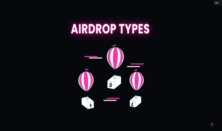
From Beginner to Pro - The Evolution of a Trader
Hey traders,
In this educational article, we will discuss 3 stages of the evolution of a trader .
Stage 1 - Unprofitable trader 😞
The unprofitable trader has very typical characteristics:
-total absence of trading skills
Most of the time, people open a live account simply after completing some beginners course like on babypips website.
Being sure that the obtained knowledge are completely enough to start trading, they quickly face the tough reality.
-no trading plan
Having just basic knowledge, of course, they do not have a trading plan. Why the hell to have it if everything is so simple?!
All their actions on the market is just gambling. They open the positions randomly most of the time, simply relying on intuition.
-poor risk management
In 99% percent of the time, the unprofitable trader does not even think about risk management. The position sizing, stop placement and target selection are completely neglected.
Trading performance of the unprofitable traders is characterized by small wins and substantial losses and negatively trending equity.
Stage 2 - Boom and bust trader 😶
Usually, traders reach boom and bust stage after 1-2 years of unprofitable trading. At some moment, winning trades start to compensate losing trades, brining non-trending equity.
Such traders have very common traits:
-not polished trading plan
Being unprofitable for so long, traders start to realize the significance of a trading plan.
Sticking to the set of rules, they notice positive changes in their trading performance.
However, trading plan requires to be polished and modified. It takes many years for a trader to identify all its drawbacks before it starts bringing net profits.
-lack of confidence
When one starts following a trading system, confidence plays a substantial role.
The fact is that even the best trading strategy in the world occasionally produces negative results. In order to not give up and keep following such a system, one needs to build trust in that.
The confidence that after a series of losing trades, the strategy will manage to recover.
Such a trust can be built after many years of trading that strategy.
Stage 3 - Profitable trader ☺️
That is the final destination.
After many years of a struggling trading, one finally sees positively-trending equity. Winning trades start to outperform losing ones, leading to consistent account growth.
Profitable trader is characterized by iron discipline, confidence and consistency.
He knows what he is trading, when and why. His trading plan is polished, he fully controls his emotions.
He never stops learning and constantly develops his strategy.
Knowing the 3 stages of the evolution of a trader, one can easily identify at what stage he currently is. That will help to identify the things to be focused on to move to the next stage.
At what stages are you at the moment?

STOP asking this dangerous two word questionWhat if?
This simple two word question is a psychological trap that traders often encounter.
And it does nothing more than undermine their decision-making process and overall trading performance.
This question will open a box of doubts, hypotheticals, and second-guessing.
This can paralyze action, distort risk assessment, and divert focus from the present to an endless maze of unrealized possibilities.
Let’s look into the psychological effects and what you can do to stop it from creeping in.
Psychological Impact
#1: Doubt and Hesitation
Constantly questioning “What if?” introduces doubt into the decision-making process.
For traders, you need to make decisions quickly and with confidence.
If you have any hesitation when you take a trade, it can lead to missed opportunities or entering positions at less than optimal prices.
#2: Fear of Missing Out (FOMO)
“What if this stock skyrockets after I sell?”
“What if this stock isn’t ideal?”
What if this trade hits my stop loss?”
This type of questioning can lead to either:
~ Holding positions too long.
~ Not holding positions long enough.
~ Not taking the trade.
~ Or missing great opportunities that come your way.
#3: Overtrading
Conversely, the fear of missing out can also lead to overtrading.
“What if this is the next big opportunity?”
Regardless on whether the trade lined up or not.
You might be compelled to jump into trades without proper analysis or strategy.
This will increase your trades, costs and your exposure to risk.
#4: Regret and Rumination
Traders who focus on “What if?” scenarios may dwell on past decisions, and this could lead to regret and rumination.
This backward-looking perspective can hinder the ability to learn from mistakes and make more informed decisions in the future.
So let’s try prevent the WHAT IF? Scenario.
Don’t you think?
Managing “What If?” in Trading
#1: Develop a Trading Plan
Make sure you have a clear, well-thought-out trading plan.
This will help you to minimise second-guessing.
If you have pre-defined entry, exit, and risk management rules in advance, you’ll be able to reduce the temptation to ask “What if?” and instead focus on executing your strategy.
#2: Embrace Risk Management
When you understand and accept the inherent risks of trading can alleviate the stress of “What if?” questions.
Effective risk management will help ensure you to prepare for all types of outcomes.
And you’ll handle your losses without deviating from your strategy.
#3: Stay Present
You need to be in the NOW moment.
This way you’ll be able to avoid the trap of hypotheticals.
Ask the questions:
Has my trading system aligned?
What is my daily and weekly bias?
#4: Accept Uncertainty
Recognise that market conditions are inherently unpredictable as I’ve mentioned many times.
The only thing you should have your mind set to are the probabilities and possibilities of trades lining up.
No outcomes can be foreseen or controlled.
All you can do is follow your strategy accordingly and forget about the prompt “WHAT IF?”.
Final words:
I think I have covered all the ways you need to stop worrying about the unknown.
You need to stop asking “WHAT IF?”. And start saying “NOW DO”.
Let’s sum up why we would ask the hypothetical question when we trade:
#1: Doubt and Hesitation
#2: Fear of Missing Out (FOMO)
#3: Overtrading
#4: Regret and Rumination
Managing “What If?” in Trading
#1: Develop a Trading Plan
#2: Embrace Risk Management
#3: Stay Present
#4: Accept Uncertainty

Mastering the Trader Skillset: Building a Strong PyramidIn the dynamic world of trading, success hinges on a robust skillset. Imagine this skillset as a pyramid, with each level representing a crucial component that traders must master to achieve consistent profitability. At the base, we have Technical Analysis, followed by Risk Management in the middle, and Discipline and Patience at the top. Additionally, Automation plays a pivotal role, integrating seamlessly across the entire structure. Let's delve into each of these elements and understand how they contribute to a trader's success.
The Base: Technical Analysis
The foundation of the trader's pyramid is Technical Analysis. This involves studying price charts, patterns, and various indicators to make informed trading decisions. Mastering technical analysis is crucial because it:
1. Identifies Trends and Patterns: Recognizing market trends and chart patterns allows traders to predict future price movements, making it easier to enter and exit trades at optimal times.
2. Utilizes Indicators: Tools like moving averages, RSI (Relative Strength Index), MACD (Moving Average Convergence Divergence), and Bollinger Bands provide insights into market momentum, volatility, and potential reversals.
3. Supports Strategy Development: Technical analysis forms the basis for creating and refining trading strategies, whether they are short-term or long-term.
The Middle: Risk Management
Sitting at the middle of the pyramid is Risk Management, a critical component that ensures long-term survival in the market. Effective risk management includes:
1. Position Sizin: Determining the appropriate size for each trade to limit exposure and avoid catastrophic losses.
2. Stop-Loss Orders: Implementing stop-loss orders to automatically close losing positions before they can significantly impact the trading account.
3. Diversification: Spreading investments across different assets or markets to reduce risk.
By prioritizing risk management, traders can protect their capital and remain in the game, even during periods of market volatility.
The Peak: Discipline and Patience
At the pinnacle of the pyramid are Discipline and Patience, the traits that distinguish successful traders from the rest. These qualities are essential for:
1. Adhering to Strategies: Sticking to predetermined trading plans and strategies, even in the face of emotional challenges and market noise.
2. Avoiding Overtrading: Exercising restraint to prevent impulsive decisions and overtrading, which can erode profits and increase risk.
3. Waiting for the Right Opportunities: Having the patience to wait for high-probability setups, rather than forcing trades.
Discipline and patience ensure that traders remain consistent and rational, avoiding the pitfalls of emotional trading.
The Integrative Element: Automation
Automation in trading acts as an integrative element that enhances every level of the pyramid. It involves using algorithms and trading bots to execute trades based on predefined criteria. Automation benefits traders by:
1. Eliminating Emotional Bias: Automated systems follow strategies without being influenced by fear or greed, ensuring objective decision-making.
2. Enhancing Efficiency: Automation can analyze vast amounts of data quickly and execute trades with precision, improving overall trading efficiency.
3. Consistence: Automated strategies maintain consistency in trading, sticking to the plan without deviation.
By incorporating automation, traders can optimize their technical analysis, streamline risk management, and uphold discipline and patience.
The trader skillset pyramid provides a comprehensive framework for achieving trading success. Technical Analysis forms the sturdy base, enabling traders to understand market behavior and develop strategies. Risk Management, positioned in the middle, safeguards their capital and ensures longevity. Discipline and Patience, at the top, are the hallmarks of professional trading, allowing traders to execute their plans effectively. Automation, interwoven throughout, enhances each component, providing a modern edge in the fast-paced trading environment.
By mastering each level of this pyramid, traders can build a resilient and profitable trading career, equipped to navigate the complexities of financial markets with confidence.

Analysis of Currency Correlations in Forex TradingAnalysis of Currency Correlations in Forex Trading
Navigating the complex landscape of forex trading requires a nuanced understanding of currency correlations. This article discusses the various aspects of the concept, from its definition to practical applications in the world of forex trading.
Understanding Forex Currency Correlation
Acknowledging the correlation concept may help traders get a better understanding of forex market conditions and aid in the planning of their trades.
Currency correlations refer to the statistical relationship between different currency pairs, revealing how they tend to move in relation to each other. This concept is grounded in the idea that the values of currencies can be influenced by common factors such as economic indicators, interest rates, and market sentiment.
Historical and Dynamic Correlations
Observing the historical and dynamic relation between forex pairs that correlate provides a nuanced perspective on the evolving nature of market relationships. Historical price data shows the patterns and trends over time, offering insights into how pairs have moved in relation to each other in various market conditions. On the other hand, dynamic correlations acknowledge the ever-changing nature of financial markets.
Influencing Factors
Economic indicators of a country, such as inflation rates and employment figures, serve as fundamental drivers influencing the strength or weakness of its currency. Also central to the landscape are interest rates, with decisions made by central banks impacting currency values significantly. Market sentiment also contributes to the ebb and flow of currency interrelations.
Interpreting Currency Correlations
The relationship between currency pairs can vary in terms of intensity and duration. Let’s explore how traders measure correlations and which aspects they need to consider.
Identifying Strong and Weak Relationships
The correlation coefficient is the technical indicator that quantifies the degree to which two currency pairs move in relation to each other. A reading close to +1 indicates a strong positive correlation, while a coefficient near -1 signifies a strong negative correlation. An indicator reading near 0 suggests a weak or non-existent correlation.
Correlation Between Forex Pairs May Change Over Time
Major economic shifts and events can alter the relationships between currency pairs. The usual negative correlation can transform into a positive one, showcasing how economic turbulence can reshape established relationships. For example, AUD/USD and GBP/USD pairs have a strong positive correlation on the daily chart, which becomes neutral on the weekly timeframe. If we consider a monthly period, the correlation will become positive again.
Correlations can manifest differently over various timeframes. Short-term correlations may be influenced by daily economic releases or unexpected events, while long-term correlations may be shaped by broader economic trends, including adjustments in a country's interest rates, alterations in monetary policies, or a combination of economic and political events. Short-term correlations may guide intraday or swing trading, while long-term correlations can influence position trading and investment decisions. The suitability of timeframes is closely tied to the chosen forex correlation strategies.
Tools and Resources for Currency Correlations Analysis
In addition to the correlation coefficient, there may be custom indicators to calculate and display currency correlations. These indicators can be programmed to suit your specific needs and preferences. Charting platforms equipped with customisation features also enable the simultaneous visualisation of multiple pairs, aiding in the identification of patterns and trends. Forex correlation matrices, available on various trading platforms, offer a comprehensive overview of the interdependencies of currency pairs.
Types of Currency Pair Correlation
The relative movements of forex pairs can be discussed from two different perspectives. Below, we delve into that matter, offering some practical examples.
Currency Correlations
While analysing the interrelationship between currency pairs, traders distinguish between three types of correlation.
Positive: EUR/USD and GBP/USD
A positive relationship is when two currency pairs move in the same direction. Over a specific period, when the EUR/USD experiences an upward movement, the GBP/USD also tends to rise correspondingly.
Negative: GBP/USD and USD/JPY
Negative correlations indicate movement in opposite directions. For example, when the USD/JPY experiences an upward trend, the GBP/USD tends to exhibit a downward movement, and vice versa.
Neutral: EUR/GBP and AUD/CAD
This is the case when there is no systematic relation between the exchange rates of the two currencies. The chart below shows that the price movements of EUR/GBP and AUD/CAD currency pairs do not exhibit a consistent pattern of moving in the same or opposite directions.
Curious about how other pairs move in relation to each other? Visit FXOpen and try out TickTrader’s free charting tools.
Intermarket Correlations
In addition to currency pairs, intermarket correlations explore the interconnected relationships between various financial assets. For instance, the relative price movements between currency pairs and commodities or equity markets can influence forex trading strategies. Traders always consider these broader market dynamics to make informed trading decisions.
Risk Management
By identifying pairs with negative correlations, traders can potentially offset losses in one position with gains in another through a good hedging strategy. Positive patterns, on the other hand, can help confirm trends and reinforce trading strategies. Incorporating correlations into risk management strategies may help traders assess the overall risk exposure of their portfolios more accurately.
Challenges and Limitations
One challenge lies in the dynamic nature of correlations, which can shift unpredictably in response to economic events or changing market sentiment. Over-reliance on historical data poses a risk, as past patterns may not necessarily repeat in the future. Additionally, currency pairs are influenced by various global markets, while liquidity issues in certain currency pairs may affect the reliability of the patterns identified, particularly in times of heightened market volatility.
Takeaway
Understanding currency correlations is one of the key components in designing forex strategies. While their analysis offers valuable insights, a broader approach that considers various other market factors is essential for effective performance in forex trading. Ready to try your forex strategies? You can open an FXOpen account today!
This article represents the opinion of the Companies operating under the FXOpen brand only. It is not to be construed as an offer, solicitation, or recommendation with respect to products and services provided by the Companies operating under the FXOpen brand, nor is it to be considered financial advice.

Implementing SEASONAL TENDENCIESHi guys,
In this video I go through what are "seasonal tendencies", and how you can implement it into your analysis and strategy(ies).
Seasonal tendencies in the context of financial markets are basically what the particular market or asset has historically done throughout the years in terms of bullish or bearish movement. For example, in April-May the US Dollar is usually bearish, and from May-June it is usually bullish. This is useful information because it can add confluence to your bias/analysis. However, you do not want to solely use this information as a reason to get into a trade. The data is based on the past, and is not indicative to the present/future and also does not represent how much a market or asset can move because the data is only measured relative to what it has previously done. The best approach is to use this as an additional thumbs up if it coincides with your analysis, and if it does, then it allows you to be a bit more cautious or risk averse.
A simple analogy is the weather. If you were planning a holiday to Thailand for a sunny getaway, the best times would be from March to July. Most likely you are not going to book a holiday in November during the monsoon season, unless you actually wanted it to rain every day. However, some years have had very little to no rain during the monsoon season. That being said, you would most likely choose to go during a time that seasonally has hot and sunny weather. This is how you can use seasonal tendencies to add an additional layer to your analysis.
I hope that was insightful and gave you some ideas to test if you've never heard of seasonal tendencies. You can implement this both as a technical or fundamental analyst (or both).
Til next time, happy trading.
- R2F

Don't Get FOMO'd Out: Why Crypto News is a Lagging Indicator The fast-paced world of cryptocurrency can be exhilarating, but also overflowing with noise. News outlets scream about the latest price surges, social media influencers tout their favorite coins, and every tweet feels like a market-moving event. But how do you separate genuine signals from the constant background buzz?
The truth is, a lot of crypto news acts like a lagging indicator, meaning it reflects what's already happened in the market rather than predicting the future. Here's why you shouldn't base your investment decisions solely on headlines:
Looking Back, Not Forward:
Imagine waking up to a newsflash: "Bitcoin Soars 20%!" While exciting, this news tells you what already happened, not what will happen next. The price increase could be due to various factors, some of which might not be sustainable.
The FOMO Trap (Fear Of Missing Out):
Attention-grabbing headlines can trigger emotional responses, leading to impulsive investment decisions. You might rush to buy a coin that's spiking based on the news, only to see the price fall shortly after.
Case in Point: The Elon Musk Effect
Elon Musk's tweets have a well-documented history of influencing cryptocurrency prices. When he tweets positively about Dogecoin (DOGE), for example, the price often surges. However, this is often a short-lived effect, and the price can quickly retreat after the initial hype. The news reports the surge, but it doesn't necessarily predict its longevity.
How to Spot the Real Story:
So, how do you stay informed without getting caught up in the noise? Here are some tips:
Focus on Technical Analysis: Technical analysis (TA) uses historical price and volume data to identify trends, potential turning points, and areas of support and resistance. While not a crystal ball, TA can provide valuable insights into the market's underlying health.
Read Beyond the Headlines: Don't just skim headlines. Dig deeper into the news to understand the context and reasoning behind price movements.
Follow Reputable Sources: Seek out information from established financial news outlets or research firms with a proven track record in cryptocurrency analysis.
Do Your Own Research (DYOR): Never blindly follow financial advice, even from seemingly credible sources. Develop your understanding of the cryptocurrency space, research projects you're interested in, and make informed decisions based on your risk tolerance and investment goals.
Remember:
News can be a great way to stay informed about the crypto market, but don't let it dictate your investment decisions.
Combine news updates with technical analysis and fundamental research for a more comprehensive understanding.
Focus on the long-term potential of the technology and specific projects rather than short-term price fluctuations.
By adopting a more critical approach to crypto news, you can avoid the FOMO trap and make informed investment decisions based on a deeper understanding of the market.

How To Stay up to date with Market NewsHey traders so today I wanted to make a quick video about where to go to find out about Ecomonic Releases. These market data reports can really make a difference when trading.
Enjoy!
Trade Well,
Clifford

Explaining Dow Theory - Does it Deliver Results?
Dow theory stands out as one of the most revered theories in the history of financial markets. Whether you're engaged in intraday trading, short-term trading, or long-term investment, understanding this theory is bound to help you formulate diverse strategies.
Originally crafted by Charles Dow in the late 1800s, Dow Theory, also known as Dow Jones Theory, has stood the test of time. Charles Dow, the founder of the Dow-Jones financial news service WSJ (Wall Street Journal) and Dow Jones and Company, developed this trading strategy.
Even after a century, Dow theory remains influential and is considered one of the most sophisticated studies in technical analysis.
I trust this will be beneficial to anyone involved in trading or investing in financial markets.
What is the essence of Dow Theory?
In an article published in the Wall Street Journal on January 31, 1901, Charles H. Dow likened the stock market to the ebb and flow of ocean tides.
He stated, "A person observing the rising tide and wishing to determine the precise moment of high tide places a stick in the sand at the points reached by the incoming waves until the stick reaches a position where the waves no longer reach it and eventually recede enough to indicate that the tide has turned." This approach proves effective in monitoring and predicting the rising tide of the stock market.
Dow believed that analyzing the current state of the stock market could offer insights into the current state of the economy.
Indeed, the stock market can serve as a valuable gauge for understanding the underlying reasons behind upward and downward trends in both the economy and individual stocks.
How Does the Dow Theory Operate?
The Dow Theory operates based on several principles, which include the following:
1. The Averages Account for Everything:
Market prices incorporate all known or unknown factors that may impact supply and demand. It is believed that the market reflects all available information, including information not yet public. This encompasses various events such as natural disasters like droughts, cyclones, floods, or earthquakes.
Major geopolitical occurrences, trade conflicts, domestic policies, elections, GDP growth, fluctuations in interest rates, and earnings forecasts or anticipations are all already factored into market prices. While unforeseen events may arise, they typically influence short-term trends while leaving the primary trend intact.
2.The Market Exhibits Three Trends:
a)The primary trend:
This trend can extend from one year to several years and represents the dominant movement of the market. It is commonly known as either a bull or bear market. The bullish primary uptrend sees higher highs followed by higher lows, while the bearish primary downtrend witnesses lower highs and lows.
The challenge lies in predicting when and where these primary trends will conclude. The goal of Dow Theory is to leverage known information rather than making speculative guesses about the unknown. By adhering to Dow Theory guidelines, one can identify and align with the primary trend.
b)The intermediate trend or secondary trend:
This trend typically lasts from 3 weeks to several months and is characterized by reactionary movements. In a bull market, these movements are viewed as corrections, whereas in a bear market, they are seen as rally attempts.
For instance, during a primary uptrend, a stock may retrace from its high to establish a low (known as an intermediate trend or correction). Conversely, in a primary downtrend, a stock might experience a temporary rebound after a prolonged decline (known as bear market rallies).
c)The minor trend or daily fluctuations:
This trend, lasting from several days to a few hours, is the least reliable and is often disregarded according to Dow Theory. Long-term investors should perceive daily fluctuations as part of the corrective process within intermediate trends or bear market rallies.
These fluctuations represent the noise in the market and can be susceptible to manipulation. While daily price action is important, its significance lies in the context of the broader market structure.
Analyzing daily price movements over several days or weeks can provide valuable insights when viewed alongside the larger market picture. While individual pieces of the structure may seem insignificant, they are integral to completing the overall picture.
3.Major Trends Comprise Three Phases:
Dow focused extensively on major trends, identifying three distinct phases within them: Accumulation, Public participation, and Distribution.
These phases occur cyclically and repeat over time.
a) Accumulation Phase:
This phase occurs when the market is in a bearish trend, characterized by negative sentiments and a lack of hope for an upcoming uptrend. For instance, we witnessed steep declines in mid-cap stocks in the Indian share market, with new lows being made frequently.
While many investors anticipate this trend to persist indefinitely, this is actually when significant investors, such as large fund houses and institutional investors, begin gradually accumulating these stocks.
This period is known as "smart money" investing for the long term. Despite ongoing selling pressure in the market, buyers are readily found.
b) Public Participation Phase:
During this phase, the market has already absorbed the negativity, with "smart money" investing. This marks the second stage of a primary bull market and typically sees the most significant rise in prices.
At this point, the majority of the public (retail investors) also considers joining in as prices rapidly increase. However, many are left behind due to the speed of the rallies and the upward trend in averages.
Traders and investors may experience regret for not participating in the rally. This phase follows improved business conditions and increased stock valuations.
c) Distribution Phase:
The third stage represents excess, eventually transitioning into the distribution phase. In this final stage, the public (retail investors) becomes fully engaged in the market, captivated by the bull market rally.
Some investors who previously felt left out may still seek opportunities to join the rally based on valuations.
However, this is when "smart money" begins to sell off shares at every high point. Meanwhile, the public attempts to buy at these levels, absorbing the selling volumes from large investors.
In the distribution phase, whenever prices attempt to rise, "smart money" unloads their holdings.
This marks the onset of a bear market, where sentiments turn negative, bankruptcy filings increase, and economic growth shifts.
During a bear market, frustration levels rise among retail investors as hope dwindles.
4.Confirmation Between Averages is Essential:
Dow used to say that unless both Industrial and Rail(transportation) Averages exceed a previous peak, there is no confirmation or continuation of a bull market.
Both the averages did not have to move simultaneously, but the quicker one followed another – the stronger the confirmation.
To put it differently, observe the image above, as you can see both the averages are in bull market, trending upward from Point A to C.
5.Confirmation of Trends Through Volume:
Volume serves as a metric indicating the amount of shares traded within a specific timeframe, aiding in trend and pattern analysis.
According to Dow theory, a stock's uptrend should be supported by high volume and exhibit low volume during corrections.
While volume data alone may not be comprehensive, integrating it with resistance and support levels can provide a more comprehensive understanding.
6.Trend Persistence Until Clear Reversal Signals:
Similar to Newton's first law of motion, which states that an object will remain at rest or in uniform motion unless acted upon by an external force, market trends are expected to persist until a significant external force, such as changes in business conditions, prompts a reversal.
Signs of trend reversals become apparent when impending changes in trend direction are observed.
7.Signal Recognition and Trend Identification:
A significant challenge in implementing the Dow theory is accurately identifying trend reversals. Adhering to the Dow theory requires not only assessing the overall market direction but also recognizing definitive signals of trend reversals.
A key technique employed in identifying trend reversals within the Dow theory is analyzing peaks and troughs, or highs and lows. Peaks represent the highest points in a market movement, while troughs signify the lowest points.
According to the Dow theory, markets do not move in a linear fashion but rather oscillate between highs (peaks) and lows (troughs), with overall market movements trending in a particular direction.
An upward trend in Dow theory consists of a series of progressively higher peaks and troughs, while a downward trend is characterized by progressively lower peaks and troughs.
8.Market Manipulation:
Charles Dow believed that manipulation of the primary trend was improbable, while short-term trading, including intraday movements and secondary movements, could be susceptible to manipulation.
Short-term movements, ranging from hours to weeks, may be influenced by factors such as large institutions, speculators, breaking news, or rumors, potentially leading to manipulation.
While individual securities may be manipulated, such as artificially driving up prices before reverting to the primary trend, manipulating the entire market is highly unlikely due to its vast size.
Why Dow Theory Is Not Foolproof:
Dow Theory is not a fail-safe method for outperforming the market, as it is not without its flaws. Critics argue that it lacks the depth and precision of a formal theory.
Conclusion:
Understanding the Dow Theory enables traders to identify hidden trends that may elude more seasoned investors, empowering them to make informed decisions about their positions.
The Dow theory aims to pinpoint the primary trend and capitalize on significant movements. Given the market's susceptibility to emotion and tendency for overreaction, the goal is to focus on identifying and following the prevailing trend.

How CPI News Impacts Gold PricesGold prices are affected by Treasury yields and Consumer Price Index (CPI) data. High inflation typically leads to higher Treasury yields due to low unemployment and an overheating economy, which can decrease gold's appeal due to rising unemployment, making gold more attractive as a safe investment. Thus, gold tends to decline with high Treasury yields in inflationary times and increase when Treasury yields fall during deflationary periods.
