Intermarket Analisis V.1What is Intermarket Analysis?
Intermarket analysis looks at how various asset classes influence each other. The key idea is that markets are interconnected, and movements in one can signal or predict movements in another. For example:
Stocks and Bonds: Rising bond yields (e.g., US 10-year Treasury) often pressure stock prices downward.
Commodities and Forex: A rising US Dollar (USD) typically weakens gold (XAU/USD) prices due to their inverse relationship.
Forex and Equities: Strong economic data boosting equities might strengthen the USD.
This method helps you confirm trends, anticipate reversals, or avoid false signals in your EMA 10/20 crossover strategy.
Key Intermarket Relationships
USD Index (DXY) and Gold (XAU/USD):
Correlation: Inverse. When DXY rises (stronger USD), gold often falls, and vice versa.
Indicator: Track DXY on a separate chart. Use a 50-period SMA or RSI to spot overbought/oversold conditions in USD strength.
Application: If your EMA 10/20 gives a buy signal on gold but DXY is overbought (RSI > 70), it might be a false signal—wait for DXY to cool off.
US 10-Year Treasury Yields and Equities (e.g., S&P 500):
Correlation: Inverse. Higher yields increase borrowing costs, pressuring stocks.
Indicator: Use a 200-day EMA on yields (e.g., ^TNX) and compare with S&P 500’s 50-day EMA.
Application: If yields are trending up (above 200 EMA) while your EMA 10/20 signals a stock buy, consider it risky—cross-check with macro data.
Crude Oil (WTI/Brent) and Gold:
Correlation: Positive. Both are inflation hedges, so they often move together during economic uncertainty.
Indicator: Apply a MACD (12, 26, 9) on oil prices to confirm trend direction.
Application: If oil’s MACD shows a bullish crossover and your gold buy signal aligns, it strengthens the case for a trend.
Bond Yields and USD:
Correlation: Positive. Rising yields support a stronger USD.
Indicator: Use a Stochastic Oscillator (14, 3, 3) on DXY to spot momentum shifts.
Application: If Stochastic is overbought on DXY and yields are high, a gold sell signal from EMA 10/20 might be more reliable.
How to Apply Intermarket Analysis to Your EMA 10/20 Strategy
Your current strategy uses EMA 10/20 crossovers for entry/exit, with SL at swing low/high and no TP until an opposite crossover. Here’s how to integrate intermarket analysis:
Confirmation: Before acting on a buy signal (EMA 10 > EMA 20), check if DXY is weakening (e.g., below 50 SMA) or oil is rising (MACD bullish). This supports a gold uptrend.
Divergence Warning: If your EMA 10/20 buy signal occurs but DXY is trending up (strong USD) or yields are spiking, it might indicate a false breakout—hold off.
Macro Context: On July 02, 2025, 08:30 PM WIB, watch for upcoming US Jobless Claims (3-4 July). A weak report could boost gold and weaken USD, aligning with your buy signal.
Fundamental Analysis

Opening Range Breakout🧭 Overview
The Open Range Breakout (ORB) indicator is designed to capture and display the initial price range of the trading day (typically the first 15 minutes), and help traders identify breakout opportunities beyond this range. This is a popular strategy among intraday and momentum traders.
🔧 Features
📊 ORB High/Low Lines
Plots horizontal lines for the session’s high and low
🟩 Breakout Zones
Background highlights when price breaks above or below the range
🏷️ Breakout Labels
Text labels marking breakout events
🧭 Session Control
Customizable session input (default: 09:15–09:30 IST)
📍 ORB Line Labels
Text labels anchored to the ORB high and low lines (aligned right)
🔔 Alerts
Configurable alerts for breakout events
⚙️ Adjustable Settings
Show/hide background, labels, session window, etc.
⏱️ Session Logic
• The ORB range is calculated during a defined session window (default: 09:15–09:30).
• During this window, the highest high and lowest low are recorded as ORB High and ORB Low.
📈 Breakout Detection
• Breakout Above: Triggered when price crosses above the ORB High.
• Breakout Below: Triggered when price crosses below the ORB Low.
• Each breakout can trigger:
• A background highlight (green/red)
• A text label (“Breakout ↑” / “Breakout ↓”)
• An optional alert
🔔 Alerts
Two built-in alert conditions:
1. Breakout Above ORB High
• Message: "🔼 Price broke above ORB High: {{close}}"
2. Breakout Below ORB Low
• Message: "🔽 Price broke below ORB Low: {{close}}"
You can create alerts in TradingView by selecting these from the Add Alert window.
📌 Best Use Cases
• Intraday momentum trading
• Breakout and scalping strategies
• First 15-minute range traders (NSE, BSE markets)

Modüler Trailing Stop (Doğru Ölçekli)
📌 Modular Trailing Stop – Advanced Risk Management for Long & Short Strategies
Modular Trailing Stop is a dual-direction stop management tool that calculates independent stop levels for long and short positions. It is fully scale-adjusted, strategy-agnostic, and optimized for TradingView integration.
🚀 Key Features
🔹 Dual-Side Stop Logic
Separate Ref High and Stop levels for long and short trades, allowing precise and directional control.
🔹 Modular Architecture
Designed to be easily integrated into any indicator or strategy. Operates independently from entry signals.
🔹 Accurate Price Scaling
Automatically adjusts to symbol tick size using syminfo.mintick, ensuring precision across all markets (BTCUSD, ETHUSD, USDTRY...).
🔹 Static Trailing Logic
Once a position is opened, stop levels are anchored to a fixed reference price and adjusted by ATR volatility.
🔹 User-Configurable
- Customizable ATR period and multiplier
- Manual reference high percentages for long and short
- Real-time table display on the chart with key values
⚙️ Calculation Formulas
- Ref High (Long) = Base Price × (1 + %Offset) × scaleFix
- Ref High (Short) = Base Price × (1 - %Offset) × scaleFix
- Step = ATR × Multiplier
- Long Stop = Ref High (Long) – Step
- Short Stop = Ref High (Short) + Step
📈 Use Cases
- Volatility-based static stop-loss framework
- Compatible with RSI, EMA crossover, breakout, and custom signal systems
- Backtesting via TradingView Strategy Tester (WinRate, Sharpe, AvgPnL...)
🧪 Example Backtest (BTCUSDT, 4H Timeframe)
- Win Rate: 41.9%
- Sharpe Ratio: 0.27
- Profit Factor: 1.31
- Avg Trade Duration: 18 bars
- Test Strategy: RSI-based entries + modular trailing stops
🧩 Strategy Integration (Sample)
strategy.exit("Long Exit", from_entry="Long", stop=longStop)
strategy.exit("Short Exit", from_entry="Short", stop=shortStop)
🏁 Summary
Modular Trailing Stop is a robust and intuitive stop-loss management tool. It can be used as a standalone module or combined with any strategy for improved position handling, effective drawdown control, and systematic risk management.
Whether you're building strategies or optimizing entries and exits, this tool brings precision and modular flexibility to your trading workflow.

BTC SmartMoney + SQZMOM + EMA + Cloud + Trailing Stop (v2.5)🚀 BTC 15-Minute Smart Strategy: SmartMoney + SQZMOM + EMA + Trailing Stop
Designed specifically for the fast-paced and volatile crypto market, this strategy is finely tuned to deliver maximum performance on Bitcoin’s 15-minute chart.
🌟 Key Features:
SmartMoney Concepts (SMC) based CHoCH signals to detect market structure shifts and capture early trend reversals.
SQZMOM (Squeeze Momentum Oscillator) to gauge strong volatility and momentum confluence.
50 & 200 EMA Cloud combining short-term and long-term trend filters for reliable market direction.
ATR-based and manually adjustable Trailing Stop for flexible and automated risk management.
Scientifically optimized Take Profit and Stop Loss levels to minimize losses and maximize gains.
Clear exit labels on chart for real-time trade tracking and decision making.
🔥 Why Choose This Strategy?
Provides fast and reliable signals on 15-minute timeframe, protecting you against sudden market moves.
Maximizes profits with trailing stops while keeping risks controlled.
Built on professional financial models, ideal for both beginners and experienced traders.
📈 How to Use
Easily deploy on TradingView with flexible parameters that adjust to your trading style. Automates entry and exit decisions based on real-time market conditions.
A powerful companion for traders who want a reliable yet aggressive approach to BTC trading on the 15-minute timeframe.

JIYANS FVGJIYAN'S FVG is a powerful Fair Value Gap (FVG) indicator designed to help traders visually identify and track bullish and bearish imbalances across customizable timeframes. The script automatically detects FVGs based on market structure and plots them with shaded boxes and clear boundary lines on the chart.
Key Features:
Multi-Timeframe Detection: Select your preferred timeframe for FVG detection (e.g., H4, H1, M30).
Visual Clarity: Displays shaded gaps with customizable colors, upper and lower boundary lines, and optional midpoint lines for precise reference.
Dynamic Management: Automatically removes mitigated (filled) gaps to keep the chart clean and focused.
Labeling: Annotates each FVG with the selected timeframe for easy tracking.
Alerts: Built-in alerts notify you when a new FVG forms or when price touches the boundary of an existing unmitigated FVG.
This tool is perfect for traders who rely on price imbalances and fair value gaps to identify potential trading opportunities and key areas of interest.

Shavarie's Sniper LineShavarie’s Sniper Line is a precision confirmation tool built for high-quality entries — not noisy signals.
It activates only when all 3 conditions agree:
🔁 Momentum bend detection
💧 Money Flow Index (MFI) pressure
🔺 Delta volume strength (emulated from price/volume flow)
When all conditions align, the Sniper Line shifts to:
+1 for potential buy zone
-1 for potential sell zone
0 when neutral — no action
Best used in combination with supply/demand zones, Heikin Ashi, or larger trend structures. Built for traders who value patience, precision, and massive R:R setups.

Previous Day High & Low with Breakout Zones📌 Script Summary: Previous Day High/Low with Breakout Zones and Alerts
This Pine Script plots the previous day’s high and low on intraday charts, and highlights when the current price breaks out of that range during regular trading hours.
✅ Key Features
• Previous Day High/Low Lines: Draws horizontal lines at the prior day’s high and low, updated daily.
• Time-Filtered Session (09:15–15:30 IST): All logic applies only during Indian market hours.
• Breakout Zone Highlighting:
• 🟩 Green background when price closes above previous high
• 🟥 Red background when price closes below previous low
• Dynamic Labels: Displays labeled levels each day on the chart.
• Alerts:
• 🔼 Triggered when price crosses above the previous day’s high.
• 🔽 Triggered when price crosses below the previous day’s low.
• Customizable Inputs:
• Enable/disable alerts
• Toggle breakout zone highlights
• Set label offset
⚙️ Optimized For
• Intraday timeframes (e.g., 5m, 15m, 1h)
• Trading during NSE/BSE market hours
• Breakout strategy traders and range watchers


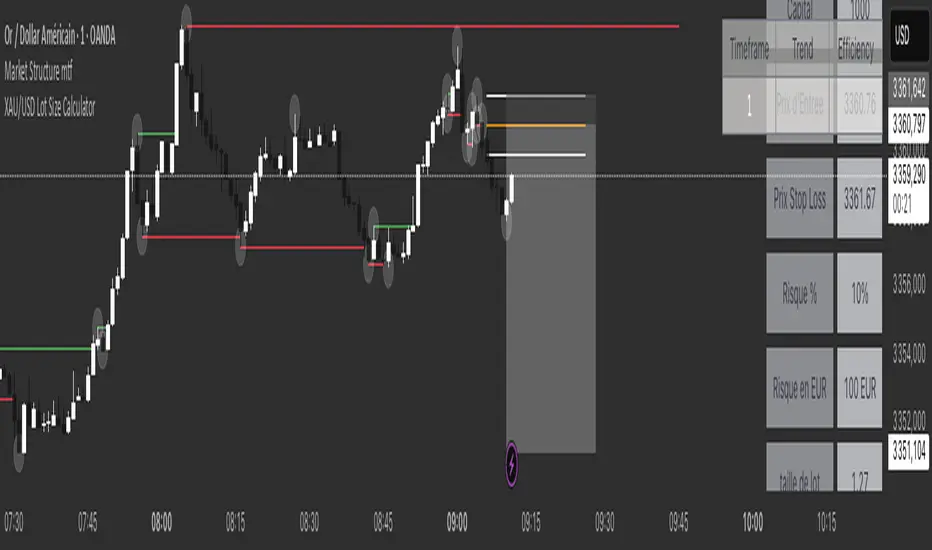
XAU/USD Lot Size CalculatorThis indicator automatically calculates the optimal lot size for XAUUSD (gold) based on the level of risk the trader wants to take. It is designed for traders using MetaTrader 4 or 5 and helps adjust position size according to the specific volatility of gold. The user can set the percentage of capital they are willing to risk on a single trade, for example 1%. The indicator also takes into account the stop loss level, which can be entered in pips or in dollars, as well as the account size (balance or equity).
Based on these parameters, it calculates the exact lot size that matches the risk amount. It then displays on the chart the recommended lot size, the risk amount in dollars, the pip value for XAUUSD, and a confirmation of the stop loss level. This type of indicator is useful for maintaining disciplined risk management and avoiding position sizing errors, especially on a highly volatile asset like gold.
Bullish Auto FibsBullish Auto Fibs Indicator
Description
The Bullish Auto Fibs indicator is a sophisticated tool designed for traders on the TradingView platform, specifically tailored for analyzing bullish price movements on XRP and other assets. It automatically plots Fibonacci retracement, B Wave, and extension levels based on a customizable ZigZag pattern, providing clear visual cues for potential support, resistance, and price targets. With a focus on the 15-minute timeframe, this indicator enhances technical analysis by dynamically updating Fibonacci levels as new pivot highs and lows are detected, ensuring traders stay aligned with evolving market trends.
Key Features:
Automatic Fibonacci Levels: Plots retracement (23.6%, 38.2%, 50%, 61.8%, 78.6%), B Wave (23.6% to 161.8%), and extension (100%, 161.8%, 261.8%) levels.
Dynamic ZigZag Detection: Identifies pivot highs and lows with an adjustable length (1–100 bars, default 20).
Real-Time Updates: Adjusts Fibonacci levels when new highs (for retracements) or lows (for B Wave and extensions) are detected, preserving key reference points like the B Wave pivot high.
Customizable Display: Toggle visibility for retracement, B Wave, and extension levels to suit your analysis needs.
Visual Clarity: Uses distinct colors (gray for retracements, yellow for B Wave, green for extensions) and labels for easy interpretation.
This indicator is ideal for traders employing Elliott Wave theory, Fibonacci-based strategies, or trend-following approaches, offering a robust framework for identifying key price levels in bullish markets.
User Manual
Configuration
The indicator’s settings can be adjusted via the “Settings” panel in TradingView:
Yellow ZigZag Length (default: 20, range: 1–100): Controls the sensitivity of pivot detection. Higher values detect more significant pivots; lower values increase sensitivity for shorter-term swings.
Show Retracement Fibs (default: true): Enable/disable retracement levels (low to high, 0% at high, 100% at low).
Show B Wave Fibs (default: true): Enable/disable B Wave levels (high to low, 100% at high, 0% at low, with extensions up to 161.8%).
Show Extension Fibs (default: true): Enable/disable extension levels (pivot low as 0%, projecting upward).
How It Works
ZigZag Pattern:
The indicator identifies pivot highs and lows using the ta.pivothigh and ta.pivotlow functions, with the specified yellowLength.
Pivots are marked with “H” (high) or “L” (low) labels in yellow.
Fibonacci Levels:
Retracement Fibs: Drawn from a pivot low (100%) to a pivot high (0%). Updates to a new high if detected, maintaining the original low.
B Wave Fibs: Drawn from a pivot high (100%) to a pivot low (0%), with extensions above 100%. Updates to a new low if detected, preserving the original high.
Extension Fibs: Drawn from a pivot low (0%) upward, based on the prior low-to-high wave length. Updates to a new low if detected.
Dynamic Updates:
Lines and labels extend to the current bar for active Fibonacci levels, ensuring real-time relevance.
When a new pivot is detected, previous levels are cleared, and new levels are drawn to reflect the latest price structure.
Usage Tips
Trend Confirmation: Use retracement levels to identify potential support zones during pullbacks in a bullish trend.
B Wave Analysis: Leverage B Wave levels for corrective wave targets, especially in Elliott Wave strategies.
Price Targets: Extension levels highlight potential bullish continuation zones.
Timeframe Flexibility: While optimized for 15-minute charts, adjust yellowLength for higher (e.g., 50–100) or lower (e.g., 5–10) timeframes.
Combine with Other Tools: Pair with trend indicators (e.g., moving averages) or oscillators (e.g., RSI) for enhanced decision-making.
Troubleshooting
No Levels Displayed: Ensure at least two pivots (high and low) are detected. Increase yellowLength if pivots are sparse.
Overlapping Labels: Reduce chart zoom or toggle off unnecessary Fibonacci types to declutter.
Performance Issues: The indicator limits arrays to 500 entries to prevent slowdowns. Older pivots are automatically removed.
Notes
The indicator is optimized for bullish markets but can be adapted for other assets by adjusting the ZigZag length.
For best results, test settings on historical data to align with your trading style.

Growthx 365📌 GrowthX 365 — Adaptive Crypto Strategy
GrowthX 365 is a precision-built Pine Script strategy designed for crypto traders who want hands-off, high-frequency execution with clear, consistent logic.
It adapts dynamically to market volatility using multi-timeframe filters and manages exits with a smart 3-tier take-profit and stop-loss system.
Built for automation, GrowthX 365 helps eliminate emotional decision-making and gives traders a rules-based, 24/7 edge across major crypto pairs.
⚙️ Core Features:
• ✅ Multi-timeframe, non-repainting trend confirmation
• ✅ Configurable TP1 / TP2 / TP3 + Fixed SL
• ✅ Trailing stop & risk-reward tuning supported
• ✅ On-chart labels, trade visuals & stat dashboard
• ✅ Fully compatible with Cornix, WunderTrading, 3Commas bots
• ✅ Works in trending, ranging, and volatile markets
🧪 Strategy Backtest Highlights (May 2025)
🔹 EIGEN/USDT — 15m Timeframe
• Net Return: +318%
• Drawdown: $35 (3.5%)
• Trades: 247
• Win Rate: 49%
📸 Screenshot: ibb.co
🔹 AVAX/USDT — 15m Timeframe
• Net Return: +108%
• Drawdown: $22.5 (2.25%)
• Trades: 115
• Win Rate: 49%
📸 Screenshot: ibb.co
🧪 Backtest settings used:
Capital: $1000 • Risk per trade: $100 • Slippage: 0.1% • Commission: 0.04%
📌 These results reflect one-month performance. Strategy has shown similar behavior across coins like SOL, INJ, and ARB in trending markets.
⚠️ Backtest performance does not guarantee future results. Always validate settings per coin and timeframe.
Access:
This script is invite-only and closed-source.
Please check my profile signature for access details.

RTH Standard Deviation+RTH Standard Deviation+ Indicator
Overview
The RTH Standard Deviation+ (RTH SD+) indicator is a versatile tool designed for traders to visualize key price levels based on the Regular Trading Hours (RTH) session.
It calculates and displays the high, low, equilibrium (midpoint), and standard deviation-based levels derived from the RTH session's price range.
This indicator is ideal for day traders and swing traders looking to identify potential support, resistance, and breakout zones.
Features
Customizable Session Window: Define the RTH session based on your preferred time window and timezone.
Key Price Levels: Displays high, low, equilibrium, 25%/75% quartile levels, and standard deviation levels (±0.5, ±1.0, ±1.33, ±1.66, ±2.0, and optional extended levels up to ±4.0).
Visual Elements: Includes horizontal lines, labels, boxes, and vertical lines to highlight key levels and session boundaries.
Flexible Styling: Customize line styles, colors, thicknesses, and visibility for all elements.
Extended Levels: Optional display of additional standard deviation levels (±2.25, ±2.33, ±2.5, ±2.66, ±2.75, ±3.0, ±3.25, ±3.33, ±3.5, ±3.66, ±3.75, ±4.0).
Deviation Boxes: Visualize specific standard deviation ranges (±0.1, ±1.33/1.66, ±2.33/2.66, ±3.33/3.66) with customizable colors.
Inputs
Session Window: Set the RTH session time (default: 06:00–09:00).
Timezone: Select the appropriate timezone (default: UTC-4).
Label Offset: Adjust the horizontal offset for price level labels (default: 5 bars).
Line Offset: Set the length of horizontal lines extending from the session end (default: 20 bars).
Show SD Levels: Toggle visibility of standard deviation lines (±0.5, ±1.0, ±1.33, ±1.66, ±2.0).
Show SD Labels: Enable or disable labels for standard deviation levels.
Show SD Boxes: Display shaded boxes for specific standard deviation ranges (e.g., ±1.33/1.66).
Show ±0.1 Dev Boxes: Highlight smaller deviation ranges (±0.1) with boxes.
Vertical Line: Toggle a vertical line at the session end, with customizable color, style, and thickness.
High/Low, Equilibrium, 25%/75%, ±0.1 Dev, ±1.33/1.66: Toggle visibility and customize colors, styles, and thicknesses for these levels.
Extended Levels: Enable additional standard deviation levels (e.g., ±2.25, ±2.5, etc.) for advanced analysis.
How It Works
Session Tracking: The indicator identifies the user-defined RTH session based on the specified time window and timezone.
It tracks the high, low, and equilibrium (midpoint) of the session's price action.
Price Range Calculation: At the session's end, the indicator calculates the price range (high - low) and uses it to compute standard deviation levels relative to the high, low, or equilibrium.
Level Visualization:
High/Low Lines: Display the session's high and low prices as horizontal lines, extended beyond the session end.
Equilibrium Line: Shows the midpoint of the session range.
Quartile Lines: Plots 25% and 75% levels within the session range.
Standard Deviation Lines: Displays levels at ±0.5, ±1.0, ±1.33, ±1.66, and ±2.0 standard deviations, with optional extended levels up to ±4.0.
Deviation Boxes: Shaded boxes highlight specific ranges (e.g., ±1.33/1.66) for quick reference.
±0.1 Deviation Lines/Boxes: Optional smaller deviation levels for precise analysis.
Dynamic Updates: During the session, high and low lines update in real-time. At session end, all levels are finalized and extended forward for post-session analysis.
Clearing Mechanism: When a new session begins, previous drawings are cleared to avoid clutter.
Usage
Add to Chart: Apply the indicator to your TradingView chart via the Pine Editor or Indicator menu.
Configure Settings:
Adjust the session window and timezone to match your market (e.g., 09:30–16:00 UTC-4 for US equities RTH).
Customize visibility, colors, styles, and thicknesses to suit your chart preferences.
Enable extended levels for deeper analysis or disable them for simplicity.
Interpret Levels:
High/Low: Act as potential support/resistance or breakout levels.
Equilibrium: Represents the session's midpoint, often a pivot point.
25%/75% Quartiles: Indicate intermediate levels within the session range.
Standard Deviation Levels: Highlight statistically significant price zones for potential reversals or breakouts.
Boxes: Emphasize key zones for quick visual reference.
Trading Application: Use levels to identify entry/exit points, set stop-losses, or gauge market volatility.
For example, ±1.0 standard deviation levels often act as strong support/resistance, while ±2.0 levels may indicate overextension.
Notes
Ensure the session window aligns with the market’s trading hours for accurate calculations.
The indicator is designed for intraday and post-session analysis but can be adapted for other timeframes.
Use in conjunction with other technical analysis tools for comprehensive decision-making.
Extended levels (±2.25 and beyond) are disabled by default to reduce chart clutter but can be enabled for specific strategies.
TradingView House Rules Compliance
This indicator contains no copyrighted material and adheres to TradingView’s Pine Script guidelines.
This indicator was approved and created with @TIMELESS1_

BTC Market D-Line PhaserBTC Market D-Line Phaser — Bitcoin Market Phase Classification Indicator
Overview
BTC Market D-Line Phaser is a streamlined, daily timeframe indicator designed to categorize the current Bitcoin market environment into clearly defined behavioral phases. By combining on-chain market valuation data with a profitability model, it assists traders and investors in understanding whether Bitcoin is in a deploy (accumulation), hold, pre-sale, distribution, or cash transition phase.
What It Does
BTC Market D-Line Phaser analyzes the Bitcoin market using two primary on-chain metrics:
1. Market Capitalization Data
Retrieves real-time total market capitalization and realized market capitalization from external sources. This combination provides a fundamental perspective on network valuation relative to price action.
2. Normalized Unrealized Profit and Loss (NUPL) Framework
Calculates an aggregate profitability ratio to estimate when the market is predominantly in loss, neutral, or significant profit conditions. This signal historically correlates with shifts in investor sentiment and behavior.
How It Works
The indicator classifies the market into five distinct phases:
1. Deploy Phase
Indicates conditions historically associated with deep value or high fear environments, where price trades at discounted valuations relative to realized capitalization. This phase is often considered by some participants as an opportunity to allocate capital.
2. Hold Phase
Suggests a neutral or moderate-profit environment, where the market is neither clearly oversold nor overextended. Typically seen as a phase of accumulation or consolidation.
3. Pre-Sale Phase
Signals growing unrealized profits across the market. This environment is often associated with rising optimism and elevated expectations.
4. Sell Phase
Highlights conditions where unrealized profits have become significant across holders, increasing the probability of distribution events and profit-taking behavior.
5. Cash Phase
Marks a transition where a previously overextended market (Sell Phase) loses momentum. This often indicates an inflection point where prior profit-taking may have exhausted buying pressure.
Each phase dynamically updates and is visualized on the chart through a color-coded line plotted beneath price. As price action evolves, the phase classification automatically shifts to reflect the current market state.
How To Use It
1. Confirm Timeframe
BTC Market D-Line Phaser is specifically designed for daily charts. Using it on intraday or weekly timeframes is not recommended and may result in inaccurate classifications.
2. Interpret the Phases
-- Deploy Phase: Historically associated with deep undervaluation. Some traders consider this favorable for accumulation.
-- Hold Phase: A baseline or neutral environment.
-- Pre-Sale Phase: Early warning of elevated unrealized profits.
-- Sell Phase: Suggests significant profit-taking risk.
-- Cash Phase: Indicates the aftermath of a distribution environment, potentially transitioning to re-accumulation or correction.
3. Integrate With Strategy
Use phase information to guide discretionary decisions, manage risk exposure, or align entries and exits with broader market sentiment.
Why It Is Unique
1. On-Chain Focus
Combines market cap and profitability metrics in real time, offering insight beyond conventional price-based indicators.
2. Simplified Classification
Distills complex market behavior into five intuitive phases, reducing noise and helping traders stay objective.
3. Visual Clarity
Clean color-coded plotting beneath price action allows immediate recognition of market phase shifts.
4. Daily Chart Optimization
Tuned exclusively for the daily timeframe to capture macro trends rather than short-term fluctuations.
Apply Risk Management
This indicator does not constitute financial advice and is not a standalone trading system. Always combine its insights with your own analysis, clearly defined trading plans, and prudent risk management practices. Evaluate how each phase aligns with your objectives, time horizon, and risk tolerance.
Timeframe Selection
Use only on daily charts. Applying it to other timeframes will compromise the integrity of the phase classification.
Best Suited For
Investors and swing traders who prefer a macro-level perspective on Bitcoin market cycles and wish to structure entries and exits around on-chain sentiment trends.
Important Notes
Signals and phases generated by BTC Market D-Line Phaser are for informational purposes only. Past performance is not indicative of future results. All trading and investing decisions remain your responsibility.
License
This indicator was developed by the ProphetAlgoAI team. Use is subject to a private, invite-only TradingView license. Redistribution or unauthorized usage outside of TradingView is strictly prohibited.

Red Report FilterHello Traders,
This script will make your everyday trading sessions a lot less stressful if you're having to watch for 'Red' restricted reports.
You can set up to five reports for the day, with a selector for either: 'Red' / 'Orange'
Super simple to update manually, usually less than 15s. You do need to pull the information from ForexFactory.com or your required feed daily.
No need to worry about audio fails; the alarm background visually updates as price candles start to sweep thru the preset time window.
Default window settings are for Red Reports, '15m Before' / '6m After', for a 5m x 5m window.
I like the '15m Before' because it gives me a buffer to react to if I'm managing an open trade.
Click the tool-tip for more details.
PLEASE NOTE: Time-Zone is hard-coded UTC -4. Make the appropriate adjustment to a different zone if necessary.
Let me know how it works for you.
Thx!

DISEGNATORE Livelli Dev. Std. H4 v1.9the Drawer needed to display "net % St. Devs, CALCULATOR 4H" output.

Net % St.Devs. CALCULATOR H4a calculator able to create a Statistical Sample of 4h time-specific candles and their Net change % Values, and projects its Standard Deviations on any timeframes chart.


Non-Commercial Bias TrackerNon-Commercial Bias Tracker
Overview
The Non-Commercial Bias Tracker is a sophisticated sentiment analysis tool designed to provide traders with a clear view of the positioning of institutional speculators in the futures market. By analyzing the weekly Commitment of Traders (COT) report, this indicator helps you understand the underlying bias of large market participants for a wide range of assets, including forex, commodities, and indices.
The primary goal of this tool is to identify the prevailing trend in market sentiment and alert you to significant shifts in that trend, allowing you to align your strategy with the flow of institutional money.
Key Features
Dual Asset Analysis: Automatically detects the two assets in a trading pair (e.g., EUR and USD in EURUSD) or a single asset (e.g., GOLD) and displays their sentiment data side-by-side.
Comprehensive Data Table: A clean, customizable dashboard shows you the most critical sentiment metrics at a glance, including the current Net Position, the Change %, and the Overall Bias.
Visual Sentiment Plot: The indicator plots the primary sentiment metric and its signal line, giving you a visual representation of momentum and trend.
Clear Bias-Shift Signals: Green and red circles appear directly on the plot to highlight the exact moment the underlying sentiment momentum shifts, providing clear and timely signals.
How to Use the Indicator
Important Note: The Commitment of Traders data is released weekly. For the most accurate and meaningful signals, it is strongly recommended to use this indicator on the Weekly (W) chart timeframe.
1. The Data Table
The table in the corner of your screen is your main dashboard. Here’s what each row means:
Net Position: Shows the net difference between long (bullish) and short (bearish) contracts held by non-commercial traders. A positive number indicates a net long position; a negative number indicates a net short position.
Change %: This is the primary metric used for analysis, representing the net sentiment as a percentage.
Overall Bias: This is the final output of the indicator's analysis. It provides a clear "Long" or "Short" signal based on the current sentiment momentum. This cell is color-coded for quick interpretation (Green for Long, Red for Short).
2. The Chart Plots
Blue Line: Represents the current sentiment metric ("Change %" or "Net Position %").
Orange Line: Represents the signal line, or the average sentiment over a specific period.
Crossover Signals:
A Green Circle appears when the blue line crosses above the orange line, signaling a shift to a Long Bias.
A Red Circle appears when the blue line crosses below the orange line, signaling a shift to a Short Bias.
Settings & Customization
You can tailor the indicator to your specific needs via the Settings menu:
Data Source: Choose between "Futures Only" or the combined "Futures and Options" data.
Metric Type: Select whether to analyze the market using "Change %" (for momentum) or "Net Position %" (for conviction).
Bias Signal Line Length: Adjust the sensitivity of the crossover signals. A shorter length is faster, while a longer length provides smoother, more confirmed signals.
Style Settings: Customize the position of the data table and the color of the text to match your chart theme.
Disclaimer: This indicator is a tool for analysis and should not be considered as direct financial advice. All trading involves risk. Always use proper risk management and conduct your own due diligence before making any trading decisions.


DISEGNATORE Livelli ATR H4 v1.3 FinaleThe Drawer needed to display "ATR. St. Dev. CALCULATOR H4" output.

ATR St. Devs. CALCULATOR H4a Calculator able to create a Statistical Sample of 4h time-specific candles and their ATR Values, and projects its Standard Deviations on any timeframes chart.

Livelli Giornalieri ATRDisplays daily Open price and its ATR Value projections. Import the data from "ATR Screener"

Livelli Settimanali ATRDisplays Weekly Open price and its ATR Value projections. Import the data from "ATR Screener"
