Stock Dissect DashboardI developed this script, to help me in my analysis process of Stocks.
In it I have combined several things that I look at when evaluating a company.
First, there is the Macro part, where I have added the most important (at least for me) macro indicators, such as inflation, interest rates, initial jobless claims etc.
Under the last is the latest reported value, next we have the previous, and next to them is the change.
Underneath it is the technical part.
I have added the 1-Week, 1-Month, 3-Month, and 1-Year returns. This way I can easily see the performance of the stock over time.
We have a market regime indicator, which tells us whether the stock is Trending, Mean-Reverting, or Neutral.
Also, I've added the RSI and 50 and 200 Day Moving Averages for additional analysis
At the bottom, I've included some of the fundamentals that I look at in my analysis process. We have the PE and PB ratio, as well as the debt-to-equity and profit margins.
I hope you guys like it and saves you as much time and energy as it did for me.
Happy trading!
Fundamental Analysis

Net USD Liquidity w/ overlays [tedtalksmacro]This script aggregates and analyses total USD market liquidity in trillions of dollars - albeit with lagged, weekly data (live data is not available in TradingView!)
There's a positive correlation with the total liquidity available in the world's largest economy and risk assets like BITSTAMP:BTCUSD
The formula for net liquidity is as follows and uses account balances at the Fed and of the Treasury's General Account:
Fed Balance Sheet ECONOMICS:USCBBS — Accepted Reverse Repo Bids FRED:RRPONTTLD — Treasury General Account Balance FRED:WTREGEN
This script shows positive prints when liquidity is above it's 7 day EMA and negative when below... don't use this on timeframes lower than the 1D chart!

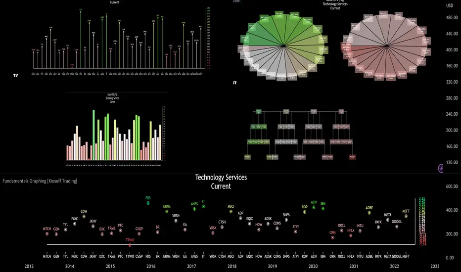
Fundamentals Graphing [Kioseff Trading]Hello!
This script "Fundamental Comparison" allows you to compare almost any fundamental metric across 40 assets; various charting methods are employable!
Thank you to @TradingView / @PineCoders for providing the framework in the "Financials on Chart" indicator - thereby expediting a generous portion of work (:
Features
Most metrics included in the "Financials on Chart" indicator are graphable
Scatter chat
Histogram
Bar chart
Pie chart
Reversible scaling
Adjusts to the size of your chart
10 industry presets
Custom symbol dataset
Retrieve, graph, and compare fundamental data by quarter/year. The indicator can "look back" to grab fundamental data from previous quarters/years.
Sortable data - ascending/descending
Built-in search function
Self-Adjusting Graph
The graph adjusts to the orientation/size of your chart!
The image above shows the graph on a price chart with a 229 bar difference.
The image above shows the same price chart; however, there's now a 1941 bar difference to which the fundamentals graph automatically adjusts!
The images above show the same expansion/reduction for the pie chart; all graph types shrink and expand with the price chart.
Fundamental Metrics
The image above shows most of the settings for the indicator!
Most of the metrics from the "Financials on Chart" indicator are included!
Quarterly or annual data are retrievable, in addition to industry presets.
Additionally, you can retrieve the financial data any number of intervals back (so long as the data exists and is provided by TradingView)
The image above shows an example of retrieving a fundamental metric from a previous FQ. The same can be done with FY!
Sortable Data
All data retrieved by the indicator is sortable - allowing for, hopefully, easier evaluations (:
The image above exemplifies the capability!
Data from any quarter/year can be sorted similarly.
Reversible Scale / Reversible Color Scheme
A seemingly trivial feature: a reversible scale and color scheme should assist in instances where "a higher number is bad" and a "lower number is good" - in addition to other scenarios.
For instance,
The image above shows a graph for taxes. The scale and color scheme have not been reversed and, presently, larger columns are correlating to a smaller amount of money out/in than smaller columns.
This can be fixed by reversing the scale.
The image above shows the "Reverse Scale" feature selected. Consequently, larger columns correlate to a larger amount of money out/in.
Similarly, a "Reverse Colors" feature is available. A useful option when a more positive number is "bad" and a less positive number is "good".
For instance,
The image above shows graphing for the Beneish M-Score.
A more positive number is generally interpreted as "bad"; a less positive number is generally interpreted as "good".
However, our color scheme doesn't seem to correspond (unless one considers red = good and green = bad)
Let's enable the reverse color feature.
The image above shows the completion of the process!
Finally, there's a built-in search feature that's a bit difficult to use; however, should you grow comfortable with it you may save some time sorting through fundamental data.
Big thanks to @rumpypumpydumpy for providing an easy-to-work-with framework for the pie chart!
That's all for now; thank you for checking this out.
MVRV Z Score and MVRV Free Float Z-ScoreIMPORTANT: This script needs as much historic data as possible. Please run it on INDEX:BTCUSD , BNC:BLX or another chart of sufficient length.
MVRV
The MVRV (Market Value to Realised Value Ratio) simply divides bitcoins market cap by bitcoins realized market cap. This was previously impossible on Tradingview but has now been made possible thanks to Coinmetrics providing us with the realized market cap data.
In the free float version, the free float market cap is used instead of the regular market cap.
Z-Score
The MVRV Z-score divides the difference between Market cap and realized market cap by the historic standard deviation of the market cap.
Historically, this has been insanely accurate at detecting bitcoin tops and bottoms:
A Z-Score above 7 means bitcoin is vastly overpriced and at a local top.
A Z-Score below 0.1 means bitcoin is underpriced and at a local bottom.
In the free float version, the free float market cap is used instead of the regular market cap.
The Z-Score, also known as the standard score is hugely popular in a wide range of mathematical and statistical fields and is usually used to measure the number of standard deviations by which the value of a raw score is above or below the mean value of what is being observed or measured.
Credits
MVRV Z Score initially created by aweandwonder
MVRV initially created by Murad Mahmudov and David Puell

Financial Data 8 YearsThis indicator will show the financial data of stock.
4 items is allowed to select.
especially item no 4, will show in each quarters below.
it simply give the raw data of financial data over 8 years (when combine annual and quarter data together).
feel free to give me feedback.
Disclaimer.
- The data may not be correct. Check and Confirm before use. Use at your own risk.

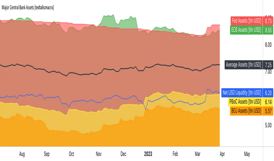
Major Central Bank Assets [tedtalksmacro]This script shows the balance sheets of the world's major central banks, the ECB [ FRED:ECBASSETSW , the PBoC [ ECONOMICS:CNCBBS , the Fed [ ECONOMICS:USCBBS and the BOJ [ FRED:JPNASSETS
Central banks drive the world's financial system and are the largest providers of liquidity so it is important to track whether they are providing or withdrawing liquidity from markets. Direct correlations between asset prices and central bank liquidity levels can be drawn.
IMPORTANT NOTES:
- Use this script on timeframes > 1D for greatest accuracy.
- Also included in the net effect of the reverse repo operations and treasury general account in the US.
- Ensure to turn labels on so that you can understand which line is what central bank!
- The black line shows the average, smoothed assets for the largest central banks... closest I could achieve to the net effect given scaling limitations of pinescript.
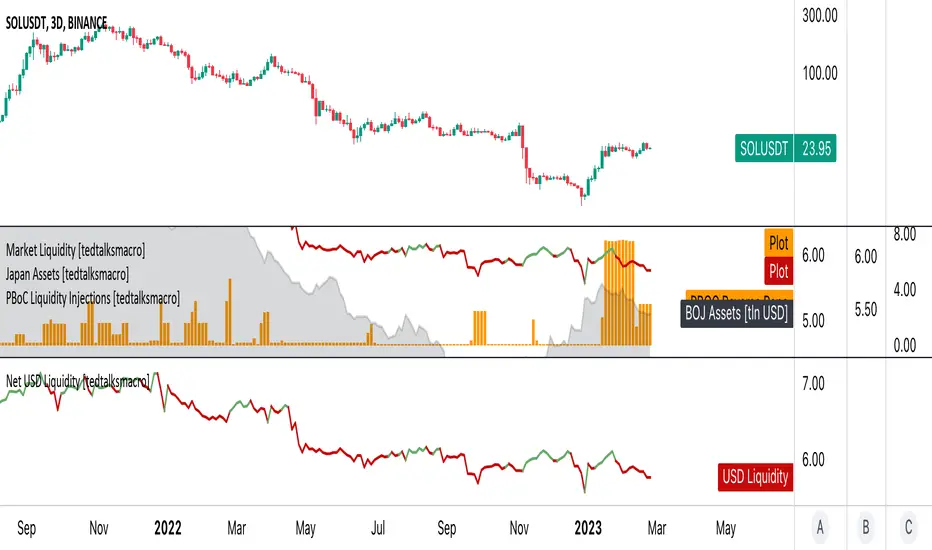
PBoC Liquidity Injections [tedtalksmacro]This script shows open market operations by the world's fourth largest central bank (by assets) - the people's bank of china.
Use this script on the 1D timeframe and higher to understand where there are periods of heightened intervention by the PBoC where financial conditions in China are loosened! Looser financial conditions often correlate with higher risk asset prices.
Takes into account:
- PBoC RR operations [ ECONOMICS:CNLIVRR ]

USD Market Liquidity [tedtalksmacro]This script aggregates and analyses total USD market liquidity in trillions of dollars - albeit with lagged, weekly data (live data is not available in TradingView!)
There's a positive correlation with the total liquidity available in the world's largest economy and risk assets like BITSTAMP:BTCUSD
The formula for net liquidity is as follows and uses account balances at the Fed and of the Treasury's General Account:
Fed Balance Sheet ECONOMICS:USBBS — Accepted Reverse Repo Bids FRED:RRPONTTLD — Treasury General Account Balance FRED:WTREGEN
This script shows positive prints when liquidity is above it's 7 day EMA and negative when below... don't use this on timeframes lower than the 1D chart!
Grenblatt Magic FormulaThe magic formula is an investing strategy created by Joel Greenblatt that focuses on finding the best price to buy certain companies in order to maximize returns. When Greenblatt coined the term magic formula investing, his portfolio had a return of 24% from 1998 to 2009.
This means that $10,000 invested at 24% for the period would have turned into just over $1 million. A fund based on the S&P 500 index for the same period would have turned that $10,000 into just under $75,000.1
Note
Bigger returns matter, especially over long periods, due to the power of compounding.
Others who ran their own experiments were not able to duplicate Greenblatt's high returns but still yielded positive results. As a result, investing experts agree that the strategy of magic formula investing outperforms the indexes. In most cases, though, it doesn't seem to beat indexes by as much as Greenblatt indicated when he introduced the concept in his book, The Little Book That Beats the Market.
There are two ratios in the magic formula. The first is the earnings yield: EBIT /EV. This is earnings before interest and taxes divided by enterprise value.A simpler and more common version of this ratio is earnings /price. Greenblatt prefers EBIT over earnings , because EBIT more accurately compares companies with different tax rates. EV is preferred to share price because EV also factors in the company's debt. Therefore, EBIT /EV provides a better picture of overall earnings than earnings /price.
The second ratio is return on capital, which is EBIT /(Net Fixed Assets + Working Capital)
The first ratio looks at earnings before interest and taxes compared to enterprise value. The second ratio focuses on the earnings relative to tangible assets. Many assets listed on the balance sheet depreciate over time as their usefulness is used up. These types of assets are called "fixed assets."
Net fixed assets are fixed assets minus all the accumulated depreciation and any liabilities associated with the asset. This gives a more accurate sense of the real value of a company's assets, compared to just looking at the total asset number on the balance sheet . Working capital is also part of this ratio and is current assets minus current liabilities. This gives a picture of whether the company is likely able to continue operations in the short term.
While the two ratios in the magic formula look small, they actually are computing a lot of data about the inner workings of a company, including:
Earnings
Interest
Tax rates
Equity price
Debt
Depreciation of assets
Current assets
Current liabilities
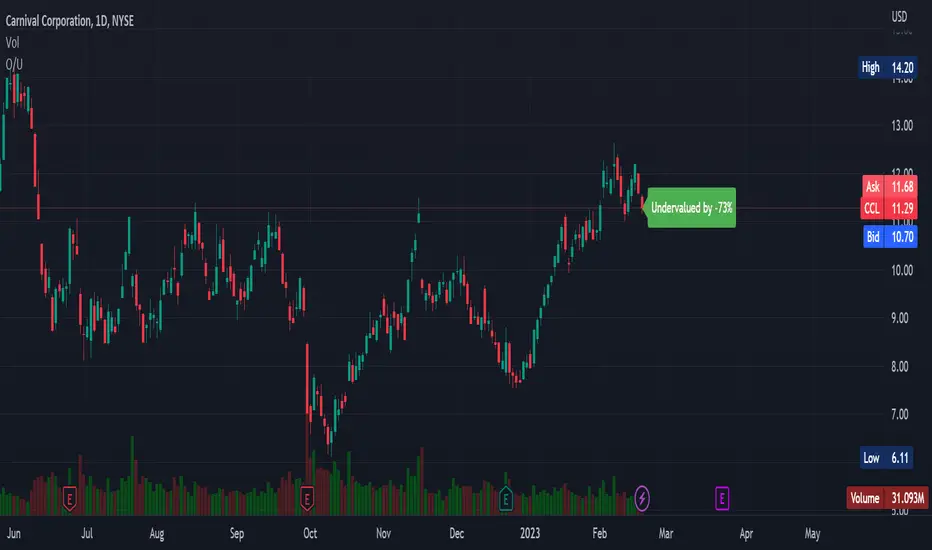
Overvalued/Undervalued OverlayThis indicator will tell you whether the security you are looking at is overvalued or undervalued using a company's total assets and their market cap. In theory, a company's total assets is everything that they own, which then should technically be how much the company is worth. Therefore, if the company's market cap is higher than their total assets, the indicator will read "Overvalued by X%". However, if the company's market cap is lower than their total assets, the indicator will read "Undervalued by X%". If you have any questions, feel free to let me know. Keep in mind that this indicator should be only used for long-term investing.
Gold Value RainbowThis indicator can only be used with 'GOLD' ticker. It is used to estimate Gold valuation based on major countries base money supply M0 such as US, EU, JP and CN. These 4 countries represent nearly 75% of total global money supply in the world. The chart will compare how gold value will move alongside with base money supply for comparison study. The chart presented here is just a relative comparison with some scaling and shifting so it doesn't refers to any real measurement. However it can be used to track gold price whether it's too cheap or too expensive in relative to money supply available in the market.
- The gray line represent major countries money supply M0
- The rainbow above the gray line represent the multiplication factors from 1x, 2x, ..., 10x
- The rainbow below the gray line represent the division factors from 0.8x, 0.6x, ..., 0.2x
Check other script to value stock and index:
- Stock Value Rainbow: script to value stock based on book value, earning, dividend and cash flow
- Index Value Rainbow: script to value index based on fed balance sheet and base money supply
- Gold Value Rainbow: script to value gold based on global money supply
- Stock Value US: script to check US stock value
- Stock Value EU: script to check EU stock value
- Stock Value JP: script to check JP stock value
- Stock Value CN: script to check CN stock value
Index Value RainbowThis indicator is used to estimate Index valuation based on each countries base money supply M0. The chart will compare how the index value will move alongside with base money supply for comparison study. The chart presented here is just a relative comparison with some scaling and shifting so it doesn't refers to any real measurement. However it can be used to track the index whether it's too cheap or too expensive in relative to money supply available in the market.
- The gray line represent the money supply M0
- The rainbow above the gray line represent the multiplication factors from 1x, 2x, ..., 10x
- The rainbow below the gray line represent the division factors from 0.8x, 0.6x, ..., 0.2x
This indicator can only be used with specific indices mentioned below. Currently can be used to estimate the value of largest indices by market cap:
- US Index - based on Fed Balance Sheet (SPX, NDX, DJI, RUI, RUT, RUA, ES1!, NQ1!, YM1!, RTY1!)
- EU Index - based on M1 Money Supply (N100, EU500)
- JP Index - based on M0 Money Supply (NI225, NKY)
- CN Index - based on M0 Money Supply (000001, 399001)
- HK Index - based on M0 Money Supply (HSI)
- SG Index - based on M0 Money Supply (STI)
- CA Index - based on M0 Money Supply (TSX)
- AU Index - based on M0 Money Supply (ASX200, AUS200)
- ID Index - based on M0 Money Supply (COMPOSITE)
Check other script to value stock and index:
- Stock Value Rainbow: script to value stock based on book value, earning, dividend and cash flow
- Index Value Rainbow: script to value index based on fed balance sheet and base money supply
- Gold Value Rainbow: script to value gold based on global money supply
- Stock Value US: script to check US stock value
- Stock Value EU: script to check EU stock value
- Stock Value JP: script to check JP stock value
- Stock Value CN: script to check CN stock value

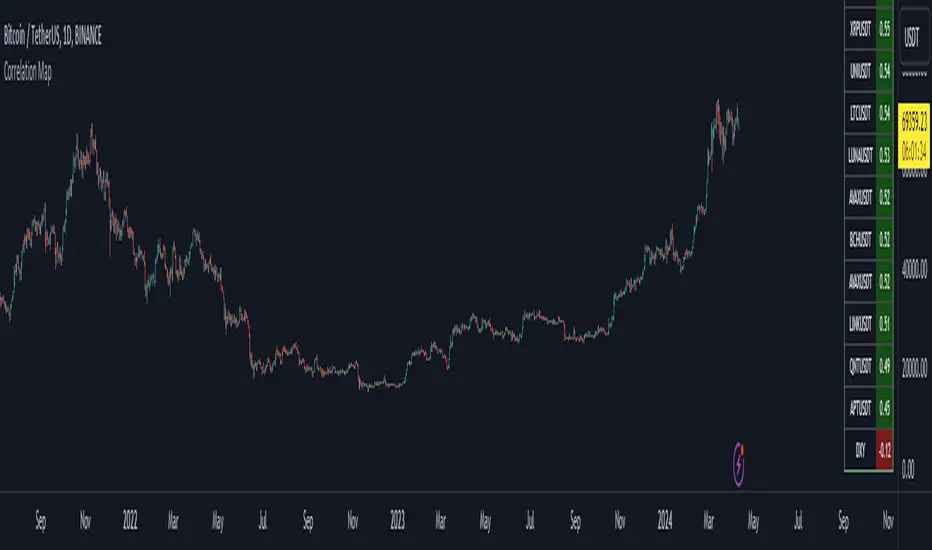
Bitcoin Correlation MapHello everyone,
This indicator shows the correlation coefficients of altcoins with bitcoin in a table.
What is the correlation coefficient?
The correlation coefficient is a value that takes a value between 0 and 1 when a parity makes similar movements with the reference parity, and takes a value between 0 and -1 when it makes opposite movements.
In order to obtain more meaningful and real-time results in this indicator, the weighted average of the correlation values of the last 200bar was used. You can change the bar length as you wish. With the correlation value, you can see the parities that have similar movements with bitcoin and integrate them into your strategy.
You can change the coin list as you wish, and you can also calculate their correlation with etherium instead of bitcoin .
The indicator shows the correlation value of 36 altcoins at the moment.
The indicator indicates the color of the correlated parities as green and the color of the inversely correlated parities as red.
Cheers
Dark Energy Divergence OscillatorThe Dark Energy Divergence Oscillator (DEDO)
What makes The Universe grow at an accelerating pace?
Dark Energy.
What makes The Economy grow at an accelerating pace?
Debt.
Debt is the Dark Energy of The Economy.
I pronounce DEDO "Deed-oh", but variations are fine with me.
Note: The Pine Script version of DEDO is improved from the original formula, which used a constant all-time high calculation in the normalization factor. This was technically not as accurate for calculating liquidity pressure in historical data because it meant that historical prices were being tested against future liquidity factors. Now using Pine, the functions can be normalized for the bar at the time of calculation, so the liquidity factors are normalized per candle, not across the entire series, which feels like an improvement to me.
Thought Process:
It's all about the liquidity. What I started with is a correlation between major stock indices such as SPX and WRESBAL , a balance sheet metric on FRED
After September 2008, when QE was initiated, many asset valuations started to follow more closely with liquidity factors. This led me to create a function that could combine asset prices and liquidity in WRESBAL , in order to calculate their divergence and chart the signal in TradingView.
The original formula:
First, we don't want "non-QE" data. we only want data for the market affected by QE .
So, find SPX on the day of pre-QE: 1255.08 and subtract that from the 2022 top 4818.62 = 3563.54
With this post-QE SPX range, now you can normalize the price level simply by dividing by the range = ( SPX -1255.08)/3563.54)
Normalization produces values from 0 to 1 so that they can be compared with other normalized figures.
In order to test the 0 to 1 normalized SPX range measure against the liquidity number, WRESBAL , it's the same idea: normalize it using the max as the denominator and you get a 0 to 1 liquidity index:
( WRESBAL /4276000000000)
Subtract one from the other to get the divergence:
(( WRESBAL /4276000000000)-(( SPX -1255.08)/3563.54))*10
x10 to reduce decimal places, but this option is configurable in DEDO's input settings tab.
Positive values indicate there's ample liquidity to hold up price or even create bullish momentum in some cases. Negative values mean price levels are potentially extended beyond what liquidity levels can support.
Note: many viewers of the charts on social media wanted the values to go down in alignment with price moving down, so inverting the chart is what I do with Option + I. I like the fact that negative values represent a deficit in liquidity to hold up price but that's just me.
Now with Pine Script and some help from other liquidity focused accounts on TradingView , I was able to derive a script that includes central bank liquidity and Reverse Repo liquidity drain, all in one algorithm, with adjustable settings.
Central bank assets included in this version:
-JPY (Japan)
-CNY (China)
-UK (British Pound)
-SNB (Swiss National Bank)
-ECB (European Central Bank )
Central Bank assets can be adjusted to an allocation % so that the formula is adjusted for the market cap of the asset.
A handy table in the lower right corner displays useful information about the asset market cap, and percentage it represents in the liquidity pool.
Reverse repo soak is also an optional addition in the Input settings using the RRPONTSYD value from FRED. This value is subtracted from global liquidity used to determine divergence since it is swept away from markets when residing in the Fed's reverse repo facility.
There is an option to draw a line at the Zero bound. This provides a convenience so that the line doesn't keep having to be redrawn on every chart. The normalized equation produces a value that should oscillate around zero, as price/valuation grows past liquidity support, falls under it, and repeats in cycles.

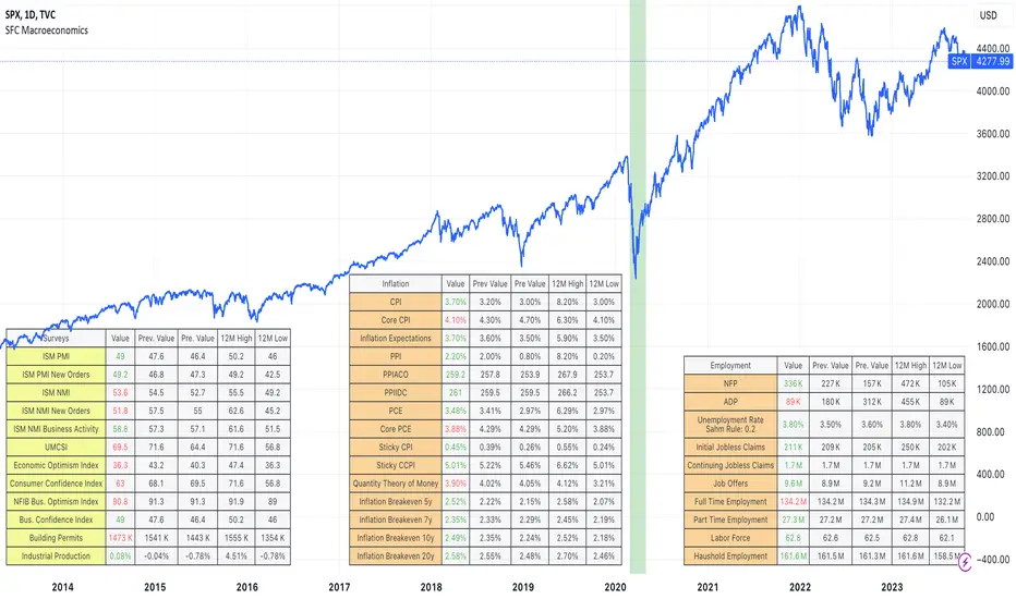
SFC MacroeconomicsThe Macroeconomics indicator can give us an instant view of the most important economic indicators. The indicator displays different tables in different sectors:
- Money : It give us a basic information about the money indicators in USA;
- Surveys: They are usually used as leading indicators.
- Inflation: It is showing overall inflation in the country
- Employment: Provides deep information about the current labor market
- Government: Usually legging indicators, but providing very good information about the USA
- Others: Few important indicators, for example GDP.
How we can use the indicator:
1) The indicator can be used to help traders, getting an instant overview of the economic indicators, helping them to create the Macroeconomic analysis.
2) The indicator can be use as a preparation before the high-impact news.
Note:
Yellow colour - leading indicators
Orange colour - legging indicators
Tables are showing the current data, also 12 months high and low. This is very important information, because it shows the extremes and normally if the current data is 12 months high or low it will be observed by the big players.
Before use this indicator, traders need basic macroeconomic understanding. A good knowledge is required in order to take advantage of the indicators and create the economic analysis or bias.
Global Net LiquidityShows the value of Global Net Liquidity.
Currently defined as:
Fed + Japan + China + UK + ECB - RRP - TGA
where the first five components are central bank assets.

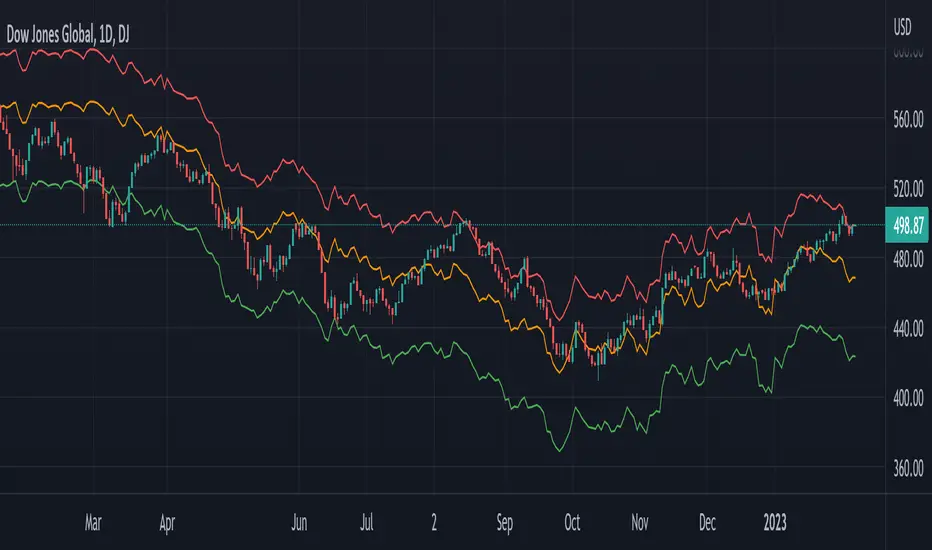
Global Net Liquidity - Dow Jones Global Fair ValueThis is similar to Global Net Liquidity - SPX Fair Value except it's for Dow Jones Global (symbol: W1DOW here on TradingView).
This is experimental and may change at any time.
Global Net Liquidity - SPX Fair ValueThis is similar to the SPX Fair Value Bands indicator.
It currently only displays the fair value.
The original SPX Fair Value formula only includes the Fed balance sheet data.
This indicator incorporates the following central bank assets:
Fed
Japan
China
UK
ECB
This is currently experimental. Feel free to explore using different formula constants.

ONCHAIN: BTC HOLDERS/RETAIL Assets RatioThis indicator is based on on-chain data developed exclusively for Bitcoin
This indicator measures the ratio of Hodlers' assets to Retails' assets based on the On-chain data of Intotheblock platform (you can find it on Sources). This is consistent with Wyckoff's theory of accumulation and distribution. At the top of the market, Hodlers have sold most of their assets to retailers, so this ratio is at its lowest. At market bottoms, Hodlers accumulates the asset at low prices. The uptrend and downtrend of this indicator can also be used to confirm the uptrend or downtrend of the Bitcoin market.

Kitti-Playbook request.earnings R0.0Date: Feb 5 2023
Objective :
Display Earnings per share
Calculation :
Get Earning value by use Function "request.earnings "
Display :
Plot Earnings Data
Earnings History Tab

Financials - Comparing CompaniesHello All
For a while I have been working on this indicator to compare financials of the companies and sort them accordingly. Finally I completed and published it. I preferred using new object type feature in Pine language™ and I hope it might be an example and helpful for the developers.
First of all, as we have limitation on security calls, the indicator can get and compare financials for 5 companies only. also Chart time frame must be 1Day or higher! ( I recommend 1Day time frame ). if not then the indicator stops and shows the error message: "Please set the time frame 1Day or higher" . More important than others: You should choose the companies from the same sector! Compare apples to apples :)
The Financials in the indicator:
Earnings Per Share
Price to Earnings Ratio
Price to Sales Ratio
Price to Book Ratio
Profit Margin
Dept to Equity
Current Ratio
Market Capitalization
Also more information shown for each stocks:
Closing Price, sets the color accordingly
2 Simple/Exponential moving average, you can set the length, also it checks if it is rising/falling and sets the color accordingly
Volume info
Average volume (20 days), you can set the period
Currency for each security
Lets see some features in it:
it sorts the companies according to the financials:
If you move the mouse onto any header then it shows explanation about the financial:
You can change location and text size:
You can set the type of Moving averages as SMA or EMA and you can also set the length for both . Headers for both are changed automatically by MA type and length
Colors for Closing price and MA cells are set automatically:
For new Objects in Pine language click here
P.S. You can use this indicator while analyzing the financials of the companies in same sector/industry. So please don't ask for the alerts :)
Enjoy!

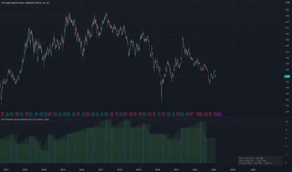
Kitti-Playbook request.dividends R0.0 Date Feb 5 2023
Objective : Display Dividends Amount per Share
Calculation :
Use function ==> request.dividends(ticker, field, gaps, lookahead, ignore_invalid_symbol, currency )
Display : The value get from " request.dividends "
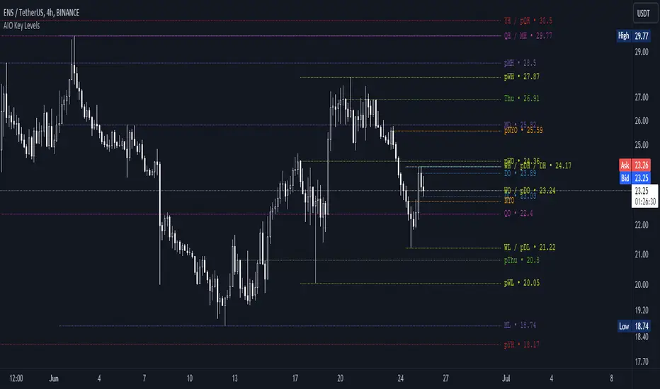
AIO Key LevelsAll In One Key Levels - Displays key levels for any type of chart.
Over 30 levels at your complete disposal.
Filled with a host of features that allow you to customise the appearance and display of the indicator to suit your individual trading style.
The result is a clear and concise indicator that helps traders easily identify key levels.
- The indicator is easy to use and does not need a detailed description.
- With customisable input parameters such as display style, line style, font style, offset, threshold and index.
- The colours for the key levels can also be customised.
- The script uses a 'switch' function and selected input parameters to set display, line and font styles.
- The key levels are constructed using the data received and the selected styles and colours.
- A unique cycle helps to improve the readability of the levels without "polluting" the graph with multiple labels
- In addition, I have left hints in the indicator to help you understand it better.
For Pine coders.
Why did I create it when there are many counterparts?
Simply because counterparts have very large and complex code and modest functionality and flex.
Here I have managed to fit it into 100 lines still readable.
You can learn how to call lots of lines and marks with just one function.
I also created a unique loop that connects labels if they are too close together for better visibility on a plot.
I have left detailed comments for each action.
I would be glad if someone could tell me how to make it more easier.