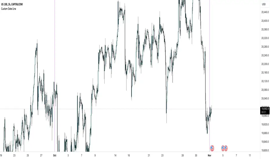
Globex time (New York Time)This indicator is designed to highlight and analyze price movements within the Globex session. Primarily geared toward the Globex Trap trading strategy, this tool visually identifies the session's high and low prices, allowing traders to better assess price action during extended hours. Here’s a comprehensive breakdown of its features and functionality:
Purpose
The "Globex Time (New York Time)" indicator tracks price levels during the Globex trading session, providing a clear view of overnight market activity. This session, typically running from 6 p.m. ET (18:00) until the following morning at 8:30 a.m. ET, is a critical period where significant market positioning can occur before the regular session opens. In the Globex Trap strategy, the session high and low are essential levels, as price movements around these areas often indicate potential support, resistance, or reversal zones, which traders use to set up entries or exits when the regular trading session begins.
Key Features
Customizable Session Start and End Times
The indicator allows users to specify the exact start and end times of the Globex session in New York time. The default settings are:
Start: 6 p.m. ET (18:00)
End: 8:30 a.m. ET
These settings can be adjusted to align with specific market hours or personal preferences.
Session High and Low Identification
Throughout the defined session, the indicator dynamically calculates and tracks:
Session High: The highest price reached within the session.
Session Low: The lowest price reached within the session.
These levels are essential for the Globex Trap strategy, as price action around them can indicate likely breakout or reversal points when regular trading resumes.
Vertical Lines for Session Start and End
The indicator draws vertical lines at both the session start and end times:
Session Start Line: A solid line marking the exact beginning of the Globex session.
Session End Line: A similar vertical line marking the session’s conclusion.
Both lines are customizable in terms of color and thickness, making it easy to distinguish the session boundaries visually on the chart.
Horizontal Lines for Session High and Low
At the end of the session, the indicator plots horizontal lines representing the Globex session's high and low levels. Users can customize these lines:
Color: Define specific colors for the session high (default: red) and session low (default: green) to easily differentiate them.
Line Style: Options to set the line style (solid, dashed, or dotted) provide flexibility for visual preferences and chart organization.
Automatic Reset for Daily Tracking
To adapt to the next trading day, the indicator resets the session high and low data once the current session ends. This reset prepares it to start tracking new levels at the beginning of the next session without manual intervention.
Practical Application in the Globex Trap Strategy
In the Globex Trap strategy, traders are primarily interested in price behavior around the high and low levels established during the overnight session. Common applications of this indicator for this strategy include:
Breakout Trades: Watching for price to break above the Globex high or below the Globex low, indicating potential momentum in the breakout direction.
Reversal Trades: Monitoring for failed breakouts or traps where price tests and rejects the Globex high or low, suggesting a reversal as liquidity is trapped in these zones.
Support and Resistance Zones: Using the session high and low as key support and resistance levels during the regular trading session, with potential entry or exit points when price approaches these areas.
Additional Configuration Options
Vertical Line Color and Width: Define the color and thickness of the vertical session start and end lines to match your chart’s theme.
Upper and Lower Line Colors and Styles: Customize the appearance of the session high and low horizontal lines by setting color and line style (solid, dashed, or dotted), making it easy to distinguish these critical levels from other chart markings.
Summary
This indicator is a valuable tool for traders implementing the Globex Trap strategy. It visually segments the Globex session and marks essential price levels, helping traders analyze market behavior overnight. Through its customizable options and clear visual representation, it simplifies tracking overnight price activity and identifying strategic levels for potential trade setups during the regular session.
Fundamental Analysis

X-Force Selector中文說明
X-Force 篩選者 是基於 Mark Minervini 概念設計的強勢標的篩選指標,旨在幫助交易者捕捉市場中的極端強勢標的。此指標運用多重篩選條件,使交易者能在價格達到特定關鍵位置時精準進場,專注於上漲動能強勁、突破阻力較小的標的。
指標篩選條件
100% 關鍵價位:當價格位於365根K棒的最低點的100%之上時,顯示該標的處於強勢區域,具備顯著的上漲動能。
25% 高點價位:同時,當價格位於365根K棒的高點以下25%之上時,代表該標的上方阻力較小,是一個潛在的突破信號。
滿足以上兩個條件的標的才會被視為進場機會,這符合 Minervini 所強調的「專注於強勢標的」的策略。Minervini 的概念強調當標的價格突破關鍵價位時,可能帶來更高的回報潛力,且風險相對較小。
加密貨幣與時間周期的應用
在加密貨幣交易中,1小時到4小時的小時間框架適合使用100%、66%、33%這些百分比範圍參數,以反映市場的高波動特性。對於更短周期,建議進一步縮小百分比,以提高指標對短期波動的敏感度,並增強篩選結果的準確性。
靈活的篩選與戰警風格
此指標的設計結合了 Minervini 的概念和戰警風格,旨在精準鎖定極具潛力的突破標的。X-Force 篩選者適合追隨趨勢的交易者,尤其是熱衷於 Mark Minervini 策略的投資者,使交易者能夠專注於市場中最具上漲動能的標的,實現更精確的進場決策。
English Description
X-Force Selector is a powerful trend-filtering indicator inspired by Mark Minervini’s trading concepts, designed to help traders capture assets with extreme strength in the market. By applying multiple filtering criteria, this indicator enables precise entry decisions when price reaches specific key levels, focusing on assets with strong upward momentum and minimal resistance.
Indicator Selection Criteria
100% Key Price Level: When the price is above 100% of the lowest low over the past 365 bars, it indicates the asset is in a strong zone with substantial upward momentum.
25% High Price Level: Additionally, when the price is within 25% below the 365-bar high, it signals reduced resistance above, indicating potential for a breakout.
Assets meeting both criteria are considered potential entry opportunities, aligning with Minervini's strategy of “focusing on strong assets.” Minervini’s concept emphasizes capturing high-potential assets as they break through critical levels, aiming for higher returns with relatively low risk.
Application to Cryptocurrency and Timeframes
In cryptocurrency trading, shorter timeframes such as 1H to 4H are well-suited for the 100%, 66%, and 33% thresholds, reflecting the high volatility of crypto markets. For even smaller timeframes, it is recommended to reduce these percentages to enhance the indicator’s sensitivity to short-term fluctuations, improving the accuracy of filtered results.
Flexible Filtering with a Battle-Ready Style
With a design inspired by Minervini's concepts and a battle-ready scanning approach, the X-Force Selector precisely locks onto high-potential breakout candidates. This indicator is ideal for trend-following traders, especially those applying Mark Minervini’s strategies, enabling them to concentrate on assets with the strongest upward momentum for precise entry decisions.

Adaptive Support & Resistance Zones Description:
The Enhanced Support and Resistance Zones indicator identifies and visualizes significant support and resistance areas on the chart, helping traders spot potential reversal or breakout points. This tool offers advanced customization options for zone thickness, lookback period, validation criteria, and zone expiration, making it adaptable for various trading styles and market conditions.
Key Features:
1. Zone Thickness Multiplier: The Zone Thickness Multiplier controls the visual “thickness” of each support and resistance zone, allowing traders to adjust the width based on volatility or personal preference. A higher multiplier increases the zone’s range, capturing a wider area around the support or resistance level.
2. Lookback Periods for Support and Resistance: The Lookback for Resistance and Lookback for Support inputs define the number of bars analyzed to identify swing highs and lows, respectively. This allows traders to adjust how far back the script should search for key levels, which can be useful when adjusting for different timeframes or varying levels of historical significance in zones.
3. Minimum Touch Count: To filter out weak zones, the Minimum Touch Count setting establishes the required number of price “touches” (or tests) within a zone before it’s considered valid. By increasing this value, traders can focus only on zones that the price has interacted with frequently, indicating stronger potential support or resistance.
4. Zone Expiration Bars: The Zone Expiration Bars setting enables automatic expiration of older zones, reducing chart clutter from outdated levels. This parameter specifies the maximum number of bars a zone will remain active after its creation. When the set limit is reached, the zone is cleared, allowing the indicator to stay responsive to more recent price action.
5. Dynamic Visualization by Touch Count: Zones with more touches are displayed with a thicker line, visually emphasizing the strength of these areas. Zones with fewer touches are shown with a thinner line, helping traders easily distinguish between stronger and weaker support and resistance levels.
6. Alerts for Zone Touches: Alerts can be configured to notify traders when the price touches the support or resistance zones, offering real-time notifications for potential trading opportunities.
How to Use:
1. Adjusting Zone Thickness: Use the Zone Thickness Multiplier to expand or contract the width of each zone. A higher multiplier may be beneficial in volatile markets, where price tends to fluctuate around levels rather than touching them precisely. Lower values can provide a more precise zone in less volatile environments.
2. Setting Lookback Periods for Zone Identification: The Lookback for Resistance and Lookback for Support inputs allow traders to define how many historical bars to analyze for determining key levels. Longer lookbacks may be useful on higher timeframes to capture more significant support or resistance, while shorter lookbacks can be suitable for lower timeframes or more recent levels.
3. Filtering with Minimum Touch Count: Increase the Minimum Touch Count to filter for stronger zones. For example, setting a minimum touch count of 3 will display only zones that have been tested by the price at least three times, indicating potentially stronger support or resistance.
4. Configuring Zone Expiration: Use Zone Expiration Bars to limit how long each zone remains on the chart, helping to keep the focus on more recent levels. Expiring zones after a set number of bars can be especially useful on lower timeframes, where older levels may no longer be relevant.
5. Using Alerts for Real-Time Notifications: Set up alerts to receive notifications when price enters the support or resistance zones, allowing you to monitor potential trade setups without needing to watch the chart continuously.
This indicator is well-suited for traders aiming to identify high-quality support and resistance areas while managing chart clarity. With these customizable options, traders can adapt the indicator to match their unique trading style and market focus. For best results, test these settings on your preferred timeframe and adjust parameters to fit specific trading goals and market conditions.

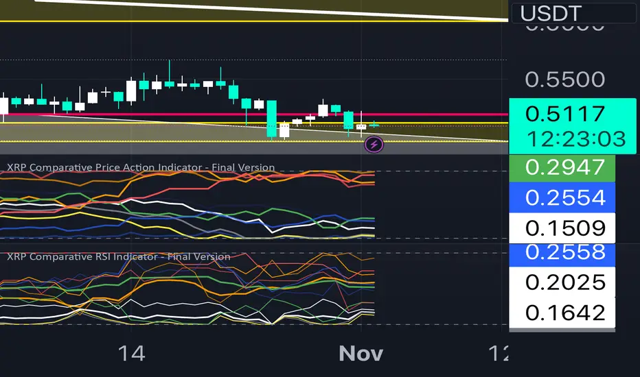
XRP Comparative RSI Indicator - Final VersionXRP Comparative RSI Indicator - Final Version
The XRP Comparative RSI Indicator offers a dynamic analysis of XRP’s market positioning through relative strength index (RSI) comparisons across various cryptocurrencies and major market indicators. This indicator allows traders and analysts to gauge XRP’s momentum and potential turning points within different market conditions.
Key Features:
• Normalized RSIs: Each RSI value is normalized between 0.00 and 1.00, allowing seamless comparison across multiple assets.
• Grouped Analysis: Three RSI groups provide specific insights:
• Group 1 (XRP-Specific): Measures XRPUSD, XRP Dominance (XRP.D), and XRP/BTC, focusing on XRP’s performance across different trading pairs.
• Group 2 (Market Influence - Bitcoin): Measures BTCUSD, BTC Dominance (BTC.D), and XRP/BTC, capturing the influence of Bitcoin on XRP.
• Group 3 (Liquidity Impact): Measures USDT Dominance (USDT.D), BTCUSD, and ETHUSD, evaluating the liquidity impact from key assets and stablecoins.
• Individual Asset RSIs: Track the normalized RSI for each specific pair or asset, including XRPUSD, BTCUSD, ETHUSD, XRP/BTC, BTC Dominance, ETH Dominance, and the S&P 500.
• Clear Color Coding: Each asset’s RSI is plotted with a unique color scheme, consistent with the first indicator, for easy recognition.
This indicator is ideal for identifying relative strengths, potential entry and exit signals, and understanding how XRP’s momentum aligns or diverges from broader market trends.
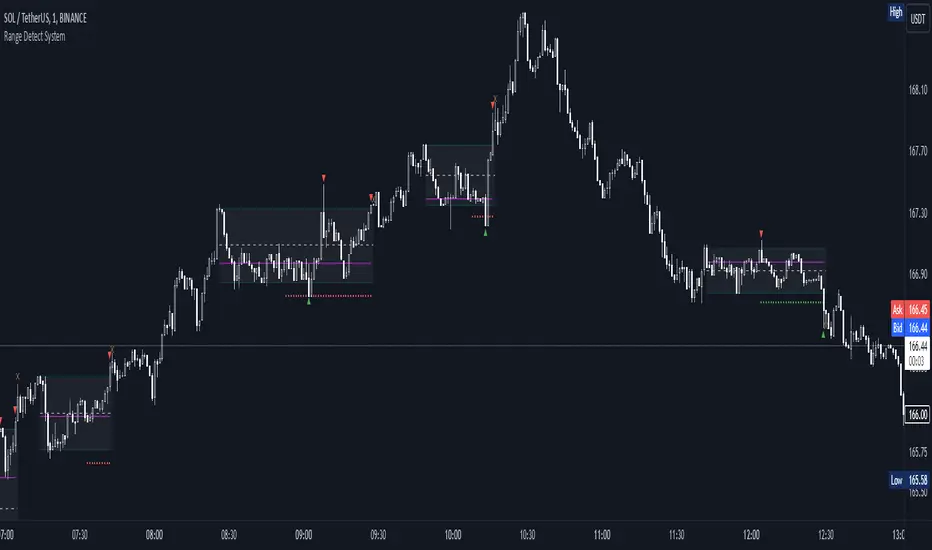
Range Detect SystemTechnical analysis indicator designed to identify potential significant price ranges and the distribution of volume within those ranges. The system helps traders calculate POC and show volume history. Also detecting breakouts or potential reversals. System identifies ranges with a high probability of price consolidation and helps screen out extreme price moves or ranges that do not meet certain volatility thresholds.
⭕️ Key Features
Range Detection — identifies price ranges where consolidation is occurring.
Volume Profile Calculation — indicator calculates the Point of Control (POC) based on volume distribution within the identified range, enhancing the analysis of market structure.
Volume History — shows where the largest volume was traded from the center of the range. If the volume is greater in the upper part of the range, the color will be green. If the volume is greater in the lower part, the color will be red.
Range Filtering — Includes multi-level filtering options to avoid ranges that are too volatile or outside normal ranges.
Visual Customization — Shows graphical indicators for potential bullish or bearish crossovers at the upper and lower range boundaries. Users can choose the style and color of the lines, making it easier to visualize ranges and important levels on the chart.
Alerts — system will notify you when a range has been created and also when the price leaves the range.
⭕️ How it works
Extremes (Pivot Points) are taken as a basis, after confirming the relevance of the extremes we take the upper and lower extremes and form a range. We check if it does not violate a number of rules and filters, perform volume calculations, and only then is the range displayed.
Pivot points is a built-in feature that shows an extremum if it has not been updated N bars to the left and N bars to the right. Therefore, there is a delay depending on the bars specified to check, which allows for a more accurate range. This approach allows not to make unnecessary recalculations, which completely eliminates the possibility of redrawing or range changes.
⭕️ Settings
Left Bars and Right Bars — Allows you to define the point that is the highest among the specified number of bars to the left and right of this point.
Range Logic — Select from which point to draw the range. Maximums only, Minimums only or both.
Use Wick — Option to consider the wick of the candles when identifying Range.
Breakout Confirmation — The number of bars required to confirm a breakout, after which the range will close.
Minimum Range Length — Sets the minimum number of candles needed for a range to be considered valid.
Row Size — Number of levels to calculate POC. *Larger values increase the script load.
% Range Filter — Dont Show Range is than more N% of Average Range.
Multi Filter — Allows use of Bollinger Bands, ATR, SMA, or Highest-Lowest range channels for filtering ranges based on volatility.
Range Hit — Shows graphical labels when price hits the upper or lower boundaries of the range, signaling potential reversal or breakout points.
Range Start — Show points where Range was created.
Bullish B's - RSI Divergence StrategyThis indicator strategy is an RSI (Relative Strength Index) divergence trading tool designed to identify high-probability entry and exit points based on trend shifts. It utilizes both regular and hidden RSI divergence patterns to spot potential reversals, with signals for both bullish and bearish conditions.
Key Features
Divergence Detection:
Bullish Divergence: Signals when RSI indicates momentum strengthening at a lower price level, suggesting a reversal to the upside.
Bearish Divergence: Signals when RSI shows weakening momentum at a higher price level, indicating a potential downside reversal.
Hidden Divergences: Looks for hidden bullish and bearish divergences, which signal trend continuation points where price action aligns with the prevailing trend.
Volume-Adjusted Entry Signals:
The strategy enters long trades when RSI shows bullish or hidden bullish divergence, indicating an upward momentum shift.
An optional volume filter ensures that only high-volume, high-conviction trades trigger a signal.
Exit Signals:
Exits long positions when RSI reaches a customizable overbought level, typically indicating a potential reversal or profit-taking opportunity.
Also closes positions if bearish divergence signals appear after a bullish setup, providing protection against trend reversals.
Trailing Stop-Loss:
Uses a trailing stop mechanism based on ATR (Average True Range) or a percentage threshold to lock in profits as the price moves in favor of the trade.
Alerts and Custom Notifications:
Integrated with TradingView alerts to notify the user when entry and exit conditions are met, supporting timely decision-making without constant monitoring.
Customizable Parameters:
Users can adjust the RSI period, pivot lookback range, overbought level, trailing stop type (ATR or percentage), and divergence range to fit their trading style.
Ideal Usage
This strategy is well-suited for trend traders and swing traders looking to capture reversals and trend continuations on medium to long timeframes. The divergence signals, paired with trailing stops and volume validation, make it adaptable for multiple asset classes, including stocks, forex, and crypto.
Summary
With its focus on RSI divergence, trailing stop-loss management, and volume filtering, this strategy aims to identify and capture trend changes with minimized risk. This allows traders to efficiently capture profitable moves and manage open positions with precision.
This Strategy BEST works with GLD!

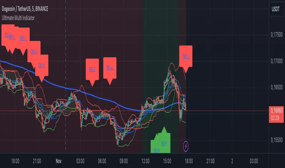
Ultimate Multi Indicator - by SachaThe Ultimate Multi Indicator: The Ultimate Guide To Profit
This custom indicator, the Ultimate Multi Indicator , integrates multiple trading indicators to have powerful buy and sell signals. I combined MACD, EMA, RSI, Bollinger Bands, Volume Profile, and Ichimoku Cloud indicators to help traders analyze both short-term and long-term price movements.
Key Components and How to Use Them
- MACD (Moving Average Convergence Divergence):
- Use for trend direction and potentiality of reversals.
- The blue line (MACD Line) crossing above the orange line (Signal Line) indicates a bullish reversal; the opposite signals a bearish reversal.
- Watch for crossovers to confirm the direction of smaller price movements.
- 200 EMA (Long) (Exponential Moving Average):
- Use to indicate a long-term trend direction.
- If the price is above the 200 EMA, the market is in an uptrend; below it suggests a downtrend.
- The chart’s background color shifts subtly green (uptrend) or red (downtrend) depending on the EMA's relative position.
- RSI (Relative Strength Index):
- Tracks momentum and overbought/oversold levels.
- RSI over 70 signifies overbought conditions; under 30 indicates oversold.
- Look for RSI turning points around these levels to identify potential reversals.
- Bollinger Bands :
- The price touching or crossing the upper Bollinger Band may mean overbought conditions are filled, while a touch at the lower band indicates oversold.
- Bollinger Band interactions often align with key reversal points, especially when combined with other signals.
- Volume Profile :
- A yellow VP line on the chart represents significant trading volume occurred.
- This line can be used as both a support and resistance level, and especially during consolidations or trend changes.
- Ichimoku Cloud :
- Identifies support/resistance levels and trend direction.
- Green and red cloud regions visually show if the price is above (bullish) or below (bearish) key levels.
- Price above the cloud (green) confirms a bullish market, while below (red) signals bearish.
Signal Conditions and Visualization
- Buy Signals :
- This is triggered right away when MACD crosses up, RSI is oversold, or price touches the lower Bollinger Band, provided price is above both the Ichimoku Cloud and the 200 EMA.
- A green “BUY” label appears below the bar, suggesting a potential entry.
- Sell Signals :
- This signal is generated when MACD crosses down, RSI is overbought, or price touches the upper Bollinger Band, and price is below the Ichimoku Cloud and the 200 EMA.
- A red “SELL” label is shown above the bar, indicating a potential exit.
Tips & Tricks
- Confirm Signals : Use multiple signals to confirm entries and exits. For example, if both the MACD and RSI align with the Ichimoku Cloud direction, the trade setup is stronger.
- Trend Directions : Only take buy signals if the price is above the 200 EMA, and sell signals if it is below, aligning trades with the overall trend.
- Adjust for Volatility : In high-volatility markets, especially in the crypto markets, pay close attention to the Bollinger Bands for breakout potential.
- Ichimoku as a Trend Guide : Use the Ichimoku Cloud as a guide for long-term support and resistance levels, especially for swing trades.
This multi-layered indicator gives a balanced blend of short-term signals and long-term trend insights, making it a versatile tool for day trading, swing trading, or even longer-term analysis.
Remember that indicators that will make you rich instantly don't exist. To expect minimum profit from them, you shouldn't trade all you have at the same time but only trade with the money you can afford to lose.
After that being said, I wish you traders luck with the Ultimate Multi Indicator!
Vertical Line on Custom DateThis Pine Script code creates a custom indicator for TradingView that draws a vertical line on the chart at a specific date and time defined by the user.
User Input: Allows the user to specify the day, hour, and minute when the vertical line should appear.
Vertical Line Drawing: When the current date and time match the user’s inputs, a vertical line is drawn on the chart at the corresponding bar, offset by one bar to align properly.
Customizable Color and Width: The vertical line is displayed in purple with a customizable width.
Overall, this indicator helps traders visually mark important dates and times on their price charts.
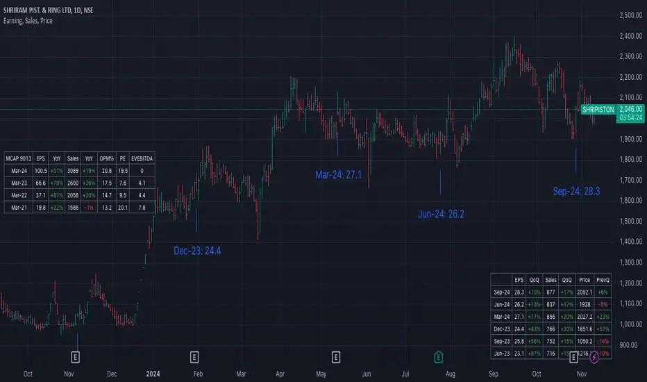
Earning, Sales, and PriceThis Pine Script indicator is designed to visualize and analyze the growth of Earnings Per Share (EPS) and Sales for a given stock over specified time periods. With a user-friendly interface, it allows traders and investors to monitor key financial metrics, helping them make informed decisions based on company performance.
The script presents earnings, sales, and price growth in a clear tabular format directly on the price chart. It features two distinct tables: one for annual data and another for quarterly metrics. For each financial metric, the script calculates and displays growth figures by comparing the current results with either the previous quarter's numbers or the previous year's figures. Additionally, it showcases the stock price along with the corresponding growth between these two data points, providing a comprehensive view of the stock's performance over time.
How to Use:
Typically, growth stocks will rally for a few quarters. However, after significant rallies, the stock needs rest. During this period, the stock will either consolidate or slide down slowly to take support at the key moving average. Importantly, during this time, sales and earnings may continue to grow while the stock is still consolidating.
Typically, after the stock consolidates significantly—even when sales and earnings numbers are increasing—the stock will finally start the next leg of the rally just before the next earnings date or immediately after the earnings report.
For this purpose, the script shows the EPS and sales growth. Additionally, the script displays the price when the previous earnings were declared along with the price growth. This data can be used to find patterns in the stock's behavior. Utilize this indicator to analyze growth patterns and make informed trading decisions based on historical performance and upcoming earnings expectations.
Key Metrics Analyzed:
Earnings Per Share (EPS): Monitors the diluted earnings per share to evaluate company profitability.
Total Revenue: Analyzes sales performance, providing insights into overall revenue generation.
Price Growth: Tracks changes in stock price alongside EPS and sales for comprehensive performance assessment.
Usage:
Ideal for investors and traders looking to evaluate company growth potential and make data-driven decisions.
Use in conjunction with other technical analysis tools for a holistic approach to stock analysis.
Gap Finder with Box FillSetup and Inputs
The indicator checks the current and previous candles to find gaps, using a color input for filling the gap area on the chart.
Gap Detection:
If the current candle opens higher than the previous close and doesn’t overlap with the previous candle’s range, it marks this as a gap-up.
If the current candle opens lower than the previous close without overlap, it’s marked as a gap-down.
Drawing the Gap:
When a gap-up or gap-down is found, the script draws a box from the previous close to the current candle’s low or high, filling it with the chosen color.
Benefits
Visual Aid: The filled box highlights gaps, making them easy to spot on the chart.
Trade Signals: Gaps can show strong market moves, helping traders spot potential entries or watch for reversals.
Customizable: You can adjust the color to fit your chart style, making the gaps stand out clearly.
This simple tool gives traders a quick view of gaps, which are often key points of interest in technical analysis.

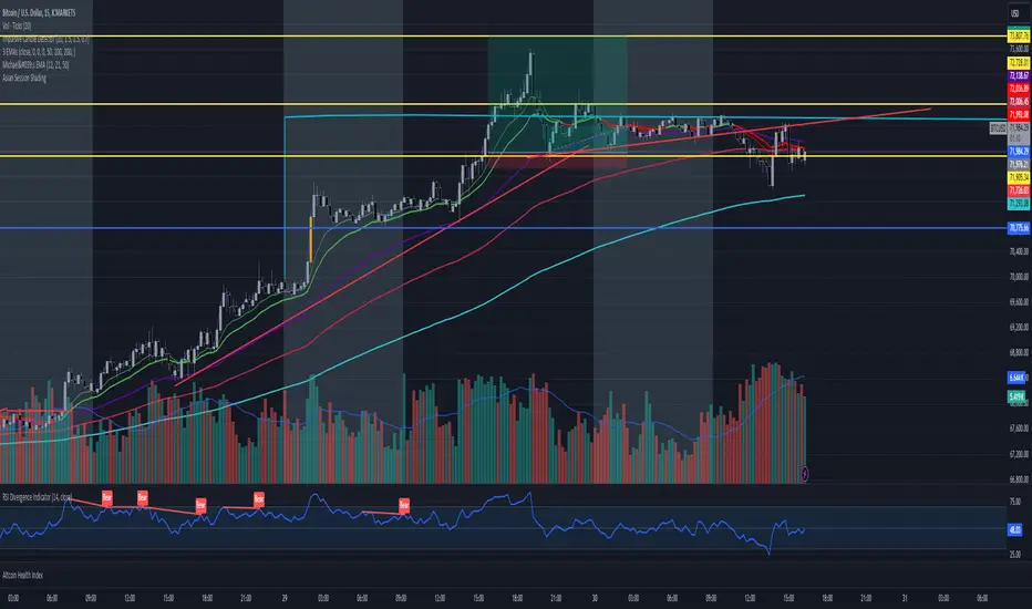
Asian Session ShadingDescription
The "Asian Session Shading" indicator is designed to highlight the trading hours of the Asian market session on TradingView charts. This script shades the background of the chart in a pale blue color to visually distinguish the time period of the Asian trading session. By using this indicator, traders can easily identify when the Asian session is active, helping them to analyze and make informed trading decisions based on time-specific market behavior.
Features
Customizable Timing: The session start and end times can be adjusted to fit different Asian market hours.
Visual Clarity: The pale blue shading helps to visually separate the Asian session from other trading sessions.
Easy to Use: Simple implementation with clear visual cues on the chart.
Best Use Cases
Market Analysis: Traders can use this indicator to analyze market movements and trends specific to the Asian trading session.
Trading Strategies: This tool can assist in developing and implementing trading strategies that take into account the unique characteristics of the Asian market.
Time Management: Helps traders to manage their trading schedule by clearly marking the start and end of the Asian session.
How to Use
Apply to Chart: Save and apply the indicator to your chart to see the shaded Asian session.
This indicator is particularly useful for forex traders, stock traders, and anyone looking to incorporate the Asian market's influence into their trading strategy.
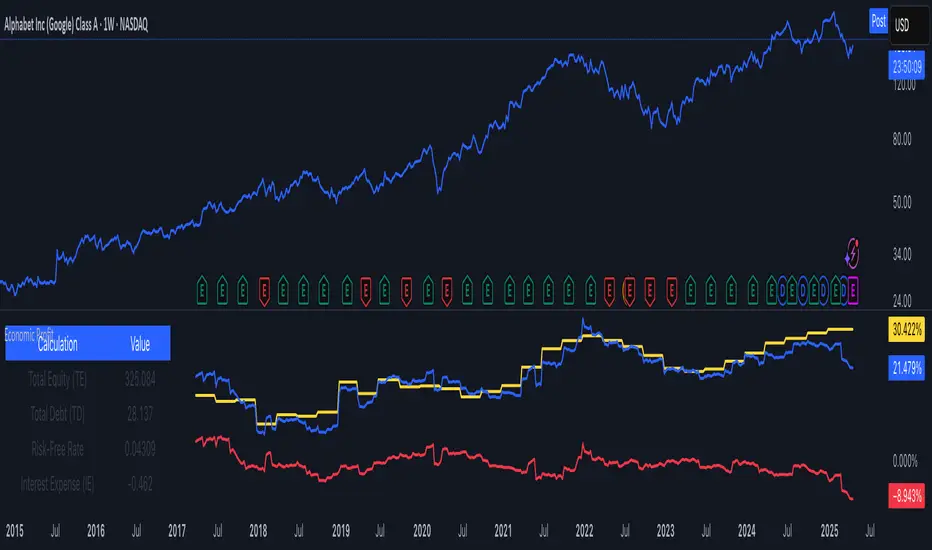
Economic Profit (YavuzAkbay)The Economic Profit Indicator is a Pine Script™ tool for assessing a company’s economic profit based on key financial metrics like Return on Invested Capital (ROIC) and Weighted Average Cost of Capital (WACC). This indicator is designed to give traders a more accurate understanding of risk-adjusted returns.
Features
Customizable inputs for Risk-Free Rate and Corporate Tax Rate assets for people who are trading in other countries.
Calculates Economic Profit based on ROIC and WACC, with values shown as both plots and in an on-screen table.
Provides detailed breakdowns of all key calculations, enabling deeper insights into financial performance.
How to Use
Open the stock to be analyzed. In the settings, enter the risk-free asset (usually a 10-year bond) of the country where the company to be analyzed is located. Then enter the corporate tax of the country (USCTR for the USA, DECTR for Germany). Then enter the average return of the index the stock is in. I prefer 10% (0.10) for the SP500, different rates can be entered for different indices. Finally, the beta of the stock is entered. In future versions I will automatically pull beta and index returns, but in order to publish the indicator a bit earlier, I have left it entirely up to the investor.
How to Interpret
We see 3 pieces of data on the indicator. The dark blue one is ROIC, the dark orange one is WACC and the light blue line represents the difference between WACC and ROIC.
In a scenario where both ROIC and WACC are negative, if ROIC is lower than WACC, the share is at a complete economic loss.
In a scenario where both ROIC and WACC are negative, if ROIC has started to rise above WACC and is moving towards positive, the share is still in an economic loss but tending towards profit.
A scenario where ROIC is positive and WACC is negative is the most natural scenario for a company. In this scenario, we know that the company is doing well by a gradually increasing ROIC and a stable WACC.
In addition, if the ROIC and WACC difference line goes above 0, the company is now economically in net profit. This is the best scenario for a company.
My own investment strategy as a developer of the code is to look for the moment when ROIC is greater than WACC when ROIC and WACC are negative. At that point the stock is the best time to invest.
Trading is risky, and most traders lose money. The indicators Yavuz Akbay offers are for informational and educational purposes only. All content should be considered hypothetical, selected after the facts to demonstrate my product, and not constructed as financial advice. Decisions to buy, sell, hold, or trade in securities, commodities, and other investments involve risk and are best made based on the advice of qualified financial professionals. Past performance does not guarantee future results.
This indicator is experimental and will always remain experimental. The indicator will be updated by Yavuz Akbay according to market conditions.
MCD - Meme Coin Dominance [Da_Prof]I took the meme coins in the top 100 according to CoinMarketCap and added their market caps together and divided by TOTAL. Ultimately, I see Tradingview doing a much better job once they create a dedicated symbol for this, but in the interim, I thought this might help all you degens.
Enjoy.
Da_Prof

Multi-Currency Economic IndicatorCreating a Multi-Currency Economic Indicator that incorporates data for USD, JPY, AUD, GBP, CHF, NZD, and CAD will provide valuable insights into the economic health of these currencies. By plotting key economic indicators such as interest rates and allowing for customization, users can effectively analyze and make informed decisions.
If you have any further modifications or specific features you would like to add, feel free to let me know!

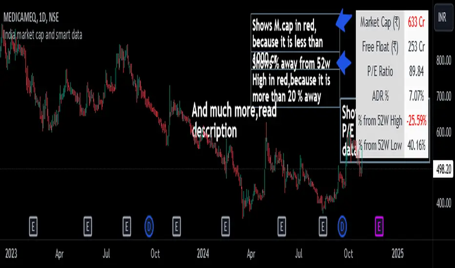
India market cap and smart dataThis indicator displays important financial and technical data, such as Market Cap, P/E Ratio, ADR %, etc.
It is specially designed for swing traders.
Key Features and Highlights
- Market Cap Alert: If the Market Cap of a stock is below 1000 crore , it is displayed in red to indicate a potential liquidity issue.
- P/E Ratio for Loss-Making Companies : For companies with net losses, the P/E ratio is shown as 0 and displayed in red , alerting you to the unprofitable status of the company.
- ADR Alert: When the ADR is below 4% , it is highlighted in red . Swing traders typically look for stocks with high ADR.
- 52-Week High Proximity: If a stock is more than 20% below its 52-week high , this data is shown in red .
- 52-Week Low Performance: If a stock is up by more than 70% from its 52-week low , the data is displayed in green , indicating strong performance.
Additional Features
- Toggle data points on or off as desired.
- Supports both dark and light modes.
- Position the table wherever preferred on the chart.
- Customize the ADR % calculation based on the desired number of days (default is 20 days).
Note: The calculation for the percentage away from the 52-week high is based on the closing price of the 52-week high candle, not the high price.
RiskMosaic | QuantEdgeBRisk On/Off System
This indicator acts as a comprehensive framework that integrates a diverse range of indicators—spanning liquidity, sentiment, market volatility, and macroeconomic factors—to construct a holistic view of risk.
By blending these varied components, the system identifies shifts in risk-on and risk-off environments, providing a complete and dynamic assessment of global market conditions.
This allows for more informed decision-making by capturing both localized and broad market influences in real time, enabling proactive risk management and the ability to adapt to rapidly changing conditions.
Composition :
4 different categories - each one equal weight
-> Mix of Global & U.S Liquidity
-> Mix of different macro factors
-> Mix of Crypto and Commodities
-> Mix of Volatility & Risk Indicators
Colors description:
- Green = strong = full risk on sentiment/environment
- Red = weak = full risk off sentiment/environment
- Blue = recovery = medium risk on sentiment/environment
- Purple = contraction = medium risk of sentiment/environment
-> Colors are based on oscillator line:
- crossing over 0 or 0.4 = green
- crossing under 0 or -0.5 = red
- crossing over -0.35 = blue
- crossing under 0.35 = purple

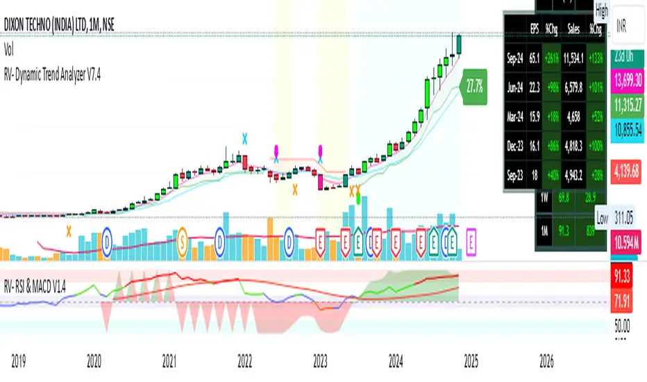
RV- Dynamic Trend AnalyzerRV Dynamic Trend Analyzer
The RV Dynamic Trend Analyzer is a powerful TradingView indicator designed to help traders identify and capitalize on trends across multiple time frames—daily, weekly, and monthly. With dynamic adjustments to key technical indicators like EMA and MACD, the tool adapts to different chart periods, ensuring more accurate signals. Whether you are swing trading or holding longer-term positions, this indicator provides reliable buy/sell signals, breakout opportunities, and customizable visual elements to enhance decision-making. Its intelligent use of EMAs and MACD values ensures high potential returns, making it suitable for traders seeking strong, data-driven strategies. Below are its core features and their respective benefits.
Supertrend Indicator:
Importance: The Supertrend is a trend-following tool that helps traders identify the market’s direction by offering clear buy and sell signals based on price movement relative to the Supertrend line.
Benefits:
Helps filter out market noise and enables traders to stay in trends longer.
The pullback detection feature enhances trade timing by identifying potential entry points during retracements.
ATH/ATL & 52-Week High/Low with Candle Coloring:
Importance: Tracking all-time highs (ATH), all-time lows (ATL), and 52-week high/low levels helps traders identify key support and resistance levels.
Benefits:
Offers insights into the strength of price movements and potential reversal zones.
Candle coloring improves visual analysis, allowing quick identification of bullish or bearish conditions at critical levels.
Multi-Time Frame Analysis
Importance: The ability to view indicators like RSI and MACD across multiple time frames provides a more in-depth and comprehensive view of market behavior, allowing traders to make informed decisions that align with both short-term and long-term trends.
Benefits:
Align Strategies Across Time frames: By using multiple time frames, traders can align their strategies with larger trends (such as weekly or daily) while executing trades on lower time frames (like 1-minute or 5-minute charts). This improves the accuracy of trade entries and exits.
Reduce False Signals: Viewing key technical indicators like RSI and MACD across different time frames reduces the likelihood of false signals by offering a broader market context, filtering out noise from smaller time frames.
Customization of Table Display: Traders can customize the position and size of a table that displays RSI and MACD values for selected time frames. This flexibility enhances visibility and ease of analysis.
Time frame-Specific Data: The code allows for displaying RSI and MACD data for up to seven different time frames, making it highly customizable for traders depending on their preferred analysis period.
Visual Clarity: The table displays key values such as RSI and MACD histogram readings in a visually clear format, with color coding to quickly indicate overbought/oversold levels or MACD crossovers.
Pivot Points:
Importance: Pivot points serve as key support and resistance levels that help predict potential price movements.
Benefits:
Assists in identifying potential reversal zones and breakout points, aiding in trade planning.
Displaying pivot points across multiple time frames enhances market insight and improves strategic planning.
Quarterly Earnings Table:
Importance: Understanding a company’s quarterly earnings releases is crucial, as these events often lead to significant price volatility. Traders can leverage this information to adjust their strategies around earnings reports and prevent unexpected losses.
Benefits:
Helps traders anticipate potential price movements due to earnings reports.
Allows traders to avoid sudden losses by being aware of important earnings announcements and adjusting positions accordingly.
Customizable Visuals for Traders:
Dark Mode: Toggle between dark and light themes based on your chart's color scheme.
Mini Mode: A condensed version that visually simplifies the data, making it quicker to interpret through color-coded traffic lights (green for positive, red for negative).
Table Size & Position: Customize the size and position of the table for better visibility on your charts.
Data Period (FQ vs FY): Easily switch between displaying quarterly or yearly data based on the selected period.
Top-Left Cell Display: Option to display Free Float or Market Cap in the top-left cell for quick reference.
Exponential Moving Averages (EMAs) with Adjustable Lengths:
Importance: EMAs are essential for identifying trends and generating reliable buy/sell signals. The indicator plots four EMAs that dynamically adjust based on the selected time frame.
Benefits:
Dynamic Time frame Logic: EMA lengths and sources automatically adapt based on whether the user selects daily, weekly, or monthly time frames. This ensures the EMAs are relevant for the chosen strategy.
Multiple EMAs: By incorporating four different EMAs, users can observe both short-term and long-term trends simultaneously, improving their ability to identify key trend shifts.
Breakout Arrow Functionality:
Importance: This feature visually signals potential buy/sell opportunities based on the interaction between EMAs and MACD crossovers.
Benefits:
Crossover Signals: Arrows are plotted when EMAs and MACD cross, indicating breakout opportunities and aiding in quick trade decisions.
RSI Filter Option: Users can apply an optional RSI filter to refine buy/sell signals, reducing false signals and improving overall accuracy.
Disclaimer:
Before engaging in actual trading, we strongly recommend back testing the this indicator to ensure it fits your trading style and risk tolerance. Be sure to adjust your risk-reward ratio and set appropriate stop-loss levels to safeguard your investments. Proper risk management is key to successful trading.
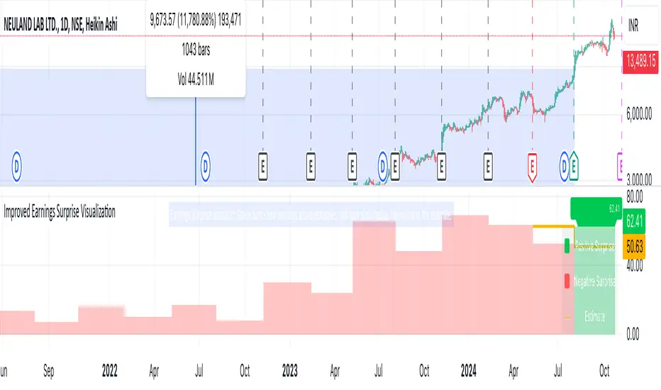
Earnings Surprise Indicator (Post-Earnings Announcement Drift)What It Does:
- Displays a company's actual earnings vs. analysts' estimates over time
- Shows "earnings surprises" - when actual results beat or miss expectations
- Helps identify trends in a company's financial performance
How It Works:
- Green bars: Positive surprise (earnings beat estimates)
- Red bars: Negative surprise (earnings missed estimates)
- Yellow line: Analysts' earnings estimates
Correlation with Post Earnings Announcement Drift (PEAD): PEAD is the tendency for a stock's price to drift in the direction of an earnings surprise for several weeks or months after the announcement.
Why It Matters:
- Positive surprises often lead to upward price drift
- Negative surprises often lead to downward price drift
- This drift can create trading opportunities
How to Use It:
1. Spot Trends:
- Consistent beats may indicate strong company performance
- Consistent misses may signal underlying issues
2. Gauge Market Expectations:
- Large surprises may lead to significant price movements
3. Timing Decisions:
- Consider long positions after positive surprises
- Consider short positions or exits after negative surprises
4. Risk Management:
- Be cautious of reversal if the drift seems excessive
- Use in conjunction with other technical and fundamental analysis
Key Takeaways:
- Earnings surprises can be fundamental-leading indicators of future stock performance, especially when correlated with analyst projections
- PEAD suggests that markets often underreact to earnings news initially
- This indicator helps visualize the magnitude and direction of surprises
- It can be a valuable tool for timing entry and exit points in trades
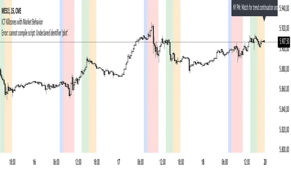
ICT Killzones with Market BehaviorIndicator Title: ICT Killzones with Market Behavior
Description:
Introducing the ICT Killzones with Market Behavior indicator, a powerful tool designed for traders looking to capitalize on key trading timeframes in the New York session.
Key Features:
Visual Timeframes: This indicator highlights essential trading periods, including Pre-Market, NY Open, NY Lunch, and NY PM sessions. These visual markers help you quickly identify when the market is likely to experience heightened activity and liquidity.
Real-Time Insights: Stay informed with dynamic text displayed at the top of your chart. The indicator updates in real-time, providing actionable insights on what to expect during each session—whether it’s volatility, consolidation, or potential trend continuation.
Custom Color Options: Tailor the color settings for each killzone to fit your personal trading style and enhance the visual clarity of your chart.
User-Friendly Design: Built with simplicity in mind, this indicator integrates seamlessly into TradingView, making it easy for traders of all experience levels to utilize.
How to Use:
Add to Your Chart: Integrate the ICT Killzones with Market Behavior indicator into your TradingView setup.
Monitor Market Conditions: Keep an eye on the highlighted timeframes and the real-time insights displayed at the top. This information can guide your trading strategy effectively.
Adjust Your Approach: Use the insights from the indicator to modify your trading decisions based on the expected market behavior during each session.
Note: This indicator is for educational purposes only and should not be interpreted as financial advice. Always perform your own research and assess risks before making any trading decisions.
DMR By ANTExplanation of the DMR by ANT Script
a. What is This Script and How Is It Useful?
This Pine Script, named "DMR by ANT, " is designed for use on TradingView, focusing on dynamically assessing market conditions. It calculates key levels, specifically the high and low of the previous two days, to establish trading zones that assist traders in making informed decisions.
The script highlights:
Previous Day's High and Low : It captures the high and low prices from the previous two days to help set up trading ranges.
First 15 Minutes Candles High and low is marked with Orange Lines .
Trade Zones : It identifies whether the current price is in a 'tradeable' zone or 'non-tradeable' zone. The zones are determined based on the relationship between the current price, today's open price, and the calculated high and low levels.
Targets and Stop Losses : The script dynamically provides target and stop-loss levels based on user-defined input points, which can help manage risk effectively.
This script is beneficial for traders looking to enter (or avoid) trades based on defined price action criteria and can effectively streamline the analysis process in fast-moving markets.
Customize Input Parameters:(settings)
Adjust the ATR, based on ATR target and stop-loss is calculated and displayed. The default values 7(rest see the help), Dynamics changes based on ATR values changes in real time.
b. How to Effectively Use This Script
The DMR script can be utilized across various trading instruments, including:
Indexes: Suitable for gauging market sentiment and overall trends; can assist in short-term trading strategies.
Options: Helps determine the likely movement of the underlying assets, providing insight into probable volatility and directional bias.
ETFs (Exchange-Traded Funds): Useful for trading diversified portfolios; traders can define entry and exit points relevant to the basket of stocks.
Stocks: Ideal for individual stock trading, as traders can analyze stock movements concerning broader market trends.
When utilizing this script, traders should:
Identify key trading levels before entering trades based on the calculated high and low ranges.
Use the dynamic targets and stop-loss levels to protect capital and maximize potential gains.
Continuously monitor the script's signals and adapt to ongoing market changes.
c. Best Time Frames for Different Instruments
The optimal time frames for using the DMR script can vary based on the trading instrument.
Here’s a summary in tabular format for clearer guidance:
Instrument Best Time Frames
Index 5-minute, 15-minute, 1-hour
Options 1-minute, 5-minute, 15-minute
ETF 5-minute, 15-minute, 1-hour
Stocks 5-minute, 15-minute, 1-hour, Daily
Indexes: Shorter time frames (5 to 15 minutes) can capture quick market movements, while 1-hour frames can provide a broader market overview.
Options Trading: Given the time sensitivity of options, using very short time frames (1-5 minutes) can be effective to seize rapid price movements before expiry.
ETFs: Similar to indices, shorter frames help in effectively tracking movements of the underlying assets.
Stocks: A mix of short (5-15 minutes) for day trading and daily charts for swing trading can provide balanced insights.
Conclusion
Utilizing the DMR by ANT script can greatly enhance a trader's ability to analyze market conditions, identify opportunities, and manage risk effectively. By adapting the script through the different listed recommendations, traders can maximize their trading strategy’s effectiveness across various instruments.
Do comment below for further improvement.

Quarterly Highlight ModelDiscover a new edge in your market analysis with our latest TradingView script. Designed to highlight quarterly performance, this tool not only offers insights into individual companies but also serves as a powerful lens to examine broader market trends.
Key Features:
- Quarterly Highlights: Easily identify and analyze each company's performance across four quarters, with each quarter represented by a unique color for clear visual distinction.
- Trend Analysis: Use quarterly data to spot trends and make informed decisions.
Enhance your trading strategy with deeper insights and a comprehensive view of market conditions. Check it out and let’s revolutionize the way we understand the markets!

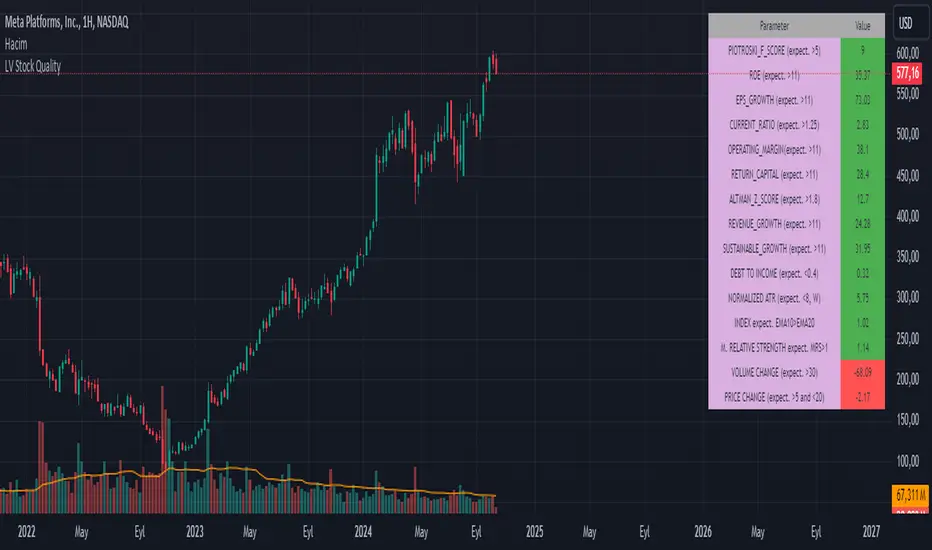
LV Stock QualityCritical financial and technical values are listed in the table.
PIOTROSKI_F_SCORE (expect. >5) -> The Piotroski score is a discrete score between zero and nine that reflects nine criteria used to determine the strength of a firm's financial position. The Piotroski score is used to determine the best value stocks, with nine being the best and zero being the worst. Having a score bigger than 5 is a good sign for the strength of a firm's financial position
ROE (expect. >11) --> Return on equity (ROE) is a measure of a company's financial performance. It is calculated by dividing net income by shareholders' equity. Because shareholders' equity is equal to a company’s assets minus its debt, ROE is a way of showing a company's return on net assets. A “good” ROE will depend on the company’s industry and competitors.
EPS_GROWTH (expect. >11) --> This indicator is calculated as the percentage change in Basic earnings per share for one year. This indicator reflects the growth rate of a company's basic profit per share outstanding for one year. It is calculated based using only common shares. An increase in EPS growth may signal that a company is becoming more profitable and efficient in its operations. A decline in EPS growth may signal that a company is spending more or losing business share. EPS growth should be viewed alongside other metrics like revenue and costs.
CURRENT_RATIO (expect. >1.25) --> The current ratio measures a company’s ability to pay current, or short-term, liabilities (debt and payables) with its current, or short-term, assets (cash, inventory, and receivables). Current ratios over 1.00 indicate that a company's current assets are greater than its current liabilities, meaning it could more easily pay of short-term debts.
OPERATING_MARGIN(expect. >11) --> The operating margin measures how much profit a company makes on a dollar of sales after paying for variable costs of production, such as wages and raw materials, but before paying interest or tax.
RETURN_CAPITAL (expect. >11) --> Return of capital (ROC) is a payment that an investor receives as a portion of their original investment and that is not considered income or capital gains from the investment.
ALTMAN_Z_SCORE (expect. >1.8) --> The Altman Z-score is the output of a credit-strength test that gauges a publicly traded manufacturing company's likelihood of bankruptcy. An Altman Z-score close to 0 suggests a company might be headed for bankruptcy, while a score closer to 3 suggests a company is in solid financial positioning.
REVENUE_GROWTH (expect. >11) --> Quarterly revenue growth is an increase in a company's sales in one quarter compared to sales of a different quarter. Comparing a company's financials from one period to another gives a clear picture of its revenue growth rate and can help investors identify the catalyst for such growth.
SUSTAINABLE_GROWTH (expect. >11) --> The sustainable growth rate (SGR) is the maximum rate of growth that a company or social enterprise can sustain without having to finance growth with additional equity or debt. In other words, it is the rate at which the company can grow while using its own internal revenue without borrowing from outside sources.
DEBT TO INCOME (expect. <0.4) --> A debt-to-income (DTI) ratio is a financial metric used by lenders to determine your borrowing risk. Your DTI ratio represents the total amount of debt you owe compared to the total amount of money you earn each month.
NORMALIZED ATR (expect. <8, W) --> The Normalized Average True Range (Normalized ATR) is an indicator used to measure market volatility by normalizing the average true range values. It does this by dividing the Average True Range (ATR) by the asset's closing price, converting it into a percentage. This normalization allows for the comparison of volatility levels across different securities or market conditions, regardless of the asset's price levels. The Normalized ATR helps traders to adjust their strategies based on relative volatility, rather than absolute price movements.
INDEX expect. EMA10>EMA20 --> it is expected to have EMA 10 > EMA 20 in weekly basis graph. It is known that having a strong trend in index will also increases chance of strong trend on stock levels. You need to select INDEX Market of stock via settings.
M. RELATIVE STRENGTH expect. MRS>1 --> Stan Weinstein uses the Mansfield RS indicator as another relative strength indicator. The indicator measures the variation in the 52-week ratio of stock and market.
VOLUME CHANGE (expect. >30) --> Having an increase on volume comparing to previous week can be a good sign if it occurs at the same time of breakout.
PRICE CHANGE (expect. >5 and <20) --> Having an increase on price comparing to previous week can be a good sign if it occurs at the same time of breakout.
It is better to look on weekly basis graphs.
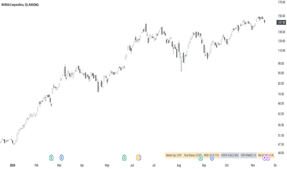
Chartonaut: GlimpseDisplays an overview of some key metrics as a table.
Market Cap : value of the company.
Float Shares : number of shares available for trading.
AR# : average range over the last # sessions.
ATR# : average true range over the last # sessions.
ATR#/MA# : distance of the current price from the given moving average (MA) in terms of ATR multiples.
Rel Volatility : current session's range, including gaps from previous close, relative to the ATR.
Additionally, it highlights some metrics if they are crossing a given threshold, as to warn that some criteria might not be met.