Blockchain Fundamentals: 200 Week MA Heatmap [CR]Blockchain Fundamentals: 200 Week MA Heatmap
This is released as a thank you to all my followers who pushed me over the 600 follower mark on twitter. Thanks to all you Kingz and Queenz out there who made it happen. <3
Indicator Overview
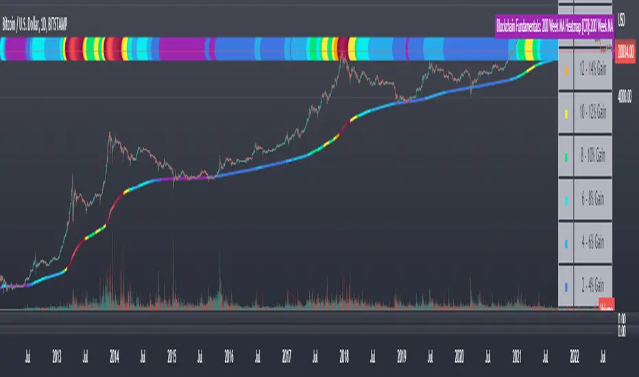
In each of its major market cycles, Bitcoin's price historically bottoms out around the 200 week moving average.
This indicator uses a color heatmap based on the % increases of that 200 week moving average. Depending on the rolling cumulative 4 week percent delta of the 200 week moving average, a color is assigned to the price chart. This method clearly highlights the market cycles of bitcoin and can be extremely helpful to use in your forecasts.
How It Can Be Used
The long term Bitcoin investor can monitor the monthly color changes. Historically, when we see orange and red dots assigned to the price chart, this has been a good time to sell Bitcoin as the market overheats. Periods where the price dots are purple and close to the 200 week MA have historically been good times to buy.
Bitcoin Price Prediction Using This Tool
If you are looking to predict the price of Bitcoin or forecast where it may go in the future, the 200WMA heatmap can be a useful tool as it shows on a historical basis whether the current price is overextending (red dots) and may need to cool down. It can also show when Bitcoin price may be good value on a historical basis. This can be when the dots on the chart are purple or blue.
Over more than ten years, $BTC has spent very little time below the 200 week moving average which is also worth noting when thinking about price predictions for Bitcoin or a Bitcoin price forecast.
Notes
1.) If you do not want to view the legend do the following: Indicator options > Style tab > Uncheck "Tables"
2.) I use my custom function to get around the limited historical data for bitcoin. You can check out the explanation of it here:
Fundamental Analysis
USD Liquidity Conditions IndexUSD Liquidity Conditions Index = — —
"Bitcoin vs. USD Liquidity Conditions Index
In this current phase of the crypto currency capital markets, Bitcoin represents a high-powered coincident (and sometimes leading indicator) of global USD liquidity conditions."
cryptohayes.medium.com

Blockchain Fundamentals - Active Address Sentiment Osc. [CR]Blockchain Fundamentals: Active Address Sentiment Oscillator AASO
Back with another script today, this one is a useful tool in helping to determine bitcoins value. We are looking at 2 data sources: the daily active addresses on the BTC blockchain, and the daily returns of BTC.
THIS INDICATOR WILL ONLY GIVE YOU THE CORRECT RESULTS ON THE DAILY TIMEFRAME
There is an interesting relationship that you can see by comparing the two timeseries. But for us to create a good indicator we first need to normalize the data. So we look at the percent change over the past 28 days for each metric (DAA and price).
THIS INDICATOR WILL ONLY GIVE YOU THE CORRECT RESULTS ON THE DAILY TIMEFRAME
We then calculate standard deviation bands around the DAA metric. We finalize them by averaging the bands over a 28 day period.
When the Price series (yellow line) is higher than the SD bands BTC is considered overvalued or price is overheated. A pullback could be expected soon. When the Price series is below the SD bands BTC is considered undervalued or price is oversold.
THIS INDICATOR WILL ONLY GIVE YOU THE CORRECT RESULTS ON THE DAILY TIMEFRAME
This tool doesnt give signals on the one minute chart or tell you exactly when to buy or sell. BUT what it does do is act as a convenient macro sentiment indicator that is not based completely upon price.
In an attempt to narrow down the really juicy areas, if you seen the background color highlights with white, that means its likely a top or bottom. At the very least on a local sense and many times in a cyclical macro sense as well. It also narrows down the signal to a generally more profitable area.
This indicator is not meant to be used on timeframes other than daily (did I mention that already?). I am lazy and did not code the calculations to be MTF (which is why you have to use on the daily chart). If you want to code this, please forward it on to me and I will post an update with a heartfelt credit to you.
Effective Interest RateThis indicator shows de Effective Monthly Interest Rate (EMIR) that you get when you buy the asset and keep it for N bars (Period of Time). You can chose N on "Properties". In fact you can chose 3 different periods of time (Ns) that I called "Lenght 1", "Lenght 2" and "Lenght 3" and Trading View will plot 3 EMIR lines.
It works on 3 time frames: Monthly bars, Weekly bars and Dayly bars.
I hope it helps you on your annalisys

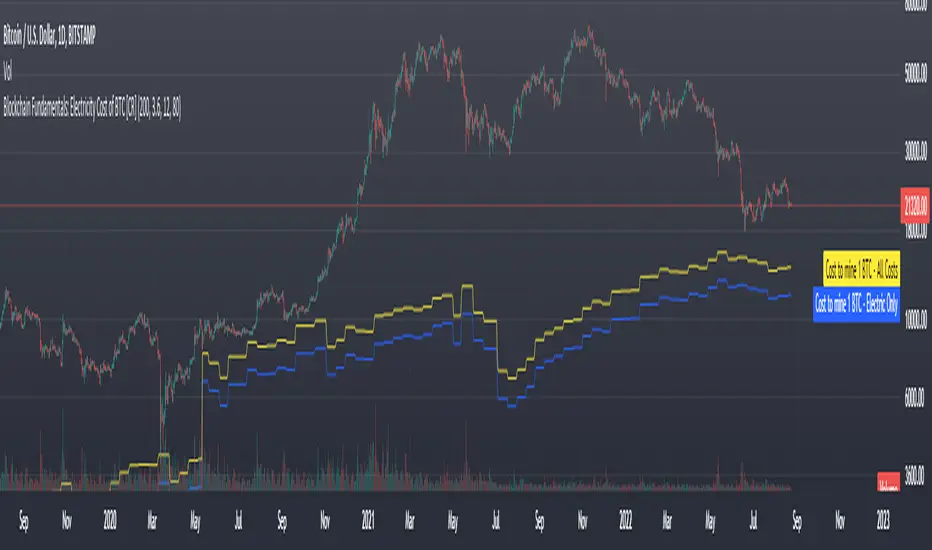
Blockchain Fundamentals: Electricity Cost of BTC [CR] Blockchain Fundamentals: Electricity Cost of BTC
After a hiatus, now a return to publishing tools and scripts for the community. This is my first script in over and year, and I have a number more coming soon as well! (so Stay Tuned!)
This is a simple calculator to estimate the cost of Bitcoin miners to mine one bitcoin. It works on all timeframes (doesnt have to be on daily).
By entering the inputs of total TH's, kWh used, cost of electricity per kWh (in USD cents) we can generate the electricity cost.
But miners also have other costs of operation including HVAC, maintenance, rent, etc. In light of that we include a multiplier that accounts for these extra costs. First, type in what percent of your total operating costs come from the electricity. Then check the enable total cost plot option and you will also see total costs in addition to electricity costs.
Its a simple model and gives anyone curious a starting point for their own testing and research.
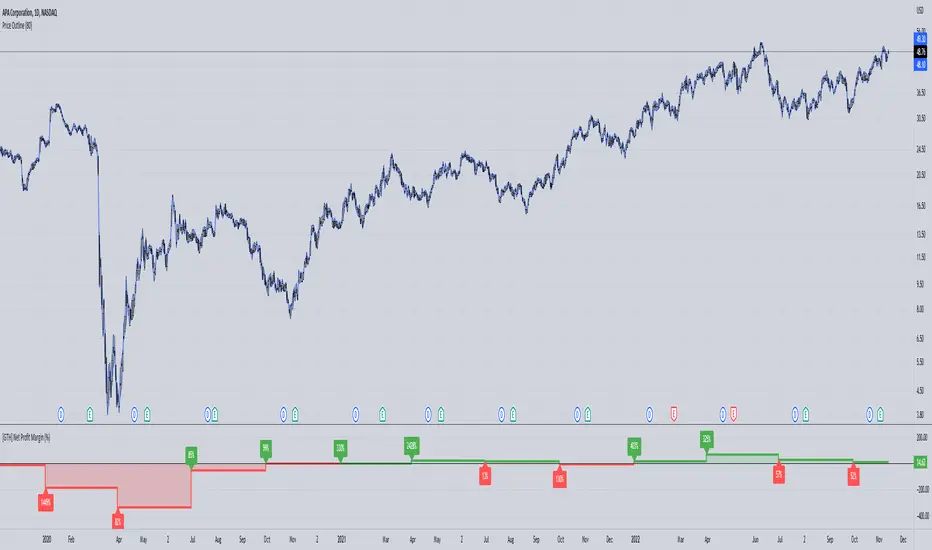
[GTH] Net Profit Margin (%)Displays the Net Profit Margin in a more "readable" fashion than the built-in TV Indicator.
This indicator concludes the series of 'Minervini-indicators', consisting of "GTH Earnings", "GTH Revenues" and "GTH Net Profit Margin (%)".
Famous trader Mark Minervini repeately describes rising earnings, revenues and net profit margin as the most important financials for finding superperformers.
In case of reporting a malfunction: Please be specific. Statements like "does not work" are useless. Thanks.
BETABETA (β) value is a risk index, which is used to measure the price fluctuations of individual stocks or mutual funds relative to the entire stock market.
The higher the β value, the greater the volatility of the stock phase on the performance evaluation benchmark, and vice versa.
When β = 1, it means that the income and risks of the stock are consistent with the income and risks of the broader market; when β> 1, it means that the stock income and risk are greater than the income and risk of the broader market index.
Our Beta calculation method is the same as finance.yahoo.com, markets.ft.com, zacks.com and cnbc.com .
Default Beta setting is data over a 5 Years (Monthly) period and base value of 1.0 is S&P 500 Index.

Growth Stock CyclicClick the chart below to see the "idea" associated with this script for documentation:

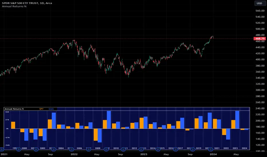
Annual Returns % Comparison [By MUQWISHI]Overview
The Annual Returns % Comparison indicator aimed to compare the historical annual percentage change of any two symbols. The indicator output shows a column-plot that was developed by two using a pine script table, so each period has pair columns showing the yearly percentage change for entered symbols.
Features
- Enter date range.
- Fill up with any two symbols.
- Choose the output data whether adjusted or not.
- Change the location of the table plot
- Color columns by a symbol.
- Size the height and width of columns.
- Color background, border, and text.
- The tooltip of the column value appears once the cursor sets above the specific column. As it seen below.
Let me know if you have any questions.
Thanks.
OBV Trend Indicator by Bruno MoscanOBV Trend is a modification I made in other scripts, so that after months of testing, I got a very accurate indicator as to the right moment to enter a high-yield trade.
The red line indicates the very short-term OBV variation, counting the last 3 candles.
The yellow line shows the short-term OBV variation, counting the last 9 candles.
The white line shows the medium-term OBV variation, counting the last 21 candles.
The trend is up (Bull Market) while the order of the lines on the chart is Red/Yellow/White.
The trend is Bear Market while the order of the lines on the chart is White/Yellow/Red.
If the Yellow line is in the first position, either from bottom to top, or from top to bottom, it is a sign that the trend is changing, reversing, wait for the lines to organize before entering the movement.
When the lines are so close together that it is difficult to understand the correct order of the lines, it means that you are facing the best possible entry point. Wait for the lines to separate, at the first perfect food signal as described above, enter the movement, at this point, your stoploss may be very short, positioned at the base of the last candlestick.
The indicator works best on H1, H2, H4 and D1. In the Weekly until the signal reversal occurs, you can lose several days, sometimes weeks. On minute charts, there are many reversals and you can be stopped many times.
Good trends.
*Translate by Google Tradutor*
*In Brazil, we speack Portuguese, not Spanish or English :p *

Growth Stock Arbitrage Indicator [@PierceARK]This indicator takes advantage of the fact that when the 10 and 5 year Treasury Constant Maturity Minus Federal Funds rates (T10YFF/T5YFF) go down sharply, investors tend to rotate into stocks. This arbitrage works great for growth stocks, since growth stocks are higher beta by virtue of their lower market cap and more speculative nature in general. This script identifies the moving-average convergence/divergence of the average of the 10y and 5y treasury rates and then finds the variance of that macd line. By averaging that variance with the macdline's inverse, an analog output of treasury -> stock rotation can be identified. The upper and lower thresholds bring buy and sell windows into focus.

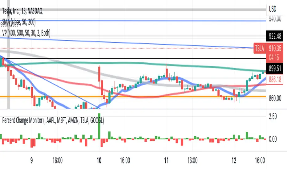
Sushman Ticcy Toppy Percent Change MonitorSP 500 Trend Identifier, looks at top 5 SP500 stocks and shows performance of these 5 combined stocks for the day. Are they going up or down, TSLA< AAPL< MSFT<GOOGL<AMZN
[GTH] RevenueVisually similar to the GTH Earnings indicator, this indicator plots
Reported Revenue (black line)
Difference to Estimated Revenue (colored bars)
Percentage change to the previous Reported Revenue (tags)
Note 1: Although in Tradingview the 'E' tags on the time line display Revenues alongside with Earnings , there is a difference in timing. Revenues are reported quarterly; Earnings reporting dates differ with each stock. Hence, the tags in this indicator are not necessarily aligned with the Earnings reporting dates.
Note 2: It should be obvious that this indicator can only report data provided by Tradingview. Even more obviousy, it can not display revenues of anything else but stocks.
If you find a malfunction, please provide examples. "Does not work" is not helpful.

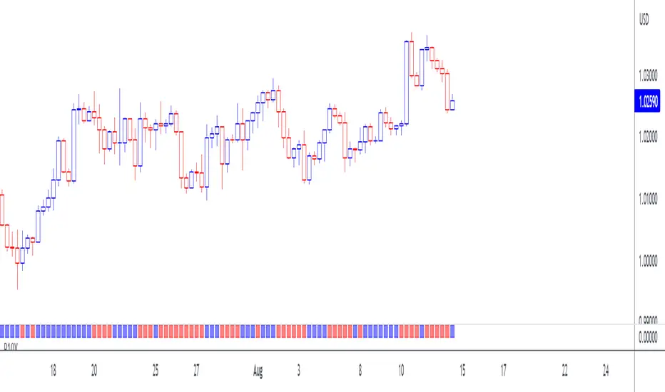
10-Year Bond Yields (Interest Rate Differential)With this little script, I have attempted to incorporate fundamental data (in this case, 10-year bond yields) into technical analysis . When pairing two currencies, the one with a higher bond interest rate usually appreciates when the interest rate differential widens, or, to use a simple example: in a currency pair A vs. B, with A showing a higher bond yield than B, a widening interest rate gap is likely to help A and create a buying opportunity (shown as a blue square at the bottom of the chart), while the opposite is true when the gap tightens (sell signal, red square).
While long-term investors know about and make use of the importance of bond yield fluctuations, most short-term traders tend to dismiss the idea of using fundamental data, mostly for lack of quantifiability and limited impact in an intraday environment. After extensive backtesting on daily and intraday charts (6-12 hours), however, I realized this indicator still managed to produce useful results (less useful than on monthly and yearly charts, to be fair, but still useful enough), especially when paired with simple price-driven indicators, such as Heikin Ashi or linear regression .
My personal (and thus subjective) thoughts: worth a try. Buy and sell signals frequently contradicted both more popular indicators and my gut feeling and managed to take out losing trades that I had considered trades with a high winning probability. In other words, when the market lures traders into seemingly promising trading decisions, this indicator might give you an early warning, especially when you manage to adjust period and continuity parameters to your trading strategy.
Currency pairs used in this script are all possible combinations of the eight majors. Each security has been assigned a name ("inst01" to "inst08" in the code) and a broker; if you make changes to the code, be sure not to mess with currency and broker names as this would render the entire script useless. Good luck trading, and feel free to suggest improvements!
MA trading Tool V2.0Background to the tool
The tool was built out of frustration. Having traded for many years with a reasonable level of success I was always frustrated that my trading never went up a level. The world of trading is filled with people having so much more success than me and this level of FOMO really bothered me and resulted in inconsistency and countless hours sitting in front of a screen, hoping for the best. I also became a little bit of an indicator junkie - was there a holy grail indicator out there for me? I always felt that as a retail trader I was behind the curve. I started to investigate how the major market participants trade and make money and I was astounded at the level of success that they get from creating strategies and sticking to it. The market is driven largely by a "black boxes" which, for us retail traders are outside of our ability to access. I wanted to build a tool that could give me a traders edge.
Another factor that has always bothered me was when reading investing books there is a general assumption that a standard entry, say 8/13 cross over, works on all stocks. However, it is not the case and it can be frustrating for a trader using a set up and not realizing that the set up was/is the problem, not the trader. This realization alone has made a huge impact on my trading. The big boxes that control the market know this already.
Also, a lot of indicators that are available don’t take advantage of the backtesting capability provided in Tradingview. It is fairly simple to find 8-9 trades where a set up worked and then fall into the trade of assuming that it cannot fail. Knowing which set ups work and how frequently it will print will change the way that you trade.
The goal with the tool is to identify setups that have worked in the past with a high degree of profitability, high profit factor and low drawdown and using the planning tool allows you to customize the setup to find exactly what you are looking for across any tradeable asset on TradingView.
Over the past 20 years I have realized the following:
1) Not all entries and signals work the same on all stocks and knowing the historical performance of a strategy is critical
2) Not having a plan in advance lowers your probability of success
3) Developing consistency in analysis is critical
4) Developing confidence in your own plan is more important than whose trades you try to copy
5) Having 30 indicators does not help you trade better - it leads to more frustration
So here is the product of these realisations:
1) The tool looks across the most common entry strategies (RMA / EMA / SMA / HMA / WMA cross on 5 dimensions of type and 5 common crossovers) and can be used on 19 different time frames giving you guidance on what the best set up is for the stock you are analysing
2) It incorporates volatility into the strategy – when stocks are trading outside of a predetermined volatility band, a trade will not be entered. This accommodates traders who tend to get shaken out of trades too early.
3) It looks at the impact of “buying the dip” – often a common strategy employed by many traders which now can be backtested and reviewed to see if it actually helped or hindered the trade.
4) It measures your trade plan against your R – what you are willing to risk – and calculates your target profit based on your R multiple
5) It provides a non repaint signal on your base strategy and provides you with signals to trade smaller or shorter signals within the bigger strategy.
6) This includes elements from the Squeeze Tool namely the histogram and. stochastic entry and exit criteria
There are some additional visual tools:
• Squeeze signals - I am a big fan of the TTM squeeze however the Squeeze by itself can be hard to trade. Seeing a squeeze fire long on a chart can add to trade confidence.
• Seeing zones of support and resistance rather than single lines can also give you some leeway in terms of not getting pushed out of a trade too soon.
The backtester is always reviewed on a 2 to 3 year period to get an understanding of win rate %, profit ratio and average duration of trade. As an option trader knowing that a high probability move is playing out allows me to make sure that I don’t undercut the time frame for the expiration of the option relative to the historical average duration of a trade. Backtesting on shorter times is unrealistic.
Key benefits
1) It will save you a ton of time. I don’t have to sit in front of a screen watching ticks each day. I can plan for an entry, set an alert for a trade and when the conditions are met the TradingView system sends me a message and I will go and confirm a trade, execute it, set my alerts for control and move on with my life.
2) It allows me to review trade ideas in a consistent manner using the best trade plan and set up for a stock.
3) It forces me to be patient and not panic (always a good thing). With an adjustable volatility feature I can modify the volatility band in the trade plan to accommodate choppy market conditions.
4) It looks at both sides of the market (long and short) and you can calculate the impact of being market neutral or having a directional bias.
I hope this tool helps you to achieve some degree of peace in your trading.
To get access to the tool, please contact the author.
[GTH] Earnings
Black line -> actually Reported Earnings
Colored bars -> positive/negative surprise in regard to Estimated Earnings
Labels -> percentage of change in regard of the previous Reported Earnings
Multi Yield CurveAn inversion between the 2 year and 10 year US treasury yield generally means a recession within 2 years. But the yield curve has more to it than that. This script helps analysis of the current and past yield curve (not limited to US treasury) and is very configurable.
"A yield curve is a line that plots yields (interest rates) of bonds having equal credit quality but differing maturity dates. The slope of the yield curve gives an idea of future interest rate changes and economic activity." (Investopedia)
When the slope is upward (longer maturity bonds have a higher interest rate than shorter maturity bonds), it generally means the economy is doing well and is expanding. When the slope is downward it generally means that there is more downside risk in the future.
The more inverted the curve is, and the more the inversion moves to the front, the more market participants are hedging against downside risk in the future.
The script draws up to 4 moments of a yield curve, which makes it easy to compare the current yield curve with past yield curves. It also draws lines in red when that part of the curve is inverted.
The script draws the lines with proper length between maturity (which most scripts do not) in order to make it more representative of the real maturity duration. The width cannot be scaled because TradingView does not allow drawing based on pixels.
This script is the only free script at time of writing with proper lengths, showing multiple yield curves, and being able to show yield curves other than the US treasury.
█ CONFIGURATION
(The following can be configured by clicking "Settings" when the script is added to a chart)
By default the script is configured to show the US treasury (government bond) yields of all maturities, but it can be configured for any yield curve.
A ticker represents yield data for a specific maturity of a bond.
To configure different tickers, go to the "TICKERS" section. Tickers in this section must be ordered from low maturity to high maturity.
• Enable: draw the ticker on the chart.
• Ticker: ticker symbol on TradingView to fetch data for.
• Months: amount of months of bond maturity the ticker represents.
To configure general settings, go to the "GENERAL" section.
• Period: used for calculating how far back to look for data for past yield curve lines. See "Times back" further in this description for more info.
• Min spacing: minimum amount of spacing between labels. Depending on the size of the screen, value labels can overlap. This setting sets how much empty space there must be between labels.
• Value format: how the value at that part of the line should be written on the label. For example, 0.000 means the value will have 3 digits precision.
To configure line settings per yield curve, each has its own "LINE" section with the line number after it.
• Enable: whether to enable drawing of this line.
• Times back: how many times period to go back in time. When period is D, and times value is 2, the line will be of data from 2 days ago.
• Color: color of the line when not inverted.
• Style: style of the line. Possible values: sol, dsh, dot
• Inversion color: color of the line when the curve inverses between the two maturities at that part of the curve.
• Thickness: thickness of the line in pixels.
• Labels: whether to draw value labels above the line. By default, this is only enabled for the first line.
• Label text color: text color of value label.
• Label background color: background color of value label.
To configure the durations axis at the bottom of the chart, go to the "DURATIONS" section.
• Durations: whether to show maturity term duration labels below the chart.
• Offset: amount to offset durations label to be below chart.
█ MISC
Script originally inspired by the US Treasury Yield Curve script by @longfiat but has been completely rewritten and changed.

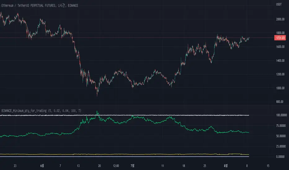
BINANCE_Minimum_qty_for_tradingWe can not buy just 0.001ETH in Binance on 2022.8.8
Why? Binance have trading role about the minimum qty of coins.
Until now, we can not find the info in TradingView.
I hope Our TradingView give us this updating info easily oneday.
I am not a good English speaker.
Sorry about my short explanation.
reference: www.binance.com
Investing - Order HelperFYI: This idea is not new and I believe there is plenty of other indicator similar to this. I have used 'Scaled.orders' from @highewaterr and add in additional calculation.
This is for education purposes only, if you decide to use it LIVE and you lose money using it, it is not my fault. Do not risk what you can't afford to lose.
Order Helper was improved to better help simplify my investing journey.
It calculates each size and price automatically for me after inputting into the settings.
Unlike the common investing method (DCA Daily/Weekly/Monthly or Support & Resistance).
There is issue for these investing method.
DCA based on time is prompt to buying at higher price which will bring your average cost and your risk higher .
So why risk more when you have plenty of time to wait for the project/stocks to be at a discount?
Support & Resistance based can be a hustle to some investor like me.
Why?
1. Complication when drawing multiple support & resistance line / zone.
2. Time Consuming (Refer to point 1)
To reduce/eliminate the issue prompt by these 2 investing method, I use order helper.
It free up that few minutes of each chart, reduce the complexity in drawing support & resistance.
However, it bring method is prompt to 'missing out'.
IF I were to stick to the prices and size based on this indicator, my order might not be triggered and price just continue going.
But personally, I am fine with it. As I would rather miss out than putting my hard earned money in a higher risk.
---------------------------------------------------------------------------------------------------------------------------------
Main Component of this indicator
Scaling options is the main component of this indicator.
There is 4 options to this component:
Linear
Ease-in -> The amount of orders/size CLOSEST to the START price, will be higher.
Ease-out -> The amount of orders/size FURTHEREST to the START price, will be higher.
Ease-in-out -> It's a mixture of Ease-in and Ease-out.
How to use this indicator?
It is best for you to play around with the settings, as it will be easier to understand rather than reading how I do it.
There is no right or wrong method in using this indicator. But this is how I use it.
Go to a higher time frame (Weekly/Monthly)
Identify major support & resistance
Open up 'Order Helper' settings
Input your preferred options (Linear/Ease-in/Ease-out/Ease-in-out)
Input the start price -> referring to the first major support & resistance line (closes to the current price)
Input the end price -> referring to the last major support & resistance line (furtherest away from the current price)
Input the number of orders you preferred
Position Size that you wish to purchase
I decide not to share the source code of this as I do not fully understand the math calculation behind.
But if it works, and it helps me. Then those math calculation doesn't really matter.
Hopefully this will help simplify your investing journey.
If there is any question, feel free to comment it below and I will try my best to assist.

Investing - Correlation Table This correlation tables idea is nothing new, many sites provides it.
However, I couldn't find any simple correlation indicator on TradingView despite how simple this indicator is.
This indicator works as its called. Calculating the correlation between 2 projects (can be used in stocks as well) using the 'ta.correlation' feature built into pinescript.
When it comes to investing, we do not want our stocks / crypto project to be heavily correlated to each other.
If they are heavily correlated to each other, then there isn't much point in diversifying.
That being said, it can be useful for traders who trade multiple pairs.
-----------------------------------------------------------------------------------------------------------------------------------------------------------
In this indicator, consist of 5 primary input and 15 secondary input (Symbol List).
Correlation Source:
This input options allow you to change how the correlation is calculated. By default, it uses 'close'.
Correlation Percentage(%):
This input options allows you configure how many (%) of correlation is considered as 'decoupled'.
This correlation will only move between -100% ~ 100%.
100% refers to it moving together.
-100% refers to it moving the opposite direction.
For example, Project A rises in Price, what is the possibility of Project B following:
A 100% correlation between Project A and Project B, refers to Project B will follow Project A movement.
A 50% correlation between Project A and Project B, refers to there is only 50% chance for Project B to follow Project A movement.
A -20% correlation between Project A and Project B, refers to there is a 20% chance of Project B moving the opposite direction of Project A
(Refers to the table on chart above to better understand what the numbers means. DOT/USD has a 100% correlation to DOT/USD. However. MXCUSDT has a -37.2% correlation to DOT/USD.)
Amounts Bars To Check:
This input options will check the amount of bars since the last bar in the chart.
If you want to know the correlation of the past 100 days in a daily chart, you will enter '100' into this options and it will check only the past 100 days.
Symbol List
This will allow you to input all the project symbol ticker ID to add into the correlation table.
-----------------------------------------------------------------------------------------------------------------------------------------------------------
Originally, I wish to use for loop to go through the symbol list to reduce the amount of code required. However, due to limitation of 'request.security' feature, I had to abandon that idea and use hard-coded for requesting security and use a while loop to identify the symbol correlation value in the array set then set the table value accordingly.
If there is any script writer could improve this or any unclear explanation, feel free to drop a comment below.

Inflation Adjusted Performance: Ticker/M2 money supplyPlots current ticker / M2 money supply, to give an idea of 'inflation adjusted performance'.
~In the above, see the last decade of bullish equities is not nearly as impressive as it seems when adjusted to account for the FED's money printing.
~Works on all timeframes/ assets; though M2 money supply is daily data release, so not meaningful to plot this on timeframe lower than daily.
~To display on same pane; comment-out line 6 and un-comment line 7; then save, remove and re-add indicator.
~Scale on the right is meaningless; this indicator is just to show/compare the shape of the charts.

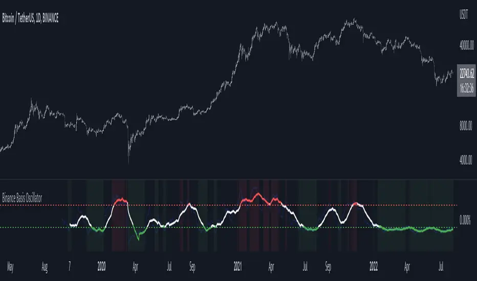
Binance Basis OscillatorBinance Basis Oscillator illustrates the premium or discount between Binance spot vs perps.
This indicates whether speculators (i.e. traders on perps) are paying premium vs spot. If true then speculation is leading, indicating euphoria (at certain levels).
Conversely, spot leading perps (i.e. perps at a discount) shows extreme bearish conditions, where speculation is on the short side. Indicating times of despair.