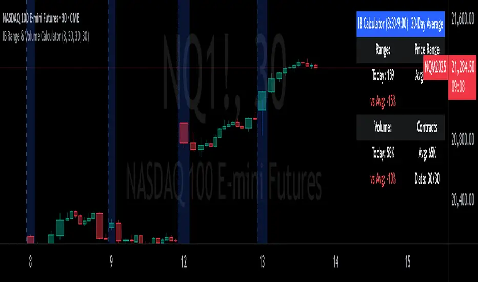
IB Range & Volume CalculatorIB Range & Volume Calculator - Summary
Overview
This indicator tracks and analyzes the Initial Balance (IB) period (first 30 minutes of trading from 8:30-9:00 AM Chicago time) by measuring both price range and trading volume. It compares today's values against a 30-day average, providing essential context for day traders and scalpers.
Key Features
Range Analysis
Automatically calculates high-low range during the Initial Balance period
Compares today's range with the 30-day historical average
Shows percentage difference from average with color coding (green for above average, red for below)
Volume Analysis
Tracks cumulative volume during the Initial Balance period
Calculates and displays 30-day volume average
Compares today's volume to the average with percentage difference
Visual Elements
Highlights all IB period candles with light blue background
Displays a fixed information panel in the upper right corner
Shows real-time status during the IB period ("In progress...")
Updates with final values once the IB period completes
Data Management
Maintains a rolling 30-day history of both range and volume data
Displays data collection progress (x/30 days)
Automatically resets calculations at the beginning of each new session
Trading Applications
This indicator is particularly valuable for:
Context-Based Trading Decisions
Compare today's market behavior to normal conditions
Adjust scalping targets based on relative volatility
Volume-Price Relationship Analysis
Identify unusual volume patterns that may precede significant moves
Validate price movements with corresponding volume confirmation
Trading Strategy Selection
High volume + high range: Momentum strategy opportunities
High volume + low range: Potential breakout setup
Low volume + high range: Possible fade/reversal opportunities
Low volume + low range: Range-bound scalping environment
5-Point Scalp Targeting
Determine if 5-point targets are aggressive or conservative for the day
Adapt stop levels based on relative volatility
Timing Optimization
Identify days with abnormal opening characteristics
Anticipate potential afternoon behavior based on IB patterns
The indicator provides essential context for rapid decision-making in fast-moving markets, helping traders calibrate their expectations and adapt their strategies to current market conditions.
Fundamental Analysis
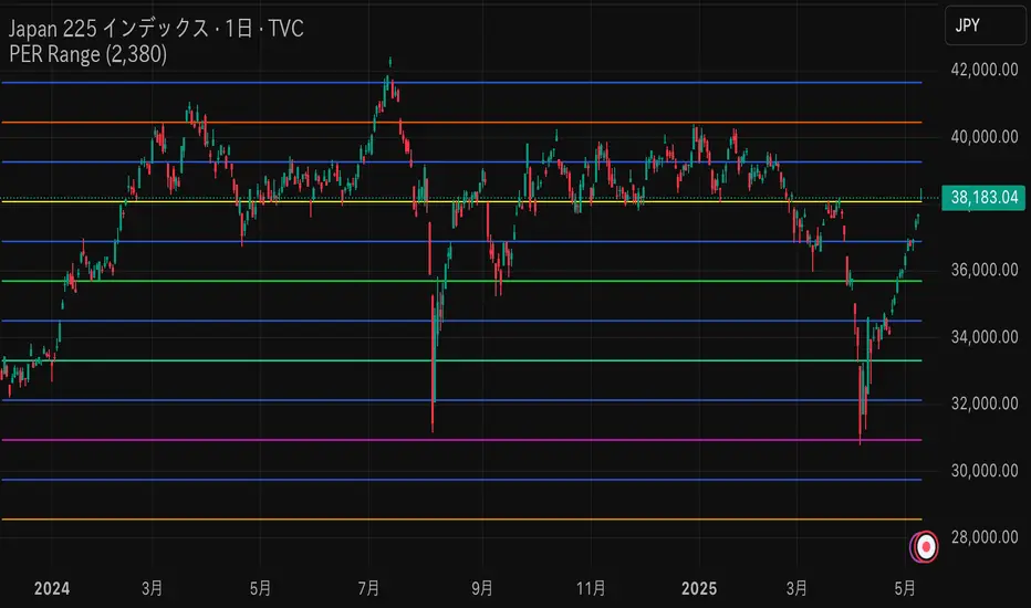
PER x RangeThis Pine Script calculates the target price of the Nikkei Average based on the EPS (Earnings Per Share) and different PER (Price-to-Earnings Ratio) multiples ranging from 17.5x to 12x, in increments of 0.5x. It then plots these target prices on the chart.
Key Features:
Input EPS: You can manually input the current EPS value of the Nikkei Average (the example uses 2380, but you can replace it with the actual EPS).
PER Multiples Calculation: The script calculates target prices for different PER multiples (17.5x, 17x, 16.5x, ..., down to 12x).
Plotting Target Prices: The calculated target prices (EPS * PER) are plotted on the chart as blue lines, showing you different target price scenarios based on varying PER multiples.
VOID Directional Spike MarkerThis indicator highlights significant directional moves on the $VOID chart (NYSE USI:UVOL − DERIBIT:DVOL ) using simple visual cues:
🔼 Green up arrows when the candle closes significantly higher than it opens
🔽 Red down arrows when the candle closes significantly lower than it opens
Threshold is fully customizable (default: 15,000,000)
Ideal for spotting explosive internal shifts on the 5-minute chart during key market moments
Alerts included for both up and down spikes
Use this to track aggressive buying or selling pressure across NYSE internals and time your entries on NQ, ES, or YM with stronger conviction.

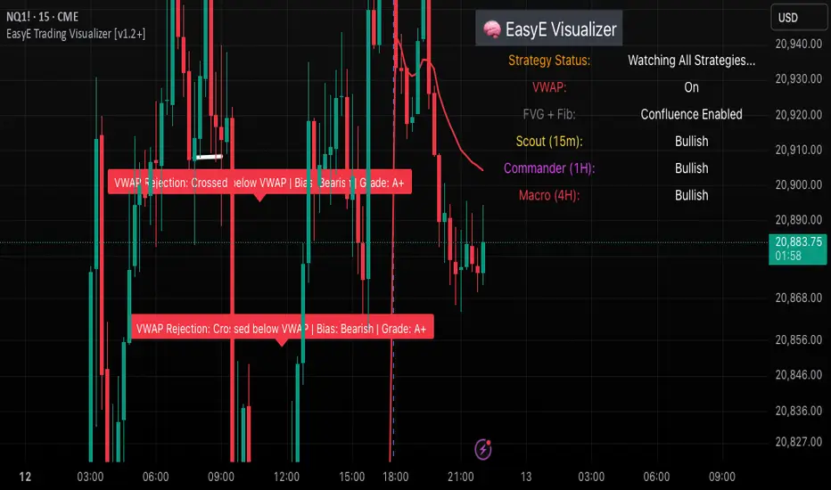
EasyE Trading Visualizer [v1.2+]This indicator is a comprehensive trading assistant designed for scalpers and intraday traders who prioritize structure, liquidity, and real-time narrative detection. It combines multi-confirmation logic into a clean visual system that helps traders anticipate price behavior before major moves.
The system evaluates several strategic concepts, including:
Commander Collapse / Reclaim: Detects structural breaks using higher-timeframe logic to identify failed or confirmed directional momentum.
Trap Rejection: Identifies potential reversal setups based on liquidity grabs followed by engulfing confirmations.
VWAP Reject Reload: Flags potential fade setups against volume-weighted average price, especially during retests.
Liquidity Sweeps: Differentiates between high and low liquidity grabs (sweeps), helping spot traps or continuation patterns.
FVG + Fib Confluence: Integrates smart fib zones (based on large candles) with fair value logic to confirm high-quality zones.
Flip Zones: Detects support/resistance flips and auto-clears broken levels while leaving label trails to track behavior.
Entry signals (Buy/Sell) are accompanied by a dynamic grading system:
Grade A: Strong institutional-quality moves (confluence + structural break).
Grade B: Confluence without full structure shift.
Grade C: Weak setups that lack follow-through or require confirmation.
All logic is toggleable. Users can choose compact display, emoji-only labeling, left/right justification, or predictive label plotting for next-bar anticipation.
The logic does not repaint and is built to help traders read the tape clearly and act with confidence—not just react.
Order Block with BoSHere’s a professional and concise description you can use for publishing your **TradingView script** titled **"Order Block with BoS"**:
---
### 📌 **Description for TradingView Publication:**
**"Order Block with Break of Structure (BoS)"** is a powerful price action-based indicator designed to identify potential reversal zones and momentum shifts using **Order Block** detection combined with **Break of Structure (BoS)** confirmation.
### 🔍 **Key Features:**
* **Order Block Detection**: Highlights bullish and bearish order blocks using precise candle structure logic.
* **Break of Structure (BoS)**: Confirms structural breaks above swing highs or below swing lows to validate potential trend continuation or reversal.
* **Dynamic ATR Filter**: Uses a 14-period ATR with dynamic thresholds to confirm significant moves, filtering out weak breakouts.
* **Visual Aids**:
* Color-coded **boxes** to mark detected Order Blocks.
* **Arrows** at BoS confirmation points when ATR confirms strong momentum.
* Optional **dashed BoS lines** to show where price broke structure.
### ⚙️ **Customizable Inputs**:
* `Swing Length`: Defines the sensitivity of swing high/low detection.
* `Show Break of Structure`: Toggle on/off BoS confirmation lines.
* `Candle Lookback`: Number of historical candles to consider.
This indicator is ideal for traders who incorporate **smart money concepts**, **market structure analysis**, or **institutional order flow** strategies.
---
Would you like me to help write the **strategy** version of this or translate the description into another language for international audiences?

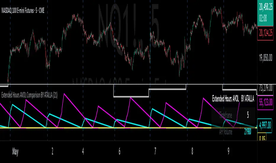
Extended Hours AVOL Comparison BY ATALLAExtended Hours AVOL Comparison BY ATALLA - Indicator Summary
Purpose
This indicator tracks and analyzes trading volume during extended market hours, dividing it into key components and comparing them to the average daily volume to provide insights into off-hours market activity.
Key Components
After Hours Volume (AH)
Tracks accumulated volume after regular market close (16:00-20:00 ET)
Displayed in absolute value and as a percentage of average daily volume
Pre-Market Volume (PM)
Tracks accumulated volume before regular market open (04:00-09:30 ET)
Displayed in absolute value and as a percentage of average daily volume
Total Extended Hours Volume (EH)
Combines AH and PM volumes to show total off-hours trading activity
Provides a consolidated view of extended hours participation
Average Daily Volume (AVOL)
Calculates the average volume over the last 21 days (configurable)
Serves as a benchmark for evaluating the significance of extended hours volumes
Visualization
Information Table
Displays all relevant data in a structured format
Shows absolute volumes and percentages for easy interpretation
Charts
Color-coded lines representing accumulated volumes (AH in cyan, PM in magenta)
Histogram visualizing the current volume percentage relative to AVOL
Practical Applications
Market Event Analysis - Evaluate the impact of news after close or before open
Momentum Assessment - Identify unusual interest in an asset outside regular hours
Opening Preparation - Assess pre-market activity to anticipate potential moves at open
Gap Strategy Development - Understand the volume behind opening or closing gaps
Liquidity Analysis - Determine if there's sufficient volume for order execution in extended hours
Customizable Settings
AVOL Period - Adjust the number of days for average volume calculation
First Volume Treatment - Option to include or exclude the volume from the first after-hours bar
This indicator serves as a valuable tool for traders who operate in or monitor assets during extended hours, providing quantitative context to assess the importance of price movements outside regular trading hours
Economic Event DatesThis TradingView indicator ("Economic Event Dates") plots significant economic event dates directly on your chart, helping you stay informed about potential market-moving announcements. It includes pre-configured dates for:
* **FOMC Meetings:** Key policy meetings of the Federal Open Market Committee.
* **CPI Releases:** Consumer Price Index data releases, a key measure of inflation.
* **Bitcoin Halvings:** Programmatic reductions in Bitcoin's new supply issuance.
**Features:**
* **Customizable Dates:** Easily input and manage dates for FOMC, CPI, and Halving events for current and future years (2025, 2026, and beyond for Halvings).
* **Visual Cues:** Displays vertical lines on the chart at the precise time of each event.
* **Event Labels:** Shows clear labels (e.g., "FOMC", "CPI", "Halving") for each event line.
* **Color Coding:** Distinct colors for FOMC (blue), CPI (orange), and Halving (purple) events for quick identification.
* **Future Events Focus:** Option to display only upcoming events relative to the current real time.
* **Morning Alerts:** (Optional) Triggers an alert on the morning of a scheduled event, providing a timely reminder.
* **Customizable Appearance:** Adjust line width and toggle label visibility.
**How to Use:**
1. Add the indicator to your TradingView chart.
2. Review and update the input dates for FOMC, CPI, and Halving events in the indicator settings. The script includes placeholders and notes for future dates that may require verification from official sources (e.g., federalreserve.gov, bls.gov).
3. Customize colors, line width, label visibility, and alert preferences as needed.
4. Observe the vertical lines on your chart indicating upcoming economic events.
This tool is designed for traders and investors who want to incorporate awareness of major economic events into their market analysis. Remember to verify future event dates as they are officially announced.
Created by YouNesta
QoQ PAT, Sales & OPM% Labels by GauravThis indicator automatically displays the Quarter-over-Quarter (QoQ) percentage change in Sales, PAT (Profit After Tax), and Operating Profit Margin (OPM%) directly on the price chart.
It fetches quarterly financial data using TradingView’s request.financial() function for:
Sales (TOTAL_REVENUE),
PAT (NET_INCOME),
Operating Profit (OPER_INCOME).
For each earnings update, it calculates:
Sales QoQ %: Growth in sales vs. the previous quarter,
PAT QoQ %: Growth in PAT vs. the previous quarter,
OPM %: Operating Profit Margin = (Operating Profit / Sales) × 100.
This helps traders and investors quickly visualize fundamental growth trends right alongside the candlestick chart, improving fundamental + technical analysis integration.

FX Currency Strength DashboardFX Currency Strength Dashboard (1H, 2H, 8H, 5D, 30D)
The FX Currency Strength Dashboard is a multi-timeframe performance analyzer for the 8 major currencies:
EUR, USD, GBP, JPY, AUD, NZD, CAD, CHF.
It displays the relative strength or weakness of each currency over five timeframes:
1 Hour
2 Hours
8 Hours
5 Days
30 Days
🧮 How It Works
Performance Measurement:
For each currency, the indicator calculates the average rate of change (ROC) across 7 currency pairs that represent that currency (e.g. EURUSD, EURJPY, EURCHF, etc.).
Directional Adjustment:
For quote-side currencies (e.g. USD in EURUSD), the ROC is inverted (i.e., negative) to correctly reflect the base currency's strength.
Averaging:
The 7 ROC values per currency are averaged to produce a clean, comparable strength score for that currency in each timeframe.
Table Display:
A real-time table shows strength scores for all 8 currencies.
The strongest currency per timeframe is highlighted in green.
The weakest currency is highlighted in red.
Neutral or middle values appear in gray.
Updates:
The dashboard refreshes every 5 bars on the 1H chart to reduce load and improve performance.

Long Short dom📊 Long Short dom (VI+) — Custom Vortex Trend Strength Indicator
This indicator is a refined version of the Vortex Indicator (VI) designed to help traders identify trend direction, momentum dominance, and potential long/short opportunities based on VI+ and VI– dynamics.
🔍 What It Shows:
• VI+ (Green Line): Measures upward trend strength.
• VI– (Red Line): Measures downward trend strength.
• Histogram (optional): Displays the difference between VI+ and VI–, helping visualize which side is dominant.
• Background Coloring: Highlights bullish or bearish dominance zones.
• Zero Line: A visual baseline to enhance clarity.
• Highest/Lowest Active Lines: Real-time markers for the strongest directional signals.
⸻
🛠️ Inputs:
• Length: Vortex calculation period (default 14).
• Show Histogram: Enable/disable VI+–VI– difference bars.
• Show Trend Background: Toggle colored zones showing trend dominance.
• Show Below Zero: Decide whether to display values that fall below 0 (for advanced use).
⸻
📈 Strategy Insights:
• When VI+ crosses above VI–, it indicates potential long momentum.
• When VI+ crosses below VI–, it signals possible short pressure.
• The delta histogram (VI+ – VI–) helps you quickly see shifts in momentum strength.
• The background shading provides an intuitive visual cue to assess trend dominance at a glance.
⸻
🚨 Built-in Alerts:
• Bullish Cross: VI+ crosses above VI– → possible entry long.
• Bearish Cross: VI+ crosses below VI– → possible entry short.
⸻
✅ Ideal For:
• Trend-following strategies
• Identifying long/short bias
• Confirming entries/exits with momentum analysis
⸻
This tool gives you clean, real-time visual insight into trend strength and shift dynamics, empowering smarter trade decisions with clarity and confidence.
Forex Session + Volume Profile [RunRox]📊 Forex Session + Volume Profile is built especially for traders who work with intra-session liquidity concepts or any strategy that needs a clear visual of trading sessions and the liquidity inside them.
Our team created this indicator to give you better session visibility, flexible session styling, and extra tools that help you navigate the market more easily.
📌 Features:
6 fully customizable sessions
Kill Zone (the high-impact trading window)
Volume Profile for each session
POC / VAL / VAH / LVN levels (Point of Control, Value Area Low, Value Area High, Low Volume Node)
PDH / PDL levels (Previous Day High / Low)
PWH / PWL levels (Previous Week High / Low)
NYM level (New York Market level)
Active sessions table
5 style options for each session
All of this gives you the flexibility to set up exactly the layout you need for your trading. Below, you’ll find a more detailed look at each feature.
🗓️ 6 CUSTOMIZABLE SESSION
The indicator includes six sessions that you can fully customize to fit your needs—everything from naming each session and choosing line colors to adjusting opacity, showing the volume profile, or even turning off a session entirely if you don’t need it.
Plus, you can pick different display styles for each session. As shown in the screenshot below, there are five style options you can apply individually to every session.
5 Style Options for Sessions
BOX
AREA
ZONES
LINES
CURVED
These styles can be customized for each session individually to help you highlight the sessions you care about on your chart. Example below
📢 VOLUME PROFILE
We’ve also integrated a Volume Profile into the indicator to pinpoint important levels on the chart. On top of that, we’ve added extra volume-based levels. Below, you’ll find the settings and a visual demo of how it appears on your chart.
To identify optimal entry points, you can use the following key reference levels:
POC (Point of Control)
VAL (Value Area Low)
VAH (Value Area High)
LVN (Low Volume Node)
You can also customize colors and line styles, or hide any levels you don’t need on your chart.
📐 ADDITIONAL LEVELS
You can display the following levels on your chart:
NYM (New York Market)
PDH (Previous Day High)
PDL (Previous Day Low)
PWH (Previous Week High)
PWL (Previous Week Low)
All of these are fully customizable with color selection and the option to extend lines into the next period.
💹 ACTIVE SESSION TABLE
The active sessions table helps you quickly identify the trading times for the sessions you care about. It’s fully customizable, with options to choose border and background colors for the table itself.
🟠 USAGE
This indicator is highly versatile: use it to simply mark trading sessions on your chart, set up the Kill Zone at your chosen time, or identify the context of the previous session by its most traded range levels. All of this makes the indicator an invaluable tool for any trader!

Divergence Macro Sentiment Indicator (DMSI)The Divergence Macro Sentiment Indicator (DMSI)
Think of DMSI as your daily “mood ring” for the markets. It boils down the tug-of-war between growth assets (S&P 500, copper, oil) and safe havens (gold, VIX) into one clear histogram—so you instantly know if the bulls have broad backing or are charging ahead with one foot tied behind.
🔍 What You’re Seeing
Green bars (above zero): Risk-on conviction.
Equities and commodities are rallying while gold and volatility retreat.
Red bars (below zero): Risk-off caution.
Gold or VIX are climbing even as stocks rise—or stocks aren’t fully joined by oil/copper.
Zero line: The line in the sand between “full-steam ahead” and “proceed with care.”
📈 How to Read It
Cross-Zero Signals
Bullish trigger: DMSI flips up through zero after a red stretch → fresh long entries.
Bearish trigger: DMSI tumbles below zero from green territory → tighten stops or go defensive.
Divergence Warnings
If SPX makes new highs but DMSI is rolling over (lower green bars or red), that’s your early red flag—rallies may fizzle.
Strength Confirmation
On pullbacks, only buy dips when DMSI ≥ 0. When DMSI is deeply positive, you can be more aggressive on position size or add leverage.
💡 Trade Guidance & Use Cases
Trend Filter: Only take your S&P or sector-ETF long setups when DMSI is non-negative—avoids hollow rallies.
Macro Pair Trades:
Deep red DMSI: go long gold or gold miners (GLD, GDX).
Strong green DMSI: lean into cyclicals, industrials, even energy names.
Risk Management:
Scale out as DMSI fades into negative territory mid-trade.
Scale in or add to winners when it stays bullish.
Swing Confirmation: Overlay on any oscillator or price-pattern system—accept signals only when the macro tide is flowing in your favour.
🚀 Why It Works
Markets don’t move in a vacuum. When stocks rally but the “real-economy” metals and volatility aren’t cooperating, something’s off under the hood. DMSI catches those cross-asset cracks before price alone can—and gives you an early warning system for smarter entries, tighter risk, and bigger gains when the macro trend really kicks in.

Extended Altman Z-Score ModelThe Extended Altman Z-Score Model represents a significant advancement in financial analysis and risk assessment, building upon the foundational work of Altman (1968) while incorporating contemporary data analytics approaches as proposed by Fung (2023). This sophisticated model enhances the traditional bankruptcy prediction framework by integrating additional financial metrics and modern analytical techniques, offering a more comprehensive approach to identifying financially distressed companies.
The model's architecture is built upon two distinct yet complementary scoring systems. The traditional Altman Z-Score components form the foundation, including Working Capital to Total Assets (X1), which measures a company's short-term liquidity and operational efficiency. Retained Earnings to Total Assets (X2) provides insight into the company's historical profitability and reinvestment capacity. EBIT to Total Assets (X3) evaluates operational efficiency and earning power, while Market Value of Equity to Total Liabilities (X4) assesses market perception and leverage. Sales to Total Assets (X5) measures asset utilization efficiency.
These traditional components are enhanced by extended metrics introduced by Fung (2023), which provide additional layers of financial analysis. The Cash Ratio (X6) offers insights into immediate liquidity and financial flexibility. Asset Composition (X7) evaluates the quality and efficiency of asset utilization, particularly in working capital management. The Debt Ratio (X8) provides a comprehensive view of financial leverage and long-term solvency, while the Net Profit Margin (X9) measures overall profitability and operational efficiency.
The scoring system employs a sophisticated formula that combines the traditional Z-Score with weighted additional metrics. The traditional Z-Score is calculated as 1.2X1 + 1.4X2 + 3.3X3 + 0.6X4 + 1.0X5, while the extended components are weighted as follows: 0.5 * X6 + 0.3 * X7 - 0.4 * X8 + 0.6 * X9. This enhanced scoring mechanism provides a more nuanced assessment of a company's financial health, incorporating both traditional bankruptcy prediction metrics and modern financial analysis approaches.
The model categorizes companies into three distinct risk zones, each with specific implications for financial stability and required actions. The Safe Zone (Score > 3.0) indicates strong financial health, with low probability of financial distress and suitability for conservative investment strategies. The Grey Zone (Score between 1.8 and 3.0) suggests moderate risk, requiring careful monitoring and additional fundamental analysis. The Danger Zone (Score < 1.8) signals high risk of financial distress, necessitating immediate attention and potential risk mitigation strategies.
In practical application, the model requires systematic and regular monitoring. Users should track the Extended Score on a quarterly basis, monitoring changes in individual components and comparing results with industry benchmarks. Component analysis should be conducted separately, identifying specific areas of concern and tracking trends in individual metrics. The model's effectiveness is significantly enhanced when used in conjunction with other financial metrics and when considering industry-specific factors and macroeconomic conditions.
The technical implementation in Pine Script v6 provides real-time calculations of both traditional and extended scores, offering visual representation of risk zones, detailed component breakdowns, and warning signals for critical values. The indicator automatically updates with new financial data and provides clear visual cues for different risk levels, making it accessible to both technical and fundamental analysts.
However, as noted by Fung (2023), the model has certain limitations that users should consider. It may not fully account for industry-specific factors, requires regular updates of financial data, and should be used in conjunction with other analysis tools. The model's effectiveness can be enhanced by incorporating industry-specific benchmarks and considering macroeconomic factors that may affect financial performance.
References:
Altman, E.I. (1968) 'Financial ratios, discriminant analysis and the prediction of corporate bankruptcy', The Journal of Finance, 23(4), pp. 589-609.
Li, L., Wang, B., Wu, Y. and Yang, Q., 2020. Identifying poorly performing listed firms using data analytics. Journal of Business Research, 109, pp.1–12. doi.org

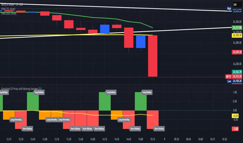
Simulated OI Proxy with Moving Average🧠 Simulated Open Interest (OI) Proxy with Moving Average
This custom TradingView indicator estimates market participation and positioning by simulating Open Interest (OI) using a proxy derived from price change and volume movement — useful especially when OI data is unavailable (e.g., NSE stocks or options).
📊 Concept & Logic:
Since TradingView doesn’t provide real OI data for many symbols (like Indian equities), this script uses a smart proxy:
✅ Simulated OI Conditions:
Long Buildup (Green bar):
Price is rising and volume is increasing → suggests fresh buying.
Short Buildup (Red bar):
Price is falling and volume is increasing → suggests new shorts are entering.
Short Covering (Blue bar):
Price is rising but volume is falling → suggests shorts are exiting positions.
Long Unwinding (Orange bar):
Price is falling and volume is dropping → suggests long positions are closing.
Neutral (Gray):
No strong directional signal.
Each condition is assigned a numeric value for analysis:
Long Buildup = +1
Short Buildup = -1
Short Covering = +0.5
Long Unwinding = -0.5
Neutral = 0
📈 Simulated OI Moving Average (Yellow Line):
To remove short-term noise, we apply a Simple Moving Average (SMA) over the simulated OI values (default: 21 periods). This line helps you:
Identify dominant positioning trends (bullish or bearish).
Use it as a signal filter in your trading strategies.
🔧 Customization:
OI MA Period: Adjust how smooth or reactive the moving average should be.
You can change the logic or combine this with EMA, RSI, or price action tools for a complete trading system.
🔍 Use Cases:
Traders in markets where real OI data is not available (like Indian stocks/options).
To analyze buildup and unwinding behavior without relying on exchange-fed OI.
As a momentum filter or signal enhancer in broader strategies.
📌 Note:
This is a proxy indicator, not a substitute for actual Open Interest. But it’s highly effective when used alongside price action and trend filters.
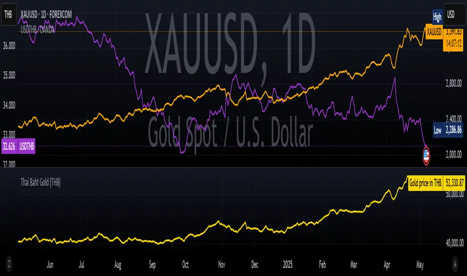
Thai Gold BahtIndicator Name: Thai Gold Baht
Short Title: Thai Gold Baht
Purpose
This indicator calculates and visualizes the real-time price of 1 Thai Gold Baht (15.244 grams) based on the global gold price ( XAU/USD ) and the USD/THB exchange rate .
Users can customize gold weight and purity to simulate the local Thai gold market price.
What it does
Retrieves live gold price per troy ounce in USD
Retrieves current USD to Thai Baht exchange rate
Converts the value using user-defined weight and purity
Displays result as a real-time chart
Shows calculation details in the Data Window
Ideal for
Traders tracking Thai gold based on international prices
Analysts comparing local and global bullion markets
Anyone needing a configurable, transparent gold price conversion
Pine Script Functionality
// Uses XAU/USD and USD/THB as inputs
// Calculates 1 Baht Gold (96.5% default purity)
// Outputs the value in THB as a chart line
ชื่ออินดิเคเตอร์: Thai Gold Baht
ชื่อย่อ: Thai Gold Baht
วัตถุประสงค์
อินดิเคเตอร์นี้ใช้คำนวณและแสดงราคาทองคำไทย 1 บาท (15.244 กรัม) แบบเรียลไทม์
โดยอ้างอิงจากราคาทองคำในตลาดโลก ( XAU/USD ) และอัตราแลกเปลี่ยน USD/THB
ผู้ใช้สามารถกำหนดน้ำหนักทองและความบริสุทธิ์เองได้ เพื่อจำลองราคาทองคำในประเทศไทยอย่างแม่นยำ
สิ่งที่อินดิเคเตอร์นี้ทำ
ดึงราคาทองคำแบบเรียลไทม์ต่อทรอยออนซ์ในสกุลเงิน USD
ดึงอัตราแลกเปลี่ยน USD → THB แบบเรียลไทม์
คำนวณราคาจากน้ำหนักและเปอร์เซ็นต์ความบริสุทธิ์ที่ผู้ใช้กำหนด
แสดงผลลัพธ์เป็นกราฟแบบเรียลไทม์ในหน่วยบาทไทย
แสดงรายละเอียดการคำนวณในหน้าต่าง Data Window ของ TradingView
เหมาะสำหรับ
นักเทรดที่ต้องการติดตามราคาทองคำไทยจากราคาทองคำตลาดโลก
นักวิเคราะห์ที่เปรียบเทียบราคาทองคำในประเทศและต่างประเทศ
ผู้ใช้งานที่ต้องการการแปลงราคาทองคำระหว่างประเทศให้โปร่งใสและปรับแต่งได้
การทำงานของ Pine Script
// ใช้ข้อมูล XAU/USD และ USD/THB เป็นอินพุต
// คำนวณราคาทองคำไทย 1 บาท (ความบริสุทธิ์เริ่มต้นที่ 96.5%)
// แสดงผลเป็นเส้นกราฟของราคาทองคำในหน่วยบาทไทย
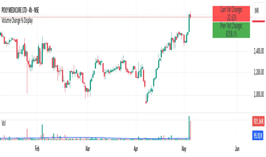
Volume Change % Display1- Current bar's volume change %
2- Previous bar's volume change %
* Each line uses its own color based on volume rising or falling.
* Keeps the layout compact and readable.
FA Dashboard: Valuation, Profitability & SolvencyFundamental Analysis Dashboard: A Multi-Dimensional View of Company Quality
This script presents a structured and customizable dashboard for evaluating a company’s fundamentals across three key dimensions: Valuation, Profitability, and Solvency & Liquidity.
Unlike basic fundamental overlays, this dashboard consolidates multiple financial indicators into visual tables that update dynamically and are grouped by category. Each ratio is compared against configurable thresholds, helping traders quickly assess whether a company meets certain value investing criteria. The tables use color-coded checkmarks and fail marks (✔️ / ❌) to visually signal pass/fail evaluations.
▶️ Key Features
Valuation Ratios:
Earnings Yield: EBIT / EV
EV / EBIT and EV / FCF: Enterprise value metrics for profitability
Price-to-Book, Free Cash Flow Yield, PEG Ratio
Profitability Ratios:
Return on Invested Capital (ROIC), ROE, Operating, Net & Gross Margins, Revenue Growth
Solvency & Liquidity Ratios:
Debt to Equity, Debt to EBITDA, Current Ratio, Quick Ratio, Altman Z-Score
Each of these metrics is calculated using request.financial() and can be viewed using either annual (FY) or quarterly (FQ) data, depending on user preference.
🧠 How to Use
Add the script to any stock chart.
Select your preferred data period (FY or FQ).
Adjust thresholds if desired to match your personal investing strategy.
Review the visual dashboard to see which metrics the company passes or fails.
💡 Why It’s Useful
This tool is ideal for traders or long-term investors looking to filter stocks using fundamental criteria. It draws inspiration from principles used by Benjamin Graham, Warren Buffett, and Joel Greenblatt, offering a fast and informative way to screen quality businesses.
This is not a repackaged built-in or autogenerated script. It’s a custom-built, interactive tool tailored for fundamental analysis using official financial data provided via Pine Script’s request.financial().

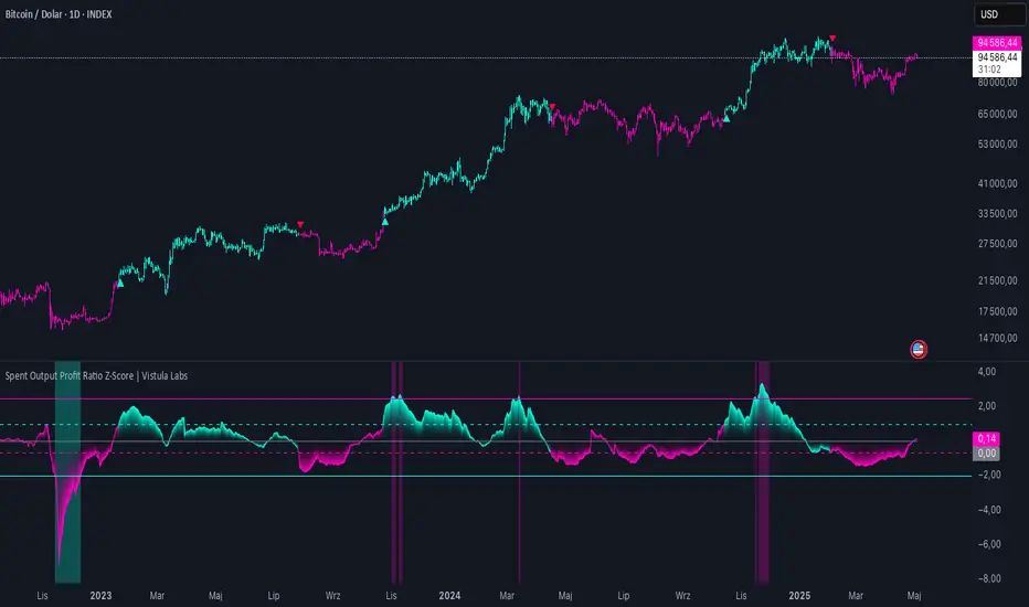
Spent Output Profit Ratio Z-Score | Vistula LabsOverview
The Spent Output Profit Ratio (SOPR) Z-Score indicator is a sophisticated tool designed by Vistula Labs to help cryptocurrency traders analyze market sentiment and identify potential trend reversals. It leverages on-chain data from Glassnode to calculate the Spent Output Profit Ratio (SOPR) for Bitcoin and Ethereum, transforming this metric into a Z-Score for easy interpretation.
What is SOPR?
Spent Output Profit Ratio (SOPR) measures the profit ratio of spent outputs (transactions) on the blockchain:
SOPR > 1: Indicates that, on average, coins are being sold at a profit.
SOPR < 1: Suggests that coins are being sold at a loss.
SOPR = 1: Break-even point, often seen as a key psychological level.
SOPR provides insights into holder behavior—whether they are locking in profits or cutting losses—making it a valuable gauge of market sentiment.
How It Works
The indicator applies a Z-Score to the SOPR data to normalize it relative to its historical behavior:
Z-Score = (Smoothed SOPR - Moving Average of Smoothed SOPR) / Standard Deviation of Smoothed SOPR
Smoothed SOPR: A moving average (e.g., WMA) of SOPR over a short period (default: 30 bars) to reduce noise.
Moving Average of Smoothed SOPR: A longer moving average (default: 180 bars) of the smoothed SOPR.
Standard Deviation: Calculated over a lookback period (default: 200 bars).
This Z-Score highlights how extreme the current SOPR is compared to its historical norm, helping traders spot significant deviations.
Key Features
Data Source:
Selectable between BTC and ETH, using daily SOPR data from Glassnode.
Customization:
Moving Average Types: Choose from SMA, EMA, DEMA, RMA, WMA, or VWMA for both smoothing and main averages.
Lengths: Adjust the smoothing period (default: 30) and main moving average length (default: 180).
Z-Score Lookback: Default is 200 bars.
Thresholds: Set levels for long/short signals and overbought/oversold conditions.
Signals:
Long Signal: Triggered when Z-Score crosses above 1.02, suggesting potential upward momentum.
Short Signal: Triggered when Z-Score crosses below -0.66, indicating potential downward momentum.
Overbought/Oversold Conditions:
Overbought: Z-Score > 2.5, signaling potential overvaluation.
Oversold: Z-Score < -2.0, indicating potential undervaluation.
Visualizations:
Z-Score Plot: Teal for long signals, magenta for short signals.
Threshold Lines: Dashed for long/short, solid for overbought/oversold.
Candlestick Coloring: Matches signal colors.
Arrows: Green up-triangles for long entries, red down-triangles for short entries.
Background Colors: Magenta for overbought, teal for oversold.
Alerts:
Conditions for Long Opportunity, Short Opportunity, Overbought, and Oversold.
Usage Guide
Select Cryptocurrency: Choose BTC or ETH.
Adjust Moving Averages: Customize types and lengths for smoothing and main averages.
Set Thresholds: Define Z-Score levels for signals and extreme conditions.
Monitor Signals: Use color changes, arrows, and background highlights to identify opportunities.
Enable Alerts: Stay informed without constant chart watching.
Interpretation
High Z-Score (>1.02): SOPR is significantly above its historical mean, potentially indicating overvaluation or strong bullish momentum.
Low Z-Score (<-0.66): SOPR is below its mean, suggesting undervaluation or bearish momentum.
Extreme Conditions: Z-Scores above 2.5 or below -2.0 highlight overbought or oversold markets, often preceding reversals.
Conclusion
The SOPR Z-Score indicator combines on-chain data with statistical analysis to provide traders with a clear, actionable view of market sentiment. Its customizable settings, visual clarity, and alert system make it an essential tool for both novice and experienced traders seeking an edge in the cryptocurrency markets.
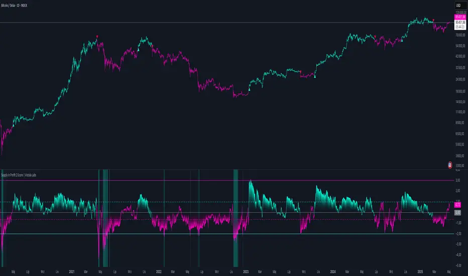
Supply In Profit Z-Score | Vistula LabsOverview
The Supply In Profit Z-Score indicator is a Pine Script™ tool developed by Vistula Labs for technical analysis of cryptocurrencies, specifically Bitcoin (BTC) and Ethereum (ETH). It utilizes on-chain data from IntoTheBlock to calculate the difference between the percentage of addresses in profit and those in loss, transforming this metric into a Z-Score. This indicator helps traders identify market sentiment, trend-following opportunities, and overbought or oversold conditions.
What is Supply In Profit?
Supply In Profit is defined as the net difference between the percentage of addresses in profit and those in loss:
Profit Percentage: The proportion of addresses where the current value of holdings exceeds the acquisition price.
Loss Percentage: The proportion of addresses where the current value is below the acquisition price.
A positive value indicates more addresses are in profit, suggesting bullish sentiment, while a negative value indicates widespread losses, hinting at bearish sentiment.
How It Works
The indicator computes a Z-Score to normalize the Supply In Profit data relative to its historical behavior:
Z-Score = (Current Supply In Profit - Moving Average of Supply In Profit) / Standard Deviation of Supply In Profit
Current Supply In Profit: The latest profit-minus-loss percentage.
Moving Average: A customizable average (e.g., EMA, SMA) over a default 180-bar period.
Standard Deviation: Calculated over a default 200-bar lookback period.
Key Features
Data Source:
Selectable between BTC and ETH, pulling daily profit/loss percentage data from IntoTheBlock.
Customization:
Moving Average Type: Options include SMA, EMA, DEMA, RMA, WMA, or VWMA (default: EMA).
Moving Average Length: Default is 180 bars.
Z-Score Lookback: Default is 200 bars.
Thresholds: Adjustable for long/short signals and overbought/oversold levels.
Signals:
Long Signal: Z-Score crosses above the Long Threshold (default: 1.0).
Short Signal: Z-Score crosses below the Short Threshold (default: -0.64).
Overbought/Oversold Conditions:
Overbought: Z-Score > 3.0.
Oversold: Z-Score < -2.0.
Visualizations:
Z-Score Plot: Teal for long signals, magenta for short signals.
Threshold Lines: Dashed lines for long/short, solid lines for overbought/oversold.
Candlestick Coloring: Matches signal colors (teal/magenta).
Arrows: Green up-triangles for long entries, red down-triangles for short entries.
Background Colors: Magenta for overbought, teal for oversold.
Alerts:
Conditions for Long Opportunity, Short Opportunity, Overbought, and Oversold.
Usage Guide
Trend Following
Long Entry: When Z-Score crosses above 1.0, indicating potential upward momentum.
Short Entry: When Z-Score crosses below -0.64, suggesting potential downward momentum.
Overbought/Oversold Analysis
Overbought (Z-Score > 3.0): Consider profit-taking or preparing for a reversal.
Oversold (Z-Score < -2.0): Look for buying opportunities or exiting shorts.
Timeframe
Uses daily IntoTheBlock data, ideal for medium to long-term analysis.
Interpretation
High Z-Score: Indicates Supply In Profit is significantly above its historical mean, potentially signaling overvaluation.
Low Z-Score: Suggests Supply In Profit is below its mean, indicating possible undervaluation.
Signals and thresholds help traders act on shifts in market sentiment or extreme conditions.
Conclusion
The Supply In Profit Z-Score indicator provides a robust, data-driven approach to analyzing cryptocurrency market trends and sentiment. By combining on-chain metrics with statistical normalization, it empowers traders to make informed decisions based on historical context and current market dynamics.
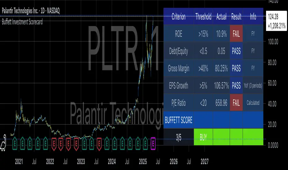
Buffett Investment ScorecardYou want to buy a stock and wonder if Warren Buffett would buy it?
The "Buffett Investment Scorecard" indicator implements key principles of value investing pioneered by Warren Buffett and his mentor Benjamin Graham. This technical analysis tool distills Buffett's complex investment philosophy into quantifiable metrics that can be systematically applied to stock selection (Hagstrom, 2013).
Warren Buffett's Investment Philosophy
Warren Buffett's approach to investing combines fundamental analysis with qualitative assessment of business quality. As detailed in his annual letters to Berkshire Hathaway shareholders, Buffett seeks companies with durable competitive advantages, often referred to as "economic moats" (Buffett, 1996). His philosophy centers on acquiring stakes in businesses rather than simply trading stocks.
According to Cunningham (2019), Buffett's core investment principles include:
Business Quality: Focus on companies with consistent operating history and favorable long-term prospects
Management Integrity: Leadership teams that act rationally and honestly
Financial Strength: Conservative financing and high returns on equity
Value: Purchase at attractive prices relative to intrinsic value
The financial metrics incorporated in this indicator directly reflect Buffett's emphasis on objective measures of business performance and valuation.
Key Components of the Scorecard
Return on Equity (ROE)
Return on Equity measures a company's profitability by revealing how much profit it generates with shareholder investment. Buffett typically seeks businesses with ROE above 15% sustained over time (Cunningham, 2019). As noted by Hagstrom (2013, p.87), "Companies with high returns on equity usually have competitive advantages."
Debt-to-Equity Ratio
Buffett prefers companies with low debt. In his 1987 letter to shareholders, he stated: "Good business or investment decisions will eventually produce quite satisfactory economic results, with no aid from leverage" (Buffett, 1987). The scorecard uses a threshold of 0.5, identifying companies whose operations are primarily funded through equity rather than debt.
Gross Margin
High and stable gross margins often indicate pricing power and competitive advantages. Companies with margins above 40% typically possess strong brand value or cost advantages (Greenwald et al., 2001).
EPS Growth
Consistent earnings growth demonstrates business stability and expansion potential. Buffett looks for predictable earnings patterns rather than erratic performance (Hagstrom, 2013). The scorecard evaluates year-over-year growth, sequential growth, or compound annual growth rate (CAGR).
P/E Ratio
The price-to-earnings ratio helps assess valuation. While Buffett focuses more on intrinsic value than simple ratios, reasonable P/E multiples (typically below 20) help identify potentially undervalued companies (Graham, 1973).
Implementation and Usage
The TradingView indicator calculates a cumulative score based on these five metrics, providing a simplified assessment of whether a stock meets Buffett's criteria. Results are displayed in a color-coded table showing each criterion's status (PASS/FAIL).
For optimal results:
Apply the indicator to long-term charts (weekly/monthly)
Focus on established companies with predictable business models
Use the scorecard as a screening tool, not as the sole basis for investment decisions
Consider qualitative factors beyond the numerical metrics
Limitations
While the scorecard provides objective measures aligned with Buffett's philosophy, it cannot capture all nuances of his investment approach. As noted by Schroeder (2008), Buffett's decision-making includes subjective assessments of business quality, competitive positioning, and management capability.
Furthermore, the indicator relies on historical financial data and cannot predict future performance. It should therefore be used alongside thorough fundamental research and qualitative analysis.
References
Buffett, W. (1987). Letter to Berkshire Hathaway Shareholders. Berkshire Hathaway Inc.
Buffett, W. (1996). Letter to Berkshire Hathaway Shareholders. Berkshire Hathaway Inc.
Cunningham, L.A. (2019). The Essays of Warren Buffett: Lessons for Corporate America. Carolina Academic Press.
Graham, B. (1973). The Intelligent Investor. Harper & Row.
Greenwald, B., Kahn, J., Sonkin, P., & van Biema, M. (2001). Value Investing: From Graham to Buffett and Beyond. Wiley Finance.
Hagstrom, R.G. (2013). The Warren Buffett Way. John Wiley & Sons.
Schroeder, A. (2008). The Snowball: Warren Buffett and the Business of Life. Bantam Books.
MBODDS GLOBAL - Enhanceden
MBODDS GLOBAL Indicator – Detailed Interpretation
What does the indicator measure?
Liquidity preferences
Credit risk perception
Market stress levels
Interpreting the ODDS Value
ODDS Value Explanation
Positive ODDS (> 0) SOFR is higher than the T-Bill rate → Interbank liquidity is more expensive → Possible financial stress.
Negative ODDS (< 0) T-Bill rates are higher than SOFR → The government pays more interest in the short term → Liquidity abundance, normal market conditions.
ODDS ≈ 0 Neutral market state → Low stress, market is stable.
Z-Score Interpretation (Extremity Analysis)
The Z-Score measures the standard deviation of ODDS, detecting extreme values:
Z-Score Meaning
> +1.0 Spread is unusually high → Stress/crisis risk increases.
< -1.0 Spread is unusually low → Liquidity could be abundant.
> +2.0 Extremely high spread → Systemic risk (observed during 2008-2020 periods).
≈ 0 Average level → Normal conditions, no notable risk.
The Z-Score functions as an "anomaly detector" for this indicator.
SMA (Simple Moving Average) Interpretation
The 21-day SMA shows the trend of ODDS:
ODDS consistently above SMA: Rising stress and credit costs.
ODDS consistently below SMA: Easier liquidity and lower market concerns.
Threshold Bands (±0.5)
These thresholds are visual guides for alerts:
ODDS > +0.5: Rising stress, potential liquidity tightening → Risky environment.
ODDS < -0.5: Low spread → Abundant liquidity, low stress → Comfortable environment.
Use Cases
Macro analysis (especially after Fed policy changes)
Direction determination in bond, equity, or credit markets
Early signal for stressful periods
Predicting liquidity crises
Conclusion:
This indicator acts as a macro-based "silent alarm." Specifically:
SOFR > T-Bill and Z-Score > 1: Stress and risk are increasing, protection strategies should be considered.
T-Bill > SOFR and Z-Score < -1: Liquidity is abundant, risk appetite may rise.

Global ETF Capital FlowsThe Global ETF Capital Flows indicator is designed as a research and monitoring tool for identifying capital allocation trends across major global exchange-traded funds (ETFs). It provides standardized fund flow data for regional equity markets (including the United States, Europe, Asia, and Emerging Markets), as well as alternative asset classes such as bonds and gold.
Fund flows into and out of ETFs are increasingly recognized as a leading indicator of investor behavior, particularly in the context of tactical asset allocation and risk appetite (Ben-David et al., 2017). By tracking aggregated ETF flows, the script enables the user to detect shifts in global investment preferences, which may precede price action and influence broader macro trends (Bank of International Settlements, 2018). For example, consistent inflows into U.S. large-cap ETFs such as SPY or QQQ may signal heightened investor confidence in domestic equities, whereas rising flows into bond ETFs such as TLT may suggest a flight to safety or expectations of declining interest rates (Israeli et al., 2017).
The visualization aspect of the script uses standardized z-scores to represent cumulative flows over a specified period. This normalization allows users to compare fund flows across regions and asset classes on a relative basis, filtering out scale differences and allowing for more effective cross-market analysis. According to Coates and Herbert (2008), normalization techniques such as z-scores are crucial in behavioral finance research, as they help detect anomalies and emotional extremes in investor activity.
Practically, this indicator is suited for top-down macro analysis, sector rotation strategies, and confirmation of technical signals. For instance, significant positive deviations in the standardized flow data for European ETFs may support a bullish bias on regional equities, especially if corroborated by technical breakouts or improving economic indicators. Conversely, elevated inflows into gold ETFs may be interpreted as hedging behavior against geopolitical uncertainty or inflationary pressure, consistent with historical patterns of gold’s role as a safe haven (Baur and Lucey, 2010).
Additionally, the tool allows for visual alerts when flow anomalies exceed a user-defined threshold, thereby supporting more responsive and data-driven decision-making. This feature aligns with findings from the CFA Institute (2019), which emphasize the growing importance of alternative data and automated alert systems in modern portfolio management.
From a research perspective, the indicator facilitates empirical study into capital mobility, intermarket relationships, and ETF investor psychology. It offers real-time monitoring of region-specific investment flows, thus serving as a proxy for investor conviction, liquidity trends, and cross-border risk-on/risk-off sentiment. Several recent studies have demonstrated the predictive power of ETF flows on future returns and volatility, particularly during periods of market stress or structural dislocations (Madhavan, 2016; Pan and Zeng, 2019).
References
• Baur, D.G. and Lucey, B.M., 2010. Is gold a hedge or a safe haven? An analysis of stocks, bonds and gold. Financial Review, 45(2), pp.217-229.
• Ben-David, I., Franzoni, F. and Moussawi, R., 2017. Exchange-traded funds (ETFs). Annual Review of Financial Economics, 9, pp.169–189.
• Bank of International Settlements (BIS), 2018. ETFs – growing popularity, growing risks? BIS Quarterly Review, March 2018.
• CFA Institute, 2019. Investment Professional of the Future. Available at: www.cfainstitute.org .
• Coates, J.M. and Herbert, J., 2008. Endogenous steroids and financial risk taking on a London trading floor. Proceedings of the National Academy of Sciences, 105(16), pp.6167–6172.
• Israeli, D., Lee, C.M. and Sridharan, S.A., 2017. Is there a dark side to ETF trading? Evidence from corporate bond ETFs. SSRN Working Paper. Available at SSRN: ssrn.com
• Madhavan, A., 2016. Exchange-Traded Funds and the New Dynamics of Investing. Oxford University Press.
• Pan, K. and Zeng, Y., 2019. ETF Arbitrage Under Liquidity Mismatch. Journal of Finance, 74(6), pp.2731–2783.

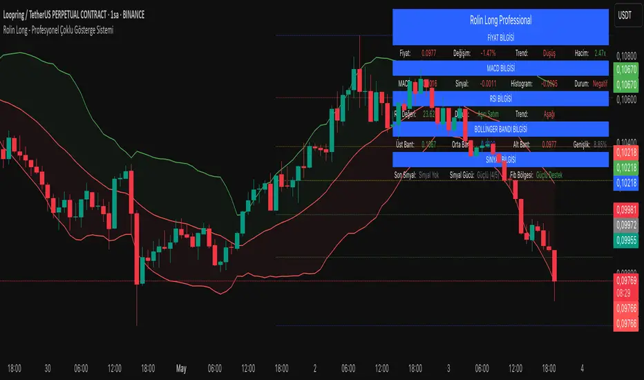
Professional Multi-Indicator SystemDescription
Professional Multi-Indicator System merges several proven technical indicators into a single overlay, allowing you to monitor trend, momentum, volatility, and key price levels all at once. Below you’ll find why these components work together, default parameters, backtest results, usage recommendations, and important disclaimers.
1. Mashup Justification & Components
MACD: Detects trend direction and momentum shifts via fast/slow crossover and histogram analysis.
RSI: Filters overbought/oversold conditions and confirms momentum using a 50-level threshold.
Bollinger Bands: Captures volatility squeezes and band touches to signal potential breakouts or pullbacks.
Fibonacci Retracement: Automatically (or manually) draws key support/resistance levels at 23.6%, 38.2%, 50%, 61.8%, 78.6%, and 100%.
Combined Workflow:
Trend Confirmation (MACD + RSI)
Volatility Check (Bollinger Bands)
Level-Based Entries/Exits (Fibonacci)
This layered approach reduces false signals and increases overall reliability.
2. Default Settings
Account Size: $10,000 (example)
Commission: 0.1% per trade
Slippage: 0.05%
Test Instrument & Period: BTCUSDT 1H, Jan 1 2022 – Dec 31 2023
Risk per Trade: Maximum 5% of equity
Indicator Defaults:
MACD: 12 / 26 / 9 (optional confirmation)
RSI: 14 period, OB = 70, OS = 30 (optional confirmation)
Bollinger Bands: 20 period, ±2 σ (optional confirmation)
Fibonacci: 50 period, auto-trend detection on
Volume Filter: 20-period SMA, threshold = 1.5× average
Visuals: Modern labels, large icons, info table in top-right
3. Backtest Summary
Total Trades: 158
Win Rate: 58.2%
Average Risk/Reward: 1:1.6
Max Drawdown: 12.4%
Net Return: +24.7%
Note: Past performance does not guarantee future results. Adjust settings to your own instruments and timeframes.
4. How to Use
Add to Chart: Select “Professional Multi-Indicator System.”
Review Settings: Open Settings → Main, MACD, RSI, Bollinger, Volume, Fibonacci, Visuals.
Enable Confirmations: Turn on “confirmation” for each component to filter weak signals.
Wait for Strong Signal: Consider entries when signalStrength ≥ 3/5.
Manage Risk: Size positions ≤ 5% of your capital; factor in commission/slippage.
Exit Rules: Close on “Strong SELL” alert or your predefined stop-loss.
5. Warnings & Disclaimer
This indicator is for educational purposes only. Always apply your own analysis and risk management. Past performance is not indicative of future results. Update commission, slippage, and risk settings to match your trading environment.