MC Geopolitical Tension Events📌 Script Title: Geopolitical Tension Events
📖 Description:
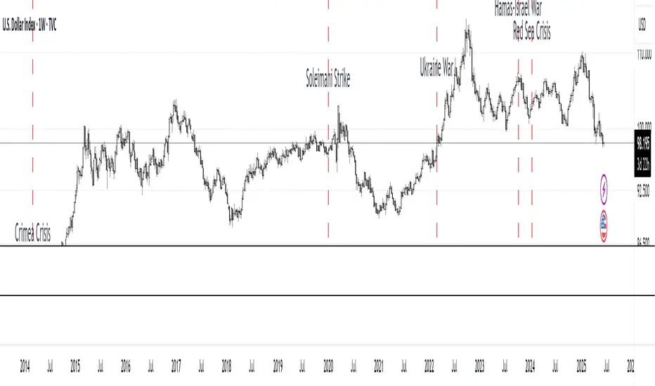
This script highlights key geopolitical and military tension events from 1914 to 2024 that have historically impacted global markets.
It automatically plots vertical dashed lines and labels on the chart at the time of each major event. This allows traders and analysts to visually assess how markets have responded to global crises, wars, and significant political instability over time.
🧠 Use Cases:
Historical backtesting: Understand how market responded to past geopolitical shocks.
Contextual analysis: Add macro context to technical setups.
🗓️ List of Geopolitical Tension Events in the Script
Date Event Title Description
1914-07-28 WWI Begins Outbreak of World War I following the assassination of Archduke Franz Ferdinand.
1929-10-24 Wall Street Crash Black Thursday, the start of the 1929 stock market crash.
1939-09-01 WWII Begins Germany invades Poland, starting World War II.
1941-12-07 Pearl Harbor Japanese attack on Pearl Harbor; U.S. enters WWII.
1945-08-06 Hiroshima Bombing First atomic bomb dropped on Hiroshima by the U.S.
1950-06-25 Korean War Begins North Korea invades South Korea.
1962-10-16 Cuban Missile Crisis 13-day standoff between the U.S. and USSR over missiles in Cuba.
1973-10-06 Yom Kippur War Egypt and Syria launch surprise attack on Israel.
1979-11-04 Iran Hostage Crisis U.S. Embassy in Tehran seized; 52 hostages taken.
1990-08-02 Gulf War Begins Iraq invades Kuwait, triggering U.S. intervention.
2001-09-11 9/11 Attacks Coordinated terrorist attacks on the U.S.
2003-03-20 Iraq War Begins U.S.-led invasion of Iraq to remove Saddam Hussein.
2008-09-15 Lehman Collapse Bankruptcy of Lehman Brothers; peak of global financial crisis.
2014-03-01 Crimea Crisis Russia annexes Crimea from Ukraine.
2020-01-03 Soleimani Strike U.S. drone strike kills Iranian General Qasem Soleimani.
2022-02-24 Ukraine Invasion Russia launches full-scale invasion of Ukraine.
2023-10-07 Hamas-Israel War Hamas launches attack on Israel, sparking war in Gaza.
2024-01-12 Red Sea Crisis Houthis attack ships in Red Sea, prompting Western naval response.
Fundamental Analysis
Yelober - Intraday ETF Dashboard# How to Read the Yelober Intraday ETF Dashboard
The Intraday ETF Dashboard provides a powerful at-a-glance view of sector performance and trading opportunities. Here's how to interpret and use the information:
## Basic Dashboard Reading
### Color-Coding System
- **Green values**: Positive performance or bullish signals
- **Red values**: Negative performance or bearish signals
- **Symbol colors**: Green = buy signal, Red = sell signal, Gray = neutral
### Example 1: Identifying Strong Sectors
If you see XLF (Financials) with:
- Day % showing +2.65% (green background)
- Symbol in green color
- RSI of 58 (not overbought)
**Interpretation**: Financial sector is showing strength and momentum without being overextended. Consider long positions in top financial stocks like JPM or BAC.
### Example 2: Spotting Weakness
If you see XLK (Technology) with:
- Day % showing -1.20% (red background)
- Week % showing -3.50% (red background)
- Symbol in red color
- RSI of 35 (approaching oversold)
**Interpretation**: Technology sector is showing weakness across multiple timeframes. Consider avoiding tech stocks or taking short positions in names like MSFT or AAPL, but be cautious as the low RSI suggests a bounce may be coming.
## Advanced Interpretations
### Example 3: Sector Rotation Detection
If you observe:
- XLE (Energy) showing +2.10% while XLK (Technology) showing -1.50%
- Both sectors' Week % values showing the opposite trend
**Interpretation**: This suggests money is rotating out of technology into energy stocks. This rotation pattern is actionable - consider reducing tech exposure and increasing energy positions (look at XOM, CVX in the Top Stocks column).
### Example 4: RSI Divergences
If you see XLU (Utilities) with:
- Day % showing +0.50% (small positive)
- RSI showing 72 (overbought, red background)
**Interpretation**: Despite positive performance, the high RSI suggests the sector is overextended. This divergence between price and indicator suggests caution - the rally in utilities may be running out of steam.
### Example 5: Relative Strength in Weak Markets
If SPY shows -1.20% but XLP (Consumer Staples) shows +0.30%:
**Interpretation**: Consumer staples are showing defensive strength during market weakness. This is typical risk-off behavior. Consider defensive positions in stocks like PG, KO, or PEP for protection.
## Practical Application Scenarios
### Day Trading Setup
1. **Morning Market Assessment**:
- Check which sectors are green pre-market
- Focus on sectors with Day % > 1% and RSI between 40-70
- Identify 2-3 stocks from the Top Stocks column of the strongest sector
2. **Midday Reversal Hunting**:
- Look for sectors with symbol color changing from red to green
- Confirm with RSI moving away from extremes
- Trade stocks from that sector showing similar pattern changes
### Swing Trading Application
1. **Trend Following**:
- Identify sectors with positive Day % and Week %
- Look for RSI values in uptrend but not overbought (45-65)
- Enter positions in top stocks from these sectors, using daily charts for confirmation
2. **Contrarian Setups**:
- Find sectors with deeply negative Day % but RSI < 30
- Look for divergence (price making new lows but RSI rising)
- Consider counter-trend positions in the stronger stocks within these oversold sectors
## Reading Special Conditions
### Example 6: Risk-Off Environment
If you observe:
- XLP (Consumer Staples) and XLU (Utilities) both green
- XLK (Technology) and XLY (Consumer Disc) both red
- SPY slightly negative
**Interpretation**: Classic risk-off rotation. Investors are moving to safety. Consider defensive positioning and reducing exposure to growth sectors.
### Example 7: Market Breadth Analysis
Count the number of sectors in green vs. red:
- If 7+ sectors are green: Strong bullish breadth, consider aggressive long positioning
- If 7+ sectors are red: Weak market breadth, consider defensive positioning or shorts
- If evenly split: Market is indecisive, focus on specific sector strength instead of broad market exposure
Remember that this dashboard is most effective when combined with broader market analysis and appropriate risk management strategies.

Global Market Pulse + [Combined]The Global Market Pulse + is a multi-functional analytical tool designed for traders and investors working with cryptocurrencies, stocks, and macroeconomic assets. It integrates 7 independent analytical modules into a single script, providing a comprehensive market assessment.
Operating Modes
1️⃣ Crypto Mode
Function: Monitors the crypto market health by analyzing:
Altcoin market capitalization (excluding BTC)
Bitcoin and Ethereum dominance shifts
Trading volume dynamics
Output: Pulse line (0-100 scale) with:
Accumulation Zone (Bullish)
Distribution Zone (Bearish)
2️⃣ Equity Mode
Function: Tracks traditional markets via:
S&P 500 (SPX) momentum
US Dollar Index (DXY) trends
Gold/Silver ratio
Use Case: Identifies "risk-on/risk-off" periods affecting crypto.
3️⃣ Correlation Mode
Function: Calculates BTC's correlation with:
SPX | Gold | Oil | Custom assets (user-defined)
Thresholds:
+0.7+ Strong positive correlation
-0.7- Inverse correlation
4️⃣ Altseason Mode
Function: Detects altcoin investment opportunities using:
Altcoin Dominance Oscillator
Custom OB/OS levels
Signals:
Buy: Oversold + Volume spike
Sell: Overbought + Volume drop
5️⃣ Cycle Mode
Function:
Auto-detects market cycle lengths
Predicts future turning points
Features:
Adaptive timeframe-based settings
Anomaly detection (deviations from mean)
6️⃣ RSX-MACD Mode
Function: Hybrid momentum indicator combining:
RSX (smoothed RSI)
Classic MACD logic
Advantage: Reduced false signals vs traditional MACD.
7️⃣ Dual-RSX Mode
Function: Dual-speed RSX indicator with:
Fast line (short-term)
Slow line (long-term)
Key Features
Adaptive Logic: Auto-adjusts parameters based on:
Selected timeframe (M1 - Weekly)
Market type (Crypto/Stocks)
Multi-Timeframe Analysis: Processes higher timeframe data on any chart.
Custom Assets: Add any ticker for correlation studies.
Visual Alerts: Color-coded signals for quick interpretation.
Usage Recommendations
For Crypto Traders:
Combine Crypto + Altseason modes for altcoin timing.
Use Correlation to filter macro risks.
Stock Investors:
Equity + Cycle modes for SPX/gold entry points.
Algorithmic Trading:
RSX-MACD/Dual-RSX provide ready-made conditions for bots.
⚠ Disclaimer: Educational tool only. Always confirm signals with additional analysis.
Global Market Pulse + — это многофункциональный инструмент для анализа крипторынка, акций и макроактивов. Он объединяет 7 независимых модулей в одном скрипте.
Режимы работы
1️⃣ Crypto (Крипторынок)
Анализ:
Капитализация альткоинов (без BTC)
Доминирование BTC/ETH
Объемы торгов
Сигналы:
Аккумуляция (бычья зона)
Дистрибуция (медвежья зона)
2️⃣ Equity (Фондовый рынок)
Анализ:
Динамика S&P 500 (SPX)
Индекс доллара (DXY)
Соотношение золото/серебро
Применение: Определение "risk-on/risk-off" периодов.
3️⃣ Correlation (Корреляции)
Анализ: Корреляция BTC с:
SPX | Золото | Нефть | Пользовательскими активами
Пороги:
+0.7+ Сильная прямая связь
-0.7- Обратная корреляция
4️⃣ Altseason (Альтсезон)
Анализ:
Осциллятор доминирования альткоинов
Уровни перекупленности/перепроданности
Сигналы:
Покупка: Перепроданность + рост объемов
Продажа: Перекупленность + падение объемов
5️⃣ Cycle (Циклы)
Функции:
Автовыявление длительности циклов
Прогноз точек разворота
Особенности:
Автоподстройка под таймфрейм
Детекция аномалий
6️⃣ RSX-MACD
Особенности: Гибрид RSX (сглаженный RSI) и MACD.
Преимущество: Меньше ложных сигналов.
7️⃣ Dual-RSX
Функция: Двойной RSX с:
Быстрой линией (краткосрок)
Медленной линией (долгосрок)
Уровни: 20 (перепрод.) / 50 (центр) / 80 (перекуп.)
Ключевые особенности
Автоподстройка под таймфрейм и тип рынка.
Мультитаймфрейм-анализ на любом графике.
Кастомизация: Добавление любых активов для корреляций.
Визуальные сигналы: Цветовая индикация состояний.
Рекомендации по использованию
Криптотрейдерам:
Комбинация Crypto + Altseason для торговли альткоинами.
Correlation для учета макрорисков.
Инвесторам:
Equity + Cycle для точек входа в SPX/золото.
Алготрейдинг:
RSX-MACD/Dual-RSX как условия для торговых роботов.
⚠ Важно: Инструмент для анализа. Не является торговой рекомендацией.

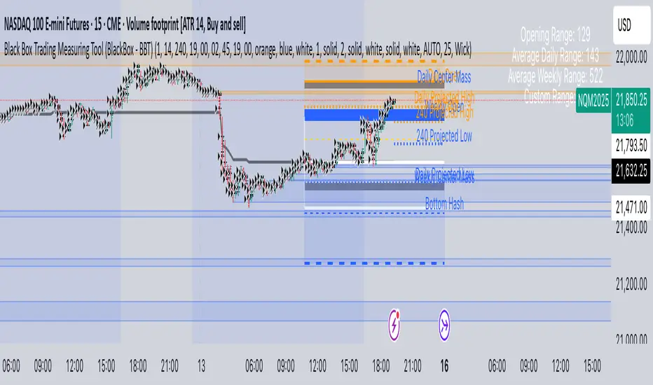
Black Box Trading Measuring Tool (BlackBox - BBT)Overview
The Black Box Trading Indicator is a comprehensive technical analysis tool that combines multiple trading concepts into a single, powerful indicator. It displays custom session ranges, Average Daily Range (ADR) projections, support/resistance levels, and order blocks to help traders identify key market levels and potential trading opportunities.
Key Features
1. Custom Session Ranges
Define and visualize any trading session with customizable start and end times
Automatically calculates session high, low, and midpoint
Displays quarter levels (25% and 75% of range)
Shows range projections at 100%, 150%, 200%, and 250% extensions
2. Average Daily Range (ADR) Analysis
Calculates and displays ADR for daily, weekly, monthly, and custom timeframes
Shows projected high and low targets based on ADR
Includes "hash" levels at 50% ADR from session midpoint
Visual range boxes highlight potential support/resistance zones
3. Market Structure Levels
Daily and weekly opening prices with dynamic coloring
Previous daily and weekly center mass (50% of previous period's range)
Real-time range statistics displayed in an information table
4. Order Block Detection
Automatically identifies bullish and bearish order blocks
Visual representation with customizable colors and transparency
Mitigation tracking to remove invalidated blocks
Alert system for price interaction with order blocks
Parameter Guide
Display Settings
Show Blocks
Enables/disables order block visualization
Useful for cleaner charts when focusing on other elements
Show Previous Daily/Weekly Center Mass
Displays the midpoint of the previous period's range
Helps identify potential support/resistance from prior price acceptance areas
Show Daily/Weekly Open
Shows opening prices with color coding (blue for bullish, orange for bearish)
Important reference points for intraday trading
Show ADR Targets
Displays projected highs and lows based on Average Daily Range
Essential for setting realistic profit targets and stop losses
Show Range Projection
Extends the session range by multiples (1x, 1.5x, 2x, 2.5x)
Helps identify potential price targets during trending moves
Show Average Daily Range
Displays the ADR statistics table
Shows current range metrics for multiple timeframes
Display range in pips
Converts range values to pips for forex traders
Provides standardized measurement across different instruments
ADR Configuration
ADR Days
Number of days to include in current ADR calculation
Default: 1 (shows today's developing range)
ADR Period
Lookback period for calculating average range
Default: 14 days (standard period for volatility measurement)
Custom Range
Select between 60-minute or 240-minute timeframes
Allows analysis of intermediate timeframes
Session Time Settings (EST)
Start Hour/Minute
Define when your custom session begins
Default: 19:00 EST (Asian session open)
End Hour/Minute
Define when your custom session ends
Default: 02:45 EST (London session approach)
Extend To Hour/Minute
How far to extend the horizontal lines
Default: 19:00 EST (full 24-hour extension)
Visual Customization
Color Settings
Top Color: Used for upper levels and bullish projections
Bottom Color: Used for lower levels and bearish projections
Range Outline Color: Main session range boundaries
Center Range Line Color: Session midpoint visualization
Line Settings
Range Outline Width: Thickness of range box borders
Session Line Width: Thickness of horizontal level lines
Line Styles: Choose between solid, dashed, or dotted
Text Settings
Text Color: Color for all labels
Text Size: AUTO, tiny, small, normal, or large
Order Block Settings
Sensitivity
Percentage threshold for order block detection (1-100)
Higher values = fewer but stronger blocks
Default: 25 (detects 25% price movements)
OB Mitigation Type
Close: Block is mitigated when price closes beyond it
Wick: Block is mitigated when price wicks beyond it
Color Configuration
Separate colors for bullish and bearish blocks
Border and background colors can be customized independently
Trading Applications
1. Session-Based Trading
Identify the initial balance (first hour of trading)
Trade breakouts from defined session ranges
Use range projections for profit targets
Monitor for range-bound vs trending conditions
2. ADR-Based Strategies
Set daily profit targets based on ADR projections
Identify overextended moves when price exceeds ADR
Use ADR levels for position sizing and risk management
Compare current range to average for volatility assessment
3. Support/Resistance Trading
Use previous period center mass as dynamic S/R
Trade bounces from daily/weekly opens
Combine multiple timeframe levels for confluence
Monitor order blocks for potential reversal zones
4. Order Block Trading
Enter trades when price returns to unmitigated blocks
Use blocks as stop loss placement guides
Look for confluence with other indicator levels
Monitor block mitigation for trend confirmation
Best Practices
1. Multi-Timeframe Analysis
Use higher timeframe blocks for major levels
Combine with lower timeframe entries
Monitor weekly levels on daily charts
2. Confluence Trading
Look for areas where multiple levels align
Combine order blocks with ADR targets
Use session ranges with center mass levels
3. Risk Management
Use ADR for realistic daily profit targets
Place stops beyond order blocks or range extremes
Size positions based on distance to key levels
4. Alert Usage
Set alerts for ADR target hits
Monitor order block interactions
Track range breakouts and hash level tests
Tips for Effective Use
Start Simple: Begin with basic session ranges and ADR before adding all features
Color Coding: Use consistent colors across your trading setup
Time Zones: Ensure session times match your trading schedule
Clean Charts: Toggle off unused features for clarity
Backtesting: Study how price respects these levels historically
Journaling: Document which levels work best for your traded instruments
Common Trading Scenarios
Range Trading
Enter longs at session low or lower projections
Enter shorts at session high or upper projections
Target the session midpoint or opposite extreme
Breakout Trading
Wait for clear breaks of session range
Use range width for measuring targets
Monitor ADR to gauge breakout potential
Trend Following
Use order blocks as pullback entries
Trail stops using range projections
Scale out at ADR targets
Reversal Trading
Look for price rejection at ADR extremes
Monitor order block mitigation failures
Use center mass as reversal confirmation
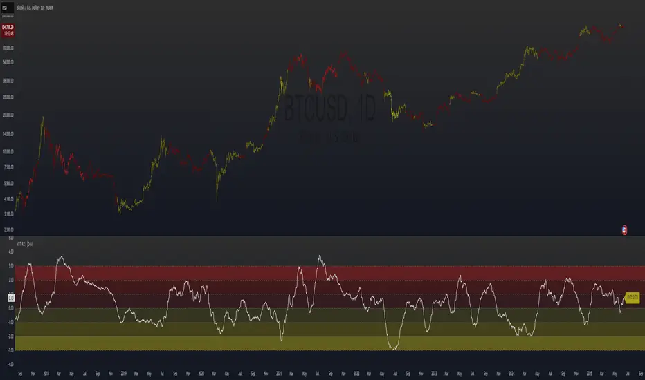
NVT Ratio Z-Score | [DeV]** DISCLAIMER: This indicator is not trend following, so it SHOULD NOT be a buy/sell signal or used as a stand alone indicator to tell you to buy or sell. It's simply giving insight into potential overbought or oversold market conditions, and should be used in conjunction with other market analysis tools to give you an idea of possible market reversals.**
The NVT Ratio Z-Score is a unique on-chain valuation tool that helps users assess whether Bitcoin is potentially overbought or oversold relative to its network fundamentals. This indicator calculates the Network Value to Transactions (NVT) ratio, which compares Bitcoin’s market capitalization (price × circulating supply) to the USD-denominated daily transaction volume on the network. To improve clarity and remove short-term noise, the NVT value is smoothed using a customizable moving average (NVT Smoothing Period). The smoothed value is then normalized using a Z-score over a rolling period (Normalization Lookback Period), allowing for easier comparison of extreme deviations over time. This normalization makes it possible to spot historically high or low valuation zones with consistency.
While the NVT Ratio Z-Score is not a price action or trend-following indicator, it excels as a valuation-based supplemental tool. By using this indicator alongside your existing technical setups—such as momentum oscillators (like RSI or MACD), moving averages, or volume profiles—you can gain a deeper perspective on whether the broader market is operating in an overheated or undervalued state.
Interpretation is straightforward: the lower the Z-score dips into negative territory, the more oversold the market may be, potentially indicating a bottoming process or future upward reversal. Conversely, higher Z-scores suggest the market is becoming overheated or overbought, which can precede pullbacks or broader downtrends. However, it’s crucial to remember: this is not a trend indicator. Overbought conditions don’t guarantee immediate downturns, and oversold conditions don’t guarantee immediate rallies. Markets can remain extended in either direction for prolonged periods.
Use the NVT Ratio Z-Score to contextualize price moves and strengthen conviction when your other tools show signals aligning with extreme valuation zones. This indicator is especially helpful for swing traders, long-term investors, and those analyzing Bitcoin through a macro-on-chain lens.
Greer Value📈 Greer Value
This indicator evaluates the year-over-year (YoY) growth consistency of five key fundamental metrics for any stock:
Book Value Per Share
Free Cash Flow
Operating Margin
Total Revenue
Net Income
The script tracks whether each metric increases annually based on financial statement data (FY), then calculates both individual and aggregate increase percentages over time. A color-coded table is displayed on the most recent bar showing:
Raw counts of increases vs. checks per metric
Percentage of years with growth
Overall "Greer Value" score indicating total consistency across all five metrics
✅ Green = Strong YoY growth
❌ Red = Weak or inconsistent growth
Use this tool to help identify fundamentally improving companies with long-term value creation potential.

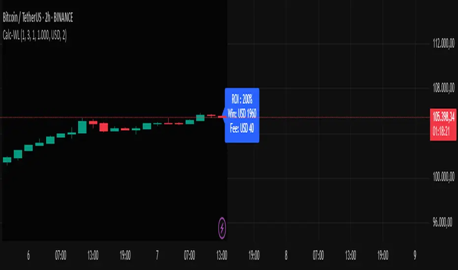
Calc win-LoserHow to Use the Calc win-Loser Indicator
The indicator calculates the profit or loss of the operation, showing how much you gained or lost on the invested amount, without adding the initial capital, displaying only the profit or loss separately.
Use a period (.) to separate decimal numbers, without thousand separators (e.g., 1000 for one thousand, 1000.50 for one thousand and fifty cents).
Price Definition for Calculation
Long Position (buy):
Low Price: entry price (lower)
High Price: exit price (higher)
Example: enter at 1 and exit at 3
Short Position (sell):
High Price: entry price (higher)
Low Price: exit price (lower)
Example: enter at 3 and exit at 1
Main Parameters
Parameter Description Example
Low Price Base price for calculation (Long: entry; Short: exit) 1
High Price Base price for calculation (Long: exit; Short: entry) 3
Leverage Operation multiplier (leverage) 2.0
Universal Amount Total amount invested 1000
Broker Fee (%) Percentage fee charged by broker 0.1
Currency Currency symbol for value display USD
Practical Example
Long: entry at 1, exit at 3, 2x leverage, $1000 investment, 0.1% fee.
Short: entry at 3, exit at 1, 2x leverage, $1000 investment, 0.1% fee.
The indicator will show the expected profit or loss based on the percentage difference adjusted by leverage and subtracting the broker fee.
Notes
Adjust prices according to the type of operation (Long or Short).
Use a period for decimals and do not use thousand separators.
This indicator is a simulation tool and does not execute automatic trades.
Original indicator by Canhoto-Medium — protected to maintain order and respect, prevent copying and plagiarism.
Simple Position CalculatorThis indicator provides a real-time position sizing calculator designed for fast momentum trading. It instantly calculates optimal trade size based on your risk parameters, entry/exit prices, and exchange conditions (fees/slippage). Perfect for high-speed entries during candle closes and breakouts.

Discount to Net Asset ValueOverview
This indicator helps investors and analysts identify when a company’s stock is trading below or above its intrinsic value. A persistent discount may highlight potential value opportunities, while a sustained premium could signal overvaluation or strong market sentiment. By visually shading the background and plotting the discount/premium percentage, users can quickly screen for undervalued stocks, confirm fundamental research, and make more informed buy or sell decisions.
Usage
Calculates the Net Asset Value discount (or premium) for any symbol.
By default the indicator uses the current chart symbol’s TOTAL_ASSETS, TOTAL_LIABILITIES, and TOTAL_SHARES_OUTSTANDING.
You can select another symbol by checking “Use Custom Symbol” and entering the ticker of the other symbol. This is useful for comparing the Discount to NAV across symbols.
Shows the percentage discount (or premium) of market capitalization relative to net asset value.
Recommended timeframes: daily bars or higher.
Reporting Periods:
• FQ = Fiscal Quarter
• FY = Fiscal Year
• TTM = Trailing Twelve Months
Note: NAV is pulled on the chosen reporting period (FQ, FY, TTM).
By default the background is shaded red to illustrate a discount to NAV and green to illustrate a premium to NAV. This can be toggled in the settings.

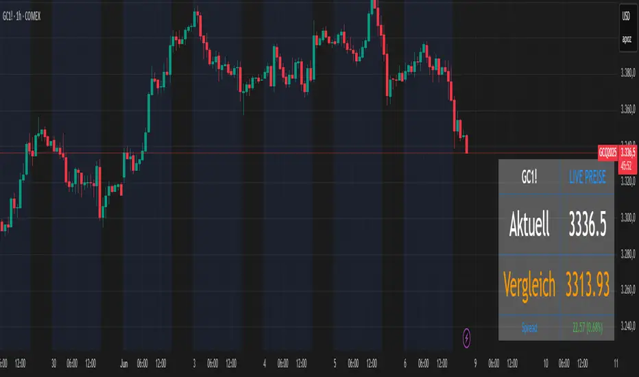
Futures vs CFD Price Display
🎯 Trading the same asset in CFDs and Futures but tired of switching charts to compare prices? This is your indicator!
Stop the constant chart hopping! This live price comparison shows you instantly where the better conditions are.
✨ What you get:
Bidirectional: Works in both Futures AND CFD charts
Live prices: Real-time comparison of both markets
Spread calculation: Automatic difference in points and percentage
Fully customizable: Colors, position, size to your liking
Professional design: Clean display with symbol header
🎯 Perfect for:
Gold traders (Futures vs CFD)
Arbitrage strategies
Spread monitoring
Multi-broker comparisons
⚙️ Customization:
3 sizes (Small/Normal/Large) for all screens
4 positions available
Individual color schemes
Toggle features on/off
💡 Simply enter the symbol and keep both markets in sight!
Notice: "Co-developed with Claude AI (Anthropic) - because even AI needs to pay the server bills! 😄"
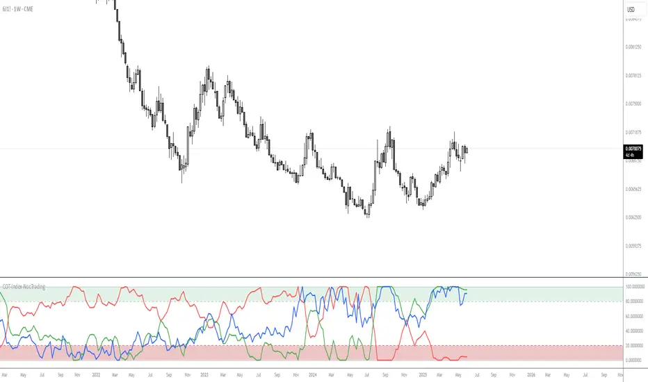
COT Commitment of Traders IndexOVERVIEW
Commitment of Traders (COT) Indicator is a trading tool which designed to visualise net positions/commitment of traders that is reported weekly basis to the commissions.
CONCEPTS
The Indicator help you understand the position of long or short trades by market participants relative to their historical positioning. The change in position will help you in analysing the medium-to-long term market trend.
The commercial traders represents producers or consumers of the commodity that usually positions as hedgers in the market, protecting their asset over market fluctuation risk. The non-commercial traders represents fund or money managers that the goal is speculate and take profit from the market fluctuations. Non-reportable represents small or retail traders.
Understand the relative of those all traders will give better insight of how to positions ourselves in the market.
DETAILS & EXAMPLE OF HOW TO USE
An example of Gold Future chart (GC1!) to demonstrate the indicator in real market scenario.
Blue graph indicate the Commercial Index, showing on the extreme low under 20 level. Commercial traders as a hedgers indicate the turning point over an asset in extreme value. This showing the potential change in market direction the upside.
On the same time, Orange graph indicate the Non-Commercial Index, showing an extreme high level above 80. Non-Commercial traders will most of the time trade with the trend. This showing the potential continuation of market direction to the upside.
Base on those information, combine with other technical strategy on the same timeframe or even lower timeframe. For example using Supply & Demand to find the entry.
The result is a massive push to the upside in the long term direction.
FEATURES
3 Index in 1 indicator
Customisable historical period and threshold
LIMITATIONS
The Indicator is best applied on weekly, due to the weekly release of COT data.
Not intended as a stand-alone signal, but should be as part of long-term strategy analysis.
Should be combined with other lower-timeframe technical tools like supply and demand.

Enhanced Seasonality Trade BacktestEnhanced Seasonality Trade Backtest
Overview
A comprehensive Pine Script indicator that backtests seasonal trading strategies by analyzing historical price performance during specific date ranges. The tool provides detailed statistics, visual markers, and election cycle filtering to identify profitable seasonal patterns.
Key Features
📊 Backtesting Engine
Tests up to 50 years of historical data
Configurable entry/exit dates (day/month)
Automatic holiday/weekend date adjustment
Separate analysis for long and short positions
🗳️ Election Cycle Filter
All Years: Test every year in the lookback period
Election Years: US presidential election years only (2024, 2020, 2016...)
Pre-Election Years: Years before elections (2023, 2019, 2015...)
Post-Election Years: Years after elections (2021, 2017, 2013...)
📈 Comprehensive Statistics
Win rate percentage
Total and average returns
Best/worst performing years
Detailed trade-by-trade breakdown
Years tested vs. years filtered
🎯 Visual Indicators
Entry/exit lines for all historical trades
Future trade date projections
Background highlighting during trade periods
Color-coded performance labels
⚙️ Customization Options
Toggle between long/short analysis
Show/hide price and date details
Adjustable table position
Future trade date visualization
Use Cases
Seasonal Trading: Identify recurring profitable periods (e.g., "Sell in May")
Election Cycle Analysis: Test how political cycles affect market performance
Strategy Validation: Backtest specific date-range strategies
Risk Assessment: Analyze worst-case scenarios and drawdowns
Perfect For
Swing traders looking for seasonal edges
Portfolio managers timing market entries/exits
Researchers studying market cyclicality
Anyone wanting to quantify seasonal market behavior
ONLY WORKS IN 1D TIME FRAME

Enhanced Zones with Volume StrengthEnhanced Zones with Volume Strength
Your reliable visual guide to market zones — now with Multi-Timeframe (MTF) power!
What you get:
Clear visual zones on your chart — color-coded boxes that highlight important price areas.
Blue Boxes for neutral zones — easy to spot areas of indecision or balance.
Gray Boxes to show normal volume conditions, giving you context without clutter.
Green Boxes highlighting bullish zones where strength is showing.
Red Boxes marking bearish zones where weakness might be in play.
Multi-Timeframe Support:
Seamlessly visualize these zones from higher timeframes directly on your current chart for a bigger-picture view, helping you make smarter trading decisions.
How to use it:
Adjust the box width (in bars) to fit your trading style and timeframe.
Customize colors and opacity to suit your chart theme.
Toggle neutral blue and gray volume boxes on/off to focus on what matters most to you.
Set the maximum number of boxes to keep your chart clean and performant.
Why you’ll love it:
This indicator cuts through the noise by visually marking zones where volume and price action matter the most — without overwhelming your chart. The MTF feature means you’re always aligned with higher timeframe trends without switching views.
Pro tip:
Use these boxes as dynamic support/resistance areas or to confirm trade setups alongside your favorite indicators.
No complicated formulas here, just crisp, actionable visuals designed for clarity and confidence.

COT-Index-NocTradingCOT Index Indicator
The COT Index Indicator is a powerful tool designed to visualize the Commitment of Traders (COT) data and offer insights into market sentiment. The COT Index is a measurement of the relative positioning of commercial traders versus non-commercial and retail traders in the futures market. It is widely used to identify potential market reversals by observing the extremes in trader positioning.
Customizable Timeframe: The indicator allows you to choose a custom time interval (in months) to visualize the COT data, making it flexible to fit different trading styles and strategies.
How to Use:
Visualize Market Sentiment: A COT Index near extremes (close to 0 or 100) can indicate potential turning points in the market, as it reflects extreme positioning of different market participant groups.
Adjust the Time Interval: The ability to adjust the time interval (in months) gives traders the flexibility to analyze the market over different periods, which can be useful in detecting longer-term trends or short-term shifts in sentiment.
Combine with Other Indicators: To enhance your analysis, combine the COT Index with your technical analysis.
This tool can serve as an invaluable addition to your trading strategy, providing a deeper understanding of the market dynamics and the positioning of major market participants.
Doganayy2 Buy/Sell & liquidityTrap🔧 User-Changeable Settings and Their Meanings
1. ✅ Is Wick Filter Active?
What does it do?: Controls the length of the candle wick.
Effect: If active, a long wick is considered a trap (a sign of manipulation).
2. 📊 Is Volume Filter Active?
What does it do?: Controls abnormally high volume according to the volume average.
Effect: If active, high volume candles are considered for a liquidity trap signal.
3. 📈 Is RSI Filter Active?
What does it do?: Controls overbought/oversold according to the RSI level.
Effect: If active;
If RSI > ?, a long trap is searched.
If RSI < ?, a short trap is searched.
4. 🔴🟢 Is Candle Color (Direction) Filter Active?
What does it do?: Controls whether the candle is green or red.
Effect: If active;
A red candle (selling pressure) is required for a long trap.
A green candle (buying pressure) is required for a short trap.
5. 🧮 Is Fibonacci Level Filter Active?
What does it do?: Checks whether the price has reached important Fibonacci levels.
Effect: If active;
For a long trap, the price must rise above the Fibo level.
For a short trap, the price must fall below the Fibo level.
6. 📏 Is ATR Filter Active?
What does it do?: Checks whether there is sufficient deviation in the price according to the ATR.
Effect: If active;
A trap signal is given according to whether the price has moved too far from the ATR.
📌 As a result:
As these filters are activated, the system's long/short trap detection becomes tighter and produces fewer but more reliable signals. If you close the filters, you will receive more signals, but reliability may decrease.
Purpose of the indicator: To present buy/sell opportunities by detecting liquidity traps.
PER Bands (Auto EPS)PER Bands Indicator - Technical Specification
Function
This PineScript v6 overlay indicator displays horizontal price bands based on Price-to-Earnings Ratio multiples. The indicator calculates price levels by multiplying earnings per share values by user-defined PER multiples, then plots these levels as horizontal lines on the chart.
Data Sources
The script attempts to automatically retrieve earnings per share data using TradingView's `request.financial()` function. The system first queries trailing twelve months EPS data, then annual EPS data if TTM is unavailable. When automatic retrieval fails or returns zero values, the indicator uses manually entered EPS values as a fallback.
Configuration Options
Users can configure five separate PER multiples (default values: 10x, 15x, 20x, 25x, 30x). Each band supports individual color customization and adjustable line width settings from 1 to 5 pixels. The indicator includes toggles for band visibility and optional fill areas between adjacent bands with 95% transparency.
Visual Components
The indicator plots five horizontal lines representing different PER valuation levels. Optional fill areas create colored zones between consecutive bands. A data table in the top-right corner displays current EPS source, EPS value, current PER ratio, and calculated price levels for each configured multiple.
Calculation Method
The indicator performs the following calculations:
- Band Price = Current EPS × PER Multiple
- Current PER = Current Price ÷ Current EPS
These calculations update on each bar close using the most recent available EPS data.
Alert System
The script includes alert conditions for price crossovers above the lowest PER band and crossunders below the highest PER band. Additional alert conditions can be configured for any band level through the alert creation interface.
Debug Features
Debug mode displays character markers on the chart indicating when TTM or annual EPS data is available. This feature helps users verify which data source the indicator is using for calculations.
Data Requirements
The indicator requires positive, non-zero EPS values to function correctly. Stocks with negative earnings or zero EPS will display "N/A" for current PER calculations, though bands will still plot using the manual EPS input value.
Exchange Compatibility
Automatic EPS data availability varies by exchange. United States equity markets typically provide comprehensive fundamental data coverage. International markets may have limited automatic data availability, requiring manual EPS input for accurate calculations.
Technical Limitations
The indicator cannot fetch real-time EPS updates and relies on TradingView's fundamental data refresh schedule. Historical EPS changes are not reflected in past band positions, as the indicator uses current EPS values for all historical calculations.
Display Settings
The information table shows EPS source type (TTM Auto, Annual Auto, Manual, or Manual Fallback), allowing users to verify data accuracy. The table refreshes only on the last bar to optimize performance and reduce computational overhead.
Code Structure
Built using PineScript v6 syntax with proper scope management for plot and fill functions. The script uses global scope for all plot declarations and conditional logic within plot parameters to handle visibility settings.
Version Requirements
This indicator requires TradingView Pine Script version 6 or later due to the use of `request.financial()` functions and updated syntax requirements for plot titles and fill operations.

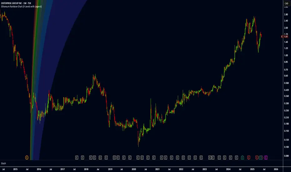
Ethereum Rainbow Chart (9 Levels with Legend)The Ethereum Rainbow Chart is a long-term, color-coded chart that displays Ethereum’s price on a logarithmic scale to show historical trends and growth patterns. It uses colored bands to highlight different price zones, helping to visualize how ETH’s price has moved over time without focusing on short-term fluctuations.
Advanced Petroleum Market Model (APMM)Advanced Petroleum Market Model (APMM): A Multi-Factor Fundamental Analysis Framework for Oil Market Assessment
## 1. Introduction
The petroleum market represents one of the most complex and globally significant commodity markets, characterized by intricate supply-demand dynamics, geopolitical influences, and substantial price volatility (Hamilton, 2009). Traditional fundamental analysis approaches often struggle to synthesize the multitude of relevant indicators into actionable insights due to data heterogeneity, temporal misalignment, and subjective weighting schemes (Baumeister & Kilian, 2016).
The Advanced Petroleum Market Model addresses these limitations through a systematic, quantitative approach that integrates 16 verified fundamental indicators across five critical market dimensions. The model builds upon established financial engineering principles while incorporating petroleum-specific market dynamics and adaptive learning mechanisms.
## 2. Theoretical Framework
### 2.1 Market Efficiency and Information Integration
The model operates under the assumption of semi-strong market efficiency, where fundamental information is gradually incorporated into prices with varying degrees of lag (Fama, 1970). The petroleum market's unique characteristics, including storage costs, transportation constraints, and geopolitical risk premiums, create opportunities for fundamental analysis to provide predictive value (Kilian, 2009).
### 2.2 Multi-Factor Asset Pricing Theory
Drawing from Ross's (1976) Arbitrage Pricing Theory, the model treats petroleum prices as driven by multiple systematic risk factors. The five-factor decomposition (Supply, Inventory, Demand, Trade, Sentiment) represents economically meaningful sources of systematic risk in petroleum markets (Chen et al., 1986).
## 3. Methodology
### 3.1 Data Sources and Quality Framework
The model integrates 16 fundamental indicators sourced from verified TradingView economic data feeds:
Supply Indicators:
- US Oil Production (ECONOMICS:USCOP)
- US Oil Rigs Count (ECONOMICS:USCOR)
- API Crude Runs (ECONOMICS:USACR)
Inventory Indicators:
- US Crude Stock Changes (ECONOMICS:USCOSC)
- Cushing Stocks (ECONOMICS:USCCOS)
- API Crude Stocks (ECONOMICS:USCSC)
- API Gasoline Stocks (ECONOMICS:USGS)
- API Distillate Stocks (ECONOMICS:USDS)
Demand Indicators:
- Refinery Crude Runs (ECONOMICS:USRCR)
- Gasoline Production (ECONOMICS:USGPRO)
- Distillate Production (ECONOMICS:USDFP)
- Industrial Production Index (FRED:INDPRO)
Trade Indicators:
- US Crude Imports (ECONOMICS:USCOI)
- US Oil Exports (ECONOMICS:USOE)
- API Crude Imports (ECONOMICS:USCI)
- Dollar Index (TVC:DXY)
Sentiment Indicators:
- Oil Volatility Index (CBOE:OVX)
### 3.2 Data Quality Monitoring System
Following best practices in quantitative finance (Lopez de Prado, 2018), the model implements comprehensive data quality monitoring:
Data Quality Score = Σ(Individual Indicator Validity) / Total Indicators
Where validity is determined by:
- Non-null data availability
- Positive value validation
- Temporal consistency checks
### 3.3 Statistical Normalization Framework
#### 3.3.1 Z-Score Normalization
The model employs robust Z-score normalization as established by Sharpe (1994) for cross-indicator comparability:
Z_i,t = (X_i,t - μ_i) / σ_i
Where:
- X_i,t = Raw value of indicator i at time t
- μ_i = Sample mean of indicator i
- σ_i = Sample standard deviation of indicator i
Z-scores are capped at ±3 to mitigate outlier influence (Tukey, 1977).
#### 3.3.2 Percentile Rank Transformation
For intuitive interpretation, Z-scores are converted to percentile ranks following the methodology of Conover (1999):
Percentile_Rank = (Number of values < current_value) / Total_observations × 100
### 3.4 Exponential Smoothing Framework
Signal smoothing employs exponential weighted moving averages (Brown, 1963) with adaptive alpha parameter:
S_t = α × X_t + (1-α) × S_{t-1}
Where α = 2/(N+1) and N represents the smoothing period.
### 3.5 Dynamic Threshold Optimization
The model implements adaptive thresholds using Bollinger Band methodology (Bollinger, 1992):
Dynamic_Threshold = μ ± (k × σ)
Where k is the threshold multiplier adjusted for market volatility regime.
### 3.6 Composite Score Calculation
The fundamental score integrates component scores through weighted averaging:
Fundamental_Score = Σ(w_i × Score_i × Quality_i)
Where:
- w_i = Normalized component weight
- Score_i = Component fundamental score
- Quality_i = Data quality adjustment factor
## 4. Implementation Architecture
### 4.1 Adaptive Parameter Framework
The model incorporates regime-specific adjustments based on market volatility:
Volatility_Regime = σ_price / μ_price × 100
High volatility regimes (>25%) trigger enhanced weighting for inventory and sentiment components, reflecting increased market sensitivity to supply disruptions and psychological factors.
### 4.2 Data Synchronization Protocol
Given varying publication frequencies (daily, weekly, monthly), the model employs forward-fill synchronization to maintain temporal alignment across all indicators.
### 4.3 Quality-Adjusted Scoring
Component scores are adjusted for data quality to prevent degraded inputs from contaminating the composite signal:
Adjusted_Score = Raw_Score × Quality_Factor + 50 × (1 - Quality_Factor)
This formulation ensures that poor-quality data reverts toward neutral (50) rather than contributing noise.
## 5. Usage Guidelines and Best Practices
### 5.1 Configuration Recommendations
For Short-term Analysis (1-4 weeks):
- Lookback Period: 26 weeks
- Smoothing Length: 3-5 periods
- Confidence Period: 13 weeks
- Increase inventory and sentiment weights
For Medium-term Analysis (1-3 months):
- Lookback Period: 52 weeks
- Smoothing Length: 5-8 periods
- Confidence Period: 26 weeks
- Balanced component weights
For Long-term Analysis (3+ months):
- Lookback Period: 104 weeks
- Smoothing Length: 8-12 periods
- Confidence Period: 52 weeks
- Increase supply and demand weights
### 5.2 Signal Interpretation Framework
Bullish Signals (Score > 70):
- Fundamental conditions favor price appreciation
- Consider long positions or reduced short exposure
- Monitor for trend confirmation across multiple timeframes
Bearish Signals (Score < 30):
- Fundamental conditions suggest price weakness
- Consider short positions or reduced long exposure
- Evaluate downside protection strategies
Neutral Range (30-70):
- Mixed fundamental environment
- Favor range-bound or volatility strategies
- Wait for clearer directional signals
### 5.3 Risk Management Considerations
1. Data Quality Monitoring: Continuously monitor the data quality dashboard. Scores below 75% warrant increased caution.
2. Regime Awareness: Adjust position sizing based on volatility regime indicators. High volatility periods require reduced exposure.
3. Correlation Analysis: Monitor correlation with crude oil prices to validate model effectiveness.
4. Fundamental-Technical Divergence: Pay attention when fundamental signals diverge from technical indicators, as this may signal regime changes.
### 5.4 Alert System Optimization
Configure alerts conservatively to avoid false signals:
- Set alert threshold at 75+ for high-confidence signals
- Enable data quality warnings to maintain system integrity
- Use trend reversal alerts for early regime change detection
## 6. Model Validation and Performance Metrics
### 6.1 Statistical Validation
The model's statistical robustness is ensured through:
- Out-of-sample testing protocols
- Rolling window validation
- Bootstrap confidence intervals
- Regime-specific performance analysis
### 6.2 Economic Validation
Fundamental accuracy is validated against:
- Energy Information Administration (EIA) official reports
- International Energy Agency (IEA) market assessments
- Commercial inventory data verification
## 7. Limitations and Considerations
### 7.1 Model Limitations
1. Data Dependency: Model performance is contingent on data availability and quality from external sources.
2. US Market Focus: Primary data sources are US-centric, potentially limiting global applicability.
3. Lag Effects: Some fundamental indicators exhibit publication lags that may delay signal generation.
4. Regime Shifts: Structural market changes may require model recalibration.
### 7.2 Market Environment Considerations
The model is optimized for normal market conditions. During extreme events (e.g., geopolitical crises, pandemics), additional qualitative factors should be considered alongside quantitative signals.
## References
Baumeister, C., & Kilian, L. (2016). Forty years of oil price fluctuations: Why the price of oil may still surprise us. *Journal of Economic Perspectives*, 30(1), 139-160.
Bollinger, J. (1992). *Bollinger on Bollinger Bands*. McGraw-Hill.
Brown, R. G. (1963). *Smoothing, Forecasting and Prediction of Discrete Time Series*. Prentice-Hall.
Chen, N. F., Roll, R., & Ross, S. A. (1986). Economic forces and the stock market. *Journal of Business*, 59(3), 383-403.
Conover, W. J. (1999). *Practical Nonparametric Statistics* (3rd ed.). John Wiley & Sons.
Fama, E. F. (1970). Efficient capital markets: A review of theory and empirical work. *Journal of Finance*, 25(2), 383-417.
Hamilton, J. D. (2009). Understanding crude oil prices. *Energy Journal*, 30(2), 179-206.
Kilian, L. (2009). Not all oil price shocks are alike: Disentangling demand and supply shocks in the crude oil market. *American Economic Review*, 99(3), 1053-1069.
Lopez de Prado, M. (2018). *Advances in Financial Machine Learning*. John Wiley & Sons.
Ross, S. A. (1976). The arbitrage theory of capital asset pricing. *Journal of Economic Theory*, 13(3), 341-360.
Sharpe, W. F. (1994). The Sharpe ratio. *Journal of Portfolio Management*, 21(1), 49-58.
Tukey, J. W. (1977). *Exploratory Data Analysis*. Addison-Wesley.

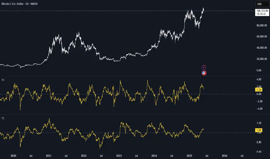
BTC Thermocap Z-ScoreBTC Thermocap Indicator Overview
The BTC Thermocap is a specialized on-chain ratio indicator designed to provide deeper insight into Bitcoin's market valuation relative to its cumulative issuance. By comparing the current market price of Bitcoin to the total value of all BTC ever mined (also known as "thermocap"), this indicator helps identify potential overvaluation or undervaluation periods within the Bitcoin market cycle.
Key Features and Customizable Inputs:
Moving Average Length (MA Length)
Moving Average Type (MA Type) - SMA or EMA
Z-Score Calculation Length
Z-Score Toggle (Use Z-Score)
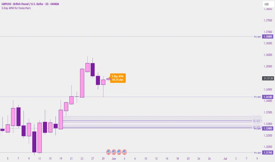
Last Week's APM FX pairs only📖 Description:
This script is designed for precision-focused forex traders who understand the power of volatility measurement. It calculates the Average Price Movement (APM) from the previous week by measuring the full wick-to-wick range (high to low) of each daily candle from Monday to Friday, then averaging them across the five sessions.
🔍 Core Features:
✅ Accurate APM Calculation:
Pulls daily high-low ranges from last week using locked daily timeframe data, ensuring stable and reliable pip range measurements across all chart timeframes.
✅ Auto-Adjusts for Pip Precision:
Detects whether the pair is JPY-based or not, and automatically adjusts the pip multiplier (100 for JPY pairs, 10,000 for all others) to give true pip values.
✅ Visual Display in Clean UI:
The calculated APM is displayed in a non-intrusive, fixed-position table in the top-right corner of the chart — making it ideal for traders who want continuous awareness of recent market behavior without visual clutter.
✅ Timeless on Any Timeframe:
Whether you’re on the 1-minute chart or the daily, the script remains anchored and accurate because it sources raw data from the daily chart internally.
📈 How It Helps Your Trading:
🧠 Volatility Awareness: Know how much a pair typically moves per day based on recent historical behavior — great for range analysis, target setting, or session biasing.
📊 Week-to-Week Comparison: Use it as a benchmark to compare current volatility to last week’s. Great for identifying if the market is expanding, contracting, or stabilizing.
🔗 Perfect for Confluence: APM can serve as a supporting metric when combined with order blocks, liquidity zones, news catalysts, or other volatility-based tools like ATR.
🛠️ Ideal For:
Professional and prop firm traders
Institutional model traders (ICT-style or SMC)
Volatility scalpers and range-based intraday traders
Anyone building a rules-based trading system with data-driven logic
🔐 Clean. Reliable. Focused.
If you value structure, volatility awareness, and pip precision — this tool belongs in your chart workspace.

SURF (ex-mafgi) 2.5 4m design @VanyaKsenyaSURF
designed by my 2 older kids, idea by me.
Correlation long only indicator which is fun to use and easy to decipher (hopefully).
What it does, is you can pick up to 3 assets that correlate with the asset you study.
Then it calculates the fear and greed index for each of the assets, and assigns it a weight based on either of the 3 included correlation measuring methods - simple, volatility-based, time-shifted, and (not yet working as of now) - grander causality method.
When the correlated assets are in fear zone (for positively correlated assets) - it shows a surfer who is ready to surf the upcoming wave up.
However, be cautious and take your profit when you see a palm tree or the sea throws out some green seaweed.
Waves are deep back in the sea and dark blue, with a lot of wet sand on the beach - good entry points for longs.
Opposite - good for shorts. When waves are so high that they reach the dry sand.
Enjoy!
(don't forget to check and modify the list of the assets which you think might corellate with the asset you're studying or trading).

5-Day APM for Forex PairsThis script calculates the 5-Day Average Pip Movement (APM) for major Forex pairs.
It displays the average daily range (in pips) over the past 5 trading days using true high-low price movement.
The script is optimized for clarity and minimalism — showing a single floating label on the main chart for pairs like GBPUSD, USDJPY, EURUSD, etc.
Automatically adjusts pip calculation for JPY pairs (×100) and other pairs (×10000).
✅ Great for identifying high-volatility vs low-volatility conditions
✅ Clean design with no clutter
✅ Only works on major FX pairs (whitelisted)
MVRV Ratio [Alpha Extract]The MVRV Ratio Indicator provides valuable insights into Bitcoin market cycles by tracking the relationship between market value and realized value. This powerful on-chain metric helps traders identify potential market tops and bottoms, offering clear buy and sell signals based on historical patterns of Bitcoin valuation.
🔶 CALCULATION The indicator processes MVRV ratio data through several analytical methods:
Raw MVRV Data: Collects MVRV data directly from INTOTHEBLOCK for Bitcoin
Optional Smoothing: Applies simple moving average (SMA) to reduce noise
Status Classification: Categorizes market conditions into four distinct states
Signal Generation: Produces trading signals based on MVRV thresholds
Price Estimation: Calculates estimated realized price (Current price / MVRV ratio)
Historical Context: Compares current values to historical extremes
Formula:
MVRV Ratio = Market Value / Realized Value
Smoothed MVRV = SMA(MVRV Ratio, Smoothing Length)
Estimated Realized Price = Current Price / MVRV Ratio
Distance to Top = ((3.5 / MVRV Ratio) - 1) * 100
Distance to Bottom = ((MVRV Ratio / 0.8) - 1) * 100
🔶 DETAILS Visual Features:
MVRV Plot: Color-coded line showing current MVRV value (red for overvalued, orange for moderately overvalued, blue for fair value, teal for undervalued)
Reference Levels: Horizontal lines indicating key MVRV thresholds (3.5, 2.5, 1.0, 0.8)
Zone Highlighting: Background color changes to highlight extreme market conditions (red for potentially overvalued, blue for potentially undervalued)
Information Table: Comprehensive dashboard showing current MVRV value, market status, trading signal, price information, and historical context
Interpretation:
MVRV ≥ 3.5: Potential market top, strong sell signal
MVRV ≥ 2.5: Overvalued market, consider selling
MVRV 1.5-2.5: Neutral market conditions
MVRV 1.0-1.5: Fair value, consider buying
MVRV < 1.0: Potential market bottom, strong buy signal
🔶 EXAMPLES
Market Top Identification: When MVRV ratio exceeds 3.5, the indicator signals potential market tops, highlighting periods where Bitcoin may be significantly overvalued.
Example: During bull market peaks, MVRV exceeding 3.5 has historically preceded major corrections, helping traders time their exits.
Bottom Detection: MVRV values below 1.0, especially approaching 0.8, have historically marked excellent buying opportunities.
Example: During bear market bottoms, MVRV falling below 1.0 has identified the most profitable entry points for long-term Bitcoin accumulation.
Tracking Market Cycles: The indicator provides a clear visualization of Bitcoin's market cycles from undervalued to overvalued states.
Example: Following the progression of MVRV from below 1.0 through fair value and eventually to overvalued territory helps traders position themselves appropriately throughout Bitcoin's market cycle.
Realized Price Support: The estimated realized price often acts as a significant
support/resistance level during market transitions.
Example: During corrections, price often finds support near the realized price level calculated by the indicator, providing potential entry points.
🔶 SETTINGS
Customization Options:
Smoothing: Toggle smoothing option and adjust smoothing length (1-50)
Table Display: Show/hide the information table
Table Position: Choose between top right, top left, bottom right, or bottom left positions
Visual Elements: All plots, lines, and background highlights can be customized for color and style
The MVRV Ratio Indicator provides traders with a powerful on-chain metric to identify potential market tops and bottoms in Bitcoin. By tracking the relationship between market value and realized value, this indicator helps identify periods of overvaluation and undervaluation, offering clear buy and sell signals based on historical patterns. The comprehensive information table delivers valuable context about current market conditions, helping traders make more informed decisions about market positioning throughout Bitcoin's cyclical patterns.
