Sessioni Colorate come ScreenshotPre-Market and Post-Market Session Highlighter (US)
This script highlights the Pre-Market and Post-Market trading sessions for US stocks and indices by coloring the background directly on the chart.
Time zone: UTC
• Pre-Market: 09:00 – 13:30 UTC
• Regular Session: 13:30 – 20:00 UTC (not highlighted)
• Post-Market: 20:00 – 00:00 UTC
Useful for identifying price behavior outside regular trading hours.
Fundamental Analysis

JIYANS RDRBThis script is based on the ICT (Inner Circle Trader) Redelivered concepts, specifically focusing on the Rebalance principle. It automatically identifies price imbalances (Fair Value Gaps) and highlights potential rebalance zones where the market is likely to revisit before continuing its delivery. The tool helps traders spot key inefficiencies and anticipate where price may return to mitigate those gaps. Fully customizable for different timeframes, this script is designed to support precision trading aligned with ICT methodologies.

Steez's Timeframe TableSimple timeframe indicator which can assist with daily bias or draw on liquidity.
Shows all timeframes from 1 minute to 1 day.
Shows close time and if the candle is currently bearish or bullish.

EMA Crossover with DiamondsGreen diamond when 20 exponential moving average crosses over 50 exponential moving average, and shows a red diamond when 50 moving average crosses over 20 exponential moving average

Biotech WarningFor traders that don't like the risks of trading biotechs, but like to examine 100's or 1,000's of charts at a time, it can potentially take some time to identify if a stock is a biotech or not. This simple indicator places a large "Biotechnology Warning" on your chart if the stock you're looking at falls into this industry.


Boomerang Trading Indicator# Boomerang News Trading Indicator
## Overview
The Boomerang Trading Indicator is designed to identify potential reversal opportunities following major economic news releases. This indicator analyzes the initial market reaction to news events and provides visual cues for potential counter-trend trading opportunities based on Fibonacci retracement levels.
## How It Works
### News Event Detection
- Automatically detects major news release times (NFP, CPI, FOMC, etc.)
- Analyzes the first significant price movement following news releases
- Requires minimum candle size threshold to filter out weak reactions
### First Move Analysis
The indicator employs multiple analytical methods to determine the initial market direction:
**Simple Analysis (High Confidence):**
- When the news candle has ≥70% body-to-total ratio, uses straightforward bullish/bearish classification
**Advanced Analysis (Complex Cases):**
- Volume-weighted direction analysis
- Momentum and wick pattern analysis
- Market structure and gap analysis
- Weighted voting system combining all methods
### Entry Signal Generation
Based on the "boomerang" concept where markets often reverse after initial news reactions:
**For Bullish First Moves (Price Up Initially):**
- Generates SHORT entry signals when price retraces to 1.25-1.5 Fibonacci levels
- Visual: Red triangles above price bars
**For Bearish First Moves (Price Down Initially):**
- Generates LONG entry signals when price retraces to -0.25 to -0.5 Fibonacci levels
- Visual: Green triangles below price bars
## Key Features
### Visual Elements
- **Fibonacci Levels**: Displays key retracement levels based on the initial reaction range
- **Entry Zones**: Clear visual marking of optimal entry areas
- **Direction Arrows**: Shows the initial market reaction direction
- **Target Levels**: Displays profit target zones at 50% and 100% retracement levels
### Information Panel
Real-time display showing:
- Current setup status
- First move direction and body percentage
- Recommended trade direction
- Key price levels (reaction high/low)
- Profit targets with historical success rates
### Alert System
- Pre-news warnings (customizable timing)
- News event notifications
- Setup activation alerts
- Entry signal notifications
### Success Tracking
- Visual "BOOM!" animations when targets are hit
- Target 1 (50% level): ~95% historical success rate
- Target 2 (Main target): ~80% historical success rate
## Configuration Options
### Time Settings
- News release hour and minute (customizable for different events)
- Pre-news alert timing
- Setup duration (default 60 bars after news)
### Fibonacci Levels
- Adjustable retracement percentages
- Customizable target levels
- Mid-level importance weighting
### Risk Management
- Minimum reaction candle size filter
- Maximum risk point setting
- Visual risk/reward display
### Display Options
- Toggle Fibonacci level visibility
- Toggle target level display
- Toggle animation effects
- Customizable alert preferences
## Applicable News Events
This indicator is designed for high-impact economic releases:
- Non-Farm Payrolls (NFP) - First Friday, 8:30 AM ET
- Consumer Price Index (CPI) - Monthly, 8:30 AM ET
- Producer Price Index (PPI) - Monthly, 8:30 AM ET
- Gross Domestic Product (GDP) - Quarterly, 8:30 AM ET
- FOMC Interest Rate Decisions - 8 times yearly, 2:00 PM ET
## Trading Strategy Framework
### Core Principle
Markets often overreact to news initially, then reverse toward more rational price levels. This "boomerang effect" creates short-term trading opportunities.
### Entry Strategy
1. Wait for significant initial reaction (>10 points minimum)
2. Identify the initial direction using multi-factor analysis
3. Trade opposite to the initial reaction when price reaches sweet spot zones
4. Use Fibonacci retracement levels as entry triggers
### Risk Management
- Always use appropriate position sizing
- Set stop losses beyond recent swing levels
- Consider market volatility and news importance
- Monitor for setup invalidation signals
## Important Notes
### Educational Purpose
This indicator is for educational and analytical purposes. Users should:
- Thoroughly test strategies in demo environments
- Understand the risks involved in news trading
- Consider market conditions and volatility
- Use proper risk management techniques
### Market Considerations
- High volatility during news events increases both opportunity and risk
- Spreads may widen significantly during news releases
- Different brokers may have varying execution conditions
- Economic calendar timing may vary between sources
### Limitations
- Past performance does not guarantee future results
- Market conditions can change, affecting strategy effectiveness
- News events may have unexpected outcomes affecting normal patterns
- Technical analysis should be combined with fundamental analysis
## Version Information
- Compatible with TradingView Pine Script v5
- Designed for 1-minute timeframe optimal performance
- Works on major forex pairs, indices, and commodities
- Regular updates based on market condition changes
---
**Disclaimer:** This indicator is provided for educational purposes only. Trading involves substantial risk and is not suitable for all investors. Past performance is not indicative of future results. Users should conduct their own research and consider their financial situation before making trading decisions.

Fair Value Gaps (FVG)Overview:
This indicator detects Fair Value Gaps (FVGs) – also known as Liquidity Voids – which are three-candle price inefficiencies formed when the market aggressively moves in one direction, leaving an imbalance between buyers and sellers. These zones often act as magnetic areas where prices return to "fill the gap" before continuing their trend.
🔍 Core Logic:
A bullish FVG is identified when the high of candle 1 (two bars back) is below the low of candle 3 (current bar).
A bearish FVG is identified when the low of candle 1 (two bars back) is above the high of candle 3 (current bar).
A minimum gap size is required (defined in points or as a multiple of ATR).
Each detected FVG is drawn as a rectangle, extending forward in time until mitigation.
🛠️ Key Features:
✅ Bullish & Bearish Detection: Option to show/hide each type.
📏 Minimum Gap Filter: Define minimum size in absolute points or ATR-based.
📈 Trend Filter: Enable EMA-based directional filtering to align FVGs with the trend.
🧠 Mitigation Logic: Supports four modes:
None: Gaps remain visible regardless of price action.
Partial: Mitigated when the price trades within the gap.
Full: Mitigated only when the price fills the gap.
Midpoint: Mitigated once the midpoint of the gap is touched.
⏳ Lookback Control: Automatically removes old FVGs after a configurable number of bars.
🎯 Use Cases:
Entry confirmation: Price returning to an FVG in line with the higher-timeframe trend may signal a high-probability trade.
Liquidity mapping: Helps identify where institutional orders may be filled.
Confluence zones: Combine with market structure (BOS/CHOCH) or order blocks for refined entries.
📊 Customization:
Fully adjustable visuals (color, opacity) for both active and mitigated zones.
User-defined settings to fit different instruments, timeframes, or strategies.
🧠 Best Practices:
Use FVGs on 15m–1h charts with trend confirmation from higher timeframes (e.g., 4H or Daily).
Combine with market structure shifts, momentum indicators, or volume spikes for better decision-making.
In volatile markets, consider increasing the minimum gap size or ATR multiplier.
⚠️ Disclaimer:
This tool is intended for educational and analytical purposes only. It does not constitute financial advice. Always backtest and validate before trading live.

Price to Earnings (P/E) Ratio with Yearly Avgthis price to earning ratio indicator with average PE line.
average PE line can be customize for period

Price to Earnings (P/E) Ratio with Yearly Avgthis is Price to earning ratio with average PE ratio line.
Average line can be customize for duration.

Trading Sessionsthis indicator labels asia, london, and new york sessions with accurate times for trading indexes like nq, es, or ym. It gives a range from the session lows to session highs which can be used to identify liquidity grabs and price action.

Multi Horizontal Lines 1000 Bars
This indicator is not my code, I have copied this from another user and extened the lines so they go back 1000 bars for back testing.
I use this indicator to trade Crude Oil and set the horizontal lines to 20 cents increments, 0.2 is 20 cents. You can change the horizontal lines to any price distance to suit your style of trading.
My idea is when price crosses over a horizontal line I will enter a trade long or short looking to secure 20 cents.

Mathematical EquationMathematical Equation — Advanced Multi-Factor Trend Reversal System
Overview
Mathematical Equation is a sophisticated multi-factor trading indicator designed to detect high-probability trend reversals. Its primary objective is to help traders identify key market turning points by combining volatility filtering, momentum validation, dynamic trend states, and custom adaptive logic. It generates clear LONG and SHORT signals when a unique set of mathematical conditions converge, making it a powerful tool for discretionary and systematic traders seeking precise entry timing.
What It Does
Mathematical Equation analyzes price action across several advanced dimensions:
1. Volatility-Adjusted Trend Engine — Uses a custom volatility filter based on ATR envelopes to define directional trend shifts, providing a foundational trend context.
2. Momentum Confirmation — Implements a MACD-style dynamic line and signal line system to validate directional strength and momentum transitions.
3. Volume Flow Index (VFI) with Adaptive Thresholds — Measures cumulative money flow relative to a dynamic cutoff, filtering out noise and confirming volume participation.
4. Custom Trend Oscillator — Computes a normalized line trend oscillator that identifies exhaustion and potential reversals using adaptive scaling across historical ranges.
5. Signal Alerts — Provides built-in alerts for both LONG and SHORT signals, enabling traders to respond quickly when a new reversal condition is met.
How It Works
The indicator dynamically classifies the market into actionable reversal states:
1. LONG — Triggered when price shows bullish confirmation, trend shifts to up, momentum crosses bullish thresholds, VFI confirms accumulation, and the oscillator signals an emerging bullish phase.
2. SHORT — Triggered when price shows bearish confirmation, trend shifts to down, momentum crosses bearish thresholds, VFI confirms distribution, and the oscillator signals emerging bearish momentum.
Result: Each signal is calculated only when trend regime, momentum alignment, volume flow, and oscillator exhaustion converge, significantly increasing selectivity and reducing false entries.
How To Use It
1. Confirm the Context — Always interpret signals within the broader market structure and trend bias. Use higher timeframes to validate macro direction.
2. Act According to the Signal Type:
-- LONG: Enter long positions when a bullish reversal signal is confirmed. Best suited for catching early trend transitions or countertrend rebounds.
-- SHORT: Enter short positions when a bearish reversal signal appears. Ideal for topping patterns or failed rallies.
Why It Is Unique
1. Integrates volatility filters, dynamic momentum validation, volume flow analysis, and proprietary trend oscillators into a single framework.
2. Goes beyond simple moving averages or crossovers by incorporating multi-dimensional confirmations for increased accuracy.
3. Provides clearly defined reversal signals, allowing traders to confidently act on emerging shifts in trend.
4. Enables traders to filter low-quality setups and focus on high-confluence conditions.
Apply Risk Management
Never rely solely on any single signal. Always use stop losses, proper position sizing, and a clear risk/reward plan. This indicator is designed to enhance trading decisions, not to replace disciplined execution.
Timeframe Selection
Optimized for intraday to swing trading (15M to 1H charts). Use lower timeframes for tactical entries once higher timeframe signals are confirmed.
Best Suited For
Swing traders, active intraday traders, and reversal-focused strategies.
Important Notes
Signals generated by Mathematical Equation are intended to support analysis, not replace it. Always combine them with personal market assessment and robust risk management. No indicator can guarantee performance or eliminate losses. This tool was developed by ProphetAlgoAI to adapt as market dynamics evolve, offering traders a consistently high-quality decision-support system.
License
This indicator was developed by the ProphetAlgoAI team. Its use is restricted to TradingView under a private, invite-only agreement. Redistribution or use outside TradingView is strictly prohibited unless explicitly authorized by the ProphetAlgoAI team.

BTC D-AccumulatorBTC D-Accumulator — Adaptive Bitcoin Macro Accumulation System
Overview
BTC D-Accumulator is an advanced Bitcoin-focused accumulation detection and signal generation tool designed for daily timeframe traders and long-term investors. Its main purpose is to help users identify potential macro accumulation zones and market cycle resets with high statistical confidence. By combining on-chain metrics (NUPL, CVDD), adaptive EMA-based trend filtering, and a proprietary math-driven crossover logic, it delivers clear accumulation signals classified into four levels of conviction: AI BUY, BUY, Low Accumulation, and Risky Accumulation.
What It Does
BTC D-Accumulator analyzes BTC price action and market health across several complementary dimensions:
1. On-Chain Valuation Metrics - NUPL (Net Unrealized Profit/Loss) is used to gauge sentiment extremes and potential undervaluation. CVDD (Cumulative Value Days Destroyed) defines probabilistic long-term floor values based on historical spending behavior.
2. Macro Crossover Logic - A custom math-based moving average crossover system dynamically adjusts its periods to the timeframe. Detects major market cycle resets or restarts (AI SELL / AI BUY signals).
3. Dynamic EMA Filtering - Evaluates BTC’s position relative to EMA50, EMA100, and EMA200 to confirm broader trend context and filter signals.
4. Momentum and Mean Reversion Conditions - RSI and smoothed RSI values ensure that signals are only triggered when the market is statistically oversold. A custom dual-line momentum engine measures directional bias and deceleration.
5. Visual Labels & Alerts - Each signal is displayed with a label directly on the chart (AI BUY, BUY, or arrows for other accumulation levels). Built-in alerts allow traders to be notified instantly when accumulation signals appear.
How It Works
BTC D-Accumulator uses the combined state of these components to classify price action into four actionable accumulation signals:
1. AI BUY – Strongest macro accumulation signal triggered by a proprietary math crossover and confirmed by other criteria.
2. BUY – High-probability accumulation signal combining on-chain undervaluation and momentum exhaustion.
3. GREEN ARROW – Moderate accumulation signal triggered when BTC is below major EMAs and shows volatility compression.
4. ORANGE ARROW – Early accumulation attempt during oversold conditions but with less confluence; higher risk.
Result: Signals only appear when multiple valuation, momentum, and trend filters align, improving selectivity and reducing noise.
How To Use It
1. Confirm the Context: Always ensure you are viewing BTC pairs (BTCUSD, BTCUSDT, BTCUSDC) on the Daily timeframe. Assess the overall market trend and sentiment before taking action.
2. Act According to the Signal Type:
-- AI BUY: Indicates a major cycle reset or strong accumulation opportunity; suitable for scaling into long-term positions.
-- BUY: Signals a statistically favorable zone for adding exposure with high confidence.
-- Low Accumulation: Moderate conviction entry; consider using partial position size.
-- Risky Accumulation: Early accumulation in potentially unstable market conditions; requires tighter risk control.
3. Manage Exposure: Use stop losses and scale entries progressively rather than committing all capital at once. Combine with your macro thesis and portfolio objectives.
Why It Is Unique
1. Integrates on-chain valuation metrics (NUPL, CVDD) with adaptive EMA filtering and math-based cycle detection.
2. Designed specifically for Bitcoin daily charts, avoiding false signals in other pairs or timeframes.
3. Provides four clearly classified accumulation signals, enabling flexible strategy deployment across different conviction levels.
4. Includes real-time visual labels and alerts for improved situational awareness and automation.
Apply Risk Management
Never rely exclusively on signals without understanding Bitcoin’s broader context. Maintain a clear risk/reward plan, diversify across entries, and size positions responsibly.
Timeframe Selection
Optimized for the Daily timeframe only. Using lower or higher timeframes will disable or distort signals.
Asset Selection
Only applicable to BTCUSD/BTCUSDT/BTCUSDC
Best Suited For
Bitcoin investors, swing traders, and position traders who want a systematic framework to identify macro accumulation opportunities.
Important Notes
The signals generated by BTC D-Accumulator are intended to support informed decisions, not to replace independent analysis. While the indicator incorporates advanced on-chain and price-based metrics, it does not guarantee outcomes. Use all information in combination with your trading plan and risk management practices.
License
This indicator was developed by the ProphetAlgoAI team. Its use is restricted to TradingView under a private, invite-only agreement. Redistribution or usage outside TradingView is strictly prohibited without explicit authorization from the ProphetAlgoAI team.

ADT MSI TableKey Features:
1. Market Smith Methodology
Composite Rating: Combines price and volume strength
Relative Strength Rating: Measures stock performance vs benchmark
Base Pattern Detection: Identifies consolidation patterns
Breakout Signals: Detects valid breakouts with volume confirmation
2. Indian Market Adaptations
INR Currency Formatting: Displays prices in ₹, Lakhs, and Crores
Indian Benchmarks: NIFTY, SENSEX, NIFTY500 options
Market Cap Display: Formatted in Indian currency standards
Trading Hours Compatibility: Works with NSE/BSE data
3. Comprehensive Data Table
Real-time Metrics: Current price, daily change, volume analysis
Technical Indicators: MA positions, RS rating, composite rating
Performance Tracking: 3M, 6M, 12M returns
Signal Generation: BUY/SELL/HOLD recommendations
4. Visual Elements
Multiple Moving Averages: 10, 20, 50, 200 period MAs
Support/Resistance Levels: Dynamic pivot-based levels
Volume Analysis: Color-coded volume bars with surge detection
Trend Background: Color-coded background based on trend strength
Breakout Markers: Visual signals for valid breakouts
5. Customizable Parameters
Adjustable Periods: All timeframes can be modified
Table Positioning: 9 different table positions
Alert System: Customizable breakout and volume alerts
Display Options: Toggle any component on/off
6. Indian Market Specific
No Errors: Fully compatible with Indian stock data
Proper Formatting: All values in Indian currency format
Market Hours: Optimized for Indian trading sessions
Volume Calculations: Adapted for Indian market volume patterns

Global Risk Matrix [QuantAlgo]🟢 Overview
The Global Risk Matrix is a comprehensive macro risk assessment tool that aggregates multiple global financial indicators into a unified risk sentiment framework. It transforms diverse economic data streams (from currency strength and liquidity measures to volatility indices and commodity prices) into standardized Z-Score readings to identify market regime shifts across risk-on and risk-off conditions.
The indicator displays both a risk oscillator showing weighted average sentiment and a dynamic 2D matrix visualization that plots signal strength against momentum to reveal current market phase and historical evolution. This helps traders and investors understand broad market conditions, identify regime transitions, and align their strategies with prevailing macro risk environments across all asset classes.
🟢 How It Works
The indicator employs Z-Score normalization across various global macro components, each representing distinct aspects of market liquidity, sentiment, and economic health. Raw data from sources like DXY, S&P 500, Fed liquidity, global M2 money supply, VIX, and commodities undergoes statistical standardization. Several components are inverted (USDT.D, DXY, VIX, credit spreads, treasury bonds, gold) to align with risk-on interpretation, where positive values indicate bullish conditions.
This unique system applies configurable weights to each component based on selected asset class presets (Crypto Investor/Trader, Stock Trader, Commodity Trader, Forex Trader, Risk Parity, or Custom), creating a weighted average Z-Score. It then analyzes both signal strength and momentum direction to classify market conditions into four distinct phases: Risk-On (positive signal, rising momentum), Risk-Off (negative signal, falling momentum), Recovery (negative signal, rising momentum), and Weakening (positive signal, falling momentum). The 2D matrix visualization plots these dimensions with historical trail tracking to show regime evolution over time.
🟢 How to Use
1. Risk Oscillator Interpretation and Phase Analysis
Positive Territory (Above Zero) : Indicates risk-on conditions with capital flowing toward growth assets and higher risk tolerance
Negative Territory (Below Zero) : Signals risk-off sentiment with capital seeking safety and defensive positioning
Extreme Levels (±2.0) : Represent statistically significant deviations that often precede regime reversals or trend exhaustion
Zero Line Crosses : Mark critical transitions between risk regimes, providing early signals for portfolio rebalancing
Phase Color Coding : Green (Risk-On), Red (Risk-Off), Blue (Recovery), Yellow (Weakening) for immediate regime identification
2. Risk Matrix Visualization and Trail Analysis
Current Position Marker (⌾) : Shows real-time location in the risk/momentum space for immediate situational awareness
Historical Trail : Connected path showing recent market evolution and regime transition patterns
Quadrant Analysis : Risk-On (upper right), Risk-Off (lower left), Recovery (lower right), Weakening (upper left)
Trail Patterns : Clockwise rotation typically indicates healthy regime cycles, while erratic movement suggests uncertainty
3. Pro Tips for Trading and Investing
→ Portfolio Allocation Filter : Use Risk-On phases to increase exposure to growth assets, small caps, and emerging markets while reducing defensive positions during confirmed green phases
→ Entry Timing Enhancement : Combine Recovery phase signals with your technical analysis for optimal long entry points when macro headwinds are clearing but prices haven't fully recovered
→ Risk Management Overlay : Treat Weakening phase transitions as early warning systems to tighten stop losses, reduce position sizes, or hedge existing positions before full Risk-Off conditions develop
→ Sector Rotation Strategy : During Risk-On periods, favor cyclical sectors (technology, consumer discretionary, financials) while Risk-Off phases favor defensive sectors (utilities, consumer staples, healthcare)
→ Multi-Timeframe Confluence : Use daily matrix readings for strategic positioning while applying your regular technical analysis on lower timeframes for precise entry and exit execution
→ Divergence Detection : Watch for situations where your asset shows bullish technical patterns while the matrix shows Risk-Off conditions—these often provide the highest probability short opportunities and vice versa

[DEM] % Off High % Off High calculates and plots the percentage difference between the current closing price and the all-time high of the given ticker observed since the indicator started calculating. It is displayed as a percentage, formatted with two decimal places.

Key Metrics Dashboard (Float, MCap, ATR) (ValueRay)This dashboard displays critical fundamental and volatility data, saving you from switching screens. It’s perfect for traders who need to quickly assess a stock's character, risk profile, and potential before making a move.
📊 Metrics Included
- Market Cap (MCap): Quickly gauge company size.
- Float: See tradable shares (color-coded for low-float stocks).
- Short %: Measure bearish sentiment and short-squeeze potential (color-coded).
- ATR % & ADR %: Understand true volatility to manage risk.
🚀 Key Features
- Fully Customizable: Toggle any metric on/off to create your ideal view.
- Flexible Layout: Choose your preferred on-chart position, size, and layout (horizontal or vertical).
- Lightweight & Clean: Get essential data without cluttering your chart.
If you find this indicator useful, please give it a Boost (🚀)!
Happy Trading

Fair value - NASDAQ - 1WUS100 true value based on underlying top stocks. It gives you insight into the true trend of the index. Use in combination with other indicators (such as EMA and enter ideally 200-400 ticks below highest imbalance).
Familiarise yourself with it, it's not a magic wand and won't instantly help you unless you know how to use it properly.

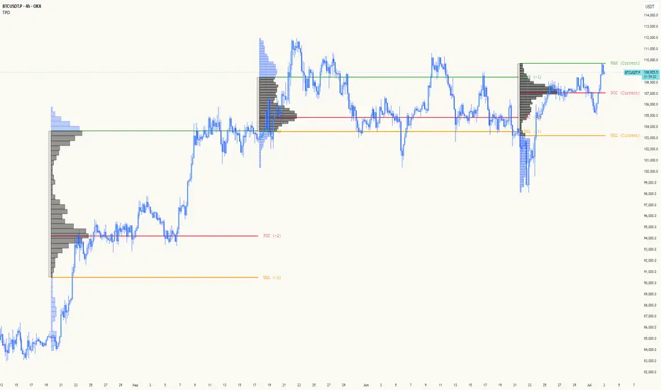
TPO[Fixed Range, Anchored, Bars Back]TPO Bars Back, Fixed Range and Anchored
Overview
The TPO Profile (Time Price Opportunity Profile) is a powerful market profile indicator that displays the amount of time price spent at different levels during a specified period. Unlike traditional volume profile indicators that show volume distribution, TPO Profile shows time distribution , providing insights into where price has spent the most time and identifying key support and resistance levels.
Key Advantages Over TradingView's Built-in TPO
Simplified Composite Creation : Automatically creates TPO profiles for any time range without manual split/merge operations
Instant Value Area Calculation : Immediately shows Value Area, POC, VAH, and VAL for your selected period
No Manual Assembly Required : TradingView's native TPO requires you to manually split sessions and merge them to create composites - this indicator does it automatically
Flexible Time Ranges : Create composites for any custom time period (multiple days, weeks, specific events) with a few clicks
Real-time Composite Updates : Anchor mode creates live composites that update as new data arrives
Multiple Composite Analysis : Easily compare different time periods without the tedious manual process
Key Features
Core Functionality
Time-Based Analysis : Shows time spent at each price level rather than volume
Configurable Time Blocks : Use any timeframe for TPO counting (30min, 1H, 4H, etc.)
Multiple Price Levels : Adjustable from 5 to 200 levels for granular analysis
Point of Control (POC) : Automatically identifies the price level with highest time activity
Value Area Calculation : Shows the price range containing 70% (configurable) of time activity
Automatic Composite Generation : Creates multi-session composites without manual intervention
Three Operating Modes
1. Bars Back Mode
Analyzes the last N bars from the current bar
Perfect for recent market activity analysis
Range: 10-500 bars
Use Case : Intraday analysis, recent session review
2. Fixed Range Mode
Analyzes a specific time period between start and end times
Ideal for historical analysis of specific events
Creates perfect composites for multi-day periods
Use Case : Earnings periods, news events, specific trading sessions, weekly/monthly composites
3. Anchor Mode (NEW)
Starts from a specific time and extends to the current bar
Dynamically updates as new bars form
Perfect for building live composites from any starting point
Use Case : Live session monitoring, event-based analysis from a specific point, growing composites
Visual Elements
TPO Bars
Horizontal bars showing time distribution at each price level
Longer bars = more time spent at that level
Color-coded to distinguish Value Area from outlying levels
Point of Control (POC)
Red line marking the price level with highest time activity
Most significant support/resistance level
Configurable line style (Solid/Dashed/Dotted) and width
Value Area High/Low (VAH/VAL)
Green and Orange lines marking the boundaries of the Value Area
Shows the price range containing the specified percentage of time activity
Optional display with customizable line styles
Single Print Detection
Identifies price levels touched by only one time block
Display options: Lines or Boxes
Purple color highlighting these significant levels
Often act as strong support/resistance in future trading
Customization Options
Time Block Configuration
Block Time : Choose timeframe for TPO counting (30min, 1H, 4H, etc.)
Allows analysis at different time granularities
Higher timeframes = broader perspective, Lower timeframes = finer detail
Visual Styling
Line Styles : Solid, Dashed, or Dotted for all line elements
Line Widths : 1-5 pixels for POC, VAH, and VAL lines
Colors : Fully customizable colors for all elements
Transparency : Adjustable transparency for better chart readability
Label Management
Show/Hide Labels : Toggle POC, VAH, VAL labels
Font Sizes : Tiny, Small, Normal, Large, Huge
Label Positioning : 8 different position options relative to lines
Offset Controls : Fine-tune label positioning
Line Extension
Level Offset Right : Controls how far lines extend
Smart extension logic:
Value ≤ 0: Infinite extension (extend.right)
Value ≥ 1: Extends exactly N bars ahead
Trading Applications
Support & Resistance
POC often acts as strong support/resistance
Value Area boundaries provide key levels
Single prints frequently become significant levels
Market Structure Analysis
Identify areas of price acceptance (thick TPO bars)
Spot areas of price rejection (thin TPO bars)
Understand where market participants are comfortable trading
Composite Profile Analysis
Create multi-day, weekly, or monthly composites instantly
Compare different composite periods without manual work
Analyze longer-term price acceptance levels
Build composites around specific events or announcements
Session Analysis
Monitor intraday session development in real-time
Compare different sessions (London, New York, Asia)
Track how profiles change throughout the trading day
Build live composites across multiple sessions
Event Analysis
Use Fixed Range mode for earnings, news events
Use Anchor mode to track price development from specific events
Compare pre/post event price acceptance levels
Create event-based composites automatically
Input Parameters
Mode Selection
Mode : Bars Back | Fixed Range | Anchor
Bars Back : Number of bars to analyze (10-500)
Start Time : Beginning time for Fixed Range and Anchor modes
End Time : Ending time for Fixed Range mode only
Analysis Configuration
Block Time : Timeframe for TPO blocks (e.g., "30" for 30-minute blocks)
TPO Levels : Number of price levels (5-200)
Value Area % : Percentage for Value Area calculation (50-95%)
Display Options
Show POC : Display Point of Control line
Show Value Area : Display Value Area box
Show VAH/VAL Lines : Display Value Area boundary lines
Show Single Prints : Display single print detection
Single Print Style : Lines or Boxes
Styling Controls
Colors : TPO, POC, Value Area, VAH, VAL, Single Print colors
Line Styles : POC, VAH, VAL line styles
Line Widths : POC, VAH, VAL line widths
Labels : Show/hide, font size, position, offset controls
Technical Details
Calculation Method
Divides the price range into equal levels based on TPO Levels setting
For each time block, determines which price levels it crosses
Adds +1 count to each crossed level
Identifies POC as the level with highest count
Calculates Value Area by expanding from POC until target percentage is reached
Performance Considerations
Historical data limited to prevent buffer overflow errors
Smart bounds checking for different timeframes
Optimized cleanup routines to prevent drawing object accumulation
Pine Script Version
Built on Pine Script v6
Uses modern Pine Script best practices
Efficient array handling and drawing object management
Best Practices
Timeframe Selection
Block Time = Chart Timeframe : Traditional TPO approach
Block Time > Chart Timeframe : Smoother, broader perspective
Block Time < Chart Timeframe : More granular, detailed analysis
Level Count Guidelines
Low levels (10-20) : Better for swing trading, major levels
High levels (50-100) : Better for scalping, precise entries
Very high levels (100+) : For very detailed analysis
Mode Selection
Bars Back : Daily analysis, recent activity
Fixed Range : Historical events, specific periods, manual composites
Anchor : Live monitoring, event-based analysis, growing composites
Composite Creation Workflow
Select Fixed Range or Anchor mode
Set your desired start time (and end time for Fixed Range)
Adjust TPO Levels for desired granularity
Enable VAH/VAL lines to see Value Area boundaries
The composite profile generates automatically with all key levels
This indicator eliminates the tedious manual process of creating composite TPO profiles in TradingView. Instead of splitting sessions and manually merging them, you get instant composite analysis with automatic Value Area calculation, POC identification, and single print detection. The combination of time-based analysis, multiple operating modes, and extensive customization options makes it a powerful tool for understanding market structure and price acceptance levels across any time period.
Red Report Filter x 'Bull_Trap_9'Hello Traders!
This one is my favorite.
This is indicator / filter: '2 of 2.'
'1 of 2' is the, 'Closed Market Filter,' I posted before this that you may like.
Again, I prefer 'Filter' over 'Indicator' because this Pine Script code does not interact with the actual price data.
It makes handling high impact reports effortless.
As you all know; if you're on a Prop and breach a 'Red,' you lose your account.
This will filter up to 5 reports. More than enough unless you're on EURUSD!
It offers both 'Red' and 'Orange' report control.
The default window times of 15 / 6 are programmed for red events. You can always alter the base code for your desired, 'Before / After.'
Click the tooltip for more info.
How to use:
You do need to update the inputs daily with the current report times before each open.
I trade YM / US markets. Those reports are very repetitive on their delivery times, so I usually leave a 10:00 setting in slot 1. I then toggle it 'On' or 'Off' per demand.
Just open the dialogue box and it is pretty self explanatory.
I used task scheduler for a lot of years, but that wasn't very reliable, modest work to set up daily and a lot of times I may not hear it or it malfunctions because of a Windows update.
TradingView has the little icon that floats from the bottom right, but who really looks for that.
Any audio alert is subject to fail for a number of reasons.
This filter REDS the screen in your face. Leaves no doubt about what's coming.
I know there may be other apps and options out there, but this filter is integral to the TradingView chart itself embedded through Pine Script. It is right there, a click away, easy to input data, and as long as your chart is active and working, the filter will fire.
I did not build an alert condition into this, but I'm sure that could be an option if you want to program in audio as well.
Please Note: Only when the price candles push into the filter zone, will the filter start to display. Run a test a minute from the current price candle and you can see how it functions.
I appreciate your interest.

Closed Market / Back-Test Filter x 'Bull_Trap_9'Hello TradingView Traders!
This is a very valuable tool that I believe all traders will find useful.
This indicator / filter is '1 of 2'. I prefer it as a filter because it is not meant for live trade analysis. It is designed to make a trader aware of their individual trade sessions and to help aid in static chart candlestick back-testing.
Also, look for my indicator / filter, '2 of 2': 'Red Report Filter'
There are two functions to this filter.
Primary use: It allows a trader to set a session window: Open / Close.
During a trade session, like YM, I only trade 9:30 - 15:00. Without the filter, many times I have traded past my cutoff because I was focused on the chart and not the time.
With this filter on as close nears with an open trade and the filter starts to apply, I know I am at session close with no more trades upon exit. Otherwise, I know the session is done with no further trades.
It is also nice to have the filter on during the session open as a demarcation boundary.
Secondary use: It is used as a chart back-test tool.
When applied to a traders back-test chart, the trader can control their trade session envelopes for easier and more precise evaluation. The filter will allow only the candles per session that the trader wants to focus on and will filter all other non-session candles.
I can easily compare a whole week of 30m session data, concentrating solely on the filtered trade windows.
Please Note: The filter will be active as far back as the historic data prints.
Thanks for viewing!

Pristine Fundamental AnalysisThe Pristine Fundamental Analysis indicator enables users to perform comprehensive fundamental stock analysis in a fraction of the time! 🏆
For swing/position traders, fundamental analysis is essential—it informs stock selection and strengthens conviction, enabling traders to stay in positions long enough to capture larger moves. Since every ticker represents both a business and a tradable asset, fundamental analysis perfectly complements technical analysis.
💠 Fundamental Analysis Insights - Weekly Timeframe
EPS & sales trends, margins & ratios, and valuation metrics are displayed on the weekly timeframe for in-depth analysis outside market hours.
💠 Fundamental Analysis Insights - Daily Timeframe
A slimmed down version of the fundamental analysis table is displayed on the daily timeframe to provide users quick insights into the fundamentals, while allowing them to focus on technical analysis during market hours.
💠 Fundamental Analysis Metrics to Deepen Understanding of Companies!
EARNINGS & SALES TRENDS
Why does it matter? Company stock prices tend to track the growth trajectory of earnings and sales over time. By analyzing fundamentals, users can gain an edge that pure technical traders do not have. This edge is most pronounced during big market dislocations when investors are forced to liquidate their top holdings.
▪ EPS - Measures year-over-year growth, quarter-over-quarter growth, and the surprise between actuals & analyst estimates
▪ Sales Analysis - Measures year-over-year growth, quarter-over-quarter growth, and the surprise between actuals & analyst estimates
MARGIN ANALYSIS
Why does it matter? Revenue is the lifeblood of a company. Margins measure company profits and expenditures as a percentage of revenue
▪ G% - Gross margin measures the percentage of revenue a company retained after subtracting the direct costs of producing the goods or services it sells, known as the cost of goods sold (COGS)
▪ CFO% - Measures the percentage of a company's revenue that was converted to Cash flow from operations (CFO). CFO, also known as operating cash flow (OCF), is the amount of cash a company generated from its core business activities over a specific period. It reflects the actual cash inflows and outflows resulting from the company’s main operations, such as selling products or providing services, and excludes cash flows from investing and financing activities.
▪ Net% - Net margin measures the percentage of revenue that was converted to net profit
▪ ROE% - Return on Equity measures how much net income a company produced for each dollar of equity invested by shareholders
▪ R&D% - R&D margin measures how much the company invested in research & development as a percentage of revenue
▪ D/E - The Debt to Equity ratio measures how much of a company’s financing comes from creditors (debt) versus owners (equity), providing insight into the company’s financial leverage and risk profile. The indicator tracks changes in the ratio over time
VALUATION METRICS
Why does it matter? Valuation metrics provide users an understanding of the potential risk if the fundamental trajectory of the company, or the broad market, changes! The more highly valued a company is, the more downside risk is present if conditions worsen, and vice versa.
▪ PE - The Price-to-Earnings ratio measures a company’s current share price relative to its trailing twelve-month(TTM) earnings per share (EPS). It helps investors assess how much they are paying for each dollar of a company’s earnings and is often used to gauge whether a stock is overvalued, undervalued, or fairly valued compared to its peers or historical averages.
▪ PS - The Price-to-Sales ratio measures a company’s current share price relative to its trailing twelve-month(TTM) sales per share. It helps investors assess how much they are paying for each dollar of a company’s sales and is often used to gauge whether a stock is overvalued, undervalued, or fairly valued compared to its peers or historical averages.
▪ BB% - Buyback yield measures the annual percentage of stock repurchased by the company. Share buybacks reduce total share count, which directly increases earnings per share!
💠 What Makes This Indicator Unique
There are many fundamental dashboards, however, what makes this indicator unique is customized metrics that were used to achieve back-to-back top finishes in the US Investing Championship. The main purpose of the indicator is to highlight companies with a history of EPS and sales acceleration , rather than focusing on the values in isolation, or even the growth of the values. Our goal is further evolution of the metrics and color signals based on continued backtesting and analysis of real-time market data.
▪ Custom Margin Metrics : Several of the margin metrics are unique and offer significant value beyond EPS and sales data alone.
For example, there are plenty of companies that have negative EPS due to non-cash expenses and/or investments they are making into their business, but that does not by itself mean that the companies are not worthy of an investment. Roblox (RBLX) is a great example. The company has consistently negative EPS, but the CFO% margin is positive! That means the core business throws off significant amounts of cash, and a large amount of it is being allocated to aggressive R&D spend, which is captured by the R&D% metric. This could propel the fundamentals of the business well into the future.
▪ Color Signals Based on Thresholds : The background colors of metrics are based on historical analysis and apply relevant thresholds to help users identify companies with strong fundamentals
▪ Comprehensive Inline Documentation : All headers cells offer detailed information about the relevant calculations/metrics as well as in-depth information on color coding and how to interpret each value. This small, yet important detail, allows users to quickly identify accelerating fundamental trends
💠 Practical Use Case Examples
Analyzing fundamentals to trade a Power Earnings Gap setup 👇
In August 2023, APP reported a +467% YoY increase in EPS, 181% higher than Wall Street estimates! This sparked a generational trading opportunity.👇
After the first earnings report with stellar earnings growth, APP rallied > 1000% in 2 years, following the trajectory of sales and EPS.👇
💠 Settings and Preferences
💠 Tips and Tricks
Fundamentals drive price action during periods of fundamental transition
▪ Pre-revenue companies that are anticipated to start earning revenue
▪ Revenue-generating companies that are anticipated to flip from negative to positive EPS
▪ Revenue-generating companies that are anticipated to flip from negative cash flow to positive cash flow
▪ Major accelerations or decelerations in sales or EPS
