Realized Profit & Loss [BigBeluga]The Realized Loss & Profit indicator aims to find potential dips and tops in price by utilizing the security function syminfo.basecurrency + "_LOSSESADDRESSES".
The primary objective of this indicator is to present an average, favorable buying/selling opportunity based on the number of people currently in profit or loss.
The script takes into consideration the syminfo.basecurrency, so it should automatically adapt to the current coin.
🔶 USAGE
Users have the option to enable the display of either Loss or Profit, depending on their preferred visualization.
Examples of displaying Losses:
Example of displaying Profits:
🔶 CONCEPTS
The concept aims to assign a score to the data in the ticker representing the realized losses. This score will provide users with an average of buying/selling points that are better to the typical investor.
🔶 SETTINGS
Users have complete control over the script settings.
🔹 Calculation
• Profit: Display people in profit on an average of the selected length.
• Loss: Display people in loss on an average of the selected length.
🔹 Candle coloring
• True: Color the candle when data is above the threshold.
• False: Do not color the candle.
🔹 Levels
- Set the level of a specific threshold.
• Low: Low losses (green).
• Normal: Low normal (yellow).
• Medium: Low medium (orange).
• High: Low high (red).
🔹 Z-score Length: Length of the z-score moving window.
🔹 Threshold: Filter out non-significant values.
🔹 Histogram width: Width of the histogram.
🔹 Colors: Modify the colors of the displayed data.
🔶 LIMITATIONS
• Since the ticker from which we obtain data works only on the daily timeframe, we are
restricted to displaying data solely from the 1D timeframe.
• If the coin does not have any realized loss data, we can't use this script.
Fundamental Analysis

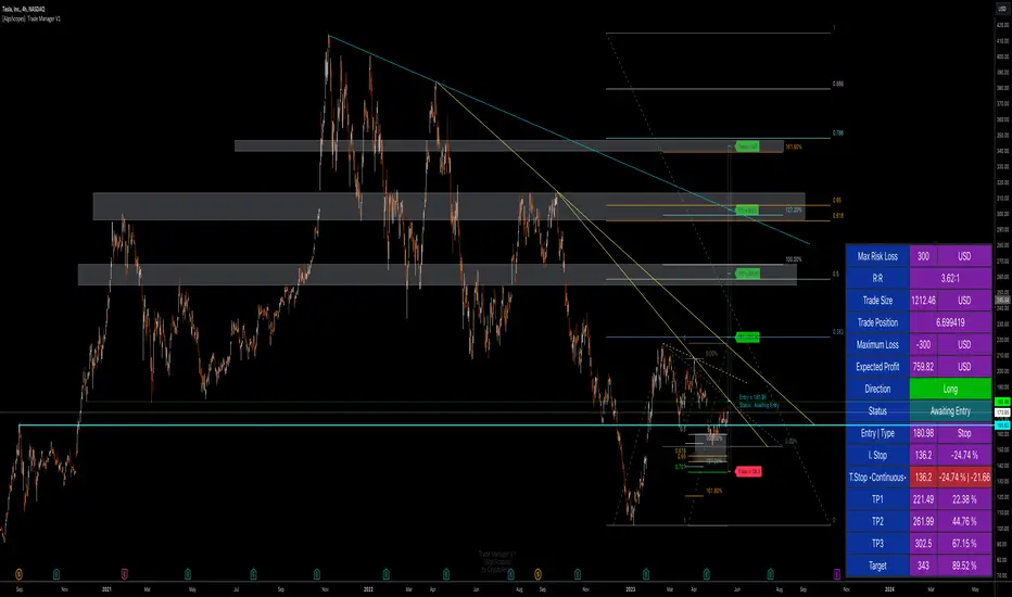
Trade Manager & Position Size Tool & PnL Tracker [AlgoScopes] V1Position size tool, leverage calculator, trade tracker, money management, trade presentation, risk reward management, margin position, live profit and loss, that's all in this one Trade Manager indicator.
The idea for this indicator comes from two years ago when I was helping a friend who, at the request of 15-20 members from our telegram group, wanted to create a paid group and share our ideas for trade with them (it started as an experiment for just a month or two and ended with 15 months with over 500 trading ideas and signals, with a complete TA chart). If I had time to create this indicator back then for members, it would have been much easier for them to be able to understand and follow the trade idea that was presented through a classic chart, with all the things that a TA must have:
Entry (as well as the reason for entry),
Stop (where the idea for the trade is no longer valid),
Target (with the reason why it is the target for that trade),
Take profits (taking part of the profit on the way to the target).
The majority of members still did not understand how much position to trade, what is the possible profit or loss, if the margin trade is how much leverage to use, in one word “money management”. The most important rule that every trader must follow is "Plan your trade and trade your plan". Learn money management and you are halfway there to becoming a successful trader. It is only after all that, you learn to use some of the "holy grail" indicators. When you have mastered those first two rules, find and master your favorite indicator or trading style (the most important thing is to stick to those two rules). The margin | leverage is also included in the script, for which there are so many dilemmas, arguments and discussions. (that many who still do not understand margin, would trade that it is not passionate if it is controlled). Too much for an introduction, especially since this indicator has so much to explain.
Most importantly, this is an invite-only indicator, and there are so many free indicators on tradingview that can also serve you very well. As far as I know, all exchanges have a calculator tool to calculate the possible profit and loss for each trade you plan to take.
*This indicator is not recommended for scalping on a 1min chart because the script, as you will see, is very complex, so the loading time is longer than with simpler indicators.
💠 ABOUT THE SCRIPT
This script is made to help manage trade. In this one indicator you have the possibility to do technical analysis, calculation for trade (four types: account size risk, trade investment, maximum to lose or position size), monitor 'PnL' (profit and loss in real time) do the calculation in the second, maybe local currency, and set an alert (from entry to any other change in trade). As the script is made for general use, some slight differences are possible for real time 'PnL' or 'ROI'. Always do a test before you start trading with larger amounts. The script is recommended for intra day trading and above. The script is not recommended for scalping on the 1min chart
💎 PROCESS TO ADD SCRIPT TO CHART
Possible trade on break example trade
As this script is invite-only, to add it to the chart you need to click on Indicators and find it under the 'Invite-Only' section. When you add the script to the chart (as it is interactive), you will be asked to do 4 steps.
🔸 'SET TRADE TIME'
Click on the chart where the last vertical bar is.
If you are already in the trade, then find the bar|time where the trade started
(you want to follow trade or trade presentation)
🔸 1) 'SET ENTRY'
Click on the horizontal level where you want to place the Entry
🔸 2) 'SET STOP'
Click on the horizontal level where you want to set the Stop
🔸 3) 'SET TARGET
Click on the horizontal level where you want to place the Target
💎 CONFIRM INPUTS
After you have done those 4 steps, a popup will appear with the relevant inputs for the trade.
You will see that some inputs are already filled (done in those 4 steps before, Entry, Stop and Target). You can correct them if you want (you will sometimes notice a longer 'space decimal' for the trade ticker, but this will not affect the calculator or other parts of the script). You can do the rest of the inputs for trade or finish it later when the script is loaded on the chart (it is recommended to fill in 'Trade Type' and 'Amount'. Don't forget to click on the "Apply" button to load the script on the chart.
💎 INDICATOR LOADED ON CHART
• When the indicator is loaded on the chart (regardless of whether it is a new trade or a trade that has already started), the following items are displayed by default:
🔸 ' Trade Table ' shows all relevant information for the trade
🔸 ' Trade Box ' with lines for Entry, Stop and Target (Take Profits if enabled)
🔸 ' Trade Box Labels ' with relevant data
• The Entry label is also the trade status label, and if the trade is not active, by default it is the Entry color
If the trade is active or when a new trade reached Entry, several new things are noticeable:
• Entry|Status label as well as status row in table will change color as well as 'Entry Reached' text
• Several extra columns relative to trade will be added to the Entry|Status label
• 3 new columns will also appear on the Trade Table (Live PnL, Live min PnL and Live ROI)
• If Trail Stop is enabled, the label will change the text to T.Stop and change color depending on whether it is in loss or profit.
• If Trail Stop is enabled, inside Trade Box trail line it will follow price action inside the box, while the label will always be fixed at the initial level
• A vertical colored line will appear on the right side of the Trade Box (depending on whether the trade is in profit or loss) which shows as in the Trade Table like Live PnL
⚪ SETTINGS
💎 Trade Account Setup
🔸 ‘Trade Type’
• 'Account Capital' or portfolio (with combination '% Capital Risk')
• 'Investment' (how much you want to invest in the trade)
• 'Risk To Lose' (how much you want to risk losing)
• 'Position Size' (exact position size, units|share for trade)
🔸 ‘Account Type’
• If the account is in another currency or you want to see possible profit | loss in local currency
• Around 150 world and local currencies supported by ICE exchange
🔸 ‘Amount’
• Amount for ‘Trade Type’
🔸 ‘% Capital Risk’
• Only for ‘Account Capital’ trade type
(i.e. 10.000 account capital with ‘% Capital Risk’ 4 is 10.000 x 4% = maximum loss 400)
🔸 ‘Leverage’
• Enable|Disable for margin trade i size of leverage (maximum 125x)
(be sure to study how and when to use margin trade through the tutorial, because margin trade can be very dangerous. If you have not perfected margin trade, there is a great possibility of losing most or even all of your account capital).
💎 TRADE ENTRY & TARGET & STOP & T.STOP & DATE | TIME
🔸 ‘Trade Date & Time’
🔸 ‘Entry’
🔸 ‘Stop’
🔸 ‘Target’
• (all was set in the previous step but can be correct/adjusted if needed)
🔸 ‘Market Entry’
• Enabled will move Entry on that bar close
🔸 ‘Liquidation’ (enabled by default)
• Show ‘Warning’ if trade Stop is close or invalid (trade will hit liquidation before reached Stop level)
🔸 ‘Trailing Type’ (4 trailing stop type)
• ‘Disabled’ (Stop will stay the entire time at the initial stop level)
• ‘Continuous’ (I.Stop follow price by distance or percent when price reached Trail start level)
• ‘Stepped’ (I.Stop moves to previous level when price reached Trail start level)
• ‘Breakeven’ (I.Stop moves to Entry when price reached Trail start level)*
* (least one Take Profit enabled)
🔸 ‘Trailing Active’ (Entry, TP1, TP2 and TP3)
• Trailing stop starts level if ‘Trailing Type’ is enabled
🔸 ‘Trailing by’ (distance or percent)
• ‘Distance’ (T.Stop will follow price action by distance)
• ‘Percent’ (T.Stop will follow price action by percent)
(this is a good example to see the difference between trailing by initial distance and initial percentage)
🔸 ‘T.Stop Distance & Percent’ (initial distance and percent for table trade only)
• Useful for bot or exchange
🔸 ‘Stop, T.Stop, Target and TP’s in PIP’s’
• Distance in PIP’s
💎 TAKE PROFIT
🔸 ‘Split Target’ (enabled by default to three take profits (TP) with auto split)
🔸 ‘Number of Take Profits’ (up to three take profits)
🔸 ‘Type’ (auto or manual)
• For manual type fill all prices to preferred level. TP percent (TP1%, TP2% and TP3% ) and Target% is how much profit you want to take on a specific level.
• PLEASE NOTE sum of all enabled ‘TP’ and targets = 100 (e.g. two TP and sets TP1% to 25 and TP2% to 35, then Target% should be 40% i.e. 25 + 35 + 40 = 100)
💎 TRADE BOX & LINES
🔸 ‘Target Line’ (color for target line and trade table ‘direction’)
🔸 ‘Stop Line’ (color for initial line and trail line)
🔸 ‘Entry Line’ (color for entry line and label & table status)
🔸 ‘To Trade Time’ (‘trade box’ left vertical line)
• By default is set to trade date and time
• Unchecked will be moved to the last bar (live time)
🔸 ‘Extended Left’ (extend Entry, Stop, Target and TP’s lines to left)
• To check for possible support|resistance
🔸 ‘Size’ (Entry, Stop, Target and TP’s lines size)
🔸 ‘PnL Box Size’ (line size for vertical box lines)
🔸 ‘Offset’ (right vertical line offset from last bar)
🔸 ‘PnL Box Color’ (right vertical line and trail fill color)
• Color changes for profit & loss
🔸 ‘Box Line Color’ (box base color)
💎 LABELS
🔸 ‘Stop & Target Labels’ (enable|disable stop and target labels)
• By default is set to small (tiny, small, normal, large, huge and auto option)
• Disabled will move all information on Entry|Status label
🔸 ‘Offset’ (label offset from trade box)
🔸 ‘Target Label’ (label color for target and all enabled tp’s)
🔸 ‘Stop Label’ (label color for initial stop and enabled trailing stop)
🔸 ‘Label Text’ (color for label text)
🔸 ‘Status Label Color’ (label table entry|status color when trade is not active)
🔸 ‘PnL’ (entry|status color for profit and loss)
🔸 ‘Size’ (by default set to normal, option tiny, small, normal, large, huge and auto)
🔸 ‘Risk to Reward’ (show risk to reward on labels)
🔸 ‘Extra Info’ (by default disabled, show extra related info for trade on labels)
• Useful if Trade Table disabled
🔸 ‘Close Trade Stats’ (by default disabled, show all info when trade is closed)
• By default is white text color for close trade stats label
💎 ALERTS
🔸 ‘Failed Trade’ (alert if price reached Stop before is active, reached Entry)
• Useful if trade need adjustment but it can also be left as it is
and alert is just warning
🔸 ‘New & Update Alert’ (alert when price reached Entry or change status to enabled Take Profits)
🔸 ‘Trade Closure Alert’ (alert when trade closed, reached Stop, Target or enabled Trail Stop)
• Alert can be in modified or default preset jSon format as well as in plain text format
• Place holders for creating alerts are :
{type}, {symbol}, {exchange}, {ticker}, {base}, {quote}, {timeframe}, {price}, {direction}, {entry}, {stop}, {tstop}, {tp1}, {tp2}, {tp3}, {target}, {tstopstatus}, {status}, {result}
* {type} placeholder is set to ‘Trade Active’, ‘Trade Update’ and ‘Trade Closed’
💎 TABLE DISPLAY
🔸 ‘Trade Table’ (enable|disable trade table)
🔸 ‘Position’ (by default set to bottom right with option bottom, middle and top with left, center and right)
🔸 ‘Size’ (by default set to normal, option tiny, small, normal, large, huge and auto)
🔸 ‘Full Table’ (by default enabled, disabled show small table without some info*)
* check picture for reference
🔸 ‘Presentation’ (by default disabled, hide all info related to PnL in trade currency)
• Useful if trade shared for presentation, hidden trade fiat|currency info)
🔸 ‘Header’ (color for trade table first row)
🔸 ‘Stats’ (color for trade table statistics row)
🔸 ‘Text’ (color for trade table text)
🔸 ‘Error’ (color for all errors if is made when trade is setup)
• Color for errors is for trade table and trade labels
🔸 ‘Fiat Price’ (by default enabled, show info for second fiat*
* if trade is in crypto and ‘quoted’ currency is not stable coin, like ETHBTC, or ‘Account Type’ is set to different currency
🔸 ‘Live Fiat Price’ (if ‘quoted’ currency enabled will show live exchange conversion)
🔸 ‘All Errors’ (enabled by default, show all error if trade setup is wrong)
• When error shows on trade, disabled this to see what|where is error
• Check below for more details
🔸 ‘Tool Tip (chart)’ (enabled show all tooltip on chart)
• Check below for more details
• When you are familiar with indicator, disable popup tooltip
💎 TOOLTIP
All possible tooltips have been added for easier understanding, especially for traders who are just learning how to place a trade. (when you perfect this indicator, you can turn off the tooltip in settings, and you can also normally use the lite version of this indicator, which does not contain all these futures)
🔸 ' Settings Tooltips’
🔸 ‘Chart Tooltips’
🔸 ‘Table Tooltips’
🔴 ERRORS
When you setup trade, not only a novice in trading, but also experienced traders can make a mistake and for this reason all possible errors are included in the indicator which will be shown on the chart by changing the color of the labels as well as on the trade table and in most of the cases and error text.
If the tooltip is enabled in the settings, you can see the reason for the error as well as the solution.
Here are some examples of possible errors.
Stay safe
PLAN YOUR TRADE AND TRADE YOUR PLAN
Daily Network Value to Transactions Signal (NVTS)
Quote of GlassNode ...
The NVT Signal (NVTS) is a modified version of the original NVT Ratio.
It uses a 90 day moving average of the daily transaction volume in the denominator instead of the raw daily transaction volume.
This moving average improves the ratio to better function as a leading indicator.
The Network Value to Transactions (NVT) Ratio is calculated by dividing the market cap by the transferred on-chain volume measured in USD.
GlassNode says the NVT Ratio was created by Willy Woo.
I have peaked into Glassnode and took their idea.
I also added a few more Moving Averages to select from, and the length can also be changed.
This script does not depend on Glassnode alone, instead I pulls data of several services...
CoinMarketCap
CoinMetrics
GlassNode
IntoTheBlock
Therefor we have more Tokens to select from.
I have also blocked some faulty data of each service.
If you get a study error of any kind then there is no data available,
or you on a wrong timeframe.
Best to use this script in a daily chart.
And keep in mind it pulls data of yesterday.
Therefor the plot is offset by 1 to the left.
The script will check each service if the data for the chart is available.
Market Cap is taken in the following order ...
CainMarketCap
GlassNode
CoinMetrics
Transaction volume as USD is taken in the following order ...
IntoTheBlock
CoinMetrics
GlassNode
Happy Trading!

Bull and Bear Market '20% IndicatorThis indicator uses the somewhat crude method of calculating bear/bull markets using the following popular ' 20% rule ':
A bear market begins when an asset trades 20% below its recent high for more than two months, a bear market ends when an asset trades 20% above its recent low for one month or more.
The 1d time-frame should be used, here's why:
"A bear market begins when an asset trades 20% below its recent high for more than two months."
If we take the standard trading month to be around 20-22 days (excluding weekends), then two months would be approximately 40-44 days. This is why we set the `bearDuration` to 60 days in the script to capture the "more than two months" criteria. Using a daily timeframe, 60 bars represent roughly 3 months (since markets are not open every day due to weekends and holidays).
"...a bear market ends when an asset trades 20% above its recent low for one month or more."
This is why the `bullDuration` is set to 20 days in the script, which represents roughly one trading month on a daily timeframe.
So, to capture the mentioned bear and bull market definitions, you'd want to apply the script on a daily (1d/1D) chart.

Book Value Per Share OverlayThis indicator will overlay the book value per share along with the price chart so that you can quickly judge where the price is in relation with the value of the company.

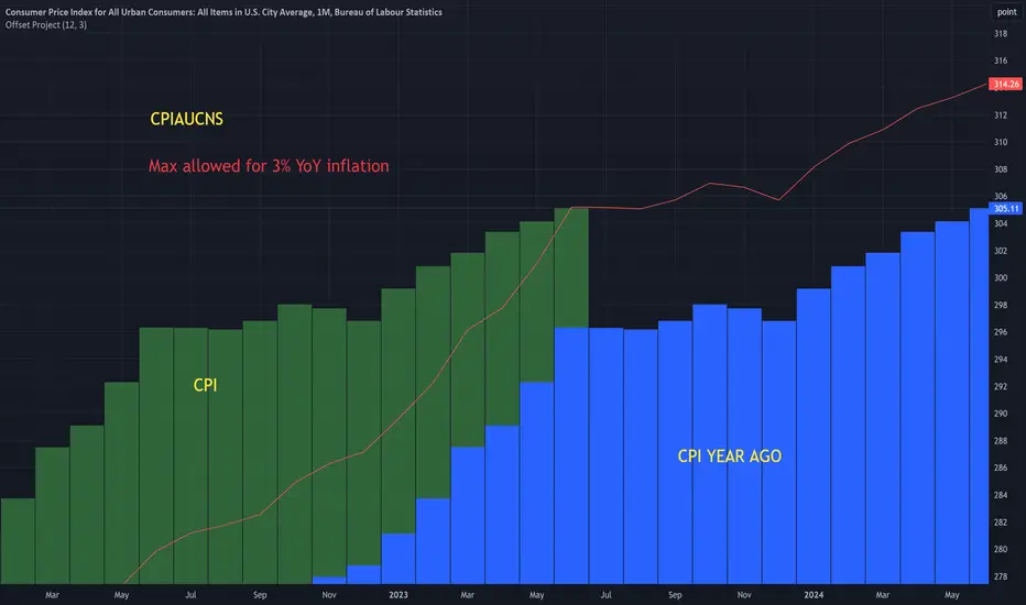
Offset ProjectIntended for use with CPI symbols like:
CPIAUCNS (all items)
CPILFENS (core)
Shows the CPI values from a year ago, next to the current values. This makes it easier to visualize the base effects .
Has a ' max inflation rate ' parameter. This is shown as a red line. So for example, if it's set to 3, then CPI must stay below the red line in in order for the inflation rate to stay below 3.
Realized price for BTC, ETH, LTCThis script calculates the realized price of BTC/ETH/LTC and shows a signal when the market price falls below the realized price - which can be signal a for potential market bottom. The realized price calculation is based on Glassnode data MVRV ratio.
- Realized Price is the average price of the Bitcoin supply, valued at the day each coin last transacted on-chain. This is often considered the 'on-chain cost basis' of the market.
- MVRV Ratio is the ratio between the market value (MV, spot price) and the Realized value (RV, realized price), allowing for a visualization of Bitcoin market cycles, and profitability.
Calculations:
REALIZED PRICE = REALIZED MARKET CAP / CIRCULATION SUPPLY
REALIZED MARKET CAP = 1 / MVRV * MARKET CAP
It's working with BTCUSD, ETHUSD, LTCUSD tickers only.

SPDR TrackerMonitor all SPDR Index Funds in one location! The purpose of this indicator is to review which sectors are trend up vs down to better manage risk against SPY, other funds and/or individual stocks.
With this indicator it may become more apparent which sectors to begin investment in that are at lows compared to others, or use it to determine which stocks may be undervalued or overvalued against SPY.
There is a small table at the bottom where each fund symbol is presented along with it's mode value, last period change as well as last period volume - there's a tooltip that shows the description for each symbol for a quick reminder.
Review the configuration pane where:
Individual funds can have their visibility toggled
Change funds colors
Adjust display mode for each fund (SMA, EMA, VWMA, BBW, Change, ATR, VWAP - many more!)
Some presentation modes may look better on some timeframes vs others, adjust lengths and use anchor point for VWAP.
Future updates may bring about new features, I have some code organization and refactoring to do but wanted to share the idea anyways.
Feel free to drop any suggestions for feature enhancement and I hope it brings success to many, enjoy.

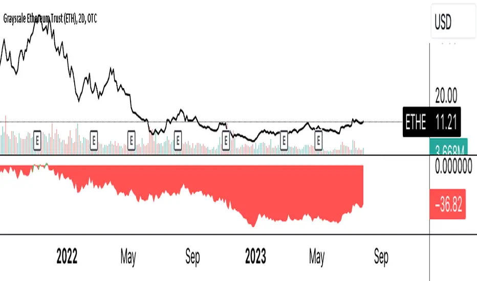
ETHE Discount/Premium to NAVThe provided script calculates the discount or premium of the Grayscale Ethereum Trust (ETHE) to its Net Asset Value (NAV), considering an annual fee of 2.5%. It does this by comparing the ETHE's price to the underlying Ethereum (ETH) value per share, adjusting for the effect of the annual fee.
PEG RatioThe 'PEG ratio' (price/earnings to growth ratio) is a valuation metric for determining the relative trade-off between the price of a stock, the earnings generated per share (EPS), and the company's expected growth. In general, the P/E ratio is higher for a company with a higher growth rate.

Extreme Fundamental PricesExtreme Fundamental Prices is developed for Stock Markets to see the optimum, estimated and extreme estimated prices of any stocks on any markets. It works globally. Every country has different inflation, interest and deposit interest rates. The indicator consider these difference and it adopts itself automatically for chosen stock. Only the "Deposit Interest Rate" is manual because tradingview does not support this value for every country or value is wrong. If you know the deposit interest rate of your country enter the value manually. This is priority. Otherwise switch to "Interest Rate" on the menu. However the Optimum P/E line is not developed to work perfectly with this option. The Extreme Fundamental Prices indicator consists three lines which are,
-Optimum P/E
-Estimated 1Y Price
-Extreme Estimated 1Y Price
Optimum P/E line consists the financial data of chosen stock and economic data of country; which are financials of the stocks, inflation rate, deposit interest rate and interest rate(if "Interest Rate" option chosen).
Estimated 1Y Price line consists the financial data of chosen stock.
Extreme Estimated 1Y Price line consists the financial data of chosen stock.
This indicator does not tell you to buy or sell the stock. If stock price above these lines, the stock is fundamentally overpriced. If stock price below these lines, the stock is not fundamentally overpriced. Logically, price can tend to meet these lines.
For Instance, default value 33.00 is the current Deposit Interest Rate of Turkey. I am using this rate to look stocks on BIST. If you are looking on NASDAQ, just simply enter the deposit interest rate value of USA, looking for DAX enter the Euro Zone deposit interest rate.

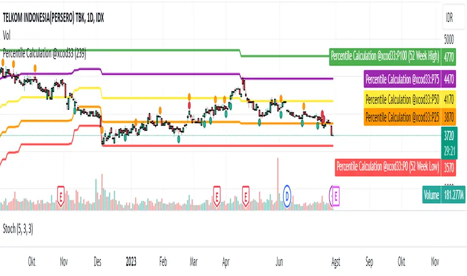
Percentile Calculation @xcod33This script calculates the current price percentile based on the highest and lowest price range in the last 52 weeks.
How to Use:
This script will provide the current price percentile relative to the 52-week price range on your chart. You can use it as an indicator to help identify where the current price stands relative to the historical price range in that period.
Targeted Market:
This script can be applied to various financial markets, including stocks, forex, indices, commodities, and others. It is not limited to a specific market and can be used across various trading instruments.
Market Conditions:
Here are some market conditions where this script can be useful:
1. Identifying Price Extremes: By looking at the current percentile, you can see if the price is near the highest or lowest extremes in the last 52 weeks. If the percentile is close to 0%, it means the price is near the lowest, while a percentile close to 100% indicates the price is near the highest.
Finding Consolidation Patterns: You can identify whether the price is within a certain range by looking at the percentile. If the percentile is around 50%, it indicates a relatively consistent price range.
2. Identifying Breakouts and Pullbacks: When the price is outside the historical range and the percentile approaches 100%, it indicates a breakout. When the price retraces back to the range and the percentile approaches 50%, it indicates a pullback.
3. However, keep in mind that this indicator only provides an additional perspective on the price relative to the 52-week range. It is not recommended to use this indicator as the sole basis for trading decisions. Always use further analysis and other indicators to confirm your trading signals.
Credit :
- M Rico Aditya Prayoga | Author
- Tri Okta Setiawan Marblo | Maker of formulas and ideas
Quarterly Version: Sustainable Growth Rate+ (SGR+)The Sustainable Growth Rate+ (SGR+) is an advanced financial indicator designed to estimate the sustainable growth rate of a company in a more comprehensive manner than the traditional Sustainable Growth Rate (SGR). This indicator has been created to overcome certain limitations of the traditional SGR, especially its reliance on Return on Equity (ROE), which does not take into account the impact of debt on a company's growth.
Calculation:
The SGR+ is calculated using the following formula:
(Net Income - Dividends - Depreciation & Amortization) / (Shareholders' Equity + Long-Term Debt)
This formula essentially adjusts the net income by subtracting dividends and depreciation & amortization expenses. The result is then divided by the sum of shareholders' equity and long-term debt. By including long-term debt in the denominator, SGR+ accounts for the role of debt in a company's capital structure, providing a more realistic picture of its potential growth.
Logic:
The logic behind the SGR+ is to factor in both the role of debt and the recurring costs of asset maintenance/replacement (approximated by Depreciation & Amortization expenses) into the growth estimation.
By incorporating debt, we capture a company's total capital employed (equity + debt) rather than just equity, thus considering the full range of financing options used to fuel growth.
Depreciation & Amortization expenses are subtracted from net income to better reflect the amount of earnings that can be retained for growth, as these expenses indicate the necessary reinvestment for maintaining the operational efficiency of a company's assets.
History:
The original SGR was based on the Dupont Analysis developed by the Dupont Corporation in the 1920s. While it provided a useful estimate of a company's potential growth, many analysts felt that it did not fully capture the realities of modern business finance, particularly the significant role of debt and recurring asset costs. This led to the development of the SGR+, which factors in these important elements to provide a more comprehensive and realistic measure of a company's sustainable growth rate.
Usage:
While SGR+ provides a more nuanced estimate of a company's potential growth, it should not be used in isolation. It is most effective when used alongside other financial indicators, including historical growth rates, ROE, and analyst forecasts. It also requires a careful evaluation of a company's earnings consistency and volatility.
Remember, the SGR+ is still an estimation based on various assumptions, and should be used with a sufficient margin of safety. Regularly comparing the SGR+ over multiple years can provide insight into the stability or volatility of a company's growth rate, contributing to a more accurate growth prediction.

The Strat with Continuity [starlord_xrp]This indicator shows entry and exit points for The Strat as well as potential setups. It also has full time frame continuity detection.

Major and Minor Trend Indicator by Nikhil34a V 2.2Title: Major and Minor Trend Indicator by Nikhil34a V 2.2
Description:
The Major and Minor Trend Indicator v2.2 is a comprehensive technical analysis script designed for use with the TradingView platform. This powerful tool is developed in Pine Script version 5 and helps traders identify potential buying and selling opportunities in the stock market.
Features:
SMA Trend Analysis: The script calculates two Simple Moving Averages (SMAs) with user-defined lengths for major and minor trends. It displays these SMAs on the chart, allowing traders to visualize the prevailing trends easily.
Surge Detection: The indicator can detect buying and selling surges based on specific conditions, such as volume, RSI, MACD, and stochastic indicators. Both Buying and Selling surges are marked in black on the chart.
Option Buy Zone Detection: The script identifies the option buy zone based on SMA crossovers, RSI, and MACD values. The buy zone is categorized as "CE Zone" or "PE Zone" and displayed in the table along with the trigger time.
Two-Day High and Low Range: The script calculates the highest high and lowest low of the previous two trading days and plots them on the chart. The area between these points is shaded in semi-transparent green and red colors.
Crossover Analysis: The script analyzes moving average crossovers on multiple timeframes (2-minute, 3-minute, and 5-minute) and displays buy and sell signals accordingly.
Trend Identification: The script identifies the major and minor trends as either bullish or bearish, providing valuable insights into the overall market sentiment.
Usage:
Customize Major and Minor SMA Periods: Adjust the lengths of major and minor SMAs through input parameters to suit your trading preferences.
Enable/Disable Moving Averages: Choose which SMAs to display on the chart by toggling the "showXMA" input options.
Set Surge and Option Buy Zone Thresholds: Modify the surgeThreshold, volumeThreshold, RSIThreshold, and StochThreshold inputs to refine the surge and buy zone detection.
Analyze Crossover Signals: Monitor the crossover signals in the table, categorized by timeframes (2-minute, 3-minute, and 5-minute).
Explore Market Bias and Distance to 2-Day High/Low: The table provides information on market bias, current price movement relative to the previous two-day high and low, and the option buy zone status.
Additional Use Cases:
Surge Indicator:
The script includes a Surge Indicator that detects sudden buying or selling surges in the market. When a buying surge is identified, the "BSurge" label will appear below the corresponding candle with black text on a white background. Similarly, a selling surge will display the "SSurge" label in white text on a black background. These indicators help traders quickly spot strong buying or selling activities that may influence their trading decisions. These surges can be used to identify sudden premium dump zones.
Option Buy Zone:
The Option Buy Zone is an essential feature that identifies potential zones for buying call options (CE Zone) or put options (PE Zone) based on specific technical conditions. The indicator evaluates SMA crossovers, RSI, and MACD values to determine the current market sentiment. When the option buy zone is triggered, the script will display the respective zone ("CE Zone" or "PE Zone") in the table, highlighted with a white background. Additionally, the time when the buy zone was triggered will be shown under the "Option Buy Zone Trigger Time" column.
Price Movement Relative to 2-Day High/Low:
The script calculates the highest high and lowest low of the previous two trading days (high2DaysAgo and low2DaysAgo) and plots these points on the chart. The area between these two points is shaded in semi-transparent green and red colors. The green region indicates the price range between the highpricetoconsider (highest high of the previous two days) and the lower value between highPreviousDay and high2DaysAgo. Similarly, the red region represents the price range between the lowpricetoconsider (lowest low of the previous two days) and the higher value between lowPreviousDay and low2DaysAgo.
Entry Time and Current Zone:
The script identifies potential entry times for trades within the option buy zone. When a valid buy zone trigger occurs, the script calculates the entryTime by adding the durationInMinutes (user-defined) to the startTime. The entryTime will be displayed in the "Entry Time" column of the table. Depending on the comparison between optionbuyzonetriggertime and entryTime, the background color of the entry time will change. If optionbuyzonetriggertime is greater than entryTime, the background color will be yellow, indicating that a new trigger has occurred before the specified duration. Otherwise, the background color will be green, suggesting that the entry time is still within the defined duration.
Current Zone Indicator:
The script further categorizes the current zone as either "CE Zone" (call option zone) or "PE Zone" (put option zone). When the market is trending upwards and the minor SMA is above the major SMA, the currentZone will be set to "CE Zone." Conversely, when the market is trending downwards and the minor SMA is below the major SMA, the currentZone will be "PE Zone." This information is displayed in the "Current Zone" column of the table.
These additional use cases empower traders with valuable insights into market trends, buying and selling surges, option buy zones, and potential entry times. Traders can combine this information with their analysis and risk management strategies to make informed and confident trading decisions.
Note:
The script is optimized for identifying trends and potential trade opportunities. It is crucial to perform additional analysis and risk management before executing any trades based on the provided signals.
Happy Trading!

GBTC Cost Equivalent per BTCGBTC Cost Equivalent per BTC, dynamically updates BTC holdings per share of GBTC daily
GBTC Discount/Premium to NAVGBTC Discount/Premium to NAV, dynamically adjust BTC holdings per share daily

Earnings Yield SpreadThe Earnings Yield Spread might offer an investor some insight into areas of value.
Earnings yield is the ratio of Diluted earnings per share over the trailing twelve months (TTM) to the company’s share price. Earnings yield shows how much the company has earned per share as a percentage of its share price. It shows investors how much yield they are getting in earnings in return for owning the stock at its current share price. (Thank you, TradingView)
One might wonder how the earnings yield on their investment compares to the yield on a US 10 year treasury bond. The Earnings Yield Spread indicator will read above zero if the stock in question earnings yield is higher than US10Y and will read below zero if the stock in question earnings yield is lower than the US10Y.
Earnings yield is relative to the stock in question, so comparisons should be drawn to its own historical reading and not to other symbols.

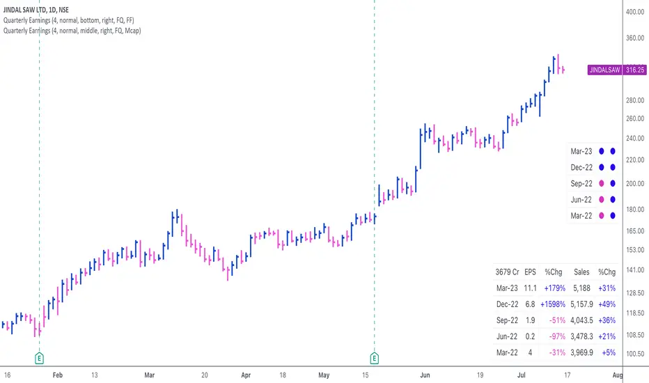
Quarterly EarningsThis script displays quarterly earnings per share (EPS) and sales data, and their year-on-year percentage change.
The script builds upon the Volume Price and Fundamentals script by Mohit_Kakkar08 and improves upon the array functions to keep the code light-weight & the output as accurate as possible. This script uses diluted EPS data for calculating the quarterly earnings. New quarters are auto-generated by the script as the earnings data gets updated in Tradingview every quarter.
Features:
⦿ View quarterly earnings per share (EPS) and sales data.
⦿ The percentage change is a YoY (year on year) comparison of the current quarter to the same quarter of the previous year.
⦿ Option to change the data from Quarterly (FQ) to Yearly (FY) .
⦿ Long mode : Option to increase the number of previous quarters displayed in the table (default is the past 4 quarters) to any number.
⦿ Location & size of the table can be changed.
⦿ Option for a 1-click dark mode
⦿ Option for a ' Mini mode ' where the values are replaced by traffic lights for a quick visual:
🟢 or 🔵 YoY increase in earnings/sales
🔴 or 🟣 YoY decrease in earnings/sales
🟡 or 🟠 YoY earnings/sales unchanged
⚪️ No data available
⦿ The top-left cell has the option to display either the free float (FF) or the marketcap (Mcap) of the stock.
Please note that sometimes the Tradingview data reflected in the script output might differ a bit from MarketSmith. Also make sure you are viewing the 'consolidated' data there.
This script was developed as a collaboration between me & @EquityCraze .
Earnings Yield & Dividend Yield (vs SP500, treasury, IG)# What's this script?
I created this because I wanted to compare the Earnings/Dividend yield of SP500 and the symbol with the time period of the chart.
Plot the following yields.
Earnings Yield of S&P500.
Calculated using S&P 500 Earnings by Month provided by Nasdaq date link.
(data.nasdaq.com)
Dividend Yield of S&P500.
Calculated using S&P 500 Dividend by Month provided by Nasdaq date link.
(data.nasdaq.com)
Earnings Yield of the displayed symbol.
Dividend Yield of the displayed symbol.
Treasury constant maturity rate. default is 10Y(FRED:DGS10).
Investment grade corporate bond yields by Moody's.
Grades from Aaa to Baa are represented by color bands.
Investment grade bond yields by BofA.
Grades from AAA to BBB are represented by color bands.
-----------
◇これなに?
request.quandl()を用いてSP500の益回りと配当利回りが得られますが
月間データなのでチャートの時間間隔でみたかったのと、
SP500とシンボルの益回りや配当利回りを比較したかったのでつくりました。
下記を表示します
- SP500の益回りと配当利回り
- 表示シンボルの益回りや配当利回り
- 設定画面で指定した財務省債券(デフォルトは10年)
- 投資適格社債(MoodysとBofAでかなり違ったので両方)をカラーバンドで表示
かんたんなものですけど、おやくにたてればさいわいです

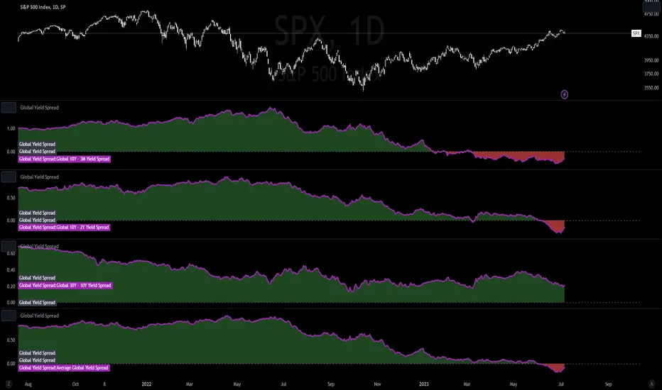
Global Yield SpreadThe Global Yield Spread is a simple indicator that can help to identify economic wellbeing and thus allows traders and investors alike to derive a rough estimation onto where the market is likely to go.
----------
Please note that things like Yield Spread generally influence the market only over longer time horizons of a couple weeks to many months.
Also be aware that the Yield Spread is only capable of measuring the Yields on Bonds and is thus limited to only changes that are reflected in the interest rates on the Bonds.
----------
The Normal Yield Spread is widely recognized for it's signal abilities for recessions or general economic well being...
However, since the rates have decreased drastically in the US something else has been proposed: The Global Yield Spread
As the normal US Yield Spread is loosing signal capacity because the US government can easily borrow money from overseas,
thus reducing the need to increase interest rates.
By monitoring and analyzing the Global Yield spread, traders and investors can gain insights into relative valuations, economic movements, market sentiment, and opportunities.
It can help inform their investment decisions and strategies, allowing them to allocate capital more effectively and potentially generate better returns.
You have options to visually represent a diversity of Countries and their according Yield Spreads.
Furthermore there are Global Yield Spreads for:
10Y-03MY
10Y-02Y
30Y-10Y
The Average Global Yield Spread encompasses the 3 options above to get an average reading.
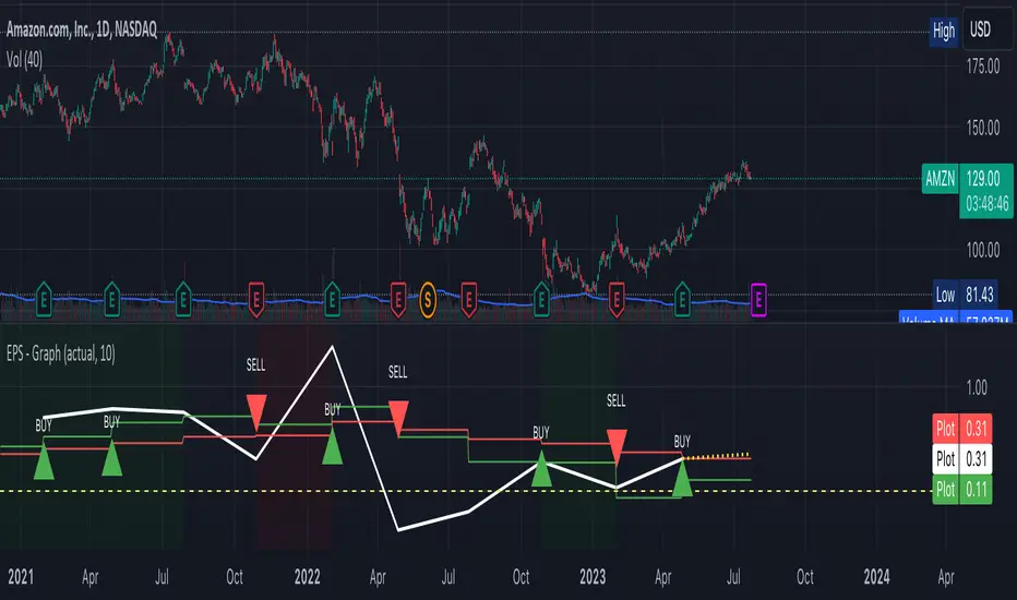
EPS GrowthA graph to display EPS growth with a trailing simple moving average of the last 4 and 8 periods.
Periods of earnings recessions have a dark red background.
Periods of earnings expansion have a dark green background.
A buy signal/sell signal is generated if the actual period earnings beat the estimates.
Upgraded WatermarkThis mimics the built in watermark feature, but adds the ability to change location as well as see an equities sector and industry group.