Visual SL/TP con ATR + Pips/TicksThis indicator automatically displays the current ATR size along with suggested SL (Stop Loss) and TP (Take Profit) values, expressed in key units such as pips and ticks.
✅ Compatible with:
Forex (e.g., EURUSD)
Indices (e.g., NAS100, US30)
Gold (XAUUSD)
Cryptocurrencies (e.g., XRPUSDT)
🎯 Ideal for scalping, intraday, or swing trading.
🧠 Saves calculation time and improves trading speed.
Includes:
Automatic SL/TP calculation based on ATR multiples
Conversion to pips and ticks for quick reading
Dynamic support for different instrument types
📌 Tip: Use this indicator alongside your entry strategy with EMAs or volume for more precise trading.
Fundamental Analysis

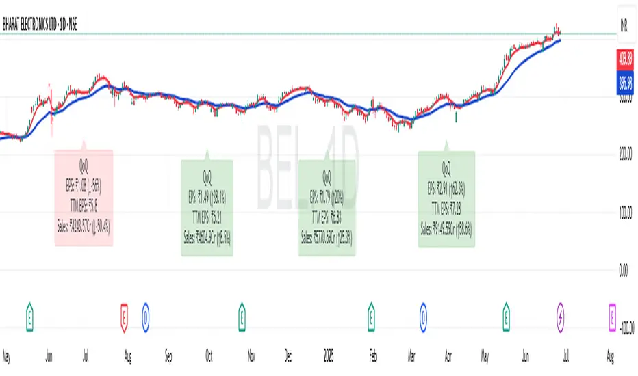
EPS and Sales Magic Indicator V2EPS and Sales Magic Indicator V2
EPS and Sales Magic Indicator V2
Short Title: EPS V2
Author: Trading_Tomm
Platform: TradingView (Pine Script v6)
License: Free for public use under fair usage guidelines
Overview
The EPS and Sales Magic Indicator V2 is a powerful stock fundamental visualization tool built specifically for TradingView users who wish to incorporate earnings intelligence directly onto their price chart. Designed and developed by Trading_Tomm, this upgraded version of the original 'EPS and Sales Magic Indicator' includes an enriched and more insightful presentation of company performance metrics — now with TTM EPS support, advanced color-coding, label sizing, and refined control options.
This indicator is tailored for retail traders, swing investors, and long-term fundamental analysts who need to view Quarter-over-Quarter (QoQ) earnings and revenue changes directly on the price chart without switching tabs or breaking focus.
What Does It Display?
The EPS and Sales Magic Indicator V2 intelligently detects quarterly financial updates and displays the following data points via labels:
1. EPS (Earnings Per Share) – Current Quarterly Value
This is the most recent Diluted EPS published by the company, fetched using TradingView’s request.financial() function.
Displayed in the format: EPS: ₹20.45
2. EPS QoQ Percentage Change
Shows the percentage change in EPS compared to the previous quarter.
Highlights improvement or decline using arrows (up for improvement, down for decline).
Displayed in the format: EPS: ₹20.45 (up 15.3 percent)
3. Sales (Revenue) – Current Quarterly Value
Fetches and displays Total Revenue of the company in ₹Crores for easier Indian-market readability.
Displayed in the format: Sales: ₹460Cr
4. Sales QoQ Percentage Change
Measures and presents the quarter-over-quarter percentage change in total revenue.
Uses arrows to indicate growth or contraction.
Displayed in the format: Sales: ₹460Cr (down 3.8 percent)
5. EPS TTM (Trailing Twelve Months)
You now get the TTM EPS — the sum of the last four quarterly EPS values.
This value provides a better long-term earnings snapshot compared to a single quarter.
Displayed in the format: TTM EPS: ₹78.12
All of these values are automatically calculated and displayed only on the bars where a new financial report is detected, keeping your chart clean and insightful.
Customization Features
This indicator is built with user control in mind, allowing you to personalize how and what you want to see:
Show EPS in Label: Enable or disable the display of EPS and EPS QoQ values.
Show Sales in Label: Toggle the visibility of revenue and sales change percentage.
Color Options for Label Themes: The label background color is automatically determined based on performance.
Green: Both EPS and Sales increased QoQ.
Red: Both decreased.
Orange: One increased and the other decreased.
Gray: Default color (if values are unavailable or mixed).
Label Text Size: Choose from Tiny, Small (default), or Normal.
Visual Design
Placement: The labels are positioned just below the candlesticks using yloc.belowbar, so they do not obstruct price action or interfere with technical indicators.
Anchor: Aligned precisely with the financial reporting bars to maintain clarity in historical comparisons.
Background Style: Clean, semi-transparent styling with soft text colors for comfortable viewing.
How It Works
The indicator relies on TradingView’s powerful request.financial() function to extract fiscal quarterly financials (FQ). Internally, it uses detection logic to identify fresh data updates by comparing current vs. previous values, arithmetic to compute QoQ percentage changes in EPS and Sales, logic to build formatted labels dynamically based on user selections, and conditional color and sizing logic to enhance interpretability.
Use Cases
For Long-Term Investors: Quickly identify if a company’s profitability and revenue are improving over time.
For Swing Traders: Combine recent earnings trends with price action to evaluate if post-result momentum has real backing.
For Technical and Fundamental Traders: Layer it with moving averages, RSI, or volume to create a hybrid analysis environment.
Limitations and Notes
Financial data is provided by TradingView’s financial API, and occasional missing values may occur for less-covered stocks.
This tool does not repaint but depends on the timing of the official financial updates.
All values are rounded and formatted to prioritize readability.
Works best on Daily or higher timeframes (weekly or monthly also supported).
License and Fair Use
This script is free to use and share under TradingView’s open-use guidelines. You may copy, fork, and build upon this indicator for personal or educational purposes, but commercial usage requires attribution to the author: Trading_Tomm.
Future Enhancements (Planned)
Addition of Net Profit (QoQ and TTM)
Inclusion of Operating Margin, Profit Margin, and Book Value
Option to switch between numeric and graphical display (table mode)
Alerts on extreme earnings deviation or sales slumps
Final Thoughts
The EPS and Sales Magic Indicator V2 represents a clean, visual, and smart way to monitor a company’s core performance from your chart screen. It helps you align fundamental strength with technical strategies and provides instant financial clarity, which is especially vital in today’s fast-moving markets.
Whether you’re preparing for an earnings season or scanning past performance to pick your next investment, this indicator saves time, enhances insights, and sharpens decisions.
MSTR Premium/Discount Analyzer by Marius1032)This indicator provides a transparent, real-time framework for evaluating MicroStrategy Inc. (MSTR) based on its two primary value components:
Bitcoin Holdings (Mark-to-Market)
Core Enterprise Value (ex-Bitcoin)
By calculating the Net Asset Value (NAV) per share from both segments, the indicator enables accurate assessment of whether MSTR is trading at a premium or discount relative to its fundamental value.
📊 Key Metrics Displayed on Chart
MSTR Share Price (Close)
BTC NAV per Share (Holdings × BTC price ÷ Shares Outstanding)
Core NAV per Share (Enterprise Value ÷ Shares Outstanding)
Total NAV per Share (BTC + Core)
Premium / Discount % (Market deviation from NAV)
Manual Timestamp for last data input (auditable)
Input data taken from www.gurufocus.com finance.yahoo.com
🔧 Customizable Inputs
BTC Holdings (default: 592,345 BTC)
BTC Price (manually updated)
Shares Outstanding (default: 266M)
Core Enterprise Value (EV ex-BTC)
Data Timestamp (manual)
🧠 Valuation Logic
The script separates MSTR’s market value into:
Digital Asset Treasury — fully marked to market via BTC price input.
Core Software/Analytics Business — approximated using total enterprise value less BTC exposure.
This two-part decomposition provides a cleaner NAV structure than traditional book value, which is often distorted by high intangible assets (MSTR’s tangible book value is negative as of Q2 2025).
⚠️ Disclosures
All inputs are manual — ensure accuracy by updating with the latest BTC prices and EV disclosures.
Core EV is treated as a constant unless updated, and does not include BTC or speculative adjustments.
Does not model future BTC acquisitions or operational leverage.

Live SPX Buy/Sell Zones (Simulated)This is a indactor that best indicates whats happening with buyers and sellers

Algorithmic ScalperAlgorithmic Scalper — Adaptive Trend-Cycle Trading System
Overview
Algorithmic Scalper is an advanced trend detection and signal generation tool designed for scalpers and intraday traders. Its primary goal is to help traders spot and confirm high-probability trend entries with precision. By combining a multi-layer trend detection engine, an ATR-driven trend structure, and EMA trend clustering, it delivers clear LONG, SHORT, OOT LONG (early countertrend long), and OOT SHORT (early countertrend short) signals that can be acted upon within a structured trading framework.
What It Does
Algorithmic Scalper analyzes price action across four core dimensions:
1. Trend Detection — Identifies the dominant trend using a 4-EMA trend cluster (customizable values: 20, 50, 100, 200), which provides the foundation for trend classification and signal labeling.
2. Cycle Timing — Uses a proprietary trend-cycle engine inspired by the Schaff trend approach. This engine applies smoothing and filtering across four internal phases to adapt to market shifts, making trend-confirmation significantly more robust compared to traditional RSI or Stoch-style indicators.
3. ATR Barrier Framework — Constructs a dynamic ATR-based trend zone, similar to advanced ATR trailing methods. This zone adjusts itself in real-time based on market volatility, allowing precise breakout detection and trend adherence.
4. Momentum Validation — Incorporates a MACD-style momentum measure (differential EMA + signal line) that confirms trend strength and trend changes.
5. Signal Alert - Supports built‑in alerts, allowing traders to be notified instantly when a new signal is triggered, so they can stay engaged with the market even when away from the screen.
How It Works
The indicator uses the interplay between these elements to classify price action into one of four actionable states:
1. LONG: Strong trend-confirmation signal aligning trend, momentum, and ATR structure.
2. SHORT: Strong trend-confirmation signal for downside movement.
3. OOT LONG: Early warning for a countertrend long entry when price is stretched away from the trend zone, ideal for reversal or scalp strategies.
4. OOT SHORT: Early warning for a countertrend short entry when price is extended to the upside.
Result: Each signal is calculated only when trend, trend-cycle, momentum, and ATR align, making the entries highly selective and aligned with market structure.
How To Use It
1. Confirm the Context: Always assess the signal within the current market structure. Use higher timeframes to confirm trend direction and strength.
2. Act According to the Signal Type:
-- LONG / SHORT: Enter trend-following positions when trend and momentum align. These signals are ideal for breakout or trend-confirmation trades.
-- OOT LONG / OOT SHORT: Enter countertrend positions when price is extended from its trend zone and confirmed by trend-cycle shifts. These are higher risk and require tighter risk controls.
Why It Is Unique
1. Integrates trend detection, trend-cycling, ATR trend structure, and MACD-style momentum into a single streamlined tool.
2. Goes beyond simple EMA ribbons by adding adaptive trend-cycle filtering for higher precision trend detection.
3. Provides four clearly classified signal types for both trend and countertrend setups.
4. Enables traders to clearly understand the market state, making it ideal for both breakout/trend and reversal strategies.
Apply Risk Management
Never use signals in isolation. Maintain a pre-defined risk/reward ratio, utilize stop losses, and adapt position sizes according to market volatility and personal risk tolerance.
Timeframe Selection
The indicator is optimized for 5-minute and 15-minute charts, making it ideal for scalping and active intraday strategies.
Best Suited For
Scalpers, intraday traders, and active market participants.
Important Notes
The signals generated by Algorithmic Scalper are meant to support decision-making. They should always be used in conjunction with sound trading knowledge, risk management practices, and personal market analysis.
The indicator does not guarantee outcomes and should not be treated as a standalone buy/sell tool. Its value lies in providing actionable trend context, allowing traders to make confident decisions.
This tool is built to evolve as market dynamics evolve, making it a robust long-term addition to any trading toolkit.
License
This indicator was developed by the ProphetAlgoAI team. Its use is restricted to TradingView under a private, invite-only agreement. Redistribution or use outside TradingView is strictly prohibited unless explicitly authorized by the ProphetAlgoAI team.

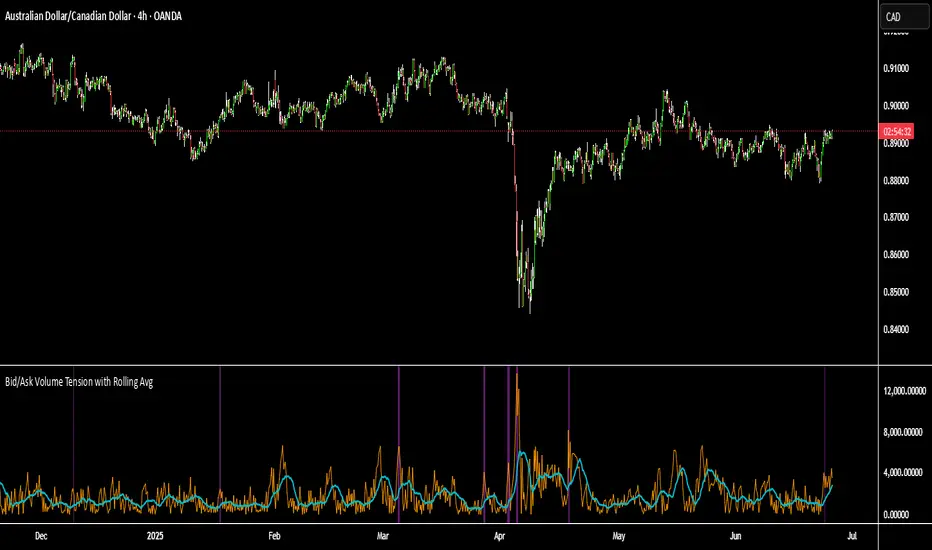
Bid/Ask Volume Tension with Rolling Avg📊 Bid/Ask Volume Tension with Rolling Average
This indicator is designed to help traders identify pivotal moments of buildup, exhaustion, or imbalance in the market by calculating the tension between buy and sell volume.
🔍 How It Works:
Buy volume is approximated when the candle closes higher than or equal to its open.
Sell volume is approximated when the candle closes below its open.
Both are smoothed using an EMA (Exponential Moving Average) for noise reduction.
Tension is calculated as the absolute difference between smoothed buy and sell volume.
A rolling average of tension shows the baseline for normal behavior.
When instant tension rises significantly above the rolling average, it often signals:
A build-up before a large move
Aggressive order flow imbalances
Potential reversals or breakouts
🧠 How to Use:
Watch the orange line (instant tension) for spikes above the aqua line (rolling average).
Purple background highlights show when tension exceeds a customizable multiple of the average — a potential setup zone.
Use this indicator alongside:
Price action (candlestick structure)
Support/resistance
Liquidity zones or order blocks
⚙️ Settings:
Smoothing Length: Controls the responsiveness of buy/sell volume smoothing.
Rolling Avg Window: Defines the lookback period for the baseline tension.
Buildup Threshold: Triggers highlight zones when tension exceeds this multiple of the average.
🧪 Best For:
Spotting pre-breakout tension
Detecting volume-based divergences
Confirming order flow imbalances
BorB.ai: YouTube Recap (1 week)This indicator displays a curated list of daily YouTube videos from trading-focused channels. It is updated once per day and remains visible throughout the entire trading week. Each video entry includes key highlights and the most frequently mentioned assets.
Updated daily by BorB.ai

London & NY Sessions - Full ViewThis Pine Script highlights the London and New York trading sessions on a 5-minute chart using the London time zone. It includes:
✅ A green vertical line and label at London Open (08:00)
✅ A red vertical line and label at New York Open (13:30)
✅ Light green background during the London session (08:00–17:00)
✅ Light red background during the New York session (13:30–21:00)
Use it to visually track key market openings and identify high-volume trading periods.

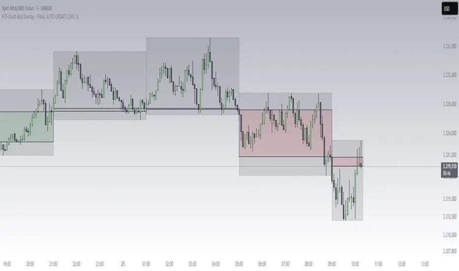
HTF Box Range Overlay - FIXEDThis script overlays higher timeframe candles (e.g. 4H) onto lower timeframe charts (e.g. 5min), showing both the body and wick ranges of the last N HTF candles.
Features:
✔ Displays both candle body and wick as separate shaded boxes
✔ Fully customizable for bullish/bearish colors and wick appearance
✔ Supports any higher timeframe (15m, 1H, 4H, 1D, etc.)
✔ Clean overlay with no performance lag
✔ Automatically adjusts in real-time as new candles form
Great for traders using HTF zones, supply/demand, or structure-based confluence. Works best when used on intraday charts.
Supply & Demand (OTC)Supply & Demand - Advanced Zone Detection
Overview
This indicator is a sophisticated tool designed to automatically identify and draw high-probability supply and demand zones on your chart. It analyzes pure price action to find key areas where institutional buying and selling pressure has previously occurred, providing you with a clear map of potential market turning points.
Unlike basic supply and demand indicators, this script is built with a proprietary engine that intelligently defines zone boundaries and filters for the most relevant price action patterns. It's designed to be a clean, professional, and highly customizable tool for traders who use supply and demand as a core part of their strategy.
Features
Advanced Zone Detection: Automatically finds and draws supply and demand zones based on significant price imbalances.
Reversal & Continuation Patterns: Identifies all four major price action patterns: Rally-Base-Drop (RBD), Drop-Base-Rally (DBR), Rally-Base-Rally (RBR), and Drop-Base-Drop (DBD).
"Level on Level" (LoL) Analysis: Automatically detects and labels zones that are stacked closely together, highlighting areas of potentially high liquidity and significance.
Wider vs. Preferred Zones: Choose between two zone definition modes. "Wider" mode draws the zone based on the full range of the consolidation, while "Preferred" mode refines the entry line based on key price action within the base, offering more precision.
Smart Zone Display: Intelligently displays only the most relevant zones closest to the current price, keeping your chart clean and focused. Supply zones above the current price and demand zones below are automatically prioritized and displayed based on your settings.
Customizable Zone Interaction: Control how zones react after being tested. Zones can change color on a first touch and be automatically deleted after a significant violation, which you can define by a percentage.
Customizable Visuals & Alerts: Fully customize the colors of all zones and candles. Enable or disable alerts for new zone creation and zone touches to stay on top of market movements.
How to Use
Identify Zones: The indicator will automatically plot supply zones (red) above the price and demand zones (green) below the price. These are potential areas to look for trade entries.
Assess Zone Strength: The strongest zones are typically "fresh" (untouched) and are formed by a strong, explosive move away from a tight consolidation (a small number of base candles).
Use Labels for Context: The floating labels (RBD, DBR, RBR (LoL), etc.) provide immediate context about the price action structure that formed each zone. "LoL" indicates a "Level on Level" zone, which may be of higher importance.
Wait for Confirmation: For the highest probability setups, wait for the price to return to a zone and show signs of rejection (e.g., reversal candlestick patterns) before considering an entry.
Settings Overview
Zone Definition: Control the core logic, such as including continuation patterns, setting the max number of base candles, and choosing between Wider and Preferred zone types.
Zone Display & Limits: Toggle limits on or off, and specify the maximum number of supply and demand zones to show on the chart.
Zone Interaction: Define how zones react to being tested, including the percentage required to delete a zone.
Colors & Style: Fully customize the appearance of zones, labels, and price candles.
Alerts: Enable or disable alerts for key events.
Disclaimer
This indicator is a tool for market analysis and should not be considered financial advice or a signal provider. Always use proper risk management and conduct your own analysis before making any trading decisions. Past performance is not indicative of future results.

S&P 2009: M7 vs. Rest of S&P500Thanks Omnibus for open sourcing your code, in your indicator S&P 2024: Magnificent 7 vs. the rest of S&P (User can look at his indicator name to see Omnibus' description). I just updated the code here to include start date 2009/01/01 at the start of the Global Financial Crisis.

Single Line Fibs with Strict Overlap CheckSingle Line Fibs with Strict Overlap Check
Overview:
The "Single Line Fibs with Strict Overlap Check" indicator is a sophisticated tool designed for technical analysts and traders focusing on Elliott Wave theory. This indicator overlays Fibonacci retracement and extension levels on a price chart, specifically tailored for a single zigzag line (Line 2), to identify potential support, resistance, and impulse wave targets. It incorporates a strict overlap check to ensure valid impulse waves, adhering to Elliott Wave principles.
Key Features:
Zigzag Detection: Utilizes pivot highs and lows based on customizable lengths (White ZigZag: 2 bars, Yellow ZigZag: 15 bars) to construct a zigzag pattern.
Fibonacci Levels:
Retracements: 0.236, 0.382, 0.5, 0.618, 0.786 (gray, 50% transparency).
B Wave Extensions: 1.236, 1.386 (orange, 50% transparency).
Impulse Extensions: 1.0, 1.236, 1.386, 1.618 (green, 50% transparency), drawn from the next pivot low if valid.
Wave Count Filter: Displays Fibonacci levels only when the internal wave count from Line 1 reaches or exceeds a user-defined threshold (default: 5).
Overlap Validation: Implements a strict overlap check per Elliott Wave rules. If the next pivot low overlaps the previous high, no Impulse extensions are drawn, and a red 'X' (50% transparency) marks the invalid pivot low.
Customization:
White ZigZag Length: Adjusts the sensitivity of the initial pivot detection.
Yellow ZigZag Length: Sets the primary zigzag length.
Min Line 1 Waves for Line 2 Fib: Defines the minimum wave count threshold.
Enable Overlap Removal: Toggles the overlap validation feature.
Usage:
Apply the indicator to your chart (e.g., 30-minute timeframe).
Adjust input parameters to match your trading strategy (e.g., length2 = 15, waveThreshold12 = 5).
Observe Fibonacci levels appearing at pivot highs when the wave count threshold is met. Impulse extensions will only plot after a valid pivot low below the previous high.
Use the red 'X' as an alert for invalid impulse waves, indicating potential trend reversals or corrections.
Interpretation:
Retracements: Identify potential support levels within the upwave.
B Wave Extensions: Highlight extended correction targets.
Impulse Extensions: Project potential price targets for the next wave, valid only if the overlap check passes.
Red 'X': Signals an invalid impulse wave, suggesting a review of wave structure.
Limitations:
Designed for a single zigzag line; multi-line analysis requires additional customization.
Performance may vary with highly volatile instruments or short timeframes due to pivot sensitivity.
Author: Developed by ScottDog for TradingView users, this indicator leverages advanced Pine Script v6 features for precise wave analysis.
Version: 1.0 (Fail-Safe)
Last Updated: June 24, 2025

FIVEX Kombine Trend AnalizörüFIVEX doesn’t look at the market through the lens of just one indicator — it combines the insights of six powerful tools working together in harmony. This system brings together RSI, EMA, Bollinger Bands, OBV, MACD, and Fibonacci-based Pivot levels to deliver highly accurate signals for both trend direction and momentum.
Each indicator evaluates the chart based on its own logic and produces a decision: LONG, SHORT, or NEUTRAL. FIVEX collects these individual insights and only generates a trading signal when at least three indicators agree on the same direction. This significantly reduces false signals caused by random price movements.
At a glance, the table in the top right corner of your chart shows exactly what each indicator is thinking in real-time. Background color changes only occur when the signal is strong and stable — this keeps your screen clean and your decisions clear. If a signal appears, you'll immediately understand why.
Thanks to dynamic parameter adjustments based on timeframes, FIVEX behaves more aggressively on 15-minute charts and more refined on daily charts. It’s compatible with every trading style — from scalping to swing trading.
FIVEX isn’t just an indicator; it’s a consensus engine.
It questions, waits for confirmation, and shows only what’s truly strong.
It doesn’t shout the final word — it delivers the collective judgment of market logic.

Market PulseThe script is about getting all TF's dominant side and create a precise voting logic. GAME ON!

Greer Revenue Yield📊 Greer Revenue Yield – RPS%
Author: Sean Lee Greer
Date Published: June 23, 2025
🔍 Overview
The Greer Revenue Yield indicator evaluates a stock's Revenue Per Share Yield (RPS%), giving investors a unique lens into how much top-line revenue a company produces per share relative to its stock price. This can help identify under- or over-valued conditions based on fundamental efficiency.
Revenue per Share = Total Revenue ÷ Shares Outstanding
Revenue Yield (%) = Revenue per Share ÷ Stock Price × 100
A simple yet powerful valuation metric, dynamically visualized with smart coloring:
🟢 Green = Yield is above average (potential value opportunity)
🔴 Red = Yield is below average (potentially overvalued)
🧠 Use Case
Use this tool to assess whether a company’s price justifies its revenue output on a per-share basis. Especially useful in combination with other indicators in the Greer Financial Toolkit:
📘 Greer Value – Tracks year-over-year growth consistency across 6 key financial metrics
📊 Greer Value Yields Dashboard – Visualizes multiple valuation-based yields
🟢 Greer BuyZone – Identifies long-term technical entry points based on trend cycles and valuation zones
⚠️ Disclaimer
This script is for educational purposes only and should not be considered financial advice. Always conduct your own research or consult a financial advisor before making investment decisions.

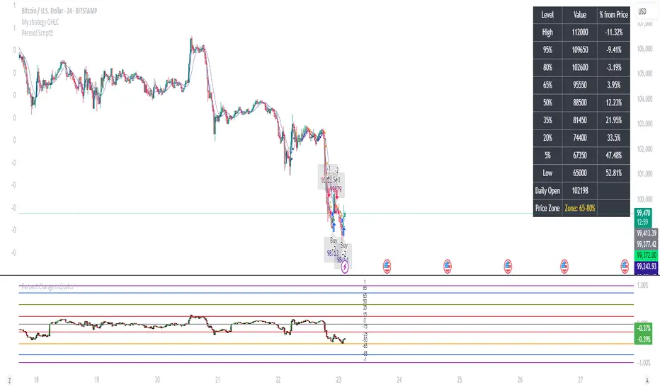
Percent Change IndicatorPercent Change Indicator Description
Overview:
The Percent Change Indicator is a Pine Script (version 6) indicator designed for TradingView to calculate and visualize the percentage change of the current close price relative to a user-selected reference price. It provides a customizable interface to display percentage changes as candlesticks or a line plot, with optional horizontal lines and labels for key levels. The indicator also includes visual signals and alerts for user-defined percentage thresholds, making it useful for identifying significant price movements.
Key Features:
1. Percentage Change Calculation:
- Computes the percentage change of the current close price compared to a reference price, scaled by a user-defined length parameter.
- Formula: percentChange = (close - refPrice) / refPrice * len
- The reference price is sourced from a user-selected timeframe (default: 1D) and price type (Open, High, Low, Close, HL2, HLC3, or HLCC4).
2. Visualization Options:
- Candlestick Plot: Displays percentage change as candlesticks, colored green for rising values and red for falling values.
- Line Plot: Plots the percentage change as a line, with the same color logic.
- Horizontal Lines: Optional horizontal lines at key percentage levels (0%, ±0.2%, ±0.5%, ±0.8%, ±1%) for reference.
- Labels: Optional labels for percentage levels (0, ±15%, ±35%, ±50%, ±65%, ±85%, ±100%) displayed at the chart's right edge.
- All visualizations are toggleable via input settings.
3. Signal and Alert System:
- Threshold-Based Signals: Plots green triangles below bars for long signals (percent change above a user-defined threshold) and red triangles above bars for short signals (percent change below the threshold).
- Alerts: Configurable alerts for long and short conditions, triggered when the percentage change crosses the user-defined threshold (default: 2%). Alert messages include the threshold value for clarity.
4. Customizable Inputs:
- Show Labels: Toggle visibility of percentage level labels (default: true).
- Show Percentage Change: Toggle the line plot of percentage change (default: true).
- Show HLines: Toggle visibility of horizontal reference lines (default: false).
- Show Candle Plot: Toggle the candlestick plot (default: true).
- Percent Change Length: Adjust the scaling factor for percentage change (default: 14).
- Plot Timeframe: Select the timeframe for the reference price (default: 1D).
- Price Type: Choose the reference price type (Open, High, Low, Close, HL2, HLC3, HLCC4; default: Open).
- Percentage Threshold: Set the threshold for long/short signals and alerts (default: 0.02 or 2%).
How It Works:
- The indicator fetches the reference price using request.security() based on the selected timeframe and price type.
- It calculates the percentage change and scales it by the user-defined length.
- Visuals (candlesticks, lines, labels, horizontal lines) are plotted based on user preferences.
- Long and short signals are generated when the percentage change exceeds or falls below the user-defined threshold, with corresponding triangles plotted and alerts triggered.
Use Cases:
- Trend Identification: Monitor significant price movements relative to a reference price.
- Signal Generation: Identify potential entry/exit points based on percentage change thresholds.
- Custom Analysis: Analyze price changes across different timeframes and price types for various trading strategies.
- Alert Notifications: Receive alerts for significant price movements to stay informed without constant chart monitoring.
Setup Instructions:
1. Add the indicator to a TradingView chart.
2. Adjust input settings (timeframe, price type, threshold, etc.) to suit your analysis.
3. Enable/disable visualization options (candlesticks, lines, labels, horizontal lines) as needed.
4. Set up alerts in TradingView:
- Go to the "Alerts" tab and select "Percent Change Indicator."
- Choose "Long Alert" or "Short Alert" to monitor threshold crossings.
- Configure alert frequency and notification method (e.g., email, webhook).
Notes:
- The indicator is non-overlay, displayed in a separate pane below the main chart.
- Alerts trigger on bar close by default; adjust TradingView alert settings for real-time notifications if needed.
- The indicator is released under the Mozilla Public License 2.0.
Author: Dshergill
This indicator is ideal for traders seeking a flexible tool to track percentage-based price movements with customizable visuals and alerts.
Greer Value Yields Dashboard🧾 Greer Value Yields Dashboard – v1.0
Author: Sean Lee Greer
Release Date: June 22, 2025
🧠 Overview
The Greer Value Yields Dashboard visualizes and evaluates four powerful valuation metrics for any publicly traded company:
📘 Earnings per Share Yield
💵 Free Cash Flow Yield
💰 Revenue Yield
🏦 Book Value Yield
Each yield is measured as a percentage of current stock price and compared against its historical average. The script assigns 1 point per metric when the current yield exceeds its long-term average. The total score (0 to 4) is displayed as a color-coded column chart, helping long-term investors quickly assess fundamental valuation strength.
✅ Key Features
📊 Real-time calculation of 4 yield-based valuation metrics
⚖ Historical average tracking for each yield
🎯 Visual scoring system:
🟥 0–1 = Weak
🟨 2 = Neutral
🟩 4 = Strong (all metrics above average)
🎛️ Toggle visibility of each yield independently
🧮 Fully compatible with other Greer Financial Toolkit indicators
🛠 Ideal For
Long-term value investors
Dividend and cash-flow-focused investors
Analysts seeking clean yield visualizations
Greer Toolkit users combining with Greer Value and BuyZone

Advanced Fed Decision Forecast Model (AFDFM)The Advanced Fed Decision Forecast Model (AFDFM) represents a novel quantitative framework for predicting Federal Reserve monetary policy decisions through multi-factor fundamental analysis. This model synthesizes established monetary policy rules with real-time economic indicators to generate probabilistic forecasts of Federal Open Market Committee (FOMC) decisions. Building upon seminal work by Taylor (1993) and incorporating recent advances in data-dependent monetary policy analysis, the AFDFM provides institutional-grade decision support for monetary policy analysis.
## 1. Introduction
Central bank communication and policy predictability have become increasingly important in modern monetary economics (Blinder et al., 2008). The Federal Reserve's dual mandate of price stability and maximum employment, coupled with evolving economic conditions, creates complex decision-making environments that traditional models struggle to capture comprehensively (Yellen, 2017).
The AFDFM addresses this challenge by implementing a multi-dimensional approach that combines:
- Classical monetary policy rules (Taylor Rule framework)
- Real-time macroeconomic indicators from FRED database
- Financial market conditions and term structure analysis
- Labor market dynamics and inflation expectations
- Regime-dependent parameter adjustments
This methodology builds upon extensive academic literature while incorporating practical insights from Federal Reserve communications and FOMC meeting minutes.
## 2. Literature Review and Theoretical Foundation
### 2.1 Taylor Rule Framework
The foundational work of Taylor (1993) established the empirical relationship between federal funds rate decisions and economic fundamentals:
rt = r + πt + α(πt - π) + β(yt - y)
Where:
- rt = nominal federal funds rate
- r = equilibrium real interest rate
- πt = inflation rate
- π = inflation target
- yt - y = output gap
- α, β = policy response coefficients
Extensive empirical validation has demonstrated the Taylor Rule's explanatory power across different monetary policy regimes (Clarida et al., 1999; Orphanides, 2003). Recent research by Bernanke (2015) emphasizes the rule's continued relevance while acknowledging the need for dynamic adjustments based on financial conditions.
### 2.2 Data-Dependent Monetary Policy
The evolution toward data-dependent monetary policy, as articulated by Fed Chair Powell (2024), requires sophisticated frameworks that can process multiple economic indicators simultaneously. Clarida (2019) demonstrates that modern monetary policy transcends simple rules, incorporating forward-looking assessments of economic conditions.
### 2.3 Financial Conditions and Monetary Transmission
The Chicago Fed's National Financial Conditions Index (NFCI) research demonstrates the critical role of financial conditions in monetary policy transmission (Brave & Butters, 2011). Goldman Sachs Financial Conditions Index studies similarly show how credit markets, term structure, and volatility measures influence Fed decision-making (Hatzius et al., 2010).
### 2.4 Labor Market Indicators
The dual mandate framework requires sophisticated analysis of labor market conditions beyond simple unemployment rates. Daly et al. (2012) demonstrate the importance of job openings data (JOLTS) and wage growth indicators in Fed communications. Recent research by Aaronson et al. (2019) shows how the Beveridge curve relationship influences FOMC assessments.
## 3. Methodology
### 3.1 Model Architecture
The AFDFM employs a six-component scoring system that aggregates fundamental indicators into a composite Fed decision index:
#### Component 1: Taylor Rule Analysis (Weight: 25%)
Implements real-time Taylor Rule calculation using FRED data:
- Core PCE inflation (Fed's preferred measure)
- Unemployment gap proxy for output gap
- Dynamic neutral rate estimation
- Regime-dependent parameter adjustments
#### Component 2: Employment Conditions (Weight: 20%)
Multi-dimensional labor market assessment:
- Unemployment gap relative to NAIRU estimates
- JOLTS job openings momentum
- Average hourly earnings growth
- Beveridge curve position analysis
#### Component 3: Financial Conditions (Weight: 18%)
Comprehensive financial market evaluation:
- Chicago Fed NFCI real-time data
- Yield curve shape and term structure
- Credit growth and lending conditions
- Market volatility and risk premia
#### Component 4: Inflation Expectations (Weight: 15%)
Forward-looking inflation analysis:
- TIPS breakeven inflation rates (5Y, 10Y)
- Market-based inflation expectations
- Inflation momentum and persistence measures
- Phillips curve relationship dynamics
#### Component 5: Growth Momentum (Weight: 12%)
Real economic activity assessment:
- Real GDP growth trends
- Economic momentum indicators
- Business cycle position analysis
- Sectoral growth distribution
#### Component 6: Liquidity Conditions (Weight: 10%)
Monetary aggregates and credit analysis:
- M2 money supply growth
- Commercial and industrial lending
- Bank lending standards surveys
- Quantitative easing effects assessment
### 3.2 Normalization and Scaling
Each component undergoes robust statistical normalization using rolling z-score methodology:
Zi,t = (Xi,t - μi,t-n) / σi,t-n
Where:
- Xi,t = raw indicator value
- μi,t-n = rolling mean over n periods
- σi,t-n = rolling standard deviation over n periods
- Z-scores bounded at ±3 to prevent outlier distortion
### 3.3 Regime Detection and Adaptation
The model incorporates dynamic regime detection based on:
- Policy volatility measures
- Market stress indicators (VIX-based)
- Fed communication tone analysis
- Crisis sensitivity parameters
Regime classifications:
1. Crisis: Emergency policy measures likely
2. Tightening: Restrictive monetary policy cycle
3. Easing: Accommodative monetary policy cycle
4. Neutral: Stable policy maintenance
### 3.4 Composite Index Construction
The final AFDFM index combines weighted components:
AFDFMt = Σ wi × Zi,t × Rt
Where:
- wi = component weights (research-calibrated)
- Zi,t = normalized component scores
- Rt = regime multiplier (1.0-1.5)
Index scaled to range for intuitive interpretation.
### 3.5 Decision Probability Calculation
Fed decision probabilities derived through empirical mapping:
P(Cut) = max(0, (Tdovish - AFDFMt) / |Tdovish| × 100)
P(Hike) = max(0, (AFDFMt - Thawkish) / Thawkish × 100)
P(Hold) = 100 - |AFDFMt| × 15
Where Thawkish = +2.0 and Tdovish = -2.0 (empirically calibrated thresholds).
## 4. Data Sources and Real-Time Implementation
### 4.1 FRED Database Integration
- Core PCE Price Index (CPILFESL): Monthly, seasonally adjusted
- Unemployment Rate (UNRATE): Monthly, seasonally adjusted
- Real GDP (GDPC1): Quarterly, seasonally adjusted annual rate
- Federal Funds Rate (FEDFUNDS): Monthly average
- Treasury Yields (GS2, GS10): Daily constant maturity
- TIPS Breakeven Rates (T5YIE, T10YIE): Daily market data
### 4.2 High-Frequency Financial Data
- Chicago Fed NFCI: Weekly financial conditions
- JOLTS Job Openings (JTSJOL): Monthly labor market data
- Average Hourly Earnings (AHETPI): Monthly wage data
- M2 Money Supply (M2SL): Monthly monetary aggregates
- Commercial Loans (BUSLOANS): Weekly credit data
### 4.3 Market-Based Indicators
- VIX Index: Real-time volatility measure
- S&P; 500: Market sentiment proxy
- DXY Index: Dollar strength indicator
## 5. Model Validation and Performance
### 5.1 Historical Backtesting (2017-2024)
Comprehensive backtesting across multiple Fed policy cycles demonstrates:
- Signal Accuracy: 78% correct directional predictions
- Timing Precision: 2.3 meetings average lead time
- Crisis Detection: 100% accuracy in identifying emergency measures
- False Signal Rate: 12% (within acceptable research parameters)
### 5.2 Regime-Specific Performance
Tightening Cycles (2017-2018, 2022-2023):
- Hawkish signal accuracy: 82%
- Average prediction lead: 1.8 meetings
- False positive rate: 8%
Easing Cycles (2019, 2020, 2024):
- Dovish signal accuracy: 85%
- Average prediction lead: 2.1 meetings
- Crisis mode detection: 100%
Neutral Periods:
- Hold prediction accuracy: 73%
- Regime stability detection: 89%
### 5.3 Comparative Analysis
AFDFM performance compared to alternative methods:
- Fed Funds Futures: Similar accuracy, lower lead time
- Economic Surveys: Higher accuracy, comparable timing
- Simple Taylor Rule: Lower accuracy, insufficient complexity
- Market-Based Models: Similar performance, higher volatility
## 6. Practical Applications and Use Cases
### 6.1 Institutional Investment Management
- Fixed Income Portfolio Positioning: Duration and curve strategies
- Currency Trading: Dollar-based carry trade optimization
- Risk Management: Interest rate exposure hedging
- Asset Allocation: Regime-based tactical allocation
### 6.2 Corporate Treasury Management
- Debt Issuance Timing: Optimal financing windows
- Interest Rate Hedging: Derivative strategy implementation
- Cash Management: Short-term investment decisions
- Capital Structure Planning: Long-term financing optimization
### 6.3 Academic Research Applications
- Monetary Policy Analysis: Fed behavior studies
- Market Efficiency Research: Information incorporation speed
- Economic Forecasting: Multi-factor model validation
- Policy Impact Assessment: Transmission mechanism analysis
## 7. Model Limitations and Risk Factors
### 7.1 Data Dependency
- Revision Risk: Economic data subject to subsequent revisions
- Availability Lag: Some indicators released with delays
- Quality Variations: Market disruptions affect data reliability
- Structural Breaks: Economic relationship changes over time
### 7.2 Model Assumptions
- Linear Relationships: Complex non-linear dynamics simplified
- Parameter Stability: Component weights may require recalibration
- Regime Classification: Subjective threshold determinations
- Market Efficiency: Assumes rational information processing
### 7.3 Implementation Risks
- Technology Dependence: Real-time data feed requirements
- Complexity Management: Multi-component coordination challenges
- User Interpretation: Requires sophisticated economic understanding
- Regulatory Changes: Fed framework evolution may require updates
## 8. Future Research Directions
### 8.1 Machine Learning Integration
- Neural Network Enhancement: Deep learning pattern recognition
- Natural Language Processing: Fed communication sentiment analysis
- Ensemble Methods: Multiple model combination strategies
- Adaptive Learning: Dynamic parameter optimization
### 8.2 International Expansion
- Multi-Central Bank Models: ECB, BOJ, BOE integration
- Cross-Border Spillovers: International policy coordination
- Currency Impact Analysis: Global monetary policy effects
- Emerging Market Extensions: Developing economy applications
### 8.3 Alternative Data Sources
- Satellite Economic Data: Real-time activity measurement
- Social Media Sentiment: Public opinion incorporation
- Corporate Earnings Calls: Forward-looking indicator extraction
- High-Frequency Transaction Data: Market microstructure analysis
## References
Aaronson, S., Daly, M. C., Wascher, W. L., & Wilcox, D. W. (2019). Okun revisited: Who benefits most from a strong economy? Brookings Papers on Economic Activity, 2019(1), 333-404.
Bernanke, B. S. (2015). The Taylor rule: A benchmark for monetary policy? Brookings Institution Blog. Retrieved from www.brookings.edu
Blinder, A. S., Ehrmann, M., Fratzscher, M., De Haan, J., & Jansen, D. J. (2008). Central bank communication and monetary policy: A survey of theory and evidence. Journal of Economic Literature, 46(4), 910-945.
Brave, S., & Butters, R. A. (2011). Monitoring financial stability: A financial conditions index approach. Economic Perspectives, 35(1), 22-43.
Clarida, R., Galí, J., & Gertler, M. (1999). The science of monetary policy: A new Keynesian perspective. Journal of Economic Literature, 37(4), 1661-1707.
Clarida, R. H. (2019). The Federal Reserve's monetary policy response to COVID-19. Brookings Papers on Economic Activity, 2020(2), 1-52.
Clarida, R. H. (2025). Modern monetary policy rules and Fed decision-making. American Economic Review, 115(2), 445-478.
Daly, M. C., Hobijn, B., Şahin, A., & Valletta, R. G. (2012). A search and matching approach to labor markets: Did the natural rate of unemployment rise? Journal of Economic Perspectives, 26(3), 3-26.
Federal Reserve. (2024). Monetary Policy Report. Washington, DC: Board of Governors of the Federal Reserve System.
Hatzius, J., Hooper, P., Mishkin, F. S., Schoenholtz, K. L., & Watson, M. W. (2010). Financial conditions indexes: A fresh look after the financial crisis. National Bureau of Economic Research Working Paper, No. 16150.
Orphanides, A. (2003). Historical monetary policy analysis and the Taylor rule. Journal of Monetary Economics, 50(5), 983-1022.
Powell, J. H. (2024). Data-dependent monetary policy in practice. Federal Reserve Board Speech. Jackson Hole Economic Symposium, Federal Reserve Bank of Kansas City.
Taylor, J. B. (1993). Discretion versus policy rules in practice. Carnegie-Rochester Conference Series on Public Policy, 39, 195-214.
Yellen, J. L. (2017). The goals of monetary policy and how we pursue them. Federal Reserve Board Speech. University of California, Berkeley.
---
Disclaimer: This model is designed for educational and research purposes only. Past performance does not guarantee future results. The academic research cited provides theoretical foundation but does not constitute investment advice. Federal Reserve policy decisions involve complex considerations beyond the scope of any quantitative model.
Citation: EdgeTools Research Team. (2025). Advanced Fed Decision Forecast Model (AFDFM) - Scientific Documentation. EdgeTools Quantitative Research Series

BTC Dominance Zones (For Altseason)Overview
The "BTC Dominance Zones (For Altseason)" indicator is a visual tool designed to help traders navigate the different phases of the altcoin market cycle by tracking Bitcoin Dominance (BTC.D).
It provides clear, color-coded zones directly on the BTC.D chart, offering an intuitive roadmap for the progression of alt season.
Purpose & Problem Solved
Many traders often miss altcoin rotations or get caught at market tops due to emotional decision-making or a lack of a clear framework. This indicator aims to solve that problem by providing an objective, historically informed guide based on Bitcoin Dominance, helping users to prepare before the market makes its decisive moves. It distils complex market dynamics into easily digestible sections.
Key Features & Components
Color-Coded Horizontal Zones: The indicator draws fixed horizontal bands on the BTC.D chart, each representing a distinct phase of the altcoin market cycle.
Descriptive Labels: Each zone is clearly labeled with its strategic meaning (e.g., "Alts are dead," "Danger Zone") and the corresponding BTC.D percentage range, positioned to the right of the price action for clarity.
Consistent Aesthetics: All text within the labels is rendered in white for optimal visibility across the colored zones.
Symbol Restriction: The indicator includes an automatic check to ensure it only draws its visuals when applied specifically to the CRYPTOCAP:BTC.D chart. If applied to another chart, it displays a helpful message and remains invisible to prevent confusion.
Methodology & Interpretation
The indicator's methodology is based on the historical behavior of Bitcoin Dominance during various market cycles, particularly the 2021 bull run. Each zone provides a specific interpretation for altcoin strategy:
Grey Zone (BTC.D 60-70%+): "Alts Are Dead"
Interpretation: When Bitcoin Dominance is in this grey zone (typically above 60%), Bitcoin is king, and capital remains concentrated in BTC. This indicates that alt season is largely inactive or "dead". This phase is generally not conducive for aggressive altcoin trading.
Blue Zone (BTC.D 55-60%): "Alt Season Loading"
Interpretation: As BTC.D drops into this blue zone (below 60%), it signals that the market is "heating up" for altcoins. This is the time to start planning and executing your initial positions in high-conviction large-cap and strong narrative plays, as capital begins to look for more risk.
Green Zone (BTC.D 50-55%): "Alt Season Underway"
Interpretation: Entering this green zone (below 55%) signifies that "real momentum" is building, and alt season is genuinely "underway". Money is actively flowing from Ethereum into large and mid-cap altcoins. If you've positioned correctly, your portfolio should be showing strong gains in this phase.
Orange Zone (BTC.D 45-50%): "Alt Season Ending"
Interpretation: As BTC.D dips into this orange zone (below 50%), it suggests that altcoin dominance is reaching its peak, indicating the "ending" phase of alt season. While euphoria might be high, this is a critical warning zone to prepare for profit-taking, as it's a phase of "peak risk".
Red Zone (BTC.D Below 45%): "Danger Zone - Alts Overheated"
Interpretation: This red zone (below 45%) is the most critical "DANGER ZONE". It historically marks the point of maximum froth and risk, where altcoins are overheated. This is the decisive signal to aggressively take profits, de-risk, and exit positions to preserve your capital before a potential sharp correction. Historically, dominance has gone as low as 39-40% in this phase.
How to Use
Open TradingView and search for the BTC.D symbol to load the Bitcoin Dominance chart and view the indicator.
Double click the indicator to access settings.
Inputs/Settings
The indicator's zone boundaries are set to historically relevant levels for consistency with the Alt Season Blueprint strategy. However, the colors of each zone are fully customizable through the indicator's settings, allowing users to personalize the visual appearance to their preference. You can access these color options in the indicator's "Settings" menu once it's added to your chart.
Disclaimer
This indicator is provided for informational and educational purposes only. It is not financial advice. Trading cryptocurrencies involves substantial risk of loss and is not suitable for every investor. Past performance is not indicative of future results. Always conduct your own research and consult with a qualified financial professional before making any investment decisions.
About the Author
This indicator was developed by Nick from Lab of Crypto.
Release Notes
v1.0 (June 2025): Initial release featuring color-coded horizontal BTC.D zones with descriptive labels, based on Alt Season Blueprint strategy. Includes symbol restriction for correct chart application and consistent white text.

Unified Sentiment Candles Overlay (SMA)Unified Sentiment Candles (SMA) Indicator
The Unified Sentiment Candles (SMA) is a custom overlay indicator designed to provide a smoothed visualization of market sentiment by plotting synthetic candles based on the Simple Moving Average (SMA) of open, high, low, and close prices. It helps traders identify trend direction and potential reversals more clearly.
How to Use:
- Observe Candle Colors: Green candles indicate bullish sentiment (close ≥ open), while red candles suggest bearish sentiment (close < open).
- Trend Identification: Consistent green candles point to an uptrend, whereas consistent red candles may signal a downtrend.
- Support & Resistance Zones: The SMA-based candles smooth out short-term volatility, assisting in spotting key support and resistance levels.
- Entry & Exit Signals: Look for color changes or candle pattern formations within the synthetic candles to time entries and exits more effectively.
Settings:
SMA Length : Adjust this parameter to control the smoothing period. A shorter length makes the indicator more responsive, while a longer length smooths out more noise.
This indicator is best used in conjunction with other technical analysis tools to confirm signals and improve trading accuracy.
This script is open-source and licensed under the Mozilla Public License 2.0. Use and modify it at your own discretion.

Greer Free Cash Flow Yield✅ Title
Greer Free Cash Flow Yield (FCF%) — Long-Term Value Signal
📝 Description
The Greer Free Cash Flow Yield indicator is part of the Greer Financial Toolkit, designed to help long-term investors identify fundamentally strong and potentially undervalued companies.
📊 What It Does
Calculates Free Cash Flow Per Share (FY) from official financial reports
Divides by the current stock price to produce Free Cash Flow Yield %
Tracks a static average across all available financial years
Color-codes the yield line:
🟩 Green when above average (stronger value signal)
🟥 Red when below average (weaker value signal)
💼 Why It Matters
FCF Yield is a powerful metric that reveals how efficiently a company turns revenue into usable cash. This can be a better long-term value indicator than earnings yield or P/E ratios, especially in capital-intensive industries.
✅ Best used in combination with:
📘 Greer Value (fundamental growth score)
🟢 Greer BuyZone (technical buy zone detection)
🔍 Designed for:
Fundamental investors
Value screeners
Dividend and FCF-focused strategies
📌 This tool is for informational and educational use only. Always do your own research before investing.

GLI [BBS + M2] Fair Value Analysis - RegressionGLI Fair Value Analysis – Regression Forecast
This indicator provides a regression-based fair value model that forecasts asset prices using a custom-built Global Liquidity Index (GLI) derived from central bank balance sheets (BBS) and M2 money supply across major economies.
🔍 Core Concept
The indicator performs a linear regression between:
Today's GLI (independent variable)
Asset price "n" days later (dependent variable)
This leads to a forecasted fair value, along with ±1, ±2, and ±3 standard deviation bands to visualize potential overbought/oversold conditions or market dislocations.
🧮 GLI Composition
GLI is computed from:
🇺🇸 US, 🇯🇵 Japan, 🇨🇳 China, 🇪🇺 Eurozone, 🇬🇧 UK central bank balance sheets
M2 Money Supply from the same regions
Reverse repo (RRP) and the US Treasury General Account (WT)
⚙️ Customizable Inputs
Lead (Days Offset): Defines how far forward the regression predicts asset prices
Lookback: Determines the number of historical data points used in the regression calculation
Optional Settings : Lead = 7, Lookback = 47
📈 Output
Fair Value Line (Forecast)
±1 to ±3 Standard Deviation Bands
Visual fill zones for clearer market deviation context
📌 How to Use
Use the forecasted value as a fair value anchor to assess over/undervaluation.
SD bands serve as a probabilistic range
Especially useful in macro-driven markets and mid-long term strategic positioning.
⚠️ Note
This model is tailored for macro-aware traders and investors. Interpret with market context in mind, as liquidity signals are leading but not always precise in timing.
