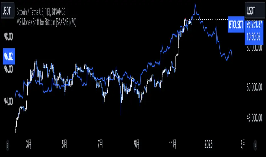
M2 Money Shift for Bitcoin [SAKANE]M2 Money Shift for Bitcoin was developed to visualize the impact of M2 Money, a macroeconomic indicator, on the Bitcoin market and to support trade analysis.
Bitcoin price fluctuations have a certain correlation with cycles in M2 money supply.In particular, it has been noted that changes in M2 supply can affect the bitcoin price 70 days in advance.Very high correlations have been observed in recent years in particular, making it useful as a supplemental analytical tool for trading.
Support for M2 data from multiple countries
M2 supply data from the U.S., Europe, China, Japan, the U.K., Canada, Australia, and India are integrated and all are displayed in U.S. dollar equivalents.
Slide function
Using the "Slide Days Forward" setting, M2 data can be slid up to 500 days, allowing for flexible analysis that takes into account the time difference from the bitcoin price.
Plotting Total Liquidity
Plot total liquidity (in trillions of dollars) by summing the M2 supply of multiple countries.
How to use
After applying the indicator to the chart, activate the M2 data for the required country from the settings screen. 2.
2. adjust "Slide Days Forward" to analyze the relationship between changes in M2 supply and bitcoin price
3. refer to the Gross Liquidity plot to build a trading strategy that takes into account macroeconomic influences.
Notes.
This indicator is an auxiliary tool for trade analysis and does not guarantee future price trends.
The relationship between M2 supply and bitcoin price depends on many factors and should be used in conjunction with other analysis methods.
Fundamental Analysis
Asset Valuation ToolAsset Valuation Tool
This script provides a multi-dimensional perspective on asset valuation by comparing its price movements against three major benchmarks: bond prices, gold prices, and the US Dollar Index (DXY). It is designed to help traders identify overbought and oversold conditions in the context of these relationships.
How It Works
Valuation Ratios: The script calculates the ratio of the primary asset's price to that of bonds, gold, and DXY.
RSI-Based Analysis: The script uses a modified RSI (Relative Strength Index) to assess the momentum of these ratios over a user-defined lookback period.
Rescaling & Normalization: To provide a unified view, the valuation metrics are rescaled to a fixed range (-100 to 100), where extreme values can indicate overbought or oversold conditions.
Features:
Customizable Inputs:
Lookback period (default: 10).
Symbols for bonds, gold, and DXY, allowing flexibility for various trading instruments.
Visual Indicators:
Dynamic plots for each valuation metric (Bond, Gold, DXY).
Horizontal lines at key levels (+75, 0, -75) for easy identification of overbought/oversold zones.
Cross-Asset Insights: Gain insights into how the asset behaves relative to key market indicators.
How to Use:
Add the script to your chart and configure the asset symbols under the settings menu.
Observe the plotted lines for each valuation metric:
Values above +75 may indicate overbought conditions relative to a benchmark.
Values below -75 may indicate oversold conditions.
Use in combination with other technical analysis tools for a comprehensive market view.
Note: This script is for educational purposes and should not be considered financial advice. Always perform additional research before making trading decisions.

Retracement Painpoints - Robinhodl21Description:
Retracement Painpoints is crafted to delve into the psychology of markets, particularly assets that are heavily driven by profit expectations and hype cycles. This tool excels when applied to assets experiencing strong hype phases. By visualizing downturns, you can assess which pullbacks are mere pauses in the hype cycle and which ones might signal the end of a trend or precede more significant declines. This insight allows you to identify critical points where market sentiment shifts, helping you make more informed trading decisions.
Main Features:
Focuses on assets influenced by hype and strong profit expectations. Helps distinguish between normal retracements and potential trend reversals.
Trend Detection Methods: Moving Average (MA): Utilizes a customizable MA period to determine market trends. Delta to All-Time High (ATH): Analyzes the percentage distance from the ATH to define trend direction. No Trend Detection: Allows for neutral analysis without trend bias.
Statistical Drawdown Analysis: Identifies local minima in drawdowns to calculate statistically significant levels. Option to calculate statistics based on trend direction (bullish/bearish). Adjustable variables for fine-tuning statistical levels.
Visualization: Plots drawdown curves with color-coding based on trend direction. Displays calculated statistical levels on the chart to highlight potential pain points.
Usage:
Set Parameters: Trend Detection Method: Choose your preferred method (MA, Delta to ATH, or None). MA Period: Define the period for the moving average (default: 420). Delta to ATH (%): Set the threshold for distance to ATH (default: 30%). Neutral Zone Delta to ATH (%): Define the neutral market zone (default: 60%). Stat Variables 1 & 2: Adjust these to select the desired statistical drawdown levels. Minimum Drawdown Threshold (%): Set the minimum drawdown to consider in analysis (default: 10%).
Interpretation: Drawdown Curve: Monitor percentage declines from local maxima. The color indicates the current trend direction: Green: Uptrend. Red: Downtrend. Gray: Neutral or no trend detection. Statistical Levels: Use the displayed levels as potential support or resistance zones, reflecting key psychological levels in the market.
Strategic Application: Identify crucial areas where the price has historically reversed. Assess whether a downturn is a typical retracement within a hype cycle or a sign of a more significant decline. Combine this tool with other technical analysis methods to enhance your trading strategy. Adjust settings based on market conditions and personal trading preferences.
Notes: The indicator is based on historical data and should not be used as the sole basis for trading decisions. It's recommended to test the indicator across various markets and timeframes. Past performance is not indicative of future results.
Created by Robinhodl

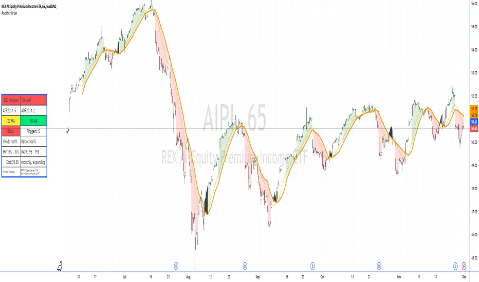
Another Brian"Another Brian" is an advanced TradingView indicator meticulously designed to offer traders a multifaceted analysis by integrating both technical and fundamental metrics. Unlike standard indicators, this script uniquely combines multi-period Moving Averages (SMA and WMA) with multi-day Volume-Weighted Average Prices (VWAPs) to accurately identify trend directions and potential support/resistance levels. It incorporates pivot points (S2 and R2) specifically calculated for intraday timeframes (1 to 14 minutes) to highlight key profit-taking areas tailored for day trading.
A standout feature of "Another Brian" is its dynamic background color coding, which changes based on the selected timeframe. This visual cue allows traders to instantly recognize the current trading context, enhancing situational awareness and decision-making efficiency.
On the fundamental side, the script evaluates dividend yield and dividend payout ratios, integrating these metrics with distribution data—crucial for ETFs where distributions may not appear as traditional dividends. By pulling and analyzing distribution information, "Another Brian" provides a more comprehensive yield assessment. This data is then compared to historical volatility (HV), enabling traders to gauge the stability and risk associated with their investments.
The indicator also features a comprehensive Risk-Adjusted Yield Ratio (RAYR), which compares the annualized distribution yield to its standard deviation. This ratio helps traders assess the efficiency of ETFs by balancing yield against volatility, highlighting investments that offer an optimal risk-return profile.
Central to the user experience is a dynamic data table that displays essential metrics such as 20-day Volume, ATR20, ADR20, moving averages status, yield ratios, and volatility measures. This table is color-coded for quick visual interpretation:
Setup : turn off the candle colors, the indicator draws price.
Red Indicators: Signal that a closer examination is needed, allowing traders to swiftly identify potential issues or opportunities.
Green and Yellow Indicators: Provide positive or neutral signals, aiding in the swift assessment of market conditions.
Additionally, "Another Brian" includes a trigger detection system that identifies potential bullish or bearish conditions based on the interaction between SMAs and WMAs across multiple timeframes. These triggers offer actionable trading signals, enhancing the tool's utility for both novice and experienced traders.
Key Features:
Moving Averages (MA):
Simple Moving Average (SMA): Calculates SMA over various periods (20-day, 50-day) to identify trend directions.
Weighted Moving Average (WMA): Computes WMA to give more significance to recent price data, aiding in trend detection.
Volume-Weighted Average Price (VWAP):
Multi-Day VWAPs: Plots VWAPs for 1-day, 2-day, and 3-day periods, helping traders identify potential support and resistance levels based on volume-weighted pricing.
Pivot Points:
Support (S2) and Resistance (R2): Calculates and plots key pivot points for intraday timeframes (1 to 14 minutes), assisting in identifying potential profit-taking zones for day trades.
Volatility Metrics:
Average True Range (ATR): Measures market volatility over a 20-day period.
Historical Volatility (HV): Assesses volatility over the past year, providing insights into price fluctuations.
Dividend and Distribution Analysis:
Dividend Yield & Payout Ratio: Displays current dividend yield and payout ratios as percentages.
Distribution Data: Integrates distribution information for ETFs, ensuring comprehensive yield analysis even when distributions don't appear as traditional dividends.
Risk-Adjusted Yield Ratio (RAYR):
RAYR Calculation: Compares the annualized distribution yield to its standard deviation, indicating the yield received for each unit of risk taken.
RAYR Indicators: Highlights ETFs with favorable RAYR values, aiding in identifying investments that offer a balanced risk-return profile.
Dynamic Data Table:
Comprehensive Metrics Display: Showcases key metrics such as 20-day Volume, ATR20, ADR20, moving averages status, yield ratios, and volatility measures.
Color-Coding: Utilizes color-coded elements to indicate the status of various metrics, enhancing visual interpretation and decision-making.
Quick View Alerts: Red indicators prompt traders to take a closer look, streamlining the analysis process.
Trigger Indicators:
Pre-Trigger Conditions: Identifies potential market triggers based on moving average crossovers and other predefined conditions.
Bullish and Bearish Conditions: Differentiates between bullish and bearish trends, providing visual cues for potential trade opportunities.
Background Color Coding:
Timeframe-Based Coloring: Changes the chart's background color based on the selected timeframe (e.g., yellow for 1-minute, blue for 5-minute), offering an immediate visual reference for the current trading context.
Usage Benefits:
Holistic Market Analysis: Combines technical indicators with fundamental metrics to provide a well-rounded view of stock performance.
Enhanced Decision-Making: Helps traders identify trends, volatility, and potential trade triggers, facilitating informed trading strategies.
Visual Clarity: Employs color-coded elements and a comprehensive data table to simplify complex data, making it easier to interpret market conditions at a glance.
Customization: Offers flexibility in selecting which VWAPs to display and allows for adjustments based on different timeframes and trading preferences.
Efficiency in Monitoring: The dynamic background and color-coded table enable quick assessments, saving traders time and enhancing responsiveness to market changes.
"Another Brian" is an invaluable tool for traders seeking to integrate multiple analytical perspectives into their trading routine. By providing deeper market insights through its unique combination of technical and fundamental metrics, along with intuitive visual cues, "Another Brian" empowers traders to make more informed and strategic decisions in the dynamic stock market environment.
Earnings Master (EM) V1.0
Earnings Master (EM)
As an Investor/ Trader, while analysing the tradingview charts, he/she may quickly like to see some of the fundamental data like the financial health of the company which may help to shortlist the list of stocks to pick.
It will be great if he can see the last few quarters or years earnings, to make informed decisions based on detailed financial data.
A person may be interested to see the last few quarters sales data, Profit data, EPS, etc.
Normally he/she has to go to some other fundamental websites to see these data, which will be highly time consuming and a hectic process if he is going through hundreads of charts per day.
Thanks for our new Indicator Earnings Master (EM). This indicator is designed to provide detailed financial insights into a company's performance by displaying key financial metrics such as Profit After Tax (PAT), Operating profit margin (OPM), Earnings Per Share (EPS), Total Revenue etc.
The indicator also calculates and visualizes the percentage changes in these metrics over different quarters, offering a comprehensive view of the company's financial health.
Also it provides sector/Industry details and percentage up from 52-week low and down from 52-week high
Features:
Table Display:
A customisable table that can be viewed in both Dark and light themes
A customisable table that can be positioned in various locations on the chart (e.g., top left, top center, bottom right, etc.).
Color-coded values to indicate positive and negative changes in financial metrics.
Dynamic text size and color for better readability.
Financial Metrics:
PAT (Profit After Tax): Displays the PAT values for the current and previous quarters.
Industry and Sector: Displays the industry and the particular sector of the company
EPS (Earnings Per Share): Displays the EPS values for the current and previous quarters.
Total Revenue: Shows revenue values in crores (Cr) for multiple quarters.
Free Float: Represents the number of freely floating shares.
Quarter-over-Quarter (QoQ) Change: Computes the percentage change in PAT and sales for different quarters.
Sales in Crores: Displays sales values in crores (Cr) and calculates the QoQ changes.
Operating profit margin (OPM): which is a financial ratio that measures how much profit a company makes on sales after paying variable production costs
Inputs
User inputs for table position, Dark mode , and calculation periods for earnings.
- Option to show/hide Borders
Also can customise the indicator to show/hide the following table fields
- Show Sector
- Show Mcap/ Free Float Mcap?
- Show Earnings
- Show 52w High/Low stats
How to Use:
Add the Earnings Master indicator to your TradingView chart.
Customize the table position and color mode as per your preference.
Analyze the displayed financial metrics and percentage changes to gain insights into the company's performance.
Use the color-coded values to quickly identify significant changes and trends in PAT, EPS, revenue, and other key metrics.
Example Output:
In Quarter Ended mode the table will display the following fields
Quarter Ended period values
PAT Quarterly values
PAT YoY in percentage
PAT QoQ in percentage
Quarterly Sales values
Sales YoY in percentage
Sales QoQ in percentage
EPS values
EPS YoY in percentage (Option available to show/hide)
EPS QoQ in percentage (Option available to show/hide)
Price To Earnings (P/E) ratio
Operating profit margin (OPM)
In Year Ended mode the table will display the following fields
Year Ended period values
PAT Quarterly values
PAT YoY in percentage
Yearly Sales values
Sales YoY in percentage
EPS values
Price To Earnings (P/E) ratio
Price To Earnings (P/E) ratio YoY in percentage
Operating profit margin (OPM)

LRSI-TTM Squeeze - AynetThis Pine Script code creates an indicator called LRSI-TTM Squeeze , which combines two key concepts to analyze momentum, squeeze conditions, and price movements in the market:
Laguerre RSI (LaRSI): A modified version of RSI used to identify trend reversals in price movements.
TTM Squeeze: Identifies market compressions (low volatility) and potential breakouts from these squeezes.
Functionality and Workflow of the Code
1. Laguerre RSI (LaRSI)
Purpose:
Provides a smoother and less noisy version of RSI to track price movements.
Calculation:
The script uses a filtering coefficient (alpha) to process price data through four levels (L0, L1, L2, L3).
Movement differences between these levels calculate buying pressure (cu) and selling pressure (cd).
The ratio of these pressures forms the Laguerre RSI:
bash
Kodu kopyala
LaRSI = cu / (cu + cd)
The LaRSI value indicates:
Below 20: Oversold condition (potential buy signal).
Above 80: Overbought condition (potential sell signal).
2. TTM Squeeze
Purpose:
Analyzes the relationship between Bollinger Bands (BB) and Keltner Channels (KC) to determine whether the market is compressed (low volatility) or expanded (high volatility).
Calculation:
Bollinger Bands:
Calculated based on the moving average (SMA) of the price, with an upper and lower band.
Keltner Channels:
Created using the Average True Range (ATR) to calculate an upper and lower band.
Squeeze States:
Squeeze On: BB is within KC.
Squeeze Off: BB is outside KC.
Other States (No Squeeze): Neither of the above applies.
3. Momentum Calculation
Momentum is computed using the linear regression of the difference between the price and its SMA. This helps anticipate the direction and strength of price movements when the squeeze ends.
Visuals on the Chart
Laguerre RSI Line:
An RSI indicator scaled to 0-100 is plotted.
The line's color changes based on its movement:
Green line: RSI is rising.
Red line: RSI is falling.
Key levels:
20 level: Oversold condition (buy signal can be triggered).
80 level: Overbought condition (sell signal can be triggered).
Momentum Histogram:
Displays momentum as histogram bars with colors based on its direction and strength:
Lime (light green): Positive momentum increasing.
Green: Positive momentum decreasing.
Red: Negative momentum decreasing.
Maroon (dark red): Negative momentum increasing.
Squeeze Status Indicator:
A marker is plotted on the zero line to indicate the squeeze state:
Yellow: Squeeze On (compression active).
Blue: Squeeze Off (compression ended, movement expected).
Gray: No Squeeze.
Information Table
A table is displayed in the top-right corner of the chart, showing closing prices for different timeframes (e.g., 1 minute, 5 minutes, 1 hour, etc.). Each timeframe is color-coded.
Alerts
LaRSI Alerts:
Crosses above 20: Exiting oversold condition (buy signal).
Crosses below 80: Exiting overbought condition (sell signal).
Squeeze Alerts:
When the squeeze ends: Indicates a potential price move.
When the squeeze starts: Indicates volatility is decreasing.
Summary
This indicator is a powerful tool for determining market trends, momentum, and squeeze conditions. It helps users identify periods when the market is likely to move or remain stagnant, providing alerts based on these analyses to support trading strategies.

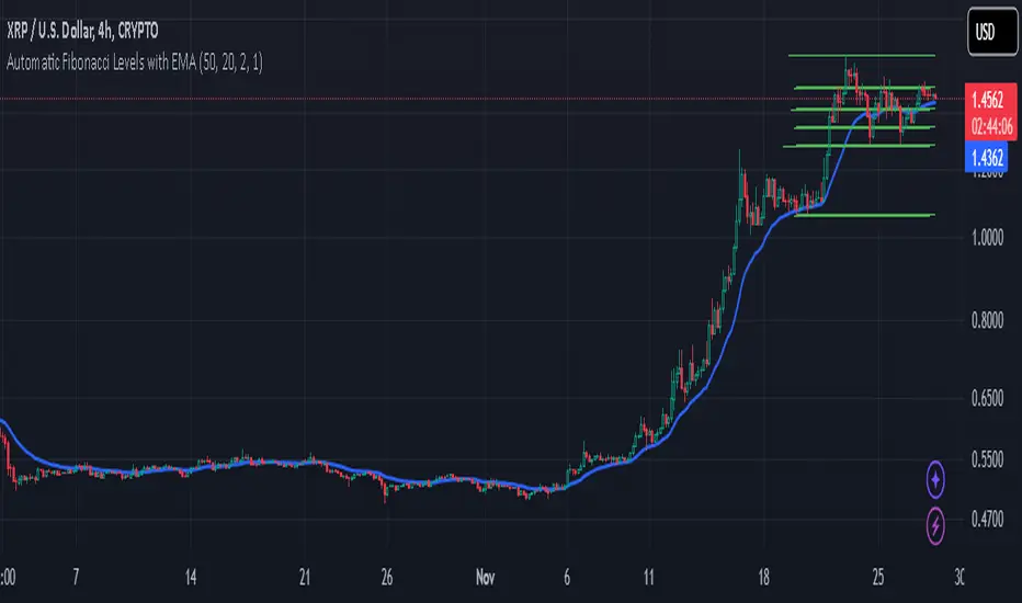
Automatic Fibonacci Levels with EMAAutomatic Fibonacci Levels with EMA
Description:
This script automatically calculates and displays Fibonacci retracement levels based on the highest and lowest prices over a dynamic lookback period. The Fibonacci levels are recalculated on every bar to adapt to price changes, providing an ongoing analysis of key support and resistance areas.
The Fibonacci levels are dynamically colored to reflect the trend direction, determined by the position of the price relative to the Exponential Moving Average (EMA). When the market is in an uptrend (price above EMA), Fibonacci levels are displayed in green, and in a downtrend (price below EMA), they are shown in red. This color coding helps traders quickly identify the current market direction.
Key Features:
Dynamic Fibonacci Levels: Automatically adjusts Fibonacci retracement levels based on recent price action, recalculated with each new bar.
EMA Trend Confirmation: The trend is confirmed by the position of the price relative to the 20-period EMA. Fibonacci levels are color-coded to reflect this trend.
Customizable Lookback Period: Adjust the base lookback period (default 50) and scale it according to your preferred timeframe for more or less sensitivity to recent price action.
Flexible Fibonacci Duration: The Fibonacci levels remain on the chart for a customizable duration (default 2 bars), allowing for visual clarity while adapting to new price action.
Timeframe Scaling: The script automatically adjusts the lookback period based on a scaling factor, making it suitable for different timeframes.
How to Use:
Use the Fibonacci levels to identify potential support and resistance zones based on the market's current price range.
Combine the trend color coding with your own strategy to enhance decision-making, whether for long or short entries.
Adjust the Lookback Period and Fibonacci Duration based on your trading style and timeframe preferences.
This script provides an automatic and customizable way to visualize Fibonacci retracements in a dynamic manner, helping traders make informed decisions based on trend direction and key price levels.
Note: As with any trading tool, always use proper risk management and test the script before using it in live trading.
ds-Income Statement Analyzer for TradersPURPOSE: Identifies trends in Revenue, Margins, and Earnings (RME), providing a quick indication of areas that may warrant further focus.
FOCUS:
This tool focuses exclusively on quarterly data, making it especially useful for traders who follow the styles of William O'Neil, Mark Minervini, and David Ryan. Built on the concept that fundamental trends support technical price trends, this indicator is designed to assist swing and position traders in analyzing income statements by highlighting recent trends in revenue, margins, and earnings. It requires three quarters of data to establish a trend, emphasizing the last three quarters. Tools and indicators should 'tell something useful,' and in this case, the tool reveals whether revenue, margins, and earnings are expanding, contracting, or remaining flat, as well as whether these movements are accelerating or decelerating. Finally, built-in logic offers an at-a-glance interpretation of whether a stock warrants closer examination of its fundamental and technical data.
SETTINGS:
# Qtrs to Include: Allows you to select how many quarters of available data to display. (5-16)
Size: Allows you to adjust the size of the displayed table.
KPI Data Text Size: Allows you to adjust the size of the text in the KPI Row. Some text here is more verbose than others.
Position: Allows you to position the table.
Show Minervini 2Qtr Avgs.?: Hover of the “i” in settings for explanation.
Show Estimates vs Actuals?: Hover of the “i” in settings for explanation.
Emphasized Data Only in Headline Indicator?: Hover of the “i” in settings for explanation.
TABLE SECTIONS
Vertically: The table is divided into three sections: Revenues, Profit Margins, and Earnings.
Horizontally:
The top row contains section headers and key information.
The second row includes column headers and summary indicator symbols.
The main body displays quarterly data, with a default of 5 quarters and a maximum of 16.
Analysis sections include 3Q Trend, KPI, and ATH.
The bottom row shows the version number and provides a column symbol indicator for each data column.
TABLE - TOP ROW (Left to Right):
SYM: Displays the symbol being viewed.
Qtrs Avail: Shows the quarters of data available from TradingView, typically up to a maximum of 32 quarters, or 8 years. If this displays less than 8 years, the company is relatively young.
REVENUES: Header label for the Revenues section. To its right is a symbol that indicates the worst case from the bottom row of symbols, based on your settings.
PROFIT MARGINS: Header label for the Profit Margins section. To its right is a symbol that indicates the worst case from the bottom row of symbols, based on your settings.
EARNINGS: Header label for the Earnings section. To its right is a symbol that indicates the worst case from the bottom row of symbols, based on your settings.
TABLE - HEADER ROW:
This row displays the column header labels. Note the Emphasized column headers “yellow text” highlight the most important column data “Rev Actual ($)”, “Rev YoY Qtr Chg (%)”, “Net Margin (NM) (%)”, “NP YoY Qtr Chg (%)”, “EPS YoY Qtr Chg (%)”. This can be modified in the settings. If you hover over the header, a label will pop up to provide more details.
TABLE BODY ROWS: Shows up to 16 rows of quarterly data.
A black or blank background cell without text indicates that data is unavailable from TradingView. Green text shows a value higher than the prior quarter, while red text shows a value lower than the prior quarter, allowing you to quickly spot trends within each data column. A yellow background highlights cells with negative values, marking them as unfavorable. The yellow cells indicate data points that ideally should not be negative.
ANAYSIS ROWS: Shown with brown background.
3Q TREND: Analyzes the last three quarters of data in each column to determine if the trend is rising, falling, or flat.
KPI: Key Performance Indicator. Highlights critical information, such as whether the current quarter is an all-time high (ATH), momentum (MOM) is sideways or accelerating upward, or percentage margins have fallen below all-time highs. You may sometimes see "struct." in the cell here which indicates there is a structural issue. e.g., Net Margin is higher than Operating, EBITDA, or Gross Margin. This might reflect a one-time event that boasted earnings and is worth investigating.
ATH: All-time-high value. If KPI shows ATH then the value in this cell should be equal to the most recent quarters value.
TABLE - BOTTOM ROW (Left to Right):
Version Number: Displays the version number of the indicator code.
Column-Specific Symbol Indicator: Shown at the bottom of each column, this indicator assesses the data in that column for trends, performance, and other factors.
Symbols include:
Green Checkmark: Indicates acceptable performance.
Yellow Triangle: Suggests caution; a closer inspection of this column's data may be warranted.
Orange Diamond: Signals extreme caution, more serious than the Yellow Triangle but not as critical as a Red Flag.
Red Flag: Warns of undesirable performance characteristics associated with this column's data, indicating potential danger.
Minervini CODE33 from Trade Like a Stock Market Wizard
Code 33 situation, three quarters of acceleration in earnings, sales, and profit margins. This can be observed in this indicator by focusing on the “Rev YoY Qtr Chg (%)”, “Net Margin (NM) (%)”, “EPS YoY Qtr Chg (%)” looking for the green text in the last two quarters of data. Remember green text simply indicates the value is greater than the prior value. Note I have chosen not to represent the “Net Margin (NM) (%)” as a Year-over-Year (YoY) figure. If you wish to see the bottom line represented as a YoY, you can approximate that by using the “NP YoY Qtr Chg (%)”.
Minervini Smoothing Volatility: Quarterly financial results can be volatile. By averaging the earnings, sales, or other key financial metrics over the last two quarters, Minervini aims to reduce the impact of any one-off events or seasonal fluctuations, providing a more stable view of the company's operational performance. In this indicator I incorporated it for “Rev 2Qtr Chg (%)” and “NP 2Qtr Avg Chg (%)” which averages the last two quarters of Quarter-over-Quarter (QoQ) change.

4-Frame Trend CountThis script tracks the current close vs the close from 4 time frames prior to spot a trend reversal after 9 consecutive up or down moves.

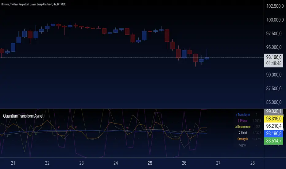
Quantum Transform - AynetQuantum Transform Trading Indicator: Explanation
This script is called a "Quantum Transform Trading Indicator" and aims to enhance market analysis by applying complex mathematical models. Written in Pine Script, the indicator includes the following elements:
1. General Structure
Quantum Parameters: Inspired by physical and mathematical concepts (Planck constant ℏ, wave function Ψ, time τ, etc.), it uses specific parameters.
Transformation Functions: Applies various mathematical operations to transform price data in different ways.
Signal Generation: Produces signals for long and short positions.
Visualization: Displays different price transformations and signals on the chart.
2. Core Parameters
The parameters allow users to control various transformations:
Planck Constant (ℏ): A scaling factor for wave modulation.
Wave (Ψ): Controls oscillation in price data.
Time (τ): The length of the lookback period for calculations.
Relativity (γ): Power factor in the Lorentz transformation.
Phase Shift (β): Manages phase shift in transformations.
Frequency (ω): Represents the frequency of price movements.
Dimensions (∇): Enables multi-dimensional field analysis.
3. Functions
a) Relativistic Transform
Inspired by the theory of relativity.
Calculates the Lorentz factor using the rate of price change.
Transforms price data to amplify the relativity effect.
b) Phase Transform
Calculates the phase of price data and applies wave modulation.
Creates phase and amplitude modulation based on the bar index.
c) Resonance Transform
Calculates resonance effects using natural frequency and oscillations.
Highlights periodic behaviors of price movements.
d) Field Transform
Applies multi-dimensional field calculations.
Combines strength, wave, and coherence aspects of price data.
e) Chaos Transform
Implements a chaos effect based on sensitivity analysis.
Simulates chaotic behaviors of price movements.
4. Main Calculations
Quantum Price: The average of all transformation functions.
Bands:
Upper Band: The highest level of quantum price.
Lower Band: The lowest level of quantum price.
Mid Band: The average of upper and lower bands.
Momentum: Calculates the rate of change in quantum price.
5. Signal Generation
Long Signal:
Triggered when the phase price crosses above the field price.
Momentum must be positive, and the price above the mid-band.
Short Signal:
Triggered when the phase price crosses below the field price.
Momentum must be negative, and the price below the mid-band.
Signal strength is calculated relative to the momentum moving average.
6. Visualization
Each transformation is displayed in a unique color.
Bands and Momentum: Visualize price behavior.
Signal Icons: Show buy/sell signals using up/down arrows on the chart.
7. Information Panel
A table in the top-right corner of the chart displays:
The current values of each transformation.
Signal strength (as a percentage).
The type of signal (⬆: Long, ⬇: Short).
Applications
Trend Following: Analyze trends with complex transformations.
Resonance and Chaos Analysis: Understand dynamic behaviors of price.
Signal Strategies: Create strong and reliable buy/sell signals.
If you have any additional questions or customization requests regarding this indicator, feel free to ask!
MicroStrategy Bitcoin Premium v2 [Kendrick_Chan]In 2020, MicroStrategy, under the leadership of CEO Michael Saylor, began purchasing large amounts of Bitcoin to hedge against inflation and diversify its corporate treasury. This move transformed MicroStrategy into one of the largest corporate holders of Bitcoin, with the company continually increasing its holdings through additional purchases funded by issuing new shares and convertible bonds.
The MicroStrategy Bitcoin Premium indicator is a dynamic tool that underscores the enthusiasm of equity market investors to gain Bitcoin exposure through MicroStrategy's (MSTR) stock. This indicator measures the premium investors are willing to pay for MSTR shares relative to the company's Bitcoin and cash holdings, reflecting the traditional market's eagerness to hold Bitcoin indirectly.
How Does It Work:
When MicroStrategy issues convertible bonds, cash level increases and all CB are assumed to convert to stocks diluting the shares.
In case of sales of MSTR new shares, cash level increases and diluted shares are adjusted tentatively before the quarterly financial reports.
In the event of Bitcoin purchases, the Bitcoins holding increases while cash level decreases.
Premium = Assumed Diluted Market Cap / ( Bitcoins Value + Cash and Cash Equivalents ) - 100%
How To Use:
By understanding and utilizing the MicroStrategy Bitcoin Premium indicator, traders and investors can make more informed decisions, whether they are swing trading MSTR, gauging Bitcoin demand, or seeking arbitrage opportunities.
1. MSTR Swing Traders
Swing traders can leverage the indicator to identify potential MSTR entry and exit points based on the overbought or oversold conditions of the stock.
2. Bitcoin Investors and Traders
The premium indicator can serve Bitcoin investors as a proxy for gauging overall market demand. A high premium indicates strong demand for Bitcoin exposure through MSTR, reflecting broader market enthusiasm for Bitcoin. A low premium suggests reduced demand.
Bitcoin traders may also anticipate the Bitcoin demand driven by MicroStrategy:
a) Shen the premium is high, MicroStrategy could issue new shares or convertible bonds to raise funds and buy more Bitcoins.
b) Arbitrageurs might also short sell MSTR and buy the equivalent Bitcoins.
3. MSTR-Bitcoin Arbitrageurs
Arbitrage traders can use the premium indicator to exploit price discrepancies between MSTR stock and Bitcoin. This strategy profits from any convergence between the stock price and the value of the underlying Bitcoin holdings.
The indicator helps identify optimal times to enter and exit arbitrage positions, minimizing risk and maximizing potential returns by capitalizing on market inefficiencies.

Crypto Index Creator (MEMES & AI Supercycle Dominance, etc)This indicator aims to help to create any INDEX desired including but not limited to its Market Cap and Dominance on the crypto market.
This script was inspired originally by Murad's "Memecoins Dominance" but then I extended it to AI and can be extended to anything in fact, so you can create any index!
I made each token entry editable so that the script can survive the evolution of time as likely projects and INDEXES are going to change a lot, so that you can add/modify your own indices of preference if not listed by default and in order to make it future proof.
You can play with the settings, can compare to BTC, ETC, SOL, etc. for helping in your studies
You also have the option to check the info of each symbol on a table available on the settings, in order to help you figure out if there are any errors and also help you to easily check how the symbols are performing individually
Notes:
- Many projects are not like MEMECOINS that have fixed supply, normally VC projects have a very variable circulating supply, so you might want to update the info of the circulating supply for your projects to make it more accurate if you desire.
- For this script there is a limit of 32 Symbols, due to tradingview own limits, yet you can always "add" multiple projects per line as long as their circulating supply is the same.
- You might want to edit/sort the tickers of the top3, top5 and top10 if they follow bellow those top ranks, but this is not necessary if you don't care about Top 3-10 specific calculations.
- My default "indices" were made of token selections of mine as of November 2024, those defaults indices/tickers I might or might not update them eventually but you are free to adapt/modify the tickers in the settings as history evolves, and you can leave your own indexes on the comment section of this post for others to use
- As you might not be able to create/store multiple different indexes at the same time, you might want to add this indicator multiple times on your screen and then modify the tickers of each instance of this indicator, by that you can have multiple indexes.

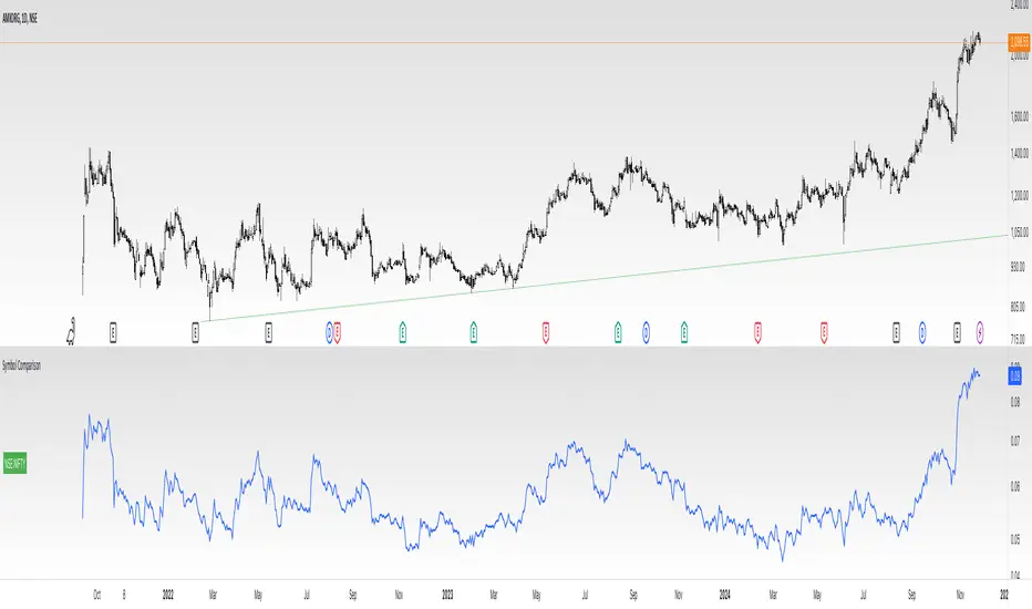
Divides company with IndexOverview:
This indicator simplifies the comparison of a stock's performance against a specified index, such as the Nifty 50. By calculating and plotting the ratio between the two, it provides a clear visual representation of relative strength.
Key Features:
-Direct Comparison: Easily compare any stock against a selected index.
-Customizable Index: Choose from a dropdown menu or input a custom index symbol.
-Visual Clarity: Maximizing the chart provides a clear view of the relative performance.
-SMA Overlay: Add a Simple Moving Average (SMA) to identify trends and potential entry/exit
points.
-Customizable Appearance: Adjust background color, text color, and label size for personalized
visualization.
How to Use:
Add the Indicator: Add the indicator to your chart.
Select the Index: Choose the desired index from the dropdown menu or input a custom symbol.
Analyze the Ratio:
-A rising ratio indicates the stock is outperforming the index.
-A falling ratio suggests underperformance.
-The SMA can help identify potential trends and momentum.
Customize the Appearance: Adjust the background color, text color, and label size to suit your preferences.
Benefits:
-Improved Decision Making: Gain insights into a stock's relative strength.
-Faster Analysis: Quickly compare multiple stocks against a benchmark index.
-Enhanced Visualization: Customize the chart for better understanding.
-By leveraging this indicator, you can make informed trading decisions and gain a deeper
understanding of market dynamics.
Session RangeThis Pine Script™ code is subject to the terms of the Mozilla Public License 2.0 at mozilla.org
This script plots the high and low price ranges for up to four customizable trading sessions directly on your chart. It is designed to help traders visualize price activity during specific trading hours.
Features
Customizable Sessions: Define up to four distinct trading sessions using the input.session parameter.
Visual Highlights: Each session range is highlighted with customizable colors for top and bottom lines as well as a fill between them.
Historical Ranges: Option to show historical session ranges with adjustable opacity.
Toggle Sessions: Enable or disable the display of specific trading sessions to tailor your analysis.
Overlay on Chart: The script works as an overlay, ensuring your analysis stays on the main chart.
How It Works:
Session Setup: Input the start and end times for each session in the Session 1, Session 2, Session 3, and Session 4 fields.
Dynamic Range Calculation: The script automatically calculates the high and low during active sessions, updating the range as new data comes in.
Customizable Colors: Adjust the colors for lines, fills, and historical ranges to match your charting style.
Clean Presentation: The script is designed to avoid clutter by limiting overlays to active and relevant sessions only.
Identify price action trends during key trading hours.
Compare ranges between multiple sessions for market behavior analysis.
Highlight significant session overlaps or range extensions.
Disclaimer :
This script is intended for educational purposes and should not be considered financial advice. Trading involves risks, and past performance does not guarantee future results.

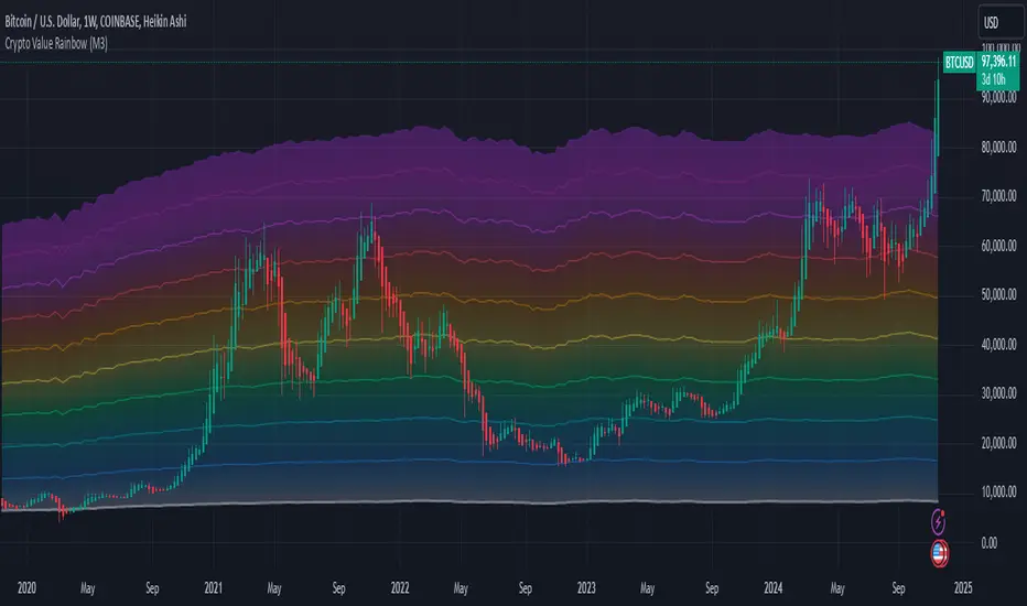
Crypto Value RainbowThe best way to value Crypto value is comparing Crypto price against the available money supply circulating in the economy. There are 3 different 4 different type of money supply M0/M1/M2/M3 which denotes the level of money printed by central government to the final credit lend out to the economy via fractional banking system. This rainbow valuation measures the relative Crypto price against the M0/M1/M2/M3 from most popular currency that account for more than 75% of money supply in the world.
CV = US MS + EU MS + CN MS + JP MS + UK MS
CV = Crypto Value
MS = Money Supply
This can only be applied to a few crypto currency:
- BTCUSD Bitcoin
- ETHUSD Ehereum
- BNBUSD BNB
- SOLUSD Solana
- XRPUSD XRP
- TONUSD Toncoin
- DOGEUSD Dogecoin
- TRXUSD Tron
- ADAUSD Cardano
- AVAXUSD Avalanche
The rainbow color is the multiplier for the total Crypto Value by 1x,2x,3x,...,10x
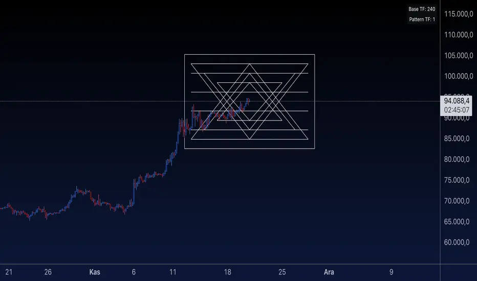
Sri Yantra MTF - AynetSri Yantra MTF - Aynet Script Overview
This Pine Script generates a Sri Yantra-inspired geometric pattern overlay on price charts. The pattern is dynamically updated based on multi-timeframe (MTF) inputs, utilizing high and low price ranges, and adjusting its size relative to a chosen multiplier.
The Sri Yantra is a sacred geometric figure used in various spiritual and mathematical contexts, symbolizing the interconnectedness of the universe. Here, it is applied to visualize structured price levels.
Scientific and Technical Explanation
Multi-Timeframe Integration:
Base Timeframe (baseRes): This is the primary timeframe for the analysis. The opening price and ATR (Average True Range) are calculated from this timeframe.
Pattern Timeframe (patternRes): Defines the granularity of the pattern. It ensures synchronization with price movements on specific time intervals.
Geometric Construction:
ATR-Based Scaling: The script uses ATR as a volatility measure to dynamically size the geometric pattern. The sizeMult input scales the pattern relative to price volatility.
Pattern Width (barOffset): Defines the horizontal extent of the pattern in terms of bars. This ensures the pattern is aligned with price movements and scales appropriately.
Sri Yantra-Like Geometry:
Outer Square: A bounding box is drawn around the price level.
Triangles: Multiple layers of triangles (primary, secondary, and tertiary) are calculated and drawn to mimic the structure of the Sri Yantra. These triangles converge and diverge based on price levels.
Horizontal Lines: Added at key levels to provide additional structure and aesthetic alignment.
Dynamic Updates:
The pattern recalculates and redraws itself on the last bar of the selected timeframe, ensuring it adapts to real-time price data.
A built-in check identifies new bars in the chosen timeframe (patternRes), ensuring accurate updates.
Information Table:
Displays the selected base and pattern timeframes in a table format on the top-right corner of the chart.
Allows traders to see the active settings for quick adjustments.
Key Inputs
Style Settings:
Pattern Color: Customize the color of the geometric patterns.
Size Multiplier (sizeMult): Adjusts the size of the pattern relative to price movements.
Line Width: Controls the thickness of the geometric lines.
Timeframe Settings:
Base Resolution (baseRes): Timeframe for calculating the pattern's anchor (default: daily).
Pattern Resolution (patternRes): Timeframe granularity for the pattern’s formation.
Geometric Adjustments:
Pattern Width (barOffset): Horizontal width in bars.
ATR Multiplier (rangeSize): Vertical size adjustment based on price volatility.
Scientific Concepts
Volatility Representation:
ATR (Average True Range): A standard measure of market volatility, representing the average range of price movements over a defined period. Here, ATR adjusts the vertical height of the geometric figures.
Geometric Symmetry:
The script emulates symmetry similar to the Sri Yantra, aligning with the principles of sacred geometry, which often appear in nature and mathematical constructs. Symmetry in financial data visualizations can aid in intuitive interpretation of price movements.
Multi-Timeframe Fusion:
Synchronizing patterns with multiple timeframes enhances the relevance of overlays for different trading strategies. For example, daily trends combined with hourly patterns can help traders optimize entries and exits.
Visual Features
Outer Square:
Drawn to encapsulate the geometric structure.
Represents the broader context of price levels.
Triangles:
Three layers of interlocking triangles create a fractal pattern, providing a visual alignment to price dynamics.
Horizontal Lines:
Emphasize critical levels within the pattern, offering visual cues for potential support or resistance areas.
Information Table:
Displays the active timeframe settings, helping traders quickly verify configurations.
Applications
Trend Visualization:
Patterns overlay on price movements provide a clearer view of trend direction and potential reversals.
Volatility Mapping:
ATR-based scaling ensures the pattern adjusts to varying market conditions, making it suitable for different asset classes and trading strategies.
Multi-Timeframe Analysis:
Integrates higher and lower timeframes, enabling traders to spot confluences between short-term and long-term price levels.
Potential Enhancements
Add Fibonacci Levels: Overlay Fibonacci retracements within the pattern for deeper price level insights.
Dynamic Alerts: Include alert conditions when price intersects key geometric lines.
Custom Labels: Add text descriptions for critical intersections or triangle centers.
This script is a unique blend of technical analysis and sacred geometry, providing traders with an innovative way to visualize market dynamics.
Pivotal Point Detection
The indicator highlights price gaps (overnight gaps) with significantly increased volume in the daily chart only. These price jumps can occur after earnings reports or other significant news and often point to an important event (e.g., a new product or business model). According to Jesse Livermore, these are called Pivotal Points.
The price jumps displayed by the indicator are not a guarantee that they represent a true Pivotal Point, but they provide a hint of a significant business development - especially when they occur repeatedly alongside revenue growth. This can help identify potentially strong growth stocks and high-performing investments. However, the underlying events and connections must be investigated through additional research.
make posible to find stocks like:
NYSE:PLTR NASDAQ:ROOT NASDAQ:NVDA NYSE:CVNA NYSE:LRN
A "pivotal price line" is drawn at the opening price of the Pivotal Point. This line is considered a support level. If the price falls below this line, the Pivotal Point loses its validity.
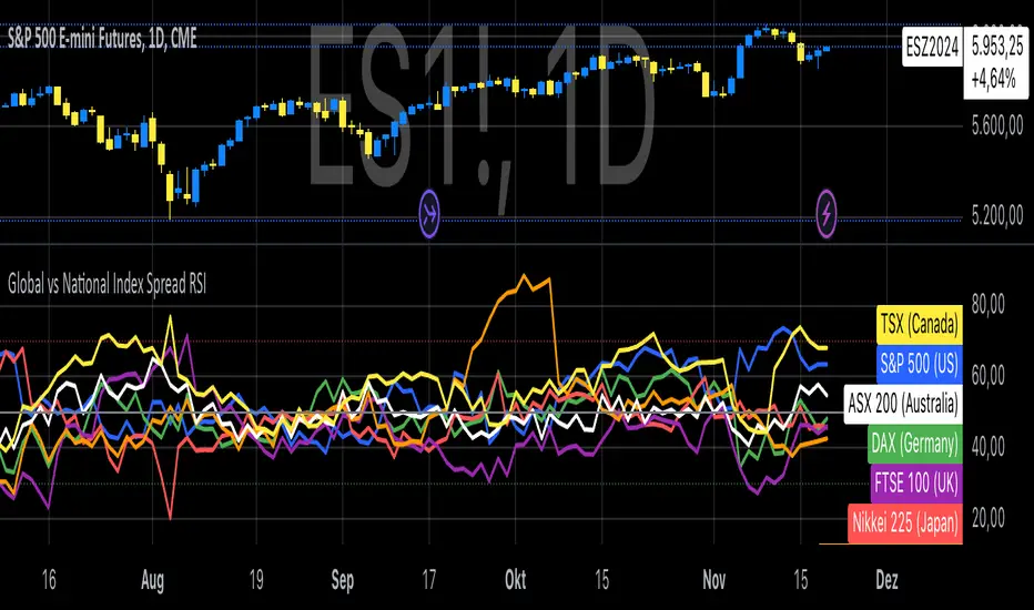
Global vs National Index Spread RSIThe Global vs National Index Spread RSI indicator visualizes the relative strength of national stock indices compared to a global benchmark (e.g., AMEX). It calculates the percentage spread between the closing prices of each national index and the global index, applying the Relative Strength Index (RSI) to each spread.
How It Works
Spread Calculation: The spread represents the percentage difference between a national index and the global index.
RSI Application: RSI is applied to these spreads to identify overbought or oversold conditions in the relative performance of the national indices.
Reference Lines: Overbought (70), oversold (30), and neutral (50) levels help guide interpretation.
Insights from Research
The correlation between global and national indices provides insights into market integration and interdependence. Studies such as Forbes & Rigobon (2002) emphasize the importance of understanding these linkages during periods of financial contagion. Observing spread trends with RSI can aid in identifying shifts in investor sentiment and regional performance anomalies.
Use Cases
- Detect divergences between national and global markets.
- Identify overbought or oversold conditions for specific indices.
- Complement portfolio management strategies by monitoring geographic performance.
References
Forbes, K. J., & Rigobon, R. (2002). "No contagion, only interdependence: Measuring stock market co-movements." Journal of Finance.
Eun, C. S., & Shim, S. (1989). "International transmission of stock market movements." Journal of Financial and Quantitative Analysis.
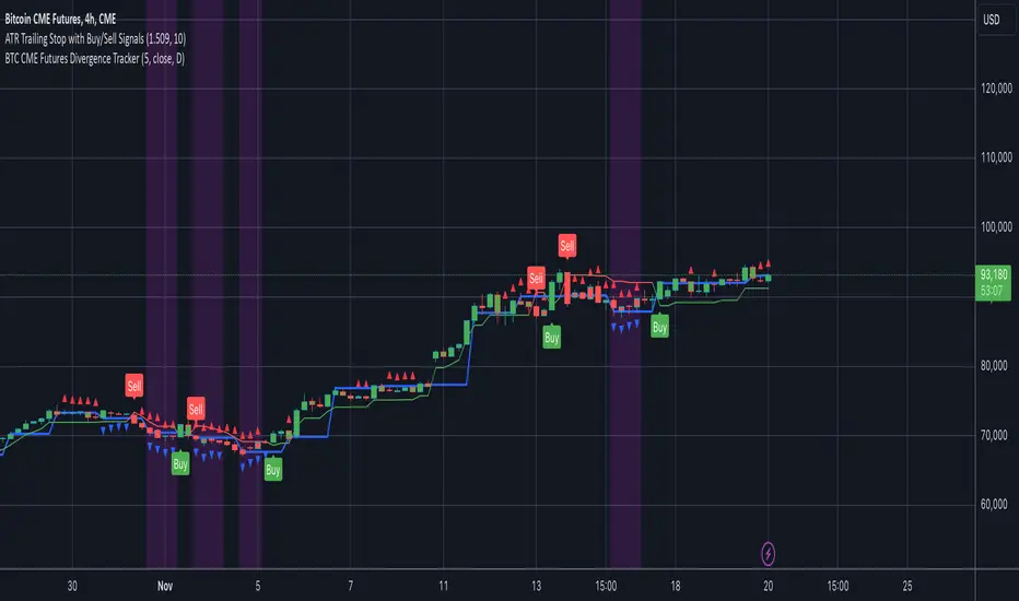
BTC CME Futures Divergence TrackerThis script tracks divergences between price action and open interest for the BTC CME Futures contract (symbol "BTC1!") using the following components:
Key Features:
1. Price Analysis: Identifies lower highs in the price over a specified lookback period. Marks these points with red upward-facing triangles above the bars.
2. Open Interest Analysis: Retrieves open interest (OI) data for the BTC CME Futures contract via request.security. Detects lower highs in open interest over the same lookback period. Highlights these points with blue downward-facing triangles below the bars.
3. Divergence Detection: A divergence is identified when both price and open interest form lower highs simultaneously. Highlights such occurrences with a purple background, indicating potential bearish sentiment or weakening momentum.
4. Alerts: If divergences are detected, an alert is triggered (if enabled), notifying the trader to take action.
5. Visualization: Open interest is plotted as a blue line in a separate pane for added context. Red and blue markers highlight significant points in price and open interest trends.
Use Cases:
- Spot Weakening Trends: Divergences between price and open interest may indicate a loss of momentum or bearish sentiment, allowing traders to preemptively adjust their strategies.
- Monitor Institutional Activity: Open interest changes reflect shifts in market participation, especially in derivative markets like CME Futures.
- Set Alerts for Key Signals: With automated alerts, traders can stay informed of potential divergence signals without constant monitoring.
Customization Options:
- Lookback Period: Adjust the number of bars used to detect lower highs.
- Timeframe: Choose the timeframe for fetching open interest data (e.g., daily, hourly).
- Alert Activation: Enable or disable alerts for divergences.
This tool combines price action with open interest dynamics to provide a robust method for identifying market trends and potential reversals in BTC CME Futures.
Volume HighlightVolume Highlight
Description:
This script helps users analyze trading volume by:
1. Highlighting the highest volume bars:
• Trading sessions with volume equal to or exceeding the highest value over the last 20 periods are displayed in purple.
• Other sessions are displayed in light gray.
2. Displaying the 20-period SMA (Simple Moving Average):
• A 20-period SMA line of the volume is included to track the general trend of trading volume.
Key Features:
• Color-coded Highlights:
• Quickly identify trading sessions with significant volume spikes.
• 20-Period SMA Line:
• Observe the overall trend of trading volume.
• Intuitive Volume Bars:
• Volume bars are clearly displayed for easy interpretation.
How to Use:
1. Add the script to your chart on TradingView.
2. Look at the color of the volume bars:
• Purple: Sessions with the highest trading volume in the past 20 periods.
• Light gray: Other sessions.
3. Use the 20-period SMA line to analyze volume trends.
Purpose:
• Analyze market momentum through trading volume.
• Support trading decisions by identifying significant volume spikes.
Illustration:
• A chart showing color-coded volume bars and the 20-period SMA line.
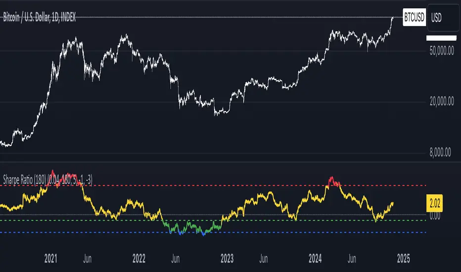
Sharpe Ratio Indicator (180)Meant to be used on the 1D chart and on BTC.
The Sharpe Ratio Indicator (180 days) is a tool for evaluating risk-adjusted returns, designed for investors who want to assess whether BTC is overvalued, undervalued, or in a neutral state. It plots the Sharpe Ratio over the past 180 days, color-coded to indicate valuation states:
- Red: Overvalued (Sharpe Ratio > 5).
- Green: Undervalued (Sharpe Ratio < -1).
-Blue: Critically Undervalued (Sharpe Ratio <-3).
- Yellow: Neutral (between -1 and 5).
Note that you can change those values yourself in the settings of the indicator.
Strengths:
- Real-time feedback on risk-adjusted returns helps in making timely investment decisions.
- Color-coded signals (red, green, blue and yellow) provide an intuitive, visual indication of the asset's valuation.
- Flexible: Easily adjustable to different subjective valuation levels and risk-free rates.
All hail to Professor Adam and The Real World Community!
London USDEGP priceThis indicator calculates the hypothetical USDEGP price using CIB receipts price in London Stock Exchange and its price in EGX. Values are smoothed.

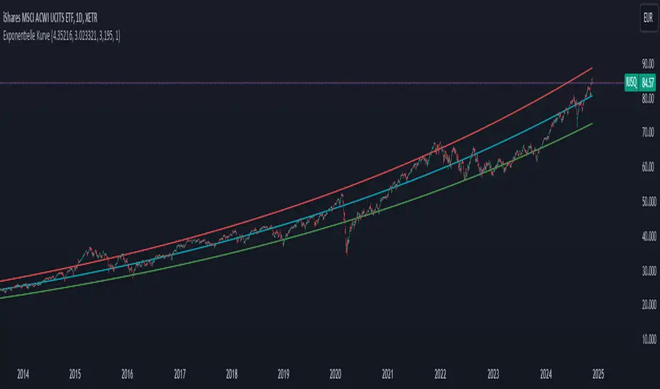
Exponential growthPurpose
The indicator plots an exponential curve based on historical price data and supports toggling between exponential regression and linear logarithmic regression. It also provides offset bands around the curve for additional insights.
Key Inputs
1. yxlogreg and dlogreg:
These are the "Endwert" (end value) and "Startwert" (start value) for calculating the slope of the logarithmic regression.
2. bars:
Specifies how many historical bars are considered in the calculation.
3.offsetchannel:
Adds an adjustable percentage-based offset to create upper and lower bands around the main exponential curve.
Default: 1 (interpreted as 10% bands).
4.lineareregression log.:
A toggle to switch between exponential function and linear logarithmic regression.
Default: false (exponential is used by default).
5.Dynamic Labels:
Creates a label showing the calculated regression values and historical bars count at the latest bar. The label is updated dynamically.
Use Cases
Exponential Growth Tracking:
Useful for assets or instruments exhibiting exponential growth trends.
Identifying Channels:
Helps identify support and resistance levels using the offset bands.
Switching Analysis Modes:
Flexibility to toggle between exponential and linear logarithmic analysis.