MVRVZ - MVRVZ Top and Bottom Indicator for BTC [Logue]Market Value-Realized Value Z-score (MVRVZ) - The MVRV-Z score measures the value of the bitcoin network by comparing the market cap to the realized value and dividing by the standard deviation of the market cap (market cap – realized cap) / std(market cap)). When the market value is significantly higher than the realized value, the bitcoin network is "overvalued". Very high values have signaled cycle tops in the past and low values have signaled bottoms. For tops, the default trigger value is above 6.85. For bottoms, the indicator is triggered when the MVRVZ is below -0.25 (default).
Fundamental Analysis

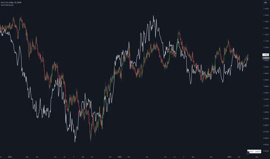
Bond Yield SpreadThe Bond Yield Spread Script is developed for forex traders, offering an automated tool to calculate the bond yield spread between two countries associated with the forex pair displayed on the chart.
Functionality:
The script starts by identifying the base and quote currencies of the current forex pair and aligns them with their corresponding national bond symbols based on user-selected maturity, with options ranging from 01Y to 30Y. It calculates the yield spread by subtracting the bond yield associated with the quote country from that of the base country, following the formula:
Yield Spread = Yield(Base Country) − Yield(Quote Country)
which is then displayed as a plot line on the chart.
This script relies solely on TradingView's internal yield symbols, with the following calculation:
"currency" => "first two letters" + maturity
And maturity, in this case, is the value that is configured in the indicator settings, for example:
"EUR" => "EU" + "02Y" will result in EU02Y -> which will be used in the formula, depending on the quote or base currency.
Application in Trading:
This indicator is invaluable for traders employing carry trading strategies or assessing currency strength based on traded interest rates as an indicator. A higher yield spread typically indicates a stronger currency, because the return obtained for holding the currency is higher.
Originality and Practicality:
This script is self-developed, aiming to fill the gap in automatic bond yield comparisons within the TradingView environment. It is particularly beneficial for traders focusing on macroeconomic factors affecting forex markets. Unlike other scripts, it integrates various bond maturities into one tool, enhancing its utility and application range.
Conclusion:
Designed for traders incorporating macroeconomics in their strategy, this script will be useful to calculate the bond yield differences automatically without having to enter a new formula for every new currency pair.
Compliance and Limitations:
The script complies with TradingView scripting standards, ensuring no lookahead bias and maintaining real-time data integrity. However, its utility depends on the comprehensive availability of bond yield data within TradingView. As not all countries issue bonds for each listed maturity, this may limit the script’s application for certain currency pairs or specific maturities.
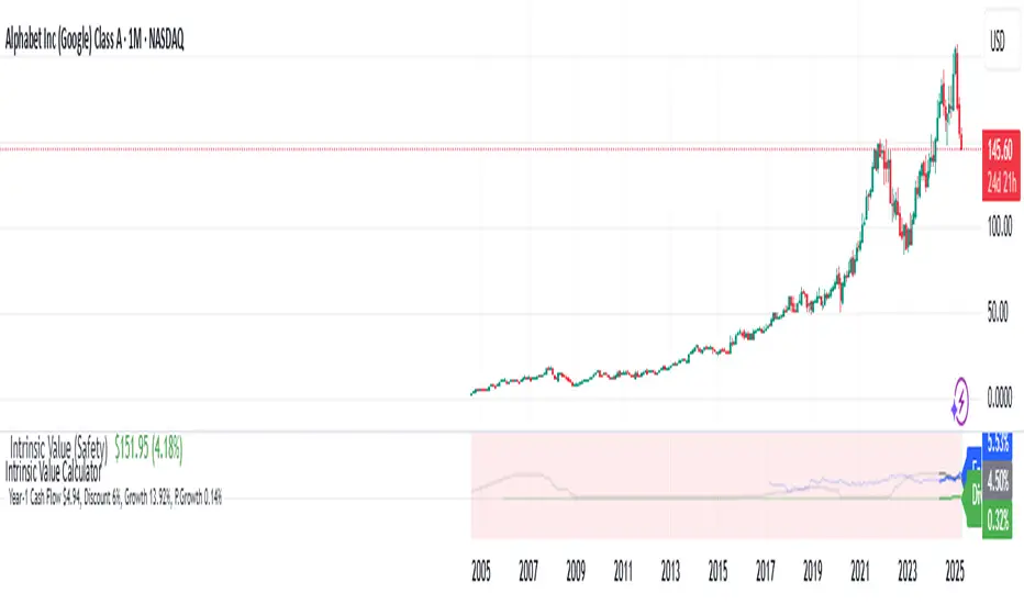
Intrinsic Value Calculator - Earnings/Dividend Yield (%)
This Intrinsic Value Calculator is a stock valuation Calculator that uses proven and science-based valuation methods to automatically estimate the intrinsic value of stocks.
What Is Intrinsic Value?
Intrinsic value is a measure of what a company's stock is worth. Intrinsic value is different from the current market price of a stock. However, comparing it to that current price can give investors an idea of whether the stock is undervalued or overvalued.
How to Calculate Intrinsic Value
To calculate the intrinsic value of a stock, we use two valuation methods: Discounted Cash Flow (DCF) Valuation and Relative Valuation. We take the average of these two methods to estimate the intrinsic value as accurately as possible.
Using Discounted Cash Flow (DCF) analysis, cash flows are estimated based on how a business may perform in the future. Those cash flows are then discounted to today’s value to obtain the company's intrinsic value. The discount rate we used is a risk-free rate of return (Fixed Deposit Interest Rate).
While intrinsic valuation models see to value a business by looking only at the company on its own, relative valuation models seek to value a business by comparing the company to other Low-Risk investment opportunities, Fixed Deposit Return.
Line Graph : Earnings Yield vs Fixed Deposit Interest Rate vs Dividend Yield
Other than automatically estimating the intrinsic value of a stock, this script would plot the Earnings Yield, Fixed Deposit Interest, and Dividend Yield of a stock.
Investors should monitor Earnings Yield, Fixed Deposit Interest, and Dividend Yield of a stock for a few key reasons:
Earnings Yield:
Earnings Yield is a crucial metric that provides insight into a company's profitability. It is calculated by dividing the company's earnings per share (EPS) by the current stock price. A higher Earnings Yield indicates that the company is generating more profit for each dollar invested by shareholders. This metric is particularly useful when comparing a company's profitability against other investment options, such as fixed deposits, bonds, or other stocks.
Fixed Deposit Interest:
The Fixed Deposit Interest Rate, also known as the risk-free rate, is the return an investor can expect from investing in a risk-free asset such as a government bond or a fixed deposit. This rate serves as a benchmark for evaluating the returns offered by other investments, including stocks.
Dividend Yield:
Dividend Yield is a measure of the annual dividend income received by an investor relative to the stock price. It is calculated by dividing the annual dividend per share by the current stock price. Dividend-paying stocks often appeal to income-oriented investors seeking regular cash flow.
Monitoring these metrics can help investors make informed decisions about their investments, assess the relative attractiveness of different investment options, and manage their investment portfolios effectively.
Key Financial Ratio display
Key investment ratios play a crucial role in helping investors make informed investment decisions. By providing valuable insights into a company's financial health, ratios such as the Gross Margin, R&D Ratio, Net Margin, Return on Equity (ROE) Ratio allow investors to quickly assess a company's profitability, liquidity, and financial stability.
Gross margin is the percentage of a company's revenue that it retains after direct expenses, such as labor and materials, have been subtracted. Gross margin is an important profitability measure that looks at a company's gross profit compared to its revenue.
The Research & Development (R&D) to Sales Ratio is a measure to compare the effectiveness of R&D expenditures between companies in the same industry. It is calculated as R&D expenditure divided by Total Sales.
The net profit margin, or simply Net Margin , measures how much net income or profit is generated as a percentage of revenue. It is the ratio of net profits to revenues for a company or business segment.
The Return on Equity (ROE) Ratio is a measure of a company's profitability and efficiency in using its shareholders' investments to generate profits. It's calculated by dividing a company's net income by its shareholder's equity. This ratio is a reflection of how well a company is utilizing its shareholders' capital to generate returns.
The Operating Cash to Debt Ratio measures the percentage of a company's total debt that is covered by its operating cash flow for a given accounting period. If the company’s ratio were higher, it would indicate a strong fiscal position, considering its cash flow from operations is higher than its total debt.
Free Cash Flow Margin is a significant financial metric that measures a company's ability to generate cash from its operations after accounting for capital expenditures. It evaluates the percentage of free cash flow relative to total revenue. A high Free Cash Flow margin suggests that a company is efficient at converting its revenue into cash flow.
NUPL - Net Unrealized Profit-Loss BTC Tops/Bottoms [Logue]Net Unrealized Profit Loss (NUPL) - The NUPL measures the profit state of the bitcoin network to determine if past transfers of BTC are currently in an unrealized profit or loss state.
Values above zero indicate that the network is in overall profit, while values below zero indicate the network is in overall loss. Highly positive NUPL values indicate overvaluation of the BTC network and relatively negative NUPL values indicate an undervaluation of the BTC network.
For tops: The default setting for tops is based on decreasing "strength" of BTC tops. A decreasing linear function (trigger = slope * time + intercept) was fit to past cycle tops for this indicator and is used as the default to signal macro tops. The user can change the slope and intercept of the line by changing the slope and/or intercept factor. The user also has the option to indicate tops based on a horizontal line via a settings selection. This horizontal line default value is 73. This indicator is triggered for a top when the NUPL is above the trigger value.
For bottoms: Bottoms are displayed based on a horizontal line with a default setting of -13. The indicator is triggered for a bottom when the NUPL is below the bottom trigger value.

Blockunity Miners Synthesis (BMS)Track the status of Bitcoin and Ethereum Miners' Netflows and their asset reserves.
The Idea
The goal is to provide a simple tool for visualizing the changes in miners' flows and reserves.
How to Use
Analysing the behaviour of miners enables you to detect long-term opportunities, in particular with the state of reserves, but also in the shorter term with the visualization of Netflows.
Elements
Miners Reserves
Miners Reserves represent the balances of addresses belonging to mining pools (in BTC or ETH).
This data can also be displayed in USD via the indicator parameters:
Miners Netflow
The Netflow is calculated by subtracting the outflows from the inflows originating from addresses associated with mining pools. When this result is negative, it indicates that more funds are exiting the miners' accounts than the funds they are receiving. Consequently, negative miner netflows suggests selling activity.
This data can also be displayed in USD via the indicator parameters. You can also choose the timeframe. For example, selecting "Yearly" will give a Netflow daily average taking into account the last 365 days:
Settings
In the settings, you can first choose which asset to view, between Bitcoin and Ethereum. Here are the reserves of Ethereum miners:
As with Bitcoin, Netflow can also be displayed in the timeframe of your choice. Here you can see the average daily netflow of Ethereum miners in USD over the last 30 days:
Here are all the parameters:
Asset Selector: Choose between Bitcoin or Ethereum miner data.
Get values in USD: Displays values in USD instead of assets.
Switch between Netflow and Reserve : If checked, displays Miners' Reserves data. If unchecked, displays Miners' Netflow data.
Display timeframe: Allows you to select the timeframe for displaying the Netflow plot.
Period Lookback (in days): Select the period to be taken into account when calculating the variation percentage of Miners' Reserves.
Lastly, you can modify all table and labels parameters.

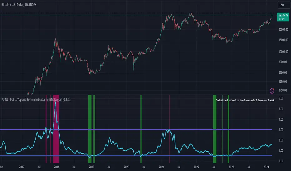
PUELL - PUELL Top and Bottom Indicator for BTC [Logue]Puell Multiple Indicator (PUELL) - The Puell multiple is the ratio between the daily coin issuance in USD and its 365-day moving average. This multiple helps to measure miner profitability. The PUELL indicator smooths the Puell multiple using a 14-day simple moving average. When the PUELL goes to high values relative to historical values, it indicates the profitability of the miners is high and a top may be near. When the PUELL is low relative to historical values, it indicates the profitability of the minors is low and a bottom may be near. The default trigger values are PUELL values above 3.0 for a "top" and below 0.5 for a "bottom".
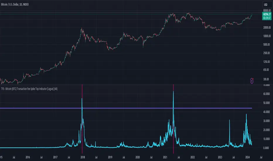
TFS - Bitcoin (BTC) Transaction Fee Spike Top Indicator [Logue]Transaction Fee Spike (TFS) - For bitcoin (BTC), transaction fees on the bitcoin network can signal a mania phase when they increase well above historical values. This mania phase may indicate we are near a top in the BTC price. The transaction fee in USD is directly retrieved from Glassnode. The default trigger for this indicator fires when the transaction fees increase above $44/transaction.
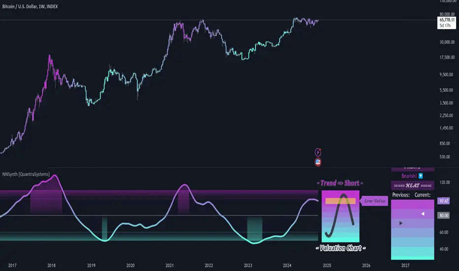
Neural Network Synthesis: Trend and Valuation [QuantraSystems]Neural Network Synthesis - Trend and Valuation
Introduction
The Neural Network Synthesis (𝓝𝓝𝒮𝔂𝓷𝓽𝓱) indicator is an innovative technical analysis tool which leverages neural network concepts to synthesize market trend and valuation insights.
This indicator uses a bespoke neural network model to process various technical indicator inputs, providing an improved view of market momentum and perceived value.
Legend
The main visual component of the 𝓝𝓝𝒮𝔂𝓷𝓽𝓱 indicator is the Neural Synthesis Line , which dynamically oscillates within the valuation chart, categorizing market conditions as both under or overvalued and trending up or down.
The synthesis line coloring can be set to trend analysis or valuation modes , which can be reflected in the bar coloring.
The sine wave valuation chart oscillates around a central, volatility normalized ‘fair value’ line, visually conveying the natural rhythm and cyclical nature of asset markets.
The positioning of the sine wave in relation to the central line can help traders to visualize transitions from one market phase to another - such as from an undervalued phase to fair value or an overvalued phase.
Case Study 1
The asset in question experiences a sharp, inefficient move upwards. Such movements suggest an overextension of price, and mean reversion is typically expected.
Here, a short position was initiated, but only after the Neural Synthesis line confirmed a negative trend - to mitigate the risk of shorting into a continuing uptrend.
Two take-profit levels were set:
The midline or ‘fair value’ line.
The lower boundary of the 𝓝𝓝𝒮𝔂𝓷𝓽𝓱 indicators valuation chart.
Although mean-reversion trades are typically closed when price returns to the mean, under circumstances of extreme overextension price often overcorrects from an overbought condition to an oversold condition.
Case Study 2
In the above study, the 𝓝𝓝𝒮𝔂𝓷𝓽𝓱 indicator is applied to the 1 Week Bitcoin chart in order to inform long term investment decisions.
Accumulation Zones - Investors can choose to dollar cost average (DCA) into long term positions when the 𝓝𝓝𝒮𝔂𝓷𝓽𝓱 indicates undervaluation
Distribution Zones - Conversely, when overvalued conditions are indicated, investors are able to incrementally sell holdings expecting the market peak to form around the distribution phase.
Note - It is prudent to pay close attention to any change in trend conditions when the market is in an accumulation/distribution phase, as this can increase the likelihood of a full-cycle market peak forming.
In summary, the 𝓝𝓝𝒮𝔂𝓷𝓽𝓱 indicator is also an effective tool for long term investing, especially for assets like Bitcoin which exhibit prolonged bull and bear cycles.
Special Note
It is prudent to note that because markets often undergo phases of extreme speculation, an asset's price can remain over or undervalued for long periods of time, defying mean-reversion expectations. In these scenarios it is important to use other forms of analysis in confluence, such as the trending component of the 𝓝𝓝𝒮𝔂𝓷𝓽𝓱 indicator to help inform trading decisions.
A special feature of Quantra’s indicators is that they are probabilistically built - therefore they work well as confluence and can easily be stacked to increase signal accuracy.
Example Settings
As used above.
Swing Trading
Smooth Length = 150
Timeframe = 12h
Long Term Investing
Smooth Length = 30
Timeframe = 1W
Methodology
The 𝓝𝓝𝒮𝔂𝓷𝓽𝓱 indicator draws upon the foundational principles of Neural Networks, particularly the concept of using a network of ‘neurons’ (in this case, various technical indicators). It uses their outputs as features, preprocesses this input data, runs an activation function and in the following creates a dynamic output.
The following features/inputs are used as ‘neurons’:
Relative Strength Index (RSI)
Moving Average Convergence-Divergence (MACD)
Bollinger Bands
Stochastic Momentum
Average True Range (ATR)
These base indicators were chosen for their diverse methodologies for capturing market momentum, volatility and trend strength - mirroring how neurons in a Neural Network capture and process varied aspects of the input data.
Preprocessing:
Each technical indicator’s output is normalized to remove bias. Normalization is a standard practice to preprocess data for Neural Networks, to scale input data and allow the model to train more effectively.
Activation Function:
The hyperbolic tangent function serves as the activation function for the neurons. In general, for complete neural networks, activation functions introduce non-linear properties to the models and enable them to learn complex patterns. The tanh() function specifically maps the inputs to a range between -1 and 1.
Dynamic Smoothing:
The composite signal is dynamically smoothed using the Arnaud Legoux Moving Average, which adjusts faster to recent price changes - enhancing the indicator's responsiveness. It mimics the learning rate in neural networks - in this case for the output in a single layer approach - which controls how much new information influences the model, or in this case, our output.
Signal Processing:
The signal line also undergoes processing to adapt to the selected assets volatility. This step ensures the indicator’s flexibility across assets which exhibit different behaviors - similar to how a Neural Network adjusts to various data distributions.
Notes:
While the indicator synthesizes complex market information using methods inspired by neural networks, it is important to note that it does not engage in predictive modeling through the use of backpropagation. Instead, it applies methodologies of neural networks for real-time market analysis that is both dynamic and adaptable to changing market conditions.
Greenblatts Magic Formula - A multiple approachThis indicator is supposed to help find undervalued stocks. Inspired by Joel Greenblatt's strategy where he ranks stocks with the lowest EV/EBIT and the highest ROC. Inspired by the ERP5 strategy I have added Earnings Yield together with ROC.
My approach and how I use the indicator is to see Magic Formula score as a multiple, rather than ranking the numbers between different stocks. Like P/E for comparison. Different kinds of companies trades at different multiples so you have to compare the current MF Score in relation to historical MF Score to get an idea if it truly is undervalued. You also want to see that price actually reacts to a low MF Score.
As i general rule for myself I stay away from companies with EV/EBIT above 13 and generally want to see MF Score below 6-7. A company trading at a negative MF Score indicates that the company may be heavily undervalued.
Red line = EV/EBIT
Green line = ROC + EY / 2
Yellow line = "MF Score" EVEBIT - (ROC+EY/2)
Blue line = The 50 EMA of MF score
The strategy is simple. Look for companies which might be undervalued. Compare the current MF score to it's history. If it's trading near a previous bottom it indicates that the company might be undervalued. You can also use the MF EMA to see a more smooth curve to interpret the multiple.

Historical PE ratio vs medianThe Trailing Twelve-Month Price-to-Earnings (TTM P/E) Ratio vs. Median Value Indicator is a financial analytical tool designed to assess the current valuation of a stock or index in comparison to its historical norm. This is achieved by calculating the P/E ratio using the sum of the entity's earnings per share (EPS) over the past twelve months and dividing it by its current share price. The resulting TTM P/E ratio is then compared against the median P/E ratio calculated over a specified historical period.
The median P/E ratio serves as a benchmark, representing the midpoint of the entity's valuation over the selected timeframe, thus smoothing out short-term volatility and anomalies. By comparing the current TTM P/E ratio to this median, the indicator provides a relative measure of whether the stock or index is currently overvalued, undervalued, or trading at its historical valuation norms.

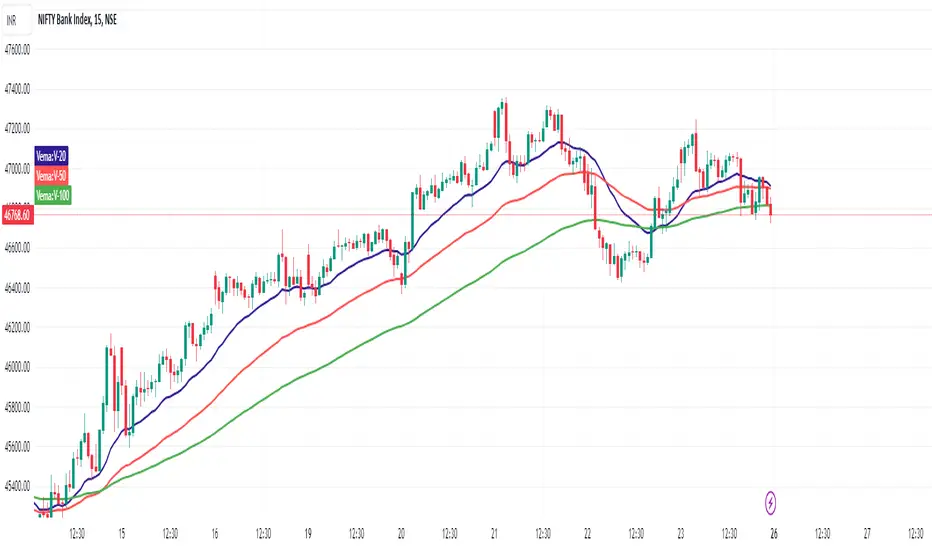
VEMA_LTFVEMA indicator is based on lower time frame volume data and it has 3 lines.
20, 50, 100 moving averages of the close price in each candle with the highest volume.
Effectively working fine and hence sharing.
Will Add more information with examples in next update
Weekend Analysis
There are always discussions about how the weekend affects Crypto-Coins.
It seems that on Monday, the price usually returns to Friday's level.
To make a qualified statement, I wrote this script that tests exactly that
and provides an evaluation.
It displays a candle for Saturday and Sunday.
Either green or red, but also blue if there was hardly any movement.
This threshold is set at 2%, but can be changed in the settings.
If the relative distance from Saturday's open to Friday's close is less than this value,
it counts as the same.
The timeframe should be between day and hour so that Tradingview goes back far enough in the past.
The output (here for BTC)
Total: 477
Lower: 20%
Equal: 55%
Higher: 25%
is displayed in the chart, but also output via the log function.

Optimal Buy Day (Zeiierman)█ Overview
The Optimal Buy Day (Zeiierman) indicator identifies optimal buying days based on historical price data, starting from a user-defined year. It simulates investing a fixed initial capital and making regular monthly contributions. The unique aspect of this indicator involves comparing systematic investment on specific days of the month against a randomized buying day each month, aiming to analyze which method might yield more shares or a better average price over time. By visualizing the potential outcomes of systematic versus randomized buying, traders can better understand the impact of market timing and how regular investments might accumulate over time.
These statistics are pivotal for traders and investors using the script to analyze historical performance and strategize future investments. By understanding which days offered more shares for their money or lower average prices, investors can tailor their buying strategies to potentially enhance returns.
█ Key Statistics
⚪ Shares
Definition: Represents the total number of shares acquired on a particular day of the month across the entire simulation period.
How It Works: The script calculates how many shares can be bought each day, given the available capital or monthly contribution. This calculation takes into account the day's opening price and accumulates the total shares bought on that day over the simulation period.
Interpretation: A higher number of shares indicates that the day consistently offered better buying opportunities, allowing the investor to acquire more shares for the same amount of money. This metric is crucial for understanding which days historically provided more value.
⚪ AVG Price
Definition: The average price paid per share on a particular day of the month, averaged over the simulation period.
How It Works: Each time shares are bought, the script calculates the average price per share, factoring in the new shares purchased at the current price. This average evolves over time as more shares are bought at varying prices.
Interpretation: The average price gives insight into the cost efficiency of buying shares on specific days. A lower average price suggests that buying on that day has historically led to better pricing, making it a potentially more attractive investment strategy.
⚪ Buys
Definition: The total number of transactions or buys executed on a particular day of the month throughout the simulation.
How It Works: This metric increments each time shares are bought on a specific day, providing a count of all buying actions taken.
Interpretation: The number of buys indicates the frequency of investment opportunities. A higher count could mean more consistent opportunities for investment, but it's important to consider this in conjunction with the average price and the total shares acquired to assess overall strategy effectiveness.
⚪ Most Shares
Definition: Identifies the day of the month on which the highest number of shares were bought, highlighting the specific day and the total shares acquired.
How It Works: After simulating purchases across all days of the month, the script identifies which day resulted in the highest total number of shares bought.
Interpretation: This metric points out the most opportune day for volume buying. It suggests that historically, this day provided conditions that allowed for maximizing the quantity of shares purchased, potentially due to lower prices or other factors.
⚪ Best Price
Definition: Highlights the day of the month that offered the lowest average price per share, indicating both the day and the price.
How It Works: The script calculates the average price per share for each day and identifies the day with the lowest average.
Interpretation: This metric is key for investors looking to minimize costs. The best price day suggests that historically, buying on this day led to acquiring shares at a more favorable average price, potentially maximizing long-term investment returns.
⚪ Randomized Shares
Definition: This metric represents the total number of shares acquired on a randomly selected day of the month, simulated across the entire period.
How It Works: At the beginning of each month within the simulation, the script selects a random day when the market is open and calculates how many shares can be purchased with the available capital or monthly contribution at that day's opening price. This process is repeated each month, and the total number of shares acquired through these random purchases is tallied.
Interpretation: Randomized shares offer a comparison point to systematic buying strategies. By comparing the total shares acquired through random selection against those bought on the best or worst days, investors can gauge the impact of timing and market fluctuations on their investment strategy. A higher total in randomized shares might indicate that over the long term, the specific days chosen for investment might matter less than consistent market participation. Conversely, if systematic strategies yield significantly more shares, it suggests that timing could indeed play a crucial role in maximizing investment returns.
⚪ Randomized Price
Definition: The average price paid per share for the shares acquired on the randomly selected days throughout the simulation period.
How It Works: Each time shares are bought on a randomly chosen day, the script calculates the average price paid for all shares bought through this randomized strategy. This average price is updated as the simulation progresses, reflecting the cost efficiency of random buying decisions.
Interpretation: The randomized price metric helps investors understand the cost implications of a non-systematic, random investment approach. Comparing this average price to those achieved through more deliberate, systematic strategies can reveal whether consistent investment timing strategies outperform random investment actions in terms of cost efficiency. A lower randomized price suggests that random buying might not necessarily result in higher costs, while a higher average price indicates that systematic strategies might provide better control over investment costs.
█ How to Use
Traders can use this tool to analyze historical data and simulate different investment strategies. By inputting their initial capital, regular contribution amount, and start year, they can visually assess which days might have been more advantageous for buying, based on historical price actions. This can inform future investment decisions, especially for those employing dollar-cost averaging strategies or looking to optimize entry points.
█ Settings
StartYear: This setting allows the user to specify the starting year for the investment simulation. Changing this value will either extend or shorten the period over which the simulation is run. If a user increases the value, the simulation begins later and covers a shorter historical period; decreasing the value starts the simulation earlier, encompassing a longer time frame.
Capital: Determines the initial amount of capital with which the simulation begins. Increasing this value simulates starting with more capital, which can affect the number of shares that can be initially bought. Decreasing this value simulates starting with less capital.
Contribution: Sets the monthly financial contribution added to the investment within the simulation. A higher contribution increases the investment each month and could lead to more shares being purchased over time. Lowering the contribution decreases the monthly investment amount.
-----------------
Disclaimer
The information contained in my Scripts/Indicators/Ideas/Algos/Systems does not constitute financial advice or a solicitation to buy or sell any securities of any type. I will not accept liability for any loss or damage, including without limitation any loss of profit, which may arise directly or indirectly from the use of or reliance on such information.
All investments involve risk, and the past performance of a security, industry, sector, market, financial product, trading strategy, backtest, or individual's trading does not guarantee future results or returns. Investors are fully responsible for any investment decisions they make. Such decisions should be based solely on an evaluation of their financial circumstances, investment objectives, risk tolerance, and liquidity needs.
My Scripts/Indicators/Ideas/Algos/Systems are only for educational purposes!

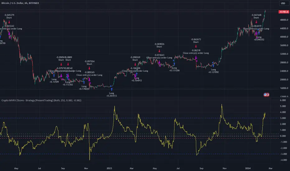
Crypto MVRV ZScore - Strategy [PresentTrading]█ Introduction and How it is Different
The "Crypto Valuation Extremes: MVRV ZScore - Strategy " represents a cutting-edge approach to cryptocurrency trading, leveraging the Market Value to Realized Value (MVRV) Z-Score. This metric is pivotal for identifying overvalued or undervalued conditions in the crypto market, particularly Bitcoin. It assesses the current market valuation against the realized capitalization, providing insights that are not apparent through conventional analysis.
BTCUSD 6h Long/Short Performance
Local
█ Strategy, How It Works: Detailed Explanation
The strategy leverages the Market Value to Realized Value (MVRV) Z-Score, specifically designed for cryptocurrencies, with a focus on Bitcoin. This metric is crucial for determining whether Bitcoin is currently undervalued or overvalued compared to its historical 'realized' price. Below is an in-depth explanation of the strategy's components and calculations.
🔶Conceptual Foundation
- Market Capitalization (MC): This represents the total dollar market value of Bitcoin's circulating supply. It is calculated as the current price of Bitcoin multiplied by the number of coins in circulation.
- Realized Capitalization (RC): Unlike MC, which values all coins at the current market price, RC is computed by valuing each coin at the price it was last moved or traded. Essentially, it is a summation of the value of all bitcoins, priced at the time they were last transacted.
- MVRV Ratio: This ratio is derived by dividing the Market Capitalization by the Realized Capitalization (The ratio of MC to RC (MVRV Ratio = MC / RC)). A ratio greater than 1 indicates that the current price is higher than the average price at which all bitcoins were purchased, suggesting potential overvaluation. Conversely, a ratio below 1 suggests undervaluation.
🔶 MVRV Z-Score Calculation
The Z-Score is a statistical measure that indicates the number of standard deviations an element is from the mean. For this strategy, the MVRV Z-Score is calculated as follows:
MVRV Z-Score = (MC - RC) / Standard Deviation of (MC - RC)
This formula quantifies Bitcoin's deviation from its 'normal' valuation range, offering insights into market sentiment and potential price reversals.
🔶 Spread Z-Score for Trading Signals
The strategy refines this approach by calculating a 'spread Z-Score', which adjusts the MVRV Z-Score over a specific period (default: 252 days). This is done to smooth out short-term market volatility and focus on longer-term valuation trends. The spread Z-Score is calculated as follows:
Spread Z-Score = (Market Z-Score - MVVR Ratio - SMA of Spread) / Standard Deviation of Spread
Where:
- SMA of Spread is the simple moving average of the spread over the specified period.
- Spread refers to the difference between the Market Z-Score and the MVRV Ratio.
🔶 Trading Signals
- Long Entry Condition: A long (buy) signal is generated when the spread Z-Score crosses above the long entry threshold, indicating that Bitcoin is potentially undervalued.
- Short Entry Condition: A short (sell) signal is triggered when the spread Z-Score falls below the short entry threshold, suggesting overvaluation.
These conditions are based on the premise that extreme deviations from the mean (as indicated by the Z-Score) are likely to revert to the mean over time, presenting opportunities for strategic entry and exit points.
█ Practical Application
Traders use these signals to make informed decisions about opening or closing positions in the Bitcoin market. By quantifying market valuation extremes, the strategy aims to capitalize on the cyclical nature of price movements, identifying high-probability entry and exit points based on historical valuation norms.
█ Trade Direction
A unique feature of this strategy is its configurable trade direction. Users can specify their preference for engaging in long positions, short positions, or both. This flexibility allows traders to tailor the strategy according to their risk tolerance, market outlook, or trading style, making it adaptable to various market conditions and trader objectives.
█ Usage
To implement this strategy, traders should first adjust the input parameters to align with their trading preferences and risk management practices. These parameters include the trade direction, Z-Score calculation period, and the thresholds for long and short entries. Once configured, the strategy automatically generates trading signals based on the calculated spread Z-Score, providing clear indications for potential entry and exit points.
It is advisable for traders to backtest the strategy under different market conditions to validate its effectiveness and adjust the settings as necessary. Continuous monitoring and adjustment are crucial, as market dynamics evolve over time.
█ Default Settings
- Trade Direction: Both (Allows for both long and short positions)
- Z-Score Calculation Period: 252 days (Approximately one trading year, capturing a comprehensive market cycle)
- Long Entry Threshold: 0.382 (Indicative of moderate undervaluation)
- Short Entry Threshold: -0.382 (Signifies moderate overvaluation)
These default settings are designed to balance sensitivity to market valuation extremes with a pragmatic approach to trade execution. They aim to filter out noise and focus on significant market movements, providing a solid foundation for both new and experienced traders looking to exploit the unique insights offered by the MVRV Z-Score in the cryptocurrency market.
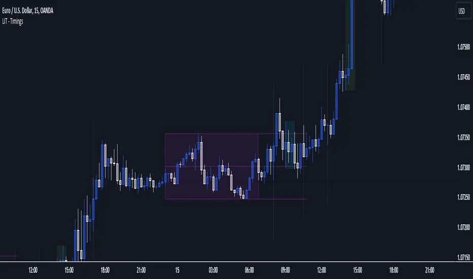
LIT - Timings Fx MartinThe Asia Liquidity Points Indicator is a powerful tool designed for traders to identify key liquidity points during the Asia trading session. This script is tailored specifically to aid traders in capitalizing on the unique characteristics of Asian markets, providing invaluable insights into liquidity zones that can significantly enhance trading decisions.
Key Features:
Asia Session Focus: The indicator focuses exclusively on the Asia trading session, which encompasses the trading activity primarily in the Asian markets such as Tokyo, Hong Kong, Singapore, and others.
Liquidity Zones Identification: The script utilizes advanced algorithms to identify and map out liquidity zones within the Asia trading session. These zones represent areas where significant buying or selling pressure is likely to occur, thus presenting lucrative trading opportunities.
Customizable Parameters: Traders have the flexibility to customize various parameters such as time frame, sensitivity, and display options to suit their trading preferences and strategies.
Visual Alerts: The indicator provides visual alerts on the trading chart, clearly indicating the location and strength of liquidity points. This feature enables traders to quickly identify potential entry or exit points based on the liquidity dynamics in the market.
Real-Time Updates: The script continuously monitors market activity during the Asia session, providing real-time updates on liquidity points as they evolve. This ensures traders stay informed and adaptable to changing market conditions.
Integration with Trading Strategies: The Asia Liquidity Points Indicator seamlessly integrates with various trading strategies, serving as a valuable tool for both discretionary and algorithmic traders. Whether used in isolation or in combination with other technical analysis tools, this indicator can enhance trading performance and profitability.
User-Friendly Interface: The indicator boasts a user-friendly interface, making it accessible to traders of all levels of experience. Whether you are a novice trader or a seasoned professional, you can easily incorporate this tool into your trading arsenal.
In conclusion, the Asia Liquidity Points Indicator offers traders a strategic advantage in navigating the nuances of the Asia trading session. By identifying key liquidity zones and providing real-time insights, this script empowers traders to make informed decisions and capitalize on lucrative trading opportunities in the dynamic Asian markets.
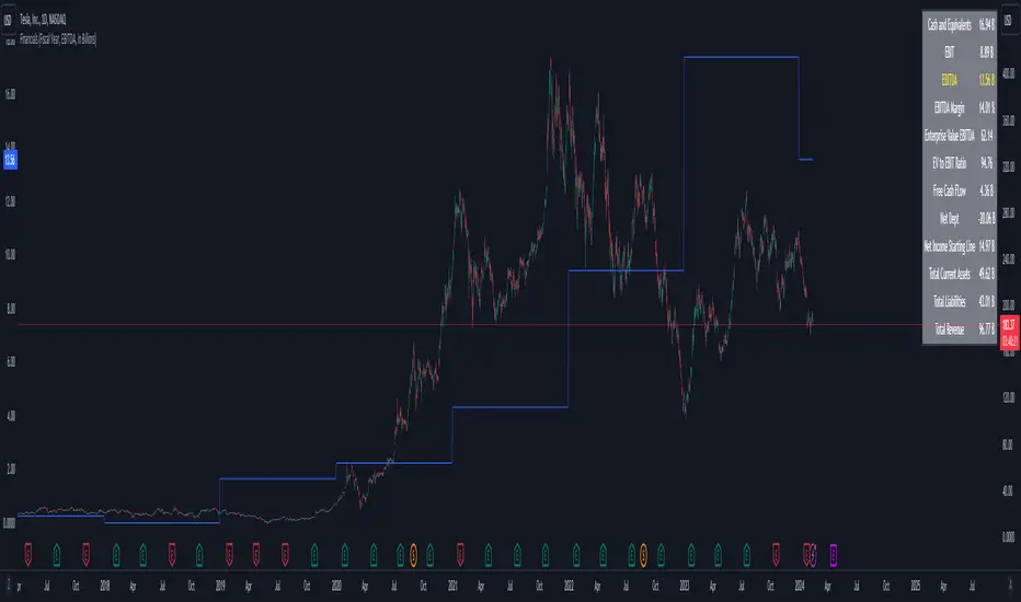
Company FinancialsThis fundamental indicator shows the latest figures for the selected ticker (assuming they are published in Factset)
The relevant metrics include:
- Cash and Equivalents
- EBIT
- EBITDA
- EBITDA Margin
- Enterprise Value EBID
- Enterprise Value EBITDA
- Free Cash Flow
- Net Debt
- Net Income Starting Line
- Total Current Assets
- Total Liabilities
- Total Revenue
These metrics are available for the Fiscal Year or Fiscal Quarter
Each metric can be chosen and plotted along with the price (values are on the left axis)
Blockunity Address Synthesis (BAS)Track the address status of the various cryptoassets and their evolution.
The Idea
The goal is to provide a simple tool for visualizing the evolution of different types of crypto addresses.
How to Use
This tool is to be used as fundamental information. It is not intended for investment or trading purposes.
Elements
Active Addresses
Active Addresses represent the subset of total addresses that made one or more on-chain transaction on a given day.
New Addresses
New Addresses refer to addresses that receive their first deposit in the selected crypto-asset.
Zero Balance Addresses
Zero Balance Addresses are addresses that transferred out (potentially sold) all of their holdings for the selected crypto-asset.
Total Addresses
Total Addresses refer to the overall count of unique addresses that have been created on a blockchain network.
Settings
In the settings, you can :
Adjust line smoothing (in terms of number of days).
Change the lookback period used to calculate the different variations.
Display or not the different address types (for better visualization, Total Addresses should be shown alone).
Show or hide labels and configure their offset.
Lastly, you can modify all table parameters.

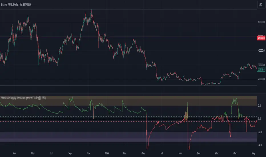
Crypto Stablecoin Supply - Indicator [presentTrading]█ Introduction and How it is Different
The "Stablecoin Supply - Indicator" differentiates itself by focusing on the aggregate supply of major stablecoins—USDT, USDC, and DAI—rather than traditional price-based metrics. Its premise is that fluctuations in the total supply of these stablecoins can serve as leading indicators for broader market movements, offering traders a unique vantage point to anticipate shifts in market sentiment.
BTCUSD 6h for recent bull market
BTCUSD 8h
█ Strategy, How it Works: Detailed Explanation
🔶 Data Collection
The strategy begins with the collection of the closing supply for USDT, USDC, and DAI stablecoins. This data is fetched using a specified timeframe (**`tfInput`**), allowing for flexibility in analysis periods.
🔶 Supply Calculation
The individual supplies of USDT, USDC, and DAI are then aggregated to determine the total stablecoin supply within the market at any given time. This combined figure serves as the foundation for the subsequent statistical analysis.
🔶 Z-Score Computation
The heart of the indicator's strategy lies in the computation of the Z-Score, which is a statistical measure used to identify how far a data point is from the mean, relative to the standard deviation. The formula for the Z-Score is:
Z = (X - μ) / σ
Where:
- Z is the Z-Score
- X is the current total stablecoin supply (TotalStablecoinClose)
- μ (mu) is the mean of the total stablecoin supply over a specified length (len)
- σ (sigma) is the standard deviation of the total stablecoin supply over the same length
A moving average of the Z-Score (**`zScore_ma`**) is calculated over a short period (defaulted to 3) to smooth out the volatility and provide a clearer signal.
🔶 Signal Interpretation
The Z-Score itself is plotted, with its color indicating its relation to a defined threshold (0.382), serving as a direct visual cue for market sentiment. Zones are also highlighted to show when the Z-Score is within certain extreme ranges, suggesting overbought or oversold conditions.
Bull -> Bear
█ Trade Direction
- **Entry Threshold**: A Z-Score crossing above 0.382 suggests an increase in stablecoin supply relative to its historical average, potentially indicating bullish market sentiment or incoming capital flow into cryptocurrencies.
- **Exit Threshold**: Conversely, a Z-Score dropping below -0.382 may signal a reduction in stablecoin supply, hinting at bearish sentiment or capital withdrawal.
█ Usage
Traders can leverage the "Stablecoin Supply - Indicator" to gain insights into the underlying market dynamics that are not immediately apparent through price analysis alone. It is particularly useful for identifying potential shifts in market sentiment before they are reflected in price movements. By integrating this indicator with other technical analysis tools, traders can develop a more rounded and informed trading strategy.
█ Default Settings
- Timeframe Input (`tfInput`): Allows users to specify the timeframe for data collection, adding flexibility to the analysis.
- Z-Score Length (`len`): Set to 252 by default, representing the period over which the mean and standard deviation of the stablecoin supply are calculated.
- Color Coding: Uses distinct colors (green for bullish, red for bearish) to indicate the Z-Score's position relative to its thresholds, enhancing visual clarity.
- Extreme Range Fill: Highlights areas between defined high and low Z-Score thresholds with distinct colors to indicate potential overbought or oversold conditions.
By integrating considerations of stablecoin supply into the analytical framework, the "Stablecoin Supply - Indicator" offers a novel perspective on cryptocurrency market dynamics, enabling traders to make more nuanced and informed decisions.
[Spinn] All Time High MonitorThis indicator is made in addition to the free |Spinn| All Time High indicator (here's the link: click ). With this Monitor, you can see the status of a large number of coins at once and choose a coin for analysis, while with the second indicator, you can analyze the chart of the selected coin.
Definitions
For simplification, in the following text, I will refer to the price movement from one value to another, expressed in percentages and/or multiples, as "distance".
ATH - All Time High
Low - the minimum reached after the ATH
Price - current price
Last Dump - distance from ATH to Low
Potential Growth - distance from Price to ATH
The indicator displays a table with the names of the coins. For each coin, you can see the distance from Price to ATH, and the distance from ATH to Low.
Since it is impossible to process more than forty coins in one indicator, the table contains up to forty coins (plus you can see the current coin). However, you can make several copies of the indicator and monitor up to nine tables simultaneously on one chart in different parts of the screen - that's more than three hundred coins. By the way, to prevent the current chart from obstructing the view, I recommend hiding it - for this, you need to click on the 👁️ next to the coin's name in the object tree (on the right, on the panel).
The code of the indicator includes 360 coins (9 sets of 40 coins), taken from the Coinmarketcap website at the time of the indicator's publication, and exchanges: Binance, Bybit, Okx, Bitget, BingX, and Huobi. Additionally, there is an option to set your custom set of coins (in the zero set). By default, the coins are sorted by the Coinmarketcap rating, but they can be sorted alphabetically. In the settings, you can specify any exchange and base currency (by default, it is USDT).
If a particular coin is not traded on the exchange, the background will be dark gray. You can set three thresholds of multiples, for which coins will be highlighted in different colors. Additionally, coins with the last dump of 99% or more are marked with the ⛔️ sign (you can change this parameter).
The indicator works on a weekly timeframe, if the timeframe is smaller, an error will be displayed. This is done to ensure that historical bars are not "cut off" on junior timeframes. Moreover, the indicator works faster this way.
----------
Этот индикатор сделан в дополнение к бесплатному индикатору |Spinn| All Time High (вот ссылка на него: тыц ). С помощью данного Монитора вы можете увидеть статус большого количества монет одновременно и выбрать монету для анализа, с помощью второго индикатора вы можете анализировать график выбранной монеты.
Определения
Для упрощения дальше в тексте я буду называть расстоянием ход цены от одного значения к другому, выраженный в процентах и/или иксах.
ATH - исторический максимум
Low - минимум, который был достигнут после ATH
Price - текущая цена
Последний дамп - расстояние от ATH до Low
Потенциальный рост - расстояние от Price до ATH
Индикатор выводит таблицу с названиями монет. Для каждой монеты можно увидеть расстояние от Price до ATH, расстояние от ATH до Low.
Поскольку невозможно обрабатывать более сорока монет в одном индикаторе, то таблица содержит до сорока монет (плюс можно видеть текущую монету). Однако можно сделать несколько копий индикатора и мониторить на одном графике одновременно до девяти таблиц в разных частях экрана - это три с лишним сотни монет. Кстати, чтобы текущий график не закрывал обзор, я рекомендую его скрыть - для этого надо кликнуть на 👁️ возле названия монеты в дереве объектов (справа, на панели).
В код индикатора зашиты 360 монет (9 наборов по 40 монет), взятых с сайта Coinmarketcap в момент публикации индикатора, а также биржи: Binance, ByBit, Okx, BitGet, BingX, Huobi, GateIO, MEXC, CoinEx и KuCoin. Кроме того, есть возможность задать свой кастомный набор монет (в нулевом наборе). По умолчанию монеты отсортированы по рейтингу Coinmarketcap, но их можно отсортировать по алфавиту. В настройках можно задать любую биржу и базовую валюту (по умолчанию это USDT).
Если данная монета не торгуется на бирже, то фон будет темно-серый. Вы можете задать три порога иксов, для которых монеты будут подсвечены разными цветами. Кроме того, знаком ⛔️ помечены монеты, у которых последний дамп составил 99% и больше (вы можете менять этот параметр).
Индикатор работаеть на недельном таймфрейме, если таймфрейм будет меньше, то будет выдана ошибка. Это сделано для того, чтобы не были «обрезаны» исторические бары на более младших таймфреймах. Кроме того, индикатор так работает шустрее.

[Spinn] All Time HighOverall, the cryptocurrency market moves cyclically upwards. There is a renewal of the All Time High (ATH), followed by a dump, accumulation over several years, and a new renewal of the ATH.
In a bullish cryptocurrency market, Bitcoin usually grows before other coins (which makes sense - the crowd invests money first in what is growing), then there is a shift of money from Bitcoin to altcoins, and altcoins catch up to Bitcoin (and often grow by larger percentages than Bitcoin, as their market capitalization is significantly less).
After Bitcoin grew and it became obvious that we are at the beginning of a bull market, I thought it would be a good idea to invest a certain amount in altcoins that have the potential for good growth. (By the way, I like the idea of closing half of the position at two times the gain to get back my investment and have free coins - even in the case of a "black swan" there will be profit and one can sleep peacefully.)
Therefore, I made this indicator to understand which alts are still at the bottom, to be able to buy them as an investment. Of course, this does not cancel out other analysis - the number of coins held by early investors, etc., but for starters, I wanted to choose a list of coins for further research.
The main goal of this indicator is to find coins that are far from their All Time High, to understand the distance they need to travel from the current price to the ATH. The indicator can also be used as a quick marker - to see on which exchanges from a given list the current coin is traded (for this, you can remove all drawing elements except for the second table) - after all, it's cool: you switch between coins and instantly see how many exchanges it is traded on.
In the process, the indicator searches for the All Time High (ATH), after which it searches for the Low, after which it searches for the High again. All three points are marked with horizontal lines. For simplicity, in the text below, I will refer to the price movement from one value to another, expressed in percentages and/or multiples, as "distance."
As a criterion for analysis, I chose the distance between the All Time High and the dump (distance from ATH to Low) after it. Firstly, I will not consider coins where the dump was more than 99%. Sure, many of them will shoot up and may even give hundreds of multiples, but I do not consider it sensible to experiment with them. Moreover, many coins have already grown quite significantly - they do not interest me either. In this study, I am interested in coins that existed before the beginning of Bitcoin's dump in the fall of 2021 and that can show from 5 to 10 multiples, as well as coins that fell very little during this Bitcoin dump, such as OKB from the Okx exchange.
The indicator outputs two tables. In the first one, it outputs values for the current chart:
Distance from the current price (Price) to ATH
Distance from Low to ATH
Ratio of segments |Low..Price| to |Price..ATH|
The same, but comparing not with the current price, but with High
The size of the drop (distance) from ATH to Low
Distance from Low to ATH
In the second one, it compares three indicators of the current trading pair on several exchanges (Binance, Okx, Bitget, Bybit, BingX, Huobi, GateIO, MEXC, CoinEx, KuCoin). You can set the names of the exchanges yourself:
Distance from Price to ATH
Distance from Low to ATH
ATH
Start date of trading for the trading pair (date of the first bar)
The size of the chart history in weeks
The indicator compares charts to USDT, USDC, USD, and USDT.P and selects the pair with the longest history. Here it shows the ticker of the selected currency
To understand how close we are to the All Time High, I analyze such parameters:
The size of the last big dump
How many percent from the current price is needed to reach ATH
How many percent we have already grown from the lowest point of the fall
What part of the path from the lowest point to ATH we have already passed
Furthermore, you can plot a dotted horizontal line on the chart, which will divide the distance from Low to ATH in a given ratio, for example, as 20 to 80 or as 10 to 90. This way, we can assess whether the price is below this line, which may help in our analysis.
It is intended that the indicator should work on a weekly timeframe; if the timeframe is smaller, there is a risk that not all historical bars will be processed, and then the results will be false. Nevertheless, on most charts, even the hourly timeframe works fine (although, perhaps, this depends on your subscription to Tradingview - lower subscriptions provide a smaller number of historical bars).
Note 1.
On coins with a short history, such analysis does not make sense, the indicator is useless. Also, if the coin made a new high and there has not been a dump yet, then the indicator has fulfilled its function, and it will only be useful on the next dump.
Note 2.
If the price made a +100% increase, then the value doubled, i.e., the coin made two multiples. If the price grew by 900%, then the value increased tenfold = 10 multiples.
Note 3.
This indicator is not a guarantee that the coin will reach its All Time High. It is merely a kind of calculator that helps analyze the price position on the chart and make trading decisions.
----------
В целом, рынок криптовалют движется циклически вверх. Происходит обновление исторического максимума (All Time High или ATH), потом происходит дамп, накопление в течение нескольких лет, и новое обновление исторического максимума.
На бычьем рынке криптовалют Биткоин обычно растет раньше других монет (это и понятно - толпа вкладывает деньги в первую очередь в то, что растет), затем происходит перелив денег из биткоина в альткоины, и альткоины подтягиваются к битку (и часто растут на бОльшие проценты, чем биткоин, так как их капитализация существенно меньше).
После того, как биткоин вырос и стало очевидно, что мы находимся в начале бычьего рынка, я задумался, что неплохо было бы инвестировать некую сумму в альткоины, которые имеют потенциал к хорошему росту. (Кстати, мне нравится идея закрывать половину позиции при двух иксах, чтобы вернуть себе инвестицию и иметь бесплатные монеты - даже в случае «черного лебедя» будет профит и можно спать спокойно.)
Поэтому я сделал этот индикатор, чтобы понять, какие альты еще болтаются внизу, чтобы успеть их купить в качестве инвестиции. Понятно, что никто не отменял прочий анализ - количество монет у ранних инвесторов и т.п., но для начала я хотел выбрать список монет для дальнейшего исследования.
Итак, главная цель данного индикатора - найти монеты, которые находятся далеко от своего исторического максимума, чтобы понять, какое расстояние им нужно пройти от текущей цены до ATH. Также индикатор можно использовать в качестве быстрого маркера - на каких биржах из заданного списка торгуется текущая монета (для этого можно убрать все элементы рисования кроме второй таблицы) - ведь это круто: переключаетесь между монетами и мгновенно видите на скольки биржах она торгуется.
В процессе работы индикатор ищет исторический максимум (ATH), после которого он ищет минимум (Low), после которого он снова ищет максимум (High). Все три точки отмечены горизонтальными линиями. Для упрощения дальше в тексте я буду называть расстоянием ход цены от одного значения к другому, выраженный в процентах и/или иксах.
В качестве критерия для анализа я выбрал расстояние между историческим максимумом и дампом (расстояние от ATH до Low) после него. Во-первых, я не буду рассматривать монеты, у которых дамп был больше 99%. Нет, конечно, многие из них выстрелят, и дадут может даже и сотни иксов, но ставить эксперименты с ними я не считаю целесообразным. Кроме того, многие монеты подросли уже достаточно сильно - они меня тоже не интересуют. В данном исследовании меня интересуют монеты, которые существовали до начала дампа битка осенью 2021-го года и которые могут показать от 5 до 10 иксов, а также монеты, которые на этом дампе битка упали совсем мало, как, например, OKB от биржи Okx.
Индикатор выводит две таблицы. В первой он выводит значения для текущего графика:
расстояние от текущей цены (Price) до ATH
расстояние от Low до ATH
соотношение отрезков |Low..Price| и |Price..ATH|
то же самое, но сравниваем не с текущей ценой, а с High
размер падения (расстояние) от ATH до Low
расстояние от Low до ATH
Во второй - он сравнивает три показателя текущей торговой пары на нескольких биржах (Binance, Okx, Bitget, Bybit, BingX, Huobi, GateIO, MEXC, CoinEx, KuCoin, названия бирж можно задавать самостоятельно):
расстояние от Price до ATH
расстояние от Low до ATH
ATH
Дата старта торгов по торговой паре (дата первого бара)
Размер истории графика в неделях
Индикатор сравнивает графики к USDT, USDC, USD и USDT.P и выбирает пару с самой длинной историей. Здесь он показывает тикер выбранной валюты
Для того, чтобы понять, насколько мы приблизились к историческому максимуму, я анализирую такие параметры:
размер последнего большого дампа
на сколько процентов от текущей цены надо вырасти, чтобы достичь ATH
на сколько процентов мы уже выросли от самой нижней точки падения
какую часть пути от нижней точки до ATH мы уже прошли
Кроме того, можно вывести на график пунктирную горизонтальную линию, которая будет разделять расстояние от Low до ATH в заданном соотношении, например, как 20 к 80 или как 10 к 90. Таким образом, мы сможем оценивать, находится ли цена ниже этой линии, что может помочь в нашем анализе.
Предусмотрено, что индикатор должен работать на недельном таймфрейме, если таймфрейм будет меньше, то есть риск, что не все исторические бары будут обработаны, и тогда результаты будут ложными. Тем не менее, на большинстве графиков даже часовой таймфрейм работает нормально (хотя, наверное, это зависит от вашей подписки на Tradingview - на младших подписках предоставляется меньшее количество исторических баров).
Примечание 1.
На монетах с короткой историей такой анализ смысла не имеет, индикатор бесполезен. Также, если монета сделала перехай и еще не было дампа, то индикатор выполнил свою функцию, и он пригодится только на следующем дампе.
Примечание 2.
Если цена сделала +100%, то стоимость увеличилась в 2 раза, то есть, монета сделала два икса. Если цена выросла на 900%, то стоимость увеличилась в 10 раз = 10 иксов.
Примечание 3.
Данный индикатор не является гарантией того, что монета достигнет своего исторического максимума. Он является лишь своего рода калькулятором, который помогает анализировать положение цены на графике и принимать торговые решения.

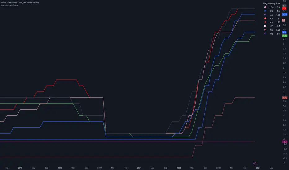
Interest Rate IndicatorThis script offers a overview of Year-over-Year (YoY) interest rates for key countries. The interest rate data utilized by default are sourced from TradingView Tickers, but they can be modified to any preferred source via the settings.
The script does not perform any calculations; its primary function is to present a comparative view of interest rates across different countries in a single indicator.
Key features include:
Interest rate data for the USA, European Union, Australia, Canada, Switzerland, Japan, United Kingdom, and New Zealand (Interest Rate Symbols are editable in the settings).
A table displaying country flags, names, and the latest interest rates, providing a clear and immediate comparison.
Country-representative colors for easy identification and visual distinction between different countries' data.
This indicator is designed for traders and analysts looking for a quick and efficient way to monitor and compare the interest rates of major economies directly within TradingView, facilitating better informed financial and investment decisions.
Debasement Adjusted CAGREquity growth may appear less significant when juxtaposed with the expansion of the money supply. This is because markets tend to adjust prices to reflect changes in money supply almost immediately.
Our indicator offers a unique perspective by adjusting the current ticker price for the M2 money supply and normalizing this data to show the percentage appreciation since the first visible bar on the chart. Users can also select alternative money supply measures, such as the EU-M2, via the indicator's settings.
This approach essentially redefines the price as the "growth of the relative share of the total money supply," providing a novel lens through which to view equity performance.
Additionally, the indicator computes both the Compound Annual Growth Rate (CAGR) and the total growth observed from this adjusted standpoint. These metrics are calculated within the context of the selected time range, adding depth to the analysis.
Although this indicator is compatible with all timeframes, it is primarily designed as a macroeconomic tool. It yields the most meaningful insights when applied to longer-term perspectives, such as weekly or monthly timeframes.
This tool builds upon the foundational work presented in the "Inflation Adjusted Performance Ticker," accessible at Inflation Adjusted Performance Ticker , enhancing its application by normalizing the results and computing CAGR and total growth.

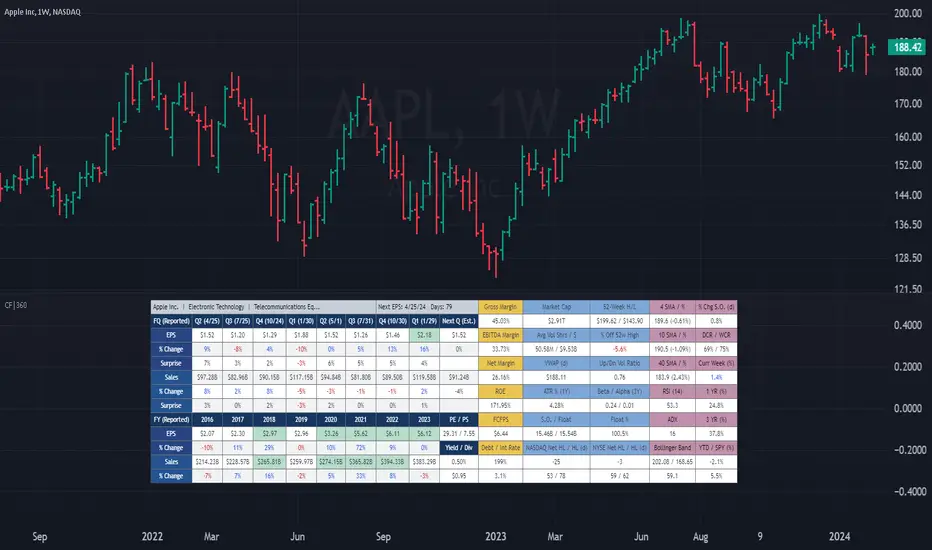
(CF|360) Caruso Financial DashboardThe Caruso Financial 360 Dashboard (CF|360) revolutionizes your TradingView charts by seamlessly integrating comprehensive Fundamental, Statistical, Technical, Performance, and Event information into an intuitively organized dashboard. This empowers users to make informed investment decisions effortlessly, eliminating the need to switch between pages or applications.
The dashboard is strategically divided into five distinct sections, each color-coded for user-friendly navigation. A quick glance at the dark blue "Fundamentals" table reveals two years of quarterly EPS and Sales data, YoY % change, and Surprise %, complete with report dates. Users can explore eight years of annual data and choose between Non-GAAP EPS, Diluted EPS, and Basic EPS for versatile analysis. Opting for Non-GAAP EPS also unveils next quarter estimates. The Fundamentals section further encompasses P/E and P/S data, alongside TTM dividend and dividend yield information.
In the yellow "Extended Fundamentals" section, users gain insights into Gross, EBITDA, and Net margins for easy profitability comparisons within the same industry group. Return on Equity data and Free Cashflow per share provide perspectives on profitability, efficiency, and financial flexibility.
The light blue "Statistics" section furnishes essential statistical measures for a rapid grasp of a company's trading characteristics. Metrics such as Market Cap, Average Volume per day (Shares and $ value), VWAP, Up/Down volume ratio, ATR%, Alpha, Beta, Shares Outstanding & Float, 52-week High/Low, and % distance from the 52-week high are presented. Additionally, market breadth is depicted through Nasdaq and NYSE 52-week high/low data.
The purple "Technical & Performance" section seamlessly integrates both Technical Analysis data and Performance statistics, enabling users to assess the stock's technical context and performance against the market over different periods. Technical indicators, including three customizable moving average types, RSI, ADX, Bollinger Band, Keltner Band, and daily and weekly closing ranges, are featured.
The grey top "Events" section offers a quick overview of the next earnings release date, countdown, and associated color changes as the date approaches. Company name, sector, and industry details are also presented.
To enhance information visibility, record EPS and Sales data are highlighted, emphasizing new records, along with highlights for new 52-week highs and lows.
The CF|360 offers customization options , including three display styles for Desktops, Desktop Slim, and Mobile devices.
Users can also tailor the lengths of technical indicators to suit their preferences. International market enthusiasts will appreciate that the CF|360 provides financial and market data for various regions, including the US, EU, Canada, and beyond.
88 Metrics Included:
Fundamentals Section (Dark Blue Group)
EPS (Adjusted Non-GAAP, Diluted, Basic)
- Quarterly, YoY % Chg, Surprise, Report Date, Next Quarter Estimate (Adjusted EPS only)
- Annual, YoY % Chg
Sales
- Quarterly, YoY % Chg, Surprise, Report Date, Next Quarter Estimate
- Annual, YoY % Chg
P/E ratio
P/S ratio
Dividend TTM
Dividend TTM Yield
Fundamentals Extended (Yellow Group)
Gross Margin
EBITDA Margin
Net Margin
Return on Equity (ROE)
Free Cashflow per Share (FCFPS)
Debt to Equity (Debt)
Effective Interest Rate (Int Rate)
Statistics (Light Blue Group)
Market Cap
Average Daily Volume (Shares)
Average Daily Volume (Dollar Value)
VWAP (Daily)
Average True Range Percent
Shares Outstanding
Shares in Float
Percentage of Share in Float
52-Week High
52-Week Low
% off of 52-Week High
Up / Down Volume Ratio
Beta
Alpha
Nasdaq Net 52-Week High/Lows
Nasdaq 52-Week Highs
Nasdaq 52-Week Lows
NYSE Net 52-Week High/Lows
NYSE 52-Week Highs
NYSE 52-Week Lows
Technical & Performance (Purple Group)
Moving Average Value (3 different averages)
Distance from Moving Average (3 different averages)
Relative Strength Index (RSI)
Average Directional Index (ADX)
Bollinger Band Value (Upper/Lower)
%b
Keltner Band Value (Upper/Lower)
%k
Percentage Changes Since Today’s Open
Daily Closing Range (DCR)
Weekly Closing Range (WCR)
Current Week % Change
1 Month % Change
3 Month % Change
6 Month % Change
1 Year % Change
3 Year % Change
YTD % Change
S&P 500 YTD % Change
Name, Group, & Events (Grey Section)
Company Name
Sector
Industry
Next Earnings Date
Days Until Next Earnings Date
Event Highlights
Record EPS (Quarterly/Annual)
Record Sales (Quarterly/Annual)
52-Week High
52-Week Low
Layout Types
Desktop
Get the full experience with the Desktop view.
Desktop Slim
Save screen real estate with a slim version of the dashboard.
Mobile
Take the most vital metrics with you on your mobile device. For the best experience, view in landscape mode.