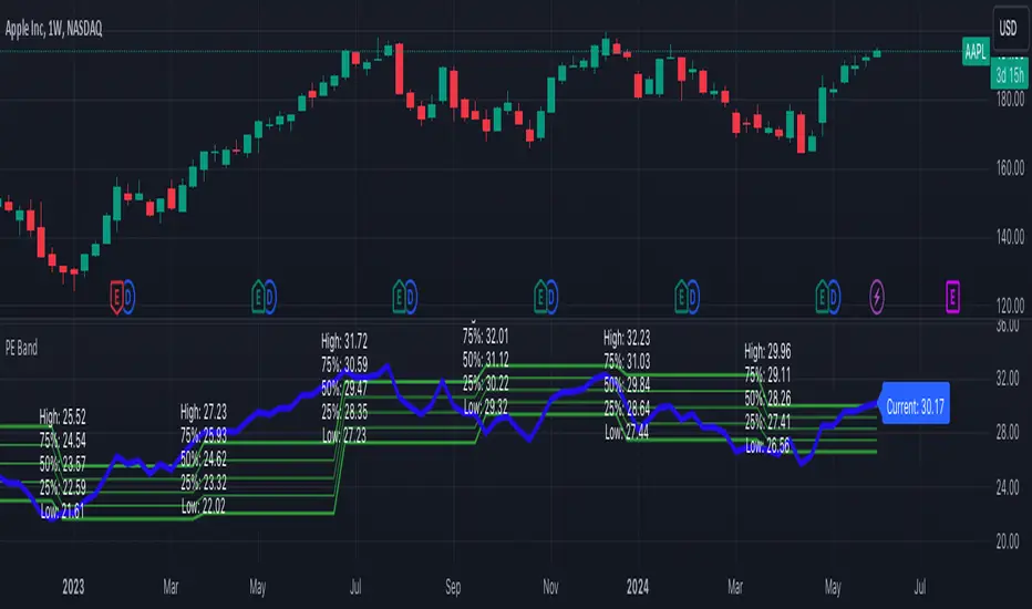
PE BandThe PE Band shows the highest and lowest P/E in the previous period with TTM EPS. If the current P/E is lower than the minimum P/E, it is considered cheap. In other words, higher than the maximum P/E is considered expensive.
PE Band consists of 2 lines.
- Firstly, the historical P/E value in "green" (if TTM EPS is positive) or "red" (if TTM EPS is negative) states will change according to the latest high or low price of TTM EPS, such as: :
After the second quarter of 2023 (end of June), how do prices from 1 July – 30 September reflect net profits? The program will get the highest and lowest prices during that time.
After the 3rd quarter of 2023 (end of September), how do prices from 1 Oct. - 31 Dec. reflect net profits? The program will get the highest and lowest prices during that time.
- Second, the blue line is the closing price divided by TTM EPS, which shows the current P/E.
Fundamental Analysis
Quaterly Earnings,Sectors/Industry,Moving AveragesDescription:
The EPS & Revenue indicator is designed to provide detailed financial insights into a company's performance by displaying key financial metrics such as Earnings Per Share (EPS), Total Revenue, Free Float, Operating Income, and Return on Equity (ROE). The indicator also calculates and visualizes the percentage changes in these metrics over different quarters, offering a comprehensive view of the company's financial health.
Features:
Table Display:
A customizable table that can be positioned in various locations on the chart (e.g., top left, top center, bottom right, etc.).
Color-coded cells to indicate positive and negative changes in financial metrics.
Dynamic text size and color for better readability.
Financial Metrics:
EPS (Earnings Per Share): Displays the EPS values for the current and previous quarters.
Total Revenue: Shows revenue values in crores (Cr) for multiple quarters.
Free Float: Represents the number of freely floating shares.
Operating Income (OP): Indicates the operating income for the company.
Return on Equity (ROE): Displays the ROE values for multiple quarters.
Calculations:
EPS Year-over-Year (YoY) Change: Calculates the YoY percentage change in EPS.
Quarter-over-Quarter (QoQ) Change: Computes the percentage change in EPS and sales for different quarters.
Sales in Crores: Displays sales values in crores (Cr) and calculates the QoQ changes.
Operating Profit Margin (OPM): Calculates the operating profit margin as a percentage of sales.
52-Week High/Low: Shows the highest and lowest prices over the past 52 weeks.
Average Daily Range (ADR): Computes the average daily range percentage.
Turnover: Displays the average turnover period and current turnover values.
Relative Volume (Rvol): Indicates the relative trading volume compared to the average.
Color Coding:
Uses different colors to highlight significant changes in metrics (e.g., dark green for strong positive changes, light green for moderate positive changes, red for negative changes).
Adjustable transparency based on the magnitude of the change.
Customization:
User inputs for table position, color settings, and calculation periods for turnover and relative volume.
Text labels for various columns and rows in the table to enhance clarity.
How to Use:
Add the EPS & Revenue indicator to your TradingView chart.
Customize the table position and color settings as per your preference.
Analyze the displayed financial metrics and percentage changes to gain insights into the company's performance.
Use the color-coded cells to quickly identify significant changes and trends in EPS, revenue, operating income, and other key metrics.
Example Output:
The table will display current and past EPS values, percentage changes in EPS and sales, operating profit margins, ROE values, turnover, relative volume, and the percentage up from 52-week low and down from 52-week high.
The data will be color-coded to indicate positive and negative changes, making it easier to interpret the company's financial performance at a glance.
This indicator is ideal for investors and traders who want to keep a close eye on a company's financial health and make informed decisions based on detailed financial data.

Wolf DCA CalculatorThe Wolf DCA Calculator is a powerful and flexible indicator tailored for traders employing the Dollar Cost Averaging (DCA) strategy. This tool is invaluable for planning and visualizing multiple entry points for both long and short positions. It also provides a comprehensive analysis of potential profit and loss based on user-defined parameters, including leverage.
Features
Entry Price: Define the initial entry price for your trade.
Total Lot Size: Specify the total number of lots you intend to trade.
Percentage Difference: Set the fixed percentage difference between each DCA point.
Long Position: Toggle to switch between long and short positions.
Stop Loss Price: Set the price level at which you plan to exit the trade to minimize losses.
Take Profit Price: Set the price level at which you plan to exit the trade to secure profits.
Leverage: Apply leverage to your trade, which multiplies the potential profit and loss.
Number of DCA Points: Specify the number of DCA points to strategically plan your entries.
How to Use
1. Add the Indicator to Your Chart:
Search for "Wolf DCA Calculator" in the TradingView public library and add it to your chart.
2. Configure Inputs:
Entry Price: Set your initial trade entry price.
Total Lot Size: Enter the total number of lots you plan to trade.
Percentage Difference: Adjust this to set the interval between each DCA point.
Long Position: Use this toggle to choose between a long or short position.
Stop Loss Price: Input the price level at which you plan to exit the trade to minimize losses.
Take Profit Price: Input the price level at which you plan to exit the trade to secure profits.
Leverage: Set the leverage you are using for the trade.
Number of DCA Points: Specify the number of DCA points to plan your entries.
3. Analyze the Chart:
The indicator plots the DCA points on the chart using a stepline style for clear visualization.
It calculates the average entry point and displays the potential profit and loss based on the specified leverage.
Labels are added for each DCA point, showing the entry price and the lots allocated.
Horizontal lines mark the Stop Loss and Take Profit levels, with corresponding labels showing potential loss and profit.
Benefits
Visual Planning: Easily visualize multiple entry points and understand how they affect your average entry price.
Risk Management: Clearly see your Stop Loss and Take Profit levels and their impact on your trade.
Customizable: Adapt the indicator to your specific strategy with a wide range of customizable parameters.

Tripart Super Forex IndicatorOverview
The “Tripart Super Forex Indicator” is an advanced trading tool designed specifically for intraday trading and scalping. It combines the power of Exponential Moving Averages (EMAs), Average True Range (ATR), and the Relative Strength Index (RSI) to generate precise buy and sell signals. This indicator helps traders identify trend direction, volatility, and momentum, ensuring well-timed entry and exit points in the forex market.
What It Does
The Tripart Super Forex Indicator provides traders with the following:
1. Entry Signals: Buy and sell signals are generated based on the crossover of short-
term and long-term EMAs combined with ATR-based volatility filtering.
2. Exit Signals: Exit signals are generated using RSI to identify overbought and oversold
conditions, ensuring timely exits to lock in profits.
3. Trailing Stop-Loss: Dynamic trailing stop-loss levels are calculated using ATR to
manage risk effectively during trades.
How It Works
1. Exponential Moving Averages (EMAs):
• Short-term EMA: Represents recent price trends, reacting quickly to price changes.
• Long-term EMA: Represents longer price trends, providing a smoother view of the
market direction.
• Buy Signal: Generated when the short-term EMA crosses above the long-term EMA,
and the closing price is above the long-term EMA plus a multiple of the ATR.
• Sell Signal: Generated when the short-term EMA crosses below the long-term EMA,
and the closing price is below the long-term EMA minus a multiple of the ATR.
2. Average True Range (ATR):
• Measures market volatility.
• Used to filter out signals during low volatility periods, ensuring trades are only taken
during significant price movements.
• ATR is also used to calculate dynamic trailing stop-loss levels to protect gains and
manage risk.
3. Relative Strength Index (RSI):
• Measures the speed and change of price movements.
• Exit Buy Signal: Triggered when RSI falls below the overbought level minus a defined
threshold, indicating potential for price reversal.
• Exit Sell Signal: Triggered when RSI rises above the oversold level plus a defined
threshold, indicating potential for price reversal.
• Helps ensure exits are timely and consistent with momentum changes.
How to Use It
1. Adding the Indicator :
• Add the “Tripart Super Forex Indicator” to your chart from the TradingView library.
• The indicator will overlay buy and sell signals on the price chart and plot EMAs if
enabled.
2. Configuring Settings :
• Customize the EMA lengths, ATR length, ATR multiplier, RSI length, RSI overbought
and oversold levels, and RSI exit threshold to suit your trading strategy.
• Optionally enable or disable the display of EMAs and ATR on the chart for a cleaner
view.
3. Interpreting Signals :
• Buy Signal: Look for green “Buy” labels below the candlesticks indicating a potential
long entry.
• Sell Signal: Look for red “Sell” labels above the candlesticks indicating a potential
short entry.
• Exit Buy Signal: Look for yellow “Exit Buy” labels below the candlesticks indicating a
recommended exit from long positions.
• Exit Sell Signal: Look for orange “Exit Sell” labels above the candlesticks indicating a
recommended exit from short positions.
4. Risk Management :
• Use the dynamic trailing stop-loss levels plotted on the chart to manage open trades
and protect profits.
• Adjust the trailing stop multiplier based on your risk tolerance and market conditions.
Concepts Underlying Calculations
• Trend Detection: Utilizes the crossover of short-term and long-term EMAs to identify
trend direction and potential entry points.
• Volatility Filtering: Incorporates ATR to filter signals during low volatility periods,
ensuring trades are taken during significant price movements.
• Momentum-Based Exits: Uses RSI to detect overbought and oversold conditions for
timely exits, preventing premature or delayed exits.
By integrating these concepts, the Tripart Super Forex Indicator provides a comprehensive and robust tool for intraday trading and scalping, helping traders make informed decisions and improve their trading performance.
Feel free to reach out for further support or clarification on using the Tripart Super Forex Indicator. Happy trading!

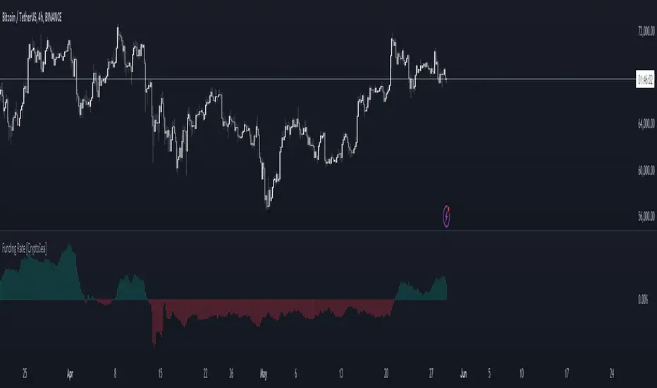
Funding Rate [CryptoSea]The Funding Rate Indicator by is a comprehensive tool designed to analyze funding rates across multiple cryptocurrency exchanges. This indicator is essential for traders who want to monitor funding rates and their impact on market trends.
Key Features
Exchange Coverage: Includes data from major exchanges such as Binance, Bitmex, Bybit, HTX, Kraken, OKX, Bitstamp, and Coinbase.
Perpetual Futures and Spot Markets: Fetches and analyzes pricing data from both perpetual futures and spot markets to provide a holistic view.
Smoothing and Customization: Allows users to smooth funding rates using a moving average, with customizable MA lengths for tailored analysis.
Dynamic Candle Coloring: Option to color candles based on trading conditions, enhancing visual analysis.
In the example below, the indicator shows how the funding rate shifts with market conditions, providing clear visual cues for bullish and bearish trends.
How it Works
Data Integration: Uses a secure security fetching function to retrieve pricing data while preventing look-ahead bias, ensuring accurate and reliable information.
TWAP Calculation: Computes Time-Weighted Average Prices (TWAP) for both perpetual futures and spot prices, forming the basis for funding rate calculations.
Funding Rate Calculation: Determines the raw funding rate by comparing TWAPs of perpetual futures and spot prices, then applies smoothing to highlight significant trends.
Color Coding: Highlights the funding rate with distinct colors (bullish and bearish), making it easier to interpret market conditions at a glance.
In the example below, the indicator effectively differentiates between bullish and bearish funding rates, aiding traders in making informed decisions based on current market dynamics.
Application
Market Analysis: Enables traders to analyze the impact of funding rates on market trends, facilitating more strategic decision-making.
Trend Identification: Assists in identifying potential market reversals by monitoring shifts in funding rates.
Customizable Settings: Provides extensive input settings for exchange selection, MA length, and candle coloring, allowing for personalized analysis.
The Funding Rate Indicator by is a powerful addition to any trader's toolkit, offering detailed insights into funding rates across multiple exchanges to navigate the cryptocurrency market effectively.
M2 Global Liquidity Index
The M2 Global Liquidity Index calculates a composite index reflecting the aggregate liquidity provided by the M2 money supply of five major currencies: Chinese Yuan (CNY), US Dollar (USD), Euro (EUR), Japanese Yen (JPY), and British Pound (GBP). The M2 money supply includes cash, checking deposits, and easily convertible near money. By incorporating exchange rates (CNY/USD, EUR/USD, JPY/USD, GBP/USD), the script adjusts each country's M2 supply to a common base (USD) and sums them up to produce a global liquidity metric. This metric, plotted on a daily timeframe, provides an overview of the total liquidity available in these five significant economies.
Understanding the M2 money supply is crucial for assessing liquidity because it represents the amount of money readily available in an economy for spending and investment. Higher M2 levels generally indicate more liquidity, suggesting easier access to capital for businesses and consumers, potentially leading to economic growth. Conversely, lower M2 levels can signify tighter liquidity conditions, possibly resulting in constrained spending and investment.

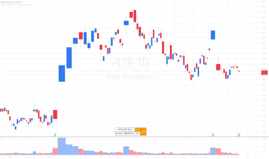
Market Cap / Revenue RatioA variation of the P/S ratio, this script takes the future estimated revenue of the current stock versus it's Market Cap. It then compares the aforementioned Market Cap:Revenue ratio against a market bellwether's corresponding ratio (MSFT by default) to determine the following:
- Light green when the ratio is extremely low (Stock is very undervalued)
- Green when the ratio is low (Stock's multiple is lower by 20-50%)
- Blue when the ratio is close to the benchmark (Stock is fairly valued to benchmark multiple)
- Red when the ratio is high (Stock's mulitple is higher by 50% or more)
- Dark red when the ratio is extremely high (Stock is very overvalued)
CONFIGURABLE
- Full Table: Show the entire calculation table
- Minimalist: Go minimal and show only the ratio and color code
- Show Benchmark Multiple: Show the multiple ratio calculated between the current stock and the benchmark stock (MSFT by default)
NOTES
- When calculating the Market Cap, TradingView sometimes under-reports the number of shares and thus skews the Market Cap too low. This seems to happen for stocks with multiple share classes like GOOGL so be mindful that the data can be wrong for these kinds of stocks. You can check on this by going into the Indicator's Settings and select Show Full Table which will show the number of shares outstanding reported by TradingView.
- For certain stocks such as foreign ADRs, there won't be a future revenue estimate so the script will automatically use the Total Revenue for the most recent Quarter in these cases
Global Financial IndexIntroducing the "Global Financial Index" indicator on TradingView, a meticulously crafted tool derived from extensive research aimed at providing the most comprehensive assessment of a company's financial health, profitability, and valuation. Developed with the discerning trader and investor in mind, this indicator amalgamates a diverse array of financial metrics, meticulously weighted and balanced to yield optimal results.
Financial Strength:
Financial strength is a cornerstone of a company's stability and resilience in the face of economic challenges. It encompasses various metrics that gauge the company's ability to meet its financial obligations, manage its debt, and generate sustainable profits. In our Global Financial Index indicator, the evaluation of financial strength is meticulously crafted to provide investors with a comprehensive understanding of a company's fiscal robustness. Let's delve into the key components and the rationale behind their inclusion:
1. Current Ratio:
The Current Ratio serves as a vital indicator of a company's liquidity position by comparing its current assets to its current liabilities.
A ratio greater than 1 indicates that the company possesses more short-term assets than liabilities, suggesting a healthy liquidity position and the ability to meet short-term obligations promptly.
By including the Current Ratio in our evaluation, we emphasize the importance of liquidity management in sustaining business operations and weathering financial storms.
2. Debt to Equity Ratio:
The Debt to Equity Ratio measures the proportion of a company's debt relative to its equity, reflecting its reliance on debt financing versus equity financing.
A higher ratio signifies higher financial risk due to increased debt burden, potentially leading to liquidity constraints and solvency issues.
Incorporating the Debt to Equity Ratio underscores the significance of balancing debt levels to maintain financial stability and mitigate risk exposure.
3. Interest Coverage Ratio:
The Interest Coverage Ratio assesses a company's ability to service its interest payments with its operating income.
A higher ratio indicates a healthier financial position, as it implies that the company generates sufficient earnings to cover its interest expenses comfortably.
By evaluating the Interest Coverage Ratio, we gauge the company's capacity to manage its debt obligations without compromising its profitability or sustainability.
4. Altman Z-Score:
The Altman Z-Score, developed by Edward Altman, is a composite metric that predicts the likelihood of a company facing financial distress or bankruptcy within a specific timeframe.
It considers multiple financial ratios, including liquidity, profitability, leverage, and solvency, to provide a comprehensive assessment of a company's financial health.
The Altman Z-Score categorizes companies into distinct risk groups, allowing investors to identify potential warning signs and make informed decisions regarding investment or credit exposure.
By integrating the Altman Z-Score, we offer a nuanced perspective on a company's financial viability and resilience in turbulent market conditions.
Profitability Rank:
Profitability rank is a crucial aspect of investment analysis that evaluates a company's ability to generate profits relative to its peers and industry benchmarks. It involves assessing various profitability metrics to gauge the efficiency and effectiveness of a company's operations and management. In our Global Financial Index indicator, the profitability rank segment is meticulously designed to provide investors with a comprehensive understanding of a company's profitability dynamics. Let's delve into the key components and rationale behind their inclusion:
1. Return on Equity (ROE):
Return on Equity measures a company's net income generated relative to its shareholders' equity.
A higher ROE indicates that a company is generating more profits with its shareholders' investment, reflecting efficient capital utilization and strong profitability.
By incorporating ROE, we assess management's ability to generate returns for shareholders and evaluate the overall profitability of the company's operations.
2. Gross Profit Margin:
Gross Profit Margin represents the percentage of revenue retained by a company after accounting for the cost of goods sold (COGS).
A higher gross profit margin indicates that a company is effectively managing its production costs and pricing strategies, leading to greater profitability.
By analyzing gross profit margin, we evaluate a company's pricing power, cost efficiency, and competitive positioning within its industry.
3. Operating Profit Margin:
Operating Profit Margin measures the percentage of revenue that remains after deducting operating expenses, such as salaries, rent, and utilities.
A higher operating profit margin signifies that a company is efficiently managing its operating costs and generating more profit from its core business activities.
By considering operating profit margin, we assess the underlying profitability of a company's operations and its ability to generate sustainable earnings.
4. Net Profit Margin:
Net Profit Margin measures the percentage of revenue that remains as net income after deducting all expenses, including taxes and interest.
A higher net profit margin indicates that a company is effectively managing its expenses and generating greater bottom-line profitability.
By analyzing net profit margin, we evaluate the overall profitability and financial health of a company, taking into account all expenses and income streams.
Valuation Rank:
Valuation rank is a fundamental aspect of investment analysis that assesses the attractiveness of a company's stock price relative to its intrinsic value. It involves evaluating various valuation metrics to determine whether a stock is undervalued, overvalued, or fairly valued compared to its peers and the broader market. In our Global Financial Index indicator, the valuation rank segment is meticulously designed to provide investors with a comprehensive perspective on a company's valuation dynamics. Let's explore the key components and rationale behind their inclusion:
1. Price-to-Earnings (P/E) Ratio:
The Price-to-Earnings ratio is a widely used valuation metric that compares a company's current stock price to its earnings per share (EPS).
A lower P/E ratio may indicate that the stock is undervalued relative to its earnings potential, while a higher ratio may suggest overvaluation.
By incorporating the P/E ratio, we offer insight into market sentiment and investor expectations regarding a company's future earnings growth prospects.
2. Price-to-Book (P/B) Ratio:
The Price-to-Book ratio evaluates a company's market value relative to its book value, which represents its net asset value per share.
A P/B ratio below 1 may indicate that the stock is trading at a discount to its book value, potentially signaling an undervalued opportunity.
Conversely, a P/B ratio above 1 may suggest overvaluation, as investors are paying a premium for the company's assets.
By considering the P/B ratio, we assess the market's perception of a company's tangible asset value and its implications for investment attractiveness.
3. Dividend Yield:
Dividend Yield measures the annual dividend income received from owning a stock relative to its current market price.
A higher dividend yield may indicate that the stock is undervalued or that the company is returning a significant portion of its profits to shareholders.
Conversely, a lower dividend yield may signal overvaluation or a company's focus on reinvesting profits for growth rather than distributing them as dividends.
By analyzing dividend yield, we offer insights into a company's capital allocation strategy and its implications for shareholder returns and valuation.
4. Discounted Cash Flow (DCF) Analysis:
Discounted Cash Flow analysis estimates the present value of a company's future cash flows, taking into account the time value of money.
By discounting projected cash flows back to their present value using an appropriate discount rate, DCF analysis provides a fair value estimate for the company's stock.
Comparing the calculated fair value to the current market price allows investors to assess whether the stock is undervalued, overvalued, or fairly valued.
By integrating DCF analysis, we offer a rigorous framework for valuing stocks based on their underlying cash flow generation potential.
Earnings Transparency:
Mitigating the risk of fraudulent financial reporting is crucial for investors. The indicator incorporates the Beneish M-Score, a robust model designed to detect earnings manipulation or financial irregularities. By evaluating various financial ratios and metrics, this component provides valuable insights into the integrity and transparency of a company's financial statements, aiding investors in mitigating potential risks.
Overall Score:
The pinnacle of the "Global Financial Index" is the Overall Score, a comprehensive amalgamation of financial strength, profitability, valuation, and manipulation risk, further enhanced by the inclusion of the Piotroski F-Score. This holistic score offers investors a succinct assessment of a company's overall health and investment potential, facilitating informed decision-making.
The weighting and balancing of each metric within the indicator have been meticulously calibrated to ensure accuracy and reliability. By amalgamating these diverse metrics, the "Global Financial Index" empowers traders and investors with a powerful tool for evaluating investment opportunities with confidence and precision.
This indicator is provided for informational purposes only and does not constitute financial advice, investment advice, or any other type of advice. The information provided by this indicator should not be relied upon for making investment decisions. Trading and investing in financial markets involves risk, and you should carefully consider your financial situation and consult with a qualified financial advisor before making any investment decisions. Past performance is not necessarily indicative of future results. The creator of this indicator makes no representations or warranties of any kind, express or implied, about the completeness, accuracy, reliability, suitability, or availability with respect to the indicator or the information contained herein. Any reliance you place on such information is therefore strictly at your own risk. By using this indicator, you agree to assume full responsibility for any and all gains and losses, financial, emotional, or otherwise, experienced, suffered, or incurred by you.

Buffett Quality Score [Communication Services]Buffett Quality Score "Communication Services": Analyzing Communication Companies with Precision
The communication services sector encompasses a diverse range of companies involved in telecommunications, media, and entertainment. To assess the financial strength and performance of companies within this sector, the Buffett Quality Score employs a tailored set of financial metrics. This scoring system, inspired by the Piotroski F-Score methodology, assigns points based on specific financial criteria to provide a comprehensive quality assessment.
Scoring Methodology
The Buffett Quality Score is designed to evaluate the overall financial health and quality of companies operating within the communication services sector. Each selected financial metric is chosen for its relevance and importance in evaluating a company's performance and potential for sustainable growth. The score is computed by assigning points based on the achievement of specific thresholds for each indicator, with the total points determining the final score. This methodology ensures a nuanced analysis that captures the unique dynamics of the communication services industry.
Selected Financial Metrics and Criteria
1. Return on Invested Capital (ROIC) > 10.0%
Relevance: ROIC measures a company's efficiency in allocating capital to profitable investments. For communication companies, a ROIC above 10.0% indicates effective capital utilization, crucial for sustaining growth and innovation.
2. Return on Equity (ROE) > 15.0%
Relevance: ROE evaluates the return generated on shareholders' equity. A ROE exceeding 15.0% signifies robust profitability and effective management of shareholder funds, essential for investor confidence in communication companies.
3. Revenue One-Year Growth > 10.0%
Relevance: High revenue growth indicates strong market demand and successful business strategies. For communication services, where innovation and content delivery are paramount, growth exceeding 10.0% reflects market leadership and competitive positioning.
4. Gross Margin > 40.0%
Relevance: Gross margin measures profitability after accounting for production costs. In the communication services sector, a gross margin above 40.0% demonstrates efficient operations and high-value content offerings, critical for maintaining competitive advantage.
5. Net Margin > 10.0%
Relevance: Net margin assesses overall profitability after all expenses. A net margin exceeding 10.0% indicates effective cost management and operational efficiency, fundamental for sustained profitability in communication companies.
6. EPS One-Year Growth > 10.0%
Relevance: EPS growth reflects the company's ability to increase earnings per share. For communication firms, where content monetization and subscription models are prevalent, EPS growth above 10.0% signals successful business expansion and value creation.
7. Piotroski F-Score > 6.0
Relevance: The Piotroski F-Score evaluates fundamental strength across various financial metrics. A score above 6.0 suggests strong financial health and operational efficiency, crucial for navigating competitive pressures in the communication services industry.
8. Price/Earnings Ratio (Forward) < 25.0
Relevance: The forward P/E ratio compares current share price to expected future earnings. A ratio below 25.0 indicates reasonable valuation relative to growth prospects, important for investors seeking value opportunities in communication stocks.
9. Current Ratio > 1.5
Relevance: The current ratio assesses short-term liquidity by comparing current assets to current liabilities. In communication companies, a ratio above 1.5 ensures financial flexibility and the ability to meet short-term obligations, vital for operational stability.
10. Debt to Equity Ratio < 1.0
Relevance: A lower debt to equity ratio indicates prudent financial management and reduced reliance on debt financing. For communication firms, maintaining a ratio below 1.0 signifies a healthy balance sheet and lower financial risk.
Interpreting the Buffett Quality Score
0-4 Points: Indicates potential weaknesses across multiple financial areas, suggesting higher risk.
5 Points: Represents average performance, warranting further analysis to understand underlying factors.
6-10 Points: Reflects strong financial health and quality, positioning the company favorably within the competitive communication services industry.
Conclusion
The Buffett Quality Score provides a robust framework for evaluating communication companies, emphasizing critical financial indicators tailored to industry dynamics. By leveraging these insights, investors and analysts can make informed decisions, identifying companies poised for sustainable growth and performance in the ever-evolving communication services landscape.
Disclaimer: The Buffett Quality Score serves as a tool for financial analysis and should not replace professional advice or comprehensive due diligence. Investors should conduct thorough research and consult with financial experts based on individual investment objectives.

Buffett Quality Score [Information Technology]Buffett Quality Score 'Information Technology': Assessing Tech Companies with Precision
The information technology sector is characterized by rapid innovation, high growth potential, and significant competition. To evaluate the financial health and performance of companies within this dynamic industry, the Buffett Quality Score employs a tailored set of financial metrics. This scoring system, inspired by the Piotroski F-Score methodology, assigns points based on specific financial criteria to provide a comprehensive quality assessment.
Scoring Methodology
The Buffett Quality Score is designed to assess the overall financial strength and quality of companies within the tech sector. Each selected financial metric is chosen for its relevance and importance in evaluating a company's performance and potential for sustainable growth. The score is computed by assigning points based on the achievement of specific thresholds for each indicator, with the total points determining the final score. This methodology ensures a nuanced analysis that captures the unique dynamics of the information technology industry.
Selected Financial Metrics and Criteria
1. Return on Invested Capital (ROIC) > 10.0%
Relevance: ROIC measures a company's efficiency in allocating capital to profitable investments. For tech companies, a ROIC above 10.0% indicates effective use of investment capital to generate strong returns, crucial for sustaining innovation and growth.
2. Return on Assets (ROA) > 5.0%
Relevance: ROA assesses how efficiently a company utilizes its assets to generate earnings. A ROA above 5.0% signifies that the company is effectively leveraging its assets, which is vital in the capital-intensive tech sector.
3. Revenue One-Year Growth > 10.0%
Relevance: High revenue growth indicates robust market demand and successful product or service offerings. For tech companies, where rapid scalability is common, growth exceeding 10.0% demonstrates significant market traction and expansion potential.
4. Gross Margin > 40.0%
Relevance: Gross margin reflects the proportion of revenue remaining after accounting for the cost of goods sold. In the tech sector, a gross margin above 40.0% indicates efficient production and high-value offerings, essential for maintaining competitive advantage.
5. Net Margin > 15.0%
Relevance: Net margin measures overall profitability after all expenses. A net margin above 15.0% demonstrates strong financial health and the ability to convert revenue into profit, highlighting the company's operational efficiency.
6. EPS One-Year Growth > 10.0%
Relevance: Earnings per share (EPS) growth indicates the company's ability to increase profitability per share. For tech firms, EPS growth above 10.0% signals positive earnings momentum, reflecting successful business strategies and market adoption.
7. Piotroski F-Score > 6.0
Relevance: The Piotroski F-Score assesses fundamental strength, including profitability, leverage, liquidity, and operational efficiency. A score above 6.0 suggests solid financial fundamentals and resilience in the competitive tech landscape.
8. Price/Earnings Ratio (Forward) < 25.0
Relevance: The forward P/E ratio compares current share price to expected future earnings. A ratio below 25.0 indicates reasonable valuation relative to growth expectations, important for identifying undervalued opportunities in the fast-paced tech sector.
9. Current Ratio > 1.5
Relevance: The current ratio evaluates short-term liquidity by comparing current assets to current liabilities. In the tech industry, a ratio above 1.5 ensures the company can meet its short-term obligations, essential for operational stability.
10. Debt to Equity Ratio < 1.0
Relevance: A lower debt to equity ratio signifies prudent financial management and reduced reliance on debt. For tech companies, which often require significant investment in R&D, a ratio below 1.0 highlights a strong financial structure.
Interpreting the Buffett Quality Score
0-4 Points: Indicates potential weaknesses across multiple financial areas, suggesting higher risk.
5 Points: Represents average performance, warranting further analysis to understand underlying factors.
6-10 Points: Reflects strong financial health and quality, positioning the company favorably within the competitive tech industry.
Conclusion
The Buffett Quality Score provides a strategic framework for evaluating tech companies, emphasizing critical financial indicators tailored to industry dynamics. By leveraging these insights, investors and analysts can make informed decisions, identifying companies poised for sustainable growth and performance in the ever-evolving tech landscape.
Disclaimer: The Buffett Quality Score serves as a tool for financial analysis and should not replace professional advice or comprehensive due diligence. Investors should conduct thorough research and consult with financial experts based on individual investment objectives.

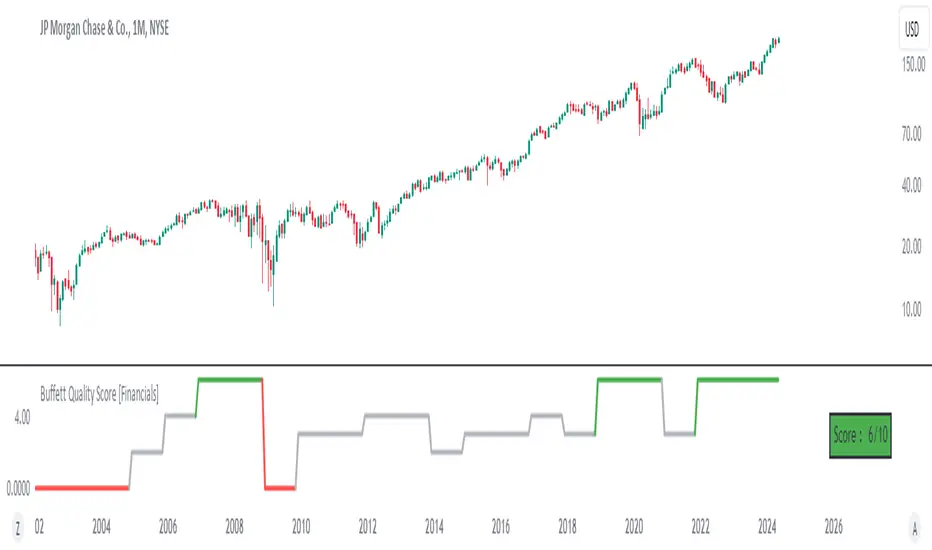
Buffett Quality Score [Financials]Evaluating Financial Companies with the Buffett Quality Score 'Financials'
The financial sector, with its unique regulatory environment and market dynamics, requires a tailored approach to financial evaluation. The Buffett Quality Score is meticulously designed to assess the financial robustness and quality of companies within this sector. By focusing on industry-specific financial metrics, this scoring system provides valuable insights for investors and analysts navigating the complexities of the financial industry.
Scoring Methodology
Each selected financial metric contributes a point to the overall score if the specified condition is met. The combined score is a summation of points across all criteria, providing a comprehensive assessment of financial health and quality.
Selected Financial Metrics and Criteria
1. Altman Z-Score > 2.0
Relevance: The Altman Z-Score evaluates bankruptcy risk based on profitability, leverage, liquidity, solvency, and activity. In the financial sector, where market stability and solvency are critical, a score above 2.0 signifies a lower risk of financial distress.
2. Debt to Equity Ratio < 2.0
Relevance: A lower Debt to Equity Ratio signifies prudent financial management and reduced reliance on debt financing. This is particularly important for financial companies, which need to manage leverage carefully to avoid excessive risk.
3. Interest Coverage > 3.0
Relevance: The Interest Coverage Ratio measures a company's ability to meet its interest obligations from operating earnings. A ratio above 3.0 indicates that the company can comfortably cover its interest expenses, reducing the risk of default.
4. Return on Equity (ROE) > 10.0%
Relevance: ROE indicates the company's ability to generate profits from shareholder equity. An ROE above 10.0% suggests efficient use of capital and strong returns for investors, which is a key performance indicator for financial companies.
5. Return on Assets (ROA) > 1.0%
Relevance: ROA measures the company's ability to generate earnings from its assets. In the financial sector, where asset management is crucial, an ROA above 1.0% indicates effective use of assets to generate profits.
6. Net Margin > 10.0%
Relevance: Net Margin measures overall profitability after all expenses. A margin above 10.0% demonstrates strong financial performance and the ability to convert revenue into profit effectively.
7. Revenue One-Year Growth > 5.0%
Relevance: Revenue growth reflects market demand and company expansion. In the financial sector, where growth can be driven by new products and services, revenue exceeding 5.0% indicates successful market penetration and business expansion.
8. EPS One-Year Growth > 5.0%
Relevance: EPS growth reflects the company's ability to increase earnings per share over the past year. For financial companies, growth exceeding 5.0% signals positive earnings momentum and potential market strength.
9. Price/Earnings Ratio (Forward) < 20.0
Relevance: The Forward P/E Ratio reflects investor sentiment and earnings expectations. A ratio below 20.0 suggests reasonable valuation relative to earnings projections, which is important for investors seeking value and growth opportunities in the financial sector.
10. Piotroski F-Score > 6.0
Relevance: The Piotroski F-Score assesses fundamental strength, emphasizing profitability, leverage, liquidity, and operating efficiency. For financial companies, a score above 6.0 indicates strong financial health and operational efficiency.
Interpreting the Buffett Quality Score
0-4 Points: Indicates potential weaknesses across multiple financial areas, warranting careful consideration and risk assessment.
5 Points: Suggests average performance based on sector-specific criteria, requiring further analysis to determine investment viability.
6-10 Points: Signifies strong financial health and quality, positioning the company favorably within the competitive financial industry.
Conclusion
The Buffett Quality Score offers a strategic framework for evaluating financial companies, emphasizing critical financial indicators tailored to industry dynamics. By leveraging these insights, stakeholders can make informed decisions and identify companies poised for sustainable growth and performance in the evolving financial landscape.
Disclaimer: The Buffett Quality Score serves as a tool for financial analysis and should not replace professional advice or comprehensive due diligence. Investors should conduct thorough research and consult with financial experts based on individual investment objectives.
Buffett Quality Score [Health Care]Evaluating Health Care Companies with the Buffett Quality Score "Health Care"
The health care sector presents unique challenges and opportunities, demanding a specialized approach to financial evaluation. The Buffett Quality Score is meticulously designed to assess the financial robustness and quality of companies within this dynamic industry. By focusing on industry-specific financial metrics, this scoring system provides valuable insights for investors and analysts navigating the complexities of the health care sector.
Scoring Methodology
Each selected financial metric contributes a point to the overall score if the specified condition is met. The combined score is a summation of points across all criteria, providing a comprehensive assessment of financial health and quality.
Selected Financial Metrics and Criteria
1. Altman Z-Score > 2.0
Relevance: The Altman Z-Score evaluates bankruptcy risk based on profitability, leverage, liquidity, solvency, and activity. In the health care sector, where regulatory changes and technological advancements can impact financial stability, a score above 2.0 signifies a lower risk of financial distress.
2. Piotroski F-Score > 6.0
Relevance: The Piotroski F-Score assesses fundamental strength, emphasizing profitability, leverage, liquidity, and operating efficiency. For health care companies, which often face regulatory challenges and R&D expenses, a score above 6.0 indicates strong financial health and operational efficiency.
3. Current Ratio > 1.5
Relevance: The Current Ratio evaluates short-term liquidity by comparing current assets to current liabilities. In the health care sector, where cash flow stability is essential for ongoing operations, a ratio above 1.5 ensures the company's ability to meet near-term obligations.
4. Debt to Equity Ratio < 1.0
Relevance: A lower Debt to Equity Ratio signifies prudent financial management and reduced reliance on debt financing. This is critical for health care companies, which require significant investments in research and development without overleveraging.
5. EBITDA Margin > 15.0%
Relevance: The EBITDA Margin measures operating profitability, excluding non-operating expenses. A margin above 15.0% indicates efficient operations and the ability to generate substantial earnings from core activities.
6. EPS One-Year Growth > 5.0%
Relevance: EPS growth reflects the company's ability to increase earnings per share over the past year. For health care companies, which often face pricing pressures and regulatory changes, growth exceeding 5.0% signals positive earnings momentum and potential market strength.
7. Net Margin > 10.0%
Relevance: Net Margin measures overall profitability after all expenses. A margin above 10.0% demonstrates strong financial performance and the ability to convert revenue into profit effectively.
8. Return on Equity (ROE) > 15.0%
Relevance: ROE indicates the company's ability to generate profits from shareholder equity. An ROE above 15.0% suggests efficient use of capital and strong returns for investors.
9. Revenue One-Year Growth > 5.0%
Relevance: Revenue growth reflects market demand and company expansion. In the health care sector, where innovation drives growth, revenue exceeding 5.0% indicates successful market penetration and product adoption.
10. Price/Earnings Ratio (Forward) < 20.0
Relevance: The Forward P/E Ratio reflects investor sentiment and earnings expectations. A ratio below 20.0 suggests reasonable valuation relative to earnings projections, which is important for investors seeking value and growth opportunities in the health care sector.
Interpreting the Buffett Quality Score
0-4 Points: Indicates potential weaknesses across multiple financial areas, warranting careful consideration and risk assessment.
5 Points: Suggests average performance based on sector-specific criteria, requiring further analysis to determine investment viability.
6-10 Points: Signifies strong financial health and quality, positioning the company favorably within the competitive health care industry.
Conclusion
The Buffett Quality Score offers a strategic framework for evaluating health care companies, emphasizing critical financial indicators tailored to industry dynamics. By leveraging these insights, stakeholders can make informed decisions and identify companies poised for sustainable growth and performance in the evolving health care landscape.
Disclaimer: The Buffett Quality Score serves as a tool for financial analysis and should not replace professional advice or comprehensive due diligence. Investors should conduct thorough research and consult with financial experts based on individual investment objectives.

Buffett Quality Score [Consumer Discretionary]Evaluating Consumer Discretionary Companies with the Buffett Quality Score
The consumer discretionary sector, characterized by its sensitivity to economic cycles and consumer spending patterns, demands a robust framework for financial evaluation. The Buffett Quality Score offers a comprehensive assessment of financial health and performance specifically tailored to this dynamic industry. This scoring system combines critical financial ratios uniquely relevant to consumer discretionary companies, providing investors and analysts with a reliable tool for evaluation.
Selected Financial Metrics and Criteria
1. Altman Z-Score > 2.0
Relevance: The Altman Z-Score assesses bankruptcy risk, combining profitability, leverage, liquidity, solvency, and activity ratios. For consumer discretionary companies, which often face volatile market conditions, a score above 2.0 indicates financial stability and the ability to withstand economic downturns. This metric is particularly important in this sector due to the high variability in consumer spending.
2. Piotroski F-Score > 6.0
Relevance: The Piotroski F-Score evaluates fundamental strength based on profitability, leverage, liquidity, and operating efficiency. In the consumer discretionary sector, where rapid changes in consumer preferences can impact performance, a score above 6.0 highlights strong fundamental performance and resilience. This score is crucial for identifying companies with robust financial foundations in a highly competitive environment.
3. Asset Turnover > 1.0
Relevance: Asset Turnover measures the efficiency of asset use in generating sales. For consumer discretionary companies, a ratio above 1.0 signifies effective utilization of assets to drive revenue growth. Given the sector's reliance on high sales volumes and rapid inventory turnover, this metric is key to assessing operational efficiency.
4. Current Ratio > 1.5
Relevance: The Current Ratio assesses liquidity by comparing current assets to current liabilities. A ratio above 1.5 ensures that consumer discretionary companies can meet short-term obligations. This liquidity is essential for maintaining operational stability and flexibility to adapt to market changes, especially during economic fluctuations.
5. Debt to Equity Ratio < 1.0
Relevance: A lower Debt to Equity Ratio indicates prudent financial management and reduced reliance on debt. This is particularly important for consumer discretionary companies, which need to maintain financial flexibility to invest in new trends and innovations without overleveraging. Lower debt levels also reduce risk during economic downturns.
6. EBITDA Margin > 15.0%
Relevance: The EBITDA Margin measures operating profitability. A margin above 15.0% indicates efficient operations and the ability to generate sufficient earnings before interest, taxes, depreciation, and amortization. This is crucial for sustaining profitability in a competitive and fluctuating market, ensuring the company can reinvest in growth and innovation.
7. EPS One-Year Growth > 5.0%
Relevance: EPS growth reflects the company’s ability to increase earnings per share over the past year. For consumer discretionary companies, growth exceeding 5.0% signals positive earnings momentum, which is vital for investor confidence and the ability to fund future growth initiatives. This metric highlights companies that are successfully increasing profitability.
8. Gross Margin > 25.0%
Relevance: Gross Margin represents the profitability of sales after production costs. A margin exceeding 25.0% indicates strong pricing power and effective cost management, crucial for maintaining profitability while adapting to changing consumer demands. High gross margins are indicative of a company’s ability to control costs and price products competitively.
9. Net Margin > 10.0%
Relevance: Net Margin measures overall profitability after all expenses. A margin above 10.0% highlights the company’s ability to maintain strong profit levels, ensuring financial health and stability. This is essential for sustaining operations and investing in new opportunities, reflecting the company's efficiency in converting revenue into actual profit.
10.Return on Equity (ROE) > 15.0%
Relevance: ROE indicates how effectively a company uses equity to generate profits. An ROE above 15.0% signifies strong shareholder value creation. This metric is key for evaluating long-term performance in the consumer discretionary sector, where investor returns are closely tied to the company’s ability to innovate and grow. High ROE demonstrates effective management and profitable use of equity capital.
Interpreting the Buffett Quality Score
0-4 Points: Indicates potential weaknesses across multiple financial areas, warranting further investigation and risk assessment.
5 Points: Suggests average performance based on sector-specific criteria, indicating a need for cautious optimism.
6-10 Points: Signifies strong financial health and quality, meeting or exceeding most performance thresholds, making the company a potentially attractive investment.
Conclusion
The Buffett Quality Score provides a structured approach to evaluating financial health and performance. By focusing on these essential financial metrics, stakeholders can make informed decisions, identifying companies that are well-positioned to thrive in the competitive and economically sensitive consumer discretionary sector.
Disclaimer: The Buffett Quality Score serves as a tool for financial evaluation and analysis. It is not a substitute for professional financial advice or investment recommendations. Investors should conduct thorough research and seek personalized guidance based on individual circumstances.

Juice RemedyThis Remedy suite is a remake of the Auto Remedy suite.
We have improved the performance and added a few new features.
Updated:
- Converted some boxes to lines to mitigate the limit of 500.
- Rewrote the code and disabled blocks if features are turned off
New features:
- RSI based candle colors
- Added features to limit historical renders
---
RSI Candles tells you the RSI and volatility by coloring the candlesticks. The different stages are: overbought, oversold, neutral and a top and bottom RSI / EMA crossover.
There is also an option to enable the RSI signal on the chart to see when it's entering an overbought or oversold area.
---
Volume Profile displays a vertical histogram on the right side of the price chart, representing the volume traded at each price level. The length of each bar corresponds to the total volume traded at that particular price level. Traders can analyze the shape and distribution of the Volume Profile to gain valuable information about the market structure.
Here's how Volume Profile is used and applied in trading:
Identifying Areas of High Volume:
Volume Profile helps traders identify areas of high trading activity. Peaks in the Volume Profile histogram indicate price levels where significant buying or selling pressure was present. These areas can act as support or resistance levels in the future, as they represent levels where traders have previously shown interest.
Understanding Price Acceptance and Rejection:
Volume Profile assists in determining whether the market has accepted or rejected specific price levels. When the volume is higher at a particular price level, it suggests that traders have accepted that price and consider it fair. On the other hand, low volume at a price level indicates rejection, suggesting that traders are not willing to transact at that price.
Identifying Value Areas:
Volume Profile can help identify value areas, which are price regions where the most volume has been traded. These areas are considered significant as they reflect levels where the market has found fair value and attracted substantial trading activity. Traders often pay attention to these value areas as potential support or resistance zones.
Confirming Breakouts and Reversals:
Volume Profile can be used to confirm the validity of breakouts and reversals. If a price breaks out of a range with high volume, it suggests strong conviction and increases the likelihood of a sustained move. Similarly, if a price reverses near a high-volume area, it provides additional confirmation of a potential trend reversal.
Assessing Market Sentiment:
By analyzing the shape and structure of the Volume Profile, traders can gain insights into market sentiment. A balanced Volume Profile with volume evenly distributed across price levels indicates a neutral market. Skewed or asymmetrical Volume Profiles may suggest bullish or bearish sentiment, depending on where the volume is concentrated.
It's important to note that traders often combine Volume Profile with price patterns, trendlines, and momentum indicators to validate signals and develop a comprehensive understanding of the market.
By studying the Volume Profile, traders can gain a clearer picture of where significant trading activity has occurred and identify levels of potential support, resistance, and value. This information can assist in making more informed trading decisions and improving overall market analysis.
---
VWAP(Volume Weighted Average Price) is a technical analysis tool that calculates the average price weighted by trading volume over a specified time period. It provides traders with insights into the average price at which a particular asset has traded during a given period, considering the volume traded at each price level.
Here's a general explanation of VWAP and its application in trading:
Calculation of VWAP:
VWAP is calculated by multiplying the price of each trade by its corresponding volume, summing these values over a specific time period, and dividing the total by the cumulative volume. The calculation continuously updates as new trades occur within the specified time frame.
Interpretation of VWAP:
VWAP is primarily used as a reference point to assess whether a current price is relatively high or low compared to the average price weighted by volume. Traders compare the current price to the VWAP to gauge whether the price is trading above or below the average level. If the price is above VWAP, it suggests that the asset is trading at a premium, while a price below VWAP indicates a discount.
VWAP as a Trading Indicator:
Traders use VWAP in various ways to support their trading decisions. Here are a few common applications:
a. Trend Identification: Traders analyze the relationship between the current price and VWAP to identify the prevailing market trend. If the price consistently trades above VWAP, it is often seen as a bullish signal, while prices below the VWAP is considered a bearish signal. This approach helps traders align their trades with the overall market direction.
b. Support and Resistance Levels: VWAP can act as a dynamic support or resistance level. Traders observe how the price reacts when approaching the VWAP. If the price bounces off the VWAP and continues in the direction of the prevailing trend, it may indicate support or resistance. Traders can use the VWAP as a reference for setting stop-loss levels or determining potential entry or exit points.
c. Reversal Signals: In some cases, when the price deviates significantly from VWAP, it may indicate overbought or oversold conditions. Traders watch for price reversals when the price moves away from the VWAP, potentially signaling a short-term market reversal.
d. Volume Analysis: VWAP considers volume along with price, providing insights into the significance of price moves. Traders analyze the relationship between volume and VWAP to evaluate the strength of price movements. Higher volume trading near the VWAP may suggest increased market interest and potential continuation of the trend.
It's worth noting that the VWAP is often used in intra-day trading and is more relevant for short-term analysis. Traders typically adjust the VWAP time frame based on their trading style and the asset being analyzed.
---
The Zig Zag works by filtering out price movements below a certain threshold (percentage or points) and only displaying significant price changes. This helps to eliminate minor price fluctuations and focus on the more substantial market movements.
When applying the Zig Zag indicator, traders typically select a percentage or point value as the threshold. For example, if a 5% threshold is chosen, the Zig Zag indicator will only plot a new point when the price has moved up or down by at least 5% from the previous significant high or low.
The indicator plots lines connecting the significant highs and lows on the price chart, creating a zigzag pattern. The lines are drawn in a way that reflects the change in the trend direction. The indicator can be adjusted to suit different timeframes and trading styles.
The primary purpose of the Zig Zag indicator is to identify and highlight trend reversals and price swings. Traders often use it to:
Identify major turning points: The Zig Zag indicator helps traders spot major highs and lows in the price action. These levels can act as potential support or resistance areas for future price movements.
Filter out noise: By filtering out minor price fluctuations, the Zig Zag indicator helps traders focus on the more significant price moves and trends. This can provide a clearer picture of the overall market direction.
Confirm chart patterns: The Zig Zag indicator can be used to confirm the validity of chart patterns, such as trendlines, channels, or chart formations. It can help traders validate breakouts, pullbacks, or continuation patterns.
Set trailing stops: Traders may use the Zig Zag indicator to set trailing stops based on the significant swing highs and lows. This allows them to trail their stop-loss orders behind the price action and potentially lock in profits as the trend develops.
Additionally, it's essential to customize the settings of the Zig Zag indicator according to the specific market being analyzed, as different markets and timeframes may require different threshold values for optimal performance.
Please keep in mind that while the Zig Zag indicator can provide valuable insights, it should be used alongside other analysis tools and not solely relied upon for trading decisions.
---
Fibonacci extensions and retracements are both technical analysis tools that traders use to identify potential levels of support and resistance in financial markets. Here's a clear understanding of each concept and how they are used in trading:
1. Fibonacci Retracement:
Fibonacci retracement is based on the idea that after an upward or downward price movement, the price tends to retrace a portion of that move before continuing in the original direction. The key levels used in Fibonacci retracement are based on ratios derived from the Fibonacci sequence, such as 0.382 (38.2%), 0.500 (50%), and 0.618 (61.8%).
To apply Fibonacci retracements, traders typically select two significant points on a price chart: a swing high and a swing low. The retracement levels are then plotted as horizontal lines based on the Fibonacci ratios. These levels act as potential support (in an uptrend) or resistance (in a downtrend) where the price may reverse or consolidate before resuming the overall trend.
Traders often use Fibonacci retracement levels to identify potential entry or exit points, place stop-loss orders, or assess the strength of a trend. The most commonly used retracement levels are 38.2%, 50%, and 61.8%, but other Fibonacci ratios like 23.6% and 78.6% are also sometimes used.
2. Fibonacci Extension:
Fibonacci extension is used to identify potential price targets beyond the initial trend or price move. It helps traders determine where the price may reach once it surpasses the previous swing high or swing low.
Similar to Fibonacci retracement, Fibonacci extension levels are derived from the Fibonacci sequence. The most commonly used extension levels are 138.2%, 161.8%, 261.8%, and 423.6%, although other ratios can also be applied.
To use Fibonacci extension, traders select three points on a price chart: a swing low, a swing high (corresponding to the previous trend), and a subsequent swing low or swing high (from where the extension is projected). The extension levels are then projected beyond the swing high or swing low, acting as potential price targets or areas of interest.
Fibonacci extension levels are often used to determine potential profit targets or to identify areas where a trend may reverse or consolidate. Traders may also use extensions in conjunction with other technical analysis tools to confirm trade signals or assess the overall market structure
---
The Pitchfan tool is based on the concept of Andrew's Pitchfork, which is a popular technical analysis tool developed by Dr. Alan H. Andrews. It consists of three parallel trendlines that are drawn to encompass the price action of an asset. The trendlines are typically drawn by connecting three significant points on a price chart - usually a pivot high, a pivot low, and another pivot high.
Once the Pitchfork is plotted, the Pitchfan tool extends the concept by adding additional trendlines that are parallel to the original Pitchfork. These additional trendlines are drawn based on certain mathematical ratios (e.g., Fibonacci ratios) applied to the distance between the original trendlines.
The Pitchfan can be used to identify potential support and resistance levels, as well as potential areas for price reversal or continuation. Traders may look for price reactions near these trendlines, with the expectation that the price may find support or encounter resistance at these levels.
---
Higher timeframe opens refer to the opening prices of different sessions or timeframes above the one being currently analyzed. For example, in intra-day trading, higher timeframe opens can refer to the daily session open or the opening prices of other significant market sessions in the forex market.
In addition to higher timeframe opens, traders often utilize daily reference ranges by incorporating indicators such as Average True Range (ATR) and the previous day's range. These tools help traders gauge the potential price volatility for the day and establish reference levels for stop-loss orders, profit targets, overall risk management strategies and market knowledge to develop a comprehensive trading approach.
---
Disclaimer : Please note that trading success relies on adhering to your trading strategy, and indicators should be used in accordance with your strategy rather than being the sole basis for trading decisions.
The provided script is intended solely for informational and educational purposes. Its use does not constitute professional or financial advice. It is your sole responsibility to evaluate the script's output and assess the risks associated with its use. By utilizing the script, you agree not to hold "JuiceSignals" TradingView user liable for any potential claims for damages that may arise from decisions made based on the use of the script.

Buffett Quality Score [Consumer Staples]Evaluating Consumer Staples Companies with the Buffett Quality Score
In the world of consumer staples, where stability and consistent performance are paramount, the Buffett Quality Score provides a comprehensive framework for assessing financial health and quality. This specialized scoring system is tailored to capture key aspects that are particularly relevant in the consumer staples sector, influencing investment decisions and strategic evaluations.
Selected Financial Metrics and Criteria
1. Gross Margin > 25.0%
Relevance: Consumer staples companies often operate in competitive markets. A Gross Margin exceeding 25.0% signifies efficient cost management and pricing strategies, critical for sustainable profitability amidst market pressures.
2. Net Margin > 5.0%
Relevance: Net Margin > 5.0% reflects the ability of consumer staples companies to generate bottom-line profits after accounting for all expenses, indicating operational efficiency and profitability.
3. Return on Assets (ROA) > 5.0%
Relevance: ROA > 5.0% measures how effectively consumer staples companies utilize their assets to generate earnings, reflecting operational efficiency and resource utilization.
4. Return on Equity (ROE) > 10.0%
Relevance: ROE > 10.0% indicates efficient capital deployment and shareholder value creation, fundamental for sustaining growth and competitiveness in the consumer staples industry.
5. Current Ratio > 1.5
Relevance: Consumer staples companies require strong liquidity to manage inventory and operational expenses. A Current Ratio > 1.5 ensures sufficient short-term liquidity to support ongoing operations.
6. Debt to Equity Ratio < 1.0
Relevance: With the need for stable finances, a Debt to Equity Ratio < 1.0 reflects prudent financial management and reduced reliance on debt financing, essential for long-term sustainability.
7. Interest Coverage Ratio > 3.0
Relevance: Consumer staples companies with an Interest Coverage Ratio > 3.0 demonstrate their ability to comfortably meet interest obligations, safeguarding against financial risks.
8. EPS One-Year Growth > 5.0%
Relevance: EPS growth > 5.0% indicates positive momentum and adaptability to changing market dynamics, crucial for consumer staples companies navigating evolving consumer preferences.
9. Revenue One-Year Growth > 5.0%
Relevance: Consistent revenue growth > 5.0% reflects market adaptability and consumer demand, highlighting operational resilience and strategic positioning.
10. EV/EBITDA Ratio < 15.0
Relevance: The EV/EBITDA Ratio < 15.0 reflects favorable valuation and earnings potential relative to enterprise value, offering insights into investment attractiveness and market competitiveness.
Interpreting the Buffett Quality Score
0-4 Points: Signals potential weaknesses across critical financial areas, warranting deeper analysis and risk assessment.
5 Points: Indicates average performance based on sector-specific criteria.
6-10 Points: Highlights strong financial health and quality, aligning with the stability and performance expectations of the consumer staples industry.
Conclusion
The Buffett Quality Score for consumer staples provides investors and analysts with a structured approach to evaluate and compare companies within this sector. By focusing on these essential financial metrics, stakeholders can make informed decisions and identify opportunities aligned with the stability and growth potential of consumer staples businesses.
Disclaimer: The Buffett Quality Score serves as a tool for financial evaluation and analysis. It is not a substitute for professional financial advice or investment recommendations. Investors should conduct thorough research and seek personalized guidance based on individual circumstances.

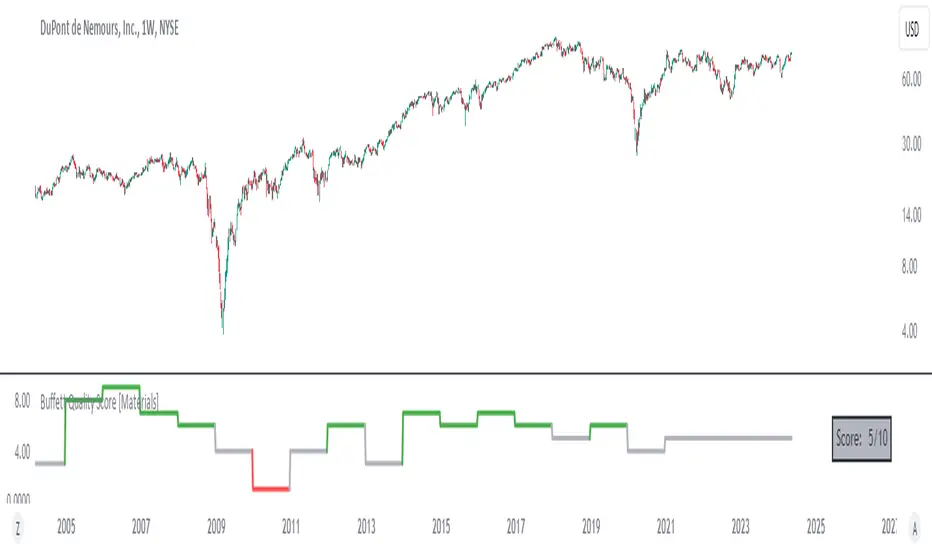
Buffett Quality Score [Materials]The Buffett Quality Score tailored for the Materials sector aims to assess the financial strength and quality of companies within this industry. Each selected financial ratio is strategically chosen to align with the unique characteristics and challenges prevalent in the Materials sector.
Selected Financial Ratios and Criteria:
1. Asset Turnover > 0.8
Relevance: In the Materials sector, efficient asset utilization is crucial for productivity and profitability. A high Asset Turnover (>0.8) indicates effective management of resources and operational efficiency.
2. Current Ratio > 1.5
Relevance: Materials companies often require adequate liquidity to manage inventory and operational expenses. A Current Ratio > 1.5 ensures sufficient short-term liquidity to support ongoing operations and investments.
3. Debt to Equity Ratio < 1.0
Relevance: Given the capital-intensive nature of Materials projects, maintaining a low Debt to Equity Ratio (<1.0) signifies prudent financial management with reduced reliance on debt financing, essential for stability amid industry fluctuations.
4. Gross Margin > 25.0%
Relevance: Materials companies deal with varying production costs and market pricing. A Gross Margin exceeding 25.0% reflects effective cost management and pricing strategies, critical for profitability in a competitive market.
5. EBITDA Margin > 15.0%
Relevance: Strong EBITDA margins (>15.0%) indicate robust operational performance and profitability, essential for sustaining growth and weathering industry-specific challenges.
6. Interest Coverage Ratio > 3.0
Relevance: The Materials sector is subject to market cyclicality and commodity price fluctuations. An Interest Coverage Ratio > 3.0 ensures the company's ability to service debt obligations, safeguarding against financial risks.
7. EPS One-Year Growth > 5.0%
Relevance: EPS growth > 5.0% demonstrates the company's ability to generate sustainable earnings amidst industry dynamics, reflecting positive investor sentiment and potential future prospects.
8. Revenue One-Year Growth > 5.0%
Relevance: Materials companies require consistent revenue growth (>5.0%) to support expansion initiatives and capitalize on market opportunities, indicative of operational resilience and adaptability.
9. Return on Assets (ROA) > 5.0%
Relevance: ROA > 5.0% showcases efficient asset utilization and profitability, essential metrics for evaluating performance and competitive positioning within the Materials industry.
10. Return on Equity (ROE) > 10.0%
Relevance: ROE > 10.0% reflects effective capital deployment and shareholder value creation, crucial for sustaining long-term growth and investor confidence in Materials sector investments.
Score Interpretation:
0-4 Points: Signals potential weaknesses across critical financial aspects, requiring in-depth analysis and risk assessment.
5 Points: Represents average performance based on sector-specific criteria.
6-10 Points: Indicates strong financial health and quality, demonstrating robustness and resilience within the demanding Materials industry landscape.
Development and Context:
The selection and weighting of these specific financial metrics underwent meticulous research and consideration to ensure relevance and applicability within the Materials sector. This scoring framework aims to provide actionable insights for stakeholders navigating investment decisions and evaluating company performance in the Materials industry.
Disclaimer: This information serves as an educational resource on financial evaluation methodology tailored for the Materials sector. It does not constitute financial advice or a guarantee of future performance. Consult qualified professionals for personalized financial guidance based on your specific circumstances and investment objectives.
Buffett Quality Score [Energy]The Buffett Quality Score for the Energy sector is designed to meticulously evaluate the financial health and quality of companies operating within this dynamic industry. Each selected financial ratio is specifically chosen based on its relevance and significance within the Energy sector context.
Selected Financial Ratios and Criteria:
1. Return on Assets (ROA) > 5%
Relevance: In the Energy sector, where asset-intensive operations are common (e.g., oil exploration and infrastructure), a robust ROA above 5% indicates efficient asset utilization, crucial for profitability.
2. Debt to Equity Ratio < 1.0
Relevance: Energy companies often require substantial capital for projects and operations. A low Debt to Equity Ratio (<1.0) suggests prudent financial management with less reliance on debt financing, vital in a capital-intensive industry vulnerable to economic cycles.
3.Interest Coverage Ratio > 3.0
Relevance: Given the capital-intensive nature of Energy projects, maintaining a healthy Interest Coverage Ratio (>3.0) ensures the company's ability to service debt obligations, particularly important during periods of economic volatility affecting commodity prices.
4. Gross Margin % > 25%
Relevance: Energy companies face varying production costs and pricing pressures. A Gross Margin exceeding 25% reflects efficient cost management and pricing power, critical in mitigating volatility in commodity prices.
5. Current Ratio > 1.5
Relevance: Energy projects often require substantial working capital. A Current Ratio > 1.5 indicates sufficient liquidity to cover short-term obligations, essential for operational continuity in an industry susceptible to market fluctuations.
6. EBITDA Margin % > 15%
Relevance: Energy companies must manage operating costs effectively. An EBITDA Margin > 15% signifies strong operational efficiency and profitability, crucial for sustaining growth amidst market uncertainties.
7. Altman Z-Score > 2.0
Relevance: The Energy sector experiences cyclical downturns and price volatility. An Altman Z-Score > 2.0 indicates financial stability and resilience, vital for weathering industry-specific challenges.
8. EPS Basic One-Year Growth % > 5%
Relevance: Energy companies' earnings growth is closely tied to commodity prices and market demand. EPS growth > 5% indicates positive momentum and adaptability to industry shifts.
9. Revenue One-Year Growth % > 5%
Relevance: Energy companies operate in a dynamic market influenced by geopolitical factors and global demand. Revenue growth > 5% reflects market adaptability and expansion potential.
10. Piotroski F-Score > 6
Relevance: Fundamental strength is paramount in the Energy sector, characterized by capital-intensive projects. A Piotroski F-Score > 6 highlights solid operational and financial performance, critical for long-term sustainability.
Score Interpretation:
0-4 Points: Indicates potential weaknesses across critical financial areas, necessitating closer scrutiny.
5 Points: Suggests average performance based on industry-specific criteria.
6-10 Points: Signifies strong overall financial health and quality, aligning with the demanding requirements of the Energy sector.
Development and Context:
The selection and weighting of these specific financial metrics underwent rigorous industry-specific research to ensure their applicability and reliability within the unique operational environment of the Energy sector. This scoring framework aims to provide actionable insights for stakeholders navigating the complexities of Energy industry investments and operations.
Disclaimer: This information serves as an educational resource on financial evaluation methodology tailored for the Energy sector. It does not constitute financial advice or a guarantee of future performance. Consult qualified professionals for personalized financial guidance based on your specific circumstances and investment objectives.

Buffett Quality Score [Industry]The Buffett Quality Score is a composite indicator developed to assess the financial health and quality of companies operating within the Industrial sector. It combines a carefully selected set of financial ratios, each weighted with specific thresholds, to provide a comprehensive evaluation of company performance.
Selected Financial Ratios and Criteria:
1. Return on Assets (ROA) > 5%
ROA measures a company's profitability by evaluating how effectively it utilizes its assets. An ROA exceeding 5% earns 1 point.
2. Debt to Equity Ratio < 1.0
The Debt to Equity Ratio reflects a company's leverage. A ratio below 1.0 earns 1 point, indicating lower reliance on debt financing.
3. Interest Coverage Ratio > 3.0
The Interest Coverage Ratio assesses a company's ability to meet interest payments. A ratio above 3.0 earns 1 point, indicating strong financial health.
4. Gross Margin % > 25%
Gross Margin represents the profitability of sales after deducting production costs. A margin exceeding 25% earns 1 point, indicating better pricing power.
5. Current Ratio > 1.5
The Current Ratio evaluates a company's liquidity by comparing current assets to current liabilities. A ratio above 1.5 earns 1 point, indicating sufficient short-term liquidity.
6. EBITDA Margin % > 15%
EBITDA Margin measures operating profitability, excluding non-operating expenses. A margin exceeding 15% earns 1 point, indicating efficient operations.
7. Altman Z-Score > 2.0
The Altman Z-Score predicts bankruptcy risk based on profitability, leverage, liquidity, solvency, and activity. A score above 2.0 earns 1 point, indicating financial stability.
8. EPS Basic One-Year Growth % > 5%
EPS One-Year Growth reflects the percentage increase in earnings per share over the past year. Growth exceeding 5% earns 1 point, indicating positive earnings momentum.
9. Revenue One-Year Growth % > 5%
Revenue One-Year Growth represents the percentage increase in revenue over the past year. Growth exceeding 5% earns 1 point, indicating healthy sales growth.
10. Piotroski F-Score > 6
The Piotroski F-Score evaluates fundamental strength based on profitability, leverage, liquidity, and operating efficiency. A score above 6 earns 1 point, indicating strong fundamental performance.
Score Calculation Process:
Each company is evaluated against these criteria.
For every criterion met or exceeded, 1 point is assigned.
The total points accumulated determine the Buffett Quality Score out of a maximum of 10.
Interpretation of Scores:
0-4 Points: Indicates potential weaknesses across multiple financial areas.
5 Points: Suggests average performance based on the selected criteria.
6-10 Points: Signifies strong overall financial health and quality, meeting or exceeding most of the performance thresholds.
Research and Development:
The selection and weighting of these specific financial ratios underwent extensive research to ensure relevance and applicability to the Industrial sector. This scoring methodology aims to provide valuable insights for investors and analysts seeking to evaluate company quality and financial robustness within the Industrial landscape.
The information provided about the Buffett Quality Score is for educational purposes only. This document serves as an illustrative example of financial evaluation methodology and should not be construed as financial advice, investment recommendation, or a guarantee of future performance. Actual results may vary based on individual circumstances and specific factors affecting each company. We recommend consulting qualified professionals for personalized financial advice tailored to your individual situation.

TASC 2024.06 REIT ETF Trading System█ OVERVIEW
This strategy script demonstrates the application of the Real Estate Investment Trust (REIT) ETF trading system presented in the article by Markos Katsanos titled "Is The Price REIT?" from TASC's June 2024 edition of Traders' Tips .
█ CONCEPTS
REIT stocks and ETFs offer a simplified, diversified approach to real estate investment. They exhibit sensitivity to interest rates, often moving inversely to interest rate and treasury yield changes. Markos Katsanos explores this relationship and the correlation of prices with the broader market to develop a trading strategy for REIT ETFs.
The script employs Bollinger Bands and Donchian channel indicators to identify oversold conditions and trends in REIT ETFs. It incorporates the 10-year treasury yield index (TNX) as a proxy for interest rates and the S&P 500 ETF (SPY) as a benchmark for the overall market. The system filters trade entries based on their behavior and correlation with the REIT ETF price.
█ CALCULATIONS
The strategy initiates long entries (buy signals) under two conditions:
1. Oversold condition
The weekly ETF low price dips below the 15-week Bollinger Band bottom, the closing price is above the value by at least 0.2 * ATR ( Average True Range ), and the price exceeds the week's median.
Either of the following:
– The TNX index is down over 15% from its 25-week high, and its correlation with the ETF price is less than 0.3.
– The yield is below 2%.
2. Uptrend
The weekly ETF price crosses above the previous week's 30-week Donchian channel high.
The SPY ETF is above its 20-week moving average.
Either of the following:
– Over ten weeks have passed since the TNX index was at its 30-week high.
– The correlation between the TNX value and the ETF price exceeds 0.3.
– The yield is below 2%.
The strategy also includes three exit (sell) rules:
1. Trailing (Chandelier) stop
The weekly close drops below the highest close over the last five weeks by over 1.5 * ATR.
The TNX value rises over the latest 25 weeks, with a yield exceeding 4%, or its value surges over 15% above the 25-week low.
2. Stop-loss
The ETF's price declines by at least 8% of the previous week's close and falls below the 30-week moving average.
The SPY price is down by at least 8%, or its correlation with the ETF's price is negative.
3. Overbought condition
The ETF's value rises above the 100-week low by over 50%.
The ETF's price falls over 1.5 * ATR below the 3-week high.
The ETF's 10-week Stochastic indicator exceeds 90 within the last three weeks.
█ DISCLAIMER
This strategy script educates users on the system outlined by the TASC article. However, note that its default properties might not fully represent real-world trading conditions for an individual. By default, it uses 10% of equity as the order size and a slippage amount of 5 ticks. Traders should adjust these settings and the commission amount when using this script. Additionally, since this strategy utilizes compound conditions on weekly data to trigger orders, it will generate significantly fewer trades than other, higher-frequency strategies.

Profitability Power RatioProfitability Power Ratio
The Profitability Power Ratio is a financial metric designed to assess the efficiency of a company's operations by evaluating the relationship between its Enterprise Value (EV) and Return on Equity (ROE). This ratio provides insights into how effectively a company generates profits relative to its equity and overall valuation.
Qualities and Interpretations:
1. Efficiency Benchmark: The Profitability Power Ratio serves as a benchmark for evaluating how efficiently a company utilizes its equity capital to generate profits. A higher ratio indicates that the company is generating significant profits relative to its valuation, reflecting efficient use of invested capital.
2. Financial Health Indicator: This ratio can be used as an indicator of financial health. A consistently high or improving ratio over time suggests strong operational efficiency and sustainable profitability.
3. Investment Considerations: Investors can use this ratio to assess the attractiveness of an investment opportunity. A high ratio may signal potential for good returns, but it's important to consider the underlying reasons for the ratio's level to avoid misinterpretation.
4. Risk Evaluation: An excessively high Profitability Power Ratio could also signal elevated risk. It may indicate aggressive financial leveraging or unsustainable growth expectations, which could pose risks during economic downturns or market fluctuations.
Interpreting the Ratio:
1. Higher Ratio: A higher Profitability Power Ratio typically signifies efficient capital utilization and strong profitability relative to the company's valuation.
2. Lower Ratio: A lower ratio may suggest inefficiencies in capital allocation or lower profitability relative to enterprise value.
3. Benchmarking: Compare the company's ratio with industry peers and historical performance to gain deeper insights into its financial standing and operational efficiency.
Using the Indicator:
The Profitability Power Ratio is plotted on a chart to visualize trends and fluctuations over time. Users can customize the color of the plot to emphasize this metric and integrate it into their financial analysis toolkit for comprehensive decision-making.
Disclaimer: The Profitability Power Ratio is a financial metric designed for informational purposes only and should not be considered as financial or investment advice. Users should conduct thorough research and analysis before making any investment decisions based on this indicator. Past performance is not indicative of future results. All investments involve risks, and users are encouraged to consult with a qualified financial advisor or professional before making investment decisions.
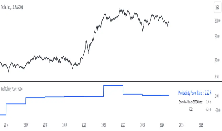
Dividend-to-ROE RatioDividend-to-ROE Ratio Indicator
The Dividend-to-ROE Ratio indicator offers valuable insights into a company's dividend distribution relative to its profitability, specifically comparing the Dividend Payout Ratio (proportion of earnings as dividends) to the Return on Equity (ROE), a measure of profitability from shareholder equity.
Interpretation:
1. Higher Ratio: A higher Dividend-to-ROE Ratio suggests a stable dividend policy, where a significant portion of earnings is returned to shareholders. This can indicate consistent dividend payments, often appealing to income-seeking investors.
2. Lower Ratio: Conversely, a lower ratio implies that the company retains more earnings for growth, potentially signaling a focus on reinvestment for future expansion rather than immediate dividend payouts.
3. Excessively High Ratio: An exceptionally high ratio may raise concerns. While it could reflect a generous dividend policy, excessively high ratios might indicate that a company is distributing more earnings than it can sustainably afford. This could potentially hinder the company's ability to reinvest in its operations, research, or navigate economic downturns effectively.
Utility and Applications:
The Dividend-to-ROE Ratio can be particularly useful in the following scenarios:
1. Income-Oriented Investors: For investors seeking consistent dividend income, a higher ratio signifies a company's commitment to distributing profits to shareholders, potentially aligning with income-oriented investment strategies.
2. Financial Health Assessment: Analysts and stakeholders can use this ratio to gauge a company's financial health and dividend sustainability. It provides insights into management's capital allocation decisions and strategic focus.
3. Comparative Analysis: When comparing companies within the same industry, this ratio helps in benchmarking dividend policies and identifying outliers with unusually high or low ratios.
Considerations:
1. Contextual Analysis: Interpretation should be contextualized within industry standards and the company's financial history. Comparing the ratio with peers in the same sector can provide meaningful insights.
2. Financial Health: It's crucial to evaluate this indicator alongside other financial metrics (like cash flow, debt levels, and profit margins) to grasp the company's overall financial health and sustainability of its dividend policy.
Disclaimer: This indicator is for informational purposes only and does not constitute financial advice. Investors should conduct thorough research and consult with financial professionals before making investment decisions based on this ratio.
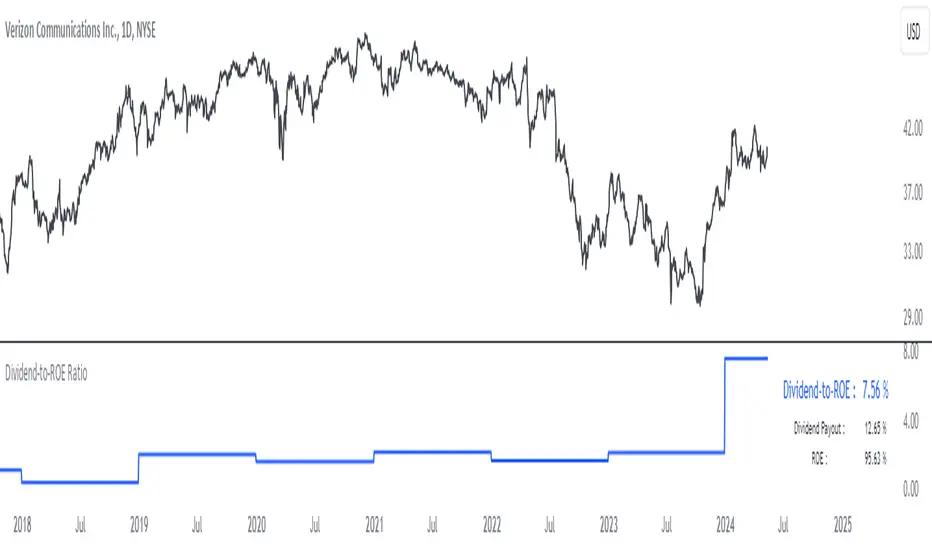
CAPEX RatioUnderstanding the CAPEX Ratio: An Essential Financial Metric
Introduction
In the world of finance, understanding how companies allocate their resources and reinvest their earnings is crucial for investors and analysts. One fundamental metric used to assess a company's investment behavior is the CAPEX Ratio. This article delves into what the CAPEX Ratio signifies, its advantages, and how to interpret its implications.
What is the CAPEX Ratio?
The CAPEX Ratio, short for Capital Expenditure Ratio, is a financial indicator that measures the proportion of a company's capital expenditures (CAPEX) relative to various financial metrics such as revenue, free cash flow, net income, or total assets. CAPEX represents investments made by a company to acquire or maintain its physical assets.
Interpreting the Results
Each variant of the CAPEX Ratio provides unique insights into a company's financial strategy:
• CAPEX to Revenue Ratio: This ratio shows what portion of a company's revenue is being reinvested into capital investments. A higher ratio might indicate aggressive expansion plans or a need for infrastructure upgrades.
• CAPEX to Free Cash Flow Ratio: By comparing CAPEX with free cash flow, this ratio reveals how much of a company's available cash is dedicated to capital investments. It helps assess financial health and sustainability.
• CAPEX to Net Income Ratio: This ratio measures how much of a company's net income is being channeled back into capital expenditures. A high ratio relative to net income could signal a company's commitment to growth and development.
• CAPEX to Total Assets Ratio: This metric assesses the proportion of total assets being allocated towards capital expenditures. It provides a perspective on the company's investment intensity relative to its overall asset base.
Advantages of Using CAPEX Ratios
• Insight into Investment Strategy: Helps investors understand where a company is directing its resources.
• Evaluation of Financial Health: Indicates how efficiently a company is reinvesting profits or available cash.
• Comparative Analysis: Enables comparisons across companies or industries to gauge investment priorities.
How to Use the CAPEX Ratio
• Comparative Analysis: Compare the CAPEX Ratios over time or against industry peers to spot trends or outliers.
• Investment Decision-Making: Consider CAPEX Ratios alongside other financial metrics when making investment decisions.
Conclusion
In conclusion, the CAPEX Ratio is a valuable financial metric that offers deep insights into a company's investment behavior and financial health. By analyzing different variants of this ratio, investors and analysts can make informed decisions about a company's growth prospects and financial stability.

Institutional Activity Index [AlgoAlpha]🌟 Introducing the Institutional Activity Index by AlgoAlpha 🌟
Welcome to a powerful new indicator designed to gauge institutional trading activity! This cutting-edge tool combines volume analysis with price movement to derive a unique index that shines a spotlight on potential institutional moves in the market. 🎯📈
Key Features:
🔍 Normalization Period : Adjust the look-back period for normalization to tailor the sensitivity to your trading strategy.
📊 Moving Average Types : Choose from SMA, HMA, EMA, RMA, WMA, or VWMA to smooth the index and pinpoint trends.
🌈 Color-Coded Trends : Instant visual feedback on index trend direction with customizable up and down colors.
🔔 Alerts : Set alerts for when the index shows increasing activity, decreasing activity, or has reached a peak.
Quick Guide to Using the Institutional Activity Index:
1. 📝 Add the Indicator: Add the indicator to favorites. Adjust the normalization period, MA type, and peak detection settings to match your trading style.
2. 📈 Market Analysis: Similar to volume that reflects the amount of collective trading activity, this index reflects an estimate of the amount of trading activity by institutions. A higher value means that institutions are trading the asset more, this can mean selling or buying as the indicator does not indicate direction . Look out for peak signals, which may indicate that institutions have already secured positions in preparation for a move in price.
3. 🔔 Set Alerts: Enable alerts to notify you when there is a significant change in the activity levels or a new peak is detected, allowing for timely decisions without constant monitoring.
How It Works: 🛠
It is common knowledge that institutions trade with high amounts of capital, but employ tactics so as to not move the price significantly when entering on positions. This can be done by entering in times of high liquidity so that when an institution buys, there are enough sellers to cancel out the price movements and prevent a huge pump in price and vice versa. The Institutional Activity Index calculates liquidity by measuring the volume relative to the price range (close-open). This value is smoothed using median and a user defined moving average type and period, enhancing its clarity. If normalization is enabled, the index is adjusted relative to its range over a user-defined period, making the data comparable across different conditions.
Embrace this innovative tool to enhance your trading insights and strategies! 🚀✨