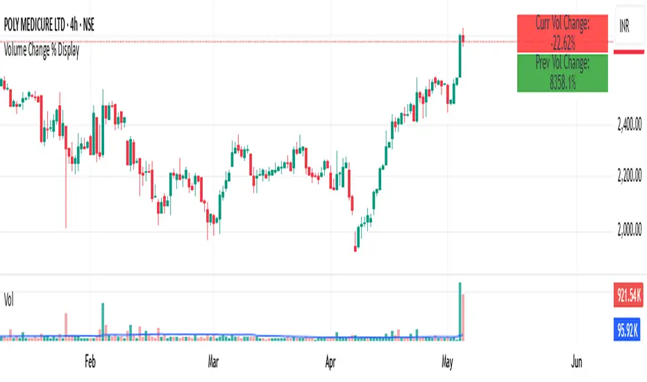
Volume Change % Display1- Current bar's volume change %
2- Previous bar's volume change %
* Each line uses its own color based on volume rising or falling.
* Keeps the layout compact and readable.
Fundamental Analysis
FA Dashboard: Valuation, Profitability & SolvencyFundamental Analysis Dashboard: A Multi-Dimensional View of Company Quality
This script presents a structured and customizable dashboard for evaluating a company’s fundamentals across three key dimensions: Valuation, Profitability, and Solvency & Liquidity.
Unlike basic fundamental overlays, this dashboard consolidates multiple financial indicators into visual tables that update dynamically and are grouped by category. Each ratio is compared against configurable thresholds, helping traders quickly assess whether a company meets certain value investing criteria. The tables use color-coded checkmarks and fail marks (✔️ / ❌) to visually signal pass/fail evaluations.
▶️ Key Features
Valuation Ratios:
Earnings Yield: EBIT / EV
EV / EBIT and EV / FCF: Enterprise value metrics for profitability
Price-to-Book, Free Cash Flow Yield, PEG Ratio
Profitability Ratios:
Return on Invested Capital (ROIC), ROE, Operating, Net & Gross Margins, Revenue Growth
Solvency & Liquidity Ratios:
Debt to Equity, Debt to EBITDA, Current Ratio, Quick Ratio, Altman Z-Score
Each of these metrics is calculated using request.financial() and can be viewed using either annual (FY) or quarterly (FQ) data, depending on user preference.
🧠 How to Use
Add the script to any stock chart.
Select your preferred data period (FY or FQ).
Adjust thresholds if desired to match your personal investing strategy.
Review the visual dashboard to see which metrics the company passes or fails.
💡 Why It’s Useful
This tool is ideal for traders or long-term investors looking to filter stocks using fundamental criteria. It draws inspiration from principles used by Benjamin Graham, Warren Buffett, and Joel Greenblatt, offering a fast and informative way to screen quality businesses.
This is not a repackaged built-in or autogenerated script. It’s a custom-built, interactive tool tailored for fundamental analysis using official financial data provided via Pine Script’s request.financial().

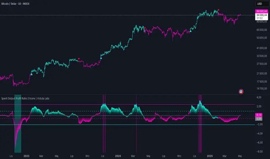
Spent Output Profit Ratio Z-Score | Vistula LabsOverview
The Spent Output Profit Ratio (SOPR) Z-Score indicator is a sophisticated tool designed by Vistula Labs to help cryptocurrency traders analyze market sentiment and identify potential trend reversals. It leverages on-chain data from Glassnode to calculate the Spent Output Profit Ratio (SOPR) for Bitcoin and Ethereum, transforming this metric into a Z-Score for easy interpretation.
What is SOPR?
Spent Output Profit Ratio (SOPR) measures the profit ratio of spent outputs (transactions) on the blockchain:
SOPR > 1: Indicates that, on average, coins are being sold at a profit.
SOPR < 1: Suggests that coins are being sold at a loss.
SOPR = 1: Break-even point, often seen as a key psychological level.
SOPR provides insights into holder behavior—whether they are locking in profits or cutting losses—making it a valuable gauge of market sentiment.
How It Works
The indicator applies a Z-Score to the SOPR data to normalize it relative to its historical behavior:
Z-Score = (Smoothed SOPR - Moving Average of Smoothed SOPR) / Standard Deviation of Smoothed SOPR
Smoothed SOPR: A moving average (e.g., WMA) of SOPR over a short period (default: 30 bars) to reduce noise.
Moving Average of Smoothed SOPR: A longer moving average (default: 180 bars) of the smoothed SOPR.
Standard Deviation: Calculated over a lookback period (default: 200 bars).
This Z-Score highlights how extreme the current SOPR is compared to its historical norm, helping traders spot significant deviations.
Key Features
Data Source:
Selectable between BTC and ETH, using daily SOPR data from Glassnode.
Customization:
Moving Average Types: Choose from SMA, EMA, DEMA, RMA, WMA, or VWMA for both smoothing and main averages.
Lengths: Adjust the smoothing period (default: 30) and main moving average length (default: 180).
Z-Score Lookback: Default is 200 bars.
Thresholds: Set levels for long/short signals and overbought/oversold conditions.
Signals:
Long Signal: Triggered when Z-Score crosses above 1.02, suggesting potential upward momentum.
Short Signal: Triggered when Z-Score crosses below -0.66, indicating potential downward momentum.
Overbought/Oversold Conditions:
Overbought: Z-Score > 2.5, signaling potential overvaluation.
Oversold: Z-Score < -2.0, indicating potential undervaluation.
Visualizations:
Z-Score Plot: Teal for long signals, magenta for short signals.
Threshold Lines: Dashed for long/short, solid for overbought/oversold.
Candlestick Coloring: Matches signal colors.
Arrows: Green up-triangles for long entries, red down-triangles for short entries.
Background Colors: Magenta for overbought, teal for oversold.
Alerts:
Conditions for Long Opportunity, Short Opportunity, Overbought, and Oversold.
Usage Guide
Select Cryptocurrency: Choose BTC or ETH.
Adjust Moving Averages: Customize types and lengths for smoothing and main averages.
Set Thresholds: Define Z-Score levels for signals and extreme conditions.
Monitor Signals: Use color changes, arrows, and background highlights to identify opportunities.
Enable Alerts: Stay informed without constant chart watching.
Interpretation
High Z-Score (>1.02): SOPR is significantly above its historical mean, potentially indicating overvaluation or strong bullish momentum.
Low Z-Score (<-0.66): SOPR is below its mean, suggesting undervaluation or bearish momentum.
Extreme Conditions: Z-Scores above 2.5 or below -2.0 highlight overbought or oversold markets, often preceding reversals.
Conclusion
The SOPR Z-Score indicator combines on-chain data with statistical analysis to provide traders with a clear, actionable view of market sentiment. Its customizable settings, visual clarity, and alert system make it an essential tool for both novice and experienced traders seeking an edge in the cryptocurrency markets.
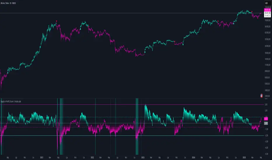
Supply In Profit Z-Score | Vistula LabsOverview
The Supply In Profit Z-Score indicator is a Pine Script™ tool developed by Vistula Labs for technical analysis of cryptocurrencies, specifically Bitcoin (BTC) and Ethereum (ETH). It utilizes on-chain data from IntoTheBlock to calculate the difference between the percentage of addresses in profit and those in loss, transforming this metric into a Z-Score. This indicator helps traders identify market sentiment, trend-following opportunities, and overbought or oversold conditions.
What is Supply In Profit?
Supply In Profit is defined as the net difference between the percentage of addresses in profit and those in loss:
Profit Percentage: The proportion of addresses where the current value of holdings exceeds the acquisition price.
Loss Percentage: The proportion of addresses where the current value is below the acquisition price.
A positive value indicates more addresses are in profit, suggesting bullish sentiment, while a negative value indicates widespread losses, hinting at bearish sentiment.
How It Works
The indicator computes a Z-Score to normalize the Supply In Profit data relative to its historical behavior:
Z-Score = (Current Supply In Profit - Moving Average of Supply In Profit) / Standard Deviation of Supply In Profit
Current Supply In Profit: The latest profit-minus-loss percentage.
Moving Average: A customizable average (e.g., EMA, SMA) over a default 180-bar period.
Standard Deviation: Calculated over a default 200-bar lookback period.
Key Features
Data Source:
Selectable between BTC and ETH, pulling daily profit/loss percentage data from IntoTheBlock.
Customization:
Moving Average Type: Options include SMA, EMA, DEMA, RMA, WMA, or VWMA (default: EMA).
Moving Average Length: Default is 180 bars.
Z-Score Lookback: Default is 200 bars.
Thresholds: Adjustable for long/short signals and overbought/oversold levels.
Signals:
Long Signal: Z-Score crosses above the Long Threshold (default: 1.0).
Short Signal: Z-Score crosses below the Short Threshold (default: -0.64).
Overbought/Oversold Conditions:
Overbought: Z-Score > 3.0.
Oversold: Z-Score < -2.0.
Visualizations:
Z-Score Plot: Teal for long signals, magenta for short signals.
Threshold Lines: Dashed lines for long/short, solid lines for overbought/oversold.
Candlestick Coloring: Matches signal colors (teal/magenta).
Arrows: Green up-triangles for long entries, red down-triangles for short entries.
Background Colors: Magenta for overbought, teal for oversold.
Alerts:
Conditions for Long Opportunity, Short Opportunity, Overbought, and Oversold.
Usage Guide
Trend Following
Long Entry: When Z-Score crosses above 1.0, indicating potential upward momentum.
Short Entry: When Z-Score crosses below -0.64, suggesting potential downward momentum.
Overbought/Oversold Analysis
Overbought (Z-Score > 3.0): Consider profit-taking or preparing for a reversal.
Oversold (Z-Score < -2.0): Look for buying opportunities or exiting shorts.
Timeframe
Uses daily IntoTheBlock data, ideal for medium to long-term analysis.
Interpretation
High Z-Score: Indicates Supply In Profit is significantly above its historical mean, potentially signaling overvaluation.
Low Z-Score: Suggests Supply In Profit is below its mean, indicating possible undervaluation.
Signals and thresholds help traders act on shifts in market sentiment or extreme conditions.
Conclusion
The Supply In Profit Z-Score indicator provides a robust, data-driven approach to analyzing cryptocurrency market trends and sentiment. By combining on-chain metrics with statistical normalization, it empowers traders to make informed decisions based on historical context and current market dynamics.
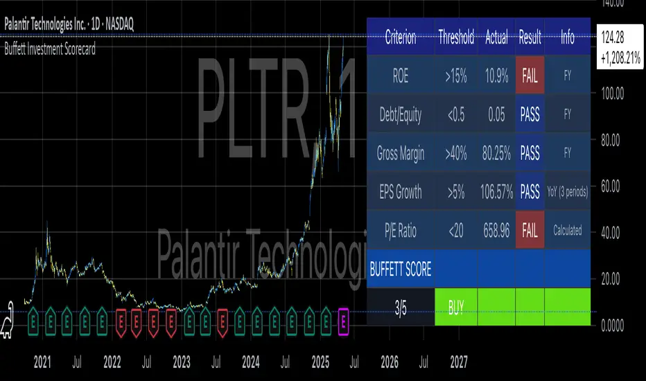
Buffett Investment ScorecardYou want to buy a stock and wonder if Warren Buffett would buy it?
The "Buffett Investment Scorecard" indicator implements key principles of value investing pioneered by Warren Buffett and his mentor Benjamin Graham. This technical analysis tool distills Buffett's complex investment philosophy into quantifiable metrics that can be systematically applied to stock selection (Hagstrom, 2013).
Warren Buffett's Investment Philosophy
Warren Buffett's approach to investing combines fundamental analysis with qualitative assessment of business quality. As detailed in his annual letters to Berkshire Hathaway shareholders, Buffett seeks companies with durable competitive advantages, often referred to as "economic moats" (Buffett, 1996). His philosophy centers on acquiring stakes in businesses rather than simply trading stocks.
According to Cunningham (2019), Buffett's core investment principles include:
Business Quality: Focus on companies with consistent operating history and favorable long-term prospects
Management Integrity: Leadership teams that act rationally and honestly
Financial Strength: Conservative financing and high returns on equity
Value: Purchase at attractive prices relative to intrinsic value
The financial metrics incorporated in this indicator directly reflect Buffett's emphasis on objective measures of business performance and valuation.
Key Components of the Scorecard
Return on Equity (ROE)
Return on Equity measures a company's profitability by revealing how much profit it generates with shareholder investment. Buffett typically seeks businesses with ROE above 15% sustained over time (Cunningham, 2019). As noted by Hagstrom (2013, p.87), "Companies with high returns on equity usually have competitive advantages."
Debt-to-Equity Ratio
Buffett prefers companies with low debt. In his 1987 letter to shareholders, he stated: "Good business or investment decisions will eventually produce quite satisfactory economic results, with no aid from leverage" (Buffett, 1987). The scorecard uses a threshold of 0.5, identifying companies whose operations are primarily funded through equity rather than debt.
Gross Margin
High and stable gross margins often indicate pricing power and competitive advantages. Companies with margins above 40% typically possess strong brand value or cost advantages (Greenwald et al., 2001).
EPS Growth
Consistent earnings growth demonstrates business stability and expansion potential. Buffett looks for predictable earnings patterns rather than erratic performance (Hagstrom, 2013). The scorecard evaluates year-over-year growth, sequential growth, or compound annual growth rate (CAGR).
P/E Ratio
The price-to-earnings ratio helps assess valuation. While Buffett focuses more on intrinsic value than simple ratios, reasonable P/E multiples (typically below 20) help identify potentially undervalued companies (Graham, 1973).
Implementation and Usage
The TradingView indicator calculates a cumulative score based on these five metrics, providing a simplified assessment of whether a stock meets Buffett's criteria. Results are displayed in a color-coded table showing each criterion's status (PASS/FAIL).
For optimal results:
Apply the indicator to long-term charts (weekly/monthly)
Focus on established companies with predictable business models
Use the scorecard as a screening tool, not as the sole basis for investment decisions
Consider qualitative factors beyond the numerical metrics
Limitations
While the scorecard provides objective measures aligned with Buffett's philosophy, it cannot capture all nuances of his investment approach. As noted by Schroeder (2008), Buffett's decision-making includes subjective assessments of business quality, competitive positioning, and management capability.
Furthermore, the indicator relies on historical financial data and cannot predict future performance. It should therefore be used alongside thorough fundamental research and qualitative analysis.
References
Buffett, W. (1987). Letter to Berkshire Hathaway Shareholders. Berkshire Hathaway Inc.
Buffett, W. (1996). Letter to Berkshire Hathaway Shareholders. Berkshire Hathaway Inc.
Cunningham, L.A. (2019). The Essays of Warren Buffett: Lessons for Corporate America. Carolina Academic Press.
Graham, B. (1973). The Intelligent Investor. Harper & Row.
Greenwald, B., Kahn, J., Sonkin, P., & van Biema, M. (2001). Value Investing: From Graham to Buffett and Beyond. Wiley Finance.
Hagstrom, R.G. (2013). The Warren Buffett Way. John Wiley & Sons.
Schroeder, A. (2008). The Snowball: Warren Buffett and the Business of Life. Bantam Books.
MBODDS GLOBAL - Enhanceden
MBODDS GLOBAL Indicator – Detailed Interpretation
What does the indicator measure?
Liquidity preferences
Credit risk perception
Market stress levels
Interpreting the ODDS Value
ODDS Value Explanation
Positive ODDS (> 0) SOFR is higher than the T-Bill rate → Interbank liquidity is more expensive → Possible financial stress.
Negative ODDS (< 0) T-Bill rates are higher than SOFR → The government pays more interest in the short term → Liquidity abundance, normal market conditions.
ODDS ≈ 0 Neutral market state → Low stress, market is stable.
Z-Score Interpretation (Extremity Analysis)
The Z-Score measures the standard deviation of ODDS, detecting extreme values:
Z-Score Meaning
> +1.0 Spread is unusually high → Stress/crisis risk increases.
< -1.0 Spread is unusually low → Liquidity could be abundant.
> +2.0 Extremely high spread → Systemic risk (observed during 2008-2020 periods).
≈ 0 Average level → Normal conditions, no notable risk.
The Z-Score functions as an "anomaly detector" for this indicator.
SMA (Simple Moving Average) Interpretation
The 21-day SMA shows the trend of ODDS:
ODDS consistently above SMA: Rising stress and credit costs.
ODDS consistently below SMA: Easier liquidity and lower market concerns.
Threshold Bands (±0.5)
These thresholds are visual guides for alerts:
ODDS > +0.5: Rising stress, potential liquidity tightening → Risky environment.
ODDS < -0.5: Low spread → Abundant liquidity, low stress → Comfortable environment.
Use Cases
Macro analysis (especially after Fed policy changes)
Direction determination in bond, equity, or credit markets
Early signal for stressful periods
Predicting liquidity crises
Conclusion:
This indicator acts as a macro-based "silent alarm." Specifically:
SOFR > T-Bill and Z-Score > 1: Stress and risk are increasing, protection strategies should be considered.
T-Bill > SOFR and Z-Score < -1: Liquidity is abundant, risk appetite may rise.

Global ETF Capital FlowsThe Global ETF Capital Flows indicator is designed as a research and monitoring tool for identifying capital allocation trends across major global exchange-traded funds (ETFs). It provides standardized fund flow data for regional equity markets (including the United States, Europe, Asia, and Emerging Markets), as well as alternative asset classes such as bonds and gold.
Fund flows into and out of ETFs are increasingly recognized as a leading indicator of investor behavior, particularly in the context of tactical asset allocation and risk appetite (Ben-David et al., 2017). By tracking aggregated ETF flows, the script enables the user to detect shifts in global investment preferences, which may precede price action and influence broader macro trends (Bank of International Settlements, 2018). For example, consistent inflows into U.S. large-cap ETFs such as SPY or QQQ may signal heightened investor confidence in domestic equities, whereas rising flows into bond ETFs such as TLT may suggest a flight to safety or expectations of declining interest rates (Israeli et al., 2017).
The visualization aspect of the script uses standardized z-scores to represent cumulative flows over a specified period. This normalization allows users to compare fund flows across regions and asset classes on a relative basis, filtering out scale differences and allowing for more effective cross-market analysis. According to Coates and Herbert (2008), normalization techniques such as z-scores are crucial in behavioral finance research, as they help detect anomalies and emotional extremes in investor activity.
Practically, this indicator is suited for top-down macro analysis, sector rotation strategies, and confirmation of technical signals. For instance, significant positive deviations in the standardized flow data for European ETFs may support a bullish bias on regional equities, especially if corroborated by technical breakouts or improving economic indicators. Conversely, elevated inflows into gold ETFs may be interpreted as hedging behavior against geopolitical uncertainty or inflationary pressure, consistent with historical patterns of gold’s role as a safe haven (Baur and Lucey, 2010).
Additionally, the tool allows for visual alerts when flow anomalies exceed a user-defined threshold, thereby supporting more responsive and data-driven decision-making. This feature aligns with findings from the CFA Institute (2019), which emphasize the growing importance of alternative data and automated alert systems in modern portfolio management.
From a research perspective, the indicator facilitates empirical study into capital mobility, intermarket relationships, and ETF investor psychology. It offers real-time monitoring of region-specific investment flows, thus serving as a proxy for investor conviction, liquidity trends, and cross-border risk-on/risk-off sentiment. Several recent studies have demonstrated the predictive power of ETF flows on future returns and volatility, particularly during periods of market stress or structural dislocations (Madhavan, 2016; Pan and Zeng, 2019).
References
• Baur, D.G. and Lucey, B.M., 2010. Is gold a hedge or a safe haven? An analysis of stocks, bonds and gold. Financial Review, 45(2), pp.217-229.
• Ben-David, I., Franzoni, F. and Moussawi, R., 2017. Exchange-traded funds (ETFs). Annual Review of Financial Economics, 9, pp.169–189.
• Bank of International Settlements (BIS), 2018. ETFs – growing popularity, growing risks? BIS Quarterly Review, March 2018.
• CFA Institute, 2019. Investment Professional of the Future. Available at: www.cfainstitute.org .
• Coates, J.M. and Herbert, J., 2008. Endogenous steroids and financial risk taking on a London trading floor. Proceedings of the National Academy of Sciences, 105(16), pp.6167–6172.
• Israeli, D., Lee, C.M. and Sridharan, S.A., 2017. Is there a dark side to ETF trading? Evidence from corporate bond ETFs. SSRN Working Paper. Available at SSRN: ssrn.com
• Madhavan, A., 2016. Exchange-Traded Funds and the New Dynamics of Investing. Oxford University Press.
• Pan, K. and Zeng, Y., 2019. ETF Arbitrage Under Liquidity Mismatch. Journal of Finance, 74(6), pp.2731–2783.

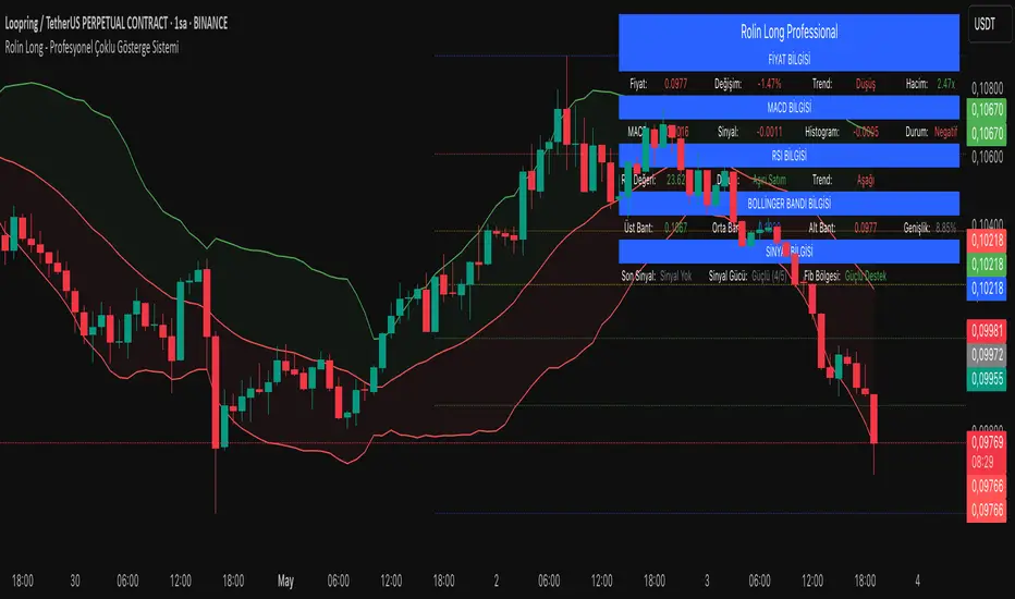
Professional Multi-Indicator SystemDescription
Professional Multi-Indicator System merges several proven technical indicators into a single overlay, allowing you to monitor trend, momentum, volatility, and key price levels all at once. Below you’ll find why these components work together, default parameters, backtest results, usage recommendations, and important disclaimers.
1. Mashup Justification & Components
MACD: Detects trend direction and momentum shifts via fast/slow crossover and histogram analysis.
RSI: Filters overbought/oversold conditions and confirms momentum using a 50-level threshold.
Bollinger Bands: Captures volatility squeezes and band touches to signal potential breakouts or pullbacks.
Fibonacci Retracement: Automatically (or manually) draws key support/resistance levels at 23.6%, 38.2%, 50%, 61.8%, 78.6%, and 100%.
Combined Workflow:
Trend Confirmation (MACD + RSI)
Volatility Check (Bollinger Bands)
Level-Based Entries/Exits (Fibonacci)
This layered approach reduces false signals and increases overall reliability.
2. Default Settings
Account Size: $10,000 (example)
Commission: 0.1% per trade
Slippage: 0.05%
Test Instrument & Period: BTCUSDT 1H, Jan 1 2022 – Dec 31 2023
Risk per Trade: Maximum 5% of equity
Indicator Defaults:
MACD: 12 / 26 / 9 (optional confirmation)
RSI: 14 period, OB = 70, OS = 30 (optional confirmation)
Bollinger Bands: 20 period, ±2 σ (optional confirmation)
Fibonacci: 50 period, auto-trend detection on
Volume Filter: 20-period SMA, threshold = 1.5× average
Visuals: Modern labels, large icons, info table in top-right
3. Backtest Summary
Total Trades: 158
Win Rate: 58.2%
Average Risk/Reward: 1:1.6
Max Drawdown: 12.4%
Net Return: +24.7%
Note: Past performance does not guarantee future results. Adjust settings to your own instruments and timeframes.
4. How to Use
Add to Chart: Select “Professional Multi-Indicator System.”
Review Settings: Open Settings → Main, MACD, RSI, Bollinger, Volume, Fibonacci, Visuals.
Enable Confirmations: Turn on “confirmation” for each component to filter weak signals.
Wait for Strong Signal: Consider entries when signalStrength ≥ 3/5.
Manage Risk: Size positions ≤ 5% of your capital; factor in commission/slippage.
Exit Rules: Close on “Strong SELL” alert or your predefined stop-loss.
5. Warnings & Disclaimer
This indicator is for educational purposes only. Always apply your own analysis and risk management. Past performance is not indicative of future results. Update commission, slippage, and risk settings to match your trading environment.
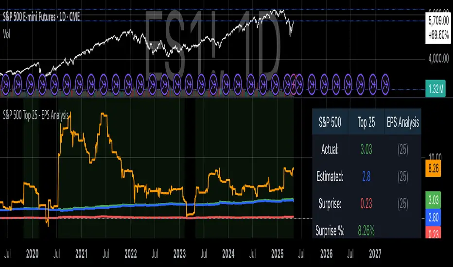
S&P 500 Top 25 - EPS AnalysisEarnings Surprise Analysis Framework for S&P 500 Components: A Technical Implementation
The "S&P 500 Top 25 - EPS Analysis" indicator represents a sophisticated technical implementation designed to analyze earnings surprises among major market constituents. Earnings surprises, defined as the deviation between actual reported earnings per share (EPS) and analyst estimates, have been consistently documented as significant market-moving events with substantial implications for price discovery and asset valuation (Ball and Brown, 1968; Livnat and Mendenhall, 2006). This implementation provides a comprehensive framework for quantifying and visualizing these deviations across multiple timeframes.
The methodology employs a parameterized approach that allows for dynamic analysis of up to 25 top market capitalization components of the S&P 500 index. As noted by Bartov et al. (2002), large-cap stocks typically demonstrate different earnings response coefficients compared to their smaller counterparts, justifying the focus on market leaders.
The technical infrastructure leverages the TradingView Pine Script language (version 6) to construct a real-time analytical framework that processes both actual and estimated EPS data through the platform's request.earnings() function, consistent with approaches described by Pine (2022) in financial indicator development documentation.
At its core, the indicator calculates three primary metrics: actual EPS, estimated EPS, and earnings surprise (both absolute and percentage values). This calculation methodology aligns with standardized approaches in financial literature (Skinner and Sloan, 2002; Ke and Yu, 2006), where percentage surprise is computed as: (Actual EPS - Estimated EPS) / |Estimated EPS| × 100. The implementation rigorously handles potential division-by-zero scenarios and missing data points through conditional logic gates, ensuring robust performance across varying market conditions.
The visual representation system employs a multi-layered approach consistent with best practices in financial data visualization (Few, 2009; Tufte, 2001).
The indicator presents time-series plots of the four key metrics (actual EPS, estimated EPS, absolute surprise, and percentage surprise) with customizable color-coding that defaults to industry-standard conventions: green for actual figures, blue for estimates, red for absolute surprises, and orange for percentage deviations. As demonstrated by Padilla et al. (2018), appropriate color mapping significantly enhances the interpretability of financial data visualizations, particularly for identifying anomalies and trends.
The implementation includes an advanced background coloring system that highlights periods of significant earnings surprises (exceeding ±3%), a threshold identified by Kinney et al. (2002) as statistically significant for market reactions.
Additionally, the indicator features a dynamic information panel displaying current values, historical maximums and minimums, and sample counts, providing important context for statistical validity assessment.
From an architectural perspective, the implementation employs a modular design that separates data acquisition, processing, and visualization components. This separation of concerns facilitates maintenance and extensibility, aligning with software engineering best practices for financial applications (Johnson et al., 2020).
The indicator processes individual ticker data independently before aggregating results, mitigating potential issues with missing or irregular data reports.
Applications of this indicator extend beyond merely observational analysis. As demonstrated by Chan et al. (1996) and more recently by Chordia and Shivakumar (2006), earnings surprises can be successfully incorporated into systematic trading strategies. The indicator's ability to track surprise percentages across multiple companies simultaneously provides a foundation for sector-wide analysis and potentially improves portfolio management during earnings seasons, when market volatility typically increases (Patell and Wolfson, 1984).
References:
Ball, R., & Brown, P. (1968). An empirical evaluation of accounting income numbers. Journal of Accounting Research, 6(2), 159-178.
Bartov, E., Givoly, D., & Hayn, C. (2002). The rewards to meeting or beating earnings expectations. Journal of Accounting and Economics, 33(2), 173-204.
Bernard, V. L., & Thomas, J. K. (1989). Post-earnings-announcement drift: Delayed price response or risk premium? Journal of Accounting Research, 27, 1-36.
Chan, L. K., Jegadeesh, N., & Lakonishok, J. (1996). Momentum strategies. The Journal of Finance, 51(5), 1681-1713.
Chordia, T., & Shivakumar, L. (2006). Earnings and price momentum. Journal of Financial Economics, 80(3), 627-656.
Few, S. (2009). Now you see it: Simple visualization techniques for quantitative analysis. Analytics Press.
Gu, S., Kelly, B., & Xiu, D. (2020). Empirical asset pricing via machine learning. The Review of Financial Studies, 33(5), 2223-2273.
Johnson, J. A., Scharfstein, B. S., & Cook, R. G. (2020). Financial software development: Best practices and architectures. Wiley Finance.
Ke, B., & Yu, Y. (2006). The effect of issuing biased earnings forecasts on analysts' access to management and survival. Journal of Accounting Research, 44(5), 965-999.
Kinney, W., Burgstahler, D., & Martin, R. (2002). Earnings surprise "materiality" as measured by stock returns. Journal of Accounting Research, 40(5), 1297-1329.
Livnat, J., & Mendenhall, R. R. (2006). Comparing the post-earnings announcement drift for surprises calculated from analyst and time series forecasts. Journal of Accounting Research, 44(1), 177-205.
Padilla, L., Kay, M., & Hullman, J. (2018). Uncertainty visualization. Handbook of Human-Computer Interaction.
Patell, J. M., & Wolfson, M. A. (1984). The intraday speed of adjustment of stock prices to earnings and dividend announcements. Journal of Financial Economics, 13(2), 223-252.
Skinner, D. J., & Sloan, R. G. (2002). Earnings surprises, growth expectations, and stock returns or don't let an earnings torpedo sink your portfolio. Review of Accounting Studies, 7(2-3), 289-312.
Tufte, E. R. (2001). The visual display of quantitative information (Vol. 2). Graphics Press.
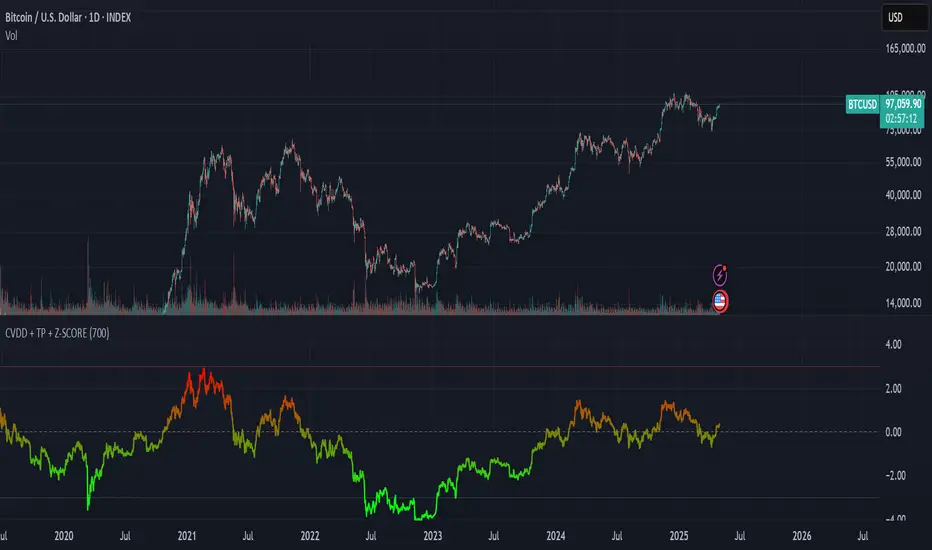
CVDD + Terminal Price Indicator + Z-SCOREThis custom indicator is designed to help identify major overvaluation and undervaluation zones in Bitcoin's market cycles by analyzing price behavior relative to long-term on-chain benchmarks.
It leverages two well-known valuation models — CVDD (Cumulative Value Days Destroyed) and Terminal Price — to define a dynamic valuation range that adapts over time. These reference points are combined with a custom Z-score framework to evaluate how extended price is compared to long-term value zones.
The result is a normalized oscillator that highlights extremes in market sentiment, ranging from –3 (potential deep value) to +3 (potential overheated conditions), with a gradient color scale for quick visual interpretation.
This tool is especially useful for long-term investors and macro analysts seeking signals of potential market tops and bottoms based on deep on-chain behavior — rather than short-term technicals.
Currency Basket vs USD - Trend & RSI Breakdown📊 Indicator Methodology
Currency Basket vs USD – Trend & Valuation Breakdown
💱 Strategy of Rotating Between USD and the Currency Basket
💰 100% cash strategy – always ready for market crashes.
🟢 Hold USD if the trend indicator shows USD is trending.
🔵 Hold the currency basket (EUR, PLN, CZK, CHF, GBP) if the basket is trending.
✅ This way, you're always on the winning side of the trade, never risking a loss of purchasing power.
📈 Since it's a LONG ONLY, NO LEVERAGE strategy, there are no trading or holding fees, except for a small 0.15% FX fee every few months when the trending currency changes.
📈 Trend Indicator
Uses 5 different indicators working together to determine which asset is in a trend.
👀 On the chart it's visualized as:
➕ Plus symbols indicating trend strength (usually ranges from -4 to +4).
🔺 If USD has a higher trend signal than the basket → Hold USD.
🔻 If the basket has a higher signal → Hold the basket.
🕒 Signals typically last several months and operate on the 3D (3-day) timeframe, giving a high probability of catching macro moves.
💡 Valuation Indicator (Z-scored RSI)
Uses RSI with a length of 30.
Z-scored between -1 to 1.
📉 Interpretation:
-1 for USD = too strong → likely stagnation or reversal.
-1 for Basket = undervalued → likely growth or stabilization.
📊 Displayed as a separate line below the main chart.
📍 A horizontal line at 90 is added on the main chart – helping you quickly see what’s above or below this key reference level.
⚙️ How the Strategy Works in Practice
✅ You update the indicator daily (takes only seconds).
✅ The trend indicator tells you which currency to hold.
✅ The valuation indicator prepares you for possible reversals.
🔄 When the trend shifts, you rotate your full position.
⏳ Trades typically last several months.
📈 Usually generates consistent profits of 2–8%.
💪 It grows your capital while keeping you ready to buy assets during major selloffs.
🔍 Best Usage
Use it as a quick scanner to observe trend or valuation changes.
If a signal appears, validate it using additional trend and valuation indicators.
📌 If most agree, take the position.

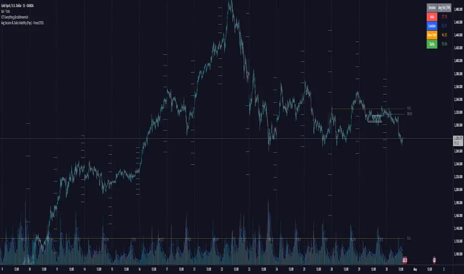
Avg Session & Daily Volatility (Pips) - Forex/CFDS🔍 Overview
The Avg Session & Daily Volatility (Pips) indicator measures the average High–Low range (volatility) of three major Forex sessions—Asia, London, New York—and the entire trading day, then displays the results in a compact overlay table.
⚙️ Key Features
Session Windows
Asia: Default 23:00 – 07:00 server time
London: 07:00 – 16:00
New York: 13:00 – 22:00
Daily Range
– Tracks the full High–Low from midnight to midnight.
Flexible Lookback
– Choose 1W / 2W / 4W / 8W (≈ 5 / 10 / 20 / 40 trading days)
Pip Conversion
Forex Pairs: 1 pip = 0.0001 → (ticks / mintick) / 10
XAU/USD (Gold): 1 pip = 1 USD → direct price difference
Custom Styling
– Pick your own colors per session & daily
– Table position: Left/Center/Right × Top/Middle/Bottom
📈 Benefits & Use Cases
Optimal Stop-Loss & Take-Profit
Gauge each session’s typical movement to size SL/TP appropriately.
Intraday Performance Check
Compare your real-time trade swings against historical averages.
Risk Management
Align position sizes with average volatility to control risk.
Multi-Asset Support
Works seamlessly for major Forex pairs and Gold (XAU/USD) thanks to smart pip logic.
🚀 How It Works
Session Scanning – Continuously tracks the session’s high and low.
Array Storage – At session close, calculates range in pips and pushes it into a rolling buffer.
Averaging – Computes the arithmetic mean of the last N values (your chosen lookback).
Visualization – Paints the four averages in a neat 2×5 table overlay.
👍 Pro Tips
Check Your Time Zone – Make sure chart timezone matches your broker’s session times.
Tweak Lookback – Use shorter windows (1W) to react quickly; longer (4–8W) to smooth out outliers.
Combine Indicators – Pair with volume or trend tools for deeper insights.
Happy Trading,
Riseofatrader
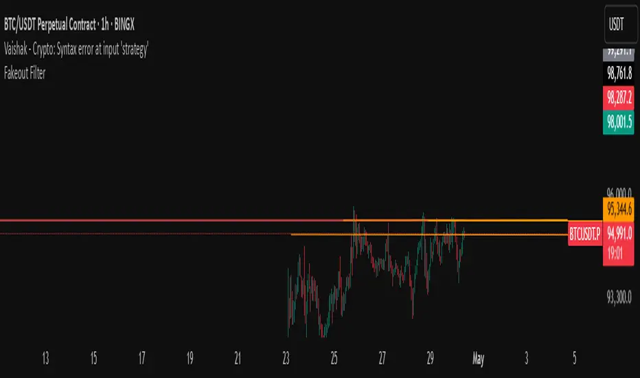
Fakeout Filter📈 Fakeout Filter by ARV
🔍 Overview:
The Fakeout Filter is a smart breakout validation tool designed to help traders avoid false breakouts and focus only on high-probability breakout trades. This indicator combines price action, volume analysis, RSI divergence detection, and OBV trend confirmation to filter out noise and improve your entries.
⚙️ Key Features:
✅ Breakout Detection
Detects when the price closes above a user-defined resistance level.
✅ Volume Spike Confirmation
Confirms breakouts only if there’s a significant increase in volume (customizable via settings).
✅ RSI Bearish Divergence Filter
Warns you of bearish RSI divergence, which often signals fakeouts during breakouts.
✅ OBV Trend Confirmation
Ensures On-Balance Volume (OBV) is rising, aligning volume flow with price movement.
✅ EMA Filter (Trend Confirmation)
Adds a safety filter using Exponential Moving Average (EMA) to ensure price action aligns with the short-term trend.
📌 How to Use:
Set Resistance Level:
In the indicator settings, input a key resistance level (manual input based on your chart analysis).
Watch for Signals:
A green background and “Breakout” label appear when:
Price closes above the resistance.
Volume is significantly higher than average.
OBV is rising.
No bearish RSI divergence is detected.
Price is above the EMA (trend confirmation).
Entry Suggestion:
Consider entering long positions only when the breakout label appears.
For additional confirmation, wait for a retest of the resistance as support before entering.
🔧 Settings:
Resistance Level – Manually set the level you're watching.
Volume Multiplier – Adjusts sensitivity to volume spikes (default: 1.5x average).
RSI Period – RSI used for divergence detection (default: 14).
EMA Period – For trend direction confirmation (default: 21).
✅ Best Use Cases:
Scalpers and intraday traders avoiding fakeouts on 5m–1H timeframes.
Swing traders validating breakout setups.
BTC, ETH, and major altcoins in consolidation or breakout zones.
⚠️ Disclaimer:
This tool is for educational purposes only. Always combine it with your own market analysis and risk management.
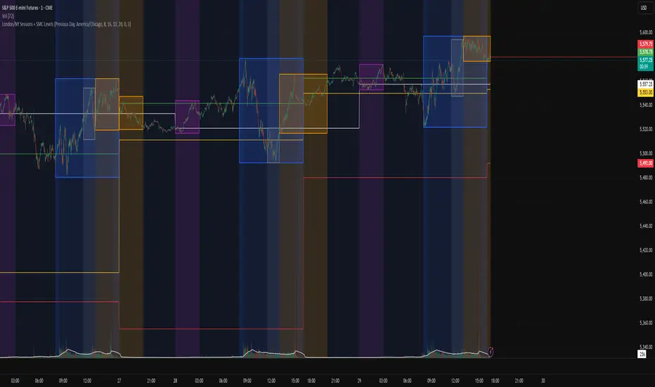
ICT Macro Zone Boxes w/ Individual H/L Tracking v3.1ICT Macro Zones (Grey Box Version
This indicator dynamically highlights key intraday time-based macro sessions using a clean, minimalistic grey box overlay, helping traders align with institutional trading cycles. Inspired by ICT (Inner Circle Trader) concepts, it tracks real-time highs and lows for each session and optionally extends the zone box after the session ends — making it a precision tool for intraday setups, order flow analysis, and macro-level liquidity sweeps.
### 🔍 **What It Does**
- Plots **six predefined macro sessions** used in Smart Money Concepts:
- AM Macro (09:50–10:10)
- London Close (10:50–11:10)
- Lunch Macro (11:30–13:30)
- PM Macro (14:50–15:10)
- London SB (03:00–04:00)
- PM SB (15:00–16:00)
- Each zone:
- **Tracks high and low dynamically** throughout the session.
- **Draws a consistent grey shaded box** to visualize price boundaries.
- **Displays a label** at the first bar of the session (optional).
- **Optionally extends** the box to the right after the session closes.
### 🧠 **How It Works**
- Uses Pine Script arrays to define each session’s time window, label, and color.
- Detects session entry using `time()` within a New York timezone context.
- High/Low values are updated per bar inside the session window.
- Once a session ends, the box is optionally closed and fixed in place.
- All visual zones use a standardized grey tone for clarity and consistency across charts.
### 🛠️ **Settings**
- **Shade Zone High→Low:** Enable/disable the grey macro box.
- **Extend Box After Session:** Keep the zone visible after it ends.
- **Show Entry Label:** Display a label at the start of each session.
### 🎯 **Why This Script is Unique**
Unlike basic session markers or colored backgrounds, this tool:
- Focuses on **macro moments of liquidity and reversal**, not just open/close times.
- Uses **per-session logic** to individually track price behavior inside key time windows.
- Supports **real-time high/low tracking and clean zone drawing**, ideal for Smart Money and ICT-style strategies.
Perfect — based on your list, here's a **bundle-style description** that not only explains the function of each script but also shows how they **work together** in a Smart Money/ICT workflow. This kind of cross-script explanation is exactly what TradingView wants to see to justify closed-source mashups or interdependent tools.
---
📚 ICT SMC Toolkit — Script Integration Guide
This set of advanced Smart Money Concept (SMC) tools is designed for traders who follow ICT-based methodologies, combining liquidity theory, time-based precision, and engineered confluences for high-probability trades. Each indicator is optimized to work both independently and synergistically, forming a comprehensive trading framework.
---
First FVG Custom Time Range
**Purpose:**
Plots the **first Fair Value Gap (FVG)** that appears within a defined session (e.g., NY Kill Zone, Custom range). Includes optional retest alerts.
**Best Used With:**
- Use with **ICT Macro Zones (Grey Box Version)** to isolate FVGs during high-probability times like AM Macro or PM SB.
- Combine with **Liquidity Levels** to assess whether FVGs form near swing points or liquidity voids.
---
ICT SMC Liquidity Grabs and OB s
**Purpose:**
Detects **liquidity grabs** (stop hunts above/below swing highs/lows) and **bullish/bearish order blocks**. Includes optional Fibonacci OTE levels for sniper entries.
**Best Used With:**
- Use with **ICT Turtle Soup (Reversal)** for confirmation after a liquidity grab.
- Combine with **Macro Zones** to catch order blocks forming inside timed macro windows.
- Match with **Smart Swing Levels** to confirm structure breaks before entry.
ICT SMC Liquidity Levels (Smart Swing Lows)
**Purpose:**
Automatically marks swing highs/lows based on user-defined lookbacks. Tracks whether those levels have been breached or respected.
**Best Used With:**
- Combine with **Turtle Soup** to detect if a swing level was swept, then reversed.
- Use with **Liquidity Grabs** to confirm a grab occurred at a meaningful structural point.
- Align with **Macro Zones** to understand when liquidity events occur within macro session timing.
ICT Turtle Soup (Liquidity Reversal)
**Purpose:**
Implements the classic ICT Turtle Soup model. Looks for swing failure and quick reversals after a liquidity sweep — ideal for catching traps.
Best Used With:
- Confirm with **Liquidity Grabs + OBs** to identify institutional activity at the reversal point.
- Use **Liquidity Levels** to ensure the reversal is happening at valid previous swing highs/lows.
- Amplify probability when pattern appears during **Macro Zones** or near the **First FVG**.
ICT Turtle Soup Ultimate V2
**Purpose:**
An enhanced, multi-layer version of the Turtle Soup setup that includes built-in liquidity checks, OTE levels, structure validation, and customizable visual output.
**Best Used With:**
- Use as an **entry signal generator** when other indicators (e.g., OBs, liquidity grabs) are aligned.
- Pair with **Macro Zones** for high-precision timing.
- Combine with **First FVG** to anticipate price rebalancing before explosive moves.
---
## 🧠 Workflow Example:
1. **Start with Macro Zones** to focus only on institutional trading windows.
2. Look for **Liquidity Grabs or Swing Sweeps** around key highs/lows.
3. Check for a **Turtle Soup Reversal** or **Order Block Reaction** near that level.
4. Confirm confluence with a **Fair Value Gap**.
5. Execute using the **OTE level** from the Liquidity Grabs + OB script.
---
Let me know which script you want to publish first — I’ll tailor its **individual TradingView description** and flag its ideal **“Best Used With” partners** to help users see the value in your ecosystem.

London/NY Sessions + SMC Levels📜 Indicator Description: London/NY Sessions + SMC Levels
Overview: This indicator highlights the key trading sessions — London, New York, NY Lunch, and Asian Range — providing structured visual guides based on Smart Money Concepts (SMC) and ICT principles.
It dynamically plots:
Session Backgrounds and Boxes for London, NY, Lunch, and Asian sessions
Reference Levels for the High, Low, and Close from today, previous day, or weekly data
Midnight Open line for ICT-style power of three setups
Real-time alerts for session starts, session closes, and important price level crossings
Features:
🕰️ Session Visualization:
Toggle London, NY, Lunch, and Asian session ranges individually, with customizable colors and transparent backgrounds.
🔔 Built-in Alerts:
Alerts for:
Price crossing the previous day's high/low
Price crossing the Midnight Open
Start and end of major sessions (London, NY, Lunch, Asian)
🟩 Reference Levels:
Plot selectable session reference levels:
Today’s intraday High/Low/Close
Previous Day’s High/Low/Close
This Week’s or Previous Week’s levels for broader context.
🌙 Midnight Open:
Track the Midnight New York Open as a reference point for daily bias shifts.
🎯 Customizable Settings:
Choose your session time zones (UTC, New York, London, etc.)
Customize all border colors, background colors, and session hours.
Use Cases:
Identify killzones and optimal trade entry windows for Smart Money Concepts (SMC) and ICT strategies.
Monitor liquidity pool sweeps and session transitions.
Confirm or refine your intraday or swing trading setups by referencing session highs/lows.
Recommended For:
ICT traders
Smart Money Concepts (SMC) practitioners
Forex, indices, crypto, and futures traders focusing on session-based volatility patterns
Anyone wanting a clean, professional session mapping tool
📈
Designed to help you trade with session precision and Smart Money accuracy.
Integrates seamlessly into any ICT, Wyckoff, or Liquidity-based trading approach.
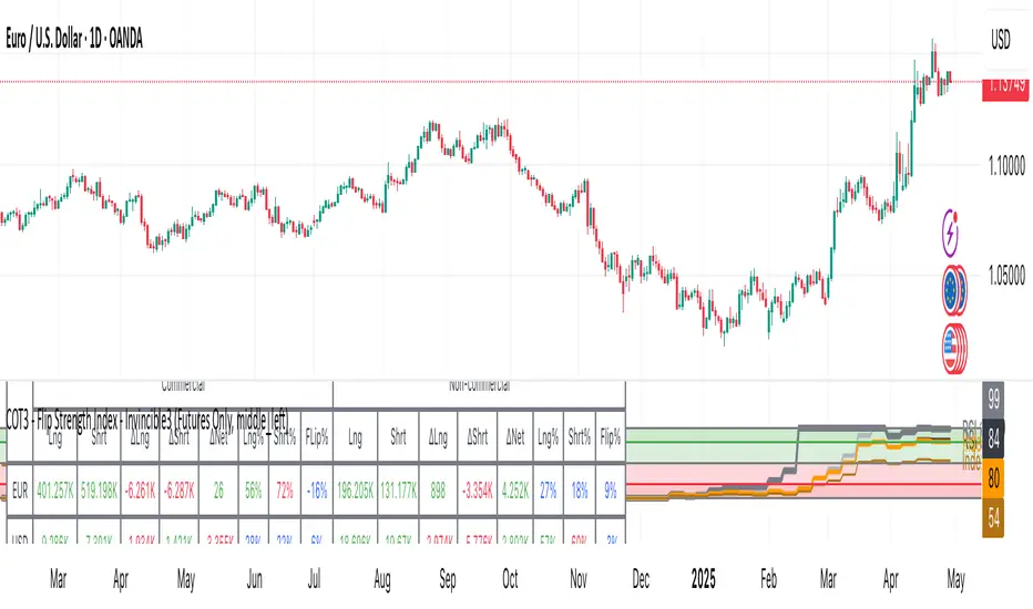
COT3 - Flip Strength Index - Invincible3This indicator uses the TradingView COT library to visualize institutional positioning and potential sentiment or trend shifts. It compares the long% vs short% of commercial and non-commercial traders for both Pair A and Pair B, helping traders identify trend strength, market overextension, and early reversal signals.
🔷 COT RSI
The COT RSI normalizes the net positioning difference between non-commercial and commercial traders over (N=13, 26, and 52)-week periods. It ranges from 0 to 100, highlighting when sentiment is at bullish or bearish extremes.
COT RSI (N)= ((NC - C)−min)/(max-min) x100
🟡 COT Index
The COT Index tracks where the current non-commercial net position lies within its 1-year and 3-year historical range. It reflects institutional accumulation or distribution phases.
Strength represents the magnitude of that positioning bias, visualized through normalized RSI-style metrics.
COT Index (N)= (NC net)/(max-min) x100
🔁 Flip Detection
Flip refers to the crossovers between long% and short%, indicating a change in directional bias among trader groups. When long positions exceed shorts (or vice versa), it signals a possible market flip in sentiment or trend.
For example, Pair B commercial flip is calculated as:
Long% = (Long/Open Interest)×100
Short% = (Short/Open Interest)×100
Flip = Long%−Short%
A bullish flip occurs when long% overtakes short%, and vice versa for a bearish flip. These flips often precede price trend changes or confirm sentiment breakouts.
Flip captures how far current positioning deviates from historical norms — highlighting periods of institutional overconfidence or exhaustion, often leading to significant market turns.
This combination offers a multi-layered edge for identifying when smart money is flipping direction, and whether that flip has strong conviction or is likely to fade.
..........................................................................................................................................................
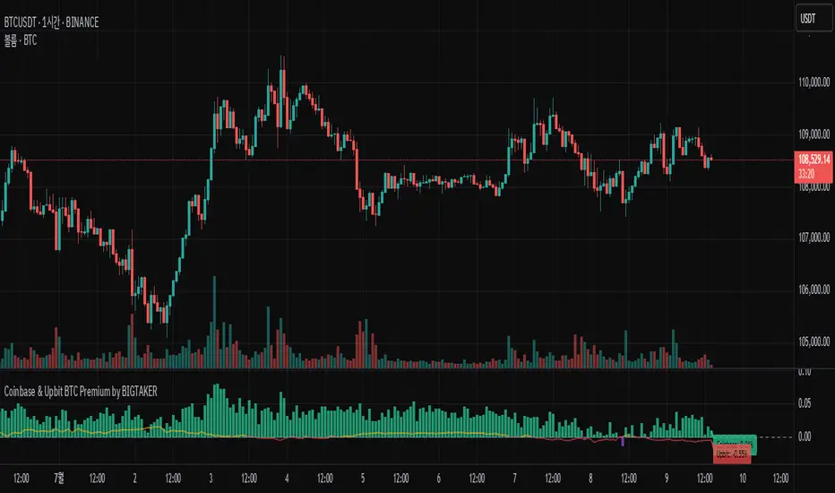
Coinbase BTC Premium by BIGTAKERBTC Premium Gap Analysis: Binance, Coinbase, Upbit
This indicator provides real-time analysis and visualization of the premium gap between the Binance BTCUSDT price and the BTC prices on Coinbase (BTCUSD) and Upbit (BTCKRW).
Key Features
Coinbase Premium Gap
Measures the price difference between Coinbase and Binance as a percentage.
To improve visibility, the Coinbase premium is visually amplified by 10x.
Upbit Premium Gap
Calculates the premium by comparing Upbit's BTCKRW price (converted into USD using the real-time USDKRW exchange rate) against Binance BTCUSDT.
Dynamic Color Coding
Premiums above 0% are displayed in lime green, indicating positive premiums.
Premiums below 0% are displayed in red, indicating discounts.
Real-Time Labels
Displays real-time premium values for both Coinbase and Upbit on the right side of the chart.
Additional Notes
Upbit premiums are adjusted for the USD/KRW exchange rate to ensure accurate USD-based comparison.
The Coinbase premium is magnified visually (10x) to better capture minor movements, while the actual premium value remains correctly displayed.
The indicator is optimized for traders who monitor global BTC market price disparities across major exchanges.
How to Use
Quickly track global BTC price discrepancies across Binance, Coinbase, and Upbit.
Detect "Kimchi Premium" conditions in the Korean market through Upbit premiums.
Analyze buying and selling pressure in North American markets through Coinbase premiums.
My-Indicator - Global Liquidity & Money Supply M2 + Time OffsetThis script is designed to visualize a global liquidity and money supply index by combining data from various regions and, optionally, central bank activity. Visualizing this data on a chart allows you to see how central banks are intervening in the financial system and how the total amount of money in the economy is changing. Let’s take a look at how it works:
Central Bank Liquidity
Shows the actions of central banks (e.g. FED, ECB) providing short-term cash to commercial banks. If you see spikes or a steady increase in these indicators, it may suggest that liquidity is being increased through intervention, which often stimulates the market.
Money Supply
M2 money supply is a monetary aggregate that includes M1 (cash and current deposits) plus savings deposits, small term deposits, and other financial instruments that, while not as liquid as M1, can be quickly converted into cash. As a result, M2 provides a broader picture of the available money in the economy, which is useful for analyzing market conditions and potential economic trends.
How does it help investors?
It allows you to quickly see when central banks are injecting additional liquidity, which could signal higher prices.
It allows you to see trends in the money supply, which informs potential changes in inflation and the economic cycle.
Combining both sets of data provides a more complete picture – both in the short and long term – which makes it easier to predict upcoming price movements.
This allows investors to better respond to changes in central bank policy and broader monetary trends, increasing their chances of making better investment decisions.
Data Collection
The script retrieves money supply data for key markets such as the USA (USM2), Europe (EUM2), China (CNM2), and Japan (JPM2). It also offers additional money supply series for other markets—like Canada (CAM2), Great Britain (GBM2), Russia (RUM2), Brazil (BRM2), Mexico (MXM2), and New Zealand (NZM2)—with extra options (e.g., Australia, India, Korea, Indonesia, Malaysia, Sweden) disabled by default. Moreover, you can enable data for central bank liquidity (such as FED, RRP, TGA, ECB, PBC, BOJ, and other central banks), which are also disabled by default.
Index Calculation
The indicator calculates the index by adding together all the enabled money supply series (and the central bank data if activated) and then scales the sum by dividing it by 1,000,000,000,000 (one trillion). This scaling makes the resulting values more manageable and easier to read on the chart.
Time Offset Feature
A key feature of the script is the time offset. With the input parameter "Time Offset (days)", the user can shift the plotted index line by a specific number of days. The script converts the given offset in days into a number of bars based on the current chart's timeframe. This allows you to adjust for the delay between liquidity changes and their effect on asset prices.
Overall, the indicator plots a line on your chart representing the global liquidity and money supply index, allowing you to visually monitor trends and better understand how liquidity and central bank actions may influence market movements.
What makes this script different from others?
Every supported market—both major regions (USA, Eurozone, China, Japan, etc.) and additional ones—is available. You can toggle each series on or off, so you can view only Money Supply data, only Central Bank Liquidity, or any custom combination.
Separated Data Groups. Inputs are organized into clear groups (“Money Supply”, “Other Money Supply”, “Central Bank Liquidity”), making it easy to focus on just the data you need without clutter.
True Day‑Based Offset. This script converts your chosen “Time Offset (days)” into actual days regardless of timeframe. Whether you’re on a 5‑minute or daily chart, the index is always shifted by exactly the number of days you specify.

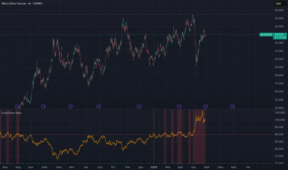
Gold/Silver RatioOverview
This indicator displays the Gold/Silver Ratio by dividing the price of gold (XAUUSD) by the price of silver (XAGUSD) on the same timeframe. It is a widely used tool in macroeconomic and precious metals analysis, helping traders and investors evaluate the relative value of gold compared to silver.
📈 What it does
Plots the ratio between gold and silver prices as a line on the chart.
Displays two key horizontal levels:
Overbought level at 90 (dashed red line).
Oversold level at 70 (dashed green line).
Highlights the chart background to show extreme conditions:
Red shading when the ratio exceeds 90 (gold is likely overvalued relative to silver).
Green shading when the ratio drops below 70 (silver is likely overvalued relative to gold).
🧠 How to Use
When the ratio exceeds 90, it suggests that gold may be overbought or silver may be undervalued. Historically, these have been good times to consider shifting exposure from gold to silver.
When the ratio falls below 70, it may indicate silver is overbought or gold is undervalued.
This tool is best used in conjunction with technical analysis, macroeconomic trends, or RSI/Bollinger Bands applied to the ratio.
⚙️ Inputs
This version of the script uses OANDA's XAUUSD and XAGUSD pairs for spot gold and silver prices. You may edit the request.security() calls to change data sources (e.g., FXCM, FOREXCOM, or CFD tickers from your broker).
✅ Best For:
Macro traders
Commodity investors
Ratio and spread traders
Long-term portfolio reallocators
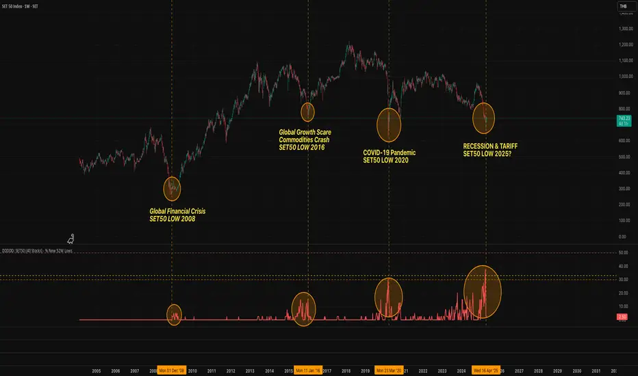
DDDDD: SET50 (40 Stocks) - % New 52W LowsDDDDD: SET50 - % New 52W Lows (40 Stocks)
This indicator measures the percentage of selected SET50 stocks making a new 52-week low, helping identify periods of extreme market fear that often align with long-term buying opportunities.
How It Works:
Tracks the daily closing prices of 40 major SET50 constituents.
A stock is counted when it closes at its lowest price over the past 252 trading days (approximately 1 year).
Calculates the percentage of new 52-week lows relative to 40 stocks.
Displays threshold lines to highlight levels of market panic.
📈 Threshold Levels:
Threshold Line Color Level (%) Interpretation Action
30% Threshold Orange 30% Early signs of stress Start monitoring opportunities
33% Threshold Yellow 33% Confirmed panic Consider gradual accumulation
50% Panic Zone Red 50% Extreme market panic Aggressive accumulation zone
📌 Important Notes:
Why not use the full 50 stocks?
Due to TradingView Pine Script's current technical limits, a script cannot request data for more than 40 symbols efficiently.
Therefore, this indicator uses 40 representative SET50 stocks to ensure optimal performance without exceeding system limits.
The selected stocks are diversified across major sectors to maintain reliability.
🔥 Key Insights:
Historically, spikes above 30%-50% of stocks making new lows have coincided with major market bottoms (e.g., 2011, 2020).
Higher simultaneous new lows = stronger potential for long-term recovery.
Global M2The Global Liquidity M2 Indicator tracks the aggregate M2 money supply across major economies (e.g., US, China, Eurozone, Japan, UK), converted to USD for consistency. M2 includes cash, checking/savings deposits, and easily convertible near-money. It visualizes global liquidity trends, helping investors assess economic conditions and potential impacts on asset prices, like stocks or cryptocurrencies, with higher M2 levels often signaling increased liquidity and economic growth.

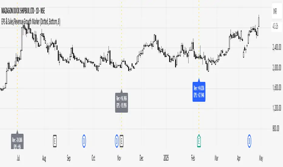
EPS & Sales/Revenue Growth MarkerThis script plots the Revenue Growth and EPS Growth % on Earnings Date.
Idea Credit: Special thanks to @dharmeshrbhatt for inspiring the concept behind this tool.
Developed and Published by learningvitals.
Plots Revenue Growth % and EPS Growth % on earnings date.
Choose label position: Above Bar, Below Bar, Top, or Bottom.
Customizable growth colors based on combined EPS and Revenue performance.
Customizable line style and colors.
Controls max number of labels to keep the chart clean.
PEAD strategy█ OVERVIEW
This strategy trades the classic post-earnings announcement drift (PEAD).
It goes long only when the market gaps up after a positive EPS surprise.
█ LOGIC
1 — Earnings filter — EPS surprise > epsSprThresh %
2 — Gap filter — first regular 5-minute bar gaps ≥ gapThresh % above yesterday’s close
3 — Timing — only the first qualifying gap within one trading day of the earnings bar
4 — Momentum filter — last perfDays trading-day performance is positive
5 — Risk management
• Fixed stop-loss: stopPct % below entry
• Trailing exit: price < Daily EMA( emaLen )
█ INPUTS
• Gap up threshold (%) — 1 (gap size for entry)
• EPS surprise threshold (%) — 5 (min positive surprise)
• Past price performance — 20 (look-back bars for trend check)
• Fixed stop-loss (%) — 8 (hard stop distance)
• Daily EMA length — 30 (trailing exit length)
Note — Back-tests fill on the second 5-minute bar (Pine limitation).
Live trading: enable calc_on_every_tick=true for first-tick entries.
────────────────────────────────────────────
█ 概要(日本語)
本ストラテジーは決算後の PEAD を狙い、
EPS サプライズがプラス かつ 寄付きギャップアップ が発生した銘柄をスイングで買い持ちします。
█ ロジック
1 — 決算フィルター — EPS サプライズ > epsSprThresh %
2 — ギャップフィルター — レギュラー時間最初の 5 分足が前日終値+ gapThresh %以上
3 — タイミング — 決算当日または翌営業日の最初のギャップのみエントリー
4 — モメンタムフィルター — 過去 perfDays 営業日の騰落率がプラス
5 — リスク管理
• 固定ストップ:エントリー − stopPct %
• 利確:終値が日足 EMA( emaLen ) を下抜け
█ 入力パラメータ
• Gap up threshold (%) — 1 (ギャップ条件)
• EPS surprise threshold (%) — 5 (EPS サプライズ最小値)
• Past price performance — 20 (パフォーマンス判定日数)
• Fixed stop-loss (%) — 8 (固定ストップ幅)
• Daily EMA length — 30 (利確用 EMA 期間)
注意 — Pine の仕様上、バックテストでは寄付き 5 分足の次バーで約定します。
実運用で寄付き成行に合わせたい場合は calc_on_every_tick=true を有効にしてください。
────
ご意見や質問があればお気軽にコメントください。
Happy trading!
