Trading Is Not Gambling: Become A Better Trader Part III'm so thankful the admins at Tradingview selected my first Trading Is Not Gambling video for their Editor's Pick section. What an honor.
I put together this video to try to teach all the new followers how to use analysis to try to plan trade actions and to attempt to minimize risks.
Within this video, I try to teach you to explore the best opportunities based on strong research/analysis skills and to learn to wait for the best opportunities for profits.
Trading is very similar to hunting or trying to hit a baseball... you have to WAIT for the best opportunity, then make a decision on how to execute for the best results.
Trust me, if trading was easy, everyone would be making millions and no one would be trying to find the best trade solutions.
In my opinion, the best solution is to learn the skills to try to develop the best consistent outcomes. And that is what I'm trying to teach you in this video.
I look forward to your comments and suggestions.
Get some.
#trading #research #investing #tradingalgos #tradingsignals #cycles #fibonacci #elliotwave #modelingsystems #stocks #bitcoin #btcusd #cryptos #spy #gold #nq #investing #trading #spytrading #spymarket #tradingmarket #stockmarket #silver
Chart Patterns

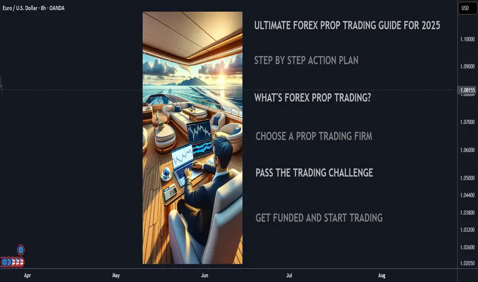
Ultimate 2025 Forex Prop Trading FAQ + Strategy Guide🧠 Forex Prop Trading: What Is It?
Prop trading (proprietary trading) is when a trader uses a firm’s capital to trade the markets (instead of their own), and keeps a share of the profits – usually 70–90%.
✅ Low startup cost
✅ No personal risk (firm takes the loss)
✅ Big upside potential with scaling plans
📋 Step-by-Step Action Plan to Get Started (2025)
🔍 1. Understand the Prop Firm Model
🏦 Prop firms fund skilled traders with $10K to $500K+
🎯 You pass a challenge or evaluation phase to prove your skills
💵 Once funded, you earn a profit split (70%–90%)
🧪 2. Choose a Top Prop Firm (2025)
Look for reliable and regulated firms with transparent rules:
FTMO 🌍 – Trusted globally, up to $400K scaling
MyFundedFX 📊 – Up to 90% profit split, no time limit
E8 Funding ⚡ – Fast scaling and instant funding
FundedNext 💼 – 15% profit share during challenge phase
The Funded Trader 🏰 – Up to $600K with leaderboard bonuses
🔎 Compare features: fees, drawdown limits, trading style freedom
💻 3. Train & Master Your Strategy
🧠 Pick a clear, rule-based strategy (e.g. trend following, breakout, supply/demand)
📅 Backtest over 6–12 months of data
💡 Use AI tools & trade journals like Edgewonk or MyFXBook
🎯 Focus on:
Win rate (above 50–60%)
Risk-reward ratio (1:2 or better)
Consistency, not wild profits
🧪 4. Pass the Evaluation Phase
🔐 Follow risk rules strictly (daily & max drawdown)
⚖️ Use proper risk management (0.5–1% risk per trade)
🧘♂️ Trade calmly, avoid overtrading or revenge trades
📈 Most challenges:
Hit 8–10% profit target
Stay under 5–10% total drawdown
Trade for at least 5–10 days
🧠 Tip: Pass in a demo environment first before going live!
💵 5. Get Funded & Start Earning
🟢 Once approved, you trade real firm capital
💰 You keep up to 90% of profits, with withdrawals every 2 weeks to 1 month
🚀 Many firms offer scaling plans to grow your account over time
💬 FAQ – Prop Trading in 2025
❓ How much can you make?
🔹 Small accounts ($50K): $2K–$8K/month with 4–8% returns
🔹 Large accounts ($200K+): $10K+/month possible for consistent traders
💡 Many traders start part-time and scale as they build trust with the firm
❓ How much do I need to start?
💳 Challenge fees range from:
$100 for $10K
$250–$350 for $50K
$500–$700 for $100K+
⚠️ No need to deposit trade capital – just the challenge fee
❓ What are the risks?
You can lose the challenge fee if you break rules or over-leverage
You won’t owe money to the firm
The biggest risk is psychological – many fail from overtrading or emotional decisions
🚀 Final Tips to Succeed
✅ Trade like a robot, think like a CEO
✅ Journal every trade – self-awareness is key
✅ Avoid over-leveraging and gambling mindset
✅ Stick to one strategy and master it
✅ Focus on consistency over quick wins
SMART MONEY FOOTPRINT ON NIFTY CHART, REVERSAL SIGN APPEAR ?Today on 21/03/2025 with upward rally, on hourly chart I found similarity or smart money footprint (sign of weakness) at the time of closing bell same as (sign of strength) on 28 February 2025. what was that? Let's try to Dig....
previous days when market was forming lower low, that was downtrend look at the time on 28 February 2025 that was 14.15 pm on hourly chart an ultrahigh volume rejection candle appear which volume was around164 M. thereafter short seller trapped to see big red candle and market move toward upward.
:
:
Today on 21/03/2025 also market gave a rejection candle on hourly chart with around 164 M ultrahigh volume Exact at 14:15 Pm so conclusion is that market may give correction after trapping Buyers or it may go downtrend again if fundamental don't support.
what is similarity?
: Same Time 14:15
: Same Volume
: same Candle body Size
: appear after strong moment
REVERSAL INDICATION:
Nifty may Facing resistance of downtrend channel on Daily Chart.
Away from 50 EMA on hourly chart.
Smart money Ultra High volume on Rejection candle indicating selling zone there
:
SO, INVESTOR NO NEED TO TRAP TO JUST SEE NEXT BIG GREEN CANDLE

How the Hammer Chart Pattern Signals a Market ComebackHello, Traders! 👋🏻
Let’s be honest — wouldn’t it be great if the market had clear signs that screamed, “Hey! The downtrend is over!”? Well, sometimes, it hints. One of those signals is the hammer candlestick pattern — a small but mighty formation that can indicate a shift in momentum.
But before you grab a hammer and start breaking things when the market dips, let’s talk about what this pattern really means. Is it a bullish hammer pattern, or is the market just playing games with your emotions? Let’s dive in.
What Is a Hammer Candlestick Pattern?
The hammer pattern is a single candlestick formation that typically appears after a downtrend. It has a small body and a long lower wick, showing that sellers tried to push the price lower but failed, as buyers stepped in and drove the price back up.
Imagine the market trying to take prices to new lows, but buyers show up and say, “Nope, not today!” That’s the essence of the hammer candle pattern — a potential sign of strength and reversal.
Key Features of the Hammer Pattern Candlestick:
✔ Small Candle Body at the Top.
✔ Long Lower Wick (at Least Twice the Size of the Body).
✔ Little to No Upper Wick.
✔ Appears After a Downtrend.
Sounds easy to spot, right? Well, not so fast. Sometimes, what looks like a hammer chart pattern might just be a random bounce. Context is everything.
The Inverted Hammer Pattern: A Bullish Twist
If the hammer candlestick pattern is the market’s way of pushing back against bears, its upside-down cousin—the inverted hammer candlestick pattern — is just as enjoyable.
The inverted hammer pattern looks like, well, a hammer flipped upside down. It has a small body at the bottom with a long upper wick, signaling that buyers attempted to push the price higher but didn’t fully succeed — yet.
While it still suggests a possible reversal, the inverted hammer pattern isn’t as strong as a regular hammer because it shows some hesitation from buyers. Think of it as the market raising its hand and saying, “I might be ready to reverse… but let’s wait and see.”
Why Do Traders Love the Hammer Trading Pattern?
Well, besides the fact that it looks kind of cool on a chart, it’s a psychological shift. It shows that buyers are fighting back, and if the momentum continues, a trend reversal could be on the horizon.
But here’s the catch — one hammer candle pattern doesn’t guarantee anything. Markets love to trick traders, and sometimes, a hammer pattern candlestick is just a temporary bounce before the trend continues downward.
So, next time you see a hammer chart pattern, ask yourself:
❓ Is This Really a Reversal, or Is the Market Just Messing With Me?
❓ Is There Enough Volume To Support a Strong Move?
❓ Are Other Indicators Confirming the Shift in Momentum?
Final Thoughts
The hammer trading pattern is one of those setups that traders love for its simplicity and reliability. But like any other pattern, it’s not a magic bullet — it’s a clue. And trading is all about putting the clues together to get the full picture.
So, the next time you see a hammer pattern candlestick, take a deep breath, check the context, and don’t rush into trades. After all, even the most substantial hammer won’t help if you’re trying to nail down the wrong trend.
What’s your experience with the hammer candlestick pattern? Let’s discuss it below!

Engulfing Candles: The Power ShiftIf there’s one candle pattern that represents an immediate shift in balance between buyers and sellers it is the engulfing candle.
Today we take a deep dive into some of the key nuances of this pattern and explain how context and confirmation are essential elements to making this pattern a useful tool in your trading toolkit.
Understanding the Engulfing Pattern
The Engulfing candle pattern occurs when a single candlestick completely engulfs the body of the previous candle. In a bullish engulfing, a large bullish candle fully covers the smaller previous bearish candle, while in a bearish engulfing, a large bearish candle engulfs the previous bullish one.
Within the space of a signal candle, the market has completely erased the previous candles price action and sometimes multiple prior candles price actions. This step change in momentum, is why it is often known as the ‘power shift pattern’ – when it is identified correctly can represent a key inflection point.
Bullish Engulfing: A bullish engulfing suggests that after a period of selling, buying pressure has taken over, overpowering the bears in one strong move. This may indicate a potential reversal, from a bearish trend to a bullish one.
Bearish Engulfing: A bearish engulfing indicates that after a period of buying, selling pressure has overwhelmed the bulls. This could signal a shift from an uptrend to a downtrend.
Example: Nvidia Daily Candle Chart
In this example, we see bullish and bearish engulfing candles form at the parameters of a range that formed on Nvidia’s daily candle chart.
Past performance is not a reliable indicator of future results
The Importance of Location and Context
Like any chart pattern, the Engulfing candle is most effective when it occurs in the right context. Its location is crucial to its reliability. Trading the pattern within a range or consolidation zone can be misleading, as there may not be a clear prevailing trend for the pattern to reverse.
For a bullish engulfing to be meaningful, it should ideally appear near a key support level, where buyers are likely to step in. In contrast, a bearish engulfing is more reliable when it appears near a key resistance level, where selling pressure may be about to take control.
In short, location is everything. An engulfing pattern at a support or resistance level holds more weight than one formed in the middle of a range or without a clear market direction.
Example: USD/CAD Daily Candle Chart
In this example, we see small bearish engulfing candles form within a consolidation range. These are not significant signals as the location and context is sub-optimal. We then see a large engulfing candle form at the parameter of resistance – creating a clear bearish signal.
Past performance is not a reliable indicator of future results
Confirmation: The Next Candle is Key
A major element to watch for with the Engulfing candle is confirmation. The next candle after the engulfing one should trade in the direction of the engulfing candle.
For a bullish engulfing, the next candle should ideally close above the high of the engulfing candle. This confirms that the buying momentum is likely to continue.
For a bearish engulfing, the next candle should ideally close below the low of the engulfing candle. This suggests that selling pressure is likely to persist.
Without this confirmation, the pattern can be less reliable, and the initial move may not hold. The following candle helps validate whether the momentum shift is real or just a short-term fluctuation.
Stop Placement
Stop placement is a crucial aspect of trading the Engulfing pattern. Stops should generally be positioned just beyond the high or low of the engulfing candle, depending on the direction of the trade.
For a bullish engulfing, place the stop below the low of the engulfing candle to allow for some movement without being stopped out prematurely.
For a bearish engulfing, place the stop above the high of the engulfing candle to protect against any potential reversal or false breakouts.
Placing stops in these locations helps manage risk while giving the trade enough room to develop, without exposing the position to unnecessary losses.
The Engulfing Pattern Across Timeframes
One of the advantages of the Engulfing candle is its versatility. It can be used effectively on any timeframe, from short-term intraday charts to long-term daily or weekly charts.
On shorter timeframes, the Engulfing pattern may act as a signal for intraday trades, indicating a quick shift in momentum.
On longer timeframes, the pattern could signal a larger, more sustained trend change, suggesting a longer-term move in the market.
Regardless of the timeframe, the Engulfing candle remains an important pattern because it highlights a significant change in market sentiment, whether on a micro or macro scale.
Final Thoughts
The Engulfing candle is an effective pattern for identifying a shift in market momentum, either from bullish to bearish or vice versa. However, its effectiveness is heavily influenced by location and confirmation. When the pattern forms at a key support or resistance level and is followed by confirmation from the next candle, it can offer valuable insight into where the market may be headed. By combining these elements with good stop placement, traders can better manage risk and increase the reliability of the signals this pattern provides.
Disclaimer: This is for information and learning purposes only. The information provided does not constitute investment advice nor take into account the individual financial circumstances or objectives of any investor. Any information that may be provided relating to past performance is not a reliable indicator of future results or performance. Social media channels are not relevant for UK residents.
Spread bets and CFDs are complex instruments and come with a high risk of losing money rapidly due to leverage. 83% of retail investor accounts lose money when trading spread bets and CFDs with this provider. You should consider whether you understand how spread bets and CFDs work and whether you can afford to take the high risk of losing your money.

A Triple Top Pattern: Signals and StrategiesA Triple Top Pattern: Signals and Strategies
Traders are always on the lookout for reliable analysis tools that can help them make informed trading decisions. One such tool is the triple top trading pattern. It is a bearish reversal formation that can help traders identify potential trend reversals and take advantage of market opportunities.
In this FXOpen article, we will explore what the triple top pattern is, what it indicates, and how to identify it on price charts. Keep reading to find examples that will help you understand how to use it in a trading strategy.
What Is a Triple Top Pattern?
A triple top is a technical analysis pattern that signals a potential reversal in a trend. Is the triple top bullish or bearish? It’s a bearish formation. The pattern occurs when the price of an asset hits the same resistance level three times, failing to break above it on each occasion. This indicates that buyers are losing strength and sellers are starting to dominate the market. It is often seen after a sustained uptrend.
Identifying a triple top involves spotting three distinct peaks at roughly the same price level, separated by two troughs. The peaks are formed when the price hits resistance but fails to push through, while the troughs occur when the price retraces after each failed attempt.
To confirm a valid triple top, the peaks should be close in height, and the troughs should create a roughly horizontal neckline. The pattern is confirmed when the price breaks below the neckline, signalling that sellers have overtaken buyers.
Triple Top Chart Pattern Trading Strategy
Once traders have identified the triple top formation, they can use various trading strategies to take advantage of it. However, there are common rules that are used as the basis:
- Entry: Traders enter a short position when the price breaks below the neckline, which is the level that connects the two troughs that separate the peaks. This level is a critical support level, and when it is broken, it confirms the triple top candlestick pattern and indicates that the trend is reversing.
- Stop Loss: To manage risk, traders place a stop-loss order above the neckline. If the price starts to rise again, the stop-loss order will limit potential losses. The theory states that traders can place a stop-loss on the neckline. However, the price often retests the support level after a breakout, so the risk of an early exit rises.
- Take Profit: There are several ways of determining a profit target. The most common technique is to measure the distance between the tops and bottoms and subtract it from the triple top breakout point.
Another strategy is to identify the target based on the closest support levels. However, this may limit potential returns if the support is too close to the entry point. Therefore, traders sometimes use trailing stops to lock in potential profits as the price continues to fall.
Trading Example
In the chart above, the price formed the triple top. We could have entered a short position once the price broke below the neckline and closed it either at the point equal to the distance between the peaks and the neckline or at the closest support level, as the levels are almost equal. However, selling volumes were low (1) at the breakout level, so we could have expected an upcoming bullish reversal. Therefore, we wouldn’t have kept the position beyond the initial take-profit target.
How Traders Confirm the Triple Top
To confirm the triple top pattern and ensure its validity, traders use a combination of technical tools and indicators. These help confirm that the trend is indeed reversing and not just experiencing a temporary pullback. Here are the key methods traders use:
- Neckline Break. The most important confirmation comes when the price breaks below the neckline, which is the horizontal level connecting the lows between the peaks. A clean break suggests a stronger reversal.
- Volume Analysis. Volume plays a crucial role in confirming the triple top. Traders look for a surge in selling volume when the price breaks the neckline. If the volume is low during the breakout, the pattern may not be reliable, and a bullish reversal could follow.
- Momentum Indicators. Traders often use momentum indicators like the Stochastic Oscillator or Moving Average Convergence Divergence (MACD). When these indicators show bearish divergence, it signals a potential downward reversal. A negative crossover in the MACD or Stochastic adds further confirmation.
- Retest of Neckline. Sometimes, after breaking the neckline, the price may retrace and retest this level as resistance. A failed retest, where the price does not move back above the neckline, confirms that sellers are in control.
Triple Top vs Triple Bottom
It is important to distinguish between the triple top and the triple bottom chart patterns, as the former is the bearish setup, while the latter is a bullish reversal formation. The triple bottom setup forms when the price hits a particular support level three times and fails to break through it. It suggests that the sellers have lost their strength, and the buyers are starting to take control. The bottoms are separated by two peaks, which occur when the price retraces some of its gains from the support level.
Traders use the same principles to trade the triple bottom as they would the triple top but vice versa. They enter a long position when the price breaks above the neckline and set a stop-loss order below it. The take-profit target might equal the distance between bottoms and peaks or be set at the closest resistance level.
Triple Top Challenges
While the triple top pattern is a valuable tool for spotting reversals, it has its limitations. Traders should be aware of the following challenges:
- False Breakouts. The price may break below the neckline only to quickly reverse back, leading to a false signal. This can cause traders to enter losing positions if they act too quickly without further confirmation.
- Extended Sideways Movement. Sometimes, the price can stay near the neckline after a breakout, leading to indecision and uncertain market behaviour. This sideways movement can make it difficult to determine if the trend has truly reversed.
- Retests Leading to Reversals. After the initial breakout, the price may retest the neckline and move back above it, invalidating the triple top pattern. Traders need to be cautious and set appropriate stop-loss orders to help potentially mitigate risk.
Final Thoughts
The triple top pattern offers traders a powerful tool for identifying potential market reversals. However, it’s crucial to confirm the pattern and integrate it with other forms of analysis to avoid false signals. Ready to put these insights into action? Open an FXOpen account today, and trade with a broker offering tight spreads, low commissions, and advanced trading platforms.
FAQ
What Does a Triple Top Mean in Trading?
The triple top pattern meaning refers to a bearish reversal formation indicating a potential end to an uptrend. It forms when the price reaches the same resistance level three times without breaking through, suggesting weakening buying momentum and increasing selling pressure. This pattern signals that the asset's price may soon decline.
How Do You Confirm the Triple Top Pattern?
To confirm a triple top pattern, traders watch for a decisive break below the neckline, which connects the lows between the peaks. Increased trading volume during the breakout strengthens the confirmation, indicating strong seller interest. Technical indicators like the Stochastic Oscillator showing bearish divergence can provide additional validation.
Is a Triple Top Bullish?
No, a triple top is not bullish; it is a bearish reversal pattern. It signifies that the asset's price has repeatedly failed to surpass a resistance level, indicating diminishing upward momentum. Traders see this as a cue to consider short positions or to exit existing long positions.
Is a Triple Top Stronger Than a Double Top?
A triple top is generally considered stronger than a double top pattern because the price has failed to break resistance three times instead of two. This extra failed attempt reinforces the strength of the resistance level and increases the likelihood of a significant reversal. However, both patterns are important and should be analysed with other market factors.
This article represents the opinion of the Companies operating under the FXOpen brand only. It is not to be construed as an offer, solicitation, or recommendation with respect to products and services provided by the Companies operating under the FXOpen brand, nor is it to be considered financial advice.

Liquidity Grab eurusd Supply & Demand Zones:
🔻 A major supply zone (resistance) is marked above 1.09618, where institutional selling pressure may appear.
🔹 A demand zone (support) is established below 1.09064, providing potential entry opportunities.
📈 Trading Plan & Targets:
✅ Expecting a bullish move from the demand zone as price reacts positively.
🎯 Target 1: 1.09064 – Mid-level liquidity area.
🎯 Target 2: 1.09618 – Major resistance & supply zone.
📌 Smart Money Concept (SMC):
🔹 Price is forming a liquidity sweep before a potential bullish push.
🔹 The structure suggests an accumulation phase, with a breakout confirmation above key levels.
💡 Key Takeaways:
🔹 Bullish bias unless price invalidates the demand zone.

Trading Is Not Gambling : Become A Better Trade Part IOver the last few weeks/months, I've tried to help hundreds of traders learn the difference between trading and gambling.
Trading is where you take measured (risk-restricted) attempts to profit from market moves.
Gambling is where you let your emotions and GREED overtake your risk management decisions - going to BIG WINS on every trade.
I think of gambling in the stock market as a person who continually looks for the big 50% to 150%++ gains on options every day. Someone who will pass up the 20%, 30%, and 40% profits and "let it ride to HERO or ZERO" on most trades.
That's not trading. That's flat-out GAMBLING.
I'm going to start a new series of training videos to try to help you understand how trading operates and how you need to learn to protect capital while taking strategic opportunities for profits and growth.
This is not going to be some dumbed-down example of how to trade. I'm going to try to explain the DOs and DO N'Ts of trading vs. gambling.
If you want to be a gambler - then get used to being broke most of the time.
I'll work on this video's subsequent parts later today and this week.
I hope this helps. At least it is a starting point for what I want to teach all of you.
Get some.
#trading #research #investing #tradingalgos #tradingsignals #cycles #fibonacci #elliotwave #modelingsystems #stocks #bitcoin #btcusd #cryptos #spy #gold #nq #investing #trading #spytrading #spymarket #tradingmarket #stockmarket #silver

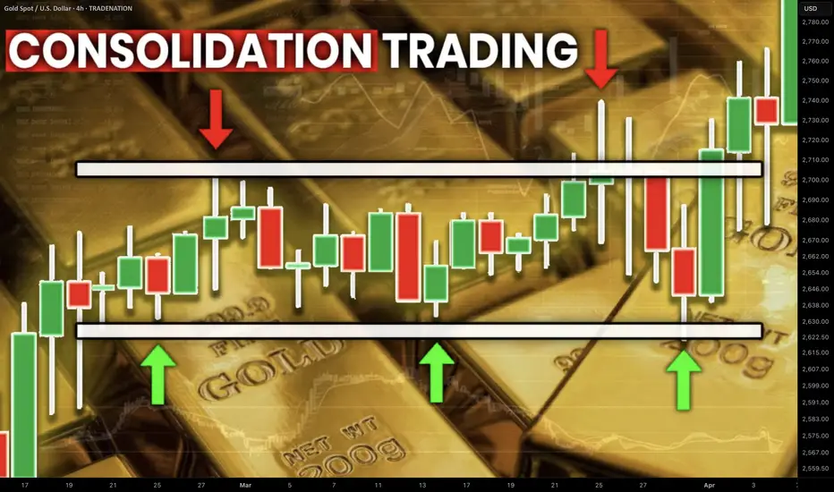
Best GOLD XAUUSD Consolidation Trading Strategy Explained
In article , you will learn how to identify and trade consolidation on Gold easily.
I will share with you my consolidation trading strategy and a lot of useful XAUUSD trading tips.
1. How to Identify Consolidation
In order to trade consolidation, you should learn to recognize that.
The best and reliable way to spot consolidation is to analyse a price action.
Consolidation is the state of the market when it STOPS updating higher highs & higher lows in a bullish trend OR lower lows & lower highs in a bearish trend.
In other words, it is the situation when the market IS NOT trending.
Most of the time, during such a period, the price forms a horizontal channel.
Above is a perfect example of a consolidation on Gold chart on a daily.
We see a horizontal parallel channel with multiple equal or almost equal highs and lows inside.
For a correct trading of a consolidation, you should correctly underline its boundaries.
Following the chart above, the upper boundary - the resistance, is based on the highest high and the highest candle close.
The lowest candle close and the lowest low compose the lower boundary - the support.
2. What Consolidation Means
Spotting the consolidating market, it is important to understand its meaning and the processes that happen inside.
Consolidation signifies that the market found a fair value.
Growth and bullish impulses occur because of the excess of demand on the market, while bearish moves happen because of the excess of supply.
When supply and demand find a balance, sideways movements start .
Look at the price movements on Gold above.
First, the market was rising because of a strong buying pressure.
Finally, the excess of buying interest was curbed by the sellers.
The market started to trade with a sideways range and found the equilibrium
At some moment, demand started to exceed the supply again and the consolidation was violated . The price updated the high and continued growth.
Usually, the violation of the consolidation happens because of some fundamental event that makes the market participants reassess the value of the asset.
At the same time, the institutional traders, the smart money accumulate their trading positions within the consolidation ranges. As the accumulation completes, they push the prices higher/lower, violating the consolidation.
3. How to Trade Consolidation
Once you identified a consolidation on Gold, there are 2 strategies to trade it.
The resistance of the consolidation provides a perfect zone to sell the market from. You simply put your stop loss above the resistance and your take profit should be the upper boundary of the support.
That is the example of a long trade from support of the consolidation on Gold.
The support of the sideways movement will be a safe zone to buy Gold from. Stop loss will lie below the support zone, take profit will be the lower boundary of the resistance.
AS the price reached a take profit level and tested a resistance, that is a short trade from that.
You can follow such a strategy till the price violates the consolidation and establishes a trend.
The market may stay a very extended period of time in sideways, providing a lot of profitable trading opportunities.
What I like about Gold consolidation trading is that the strategy is very straightforward and completely appropriate for beginners.
It works on any time frame and can be used for intraday, swing trading and scalping
❤️Please, support my work with like, thank you!❤️
I am part of Trade Nation's Influencer program and receive a monthly fee for using their TradingView charts in my analysis.
The Ultimate Guide to Price Action TradingIntroduction to Price Action
Price action trading is a powerful method that relies solely on analyzing price movements without using indicators. Instead of following lagging signals, traders use historical price movements to predict future market behavior. This approach helps in making informed decisions based on real market sentiment.
Why Use Price Action?
Many traders prefer price action because it simplifies trading by focusing only on the movement of price rather than complex technical indicators. Here are some key advantages:
Eliminates reliance on lagging indicators: Indicators often generate signals after the price has already moved significantly. Price action provides real-time insights.
Provides a clearer picture of market sentiment: By analyzing candlestick formations and key levels, traders can assess where the market is likely to move next.
Works across all timeframes and markets: Whether you trade stocks, forex, or crypto, price action techniques remain relevant.
Market Structure & Trend Analysis
Understanding market structure is key to recognising trends and making profitable trades. Price moves in patterns, forming trends, consolidations, and reversals.
Identifying Trends
A trend is a general direction in which the price is moving. Identifying trends early can give traders a significant edge.
Uptrend: Characterized by higher highs (HH) and higher lows (HL). This indicates strong buying pressure.
Downtrend: Identified by lower highs (LH) and lower lows (LL). This signals dominant selling pressure.
Ranging Market: Occurs when price moves sideways, forming equal highs and lows, showing indecision.
Using Market Structure to Trade
Follow the dominant trend for higher probability trades rather than trading against the market direction.
Look for breakouts from consolidation zones, which often lead to explosive moves in the market.
Identify trend reversals by observing changes in market structure, such as a break of previous highs or lows.
Key Support & Resistance Levels
Support and resistance levels help traders identify where price might react, leading to potential trade opportunities.
Types of Support & Resistance
Horizontal Levels: These are static price levels where the price has reversed multiple times, acting as strong barriers.
Trendlines: These dynamic levels move with price and act as diagonal support or resistance.
Psychological Levels: Round numbers like 100, 200, or 1.0000 in forex often act as key psychological barriers for traders.
How to Use Support & Resistance
Buying near support and selling near resistance is a classic strategy used by traders.
Breakout trading: If the price breaks a key level with strong momentum, it often continues in that direction.
Retest confirmation: After a breakout, the price may return to test the level before continuing its move. This offers a high-probability entry.
Candlestick Patterns & Their Meaning
Candlestick patterns provide insights into market sentiment and potential reversals or continuations.
Single Candlestick Patterns
Pin Bar (Rejection Candlestick): A pin bar has a long wick and a small body, showing strong rejection at a price level. It signals a potential reversal.
Doji: A candlestick with a small body and wicks on both sides, indicating indecision in the market.
Hammer & Shooting Star: The hammer forms at the bottom of a downtrend, signaling reversal, while the shooting star appears at the top, suggesting a potential sell-off.
Multi-Candlestick Patterns
Engulfing Pattern: A bullish engulfing pattern occurs when a large green candle completely engulfs the previous red candle, signaling a strong upward move. The opposite is true for bearish engulfing patterns.
Morning Star & Evening Star: These three-candle patterns indicate a shift in momentum, either bullish or bearish.
Head & Shoulders: A reversal pattern that suggests a shift from an uptrend to a downtrend or vice versa.
Price Action Strategies
Breakout Trading
Breakout trading involves identifying key price levels where a breakout is likely to occur. This can be from a range, a pattern like a triangle, or a resistance level.
Identify consolidation zones where price has been trading in a tight range.
Enter a trade when the price breaks above resistance or below support with strong volume.
Use stop-losses to avoid false breakouts, placing them just outside the consolidation zone.
Reversal Trading
Reversal trading focuses on identifying trend exhaustion and potential reversals.
Look for exhaustion at key levels, where price struggles to move further.
Confirm reversals with candlestick patterns such as pin bars, engulfing patterns, or head & shoulders formations.
Use risk-reward ratios of at least 1:2 to maximize profits on successful reversals.
Trend Continuation Trading
Enter on pullbacks within an established trend, rather than chasing breakouts.
Look for price bouncing off moving averages or trendlines as confirmation.
Ride trends until momentum weakens, using trailing stop-losses to lock in profits.
Trading Without Indicators
Analysing raw price action helps traders understand market movement without distractions.
Key Steps for Chart Analysis
Identify the overall market trend by checking higher highs or lower lows.
Mark key support and resistance levels to find potential trade areas.
Observe candlestick formations that provide confirmation for entries.
Wait for confirmation before entering a trade to avoid false signals.
Risk Management & Psychology in Price Action Trading
A strong mindset and risk management strategy are crucial for long-term success.
Risk Management Tips
Use stop-losses to limit risk and prevent large drawdowns.
Risk no more than 1-2% of capital per trade, ensuring longevity.
Always aim for a favorable risk-reward ratio, such as 1:2 or 1:3.
Psychological Tips
Stay disciplined and avoid emotional trading, as emotions can lead to impulsive decisions.
Accept losses as part of the process and learn from them.
Stick to a well-defined trading plan, reducing uncertainty in decision-making.
Final Thoughts & Next Steps
Mastering price action trading takes time, patience, and consistent practice. Here’s how you can improve:
Continuously analyze charts and refine your strategy by backtesting historical data.
Keep a trading journal to track progress and identify areas for improvement.
Stay updated with market conditions, as price action can behave differently in different market environments.
By applying these techniques, you can develop a strong foundation in price action trading and make more informed trading decisions. Stay disciplined, keep learning, and happy trading!
__________________________________________
Thanks for your support!
If you found this idea helpful or learned something new, drop a like 👍 and leave a comment, I’d love to hear your thoughts! 🚀
Make sure to follow me for more price action insights, free indicators, and trading strategies. Let’s grow and trade smarter together! 📈

How To Properly Read Open Interest (OI) Identify Trends $VARAIn crypto, especially when trading shit coins, measure OI on BTC, ETH, and any other asset that has futures up against whatever you are trading.
Most importantly identify positive or negative correlation between the asset pair and TRADE accordingly.
i.e. if you are measuring OI for USDX or DXY know that it will have negative correlation toward your risk asset whatever it is.
Open Interest and Volume ARE NOT THE SAME THING!
Volume is the measure of contracts settled in a trading session (hourly, daily, monthly, etc.)
Open interest (or OI for short) is the total number of contracts still outstanding.
OI and order wall size are correlated.
OI is charted.
Increasing OI means an increase in liquidity i.e. open contracts.
Decreasing OI means that there is a decrease in liquidity i.e. liquidity is leaving the market either cash or asset.
Open Interest can help you identify trend shifts. Use it along with order flow the compliment each other.
OI Rising - Market trends up - Volume increasing - Trend will continue
OI Falling - Market trends up - Volume decreasing - Trend will turn bullish
OI Rising - Market trends down - Volume rising - Strong bearish continuation
OI Falling - Market trends down - Volume falling - Bearish bias is lessening
Notice in the above simplified examples that volume MUST be paired with OI to be useful.
One might mistake that volume on it's own can be used to judge trends.
Open interest will increase as more traders enter the market which means often that money is coming into the market.
OI will decrease as traders exit the market or as contracts are closed. This means that money is leaving the market i.e. less buyers

Gann Astro Trading Course | Gann Trading StrategyGann Astro Trading Course | Free Lesson. Gann Astro Trading | Gann Time Cycles | Gann Financial Astrology. Gann Trading Strategy - Gann Trading Course
TOPIC OF THIS VIDEO - Gann Astro Trading Course | Free Lesson
🎯 Unlock the Market’s Hidden Code with W.D. Gann’s Strategies!
What if market movements weren’t random — but followed a precise, predictable blueprint? In this powerful breakdown, we dive into the groundbreaking methods of W.D. Gann, revealing how price, time, and planetary positions create a hidden pattern behind market highs and lows.
Gann’s revolutionary idea was that time and price vibrate together — making them interchangeable. By converting prices into planetary longitudes, tracking time cycles, and applying market geometry, you can uncover the market’s natural rhythm and predict turning points with remarkable accuracy. This video unveils the core of Gann’s strategy, giving you the tools to anticipate price moves before they happen.
---------------------------------------------------------------------------------------------------------------------
📌 What You’ll Learn in This Video:
✅Gann Square of 9 Explained – Understand how this iconic tool aligns price and time with planetary degrees to identify key turning points.
✅Price to Longitude Conversion – Learn how to convert market prices into planetary longitudes to uncover hidden reversal points.
✅ Time and Price Interchangeability – Discover how Gann’s theory of time-price equality helps predict trend shifts.
✅ The 10% Decimal Shift Rule – A powerful trick to reveal harmonic price levels by shifting the decimal point.
✅ Market Geometry: The Blueprint of Price Movements – Explore Gann’s geometric approach using circles, squares, and hexagons to map market pivots.
✅ Planetary Cycles and Longitudes – See how planetary movements — like Saturn’s retrograde and Mars' heliocentric positions — influence price action.
✅ Harmonic Degrees and Price Reactions – Find out why 10, 15, and other degree increments often mark critical spike reversal areas.
✅ Equilibrium Principle – Learn how Gann's "squared out" price and time cycles lead to powerful reversal setups.
✅ Real Case Studies: Tesla & IBM Analysis – Watch Gann’s techniques in action as we analyze historical charts to uncover price pivots and reversal dates.
market geometry and harmonic degrees.

How to Draw Trendlines Like a Pro – Rulers Out, Rules In!Hi everyone!
If you don’t have any rules for drawing a trendline, then this is by far the most subjective technical analysis criterion of all. So, grab your ruler, and let’s dive in! ;)
Without clear guidelines, you can draw it however you want, shaping the narrative to fit your bias. This makes it the perfect tool to talk yourself into a trade or justify staying in a bad one—there’s always a new “support” coming…
If you don't have rules, you can always find some dots to connect, making it look "perfect" for you.
In this post, I'll discuss buying opportunities using trendlines, share key rules for drawing them correctly, and highlight common mistakes to avoid - all with a focus on mid- and long-term investment opportunities.
-------------------------
The Basics: How to Draw a Trendline
The trendline is a highly effective tool for mid- and long-term investors to find an optimal buying zone for their chosen asset. I always take a full view of the chart, analyzing its entire history to find the longest trendline available. The longer the trendline, the stronger it is!
To draw a trendline, we simply connect two points and wait for the third touch to confirm it. Easy, right?
The strongest trendline comes from points that are easily recognizable—you should spot them in a split second.
Maximum view, if possible Monthly chart, connect the dots and wait for a third one.
For me, the third and fourth touches are the most reliable.
If you have to look deeply to find where to draw a trendline, then it's already a first sign that it’s not strong! The best ones appear instantly.
---------------------------
Two Myths About Trendlines
Myth #1: "You cannot draw a trendline without three touching points."
Don’t even remember from where I heard that kind of bs but as you see in the images above, yeah I can. If I have a correct lineup, the third touch is the strongest.
Myth #2: "The more touches, the stronger the trendline."
Yes, a trend appears stronger with more touches, but each additional touch increases the odds of a break or trend change. To buy from, let’s say, the sixth touch, there must be strong confluence factors, and fundamentals should support the investment.
“The trend is your friend, until the end when it bends.” — Ed Seykota
Sure, I’ve had great trades from the fifth or seventh touch, but as said, the area has to be strong, combining multiple criteria. Think of a trendline like 3-5 cm thick ice on a lake. You can’t break it with one hit, or the second, or the third. But after the fourth or fifth, it starts to crack, and by the sixth—boom!
From my psychological perspective, the more touches, the weaker the trendline becomes.
-----------------------
Rule #1: Wick to Wick or Body to Body
If there aren't any anomalies, the trendline should always be drawn from wick to wick (image below) or body to body.
Here was the trendline draw from wick to wick
I mostly use body-to-body when there is a lot of noise on the chart and many large wicks that don’t show the real price behavior—whether from a panic sell-off or other unexpected market moves.
Candlestick chart, the trendline drawn from body-to-body
Tip! Body-to-body means drawing trendlines from closing prices to remove unnecessary noise from the chart. To make the chart even clearer, I often use a line chart (it tracks closing prices), which filters out the noise and gives a cleaner view of the price action.
The same chart as above using line chart.
Mistake to avoid: If you start from the wick but the second point is from the body, it's wrong. This can lead to misleading breakout trades or confusing rejection trades.
If there are no significant large wicks, go from wicks.
If a chart offers a lot of huge panic-sell wicks, use bodies instead to get a cleaner setup.
Quite often, I use a hybrid version as well. We are investors, not traders. We need a price zone, not an exact price!
In these cases, I combine wicks and closing prices to find the optimal trendline, which stays somewhere between them.
Light-blue is the zone
-----------------------
Rule #2: Higher Highs Strengthen the Trendline
A trendline is more reliable if the price makes a new higher high (HH) after the previous rejection, and before it approaches a trendline.
The third and fourth touch came from higher high (HH) levels
This confirms that the recent trend is strong. If it all lines up, we can step in!
-----------------------
Rule #3: Even Timing Between Touches
A trendline rejection works best when the timing between touches is symmetrical. They don’t have to be perfectly equal but they also shouldn’t be wildly different - one touch being very small and another very large can weaken the trendline’s reliability.
A good combinations is when the price comes from higher high levels, the next touch has an equal or fairly similar distance between previous ones.
Yeah, there are quite a lot of touches, but you get the point; market symmetry plays an important role in making decisions.
Warning: If the next touch comes too soon, especially from a lower high (LH) levels, which signals that momentum may be fading, and the touch happens at an uneven distance, it weakens the trendline’s reliability. So, watch out for that.
Two alerts: uneven length between touches & comes from lower highs.
Next red alert: When there are huge uneven gaps between touches, as shown in the picture below.
The first and second touch compared to the second and third touch are out of balance, weakening the trendline's reliability.
------------------------
Trendline Summary: Key Criteria for Mid- to Long-Term Analysis
Open the maximum chart view – analyze all available data for the asset.
The higher the timeframe, the stronger the trendline.
A trendline needs two clean and clear points to be drawn.
The highest probability rejection happens at the third and fourth touch.
If there are large wicks or panic sell-offs, use closing prices (body-to-body).
Remove noise and wicks by using a line chart for a clearer view.
A trendline touch is strongest when the price approaches from a higher high (HH).
A trendline touch is strongest when the distance between touches is symmetrical.
A slight flex in the trendline is ideal; it should be between 20 to 35 degrees, not too steep in its climb. ;)
These are the main criteria for a trendline that I use when analyzing stocks or any asset from a mid-to long-term perspective.
----------------------
Trendlines Alone Are Not Enough
Now, here’s the interesting part. Even if a trendline looks perfect and meets all criteria, I still won’t rush to share an analysis. Why? Because a trendline alone isn’t enough.
A trendline is just one piece of the puzzle. We need multiple confluence factors in a single price zone to make the setup truly strong and reliable. Usually, I need at least 3-7 criteria to align before making a move or recommendation.
So, that's it! A brief overview and hopefully, you found this informative. Feel free to leave a comment with your thoughts!
Before you leave - Like & Boost if you find this useful! 🚀
Trade smart,
Vaido

SUPPORTS AND RESISTANCE Support and resistance levels are key concepts that help investors navigate price movements. These levels are psychological and technical markers where a coin's price tends to slow down, reverse, or consolidate. Understanding them can make the difference between a successful trade and a missed opportunity. What Are Supports and Resistances? Support is a price level where demand for a cryptocurrency is strong enough to prevent further decline. Think of it as a floor where prices “bounce” upward. Resistance is the opposite— a ceiling where selling pressure prevents the price from rising further. These levels form due to the collective actions of traders. At support levels, buyers feel the price is low enough to enter the market. At resistance levels, sellers believe the price is high enough to secure profits. Why Don’t They Last Forever? Support and resistance levels are not permanent because market conditions, sentiment, and external factors are constantly changing. These shifts happen because of supply and demand imbalances or significant events, such as news about regulations, technological upgrades, or changes in market sentiment. Avoiding the Trap of Greed Many traders make the mistake of placing their buy or sell orders right at these levels, aiming for maximum gain. However, this approach can be risky: Support and resistance levels are zones, not fixed lines. A coin’s price might come close but not touch your order before reversing. Missed opportunities: Waiting for the “perfect” entry point might result in missing a profitable trade by a few cents. A wiser strategy is to avoid being too greedy: Place buy orders slightly above support and sell orders slightly below resistance to improve the likelihood of execution. The Big Picture Support and resistance levels are tools—not guarantees. Successful traders view them as part of a broader strategy.

Why DCA Does Not Work For Short-Term TradersIn this video I go through why DCA (Dollar Cost Averaging) does not work for short-term traders and is more suitable for investors. I go through the pitfalls than come through such techniques, as well as explain how trading should really be approached. Which at it's cost should be based on having a positive edge and using the power of compounding to grow your wealth.
I hope this video was insightful, and gives hope to those trying to make it as a trader. Believe me, it's possible.
- R2F Trading

Forex Trend Trading: A Complete Guide for Traders📊 Market Structure: Uptrend vs. Downtrend
🔼 Uptrend Market Structure (Higher Highs & Higher Lows)
Price makes higher highs (HH) and higher lows (HL).
Indicates buyers are in control.
Traders look for buying opportunities at key support levels.
Example Structure:
📍 HH → HL → Higher HH → Higher HL (trend continuation).
🔽 Downtrend Market Structure (Lower Highs & Lower Lows)
Price forms lower highs (LH) and lower lows (LL).
Sellers dominate the market.
Traders look for selling opportunities at resistance levels.
Example Structure:
📍 LL → LH → Lower LL → Lower LH (trend continuation).
📌 Steps to Trade Trends Effectively
1️⃣ Identify the Trend
✅ Use a higher timeframe (H4, D1, W1) to determine the major trend.
✅ Look for HH & HL (uptrend) or LH & LL (downtrend).
✅ Use trendlines, moving averages, and price action for confirmation.
2️⃣ Find Key Support & Resistance Levels
✅ Use previous swing highs and swing lows to mark key levels.
✅ Identify trendline support & resistance zones.
✅ Look for breakouts or retests for entry confirmation.
3️⃣ Use Technical Indicators for Confirmation
🔹 Moving Averages (MA) – 50 EMA & 200 EMA for trend direction.
🔹 RSI (Relative Strength Index) – Overbought (>70) or Oversold (<30) for trend exhaustion.
🔹 MACD (Moving Average Convergence Divergence) – Confirms trend strength & momentum.
4️⃣ Plan Your Entry & Exit Points
✅ Entry Strategy:
Buy at higher lows (HL) in an uptrend.
Sell at lower highs (LH) in a downtrend.
Use candlestick patterns (pin bars, engulfing candles) for confirmation.
✅ Exit Strategy:
Place Stop Loss (SL) below last HL (uptrend) or above LH (downtrend).
Use Take Profit (TP) at key resistance/support levels.
Consider trailing stop losses to maximize gains.
5️⃣ Risk Management & Trade Execution
✅ Risk-to-Reward Ratio (RRR) – Aim for at least 1:2 or higher.
✅ Position Sizing – Risk only 1-2% of your capital per trade.
✅ Monitor Trade – Adjust SL/TP as the trade progresses.
🎯 Trend Trading Strategies
📌 Pullback Trading
Wait for a retracement to a support/resistance level.
Enter at key Fibonacci levels (38.2%, 50%, 61.8%).
Confirm with price action signals.
📌 Breakout Trading
Enter when price breaks a major resistance (uptrend) or support (downtrend).
Wait for a retest of broken structure before entering.
Avoid false breakouts using volume confirmation.
📌 Trendline Trading
Draw trendlines connecting HLs (uptrend) or LHs (downtrend).
Enter when price bounces off the trendline in the direction of the trend.
⚠️ Common Mistakes to Avoid
❌ Trading against the trend without confirmation.
❌ Ignoring risk management and overleveraging.
❌ Entering too late in an extended trend.
❌ Ignoring economic news & fundamental factors.
📌 Final Thoughts
✅ Trend trading is a powerful strategy when used with proper market analysis.
✅ Always confirm trends with technical indicators & price action.
✅ Stick to your plan, manage risk, and stay disciplined for long-term success.
🔹 Happy Trading & Stay Profitable! 🚀📊

The Two-Faced Market: The Truth Behind Trend Reversals!🎭 The Two-Faced Market: The Truth Behind Trend Reversals! 📊🚀
📢 Ever entered a trade thinking you caught the perfect trend , only to get stopped out as the market reversed?
You're not alone. The market has a way of fooling traders—but if you understand its “two-faced” nature, you can stay one step ahead.
🔥 Why Trends Reverse (and How to Catch It Early!)
Most traders believe trends reverse due to "news" or "randomness." But in reality, the market gives signals long before the turn happens. Here’s what to watch for:
🔹 Momentum Divergence: The price makes a new high, but indicators like RSI/MACD don’t.
🔹 Volume Anomaly: The trend continues, but volume dries up—a sign of weakness.
🔹 Failed Breakouts: Price breaks a key level, only to fall back inside—trapping traders.
🔹 Candlestick Clues: Reversal patterns like engulfing candles or wicks rejecting key levels appear.
🚀 Mastering these signals can put you ahead of 90% of traders.
📊 Real Example: XAU/ USD Trend Reversal in Action
🔎 Breakdown of the setup:
✅ Step 1: Identify a trend (through market structure, trendline or moving average).
✅ Step 2: Look for failed breakouts against the trend
✅ Step 3: Look for trend-following setups
🎯 The Market’s Game: Recognizing The Shift
Trends don’t die suddenly—they fade before reversing. The best traders spot the early signs and position before the crowd.
💡 Have you spotted these reversal signs before? Drop a comment with your experience! 👇🔥
📚 Always follow your trading plan regarding entry, risk management, and trade management.
Good luck!
All Strategies Are Good; If Managed Properly!
~Rich
Disclosure: I am part of Trade Nation's Influencer program and receive a monthly fee for using their TradingView charts in my analysis.

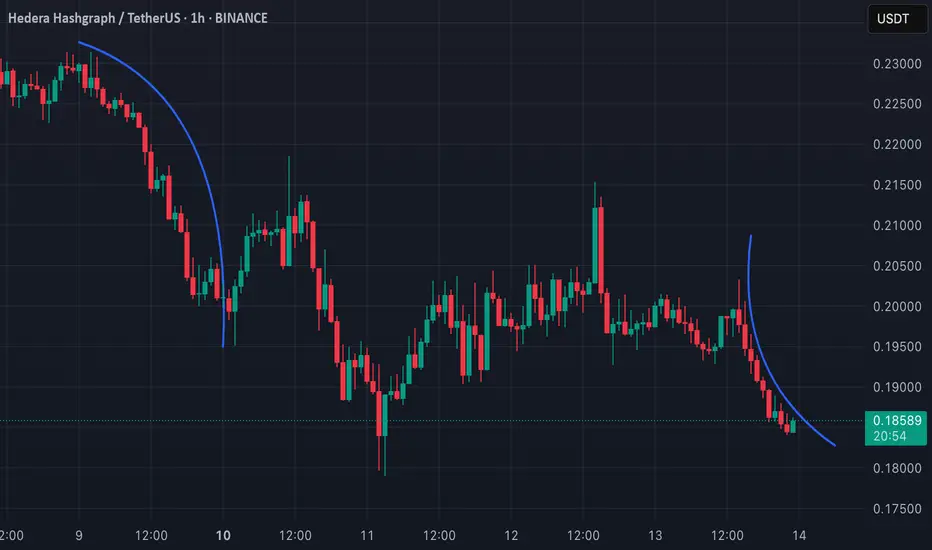
O kurwa! Curvature in Technical Analysis: What Does It Tell Us?Curvature in TA is trading approach where curved lines are used instead of traditional straight trendlines. Curved lines help to visualize how trends evolve and can provide insights into potential reversals or trend continuations.
One of the known methods that utilize curvature is the MIDAS (Market Interpretation/Data Analysis System). This system was developed by physicist Paul Levine in 1995 and uses curved support and resistance lines based on Volume-Weighted Average Price (VWAP). The curves adapt dynamically as price and volume change, helping to identify trend shifts and potential reversals.
💡 Why should we use Curvature?
Dynamic Support and Resistance: Curved lines adapt to price changes, unlike static horizontal lines.
Reversal Signals: They can signal potential trend shifts earlier than traditional methods.
Better Trend Visualization: They are particularly useful for parabolic or exponential price movements.
📊 Applying Curvature to HBAR (1H TF)
There are two curves on my chart. Both of them shows a curvature pattern forming on the 1-hour timeframe.
L: The curve on left side indicates a strong downward move, and the price appears to be following this curve closely.
R: On the other hand I have drawn curve on the right side, which is alligned as downward curve as well, but it has different angle.
This post is meant to test my theory on real life example.
🔑 Key Points:
Breaks away from the curvature could indicate a potential trend reversal or consolidation.
Combining this analysis with volume and momentum indicators can improve accuracy when predicting possible bounce or breakdown scenarios. Let's see how it works!
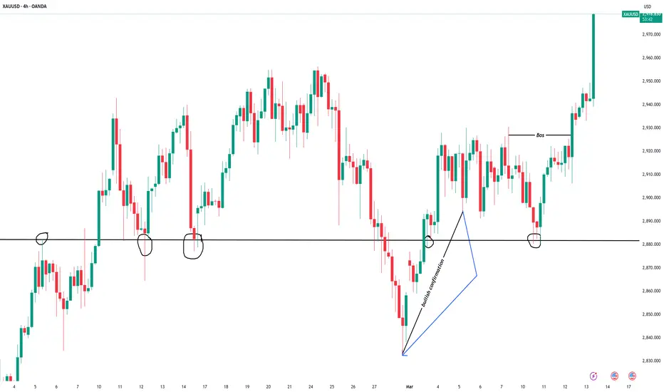
MARKET TREND/STRUCTURE USING XAUUSDTRADEWITHKENNY
EDUCATIVE : The trendline drawn above highlights the bullish confirmation on the 4-hour timeframe at the 2,890 support level , following a fake breakout . The 2,880 level acted as a key support zone and was retested multiple times , as shown on the chart before continuing the trend .
It’s always advisable to perform a top-down analysis , starting from the weekly timeframe down to the hourly and minute timeframes , to refine entries at key levels for better trade execution.
Disclaimer : This is my personal view and should not be considered financial advice.
UNDERSTANDING CHART/CANDLESTICK PATTERNSTRADEWITHKENNY
EDUCATIVE : The circled hammer candlestick on the chart confirms strong buying pressure on XAUUSD . As shown, the market broke through the key resistance level at 2,923.22 , continuing its upward movement.
I’ll be watching for buy opportunities on a retest of the previous key level at 2,923 . However, if the price breaks below this zone, it could move lower toward the key levels where the hammer candlestick initially formed.
KEY LEVELS : 2,923.22 , 2,911.85 , 2,906.77
CONCLUSION : Understanding chart patterns and market structure is crucial for trading success. Learning the market requires consistency, regardless of the losses you may encounter along the way.
Disclamer : This is my personal view and should not be considered financial advice.

Two Stock Market Crashes explained in one chart(ELLIOTT)The first is the Dot-Com Bubble that happened in Early 2000. This was the end of Wave 1(Black) and a retest was on the horizon. The market corrected with a zigzag marked in Red late in March 2000. What followed was a sharp drop Wave A(Red), B correction, and a 5 Wave move to complete Wave C of the zigzag. The 5 Wave move to Red Wave C is supported by Math as it retests at exactly at the 423% of the Fibonacci and 161.8% of Red Wave A on a Monthly time frame.
The second Stock Market Crash is the Financial Crisis of 2008 which by the way is the largest Stock Market Crash in the last 80 yrs. Historically, it is only second to the Great Depression of 1929. Can it be explained in terms of Elliott Wave? Yes. It was part of Wave 5 after Green Wave C ended. In fact, from Blue Wave 4/C there is a clear 5 wave move with a zigzag as its first correction and a flat as its second. The Financial Crisis is Wave 5 after the mentioned second flat but is called a Stock Market Crash!!
All this is avoidable.

2025 ICT Mentorship: Premium & Discount Price Delivery Intro2025 ICT Mentorship: Lecture 4_Premium & Discount Price Delivery Intro
Greetings Traders!
In this video, we dive into the fundamental concept of Premium and Discount Price Delivery—a crucial aspect of smart money trading that helps us understand how institutions approach the market with precision and efficiency.
Understanding Currency Pairs
Before we explore premium and discount dynamics, it's essential to grasp the basics of currency pairs. A currency pair, like EUR/USD or GBP/USD, represents the value of one currency against another. For example, EUR/USD shows how many U.S. dollars (the quote currency) are needed to purchase one euro (the base currency). Just like any other tradable asset, currency pairs fluctuate in value due to various economic and market factors.
Trading Is Part of Everyday Life
Believe it or not, everyone in the world is a trader. Whether you're buying groceries at a store or negotiating for goods and services, you're participating in trading activities daily. Some people aim to purchase items at a discount, while others can afford to pay a premium—it’s simply part of life.
However, banks and financial institutions take trading to another level. They don’t just trade haphazardly—they operate with extreme precision, aiming to make high-quality investments by executing trades at premium prices and targeting discount levels. This strategic approach allows them to capitalize on market inefficiencies and ensure profitable outcomes.
Why Premium and Discount Matter?
The concept of premium and discount price delivery is foundational for understanding how the market moves. By recognizing where the market is trading at a premium (overvalued) versus a discount (undervalued), traders can make more informed decisions and align their strategies with institutional order flow.
Stay tuned as we break down how to identify these zones on a chart and how to incorporate them into your trading strategy. Make sure to like, subscribe, and turn on notifications so you never miss an update!
Happy Trading,
The_Architect

A Pseudoscience called Technical analysis!Pseudoscience is characterized as a system of theories or beliefs that are presented as scientific but lack the rigors and foundations of the scientific method. It often uses scientific-sounding language while being rooted in unsubstantiated claims or cultural beliefs, and it can be misleading and harmful.
My Evolution as a Market Analyst
Early Success on TradingView
In 2020-2021, I established myself as a leading analyst on the TradingView platform, becoming the top-rated contributor for equities and high-volume tickers including TSLA, AAPL, AMZN, ARKK, COIN, RIOT, WKHS, PLTR, NIO, and Bitcoin.
Educational Background
My journey began fifteen years ago with a comprehensive study of technical analysis methodologies. I immersed myself in seminal works including:
"Technical Analysis of Financial Markets" by John J. Murphy
"Japanese Candlestick Charting Techniques" by Steve Nison
"Trading with the Andrews Pitchfork" by Glenn Wilson
"Elliott Wave - Fibonacci High Probability Trading" by Jared Sanders
Professional Recognition
While my initial goal in publishing analyses on TradingView was personal performance tracking, industry recognition came unexpectedly. Within three months, I ranked among the platform's top six contributors, advancing to the highest-rated position by the fourth month.
This visibility led to multiple partnership offers from brokerages and cryptocurrency projects, including Tiger Broker (NASDAQ: TIGR), all of which I declined to maintain independence.
Client Development
Following requests from followers, I established a contribution system to support ongoing analysis. My work attracted institutional attention, including a hedge fund managing hundreds of millions in assets that engaged me for educational services.
I developed a customized curriculum delivered via virtual platforms, maintaining a rigorous teaching schedule that ultimately revealed limitations in traditional technical analysis approaches—confirming Richard Feynman's observation that "When one teaches, two learn."
Methodological Evolution
This realization prompted a strategic pivot. I paused teaching to focus on skill development, particularly in programming and data analytics. I integrated advanced concepts including:
Game theory applications
Quantitative analysis frameworks
Behavioral finance principles
AI Integration
The emergence of accessible AI models represented a significant advancement for my practice. I leveraged Gemini (formerly Bard), ChatGPT, and Claude to enhance my options trading system, developing proprietary metrics to identify market inefficiencies in derivatives pricing.
Current Approach
Today, I operate as a substantially transformed analyst with a modernized market perspective. While my analytical methods employ sophisticated quantitative techniques, I continue presenting findings in traditional visual formats to accommodate audience preferences—a phenomenon explained by patternicity.
Understanding Cognitive Biases in Trading
Patternicity
A concept introduced by Michael Shermer describes our tendency to identify meaningful patterns within random noise
Highlights humanity's inherent drive to impose order on chaotic information
Significantly impacts decision-making processes as our minds actively seek connections, sometimes where none exist
Apophenia
The broader tendency to perceive connections between unrelated phenomena
First defined by German neurologist Klaus Conrad in 1958 as "unmotivated seeing of connections"
While common in everyday cognition, extreme manifestations can indicate psychological concerns
Trading in the AI Era
For market participants continuing to rely exclusively on traditional technical analysis methodologies—pattern trading, Elliott Wave theory, harmonic patterns, or price action systems—I offer this perspective: these approaches alone are increasingly insufficient for achieving consistent market outperformance in today's technology-driven environment.
