EUR/USD and the Fakeout Swing Reversal PatternThe Fakeout Swing Reversal pattern is a straightforward and robust candle pattern that has stood the test of time. In this analysis, we’ll explore how the pattern has recently appeared on EUR/USD’s daily candle chart, examining both its successes and failures while identifying the key factors that influence its performance.
What is the Fakeout Swing Reversal Pattern?
The Fakeout Swing Reversal pattern is a technical setup that captures moments when price fakes a breakout beyond a key swing high or low, only to sharply reverse. This pattern is particularly effective when the fakeout occurs within two candles, signalling that the market’s initial push was unsustainable and trapping traders on the wrong side.
Bullish Scenario:
The bullish Fakeout Swing Reversal begins with price breaking below a key swing low, seemingly triggering a downside move. However, within one or two candles, the price sharply reverses and closes back above the swing low, signalling a potential upward reversal. The psychology here lies in trapping short sellers who entered on the perceived breakout, forcing them to cover as buyers regain control.
Bearish Scenario:
In the bearish version, the price breaks above a key swing high, appearing to continue an uptrend. Yet, within one or two candles, it reverses and closes back below the swing high, indicating bearish momentum as long traders scramble to exit.
Fakeout Swing Reversal Pattern: EUR/USD Daily Candle Chart
Past performance is not a reliable indicator of future results
Key Elements for Execution
• Entry Trigger: Traders typically enter after the reversal candle closes, confirming the fakeout.
• Stop Placement: Stops are often placed just beyond the extreme of the fakeout candle, keeping risk tightly managed.
• Targets: Initial targets may be the midpoint of the prior range or a key support/resistance level, with traders adjusting based on market conditions.
Successful and Failed Signals: A Reality Check
No pattern works flawlessly every time, and the Fakeout Swing Reversal is no exception. Successful signals offer strong potential, but managing failed trades is equally, if not more, critical. How you handle losses defines your trading discipline and long-term success.
On EUR/USD’s recent daily chart, we can identify several instances of this pattern, showcasing its effectiveness in both bullish and bearish scenarios. Some of these signals led to rewarding reversals, while others quickly invalidated, reminding us of the need for a clear plan to handle both outcomes.
Examples: EUR/USD Daily Candle Chart
Past performance is not a reliable indicator of future results
Factors Influencing the Pattern's Effectiveness
Several elements impact the success of the Fakeout Swing Reversal pattern:
1. Momentum Leading into the Test: Strong momentum approaching the swing high or low can increase the likelihood of a breakout.
2. Strength of the Fakeout: A sharp rejection after the breakout adds credibility to the reversal.
3. Prevailing Trend: Patterns aligned with the long-term trend often have a higher probability of success.
Managing Trades: Cutting Losers and Letting Winners Run
Cutting Losers Early: When this pattern works, it tends to work quickly, so if the reversal doesn’t play out promptly, consider exiting early. By cutting losers short, you keep the size of your average losing trade small, preserving capital for better opportunities.
Letting Winners Run: Reversal trades inherently go against short-term momentum, making it challenging to let winners run. However, traders can manage this by taking partial profits at key levels and moving their stops to break even. This approach protects gains while allowing the trade room to capitalise on a sustained move.
By understanding the nuances of the Fakeout Swing Reversal pattern and applying disciplined risk management, traders can add a robust swing trading strategy to their trading arsenal.
Disclaimer: This is for information and learning purposes only. The information provided does not constitute investment advice nor take into account the individual financial circumstances or objectives of any investor. Any information that may be provided relating to past performance is not a reliable indicator of future results or performance. Social media channels are not relevant for UK residents.
Spread bets and CFDs are complex instruments and come with a high risk of losing money rapidly due to leverage. 82.67% of retail investor accounts lose money when trading spread bets and CFDs with this provider. You should consider whether you understand how spread bets and CFDs work and whether you can afford to take the high risk of losing your money.
Chart Patterns

7 Best Chart Patterns For Trading Forex and Gold
If you are studying chart parts, I prepared for you the list of 7 price action patterns you should never miss.
In this article, I will share with you powerful chart patterns for trading forex or any other financial market.
These patters work perfectly for day trading, swing trading and scalping.
We will study real market examples. I will explain the psychology and meaning of each pattern and explain to you how to trade them.
The first chart pattern that we will discuss is double top.
The pattern is formed on the edge of a bullish impulse.
It is based on 2 equal highs and a higher low between them.
A higher low composes a minor support.
A strong bearish signal is a breakout of a neckline and a candle close below that. Entry is on its retest. Stop loss is above the highs.
Target is the closest strong support.
The bullish version of a double top pattern is called double bottom
The pattern is formed on the edge of a bearish impulse.
It is based on 2 equal lows and a lower high between them.
A lower high composes a minor resistance.
A strong bullish signal is a breakout of a neckline and a candle close above that. Entry is on its retest. Stop loss is below the lows.
Target is the closest strong resistance.
The second powerful pattern is a descending triangle formation.
The pattern is formed on the edge of a bullish impulse.
It is based on at least 2 equal lows and 3 lower highs between them.
A falling trend line should respect the lower highs.
A strong bearish signal is a breakout of a neckline and a candle close below that. Entry is on its retest. Stop loss is above the highest high.
Target is the closest strong support.
A bullish variation of a triangle pattern is called an ascending triangle.
The pattern is formed on the edge of a bearish impulse.
It is based on at least 2 equal highs and 3 higher lows between them.
A rising trend line should respect the higher lows.
A strong bullish signal is a breakout of a neckline and a candle close above that. Entry is on its retest. Stop loss is below the lowest low.
Target is the closest strong resistance.
Chart pattern number 5 - Cup & Handle pattern.
Cup & handle pattern is the variation of a double bottom.
The only difference between 2 patterns is 1 lower low and a consequent higher low, instead of 2 equal lows.
Entry trigger and trade execution rules are absolutely the same as with a double bottom.
Stop loss is strictly below the lower low.
A bearish version of a cup & handle is called an inverted cup & handle.
Inverted cup & handle pattern is the variation of a double top.
The only difference between 2 patterns is 1 higher high and a consequent lower high, instead of 2 equal highs.
Entry trigger and trade execution rules are absolutely the same as with a double top.
Stop loss is strictly above the higher high.
The last and the most powerful chart pattern is the range .
Range is a strictly horizontal parallel channel where the price sets equal highs and equal lows, respecting the support and the resistance of the range.
This chart pattern signifies that the market found equilibrium, a fair value.
A strong bullish signal is a breakout of a resistance of the range and a candle close above that.
Target will be the next strong resistance, stop loss should lie below the lows of the range.
A strong bearish signal is a breakout of a support of the range and a candle close below that.
Target will be the next strong support, stop loss should lie above the highs of the range.
Of course, there are more patterns to study but these 7 are essential .
Your ability to recognize them is the key for accurate price action trading.
Learn to spot these patterns and good luck in your trading..
Let me know which patterns do you want to study in the next article.
❤️Please, support my work with like, thank you!❤️

How to use Trading View - Part 3 - TemplatesHow to use Trading View - Part 3 - Templates
Easily switch your TF, Scrip and indicators with the help of templates.
These template help save time and ensure you don't miss out on any indicators/Time Frames or Opportunities.

Trading USDCAD and AUDUSD | Silver Bullet Strategy 18/11/2024The Silver Bullet strategy, introduced by the Inner Circle Trader (ICT), aims to exploit certain market conditions within specific time frames. It involves strategically placing entries at the initial fair value gap that emerges within these periods. Yesterday, we executed trades using this strategy and we plan to show you how to incorporate this strategy into your trading toolkit.
Firstly, it's crucial to understand what a Fair Value Gap (FVG) is and recognize the optimal time to look for these trades, which is between 10:00 and 11:00 EST. In order to get into the groove of trading we got to our trading desk at 09:55 and with the help of the sessions indicator we have the our trading zones mapped out for us. It should be noted that the initial candle marking the start of a trading session cannot constitute the Fair Value Gap (FVG), but it can serve as the first candle in the formation of an FVG.
The trading session began, and we were scouting for setups to trade using the silver bullet strategy. After 15 minutes, we noticed a Fair Value Gap (FVG) had formed on the USDCAD pair, which drew our attention to it.
This development indicates that we should be on the lookout for potential selling opportunities this trading session. We must wait for price to retrace back to the FVG and only execute a trade after the candle that enters the FVG has closed. This approach helps us avoid trades that enter the FVG and immediately hit our stop-loss. After 10-minutes we got a retracement into the Fair Value Gap (FVG), and given that price did not surpass the high of the first candle in the FVG formation, we can enter this trade. A 10 pip stop loss will be set to provide sufficient room for the trade to develop.
After initiating the trade, our USDCAD position experienced minimal drawdown, and by 10:35, it was progressing favorably in our desired direction. Simultaneously, we were evaluating potential setups on other currency pairs and observed the formation of a Fair Value Gap (FVG) on AUDUSD.
The next candle retraced into the Fair Value Gap (FVG) created on the AUDUSD pair, indicating that upon its close, we could execute a trade on this pair.
The USDCAD position swiftly hit the take profit (TP) target. Within just 25 minutes, we completed this trade and shifted our focus to the other open position, AUDUSD. The AUDUSD position was also moving favorably in the direction we anticipated.
After a period of waiting, we checked the position and found that it had reached the Take Profit (TP) after two hours. We succeeded in both trades we entered yesterday, risking 1% on each and aiming for a total gain of 4%. As observed, both trades experienced minimal drawdown, but this does not guarantee similar entries in the future. It is advisable to backtest this strategy and collect sufficient data to reinforce your confidence should you choose to trade using this strategy.

From Fiat to Crypto: A Pragmatic View on Cross-Asset USD Impact1. Introduction: Why Understanding USD Impact Matters
The U.S. dollar (USD) plays a pivotal role in shaping global financial markets, especially for assets denominated in dollars, such as S&P 500 Futures (ES/MES). Its movements affect equity market flows, international capital dynamics, and, ultimately, price trends for USD-denominated instruments. However, traditional methods of gauging USD strength often fall short of capturing the nuanced interplay between fiat currencies and emerging digital assets.
To bridge this gap, we introduce a pragmatic and dynamic solution: the USD Proxy. By combining a carefully weighted mix of key global currencies (Euro and Yen) with Bitcoin (BTC), this proxy provides a comprehensive and CME-specific lens for understanding USD strength. It is a modern approach to assess the dollar's “true” influence on equity markets, particularly the S&P 500 Futures.
2. The USD Proxy: A Pragmatic Cross-Asset Index
The USD Proxy is built to reflect real-time market dynamics, offering traders a potentially more relevant measure of the dollar’s impact. Unlike static indexes, this proxy is dynamic, continuously adjusting based on three major components:
Euro Futures (6E): Representing the largest fiat currency trading block.
Japanese Yen Futures (6J): Capturing the Asian market's influence.
Bitcoin Futures (BTC): Adding a layer of innovation by integrating cryptocurrency, which operates independently of traditional fiat systems.
The weighting is determined by notional values, market prices, and volume-weighted activity as volumes change and evolve through time, ensuring the proxy adapts to liquidity and relative importance. This structure provides a balanced view of USD strength across fiat and crypto markets, making it highly applicable to modern trading.
3. Adjusting S&P 500 Futures Using the USD Proxy
To uncover the “true” equity market performance, the S&P 500 Futures can be adjusted using the USD Proxy. The formula is straightforward:
Adjusted S&P 500 Futures = S&P 500 Futures Price x USD Proxy Value
This adjustment neutralizes the effects of USD strength or weakness, revealing the core price action of the equity market. By doing so, traders can distinguish between moves driven by dollar fluctuations and those stemming from genuine market trends.
For example, during periods of a strengthening USD, the unadjusted S&P 500 Futures may appear weaker due to currency pressure. However, the adjusted version may provide a clearer picture of the underlying equity market, enabling traders to make more informed decisions.
4. Regular vs. Adjusted S&P 500 Futures: Key Insights
The comparison between regular and USD Proxy-adjusted S&P 500 Futures charts could reveal critical divergences that may have been often overlooked. These divergences highlight how currency fluctuations can obscure or exaggerate the equity market’s actual performance.
For instance, while the S&P 500 Futures have recently reached new all-time highs, some market participants may view this as an indication of the market being overpriced. However, when adjusted using the USD Proxy, the chart reveals a different reality: the S&P 500 Futures are far from their highs. This adjustment aims to neutralize the currency's impact, uncovering that the recent record-breaking levels in the unadjusted chart are likely largely influenced by USD dynamics rather than true underlying equity market performance.
5. Trading Opportunities in Adjusted S&P 500 Futures
The adjusted S&P 500 Futures chart opens up new possibilities for traders to identify actionable insights and anomalies. By neutralizing the currency effect, traders can:
Spot Relative Overperformance: Identify instances where the adjusted chart shows strength compared to the regular chart, signaling robust underlying equity market dynamics.
Capitalize on Potential Anomalies: Detect price-action discrepancies caused by abrupt currency moves and align trades accordingly.
Refine Entry and Exit Points: Use the adjusted chart especially during high-volatility periods influenced by the USD.
6. Trading Application: A Long Opportunity in Adjusted S&P 500 Futures
Trade Setup:
o Instrument: S&P 500 Futures (ES) or Micro S&P 500 Futures (MES).
o Entry Point: Around 5900.00
o Targets:
Primary Target: 6205.75 (aggressive traders, Fibonacci extension level).
Conservative Target: 6080.00 (moderate traders, earlier Fibonacci extension).
o Stop Loss: Below the entry, calculated to maintain a 1:3 reward-to-risk ratio.
Rationale:
The adjusted S&P 500 Futures chart highlights a technical setup where the price is reacting to:
Breakout to the Upside: The adjusted chart is breaking out of a key resistance level, signaling potential continuation of upward momentum.
The 20-SMA: Acting as dynamic support, aligning with recent price behavior.
Technical Support Level: A key horizontal level.
These converging factors suggest the potential for a bullish continuation, targeting Fibonacci extension levels at 6205.75 or 6080.00. The adjusted chart provides added confidence that the move is not overly influenced by USD fluctuations, grounding the analysis in equity-specific dynamics.
Trade Mechanics:
o Instrument Options:
ES (full-size contract), with a point value of $50 per point.
MES (micro-sized version), designed for smaller accounts or precision risk management, with a point value of $5 per point—10 times smaller than the full-size ES contract.
o Margins (approximate, depending on broker):
ES: Approximately $15,000 per contract.
MES: Approximately $1,5000 per contract—10 times smaller than the ES margin.
Execution Plan Example:
Place Buy Limit Order at 5900.00.
Set Stop Loss below the entry, maintaining a 1:3 reward-to-risk ratio.
Take partial profits or adjust stop losses as the price approaches 6080.00 for conservative traders or 6205.75 for aggressive targets.
7. Conclusion: A Fresh Perspective on USD and Equity Futures
By introducing the USD Proxy and applying it to S&P 500 Futures, traders gain a powerful tool to assess market dynamics. This cross-asset approach—spanning fiat and crypto—bridges the gap between traditional and modern financial metrics, offering unparalleled insights.
The adjusted S&P 500 Futures chart neutralizes currency distortions, revealing the market's true movements. Whether identifying divergences, refining trading strategies, or uncovering hidden opportunities, this method empowers traders to approach the market with clarity and precision.
As markets evolve, tools like the USD Proxy demonstrate the importance of integrating diverse assets to stay ahead in a complex trading environment.
When charting futures, the data provided could be delayed. Traders working with the ticker symbols discussed in this idea may prefer to use CME Group real-time data plan on TradingView: www.tradingview.com - This consideration is particularly important for shorter-term traders, whereas it may be less critical for those focused on longer-term trading strategies.
General Disclaimer:
The trade ideas presented herein are solely for illustrative purposes forming a part of a case study intended to demonstrate key principles in risk management within the context of the specific market scenarios discussed. These ideas are not to be interpreted as investment recommendations or financial advice. They do not endorse or promote any specific trading strategies, financial products, or services. The information provided is based on data believed to be reliable; however, its accuracy or completeness cannot be guaranteed. Trading in financial markets involves risks, including the potential loss of principal. Each individual should conduct their own research and consult with professional financial advisors before making any investment decisions. The author or publisher of this content bears no responsibility for any actions taken based on the information provided or for any resultant financial or other losses.

How to use Trading View - Part 2 - Drawings and AlertsHow to use Trading View - Part 2 - Drawings and Alerts
Remember to assign different colours to different Time Frames as we saw in the last video. www.youtube.com
Also, you can be a bit innovative and use the Trend lines to create alerts not just for the price but time as well.

How to use Trading View - Part 1 - Trend Lines and Time FramesHow to use Trading View - Part 1 - Trend Lines and Time Frames
Use these different tools to make the most of your trading View account.
Make sure to differentiate your time frames so that your charts are decluttered and you have a very clean chart handy always.
Avoid drawing too many lines and drawings at irrelevant time frames.
Keep it Simple,
Keep it Consistent,
Keep it Clean.

EMA, The correct way of usage - Part Three - minor structureFor trend traders, analyzing the short and long-term trend direction is crucial. By usage of 20EMA & 13EMA, we can understand short-term trend direction and power. In future articles, we will look at Major Structure (long-term trend analyses).
Keynotes:
1. When 20 is below 13 it means we are in an uptrend, and a Downtrend is when 20 is above 13.
2. EMAs should have a slope. If just one of them is flat, or both are sloped toward each other, or the price crosses and closes both of them, we are in the minor range. the possibility of a third one happening could be predicted by identifying an MC in the past (please refer to the MC article ).
4. We look at the distance between these two EMAs as a zone. So we don't expect the price to close exactly on any of them, to analyze for a probable pullback (Please refer to Part One and Two ).
Watch 4H:
- #1 Is where the price crosses and closes both. we are in a minor range. Then, the continuation of shaping green candles and then the cross of EMAs, means we are in a minor uptrend.
- #2 a flat 13 shows a slight range, which then again turns into an uptrend. Although we have predicted it before by drawing MC boxes.
- #3 shows 13 is toward 20. Then we are in a minor range. This is followed by price crossing and closing both in #4. Again it has been predicted by MC box to happen.
- Candle #5 is normal. Because we are in a range and in here anything can happen. But when the price couldn't cross and close both in #6 and the continuation of the downtrend and pullbacks in #7 & #8, it shows we are in a minor downtrend now. So, we are not going to trade upward until it reverses.

Robin Trap Strategy Part 6Me Going Over Some Of The Pairs I Trade And What Robin Traps Im Willing To Trade Or avoid !

Streaming Wars | Who’s Winning, Losing, and Sharing Passwords ?Netflix Is Laughing, Cable Is Crying, and Amazon Is Sneaking Up
Highlights for Today
- Trends and Market Share
- Disney: Streaming Profits on the Rise
- Comcast: Cable Restructuring Underway
- Warner Bros : Box Office Challenges
- Paramount: Streaming Growth Amidst Challenges
In the Battle for Loyalty, One Fact Stands Out: Netflix vs the Rest
1. Trends and Market Share
Platforms like YouTube Premium, Amazon Prime, and Apple TV+ do not report quarterly numbers. Additionally, Disney+ Hotstar is excluded due to its planned merger with Reliance in 2025.
Streaming continues to replace traditional linear TV, benefiting all players. Nielsen reports streaming comprised 41% of US TV time in September 2024, a 3.5-point increase year-over-year, primarily at Cable’s expense.
Key Trends to Watch
-Password-Sharing Crackdown: Following Netflix’s success, Disney introduced paid sharing in the US in late September, with effects expected to emerge in Q4. Max is also gearing up for this initiative.
-Amazon Prime’s Growing Presence:CEO Andy Jassy revealed that Prime Video attracts over 200 million global viewers monthly. Combining exclusive content, live sports, and e-commerce integration, Amazon’s ecosystem presents a credible challenge to Netflix.
-YouTube’s Dominance in Living Rooms: YouTube accounts for over 25% of US streaming TV time (excluding YouTube TV) and continues to grow. Alphabet disclosed that YouTube’s ads and subscriptions brought in $50 billion in revenue over the last 12 months, surpassing Netflix’s $38 billion.
-Subscriber Trends: Tentpole events, like the Olympics for Peacock or hit series like House of the Dragon for Max, drove sign-ups. However, retention remains a challenge for all but Netflix.
2. Disney: Streaming Profits Rise
Disney’s fiscal year ends in September, with Q3 FY24 covering the June quarter.
-Streaming Profits:Disney’s direct2consumer (DTC) segment, which includes Disney+, Hulu, and ESPN+, posted its second consecutive profitable quarter, generating $321 million in operating income. Core Disney+ subscribers rose by 4.4 million, reaching 123 million, driven by ad-supported tiers.
-Box Office Wins: Hits like Inside Out 2 and Deadpool & Wolverine powered $316 million in studio profits. Disney became the first studio to surpass $4 billion in global box office revenue in 2024.
- Challenges in Parks: Parks and Experiences revenue dropped 6% to $1.7 billion, impacted by hurricanes, rising costs, and competition from the Paris Olympics. Domestic attendance held steady, while international parks struggled.
- Linear TV Decline: Revenue fell 6%, with profits plunging 38% to $498 million as cord-cutting and reduced ad sales weighed heavily. Disney plans to integrate streaming and linear TV rather than divest assets.
- Optimistic Outlook: Disney expects earnings growth in FY25 (high single digits) and double digits in FY26 and FY27. Blockbusters like Moana2 and Mufasa:The Lion King are anticipated to maintain momentum.
Takeaway: Disney’s Q4 highlighted strides in its streaming turnaround, buoyed by box office wins. However, the decline in linear TV underscores the challenges of transitioning in a shifting media landscape. Strong content and a focus on profitability position Disney for success under Bob Iger’s leadership.
3.Comcast: Cable Restructuring
-Olympics Drive Growth:The Paris Olympics boosted NBCUniversal’s revenue by 37%, generating $1.2 billion in advertising and adding 3 million Peacock subscribers, which now total 36 million.
-Streaming Expansion: Peacock’s revenue rose 82% year-over-year to $1.5 billion, with losses narrowing to $436 million from $565 million last year.
-Cable Struggles: Cord-cutting led to a loss of 365,000 cable TV subscribers, with video segment revenue down 6.2%. Comcast is exploring a spinoff of cable networks like Bravo and CNBC to prioritize growth areas.
-Theme Parks Slow: Theme park revenue dipped 5% to $2.3 billion as domestic attendance normalized post-COVID.
-Broadband Trends:Despite losing 87,000 broadband customers, revenue increased 3%, with higher average revenue per user.
Takeaway:Comcast’s Q3 reflected both opportunities and challenges. While the Olympics showcased its media strength, declines in cable TV and theme parks persist. Streamlining through a cable spinoff could sharpen its focus, but sustaining growth in Peacock and broadband remains critical.
4.Warner Bruh : Box Office Challenges
-Streaming Growth:Max gained 7.2 million subscribers, reaching 110.5 million globally, supported by international expansion and hits like *House of the Dragon*. Streaming revenue rose 9%, marking Warner’s first profit since 2022.
-Box Office Struggles:Studio revenue declined 17%, with theatrical revenue falling 40% due to a weaker film slate (*Beetlejuice Beetlejuice* and *Twisters* compared to last year’s *Barbie*). Video game revenue dropped 31%.
-Mixed Network Results:Network revenue grew 3% from the Olympics and *Shark Week*, but advertising revenue fell 13%. The $9.1 billion NBA impairment from Q2 continues to loom.
-Debt and Cash Flow Issues:** Free cash flow dropped 69% to $632 million, with $41 billion in debt. Warner renewed its Charter Communications deal to bolster stability.
-CEO’s Confidence:David Zaslav emphasized Max’s momentum, projecting $1 billion in streaming profits by 2025 and hinting at password-sharing monetization.
Takeaway:Warner’s Q3 highlighted streaming success but underscored its dependence on Max as traditional film and TV segments falter. Balancing debt, declining cash flow, and expanding streaming profitability will be key to its stability.
5.Paramount: Streaming Growth
-Streaming Success:Paramount+ gained 3.5 million subscribers, reaching 72 million, thanks to sports like the NFL and UEFA and shows like *Tulsa King*. The streaming unit achieved a $49 million operating income, its second consecutive profitable quarter.
-TV and Film Challenges:TV revenue fell 6% due to lower ad sales and declining cable subscribers. The film division saw revenue plummet 34%, with theatrical revenue dropping 71%.
-Merger Progress:Paramount’s merger with Skydance Media is on track for early 2025, following the exploration of 12 potential bidders.
-Cost-Cutting:Paramount has completed 90% of its $500 million cost reduction initiative, resulting in layoffs and asset write-downs.
-Strategic Shift:Paramount is seeking a streaming joint-venture partner to better compete with Netflix and Disney while managing cable TV’s decline.
Takeaway: Paramount’s streaming gains are encouraging, but traditional TV and film struggles persist. The Skydance merger offers a potential transformation, though stabilizing legacy businesses remains a significant hurdle.

Trading is not a get rich quick scheme🔸Patience
▪️Market Timing: Not every moment is the right time to trade. Waiting for the ideal setup is crucial. For example, a patient trader waits for patterns, trends, or specific signals to align with their strategy.
▪️Compounding Growth: Wealth through trading often comes from compounding small, consistent gains rather than chasing big wins. This takes time to materialize.
▪️Recovery Time: Losses are inevitable. Patience allows traders to focus on gradual recovery rather than impulsively trying to "win back" losses.
🔸Discipline
▪️Sticking to the Plan: A trading plan is your blueprint. Discipline ensures you execute trades based on logic, not emotion.
▪️Avoiding Overtrading: The temptation to trade constantly can lead to unnecessary risks. A disciplined trader knows when to step back.
▪️Risk Management: Proper position sizing, setting stop losses, and avoiding over-leveraging are all practices rooted in discipline.
🔸Consistent Effort
▪️Continuous Learning: Markets evolve, and so must traders. Keeping up with new strategies, tools, and market conditions is essential.
▪️Routine Analysis: Reviewing past trades to learn what worked and what didn’t helps improve strategies.
▪️Building Experience: Expertise comes from time spent observing patterns, managing emotions, and handling a variety of market scenarios.
🔸Mindset
▪️Long-Term Thinking: Focus on building wealth slowly rather than chasing immediate profits.
▪️Resilience: Markets can be unpredictable. A strong mindset helps traders stay focused after setbacks.
▪️Adaptability: Successful traders adapt their strategies to fit different market conditions instead of forcing trades.
🔸The Journey, Not the Destination
▪️The idea of "getting rich" in trading is often a trap that leads to rushed decisions and excessive risk-taking. Instead, embrace the process:
▪️Track your progress: Measure success in terms of skill improvement, not just profits.
▪️Celebrate small wins: These build confidence and keep you motivated for the long haul.
▪️Remember, trading is a craft—those who approach it with respect, patience, and consistent effort are the ones most likely to achieve sustainable success.

What I wish I knew when I started Trading1. Study and Trade One Pair Only
Focusing on a single currency pair can streamline your learning and help you master market dynamics.
🔸Choose a Pair: Start with major pairs like EUR/USD or USD/JPY. These have high liquidity and predictable patterns.
🔸Understand Its Behavior: Learn the fundamentals and technical characteristics of the pair, such as its volatility, reaction to news, and typical trading hours.
🔸Backtesting and Practice: Use historical data to understand how the pair moves under different market conditions.
2. Losses Are Part of Trading
No trader is immune to losses. Handling them effectively is crucial for long-term success.
Mindset:
🔸Accept Losses as Learning Opportunities: View losses as part of the cost of doing business, akin to inventory in retail.
🔸Detach Emotionally: Avoid the temptation to revenge trade or let losses affect your confidence.
Practical Strategies:
🔸Set Risk Parameters: Only risk 1-2% of your trading account per trade. This limits the damage of a losing streak.
🔸Use Stop Losses: Predetermine the point at which you will exit a trade if it goes against you. This protects you from devastating losses.
🔸Keep a Journal: Document each trade, including reasons for entering, outcomes, and what you learned. Over time, patterns will emerge to guide improvement.
3. Develop Discipline and Patience
🔸Stick to a Trading Plan: Define your entry, exit, and risk management strategies before trading.
🔸Trade Less, Win More: Focus on high-probability setups instead of trading excessively.
🔸Give Yourself Time: Mastery in Forex trading can take years. Trust the process and aim for consistent improvement.
4. Build Resilience to Handle Losses
Self-Care:
🔸Step away from the charts after a big loss to regain perspective.
🔸Engage in activities that reduce stress, like exercise or meditation.
Review and Improve:
🔸Evaluate losing trades to identify errors.
🔸Adjust your strategy if recurring issues are found.
🔸Focus on the Big Picture:
🔸Track your performance over months or years, not days. This helps put individual losses into perspective.

Ticker: Celsius Elliot Wave Reference Model
Here’s a reference model for Elliot wave & the 5 Motive Waves .
This is ticker NASDAQ:CELH
Please leave a like 👍 & a positive comment.
Studying for success
Assuming you had correctly identified the wave you were in, you could have protected your capital from significant losses. Celsius’ price plummeted from $99 to below $28, a sharp drop that highlights the importance of wave analysis in safeguarding your investments. This strategy & screening methodology can serve as a valuable addition to your trading toolkit.
It’s currently 3 a.m. in Toronto, and I’ve spent the last three hours trying to solve this puzzle. 🧩
This is an Extended Wave 3 count.
While other primary waves can extend, this is most common wave to extend.
That means this charting principle & identification technique will work majority of the time at least on equities. Other assets have varying chart rules.
Step 1: Identifying Wave 3
- Look for RSI in overbought territory (70+).
- Switch to the highest time frame and identify the highest RSI level on both the price chart and RSI indicator.
- This price area often coincides with the highest volume. Highlight the highest volume bars on your chart for confirmation.
- Mark this point as Wave 3 and then work backward to identify the preceding waves.
Step 2: Identifying Primary Wave 1
& primary wave 2
As you are aware primary wave 1 is the first of the primary wave. Find an area on a chart where price has declined significantly and has created an accumulation box. Mark out the strongest impulse from the box, this should signify wave 1. Wave 1 can be seen as the start of the major move.
- Perform a visual scan of the ticker you’re analyzing:
- Identify and mark accumulation zones using a rectangular box.
- A strong price breakout from an accumulation zone typically signifies the start of Wave 1.
- If you’ve already identified Wave 3, you’ll notice Wave 1 is connected to it by a retracement (Primary Wave 2). This relationship should make Wave 1 & 2 &3 (sub 3)easier to spot.
Step 3 Primary Wave 3 / Sub wave 4 Retracement & final wave 3
- Wave 3(4) Extension: This retracement might appear to be a Primary Wave 4, but it’s actually the final wave before the extended Wave 3(5). Confusing? I know! Wave extensions are complex. Pay close attention to RSI levels to accurately judge this subwave.
Quick Tip: Use the Fibonacci extension tool:
1. Drag from the bottom of Primary Wave 1 to the top.
2. Then drag again to the end of Primary Wave 2.
3. This will mark the 1.618 level, which is often where Subwave 3 of Primary Wave 3 ends. This is the highest price point before Subwave 4’s deep or flat retracement.
• Now that you’ve identified Subwave 3 and Subwave 4, you can confirm the Primary Wave 3, which connects to Subwave 4. This will be the next impulse.
Step 4 Identifying Wave 4
- Notice the next major accumulation / basing pattern / deep retracement after primary wave 3. Done!
Very nice!
Step 5: Identifying Wave 5
Similarly to how wave 1 connect to 2 wave 4 connect to wave 5.
Done !
b]Final Mentions
Point 1
- Notice M pattern extended wave 3(5) aka ( wave 3 final) and primary 5. (M) pattern often called double top.
Point 2
- Notice the connections of both the top & bottoms of waves 3(5) and primary 5.
Creates a symmetrical triangle pattern which would flash warning signs before the huge price descent.
Point 3
- Notice the RSI where you think a new wave started it was just a sub wave in an extensions or a higher time degree Elliot wave.
Point 4( can be seen on 4hour time frame)
Note the head & shoulder which triggered & signified the end of wave 🌊 sent price from
$98 to $26.
That is it for this tutorial / reference guide.
Please leave a like and a positive comment this took lots of time. If you got to this Part drop your favourite emoji in the chat there are mine : 🌊🤝🎯
Thanks,
C Lemard

bull flag and Cup and handle pattern tp"With institutional players adding billions to Bitcoin ETFs and the supply of BTC on exchanges becoming increasingly thin, a surge in demand could lead to Bitcoin reaching $100K. Huge buyers are waiting for the right moment at $75K area, setting the stage for a potential rally toward a new all-time high by 2025."

Indentifying Bullish/Bearish Orderblocks & Mitigation Blocks Orderblocks and Mitigation Block Live Study - Looking at live example going back to early May of 2010. There was news on May 6th that caused the market to plunge but interestingly enough - Price Action manages to be find a floor around the Orderblocks indentified on the Daily, Weekly, and Monthly Charts (HTF)

How are risk free trades done (a simple way)🟢 How are risk free trades done (a simple way)
✴️ Rationale
The video shows how to take advantage of an incredibly famous chart pattern:
🥇 The TRIPLE BOTTOM chart pattern🥇
This pattern shows a strong support that have worked at least 3 times, and the video shows how to act when the 4th bottom is unfolding.
The video shows how trade RISK FREE avoiding the risk as soon as the market allows you to do so.
Step 1: Split
Use 50% of your money for the risk free strategy and the other 50% to Take large profits.
Step 2: Set up Stop Loss for both strategies
Both strategies should share the Stop Loss, usually around 3 to 6% and trying to use some previous minimum/maximum prices to adjust.
Step 3: Set up a Risk Free take profits
The first 50% of your capital will have more or less the same Stop Loss and Take profits. Both will be around 3 to 6% of the buy level. If the take profits is hit, you earn enough to pay for the Stop Loss of the other 50%.
Step 4: Find a reasonable Take profits for the returns strategy
The other 50% of your money needs a take profits far away of the buy zone, meaning that you can potentially earn more than 3 times the risk. So at least find for 10% targets, if that's not posible this is not a feasible trade, there is too much risk. Always check previous support and resistance levels.
Step 4: Enjoy
There are 3 outcomes:
1. Both strategies do Stop Loss and you lose around 3 to 6% of the amount of the trade.
2. Your Risk free trade take profits work but your return strategy fail. this is a 0 to 1% return.
3. Both strategies work as expected giving you over 10% return on average.
In the video you'll see opportunities in:
NYSE:OXY
🟢 +10% trade finished (risk free gains)
🟢 +10% trade finished (risk free gains)
🔵 0% trade finished (risk free)
🟢 +25% unfolding (risk free phase)
NASDAQ:DLTR
🟢 +15% trade unfolding (risk free phase)
The idea:
FX:EURUSD
🟢 200 pips trade unfolding (risk free phase)
The idea:

Dollar's Rise, Gold's Demise◉ Abstract
The US Dollar Index (DXY) and gold prices have a historically inverse correlation, with a stronger dollar typically reducing gold demand. Key drivers of this relationship include inflation, geopolitical tensions, and interest rates. With a 73-95% negative correlation observed over time, investors should note the current market outlook: the DXY is poised to break out above 107, potentially surging to 114, while gold prices may drop 5% to 2,400 and then 2,300. Understanding this dynamic is crucial for making informed investment decisions and capitalizing on potential trading opportunities.
◉ Introduction
The relationship between the U.S. Dollar Index (DXY) and gold prices is significant and typically characterized by an inverse correlation. Understanding this relationship is crucial for investors and traders in the gold market.
◉ U.S. Dollar Index Overview
The U.S. Dollar Index measures the value of the U.S. dollar against a basket of six major foreign currencies, including the euro, Japanese yen, and British pound. It serves as an indicator of the dollar's strength or weakness in global markets. When the index rises, it indicates that the dollar is gaining value relative to these currencies, while a decline suggests a weakening dollar.
◉ Inverse Relationship with Gold Prices
Gold is priced in U.S. dollars on international markets, which directly influences its price based on fluctuations in the dollar's value:
● Strengthening Dollar: When the DXY index increases, it generally leads to a decrease in gold prices. This occurs because a stronger dollar makes gold more expensive for investors using other currencies, thereby reducing demand.
● Weakening Dollar: Conversely, when the DXY index falls, gold prices tend to rise. A weaker dollar makes gold cheaper for foreign investors, increasing its demand and driving up prices.
Research indicates that this inverse relationship has been consistent over time, particularly in long-term trends. For instance, historical data shows that gold prices often rise when the dollar depreciates, reflecting a negative correlation of approximately 73% to 95% over various time intervals.
◉ Short-Term Deviations
While the long-term trend supports this inverse relationship, short-term anomalies can occur under specific market conditions. For example, during periods of extreme volatility or economic uncertainty, gold and the dollar may exhibit a positive correlation temporarily as both assets are sought after as safe havens. This behaviour can confuse investors who expect the typical inverse relationship to hold.
◉ Additional Influencing Factors
Several other factors also affect gold prices beyond the dollar's strength:
● Inflation: Rising inflation often leads investors to flock to gold as a hedge against currency devaluation.
➖ E.g. In 2022, as inflation rates surged to 9.1%, demand for gold increased by 12% year-over-year, pushing prices higher. Historical data shows that during periods of high inflation from 1974 to 2008, gold prices rose by an average of 14.9% annually.
● Geopolitical Events: Uncertainty from geopolitical tensions can drive demand for gold regardless of dollar fluctuations.
➖ E.g. In late 2023, escalating conflicts such as the Israel-Palestine situation and the ongoing Russia-Ukraine war contributed to a surge in gold prices, with reports indicating increases of over 3% in a week due to these tensions
● Interest Rates: When the Fed raises interest rates, it typically strengthens the dollar as higher yields attract foreign capital. A stronger dollar makes gold more expensive for holders of other currencies, which can reduce demand.
➖ E.g. During the Federal Reserve's rate hikes from March 2022 to early 2023, many investors moved away from gold as they sought higher returns from bonds and other fixed-income securities. This shift contributed to downward pressure on gold prices during that period.
◉ Technical Standings
● U.S. Dollar Index TVC:DXY
The US Dollar Index has been stuck in neutral for two years. But if it clears the 107 hurdle, get ready for a surge to 114.
● Gold Spot/USD OANDA:XAUUSD
➖ Gold prices skyrocketed to 2,790, then plunged. Expect a 5% drop to 2,400. If that support cracks, 2,300 is the next safety net.

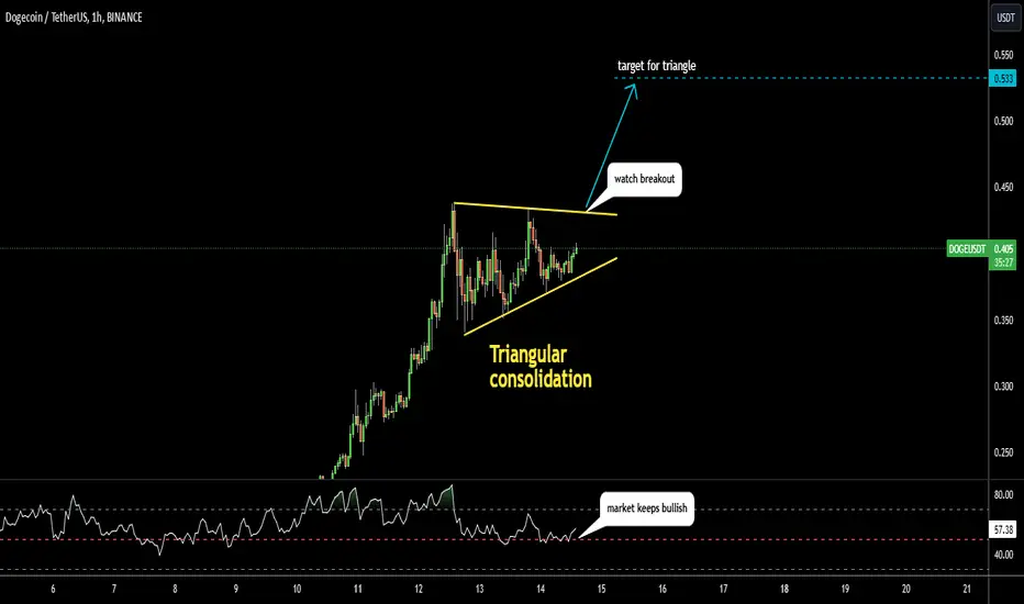
DOGE/USDt: Famous Pattern Indicates Continuation To The Upside Falling peaks and rising valleys have built famous Triangle pattern
on the hourly chart of DOGE/USDt.
It's a consolidation after a big rally, which means more upside move is ahead.
Watch the price to break out of the pattern.
The target is located at the widest part of Triangle added to the break point.
Its located at 0.533
Breakdown of Triangle would invalidate the pattern.
RSI has managed to keep above the neutral point during this consolidation.
This supports the idea of further move to the upside
EMA, The correct way of usage - Part Two - PullbackOur core belief in ARZ Trading System: Trading, is to have an "expectation" from the market. If not, at any movement, the trader will be confused! If you look at the market and don't have any expectations, don't trade! In a future article, we will discuss what to do if an expectation is not met.
In the case of Pullback, Price is not a ball, and EMA (or any other kind of S&R) is not a brick wall, especially in this case.
If you put an EMA with any period, you'll see that the price crosses it easily most of the time! Then, it might come back as a shadow or a Fake Breakout. This means we should have a confirmation system for accepting or rejecting a Pullback. Otherwise, we'll always see a pullback shaping!
Key Note 1: the higher the EMA period is, the longer will take for a pullback to shape!
Key Note 2: Never trust and trade based on just one S&R level! Always have at least 2 or 3 levels to confirm your pullback. Either in a classical way by drawing trendlines and channels, or using any kind of Indicator as a means of dynamic S&R level.
Key Note 3: a flat EMA is supposed to break easily! If not, it'll reject the price strongly. It means we have to wait for what will happen at a flat EMA to decide what to do next or expect the price will breach it (Please refer to article part one).
Key Note 4: An ascending EMA can only act as a support, and a descending one acts as a resistance, not the other way! This is critical, believe me!
Accepted ways of confirming a pullback in the ARZ System are:
1. Wait for a strong reversal pattern to shape at S&R. Never jump the gun!
2. Use a Volume Indicator like WAE (Waddah Attar Explosion) to confirm your entry at the S&R level.
In this chart:
- Pullback #1 (Bearish Engulfing) is not accepted, because it's just based on one S&R (13EMA) and the reversal pattern closed near the support of MC.
- Pullback #2 (Bullish Engulfing) is strong but closed near 100EMA. Can't trust it.
- Pullback #3 is awesome! This is a multi-candle Evening Star (Key Note 1&2), of 100EMA & Resistance of UTP & MC.
- Pullback #4 is again good but has closed near the low of MC and is risky to take.

SPY Day Trading Using @mwrightinc Indicators Give a man a fish, and you feed him for a day. Teach a man to fish, and you feed him for a lifetime. In this video, I explain how I use 4 free TradingView indicators to identify entries on SPY.
There is a lot of information out there about creating support and resistance zones. But, drawing reliable ones only comes with experience. In my 3 years of options trading and indicator building, I've found a few patterns that seem to work pretty reliably with SPY.
Order blocks, and SPY price levels at $2.50 increments, are 2 of the most predictable. To capture price movements based on these, I explain how I use the QQQ and SPY Price Levels and Magic Order Blocks indicators with SPY options and /MES futures trading.
Additionally, volume weighted average price (VWAP), plays an important role every day because institutional (large) investors commonly use it for entries and exits. It is a great gauge of daily trends. ATR bands (also known as Keltner Channels) can also provide an at-a-glance look at what can be expected of price action in the near future.
To monitor these, I explain how I use the ATR Bands (Keltner Channels) SRSI and Wick Signals and Multi VWAP indicators. Specifically, how they were used on the 11/13/2024 Trading day.
All of the indicators are free and open source, and were built with the goal of making everyone a better trader. I hope you find the content useful.
- Mo

Retail Traders Are Waking Up | Here’s How to Spot the SignsWhy Are Our Parents Texting Us About Bitcoin? It’s Getting Weird
Thanks to crypto,now I know my entire extended family and even my ancestors!
Some of them hadn’t spoken to me in a thousand years, but now they’re calling me “Bruh”
(And no, I’m not a vampire, by the way!)
Here’s why I think a retail fueled wave might be about to hit the crypto market
1/ A spike in Google searches for "crypto"
2/ Coinbase App Store rankings
The Coinbase app just shot up from #155 to #18 in two days
3/ Dogecoin and Squirrel on the rise
Retail traders have a soft spot for Doge , Cardano and memecoins.
Guess which top 10 tokens surged the most in the last week? bunch of retail traders who’ve held CRYPTOCAP:DOGE and CRYPTOCAP:ADA since the last bull run are probably getting alerts that their investments are bouncing back.(That’s one way to grab their attention)
4/ Bitcoin featured on Bloomberg's front page
Mainstream news = mainstream visibility = more pump = more lambo!
5/ Texts from our parents ( Are you winning son? )
The unique skill of being both endearing and critical at once a true dad specialty
6/ Ronald McDonald has joined the chat…
McDonald's just teased a new collaboration with Doodles (yes, the NFT project). It kicked off last week…Now, any one of these signs might not mean much alone
But taken together, they start to tell a different story.
Falling air pressure, strengthening winds, darkening skies… it looks like a retail storm might be on the horizon..Brace yourselves! The good news? This time might not be different.
Earlier in the year, there was concern about a potential “left translated cycle.”
(Translation: crypto prices rising faster than expected).
At first, that sounds great! (Who wouldn’t want a quicker path to wealth?)
But the catch is, the shorter the window for prices to peak, the harder it is to time safely
(you’d have days instead of weeks or months to sell near the top)
When Bitcoin reached all time highs ahead of the halving in March (a first), many traders started feeling “left-translated” jitters. If we stay on this track and hit the same average returns as the past three halving years, we could be looking at a ~$ 126k Bitcoin by year’s end!
Here’s hoping this time really isn’t different! BTC just hit a new ATH again!! STOP

Triple Bottom Pattern Tutorial: 5/8 Bullish Chart PatternsTriple Bottom Pattern Tutorial: 5/8 Bullish Chart Patterns
A bullish triple bottom is a reversal chart pattern that signals the potential end of a downtrend and the start of an upward trend. Here's a breakdown:
Three Lows: The pattern is characterized by three distinct lows that are roughly equal in price. These lows form after a significant downtrend, indicating strong support at that level.
Rallies Between Lows: Each low is separated by two intermediate rallies that create peaks. These peaks form the resistance level known as the neckline.
Neckline: The horizontal line connecting the highs of the intermediate rallies is called the neckline. This is a crucial resistance level that the price must break through to confirm the pattern.
Breakout: A breakout above the neckline, typically accompanied by increased trading volume, confirms the triple bottom pattern. This breakout signifies a shift in market sentiment from bearish to bullish.
Price Target: The expected price target is often calculated by measuring the distance from the pattern's lowest low to the neckline and projecting that distance upwards from the breakout point.
Traders view the triple bottom as a strong indication that the selling pressure has been exhausted and that buyers are starting to gain control, suggesting a potential upward price movement.

Bullish Double Bottom Pattern Tutorial: 4/8 Bullish PatternsGive me the description for a bullish double-bottom
A bullish double bottom is a powerful reversal chart pattern that signals the potential end of a downtrend and the beginning of an upward trend. Here’s how it forms:
Two Troughs: The pattern starts with a significant price decline, forming a low (the first bottom). The price then rebounds to create a peak (the middle of the "W" shape) but soon declines again to form a second bottom roughly at the same price level as the first bottom. This double bottom resembles the letter "W."
Neckline: The horizontal line that connects the peak of the middle rebound is called the neckline. This is a key resistance level that the price needs to break through to confirm the pattern.
Breakout: A breakout above the neckline, typically accompanied by increased volume, confirms the double bottom pattern and signals a potential trend reversal from bearish to bullish.
Price Target: The estimated price target for the upward move is usually determined by measuring the distance from the bottoms to the neckline and projecting this distance upwards from the point of breakout.
Traders view the double bottom as a strong indication that the previous downtrend has exhausted and the bulls are gaining control, leading to a potential significant upward movement.
