April 2025 Market Crash: Causes, Impact, and Strategic ResponseApril 2025 will go down in financial history as one of the most turbulent months of the past decade. A large-scale market crash, triggered by geopolitical escalation and intensified trade tensions, revealed just how fragile the global investment landscape remains—even after a relatively stable start to the year.
What Happened?
On April 6, 2025, the U.S. administration announced sweeping tariffs of up to 145% on all Chinese imports. This decision, though preceded by months of political strain, took the markets by surprise. Panic-selling ensued almost immediately. The Dow Jones plummeted over 4,000 points within two days—the steepest decline since the COVID-era crash of 2020. The S&P 500 and Nasdaq followed suit, dropping 6–9% in a matter of hours.
Asian and European indices mirrored the collapse: Japan’s Nikkei 225 fell by 7.8%, and Germany’s DAX dropped by 5.4%. The synchronized reaction emphasized the ongoing interdependence of global markets, even in an era of growing protectionism.
Why It Matters
For GeldVision clients and institutional investors worldwide, such events highlight the importance of risk-managed portfolio strategies. The April crash wasn’t solely a reaction to tariffs—it was also driven by fears of a potential recession and uncertainty surrounding central bank policies.
Another destabilizing factor was the automatic response of algorithmic trading systems, which exited positions en masse as technical indicators were breached—amplifying volatility and accelerating the selloff.
How GeldVision Responded
Since early 2025, we at GeldVision have implemented a strategy of “adaptive conservatism,” gradually reducing equity exposure in client portfolios and reinforcing positions in defensive assets such as gold, investment-grade bonds, and liquid currency instruments.
During the height of the market turmoil, our team activated internal stress protocols, including temporary order freezes on automated buy-ins and direct client communications for real-time portfolio reviews. This proactive approach allowed us to minimize losses and maintain client confidence.
What’s Next?
We expect volatility to persist at least through Q3. For investors, the key is to avoid reactive decisions and maintain a long-term perspective. GeldVision will continue to expand its macroeconomic monitoring, enhance risk models, and provide clients with the tools needed to navigate uncertain markets safely.
Chart Patterns

Why Gold Is Pulling Back Now – May 2025 Update⚡️After surging above $3,500/oz in late April, gold has since declined over 8%, recently breaking below key levels and now trading near $3,210. The retracement reflects fading panic buying and growing attention to fundamental drivers: U.S. monetary policy, the strong dollar, easing geopolitical risks, and completed trade agreements. Here’s a breakdown of the leading catalysts and their current impact (ranked 0–10).
1. Fed “Higher for Longer” Bias Strength: 9/10 The Fed kept interest rates at 4.25–4.50% at its June policy meeting and reiterated its cautious stance. The absence of cuts combined with persistent inflation pressure is lifting real yields and undercutting gold’s appeal as a non-yielding asset.
2. U.S. Dollar Resurgence Strength: 8/10The U.S. Dollar Index (DXY) has climbed above 101 as investors digest the Fed’s hawkish tone. A stronger dollar reduces global gold demand, especially from non-USD buyers.
3. U.S.–China Trade Agreement Reached in Switzerland Strength: 7.5/10 A formal trade deal was announced in Geneva in May, easing longstanding tariff tensions. While specific tariff rollback details are pending, markets welcomed the de-escalation, pushing investors away from gold and into risk assets.
4. U.S.–U.K. Trade Deal Signed Strength: 7/10 The U.S. and U.K. finalized a bilateral trade agreement in early May, boosting global sentiment and further reducing the geopolitical premium priced into gold.
5. India–Pakistan Border De-escalation Strength: 6.5/10 After brief clashes in Kashmir in mid-May, both sides have since released statements of restraint. The calm has helped cap gold’s safe-haven bids.
6. Iran–U.S. Nuclear Talks Update Strength: 6/10 Talks resumed in Vienna in May with cautious optimism. While no concrete deal has been signed, progress and diplomatic language from both sides have eased fears of escalation.
7. Russia–Ukraine Ceasefire Developments Strength: 5.5/10 Localized ceasefires in eastern Ukraine, brokered by Turkey and the UN, have lowered near-term geopolitical risk. However, skepticism remains around long-term stability.
8. ETF Inflows & Institutional Demand Strength: 5/10 ETF inflows slowed in May (up just 48.2 tonnes), reflecting waning retail momentum. Still, central bank buying—especially from China—offers a medium-term cushion.
Catalyst Strength Rankings (May 2025)
🔸Fed “higher for longer” bias 9
🔸U.S. dollar rebound 8
🔸U.S.–China trade agreement 5.5
🔸U.S.–U.K. trade deal signed 5
🔸India–Pakistan border easing 6.5
🔸Iran–U.S. nuclear diplomacy 6
🔸Russia–Ukraine ceasefire 5.5
🔸Global gold ETF & central-bank inflows 5
Where Next for Gold?
⚡️Current price: ~$3,210/oz
📉Recent support levels broken: $3,300 and $3,250
🎯Next technical floor: $3,150/oz
✨Upside triggers: Renewed dollar weakness, inflation surprise, or geopolitical flare-up
Gold’s recent drop reflects the market's rotation out of fear-driven trades into yield-bearing and risk assets. While the Fed and the dollar remain dominant forces, any shock—whether geopolitical or inflationary—could quickly reignite interest in gold as a hedge.

3 Deadly Trading Mistakes Every Trader Must Avoid NowDid you know that over 70% of trading decisions are influenced by unconscious emotions?
Fear of missing out (FOMO), greed, and external noise can easily steer traders away from rational decision-making. In this analysis, we explore the three most destructive psychological traps in trading—and how to effectively manage them.
Hello✌
Spend 3 minutes ⏰ reading this educational material. The main points are summarized in 3 clear lines at the end
🎯 Analytical Insight on Bitcoin: A Personal Perspective:
Bitcoin has recently established multiple daily resistance levels and has now executed a strong breakout above its long-standing descending channel. This move is backed by a significant increase in buying volume, signaling renewed bullish momentum. From a short-term perspective, I anticipate at least a 6% upside, with a target around the $110,000 zone. 📊🚀
Now , let's dive into the educational section,
1. Fear of Missing Out (FOMO): A Dangerous Impulse
FOMO can easily lead traders to make hasty decisions based on market hype or emotional reactions, rather than solid analysis. This often results in entering trades at the wrong time, chasing price movements, and ultimately suffering losses. 😟
How to Avoid It:
To manage FOMO, establish a well-defined trading strategy. Stick to your plan and avoid reacting to every market move. Focus on your predefined entry points, and resist the urge to "catch up" with the market. 📊
2. Greed and Its Impact on Decision-Making
Greed can cloud a trader's judgment, leading them to hold on to losing positions with the hope that prices will reverse. Alternatively, greed may push traders to enter positions at overextended price levels, anticipating further gains. This often results in greater losses or missed opportunities. 💸
How to Overcome It:
A clear risk management plan is essential. Set stop-loss and take-profit levels before entering any trade. By adhering to these boundaries, you can reduce emotional decision-making and improve the consistency of your trading approach. 📉
3. The Influence of Social Media on Trading Decisions
In today’s digital age, social media platforms are filled with opinions, rumors, and market hype that can lead traders astray. Often, unverified information or exaggerated claims can prompt traders to make impulsive decisions that don’t align with their strategies. 📱
How to Counteract It:
To combat the impact of social media, rely on credible sources of information. Always perform your own analysis and make decisions based on reliable data, not speculative posts. Surround yourself with professionals and resources that help you stay objective. 📚
Using TradingView Tools to Control Emotional Biases
One of the most effective ways to keep your emotions in check is to rely on objective technical indicators. Tools like RSI, MACD, and Bollinger Bands on TradingView can help you identify entry and exit points that align with your strategy rather than reacting to emotion. 📈
By incorporating trendlines, support/resistance levels, and alerts, you can stay disciplined and make decisions that are grounded in technical analysis. These tools guide you in staying on track, even when emotions run high.
The Vital Role of a Trading Plan
A well-structured trading plan is your shield against emotional trading. It provides clear guidelines on when to enter and exit trades, how much risk to take, and sets your financial goals. Without a plan, it’s easy to fall into the trap of impulsive decisions driven by fear or greed. 📝
How to Create One:
Define your strategy, risk management rules, and long-term objectives. A solid trading plan helps you stay focused, prioritize your financial goals, and avoid emotional disruptions. Sticking to it is crucial for sustainable success in the markets.
Conclusion : Mastering Trading Psychology for Long-Term Success
Psychological discipline is just as important as technical skills when it comes to successful trading. By understanding the emotional pitfalls that can cloud your judgment, you can make more rational, data-driven decisions. 📊
Using tools, sticking to your plan, and consistently managing your emotions are key to overcoming psychological barriers. With the right mindset and strategy, you’ll be better positioned to achieve your trading goals and build long-term success. 🚀
However , this analysis should be seen as a personal viewpoint, not as financial advice ⚠️. The crypto market carries high risks 📉, so always conduct your own research before making investment decisions. That being said, please take note of the disclaimer section at the bottom of each post for further details 📜✅.
🧨 Our team's main opinion is: 🧨
Over 70% of trading decisions are influenced by unconscious emotions, with FOMO, greed, and social media noise being major psychological pitfalls. These emotional biases can lead to impulsive decisions, resulting in losses. To avoid this, create a solid trading plan, use reliable tools like RSI, MACD, and Bollinger Bands, and stay disciplined with stop-loss and take-profit levels. 📉
Give me some energy !!
✨We invest countless hours researching opportunities and crafting valuable ideas. Your support means the world to us! If you have any questions, feel free to drop them in the comment box.
Cheers, Mad Whale. 🐋

Golden Rejection Candle Strategy–Catch Explosive Intraday Moves!Hello Trader!
Are you tired of buying options and watching premiums die slowly?
Or chasing breakouts that reverse the moment you enter?
Here’s your solution – the Golden Rejection Candle Strategy , designed especially for option buyers who want timed entries, fast momentum, and defined risk .
What is a Golden Rejection Candle?
A special candlestick that forms when price hits a strong level (like VWAP, trendline, or demand/supply zone) and gets instantly rejected.
It leaves behind a long wick (shadow), showing that buyers or sellers stepped in with force .
This candle often marks the start of a sharp intraday reversal .
It's not just a random wick — it’s a smart money footprint .
Live Chart Example – Nifty Spot vs Option Premium (23950 CE)
Date: 9th May 2025
Timeframe: 1 min (Spot), 1 min (Options)
Spot Chart Setup: Nifty approached a marked green support zone and created a strong wick rejection with a small body candle — classic sign of buyers defending the level.
Confirmation Candle: The next candle broke above the rejection candle’s high, confirming the reversal setup.
Premium Reaction: On the 1-min ATM Option chart (23950 CE), premiums jumped from 270 to 344 – a clean 26% gain within few minutes.
Risk-Reward Snapshot: Entry was at breakout, SL just below rejection wick, and target hit in a single momentum burst — the kind of move option buyers live for.
How to Trade It as an Option Buyer
Choose the Right Strike: Use ATM or slightly ITM options to get faster movement when price reverses.
Entry Strategy: Wait for the next candle to break the rejection candle’s high/low. No break = No trade.
SL Placement: Keep it just beyond the wick. Small loss if wrong, big reward if right.
Exit Plan: Aim for intraday resistance/support or spike-based exits — option premiums often give quick moves post-rejection.
What NOT to Do:
Don’t enter on the rejection candle itself — wait for confirmation.
Avoid trading this pattern in low volume or middle of the range.
Don’t hold blindly — if premium spikes, take the money and run!
Rahul’s Tip:
“Sudden reversals are where option buyers make money — not slow trends. The rejection candle shows intent. The breakout shows confirmation. Combine both.”
Conclusion:
The Golden Rejection Candle Strategy gives you an edge that most random trades lack — timing, context, and structure.
If you're an option buyer, this can be your go-to setup to avoid traps and enter only when smart money steps in.
No more guessing. No more fear.
Just clean, price-action-based entries that make sense.
👇 Have you ever used rejection-based setups? Drop your favorite trade below! Let’s learn together.
If you found this post valuable, don't forget to LIKE and FOLLOW!
I regularly share real-world trading setups, actionable strategies, and learning-focused content — all from real trading experience , not theory . Stay connected if you're serious about growing as a trader!

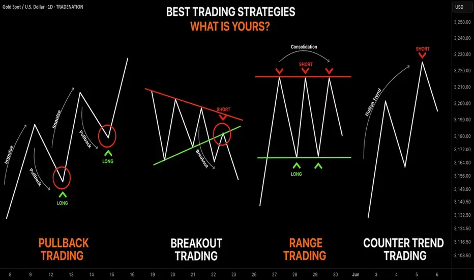
Learn the 4 Best Strategies to Maximize Your Profits in Trading
In the today's article, we will discuss 4 classic yet profitable forex and gold trading strategies.
1️⃣Pullback Trading
Pullback trading is a trend-following strategy where you open the positions after pullbacks.
If the market is trading in a bullish trend, your goal as a pullback trader is to wait for a completion of a bullish impulse and then let the market correct itself. Your entry should be the assumed completion point of a correctional movement. You expect a trend-following movement from there.
In a bearish trend, you wait for a completion of the bearish impulse, let the market retrace, and you look for short-entry after a completion of the retracement leg.
Here is the example of pullback trading.
On the left chart, we see the market that is trading in a bearish trend.
A pullback trader would short the market upon completion of the correctional moves.
On the right chart, I underlined the buy entry points of a pullback trader.
That strategy is considered to be one of the simplest and profitable and appropriate for newbie traders.
2️⃣Breakout Trading
Breakout trading implies buying or selling the breakout of a horizontal structure or a trend line.
If the price breaks a key support, it signifies a strong bearish pressure.
Such a violation will trigger a bearish continuation with a high probability.
Alternatively, a bullish breakout of a key resistance is a sign of strength of the buyers and indicates a highly probable bullish continuation.
Take a look, how the price broke a key daily resistance on a daily time frame. After a breakout, the market retested the broken structure that turned into a support. A strong bullish rally initiated from that.
With the breakout trading, the best entries are always on a retest of a broken structure.
3️⃣Range Trading
Range trading signifies trading the market that is consolidating .
Most of the time, the market consolidates within the horizontal ranges.
The boundaries of the range may provide safe points to buy and sell the market from.
The upper boundary of the range is usually a strong resistance and one may look for shorting opportunities from there,
while the lower boundary of the range is a safe place to buy the market from.
EURCAD pair is trading within a horizontal range on a daily.
The support of the range is a safe zone to buy the market from.
A bullish movement is anticipated to the resistance of the range from there.
Taking into considerations, that the financial instruments may consolidate for days, weeks and even months, range trading may provide substantial gains.
4️⃣Counter Trend Trading
Counter trend trading signifies trading against the trend.
No matter how strong is the trend, the markets always trade in zig-zags. After impulses follow the corrections , and after the corrections follow the impulses.
Counter trend traders looks for a completion of the bullish impulses in a bullish trend to short the market, and for a completion of bearish impulses in a downtrend to buy it.
Here is the example of a counter trend trade.
EURJPY is trading in a bullish trend. However, the last 3 bearish moves initiated from a rising trend line. For a trader, shorting the trend line was a perfect entry to catch a bearish move.
Such trading strategy is considered to be one of the most complicated , because one goes against the crowd and overall sentiment.
With the experience, traders may combine these strategies.
❤️Please, support my work with like, thank you!❤️
I am part of Trade Nation's Influencer program and receive a monthly fee for using their TradingView charts in my analysis.
You want to be a trader but you have a 9-5 Educational purpose only. You want to be a day trader but can't trade market open because you have a job or you are too busy. The daily bar can give you just as much profits as the 5 min charts. In this video ill teach you how to find support and resistance zone on any market. Opening a line chart starting from the weekly and then looking for areas where price has repeatedly reverse gives you a clue of where price may go in the future on a daily chart. Watch till the end to see how this strategy is applied to all markets.

Mastering Fair Value Gaps (FVG) - How to use them in trading?In this guide, I’ll explain the concept of the Fair Value Gap (FVG), how it forms, and how you can use it to identify high-probability trading opportunities. You'll learn how to spot FVGs on a chart, understand their significance in price action, and apply a simple strategy to trade them effectively.
What will be explained:
- What is a FVG?
- How can a FVG occur?
- What is a bullish FVG?
- What is a bearish FVG?
- How to trade a FVG?
-------------------------------
What is a FVG?
A FVG is a technical concept used by traders to identify inefficiencies in price movement on a chart. The idea behind a fair value gap is that during periods of strong momentum, price can move so quickly that it leaves behind a "gap" where not all buy and sell orders were able to be executed efficiently. This gap creates an imbalance in the market, which price may later revisit in an attempt to rebalance supply and demand.
A fair value gap is typically observed within a sequence of three candles (or bars). The first candle marks the beginning of a strong move. The second candle shows a significant directional push, either bullish or bearish, often with a long body indicating strong momentum. The third candle continues in the direction of the move, opening and closing beyond the range of the first candle. The fair value gap itself is defined by the price range between the high of the first candle and the low of the third candle (in the case of a bullish move), or between the low of the first candle and the high of the third (in a bearish move). This range represents the area of imbalance or inefficiency.
-------------------------------
How can a FVG occur?
There are several factors that can trigger a fair value gap
- Economic news and announcements
- Earnings reports
- Market sentiment
- Supply and demand imbalances
-------------------------------
What is a bullish FVG?
A bullish FVG is a specific type of price imbalance that occurs during a strong upward move in the market. It represents a zone where the price moved so aggressively to the upside that it didn’t spend time trading through a particular range, essentially skipping over it.
This gap usually forms over the course of three candles. First, a bullish candle marks the beginning of upward momentum. The second candle is also bullish and typically has a large body, indicating strong buying pressure. The third candle opens higher and continues moving upward, confirming the strength of the move. The bullish fair value gap is the price range between the high of the first candle and the low of the third candle. This area is considered an imbalance zone because the market moved too quickly for all buyers and sellers to interact at those prices.
-------------------------------
What is a bearish FVG?
A bearish FVG is a price imbalance that forms during a strong downward move in the market. It occurs when price drops so rapidly that it leaves behind a section on the chart where little to no trading activity happened.
This gap is identified using a three-candle formation. The first candle typically closes bearish or neutral, marking the start of the move. The second candle is strongly bearish, with a long body indicating aggressive selling pressure. The third candle opens lower and continues the move down. The bearish fair value gap is the price range between the low of the first candle and the high of the third candle. That range is considered the imbalance zone, where price skipped over potential trade interactions.
-------------------------------
How to trade a FVG?
To trade a FVG effectively, wait for price to retrace back into the gap after it has formed. The ideal entry point is around the 50% fill of the FVG, as this often represents a balanced level where price is likely to react.
During the retracement, it’s helpful to see if the FVG zone aligns with other key technical areas such as support or resistance levels, Fibonacci retracement levels, or dynamic indicators like moving averages. These additional confluences can strengthen the validity of the zone and increase the probability of a successful trade.
Enter the trade at the 50% level of the FVG, and place your stop loss just below the most recent swing low (for a bullish setup) or swing high (for a bearish one). From there, manage the trade according to your risk-to-reward preferences—whether that’s 1:1, 1:2, or a higher ratio depending on your strategy and market conditions.
-------------------------------
Thanks for your support.
- Make sure to follow me so you don't miss out on the next analysis!
- Drop a like and leave a comment!

BTC Bulls vs Bears – Critical Level Tested, What’s Next?🚀📈 BTC Bulls vs Bears – Critical Level Tested, What’s Next? 🐂🐻
Hi everyone! New day, new charts – and once again, our levels played out beautifully! 🎯 The 102,777 zone was the battleground, and after nearly 40 price interactions at that level, the bulls took control. However, all is not settled yet!
We are currently observing multiple divergences across key indicators:
📉 MACD
📉 Histogram
📉 RSI
📉 MOM (Momentum)
📉 MFI
This suggests caution despite the bullish momentum. My expectation is for a retest of the 102,777 level, which remains the key decision point.
Here’s the updated probability outlook:
➡️ 65% chance we push higher toward the next target at 105,962, with sights ultimately set on 113,000.
⬅️ 35% chance we see a rejection and head lower.
Keep an eye on these key levels:
⚔️ 102,777 – The battleground (Bulls vs Bears)
📌 105,962 – Next target
🎯 113,000 – Ultimate target
Before I wrap up, even on the 8-hour chart, there are signs of divergences, so let’s stay sharp and move carefully. Step by step, we’ll navigate this market together!
One Love,
The FXPROFESSOR 💙
ps. WE ARE STAYING LONG! OK?

PEPE - This is why price explode - Speed Index ReadingThere is always a reason why price explodes either true or fake. The criteria to look at are:
- Location - very important - where is the price locate - higher probability trades accomplished when the price leaves a significant location such us Fib, Sup/Res, AVWAP
- The volume waves - nothing moves without volume - sometimes is not so visible by the volume waves alone because they distribute or accumulate little by little, that's why we have Speed Index
- Reading Speed Index
- The proper entry signal
In the attached chart I will demonstrate how I read it using the above criteria (annotations are in sync with the chart):
1. Price entering Fib Area 50-61.8 - possibility of buyers to come in
2. Price touching AVWAP (three blue lines) coming from the bottom of a previous swing acting as resistance - another possibility of buyers to come in.
3. Speed Index 6.4, that's an abnormal speed index , that what I call first push up or PU, price never drops below the beginning of this wave
4. Speed Index 11.1, that's another abnormal speed index and that's what I call a hard to move down (HTMD) . What's happening here is that all the sell orders are absorbed by buy orders and price breaks on the up wave the origin of the HTMD wave.
5. Finally the entry Long with a PRL (Plutus Reversal Long) signal an up,up,up, we go!!!
I hope my years of work helps you out on reading charts!
Enjoy!

Bitcoin Bulls Aim for $102K – Breakout or Rejection Ahead?🚀📈 Bitcoin Bulls Aim for $102K – Breakout or Rejection Ahead? 🔍🧠
Good morning, good afternoon, or good evening — wherever you are in the world, Bitcoin is pumping, and that’s always a good sign for the bulls! 🐂
In my last BTC update, we anticipated a bounce from the key support zone around $93,600–$93,800, and price respected this level to the dot, rocketing upward just as expected. 🔥✅ That level acted as a strong springboard, and now BTC is climbing through a well-respected ascending channel on the 15-min chart.
📊 Key levels to watch:
Middle of the channel: ~$98,689
Top of the channel: ~$100,636
Psychological level: $100,000
Projected breakout target: $102,774 (60% probability 🚦)
Major resistance beyond: $113,000
However, there's always the alternate scenario: a 40% chance that we reject under $97,400, re-enter the lower end of the channel, and potentially drop toward $92,000 if that support fails. This would flip the bullish structure short-term — something to keep on your radar. ⚠️
This is a high-momentum situation, and I’ll be watching for confirmation of breakout or breakdown. Stay alert, keep your risk in check, and let the chart guide your trades. 📉📈
Let me know your thoughts in the comments — are we headed for $113K or due for a cooldown?
One Love,
The FXPROFESSOR 💙

Unlocking the Power of TradingViewWhether you're a forex newbie or a seasoned trader, having the right tools can make or break your trading success. One platform that consistently stands out is @TradingView charting powerhouse packed with features designed to give you an edge. I @currencynerd I'm all about helping traders stay smart and stay sharp, so here’s a look at @TradingView features that can enhance your trading game.
1. Advanced Charting Tools
TradingView's clean, responsive charts are one of its strongest features. You can customize everything—from chart types (like Heikin Ashi, Renko, or Line Break) to timeframes (including custom ones like 3-minute or 8-hour charts). Multiple chart layouts allow you to view several pairs or timeframes side by side—perfect for multi-timeframe analysis.
Pro Tip: Use the “Replay” feature to practice backtesting and understand market behavior in real-time.
2. Built-in Technical Indicators
TradingView offers hundreds of built-in indicators (RSI, MACD, Bollinger Bands) and community-created ones. You can also stack multiple indicators on the same pane for cleaner setups.
my is Favorite: “Pako Phutietsile's <50%”, which is an automatic indicator that detects and marks basing candles on the chart. A basing candle is a candle with body length less than 50% of its high-low range. This is essential for supply and demand traders.
3. Pine Script for Custom Strategies
If you're serious about systematizing your edge, Pine Script lets you build and backtest custom indicators and strategies. Even with basic coding knowledge, you can automate entry/exit rules, alerts, and more.
Nerdy Bonus: Many user-generated indicators are open source. Tweak them to fit your style.
4. Smart Alerts
Set price, indicator, or drawing-based alerts that trigger via popup, email, or even webhook. This means you don’t need to watch the chart all day—TradingView becomes your eyes on the market.
Example: Get an alert when RSI crosses below 30 on GBP/USD or when price hits a key Fibonacci level.
5. Economic Calendar & News Integration
Stay ahead of market-moving events with TradingView's built-in Economic Calendar and News Feed. You can filter by currency or event impact to focus only on what matters to your trades.
6. Community & Script Library
TradingView’s social side is underrated. Thousands of traders share ideas, scripts, and trade setups. It’s a great way to test your biases or discover new strategies.
Tip: Follow high-reputation contributors in the trading/investing space and learn from their setups.
7. Multi-device Access & Cloud Sync
Access your charts and watchlists from anywhere. Whether you're on desktop, tablet, or phone, everything stays synced in the cloud. You can start charting at home and get alerts on your phone while you're out.
Final Thoughts:
@TradingView isn’t just a charting tool—it’s a full-fledged trading assistant. Whether you're looking to simplify your workflow, test strategies, or get real-time alerts, the platform can enhance every part of your trading process.
If you haven’t explored these features yet, give them a try. And if you're already using TradingView like a pro, let us know your favorite features in the comments!
Stay sharp, stay nerdy. — @currencynerd

Futures on CME and Launch of XpFinance DeFi PlatformOn May 7, 2025, the XRP ecosystem received two major developments that signal a new chapter in its evolution. First, the Chicago Mercantile Exchange (CME) announced the launch of futures contracts for XRP. Shortly thereafter, developers behind the XRP Ledger unveiled XpFinance — the first non-custodial lending platform built on the network. These two events are poised to reshape XRP's market perception and could attract a wave of new investment.
XRP Futures on CME: A Leap Toward Institutional Adoption
Set to go live on May 19, the new CME product will enable investors to trade XRP through regulated futures contracts. This is a major milestone. With similar contracts already in place for Bitcoin and Ethereum, XRP becomes the third digital asset to gain such legitimacy in institutional markets.
The introduction of futures means greater liquidity, risk management tools, and a clear path for hedge funds, pension managers, and banks to engage with XRP — without needing to custody the underlying token directly. Analysts anticipate that this added market structure could drive up demand, especially if the rollout is smooth and met with trading interest.
XpFinance and the XPF Token: DeFi Comes to XRP Ledger
The second big announcement came from XpFinance, a new decentralized lending protocol. What sets it apart is its non-custodial model — users can lend assets and earn interest while retaining full control of their private keys. At a time when centralized platforms are under scrutiny, this approach appeals to security-conscious users.
XpFinance is powered by a new token, XPF, which will be used for staking rewards, fee payments, and governance. The pre-sale of XPF has already begun and is generating buzz, especially among XRP community members eager to participate in the first major DeFi initiative on the ledger.
Market Outlook and Analyst Forecasts
Reactions from analysts have been positive. According to a report from DigitalMetrics, if both the CME futures and XpFinance platforms gain traction, XRP could see a sharp upward move — potentially reaching $10 by summer 2025. That would represent a fourfold increase from its current price.
However, risks remain. Ripple Labs continues to face regulatory pressure in the U.S., and crypto markets overall remain volatile. Still, the general tone has shifted. With increasing institutional interest and expanding utility, XRP appears to be entering a new phase of growth.
Conclusion
The combination of institutional infrastructure and decentralized finance innovation makes May 2025 a pivotal moment for XRP. If these initiatives succeed, XRP could transition from a mid-cap altcoin to a primary digital asset in the eyes of both institutional investors and the broader crypto community. Whether this momentum will translate into long-term market dominance remains to be seen — but the foundation is clearly being laid.

Ultimate Guide to Master CISDCISD stands for Consolidation, Inducement, Stop Hunt, Displacement. It’s a simple, repeatable structure that shows how smart money sets up traps in the market to grab liquidity and then make a clean move in the opposite direction.
If you’re serious about trading the ICT style, this is one of the most useful frameworks to learn. It helps you avoid chasing bad breakouts and teaches you to wait for real setups that come after stop hunts and proper market structure shifts.
But there’s one rule that’s non-negotiable — a CISD setup is only valid after a liquidity sweep. If the market hasn’t taken out a clear high or low where stops are sitting, then the rest of the model doesn’t mean anything. No sweep, no trade.
1. Start With the Liquidity Sweep
Everything begins with the liquidity grab. If price hasn’t taken out a high or low where stops are stacked, you should walk away from the setup. Don’t try to front-run a move before smart money has done its job.
The liquidity sweep is what gives the rest of the move power. That’s when price runs through obvious levels, swing highs, swing lows, the Asian range, New York session highs or lows and hits stop losses. Those stops give smart money fuel to enter in the opposite direction.
When you’re watching the market, ask yourself this:
"Who just got stopped out?"
If you can’t answer that, then it’s not a sweep. And if it’s not a sweep, it’s not a CISD.
2. Consolidation — Where Liquidity Builds
This is the first part of the structure. Price starts to move sideways in a tight range, usually during Asian session or during parts of London where volume is low. It can last for hours or even across sessions.
The key here is to understand what’s happening. Traders are placing buys above the highs and sells below the lows. Liquidity is building on both sides. It’s a trap being set. Retail traders are expecting a breakout, but smart money is waiting to use that breakout to their advantage.
Your job in this phase is to identify the range and mark out the highs and lows. That’s where stops will be sitting. You’re not looking to trade during this phase. You’re watching and planning
3. Inducement (sweep)— Fake Break to Trap Traders
After the range is set, price gives a small push out of the range just enough to get people to commit. This is the inducement. It’s the bait.
Let’s say the range high is being tested. Price breaks just above it, traders think it’s a breakout, and they go long. Maybe it holds for a couple of minutes, even gives a small push in their favor. But then it rolls over. That’s the trap. Now those traders are caught, and their stops are sitting below.
Sometimes the inducement comes before the real sweep. Other times, the inducement is the sweep. What matters is that traders have been lured into bad positions and their stops are exposed.
As a trader, your job is not to take the bait. Watch how price reacts to these fake moves. Often, they come with weak volume or are followed by an immediate sharp reversal.
4. Stop Hunt — The Sweep That Validates the Setup
This is where the real move starts to form. Price aggressively runs through the level that holds liquidity, usually below the low or above the high you marked earlier.
This is when smart money takes out the traders who were induced during the fake move. Their stops get hit, and that gives institutions the volume they need to get into the opposite side.
You should be actively watching for a reaction here. Do you see rejection? Does the candle close with a strong wick? Are there signs of absorption or order flow flipping?
This is your validation point. Once price sweeps liquidity and starts to reject the level, that’s your cue to get ready for the next part, the actual shift.
5. Displacement — The Real Move Begins
Once the sweep happens, price doesn’t just drift, it snaps back hard. This is called displacement.
Displacement is a sharp, clean move in the opposite direction of the stop hunt. This is when market structure breaks, momentum shifts, and a fair value gap usually forms.
This is your confirmation that the setup is live. The sweep happened, smart money entered, and now the market is moving with intent.
You don’t want to chase the displacement candle itself. Instead, wait for the retrace. Look for price to come back into the fair value gap or an order block left behind by the impulse. That’s your entry point.
Make sure:
Structure is broken in your direction
The move away is impulsive, not choppy
You’re not forcing an entry on a weak pullback
This is the only part of CISD where you actually take the trade. Everything else is just setup.
How to Manage Risk and Entries
Once you’ve got a valid setup, here’s how to manage it:
Entry: Enter on the CISD or wait for the pullback into the fair value gap or order block. Enter on the reaction or confirmation.
Stop Loss: Place it just past the low or high that got swept. If you’re long, your stop goes below the stop hunt candle. If you’re short, it goes above.
Take Profit: Target the next liquidity level. That could be the other side of the range, a swing high or low, or an inefficiency in price.
You can scale out if price approaches a session high or low, or hold for a full range expansion depending on the session.
Final Thoughts
The CISD model works because it’s built on how the market actually moves, not indicators, not random patterns, but liquidity.
Don’t jump in early. Don’t guess. Wait for the sweep. Wait for the displacement. That’s where the edge is.
Once you get used to watching this play out in real time, you’ll start to see it everywhere. It’s in Forex, crypto, indices, any market that runs on liquidity.
Stick to the rules. Let the model do its job. And remember: no sweep, no setup!
___________________________________
Thanks for your support!
If you found this guide helpful or learned something new, drop a like 👍 and leave a comment, I’d love to hear your thoughts! 🚀
Make sure to follow me for more price action insights, free indicators, and trading strategies. Let’s grow and trade smarter together! 📈

LTC Long - Learn to read Weis Wave with SI- Target hit overnightLearning to read the chart using Weis Wave with Speed Index will help you understand how the market works. Speed Index is very valuable to understand if there is absorption happening in the market. Remember that absorption takes time, it takes hours or sometimes days, so you have to be patient. In this chart I will explain how to read this 1HR LTC chart using Speed Index and why we had this explosion in price. I have entered long (my target was hit overnight). Annotations on chart are in sync with my below notes.
Reading:
1. We had a high volume down move (buyers could be in there but I am not sure yet)
2. We have touched 50-61.8 Fib area - If buyers would like to enter this is a great area.
3. Speed Index 29 that's an Abnormal Speed Index. Why is it abnormal? Because at that time the average Speed Index of 30 waves back was 15. I call this as the first Push or the first absorption. Buyers are entering.
4. Speed Index 78.7 another abnormal SI -> more buying
5. Speed Index 37 on a down wave that's what I call a HTMD (Hard to move down) more buying and finally a PL (Plutus Long signal) breaking by a bit the previous resistance level. This is where I have Entered Long.
6. Another HTMD , hard to move down wave with Speed Index 32.2, more buying and another Plutus long signal PRL.
Therefore the explosion is completely justified because it has a history of several hours of absorption. If you were to read just volume waves you would not be able to see this coming Speed Index alerts that something is cooking and when the time is right you enter (PL signal)
I hope my above explanations helped you.
Enjoy!

Weekly analysis confirmation and continuation!!!Top-Down Analysis of the Image.
1. Macro Context: Asset Classes & Instruments
- USD & XAUUSD. The image focuses on two key financial instruments:
- USD.l Likely tracking the US Dollar Index (DXY) or a USD-paired asset.
- XAUUSD**: Gold priced in USD, a critical safe-haven commodity.
- Bearish Sentiment**: Both sections show descending price levels, indicating a broader market expectation of dollar strengthening and gold depreciation.
---
2. USD Section: Price Structure & Anomalies*
- Key Levels**:
- Starts at 3,500.000 (potential resistance) and trends downward to 3,375.845*l (support).
- Notable mid-level dip at 3,462.199 , possibly a liquidation zone or failed breakout at 33:46
- Hypothesis : Time notation (e.g., 33 minutes and 46 seconds) for a specific trading session or chart timeframe.
- Hypothesis 2. Ratio (e.g., 33:46) for risk-reward or position sizing.
---
3. XAUUSD Section: Gold’s Downward Trajectory
- **Declining Values**: From **3,324.476** to **3,238.854**, reflecting a **bearish technical breakdown**.
- **Purpose**: Likely marks **resistance levels** or **liquidation clusters** where sellers dominate.
---
#### **4. Gold-Short/Un-Subtotal: Strategic Short-Selling Plan**
- **Uniform Decrements**: Values decrease by **40.000** increments (e.g., 3,160 → 3,120 → 3,080).
- **Interpretation**: Predefined **profit-taking levels** or **trailing stop-loss zones** for a short position.
- **Risk Management**: Structured steps suggest a disciplined exit strategy to lock in gains or mitigate losses.
---
#### **5. Final Line: "May 4 7 9"**
- **Possible Meanings**:
- **Dates**: May 4, 7, and 9 could mark:
- Economic events (e.g., Fed meetings, NFP data).
- Expiry dates for options/futures contracts.
- Planned trade execution days.
- **Code**: Numeric shorthand for order IDs, time intervals (e.g., 04:07:09), or technical indicators.
---
### **Key Takeaways**
1. **Strategic Trade Setup**: The image outlines a **short-selling strategy for gold (XAUUSD)** with explicit price targets and risk parameters.
2. **Technical Focus**: Emphasis on descending levels highlights reliance on **technical analysis** (e.g., trendlines, Fibonacci retracements).
3. **Date-Driven Execution**: "May 4 7 9" suggests alignment with external catalysts or time-bound trade management.
4. **Risk Control**: Uniform decrements in the Gold-Short section reflect systematic profit-taking, reducing exposure to volatility.
---
### **Recommendations for Further Analysis**
- Cross-reference the dates (May 4, 7, 9) with economic calendars to identify relevant events.
- Validate the "33:46" notation against historical price action or trading session hours.
- Assess whether the USD levels correlate with DXY or a specific USD pair (e.g., EURUSD).
This structured approach aligns with a trader’s playbook, combining technical levels, time-based triggers, and disciplined risk management.

Understanding the Inverted Cup and Handle Chart PatternUnderstanding the Inverted Cup and Handle Chart Pattern
Understanding chart patterns is fundamental for market participants. This article delves into the inverted cup and handle formation, a bearish signal indicating a potential downward movement. Explore its identification, trading strategies, psychological underpinnings, common pitfalls, and more to boost your trading knowledge.
What Is the Inverted Cup and Handle Pattern?
The inverted cup and handle, sometimes called an upside-down cup and handle pattern, is a bearish chart pattern that may appear during up- and downtrends. It is the opposite of the traditional cup and handle pattern, which is bullish. The inverse formation consists of two main parts: the "cup," which is an inverted U-shape, and the "handle," a small upward retracement following the cup.
Identifying the Inverted Cup and Handle Pattern
Identifying the inverse cup and handle pattern involves recognising a specific sequence of market movements that signal a potential bearish move. Here's a step-by-step overview of identifying this formation:
Cup Formation
- Shape: The pattern begins with an inverted U-shaped "cup." The price gradually rises, consolidates, and then begins to decline, reflecting a shift from bullish to bearish sentiment.
- Depth: The cup should have a rounded top, not a sharp V-shape, indicating a gradual reversal. The depth of the cup can vary but typically represents a significant portion of the preceding movement.
Handle Formation
- Upward Retracement: After the cup's formation, prices usually experience a minor upward retracement or consolidation, forming the "handle." This movement should be relatively short and not exceed the initial high of the cup.
- Shape and Duration: The handle often appears as a small flag or pennant and should be brief in duration compared to the cup. An optimal handle retraces no more than half of the cup’s depth.
Breakout Confirmation
- Neckline Break: The pattern is confirmed when prices break below the neckline, the lowest point of the handle. This breakout often leads to a significant decline in prices, signalling a bearish trend.
- Volume Surge: Volume typically decreases during the formation of the cup and increases as prices decline, especially during the handle formation. A substantial increase in volume during the breakout can validate the pattern and minimise the risk of false signals.
The Psychology of the Inverted Cup and Handle
The psychology behind the inverse cup and handle pattern is rooted in market sentiment and behavioural finance. This bearish pattern reflects a shift from optimism to pessimism among traders.
- Initial Uptrend: The formation starts with an upward movement, where traders are generally bullish, driving prices higher. This phase is marked by growing confidence and increasing demand.
- Formation of the Cup: As prices peak, consolidate, and start to decline, some traders begin to take profits, leading to reduced buying pressure. The rounded decline of the cup signifies a gradual shift in sentiment from bullish to bearish as traders become cautious and selling pressure mounts.
- Handle Formation: The minor upward retracement forming the handle indicates a brief period of consolidation where the market tests the resolve of buyers. It can be considered a dead cat bounce. This phase often traps optimistic traders who expect the uptrend to resume, but the overall sentiment remains fragile and cautious.
- Breakout and Decline: The decisive break below the neckline represents a culmination of bearish sentiment. At this point, selling pressure overwhelms any remaining bullishness, leading to a sharp decline. The volume surge during this breakout confirms the shift in market psychology from hopeful to bearish as traders rush to exit their positions or initiate short sales.
Trading the Inverted Cup and Handle Pattern
Trading the inverted cup and handle pattern involves careful identification and strategic decision-making to maximise potential returns. This pattern presents two primary entry points for traders: during the handle formation or after the neckline break.
Entry on the Break of the Handle
- Risk-Reward Advantage: Entering on the breakout of the handle’s lower boundary offers a better risk-to-reward ratio but requires more skill and confidence in pattern recognition.
- Technical Tools: Traders often use a medium-term moving average (like 21 periods) to confirm the downward leg of the handle. A decisive close below the moving average indicates a continuation of the downward handle leg.
- Momentum Indicators: Using momentum indicators like the RSI (Relative Strength Index) or stochastic oscillator helps confirm downward movement. Bearish divergence suggests that the bearish trend is likely to continue.
- Volume Analysis: Increasing volume during the handle's breakout indicates strengthening seller control. High volume often validates the pattern and potentially reduces the risk of false signals. Note that volume data may be less reliable in a decentralised forex market.
- Stop Loss and Profit Target: Traders typically place a stop loss above the handle's high to potentially protect against upward spikes. The reverse cup and handle pattern target is usually set at a distance equal to the cup's height, projected downward from the handle's breakout point, although it can be greater if the retracement is particularly shallow.
Entry After the Neckline Break
- Confirmation Advantage: Waiting for the neckline break offers greater confirmation of the formation but may provide a less favourable risk-to-reward ratio.
- Price Action: A decisive close below the pattern's low, ideally with a strong candlestick and minimal wicks, indicates a reliable breakout. This typically confirms the bearish trend and provides a clear entry signal.
- Volume Confirmation: Higher volume during the neckline break can further validate the pattern and indicate that the breakout is genuine and not a false signal.
- Stop Loss and Profit Target: In this scenario, the stop loss is typically set above the handle's high. The profit target remains the same, projecting the cup's height downward from the breakout point.
Common Mistakes to Avoid
When trading the upside-down cup and handle pattern, avoiding common mistakes is key for maximising potential returns. Some of the more common mistakes traders make include:
- Premature Entry: Entering a trade too early, before the handle completes or the neckline breaks, can lead to false signals and losses. Most traders wait for clear confirmation, such as a decisive close below the neckline with increased volume.
- Ignoring Volume: Volume is a critical component in confirming the pattern. Low volume during the breakout phase may indicate a fakeout. Traders typically look for a substantial increase in volume to validate the pattern.
- Incorrect Pattern Identification: Misidentifying the pattern is a common error. The cup should have a rounded bottom, not a sharp V-shape, and the handle should be relatively short. Accurate identification requires practice and attention to detail.
- Overlooking Market Conditions: External factors, such as news events or broader market trends, can impact the pattern’s reliability. Traders consider these conditions when planning their trades.
Advantages and Disadvantages
As with all chart patterns, the inverted cup and handle pattern comes with its pros and cons. Here are some key advantages and disadvantages of using this pattern:
Advantages
- Clear Signal: The pattern provides a clear signal of a potential bearish movement, helping traders anticipate market declines.
- Risk Management: With defined entry and exit points (handle high for stop loss and cup depth for profit target), it aids in effective risk management.
- Flexibility in Analysis: Several forms of analysis, from support/resistance and momentum indicators to volume and price action, can be used to trade the pattern.
- Versatility: Applicable across various timeframes and markets, including stocks, forex, and commodities, making it a versatile tool for different trading strategies.
Disadvantages
- Complex Identification: Accurately identifying the pattern can be challenging, requiring significant experience and skill.
- Rarity: The pattern doesn’t occur frequently, limiting trading opportunities.
- False Breakouts: Like all chart patterns, it is susceptible to false breakouts, especially if not confirmed with volume and other technical indicators.
- Timing Sensitivity: Entering too early during the handle formation can result in premature positions, while waiting for the neckline break might reduce the risk-to-reward ratio.
The Bottom Line
The inverted cup and handle pattern is one of the most popular chart patterns among traders of all levels. However, like any technical formation, it should be used alongside other indicators and sound risk management to potentially increase its effectiveness. By mastering patterns like the inverted cup and handle, traders can gain deeper insights into market psychology and price action to navigate volatile markets with greater confidence.
FAQ
What Is the Inverse Cup and Handle Pattern in Forex?
The inverse cup and handle pattern in forex is a bearish chart pattern. It features an inverted U-shaped cup followed by a small upward retracement (the handle). This pattern suggests that sellers are gaining control, and prices are likely to decline further once the neckline is broken.
How Can You Trade the Inverse Cup and Handle?
Traders can enter positions either on the break of the handle’s lower boundary or after the neckline break. Entering during the handle might offer a better risk-to-reward ratio, while waiting for the neckline break provides greater confirmation. Key tools to validate the breakout include moving averages, momentum indicators like RSI or stochastic oscillator, and volume analysis.
What Happens After the Reverse Cup and Handle Pattern?
After the reverse cup and handle pattern is completed, the price typically moves downward strongly. This bearish movement is often confirmed by a strong breakout below the neckline with increased volume, signalling a sustained decline in prices.
What Is the Opposite of the Cup and Handle?
The opposite of a cup and handle is the inverse cup and handle pattern. While the cup and handle indicates a bullish movement, the inverse version signals a bearish trend.
Is the Inverted Cup and Handle Bullish or Bearish?
The inverted cup and handle pattern is bearish. It indicates that the price will move downwards, suggesting that traders may open short trades.
This article represents the opinion of the Companies operating under the FXOpen brand only. It is not to be construed as an offer, solicitation, or recommendation with respect to products and services provided by the Companies operating under the FXOpen brand, nor is it to be considered financial advice.

A 3-Step Process For Analytical SuccessIn this video I go through the 3-step process of implementing a Bias, Narrative, and Model.
This process was a game-changer for me when it came to analysis, as well as taking actual trades. It considered high-probability targets, patience in waiting for traders to coming for me, and the calm of being prepared when it was time to take an entry. It filters out pointless trades, because if I don't have Bias, then I can't have a Narrative, and if I don't have a Narrative, then I don't have a Model.
I use ICT concepts, but this process works equally well for most other methodologies that aren't completely mechanical and algorithmic.
I give a real example of a trade I took yesterday on EURUSD where I utilized this 3-step process to frame a trade.
I hope you find this video insightful and gives you more clarity in your trading!
- R2F Trading

Session Realtime BarJust an idea for better visuals, use 2 of the SessionBar indicator on the chart use the spacing setup with the active bar to the left of the overnight bar in the other indicator...
One indicator for the Active Session Bar: indicating the current session bar.
2nd indicator for the Overnight Session Bar: indicating the overnight session bar.

From Tulips to Tech: The Evolution of Financial Bubbles 🎯 Introduction:
financial/economic bubbles are a recurring theme in economic history, this is often when a particular financial asset goes to unrealistic price levels often making money for early investors but usually these high price levels do not match their fundamental value this is then followed by a large public participation who also want a piece of the pie eventually with the price collapsing or sharply declining blowing or living investors in a large financial loss..
From 17th-century tulip gardens to 21st-century crypto manias, one thing has remained constant: Humans never learn.
Every generation thinks this time is different — but the pattern of bubbles keeps repeating.
Here's the crash course in 400 years of financial euphoria, panic, and pain.
🧠 Section 1: 1637 — Tulip Mania 🌷
The original bubble.
In the Netherlands, rare tulip bulbs were worth more than houses.
Prices exploded... then collapsed 90% in a matter of weeks.
Lesson: Speculation + FOMO is not new. Humans were flipping flowers before they flipped crypto.
Mini Nerd Tip:
"When people stop caring about value and only care about price rising, watch out."
🧠 Section 2: 1720 — South Sea Bubble 📜
Britain’s South Sea Company promised massive profits trading with South America (but barely did any business).
Politicians and aristocrats pumped the stock price.
Collapsed spectacularly → ruined many fortunes (including Isaac Newton himself:
"I can calculate the motion of heavenly bodies, but not the madness of men.")
Mini Nerd Tip:
"If a bubble needs government help to stay alive, it's already dying."
🧠 Section 3: 1929 — Wall Street Crash 🏛️
Roaring 20s: endless optimism, cheap margin loans, "stocks only go up!"
1929: Stock market crashed, triggering the Great Depression.
People were buying stocks with 10% down and gambling recklessly.
Mini Nerd Tip:
"When leverage is everywhere, the smallest panic causes waterfalls."
🧠 Section 4: 2000 — Dotcom Bubble 💻
Everyone thought the internet would change everything (it did — but slower and differently).
Companies with no profits were valued in billions.
"Eyeballs" were treated as real revenue.
NASDAQ lost 78% from top to bottom.
Mini Nerd Tip:
"Innovation creates real value... but hype inflates fake value faster."
🧠 Section 5: 2008 — Housing Bubble 🏡
Banks handed out mortgages to anyone.
Financial engineering (CDOs, synthetic MBS) created the illusion of safety.
US housing prices collapsed → global financial crisis.
"Too Big to Fail" became the famous phrase.
Mini Nerd Tip:
"If everyone is getting rich easily, someone is lying or blind."
🧠 Section 6: 2017/2021 — Crypto & Meme Stocks 🚀
Gamestop, Dogecoin, NFTs, Shiba Inu — the wildest "everyone’s a genius" market since the 1920s.
Social media + free apps = amplified bubble speed.
Massive rises, insane collapses.
Mini Nerd Tip:
"Technology changes, human emotion doesn’t."
🧠 Final Section: Why Bubbles Will Never End
Greed, fear, and FOMO are timeless.
Every era dresses up bubbles in new clothes (flowers, sea companies, internet, crypto).
Smart traders understand this pattern — and use it to survive and thrive.
"**Bubbles don't pop because of bad assets. They pop because confidence disappears
put together by : Pako Phutietsile as @currencynerd
courtesy of : @TradingView

Mastering Order Blocks: How to Trade Like Smart MoneyIntroduction
Order Blocks (OBs) are one of the most critical concepts in Smart Money trading. They represent areas where institutional traders have entered the market with significant volume, typically leading to strong price movements. Identifying and trading Order Blocks gives traders an edge by aligning with the footprints of Smart Money.
What is an Order Block?
An Order Block is the last bearish candle before a bullish move for bullish OBs, or the last bullish candle before a bearish move for bearish OBs. These candles represent areas where institutions accumulated or distributed large positions, leading to a market shift.
Types of Order Blocks
A Bullish Order Block appears at the end of a downtrend or during a retracement just before the price moves sharply upward. It is typically represented by the last bearish candle prior to an impulsive bullish move. Price will often return to this level to mitigate institutional orders before continuing upward.
A Bearish Order Block, in contrast, forms at the end of an uptrend or retracement where price begins a downward reversal. It is characterized by the last bullish candle before a strong bearish move. Price tends to revisit this level to mitigate before continuing lower.
How to Identify a Valid Order Block
The key to identifying a valid Order Block is first observing a strong impulsive move, also known as displacement, that follows the OB candle. The move must also result in a break of market structure or a significant shift in direction. Order Blocks that produce Fair Value Gaps (FVGs) or Market Structure Shifts (MSS) tend to be more reliable. Another important sign is when price returns to the OB for mitigation, offering a potential entry.
Entry Model Using Order Blocks
After locating a valid OB, the next step is to wait for price to return to this area. The ideal entry happens within the OB body or near its 50% level. For extra confirmation, look for a Market Structure Shift or Break of Structure on a lower timeframe. Entries are more powerful when combined with additional elements like Fair Value Gaps, liquidity grabs, or SMT Divergences. The stop-loss should be placed just beyond the OB’s high or low, depending on the direction of the trade.
Refinement Techniques
To increase precision, higher timeframe OBs can be refined by zooming into lower timeframes like the 1M or 5M chart. Within a broad OB zone, identify internal market structure, displacement candles, or embedded FVGs to determine a more precise entry point. One effective refinement is the Optimal Trade Entry (OTE), which is often found at the 50% level of the Order Block.
Order Blocks vs. Supply and Demand Zones
While they may seem similar, Order Blocks are more narrowly defined and specifically related to institutional order flow. Supply and Demand zones are broader and typically drawn around areas of price reaction, but OBs are derived from the final institutional candle before a large move and are often confirmed by structure shifts or displacement. This makes OBs more precise and actionable in the context of Smart Money concepts.
Target Setting from Order Blocks
Targets after entering from an OB should align with liquidity objectives. Common targets include internal liquidity like equal highs or lows, or consolidation zones just beyond the OB. External liquidity targets such as previous major swing highs or lows are also ideal, especially when they align with imbalances or Fair Value Gaps. It's important to adjust targets based on the current market structure and trading session.
Common Mistakes to Avoid
A frequent mistake is treating any candle before a move as an OB without verifying key signals like displacement or a Break of Structure. Entering without other confirmations, such as an MSS or liquidity sweep, can lead to poor trades. Another common error is placing the stop-loss too tightly within the OB, instead of just beyond it, increasing the chance of premature stop-outs. Traders should also avoid executing OB trades during low-liquidity sessions where price action can be unpredictable and wicky.
Final Thoughts
Order Blocks are foundational to Smart Money trading. They allow you to enter where institutions have placed large positions and offer clear invalidation and entry logic. With practice, you can identify high-quality OBs and combine them with other concepts like FVGs, MSS, and SMT for powerful, precise trades.
Practice on different timeframes and assets, and always look for clean displacement and structure confirmation. Mastering OBs is a big step toward becoming a consistently profitable trader.
Trust the Blocks. Trade with Intention.

This is how to read the chart using Weis Wave with Speed IndexReading the chart:
1. We have bottom down and we pull back with high up volume waves, approaching the Fib area. Notice how SI is increasing on the up waves as we are reaching Fib from 13.3 to 15.7 to 18.4 and last not able to break previous resistance at 20.4. This means sellers are absorbing all buy orders of people entering long thinking that the trend will continue.
2. Notice the up volume wave with SI 20.4 and respective pip move right above it which is small compared to the amount of volume used - This is absorption.
3. The highest PVR bar at the beginning of the down wave - more sellers
4. Entry Short on the Plutus Short signal
Notice all the Short signals following confirming the continuation of the down move!
Simple as that, if you are able to read the chart and not just following signals from an indicator.
Enjoy!

How to Trade Gold with AI-Powered Algos in 2025📊 How to Trade Gold with AI-Powered Algos in 2025
A practical action plan for serious gold traders
🔍 1. Know Why Gold Requires Custom Algo Tactics
Gold is volatile, news-sensitive, and driven by macro events like Fed policy, geopolitics, and inflation. Generic stock or crypto bots fail here — gold needs precise, event-aware automation.
🧠 2. Use AI-Powered Bots Trained for Gold Volatility
Deploy bots that adapt to real-time data like CPI releases, bond yields, and geopolitical headlines. Use machine learning models that detect gold breakouts, consolidations, and safe-haven flows.
Top AI algos for gold traders: Multiple systems based on MT4/MT5
Fully-automated, AI-based gold bot with breakout detection, precision entries, and built-in risk control.
⚙️ 3. Build or Choose the Right Algo Strategy for Gold
Trend-Following: Use 21/50 EMA crosses on H1 and H4
Mean Reversion: Bollinger Band fades in range-bound sessions
Breakout Algos: Trigger trades on CPI or FOMC event volatility
Volume-Based AI: Analyze volume spikes vs. historical patterns
🧪 4. Backtest Gold-Specific Models
Always test your bot using historical gold data, especially during NFP weeks, Fed meetings, and geopolitical escalations. Use data from 2018 to 2024 for high-volatility periods.
Tools: TradingView for Pine Script testing, MetaTrader 5 for EA deployment
🛡️ 5. Control Risk with Gold-Specific Parameters
Max drawdown: Keep under 15 percent
Stop-loss: Always use hard stops (not just trailing)
Position sizing: 0.5 to 1 percent of capital per trade
Use volatility filters: Avoid entries during thin liquidity hours
🔄 6. Automate Monitoring and Adaptation
Run multiple bots for breakout, momentum, and reversal setups
Use dashboards to track gold-specific metrics like VIX, USDX, DXY, and 10Y Treasury yields Integrate AI that adjusts parameters after major data releases
🚀 7. Prepare for 2025 Market Structure
Gold is increasingly driven by
Central bank digital currency rollouts
USD de-dollarization risks
Global stagflation or recession themes
DeFi and tokenized gold products
Your algo must factor in these macro narratives using real-time data feeds
📌 Gold Algo Trading Success Plan 2025
Use AI bots built for gold volatility
Trade high-probability breakouts post-news
Backtest with gold-specific macro filters
Maintain strict risk limits with max 15 percent drawdown
Monitor global news and macro data with bot triggers
Continuously optimize and adapt
Gold is not just a commodity — it’s a signal of global risk. Automate smartly, manage risk tightly, and use AI to stay one move ahead.

How to Enter Trades the RIGHT Way!In this video, we're tackling an important question from our community member who's been crushing it in paper trading but faces the common challenge of entering trades blindly based on alerts, fearing they'll miss out otherwise.
We'll discuss:
Why blindly following signals can hurt your long-term success
The power of context in market structure: Why waiting for price to hit key support/resistance levels drastically improves your entries
A practical approach to manage FOMO: How scaling into trades can balance quick reaction times with better entries and tighter stops
Real examples of good vs. rushed entries, highlighting the impact on your risk-to-reward
