Master the Trio => to Level Up Your Trading🧠Most traders obsess over chart patterns and price action—but lasting success comes from mastering three pillars together:
Technical Analysis. Risk Management. Trading Psychology.
Miss one, and the structure collapses.
Let’s dive into each one, and see how they work together like a high-performance trading engine:
📈 1. Technical Analysis – Think in Layers, Not Lines
Most traders draw lines. Great traders read behavior.
Instead of asking “Is this support holding?”, ask “Why would smart money defend this level?”
Markets aren’t driven by lines—they’re driven by liquidity, trapped traders, and imbalances. That’s why:
A fakeout isn’t failure—it’s often a feature.
A breakout isn’t a buy signal—it’s bait.
Trendlines aren’t magic—they’re just visualizations of collective bias.
🔍 Advanced tip: When analyzing a chart, map out:
Where liquidity is resting (above equal highs/lows, tight consolidations)
Who’s likely trapped (late buyers at resistance, early sellers during accumulation)
Where the market must not go if your bias is correct (invalidations)
The real edge? Seeing the chart as a battle of intentions, not just candles.
🛡️ 2. Risk Management – Your License to Play the Game
Every trade is a bet. But without proper risk, it’s a gamble.
Risk management isn’t just about stop losses—it’s about position sizing, asymmetry, and survival.
I risk no more than 1% per trade , regardless of conviction.
I aim for 2R minimum —because even with a 50% win rate, I still grow.
I define my invalidation before I enter, never after.
You can’t control the outcome, but you can control your exposure. That’s professional.
🧠 3. Trading Psychology – Where Most Traders Break
You can have the perfect setup and smart risk, but still sabotage yourself.
Why? Because emotion overrides logic —especially when money is on the line.
Ever moved your stop? Chased a candle? Closed a trade too early, only to see it hit your TP later?
That’s not lack of skill—it’s lack of emotional discipline.
What works for me:
Journaling every trade—not just the result, but how I felt
Practicing “sit tight” discipline after entries
Reminding myself that no single trade matters—only the process does
You don’t trade the chart—you trade your beliefs about the chart. Master yourself first.
🔄 Final Thoughts
Trading isn’t just about entries.
It’s a mental game played on financial charts, where edge lies in understanding market mechanics, protecting capital, and staying emotionally grounded.
TA shows you the “what”
Risk shows you the “how much”
Psychology decides the “how well”
Master all three—and you’ll separate yourself from 95% of traders.
💬 Which of the three is your strongest? And which one needs more work?
Let’s grow together—drop your thoughts in the comments 👇
All Strategies Are Good; If Managed Properly!
~Richard Nasr
Wave Analysis

A scalping study using volume and Elliott Wave theory.A study I conducted to show how to make money in scalping by applying simple Elliott Wave analysis and volume control.
Attention: There’s no audio, and when examined carefully, none is needed.

GBPUSD – Short-Term Entry Model (Price Action Based)Education time!
This is a quick-execution on GBPUSD this London session based on a failed breakout and structure shift.
Price initially broke above the previous high but failed to sustain the breakout. The second push failed to print a higher high (HH), signaling potential exhaustion. Once the higher low (HL) that led to the failed HH was broken to the downside, a valid short setup was confirmed.
The trade targets the 161.8% Fibonacci extension of the initial move that failed to hold above the high.
📉 Result: The setup played out cleanly, hitting the target with a +17 pip gain.

SHIB - Lesson 15 this is how to read the chartUsing Lesson 15 to read the chart (annotations in sync with chart):
1. Support (coming from daily chart)
2. Largest down wave (buyers could be in there)
3. Placed AVWAP wait for the price to cross upwards and pull back
4. PFBL Long signal on the pull back and up we go
Enjoy !

SMC Trading Basics. Change of Character - CHoCH (GOLD FOREX)
In the today's post, we will discuss one of the most crucial concepts in SMC - Change of Character.
Change of Character relates to market trend analysis.
In order to understand its meaning properly, first, we will discuss how Smart Money traders execute trend analysis.
🔘Smart Money Traders apply price action for the identification of the direction of the market.
They believe that the trend is bullish ,
if the price forms at least 2 bullish impulse with 2 consequent higher highs and a higher low between them.
The market trend is considered to be bearish ,
if the market forms at least 2 bearish impulses with 2 consequent lower lows and a lower high between them.
Here is how the trend analysis looks in practice.
One perceives the price action as the set of impulse and retracement legs.
According to the rules described above, USDCAD is trading in a bullish trend because the pair set 2 higher lows and 2 higher highs.
🔘Of course, trends do not last forever.
A skill of the identification of the market reversal is a key to substantial profits in trading.
Change of Character will help you quite accurately identify a bullish and bearish trend violation.
📉In a bearish trend, the main focus is the level of the last lower high.
While the market is trading below or on that, the trend remains bearish .
However, its bullish violation is a very important bullish signal,
it is called a Change of Character, and it signifies a confirmed violation of a bearish trend.
In a bearish trend, CHoCH is a very powerful bullish pattern.
Take a look, how accurate CHoCH indicated the trend reversal on Gold.
After a massive selloff, a bullish breakout of the level of the last lower high confirmed the initiation of a strong bullish wave.
📈In a bullish trend, the main point of interest is the level of the last higher low. While the price is trading above that or on that, the trend remains bullish.
A bearish violation of the last higher low level signifies the violation of a current bullish trend. It is called a Change of Character, and it is a very accurate bearish pattern.
Take a look at the example on Dollar Index below.
In a bullish trend, bearish violation of the last higher low level
quite accurately predicted a coming bearish reversal.
Change of Character is one of the simplest , yet accurate SMC patterns that you should know.
First, learn to properly execute the price action analysis and identify HH, HL, LL, LH and then CHoCH will be your main tool for the identification of the trend reversal.
❤️Please, support my work with like, thank you!❤️
I am part of Trade Nation's Influencer program and receive a monthly fee for using their TradingView charts in my analysis.

A Step-by-step Guide to One of the Chart Analysis MethodHello Friends,
Welcome to RK_Chaarts,
Today we're going to learn step-by-step guide to one of the chart analysis Method by analyzing a chart of " Varun Beverages Ltd. (VBL) " to identify a trend change opportunity.(Educational Post).
Let's get started!
Applying Elliott Wave Theory
First, we can see that the bottom formed in March 2025 is likely a Wave ((4)) in Black as a bottom, marked as such on the chart. From there, Wave 5 should move upwards. Looking at the daily timeframe, we can see that price gone up in five sub-divisions of Wave (1) in Blue of Wave ((5)) in Black have completed, marked as Red 1-2-3-4-5, that means blue intermediate Wave (1) has ended, and Wave (2) has begun, which is unfolded in corrective nature marked as WXY in Red of Wave (2) in Blue.
According to the wave principle, Wave (2) should not retrace more than 100% of Wave (1), which started from the 419.65 bottom. Therefore, 419.65 becomes our invalidation level. If the price moves below this level, it would invalidate our Wave (2) principle.
Assuming our wave counts are correct, the upward movement is in the five sub-divisions, and the downward movement is in the three sub-divisions. Definitely, the conviction is increasing that we have correctly identified Waves (1) and (2). Shown in chart image below
Tweezers at Bottom
Now, we can see that Wave 2 has retraced more than 70% and has formed a Tweezer candlestick pattern at the bottom. A bearish candle was followed by a bullish candle, both with a Tweezer-like shape, with the second candle being green. This could indicate a potential reversal. Moreover, the latest candle has also taken out the high of the previous two candles, showing follow-through. The price has also shown follow-through on the upside after that. So, this can be considered as the first sign that Wave 2 might be ending, marked by a significant Tweezer pattern at the bottom with a follow-through candle. Shown in chart image below
Significant Breakout Pending Yet
Secondly, from the top where Wave 1 ended, we've been considering the decline from around 560.50 as a resistance. We drew a resistance trend line, and if the price breaks out above it, we can say that the resistance trend line has been broken, indicating a breakout above the last fall's trend line, Which is not Broken yet. Shown in chart image below
Dow Theory
The Dow Theory states that when the price moves up, it forms a Higher High, Higher Low pattern, and when it moves down, it forms a Lower High, Lower Low pattern. Somehow, the Dow Theory also needs to change, as the last swing was forming a Lower High, Lower Low pattern. The last swing high was at 479, which we marked with a green arrow. If the price crosses above it, we can say that the price is now forming a Higher High pattern. This indicates that the Dow Theory is changing from a falling trend to a rising trend. Shown in chart image below
Stop Loss
Once the Dow Theory also changes, we can use the last swing low at 446.15 as our stop loss. However, this stop loss will only be valid after the Dow Theory changes; otherwise, the invalidation level will remain at 419. Shown in chart image below
Projected Target of Wave (3)
So, friends, we've applied the Elliott Wave principle, and there's been a significant retracement, all within the valid range, without violating any rules or triggering invalidation. There's limited room left on the downside, and then we have the Tweezer candlestick pattern, which is a significant sign. We're expecting a reversal from there, and the price has followed up with an upward move.
What's left now is the breakout above the resistance trend line and a change in the Dow Theory. Once these two conditions are confirmed, all parameters will match, and we can add a position to our portfolio using the last swing low as our stop loss, instead of the invalidation level.
This is how chart analysis is done for investment purposes. We've seen many signs in our favor, and yet we still use a stop loss to prevent significant losses in case the stock or market moves unexpectedly. This is what stop loss is all about - minimizing potential losses.
We've also discussed the target projection based on Wave theory, 161.8% level, which we explained through an image. So, friends, I hope you've understood the entire conclusion and learned how to analyze charts using different methods, one of which we shared with you today.
I am not Sebi registered analyst.
My studies are for educational purpose only.
Please Consult your financial advisor before trading or investing.
I am not responsible for any kinds of your profits and your losses.
Most investors treat trading as a hobby because they have a full-time job doing something else.
However, If you treat trading like a business, it will pay you like a business.
If you treat like a hobby, hobbies don't pay, they cost you...!
Hope this post is helpful to community
Thanks
RK💕
Disclaimer and Risk Warning.
The analysis and discussion provided on in.tradingview.com is intended for educational purposes only and should not be relied upon for trading decisions. RK_Chaarts is not an investment adviser and the information provided here should not be taken as professional investment advice. Before buying or selling any investments, securities, or precious metals, it is recommended that you conduct your own due diligence. RK_Chaarts does not share in your profits and will not take responsibility for any losses you may incur. So Please Consult your financial advisor before trading or investing.

Impact on the Dollar and Forex — Artavion AnalyticsThe development of central bank digital currencies (CBDCs) — especially the digital yuan (e-CNY) — is becoming a key factor in transforming global currency flows. While the US dollar still dominates, the architecture of global liquidity is beginning to shift.
At Artavion, we see the e-CNY not just as a technological experiment but as a tool of China’s currency policy. Its goal is to strengthen the yuan’s role in international settlements and reduce dependence on the dollar, particularly in developing regions.
Why the Digital Yuan Matters
The e-CNY is already being used in China for retail payments and is being tested in cross-border transactions (e.g., in the mBridge project with the UAE and Thailand). This enables the creation of alternative payment systems not tied to SWIFT.
If the digital yuan gains broader acceptance, especially for commodity and energy settlements, its role in forex will grow, potentially weakening the dollar’s monopoly in certain regions.
CBDCs and Forex Structure
CBDCs won’t displace the dollar in the near term, but they are already influencing the structure of currency trading:
New currency pairs are emerging, especially in Asia;
Transactions are becoming faster and cheaper, particularly in the B2B segment;
Market participants are adjusting strategies to real-time settlements and the potential programmability of currencies.
Risks and Limitations
Privacy: CBDCs are under full state control;
Fragmentation: There is no unified technical standard across different countries’ CBDCs;
Geopolitics: The rise of the e-CNY could intensify currency competition with the dollar.
Artavion’s Conclusion
The digital yuan will not replace the dollar, but it is creating an alternative — especially in regions seeking autonomy from Western financial infrastructure. For traders and investors, this means reassessing currency risks and exploring new opportunities in decentralized settlement channels.

The Fundamental Truths About a Trending MarketBefore you can trade successfully, you must first understand what defines a market trend.
🔼 What is an Uptrend?
An uptrend is characterised by a series of Higher Highs (HH) and Higher Lows (HL). This signals that buyers are in control and price is climbing steadily.
🔽 What is a Downtrend?
A downtrend is identified by a series of Lower Lows (LL) and Lower Highs (LH). This indicates that sellers are dominant and price is consistently falling.
📌 Important Facts About a Trending Market
Trends don’t change easily. Once a trend is established, it tends to persist.
A trend reversal takes time and effort. It doesn't happen abruptly — the market needs a strong reason to change direction.
There are always warning signs. Before a trend changes, there’s usually a pattern or shift in behaviour that acts as a clue.
The bigger the trend, the longer it takes to reverse. A well-established trend will require more time and evidence before it breaks.
🎯 Keys to Trading Any Market Successfully
Identify the market condition.
Is the market trending upwards, downwards, or moving sideways (consolidating)?
Study price behaviour at key levels.
Understand how price reacts at significant highs and lows.
Learn the anatomy of price waves.
Recognise wave structure — how price expands and contracts in trends.
Align your trades with the market condition.
Your entry and exit strategies should fit the current phase of the market.
🔚 Summary
Mastering trends is one of the most important skills in trading. When you understand what defines an uptrend or downtrend, recognise when a trend may be ending, and align your strategy with the market condition, you set yourself up for consistent success. Patience, observation, and timing are key — because the market always leaves clues, but only for those who are prepared to see them.

Circle’s IPO and the Crypto Listing Wave: The Market EntersOn June 14, 2025, the U.S. stock market witnessed a pivotal moment for the crypto industry. Circle, issuer of the USDC stablecoin and a major player in the sector, successfully went public. Shares opened at $31 and soared to over $134 by the end of the first trading day—an explosive 330% gain.
This isn’t just a one-off success. It marks the beginning of a new chapter: the public crypto era, where leading crypto companies are stepping into the spotlight of traditional finance.
Why It Matters
Circle’s IPO signals the maturation of the crypto market. Just three years ago, crypto companies were seen as high-risk, unregulated tech startups. Now, they’re structured fintech firms with clear business models, institutional backing, and regulatory compliance.
Who’s Next in Line
Following Circle, a wave of major crypto firms is preparing for their own IPOs:
eToro – the social trading platform with crypto features has finalized its SPAC merger and is set to debut on NASDAQ.
Gemini – the exchange founded by the Winklevoss twins filed for an IPO in mid-May.
Galaxy Digital and Ripple – both confirmed listing plans for the second half of 2025.
Kraken is exploring a listing in Europe, where requirements are more flexible than in the U.S.
These companies are waiting for the right moment—regulatory clarity, growing interest in crypto ETFs, and progress in U.S. Congress (with the CLARITY and GENIUS bills gaining momentum).
What It Means for the Industry
Increased Investor Trust – Public companies must disclose financials, pass audits, and comply with regulations. This builds confidence in the broader crypto sector.
Institutional Capital Inflow – IPOs unlock access to capital from pension funds, hedge funds, and asset managers that cannot invest in private crypto startups.
Marketing Power – Going public draws media attention and boosts brand awareness. Every IPO is a PR win for the entire industry.
Risks and Challenges
Regulatory Uncertainty – Despite progress, the SEC could change direction, especially with potential political shifts.
Overvaluation Concerns – Circle’s stock is already raising eyebrows, with a P/E ratio over 200 and trading volume growing faster than revenue.
Crypto Market Dependency – If crypto prices crash, the valuations of these companies could quickly collapse.
What’s Next
Expect up to 10 more crypto IPOs over the next 6–12 months, including players in DeFi, blockchain infrastructure, and Web3. This is the next stage in crypto’s journey toward mainstream legitimacy.
What was once the domain of tech rebels and early adopters is now becoming a business—with a stock ticker and quarterly earnings. And that changes everything.

Wyckoff Up-Thrust - This is how to identify using Speed indexClassic Wyckoff Up-Thrust formation, this is how to read it using Speed Index (annotations in sync with the chart):
1. Fib Area - this is where sellers might come in
2. FU - Fast Up wave with SI 0.4F
3. Next up wave with an abnormal SI of 1.0S while the average speed at 0.5, which means price has a hard time to move up (more sellers on the up move). Following the up wave on the down move we have double Short signals WU-Wyckoff Up-Thrust and PRS-Plutus Reversal Short and this where we enter.
I hope this was helpful. Enjoy!

Great analysing from smart analysis This Wyckoff Accumulation scenario on Gold was like a blueprint—every stage played out almost exactly as anticipated. From the Selling Climax (SC) to the Spring and Test, it was as if the market followed the textbook. Watching this unfold live last night was both thrilling and affirming. Truly, it was a masterclass in market behavior.
Analysis : mohsen mozafari nejad 😎

My XAUUSD Scalping Strategy: Entry, Stop Loss & Management🔹 How I Think About Trading
My core trading principle is simple: capital preservation first, then profit-seeking.
While catching an entire move from start to finish can be exciting, it usually comes with greater risk. Rather than entering once and holding the full position, I prefer to scale into the move in phases. I take an initial entry with a tight stop, and once the trade moves in my favor, I take partial profits — typically reducing 70% of the position (as I’ll explain in the next section). If the market then breaks through the next key level, I re-enter using the same approach: tight stop, defined risk, and partial profits as the move extends. I repeat this process as the trend develops.
Instead of trying to hold from bottom to top in a single position, I reduce risk at each stage and use fresh entries to stay aligned with market momentum. The final portion of each trade — what I call the “runner” — is left to ride further price movement. This method keeps me engaged in the trend while tightly managing risk on every position.
To me, trading is a game of probabilities. We use structure and tools to filter out noise and increase our win rate. That’s why I believe in maintaining a consistent risk-reward ratio — it should never be changed emotionally or impulsively
🔹 How I Enter a Trade
As a scalper trading XAUUSD:
1. I identify the trend using the 30-minute and 15-minute charts
2. I confirm setups on the 5-minute chart
3. I enter a trade with precision on the 1-minute chart
4. I align all entries with the key levels I share daily
My stop losses are always tight — typically within a $1 to $3 range.
🔹 How I Manage a Trade
For example, if 3350 is a key level, I’ll wait for price to approach it closely so I can enter with a tight stop — say, at 3349.
Once in the trade, my conservative management approach is:
1. Take 70% profit after price moves $1 in my favor(e.g., if I buy around 3350 with a 3349 stop loss, and price reaches 3351, I’ll close 70% of the position)
2. Let the remaining 30% run to capture additional upside
3. Optional: Move the stop loss to breakeven, depending on your risk tolerance
3. Trim at intraday pivot levels or structure zones
This method is especially effective for new traders — it locks in early gains while keeping part of the position open for larger moves, all without increasing risk.

LTC - This is how a Wyckoff Spring look like when reading SI Reading the chart: Location, Structure, Speed Index and Plutus signals
Annotations in sync with the chart.
1. Major Fib
2. Support
3. Breaking Support with a false break - Fast wave = low Speed Index 1.1
4. Down wave, price has a hard time to move down = high Speed Index 2.9 (buyers absorbing sell orders)
5. Entry a Wyckoff Spring WS signal from Plutus
.... and up we go!!!

What are Harmonic Price Patterns?Harmonic price patterns are chart patterns based on Fibonacci ratios and market geometry, used to identify potential reversal points in Forex. They rely on Fibonacci levels (e.g., 0.618, 0.786, 1.618) to measure price structures, predicting reversal zones (PRZ - Potential Reversal Zone).
Key Features:
- Based on Fibonacci ratios.
- Geometric structure with 4-5 points (X, A, B, C, D).
- Identifies PRZ for buy/sell opportunities.
- Symmetrical, reflecting market psychology.
Key Harmonic Patterns in Forex:
1. Gartley:
- AB retraces 61.8% of XA.
- D at 78.6% of XA.
- Buy/sell at D.
2. Bat:
- AB retraces 38.2-50% of XA.
- D at 88.6% of XA.
- High-precision at D.
3. Crab:
- CD extends 161.8% of XA.
- D at extreme levels.
- Suited for strong volatility.
4. Butterfly:
- AB retraces 78.6% of XA.
- D extends 127-161.8% of XA.
- End of strong trends.
5. Shark:
- AB retraces 113-161.8% of XA.
- D at 88.6-113% of XA.
- Volatile markets.
6. Cypher:
- CD retraces 78.6% of XC.
- Short-term timeframes.
How to Use:
1. Measure Fibonacci ratios to identify the pattern.
2. Locate PRZ at D, combine with support/resistance, RSI, or candlestick patterns.
3. Set stop-loss beyond PRZ, aim for risk/reward ≥ 1:2.
4. Enter trades at D after price/indicator confirmation.
Notes:
- Requires precise measurements.
- Combine with other tools for reliability.
- Practice on a demo account first.
- Avoid during high-volatility events (e.g., news releases).
Let me know if you need details on a specific pattern!

HOW TO:Major Update Weis Wave with Speed Index Signals and TypesThis is an information video about the 6 new features of Weis Wave with Speed Index - Signal v6.0 and Weis Wave - Wave Types v3.0.
These versions will release at end of this week or next week.
Available to answer any of questions that you might have!!!
Enjoy!

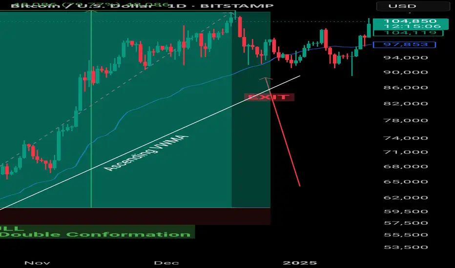
VWMA : Example Volume weighted Moving Average
🔍 VWMA in Crypto Trading
Smarter than simple MAs. Powered by volume.
What is VWMA?
🎯 VWMA = Price + Volume Combined
Unlike SMA/EMA, VWMA gives more weight to high-volume candles.
✅ Shows where the real trading pressure is.
Why Use VWMA?
💥 Volume Confirms Price
Price movement + High Volume = Stronger Signal
VWMA adjusts faster when volume spikes
📊 More reliable in volatile crypto markets.
Some VWMA Settings
📊 Optimal VWMA Periods by Timeframe
🕒 15m – VWMA 20 → For scalping
🕞 30m – VWMA 20/30 → Intraday breakouts
🕐 1h – VWMA 30/50 → Trend filter + RSI combo
🕓 4h – VWMA 50/100 → Swing trading
📅 1D – VWMA 50/100/200 → Macro trend + S/R levels
Go through different settings to see what suits you best.
VWMA in Action
📈 Price Above VWMA = Bullish Strength
More confidence in uptrend
Especially valid during high volume surges
🟢 Great confluence with MA 7/9 in short-term setups
Dynamic Support/Resistance
🛡️ VWMA Reacts to Market Strength
Acts as dynamic support or resistance—especially when volume increases.
Useful in catching pullback entries or trailing SLs.
🚦 Filter Fakeouts with VWMA + MA
✅ Use in confluence for stronger edge.
Tips for VWMA
📌 Use shorter VWMA (20–30) for entries
📌 Use longer VWMA (50–200) for trend validation
🎯 Works best in trending, high-volume conditions
Strategy & Education: Trading with Fibonacci and Order Blocks🔍 Trading Strategy Based on Fibonacci Levels and Order Blocks
This chart showcases three consecutive sell trades I executed on the BTCUSDT pair, each resulting in a profitable outcome. The purpose of this explanation is to demonstrate how Fibonacci retracement levels can be combined with Order Block zones to identify high-probability trade setups.
🧩 The Foundation: Understanding Price Retracement Behavior
The ABC, abc, and (a)(b)(c) structures marked on the chart are not Elliott Waves. Instead, these labels are used to represent simple retracement movements in the market. The focus here is not wave theory, but recognizing how price reacts and pulls back after a move, and how we can benefit from these reactions.
📌 Trade 1: Primary Fibo-OB Confluence
I drew a Fibonacci retracement from the A wave to the B wave.
The price then retraced to the C area, landing between the 0.618 and 0.786 Fibonacci levels, where an Order Block (OB) was also present.
This overlap created a strong technical and structural resistance zone.
I entered the first sell trade from this confluence.
📌 Trade 2: Internal Retracement and OB Alignment
Inside the first corrective move, a smaller abc pattern formed.
I applied Fibonacci again from small a to small b.
The c leg reached the same key Fibonacci zone (0.618–0.786) and overlapped with a second OB.
This confluence offered a second sell entry.
📌 Trade 3: Micro Structure – Same Logic Reapplied
I repeated the exact same logic one more time on a micro (a)(b)(c) structure.
Fibonacci from (a) to (b), price touched 0.618–0.786, coinciding again with an OB.
This became the third and final sell position.
🧠 The Logic Behind the Strategy:
Price doesn’t move in straight lines—it flows in waves. During pullbacks, if Fibonacci levels align with Order Block zones, the market tends to react strongly. My focus here was to identify these areas of confluence in advance and enter trades at high-probability turning points.

The Ultra Idea : d-MR96nBa's Ultimate Market Journal🌌The Ultra Idea : d-MR96nBa's🌠Ultimate Market Journal🎨
Hello Fellow Travelers
It's been some time since I've posted a Fresh Idea, though I've remained actively trading.
What better way to mark my TradView return, than to start an Ultimate Market Journal.
Financial Markets have taken my deep interest again recently, especially as we seem to be at a time of accelerating change and shifting regimes.
I believe many opportunities abound to those with open, flexible and creative minds.
A bit more about myself.
I've been involved with financial markets in one form or fashion for 18 years now.
I started out like most of us, approaching the game with fundamental analysis, only to later incorporate and then fully graduate to T/A.
I'm a natural Contrarian.
My brand of technical analysis is as much about aesthetics, creative expression, discovering hidden truths and applying Universal Principles as it is running the numbers.
I'm starting this off with Ultra Bond Futures, as UB's are the trading instrument I've come to specialise in, having had the most ongoing consistent success trading.
This by no means is going to be a "I bought here and sold there" type of Journal, as that's not my style.
Nor am I going to focus on a single market instrument, observation or style of analysis.
I'd like this to become a repository of accumulated wisdom and unique market perceptives.
I've just begun contemplating what this may evolve into in time, and I invite you to join me in taking this Leap
d-MR96nBa🌌
Concept
Inversion📈📉
Seek out and analyse whatever moves exactly inverse to what you intend to trade.
If you're having trouble discerning trend or observing price patterns, check the inverse.
This can be an excellent technique for exposing Bias.
This can work particularly well for currency traders, though can be Universally applied.
For US Ultra Bonds, the inverse is the US 30 Year Yield
Ultra Bond Futures
US 30 Year Yield
Currency traders, say you're about to trade AUD/CHF
Check out the CHF/AUD chart first, if they both appear Bullish or Bearish, you've got a Bias.
AUD/CHF
CHF/AUD
GBP/JPY
JPY/GBP
EUR/USD
USD/EUR
Are there any examples of Inversion in Trading you'd like to share ?
What else is on my🧠
Well just casually, I believe we're currently witnessing Peak Bitcoin in it's entire Life-cycle.
Have we Bull Trapped & Breakaway Gapped on Berkshire Hathaway
BRK.B
It's in the Detail

Heikin Ashi VS Regular candlesticks - EducationalNASDAQ:AMZN
Everything is explained in the video.
I hope you will find it very educational and test it. Those who trade stocks will probably switch to Heikin Ashi :)
Thank you!

Technical Analysis with Elliott Waves: A Combined ApproachHello friends, Welcome to RK Charts!
This Educational Post is based on technical analysis, specifically how to initiate analysis on a chart, and what points to consider. This is purely for Educational purposes.
This is not a trading or investing tip or advisory. Rather, it's a comprehensive guide on how to easily analyze a chart, intended for educational purposes. I hope that by reading and understanding this post, you'll gain valuable knowledge and insights. Your focused effort to understand this will surely provide you with something valuable and easy to grasp.
Let's dive in, During technical analysis, what we had observed certain points in this chart, I'm highlighting them here:
1. Resistance line breakout, where the price has closed above it.
2. The volume within that breakout.
3. The price closing above Weekly Exponential Moving Averages.
4. Elliott Wave Counts.
5. Projected Target along with Invalidation level as per Elliott Wave theory.
6. Projected Duration for Projected Targets.
Breakout of Resistance zone with Good Volume intensity:
So, friends, here we can clearly see on the chart that this is a weekly time frame chart of Shipping Corporation of India Limited. Over the last eleven months, from July 2024, the price has been falling, remaining largely bearish, but has now broken out of Curved Resistance Trendline for the first time with a bullish candle on Weekly (Closing basis), accompanied by good volume intensity.
Alongside this, the price has sustained and closed above Major EMAs:
- 50-Weekly Exponential moving average (red line plotted on the chart)
- 100-Weekly Exponential moving average (blue line plotted on the chart)
- 200-Weekly Exponential moving average (black line plotted on the chart)
on the weekly time frame.
Elliott Wave Theory:
Considering the Elliott Wave structure, if we look at it theoretically, the top it made on July 2024, was the completion of Wave III. After that, it completed Wave IV in 7 swings (WXY) and is now possibly moving higher, making higher lows. It has closed above the moving averages, broken out of the Curved Trendline, and has strong volume. So, possibly, we are unfolding an impulse Wave V.
In Elliott Wave Theory, the invalidation level means that the price should not go below that level, which in this case is the low of Wave IV at ₹130. If the price goes below that level for any reason, even by a single point, our wave counts will be invalidated, and we'll have to re-analyze the chart.
That's why we call it the invalidation level. Analysts and traders also refer to it as a stop-loss level. So, in Elliott Wave Theory, our wave counts remain valid as long as the price stays above the invalidation level and doesn't trigger it.
Now, regarding the target, if we take the measurement of Wave IV and calculate its 1.236 level, the target for Wave V should be above the high of Wave III. According to Elliott Wave Theory, the projected target for Wave V is near ₹440, which is the 1.236 Fibonacci level.
Projected Duration for Projected Targets:
In the chart analysis we conducted, where we prospectively projected a target, if everything goes right and the invalidation level is not triggered, what could be the duration of this target? It will definitely take more than a medium-term duration, maybe even a long-term duration.
This is because each candle represents a week, and we're currently looking at the weekly time frame. Since the fourth wave has just ended and the fifth wave is upcoming, it will take a long-term duration
I am not Sebi registered analyst.
My studies are for educational purpose only.
Please Consult your financial advisor before trading or investing.
I am not responsible for any kinds of your profits and your losses.
Most investors treat trading as a hobby because they have a full-time job doing something else.
However, If you treat trading like a business, it will pay you like a business.
If you treat like a hobby, hobbies don't pay, they cost you...!
Hope this post is helpful to community
Thanks
RK💕
Disclaimer and Risk Warning.
The analysis and discussion provided on in.tradingview.com is intended for educational purposes only and should not be relied upon for trading decisions. RK_Chaarts is not an investment adviser and the information provided here should not be taken as professional investment advice. Before buying or selling any investments, securities, or precious metals, it is recommended that you conduct your own due diligence. RK_Chaarts does not share in your profits and will not take responsibility for any losses you may incur. So Please Consult your financial advisor before trading or investing.

Pimp Your Indicators – A Smoothed Take on RSIYou don’t need to reinvent the wheel to find new and effective trading tools. Often, enhancing classic indicators with a few thoughtful modifications can yield surprisingly powerful results. Here’s a simple yet effective way to upgrade the RSI and turn it into a more actionable entry signal.
The Relative Strength Index (RSI) is a widely used oscillator that ranges from 0 to 100, providing a measure of upside momentum within a given timeframe. For example, an RSI reading of 60 implies a 60% upside dominance based on recent price action. Traditionally, traders interpret levels above 70 as overbought and below 30 as oversold. However, RSI on its own isn’t reliable as a standalone entry trigger. An overbought reading doesn’t necessarily mean the market is losing strength—it simply indicates recent data reflects a strong upward move.
Smoothed RSI Approaches
To extract more useful signals, we can enhance the RSI in a couple of simple but effective ways:
1. RSI vs. RSIMA (RSI Moving Average):
One approach is to smooth the RSI itself by calculating a moving average of the RSI (call it RSIMA), and then observe the difference between the RSI and its moving average. A positive difference suggests bullish momentum; a negative one, bearish. This approach reduces some noise but can still result in a choppy indicator, as seen in the subplot of the reference chart.
2. RSI on Smoothed Price (RSI5M):
A more refined method involves smoothing the price before calculating RSI. Specifically, apply a 5-period EMA (Exponential Moving Average) to the price series, then compute the RSI on this smoothed series—let’s call it RSI5M. The key insight is to then analyze the difference between RSI5M and the standard RSI. This difference creates a smoother, more robust signal that better captures market bias.
Why It Works
In uptrends, the EMA(5) smooths out short-term fluctuations and highlights the prevailing trend more clearly than raw price data. As a result, RSI5M tends to rise faster and higher than the standard RSI. The difference between the two becomes positive in uptrends and negative in downtrends, making it a useful gauge of directional momentum. This effect is illustrated in the lower subplot of the reference chart, where the smoothed signal offers a clearer view of market regimes.
Ready-to-Use Script
If you're not into coding, you can explore the public script of the Parsifal.RSI.Trend indicator on TradingView. It implements a slightly refined version of this smoothed RSI differential and provides a clean visual cue for trend bias.

How to read Speed Index and Identify Potential Reversals!In this chart we removed all Plutus signals and we are reading just Speed Index and weighted Averaged Speed Index. The purpose is to identify a potential reversal at a significant location such as Fib.
There are two numbers visible on every price wave swing, the first one is the wave's Speed Index and the second one is the weighted average Speed Index of the 30 waves back.
What do we need to identify for a potential reversal? The answer is Abnormal Speed Index compared to the weighted average Speed Index, which means that something is cooking.
Reading the chart:
- Look at highest volume up wave hitting the Fib area, Speed Index at 6.2 while the average at 5.0 , higher than the average but not too abnormal.
- The next down wave is where it gives you an Abnormal Speed Index of 10.4 with an average of 5.2. This is what we call their first Push Down, now definitely something is cooking.
- The next up wave has a Speed Index 10.4 (Abnormal) with an average of 5.2 and that's we call a Hard to Move Up Wave (HTMU).(by coincidence these two waves have the Speed Index and average Speed Index)
- Finally to make sure that all these were sellers we need price to break these waves.
To Summarize this is how we approach this Short trade (annotations are in sync with chart).
1. Fib Location (potential sellers might enter)
2. The highest volume up wave to get to Fib
3. Placed AVWAP at the beginning of this up wave, because we will go short if price goes below AVWAP with the appropriate Speed Index justification.
4. First Push Down wave with SI 10.4 with AvgSI at 5.2
5. HTMU (Hard to Move Up) wave with SI 10.4 with AvgSI at 5.2
6. Our entry Short breaking the structure of the previous waves and cross AVWAP downwards.
I hope this helps all you Weis Wave Speed Index owners. Enjoy!!!

Scalping and Swing Trading Strategies
A Guide to Optimizing on TradingView
Scalping and swing trading strategies are two popular trading approaches in Forex, OANDA:XAUUSD gold, and cryptocurrencies, enabling traders to capitalize on price movements for maximum profits. Scalping focuses on short-term trades with small gains, while swing trading targets longer-term trends. This article guides you on implementing these strategies on TradingView using tools like RSI, MACD, and Fibonacci. Let’s dive in to elevate your trading skills!
1. What is Scalping?
Scalping is a short-term trading strategy where traders execute multiple trades daily, capitalizing on small price movements (often a few pips). The goal is to accumulate small profits from numerous trades.
Timeframe: 1-minute (M1) or 5-minute (M5).
Suitable markets: Forex (EUR/USD, GBP/USD), gold (XAU/USD), or cryptocurrencies (BTC/USD).
Requirements: Quick reactions, strict risk management, and appropriate leverage.
Example: A scalper might buy EUR/USD when the price touches the lower Bollinger Band on an M5 chart and sell when it reaches the middle band.
2. What is Swing Trading?
Swing trading is a medium- to long-term strategy that captures “price swings” within larger trends. Traders hold positions for days to weeks to maximize profits from significant price movements.
Timeframe: 4-hour (H4) or daily (D1).
Suitable markets: Stocks, Forex, gold, and cryptocurrencies.
Requirements: Patience, trend analysis skills, and effective capital management.
Example: A swing trader might buy XAU/USD when the price hits the 61.8% Fibonacci level on an H4 chart and hold until it reaches the next resistance.
3. Why Use Scalping and Swing Trading Strategies on TradingView?
TradingView offers powerful tools to execute both strategies effectively:
Flexible price charts: Supports multiple timeframes and chart types (candlestick, Renko).
Technical indicators: RSI, MACD, Bollinger Bands, Fibonacci, and more.
Price alerts: Set notifications for when prices hit support/resistance levels.
Pine Script: Customize indicators or automate trading strategies.
Tip: Use TradingView’s “Replay” feature to test scalping or swing trading strategies on historical data.
4. Scalping Strategy on TradingView
4.1. Tools and Setup
Timeframe: M1 or M5.
Indicators:
Bollinger Bands (period 20, deviation 2).
RSI (period 14, overbought 70, oversold 30).
Trading pairs: EUR/USD, GBP/USD, or XAU/USD (due to high liquidity).
4.2. Trading Rules
Buy signal:
Price touches the lower Bollinger Band.
RSI <30 (oversold).
Confirmed by a reversal candlestick pattern (e.g., Doji).
Sell signal:
Price touches the upper Bollinger Band.
RSI >70 (overbought).
Confirmed by a reversal candlestick.
Risk management:
Set Stop Loss 5–10 pips below the nearest support.
Take Profit at 10–15 pips or when the price hits the middle Bollinger Band.
4.3. Example
On an M5 EUR/USD chart, if the price touches the lower Bollinger Band at 1.0850 and RSI <30, enter a buy order. Set Stop Loss at 1.0840 and Take Profit at 1.0865. Exit when the price reaches the middle band.
Image illustration: EUR/USD M5 chart with Bollinger Bands and RSI (optimize alt text: “EUR/USD scalping chart TradingView”).
5. Swing Trading Strategy on TradingView
5.1. Tools and Setup
Timeframe: H4 or D1.
Indicators:
Fibonacci Retracement.
MACD (12, 26, 9).
Moving Averages (MA50, MA200).
Trading pairs: XAU/USD, GBP/USD, or BTC/USD.
5.2. Trading Rules
Buy signal:
Price hits the 50% or 61.8% Fibonacci level in an uptrend.
MACD crosses above the signal line.
Price is above MA50.
Sell signal:
Price hits the 50% or 61.8% Fibonacci level in a downtrend.
MACD crosses below the signal line.
Price is below MA50.
Risk management:
Set Stop Loss below the nearest support (20–50 pips, depending on the pair).
Take Profit at the next resistance or a 1:2 risk-reward ratio.
5.3. Example
On an H4 XAU/USD chart, if the price hits the 61.8% Fibonacci level at $1,950 in an uptrend and MACD confirms a buy signal, enter a buy order. Set Stop Loss at $1,930 and Take Profit at $2,000.
Image illustration: XAU/USD H4 chart with Fibonacci and MACD (optimize alt text: “XAU/USD swing trading chart TradingView”).
6. Tips for Applying Scalping and Swing Trading Strategies
Combine with fundamental analysis: Economic news (interest rates, NFP reports) can impact prices, especially in Forex and OANDA:XAUUSD gold.
Backtest strategies: Use TradingView’s “Replay” mode to test strategies before live trading.
Manage emotions: Scalping requires intense focus, while swing trading demands patience. Choose the strategy that suits your personality.
Optimize costs: Scalping incurs high spread costs, so choose a broker with low spreads.
7. Conclusion
Scalping and swing trading strategies offer profitable opportunities in Forex, OANDA:XAUUSD gold, and cryptocurrencies, depending on your trading style. With TradingView’s powerful tools like Bollinger Bands, Fibonacci, and MACD, you can easily implement these strategies. Try scalping on EUR/USD or swing trading on XAU/USD today and share your results with the TradingView community! Sign up for TradingView to explore more features and optimize your trading.
