What is LEVERAGE in Forex💰
❗️Leverage is a brokerage service that is a loan in the form of cash or securities provided to a trader to secure a transaction. The loan amount may exceed the amount of the trader's deposit by 10, 20, 100 or more times. By analogy with the law of physics, leverage works as a lever, enabling a trader to make deals that he would not be able to with his own funds alone. The maximum leverage on the exchange does not depend on the trader's desire and the broker's capabilities. It is calculated based on the risks established by the clearing center for each asset. For example, if the risk amount for any stock is set at 10%, a trader will be able to trade it with a leverage of 1 to 10. If the risk value is 30%, then it is impossible to get a leverage greater than 1 to 3.
Making transactions on the exchange using leverage is called margin trading. It is the conclusion of purchase and sale transactions using borrowed funds issued against the security of a certain amount, which is called margin. In other words, in order to use the leverage service, you must have a minimum amount on the deposit (set by the broker), which will be the collateral.
The amount of leverage in trading is the ratio of the amount of the trader's own funds to the amount of the transaction (1:100, 1:1000). For example, if this indicator is 1:500, it means that the broker provides a loan amount 499 times higher than the investor's deposit. At the same time, one part of the investor's funds and 499 borrowed funds are used in the transaction.
The word "credit" scares many away, but in fact there is nothing terrible in this concept. Leverage can indeed be called a loan in the usual sense of the word, but the interest on the use of borrowed assets is significantly less than the usual bank. When transferring the positions of the transaction to the next day, a commission is withdrawn from the account in the amount of the difference in the interest rates on the loan and the deposit - the so-called swap, which can be considered an analogue of the fee for using leverage.
The loss on the transaction is deducted from the trader's own funds, if as a result their volume becomes less than the permissible minimum margin value, the broker will send a notification that the money is running out and the bidder needs to either replenish the account or close the position. Such an alert is called a Margin Call. If no action is taken, the transaction will be closed automatically (Stop out).
✅How to trade with leverage
Leverage is a financial instrument that, with a competent approach, allows you to make large transactions and get a good profit even on small deposits. In order to use this tool correctly, follow the simple recommendations:
Focus on your own deposit. Calculate the risks based on the available amount.
It is better to use a small amount of borrowed funds, which will not allow you to lose all the money at once.
With any leverage size, never trade for the entire deposit. Ideally, one operation should account for 1-2% of the deposit amount.
Be sure to set Stop loss levels, this will help reduce risks.
⚠️IMPORTANT! Stop loss is an order that fixes the financial result when the price of the selected instrument reaches a certain level. The Stop loss parameter can be set before opening a position or after. But there is one important point: in a sale transaction, the specified level should be no less than the current price on the market, and in a purchase transaction - no more.
❤️ Please, support our work with like & comment! ❤️
Wave Analysis

#3 | Impulsive wave VS corrective waveDon't say you've been in the financial markets for more than a year and you still can't differentiate between these two waves!!!
Let me remind you again...
YOU WON'T BE A PROFESSIONAL ANALYST IF YOU CAN'T UNDERSTAND THE STRUCTURE OF WAVES YOU ARE LOOKING AT.
I'll assume you're familiar with Elliott waves and Dow theory, so I won't go into detail about the difference between an impulsive wave and a correction.
Instead of that...
There are too many types of waves... But, you're good to go if you can understand only these 7 waves.
Impulsive waves
12345 (Rare)
WXYXZ
WXY
Corrective waves
It may come as an ABC wave or an ABCDE. But, 99% of the time, it will give you one of these basic flag pattern.
Regular
Running
Expanding
Contracting
I will explain each of those patterns in detail if I see likes...
Comment below. Which one should we start with? corrective or impulsive waves?

How to Find A Setup #1Watch this short clip of me back testing how I find a setup and execute it. This is one of many entry models that I use and I will overtime show more.
ENJOY!!!

Course About trading from scratchTHE ART OF CHARTING
IF YOU ARE INTRESTED IN MY COURSE I CAN SEND IT TO YOU FOR FREE
What you will get in this course :
01 Min STRATEGY Bonus
EP01- Stock God
-Purge Strategy
-Building Mental capital
-High Probability Trading
EP02 Futures Don't lie
-How Future Markets Works And how we can literally see big banks and hedge funds uyilizing liquidity -SIM data Analysis -importance of journaling and 30 day journal -trading plan refinement
EP03 Stock God
-How to backtest
-Building Watchlist
-HTF Direction bias
-LTF framework
-Psychology Aspect
ANTFX EP04
-Trading plan on how practic Velocity -How to become demo baller before live -RR and how its not as important as you think
JoshChartlab EP05
-Trading Psychology -Mindset -NY seesion Trading -Intraday Sauce on lower time frames -Walking ithrough his intraday trades

How To Analyze Any Chart From Scratch - Episode 11Hello TradingView Family / Fellow Traders. This is Richard, as known as theSignalyst.
Today we are going to go over a practical example on GBPAUD, but you can apply the same logic / strategy on any instrument.
Feel free to ask questions or request any instrument for the next episode.
You can find the previous episodes below "Related Ideas"
Always follow your trading plan regarding entry, risk management, and trade management.
Good luck!
All Strategies Are Good; If Managed Properly!
~Rich

Types of Orders & Their Features📚
⚠️One of the first things that novice traders should learn is how to use different types of orders. The exact number of orders available to you often depends on which broker you are going to use.
Learning how to use different types of orders correctly is part of comprehensive trading training.
❗️The most popular types of forex orders:
✅Market orders
A market order is probably the simplest and most common type of order. It is usually executed immediately by the broker if it has not arrived in too large a size or has been placed in fast-moving markets.
As the name implies, market orders include buying or selling a currency pair at the current market rate. Market orders can be used by a trader for long or short positions. They can also be used to close current positions by buying or selling.
One of the main advantages of market orders is that they are almost always executed. The disadvantage of using market orders is that you can get an unexpectedly unfavorable price if the market moves quickly against your position.
✅Limit orders
Whenever a trader wants to specify a lower or higher price at which an order should be executed, this type of order is called a limit order. Limit orders can be used to stop losses, as well as to fix profits.
The name of this type of order arises from the fact that the trader demanded that transactions concluded on his behalf be limited to transactions executed at the specified exchange rate or better.
In practice, however, limit orders are usually executed at the specified price, although a broker may offer a better order execution rate to impress a particularly good client.
Some traders like to use a certain type of limit order, which is called a Fill or Kill or FOK order. The first type of FOK order tells the broker to either fully execute the order at a certain price, or cancel it. The second type of FOK order instructs the broker to immediately execute all orders at the specified price, and then cancel all others. This last type of Fill or Kill order is most often used when trading large amounts.
✅Take Profit orders
The take profit order is one of the most common types of limit orders. As the name suggests, it is usually used by a trader who wants to liquidate an existing position with a profit. Therefore, the price level indicated in the take profit order should be better than the prevailing market rate.
If the trader's initial position is short, the take profit order will include the redemption of this short position at a price lower than the prevailing one in the market. Conversely, if they held a long position in accordance with the take profit order, it would be liquidated if the market moved up.
Traders may sometimes indicate that their take profit orders are of the "All or Nothing" or AON type. This means that the order must be either fully executed or not executed at all. AONs are used to prevent partial execution of orders, which may be considered undesirable.
Alternatively, traders can choose to partially fill in a smaller amount than the entire amount of the take profit order. This can be useful if the broker trying to execute the order can only execute part of the order at the exchange rate specified in the order.
✅Stop loss orders
A stop loss order is another very common type of order, usually used to liquidate an existing position. Such orders are usually executed as market orders as soon as the stop loss level is triggered when trading currency at this level.
In fact, when the market has gone against an existing position to a point and the exchange rate has reached the specified stop loss level, the stop loss order is executed and causes the trader to incur a loss.
However, a stop loss order limits the trader's further losses if the price continues to move in the same unfavorable direction. This makes stop loss orders an important part of risk management strategies for many traders.
❤️ Please, support our work with like & comment! ❤️

#2 | Understanding Wave Analysis TheoryIt's a simple concept.
Impulsive wave, corrective wave, impulsive wave, corrective wave...
You may think I'm here to talk about Elliot ... (if you know him)
No.
The problem with Elliott Wave Theory is...
IT'S TOOOOO OLD.
It has a lot of problems...
The markets of 1938 aren't the same as the markets of 2022.
I'll show you an updated version...
The biggest mistake beginners make when they trade the flag pattern is
FALSE ENTRY.
Have you ever traded a flag when it breaks the trend line, then it goes straight to hit your stop loss?
Absolutely yes, one reason for this is...
YOU DIDN'T UNDERSTAND THE STRUCTURE OF THE WAVES YOU WERE LOOKING AT.
99% of beginners do rely on stupid strategies that say:
IF THE PRICE BREAKS THE TREND LINE, JUST BUUUUUY.
Because of that, they get disappointed results...
WRONG ENTRY.
WRONG STOP LOSS.
WRONG TARGET.
EVERYTHING GOES WRONG.
I highly recommend you have a basic understanding of Dow Theory and Elliot Wave Theory .
They are the structure of this updated WA version.
That will make you able to understand the upcoming ideas and analysis where I will share with you details and my strategies to trade the regular-flag properly.
If I see likes, I'll post the 3rd idea about the different types of impulsive and corrective waves.
Make sure to follow us.

How To Analyze Any Chart From Scratch - Episode 10Hello TradingView Family / Fellow Traders. This is Richard, as known as theSignalyst.
Today we are going to go over a practical example on MATIC, but you can apply the same logic / strategy on any instrument.
Feel free to ask questions or request any instrument for the next episode.
You can find the previous episodes below "Related Ideas"
Always follow your trading plan regarding entry, risk management, and trade management.
Good luck!
All Strategies Are Good; If Managed Properly!
~Rich

FALSE BREAK | Price Action Trading📊
⚠️How often have you opened a key level breakout trade, and then the price turned against you? False breakout happens quite often and it is a problem for many traders who buy at highs and sell at lows.
Breakout trading is a fairly popular and viable trading strategy. However, some breakouts often turn out to be false. This can be quite frustrating, not to mention that it can often lead to a losing trade.
However, in many cases, an experienced trader can analyze the market situation and react to it accordingly. False breakouts can make a profit if you know how to trade them correctly.
❗️A false breakdown is a situation when the price violates an obvious level, but then suddenly changes direction. When the initial breakout of the level occurs, many traders open a trade in the direction of the breakdown. These traders are trapped when the price reverses, which triggers a series of stop losses. New traders are also entering the market, and this puts additional pressure on the price. This often turns the price into a new trend, the opposite of the initial breakout.
A breakout that turns out to be false is a sign of strength in a downtrend or weakness in an uptrend.
As you can see, a false breakout can easily cause significant losses for any trader.
Some traders develop their entire strategy around trading false breakouts, as this can be a very powerful trading approach. Some of the best trades happen when market players fall into a trap and their stops start to work.
✅How to find patterns of false breakouts?
🟢If you do not learn how to correctly identify false breakouts, you will not be able to trade them profitably. For example, there will be situations when the price returns to the breakout point, and only then continues its movement.
🟢One of the ways to detect false breakouts is to monitor the volume. Real breakouts are usually accompanied by strong indications of trading volume at the time of the breakout. When this volume is absent, there is a higher probability that the breakout will not happen.
🟢Thus, if the trading volume is low or it decreases during the breakout, a false breakout is likely to occur. In contrast, if the volume is large or it increases, a real breakdown is likely.
🟢It is also useful to monitor not only the trading volume but also the price movement on the lower timeframe. In many cases, you will see that the price makes a very sharp pullback on the lower timeframe, which is not visible on the higher timeframe.
✅False Breakout Trap
🟢After all, many trading textbooks say that a breakout can be considered confirmed when a candle closes above the resistance level. However, the price moves in your direction for a while and then turns 180 degrees. As a result, you have a stop loss triggered.
🟢The false breakout trap includes several candlesticks, usually 1-4, that go beyond the key support or resistance level. Such breakouts occur after a strong movement, as the market has reached an important level, but the price momentum still retains its strength.
Have you ever been trapped by a false breakout?
❤️ Please, support our work with like & comment! ❤️

#1 | Trading's most essential price action patternThe flag pattern.
Most of you know it, but it seems that most of you don't know how to trade it properly...
Let's fix that!
I am sure you have seen this pattern many times before.
It was there 100 years ago, and it will stay here forever... (while markets exist)
Most technical analysts do know this as one of many harmonic patterns...
Yes!
But today... forget that.
We have a different approach.
We, as wave analysers, do call this a regular flag.
We look at this differently and we trade it differently.
I entered hundreds of trades based on this pattern.
By statistics, it has an average of a 75% winning rate. (if the entry conditions are respected)
To keep things simple, you can focus only on this pattern in your trading.
When you become good enough, you will see the consistent profits come in easily.
I'll be posting a lot more information about wave analysis and the flag pattern soon... (until we fix that)
Click that follow button to be notified.

What is #Nifty upto? A Falcon Waves perspective!Celebrating Saturday with some education.
After over 2+ years of research, I have developed Falcon Waves, an easy alternative to Elliott Waves, perhaps simple wave count method for general public.
The main Falcon Waves concept is a ABCDE format
A goes to the starting point
B is a pull back for final rally up
C is the top wave
D is the bottom wave
E is the consolidation
NIFTY MONTHLY CHART - FALCON WAVE
Falcon Waves runs in ABCDE pattern. We are in wave D which has 5 waves down in #Nifty monthly chart. Looks like 3 is finished and we are in 4th wave upside. This should finish in this rally and then last wave down will end this correction followed by E wave that is consolidation
Looks like 3 is finished and we are in 4th wave upside. This should finish in this rally and then last wave down will end this correction followed by E wave that is consolidation. Falcon Waves starts with A and ends with a consolidation phase marked in E wave.
#Nifty #Nifty50 is in wave D, and it is in 4th wave of D. This should end soon around 16200-16500 levels. Followed by 5th wave down.
Here are different charts based on different time frames for your reference. You can practice it and ask questions and I will be happy to answer them.
NIFTY WEEKLY CHART - FALCON WAVE
NIFTY DAILY CHART - FALCON WAVE
Want hourly chart Falcon Wave?
Follow me on Trading View and get daily Nifty Falcon Wave counts on 1H chart.

Don't miss this tutorial!Backtesting and analysis of chart history helps improve your trading. Some traders overcomplicate things and use dozens of indicators, on the other extreme - there are fans of clean charts. The truth is, as always, in between.
In this analysis I will demontsrate some of my usual tools, that proved to be very helpful. Starting from a clean chart - and adding different TA tools step by step, that support every entry shown on the main chart, as well as the overll logic along the price action.
So, let's start. You will find a lot of screens and supporting descriptions in the updates to this post.
Cheers.

How To Analyze Any Chart From Scratch - Episode 9Hello TradingView Family / Fellow Traders. This is Richard, as known as theSignalyst.
Today we are going to go over a practical example on EURGBP, but you can apply the same logic / strategy on any instrument.
Feel free to ask questions or request any instrument for the next episode.
You can find the previous episodes below "Related Ideas"
Always follow your trading plan regarding entry, risk management, and trade management.
Good luck!
All Strategies Are Good; If Managed Properly!
~Rich

TRIPLE TOP PATTERN | Tips on How to Trade it📚
❗️A triple top is a type of graphical pattern that is used in technical analysis to predict the reversal of an asset's price movement. Consisting of three peaks, the triple top signals that the asset may no longer be growing, and that lower prices are possible.
Triple tops can occur on all timeframes, but in order for the model to be considered a triple top, it must occur after an uptrend. The opposite of a triple is a triple bottom, which indicates that the asset price is no longer falling and may rise higher.
✅How the triple vertex works
The triple top pattern occurs when the price of an asset creates three peaks at approximately the same price level. The area of peaks is resistance . The pullback between peaks is called the swing minimum . After the third peak, if the price falls below the lows of the fluctuation, the model is considered completed, and traders expect further downward movement.
Three consecutive peaks make the triple peak visually similar to the "head and shoulders" pattern; however, in this case, the average peak is almost equal to the other peaks, and not higher. The model is also similar to the double top model, when the price touches the resistance area twice, creating a pair of high points before falling.
Triple tops are traded in almost the same way as the "head and shoulders" figures.
Let's say the stock price peaks at $119, drops to $110, rises to $119.25, rolls back to $111, rises to $118, then falls below $111, which is a triple top and signals that the stock is probably moving down.
✅The value of the triple vertex
Technically, the triple top pattern shows that the price cannot break through the peak area. Translated into real events, this means that after several attempts, the asset cannot find many buyers in this price range. When the price drops, it forces all traders who bought during the pattern to start selling. If the price cannot rise above the resistance, there is limited potential for profit retention. As the price falls below the minimum of the fluctuation of the model, sales may increase as former buyers exit long positions and new traders open short ones. This is the psychology of the model and what helps fuel the sale after its completion.
No template works all the time. Sometimes a triple top is formed and completed, which makes traders believe that the asset will continue to fall. But then the price may recover and rise above the resistance area. In order to protect, a trader can place a stop loss on short positions above the last peak or above the recent maximum of the fluctuation within the model. This move limits the risk of a trade if the price does not fall, but instead rises.
✅Trading on Triple Top patterns
Some traders open a short position or exit long positions as soon as the asset price falls below the support of the model. The support level of the model is the most recent swing minimum following the second peak, or alternatively, the trader can connect the swing minima between the peaks with the trend line. When the price falls below the trend line, the figure is considered completed and further price decline is expected.
To add a confirmation of the model, traders will keep an eye on the large volume when the price falls through the support. The volume should increase, which indicates a strong interest in sales. If the volume does not increase, the model is more prone to failures (the price rises or does not fall as expected).
The pattern provides a lower target equal to the height of the pattern subtracted from the breakout point. This goal is approximate. Sometimes the price will fall far below the target, other times it will not reach the target.
⚠️Other technical indicators and graphical models can also be used in combination with the triple top. For example, a trader can watch the bearish crossing of the MACD after the third peak or the exit of the RSI from the overbought zone to confirm the price drop.
❤️ Please, support our work with like & comment! ❤️

Elliott Wave zig zags can be a gateway to other patterns. It is important to remember that just because you have a completed zig zig, you do not necessarily have a completed correction... it could only just be the beginning. Please like and follow if helpful. Cheers!

What is Potential Reversal zone and how to make it?How can we find a Potential Reversal Zone?
Is it enough to just make a simple Retracement or we can make our support zone narrower? how can we be more confident about our possible supports?
What are Fibonacci levels for different types of Fibonacci and what are typical ones among them? How can we implement different wave degrees to make our PRZ even stronger?
You can find answers to all above questions in this video.
I hope you to enjoy this video and wish you all the best.

Fundamentals of Elliott Wave Theory + Briefly about the typesThis wave theory is based on the psychology of groups of individuals and statistical patterns.
Every market decision is generated by meaningful information and simultaneously generates meaningful information. Each transaction being a result, becoming known to investors, joins the chain of causes of people's behavior (not news drives prices).
The price movement in the same direction as the trend of a larger scale develops in 5 waves. Correction - reaction against a larger trend, developes in 3 waves
Imagine a mango plantation. At the initial period, there is a bullish trend on the plantation stock exchange, which is obvious to the rational majority of mangoes (1/4 of the 3rd wave or 1/3 of the 3rd wave). Because of the confidence that tomorrow will be better, some very rational fruits began to borrow a little in order to earn a little more. This action of very rational fruits caused a faster increase in stock prices (because there is more demand). After learning about the "easy" success, the less rational mango decided to do the same, but since it is not very rational, it invested more. This pattern continued to the most irrational fruits. At the same time, with an increase in the circulation of capital (or monetary base), the borrowing rate falls (because there is a large supply of money in the market => corporations are valued more, they can issue more bonds => receive more money for business development (and not only)(This development is planned at a low rate => zombie corporations appear, and more risky projects are also being taken (not only by corporations, but also by people))). Spending by an average citizens also increased.
When speculation, fraud, financial crimes reach a noticeable scale, rational mangoes will start to short, other mangoes will think - Why is this rational mango shorting (the hypothesis of an efficient market)? => The 4th wave will begin (little by little the fruits will begin to notice what is happening).
When we reach the end of the 4th wave, the most irrational fruits begin to enter the market because of this, the 5th wave occurs ( the deceived themselves found pleasure in deception),
At the end of the 5th wave, most likely, some famous fruit economist would ask the fruit society - what's going on? => panic will begin, because everyone will suddenly want to short + "stops" will work => correction will begin.
Waves - more details
Diagonal triangles (wedges) are the only 5-wave structure aligned with the main trend within which wave 4 almost always invades the price territory of wave 1. In rare cases, a diagonal triangle may end with a truncation (form 3-3-3-3-3).The final diagonal triangles (Appear first of all in the 5th wave at those moments when the previous movement has gone too far and too fast)A small part of the final diagonal triangles appear in the wave C at the A-B-C models. In all cases, they are found in the final waves of larger models and indicate the exhaustion of a larger movement.
Triangle (3-3-3-3-3)-three tapering variants (ascending, descending and symmetrical) and an expanding variant, reverse symmetrical. Triangles always occur in the position preceding the last of the acting waves in the model, the degree of which is one more, in addition, a triangle may appear as an acting model in a corrective combination, but even then it usually precedes the last acting wave in the model, the degree of which is one more than the degree of the corrective combination. When it appears on the stock market in the position of the 4th wave, then the fifth - fast -> protracted. Growing impulses of degrees above the intermediate, appearing after triangles in commodity markets, usually turn out to be the longest in the sequence.
Alternation — At the next appearance of a wave similar in nature, one should always expect a different form of it.
Depth of corrective waves - corrections tend to show a return of prices to the price range of the previous fourth wave ( a lesser degree), usually to the level of its end.
If the 5th wave of growth is stretched, then the subsequent correction will be sharp and will find support at the minimum level of the wave 2 of stretching (Sometimes the end of the correction, but in the some cases — the end of wave A => C wave).
Equality of waves (two waves in a 5-wave sequence will tend to equality in time and magnitude (unstretched).
Puncture of the upper boundary - If the volume has decreased, then the wave will end at the level of the upper boundary or will not reach it. If the volume is significant and the 5th wave approaches the upper trend line, a puncture is possible (near the puncture point, the 4th wave of a small degree can make a sideways movement).
In the investment field, it is more important to choose the moment to buy/short/sell than a certain paper. The wave principle is to some extent applicable to individual stocks, but counting waves for them is often confusing and has little practical significance (because the sea of drops owning registered shares is mass psychology, and stocks are one independent drops)(On average, 90% of all stocks move down with the market, 75% - up).
The best Elliott models are generated by important long-term breakdowns of stretched lateral movement models.
The impact of news
An important analytical question is not in the news, but in the importance that the market attaches to the news.((1 and 2 — fear and discouragement, 3 and 4 -favorable news, 5 — less favorable) at the market peak, the fundamental background remains rosy or even improves, but the market, despite this, turns down. Negative fundamental conditions begin to increase again after the correction has already passed a significant part of its path.
Practice
News — lag behind the market in time by one or two waves
Limitations of wave theory
Low liquidity.
Incidents not characteristic to the free market.
Initially impossible business models
Since many people see the same wave in different ways, we must share our knowledge and views with each other - it is necessary to become very rational fruits.

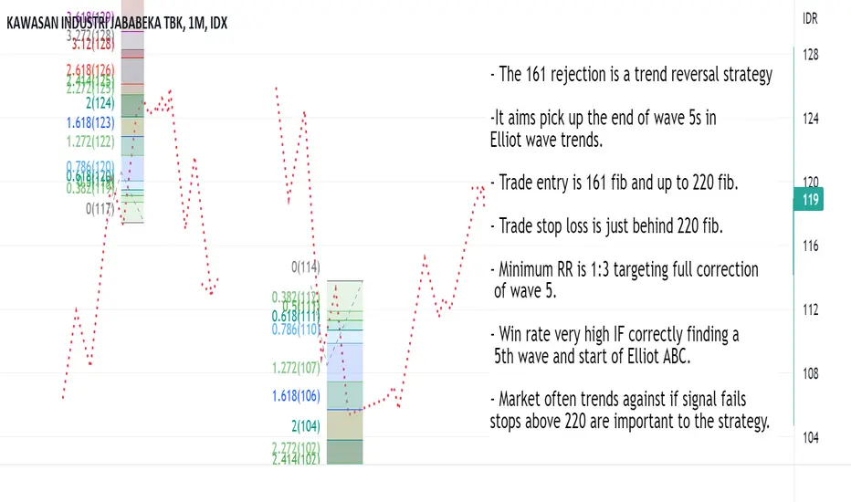
161 Rejection Strategy Strategy Name: 161 Rejection
Type of strategy: A reversal strategy.
Conditions for use: This strategy is used if there are valid Elliot wave trend legs. It is used to attempt to trade the reversal of wave 5 into the ABC correction.
Drawing the fib swing:
In Elliot wave, there should be a consistent trend and then this starting to get a bit more messy. The messy stuff will usually have a false reversal. A range and breakout of the range making it look like the trend has ended. From this there will come another big trend leg (Wave 5).
We are able to draw our swing when we have seen:
A steady trend with few dips. Starting to pick up pace.
The trend getting choppy and probably false reversals.
A new high/low being made in the trend.
Once we have these, we can fib the range and the 161 - 220 of this is our intended zone of entry for reversals. Also where we want to be protective of any profits we have from trading the trend. Even if not betting on reversal, it’s wise to trail stops tight into these levels. 161s can create reversals.
When a strong wave 3 has transitioned into a range and a pullback in the trend, this is when we can draw fibs on the pullback and look for this trade.
Basic strategy theory:
In the guidelines for Elliot wave 161 extensions are mentioned as a common ending point. And if you go through lots of examples of reversals you’ll probably come to see that has a point. Strategy is based loosely on that Elliot wave guideline. That it should be obvious seeing the hyper strong wave 5 into 161 extensions if you draw them.
To make a guideline into a practical strategy we need to work out entry and exit criteria. In testing I’ve found the reversal usually will come from the 161 or close to the 220. Sometimes just kissing the 220 fib. In most instances price is able to break the 220 the planned trade will fail. That’s why the stop is there.
Things we usually see before the strategy trades:
An early spot to notice this setting up is late into wave 3. Late into wave 3 the trend in question will be getting a lot of attention. You should look for strong trends that seem to be getting stronger and if it’s a big move there should be a lot of public chatter about it and forecasts getting increasingly more optimistic.
This obviously strong trend should transition into a messy range and/or sharp pullback. Then there should be the fastest move of the trend so far when this pullback reverses. Confidence in the trend should be ultra high and price should be consistently trending up to the 161.
Thing we usually see when strategy is not working (Stop loss conditions):
This is a great strategy when it works but it fails when used in the wrong part of a move in a big way. The rules for this strategy are price reverses at or before 220 fib. When it fails we either break the 220 and head into a strong trend or we go a bit over, make pullback smaller than we were targeting and the 220 make big break next time.
It’s best to stop out over the 220 in case a big trend move comes. Unfortunately, it’s also the case that a lot of time price will go just over the 220 and then pullback. It won’t be the target swing the trade was taking, but it would have put the trade in profit. Which means you can stop out at the worst time.
After a 220 break the probability of a bigger pullback decrease. It’s usually better to switch to following the trend and enter into any big pullbacks retesting previous support/resistance levels. Which is worth noting, it’s tempting to enter again if stopped out and it looks like it’s working. Often a trap.
Strategy strengths: Can be very high risk:reward. Helps a lot with protecting profits in a running trend trade. When this is working once the swings targeted start they are often strong and smooth and easy to take close to the full value of the move. Trailing stops do not hit and big profit targets can.
Strategy weaknesses: When used in a move that is not forming a wave 5 (For example using it through wave 3) this strategy generates false signals that price will usually trend against. Losses not cut can be devastating. Entries can sometimes be spiked out at the end of a move just over the 220 fib.
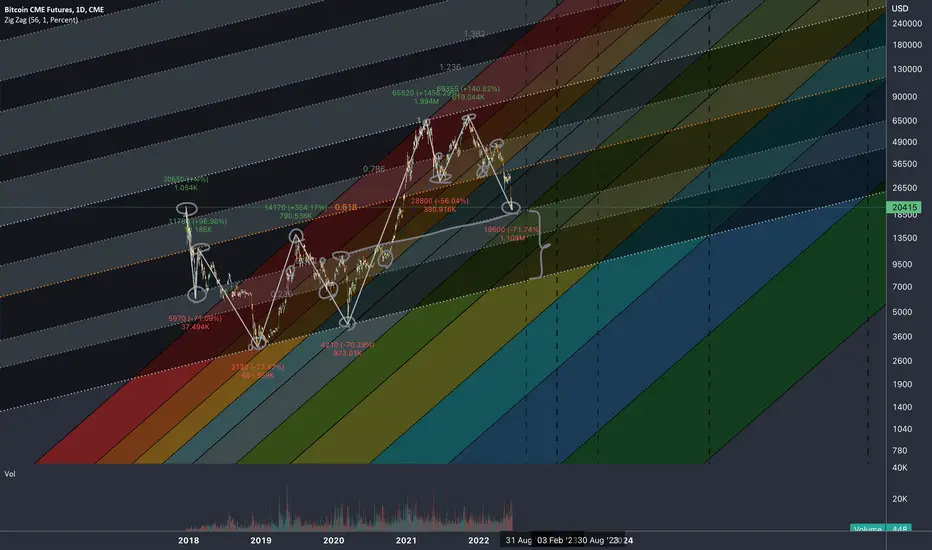
Quantum Mechanics in Financial MarketsWave–particle duality is the concept in quantum mechanics that every particle or quantum entity may be described as either a particle or a wave.
Basically has 2 types of behavior.
Duality concept is present in Financial Markets
We have 2 directions of outcomes of the market activity.
UP and Down assumed as Bulls and Bears
Whatever we see on a chart is nothing but outcome of Interference of Bulls and Bears in a given TIME.
Indeed at given price we have certain confrontation of 2 forces. Like a spin of a particle, it has 2 CHARGES when MEASURED at given point of TIME: Positive and Negative.
Wave dualism are applied to fractal with fibonacci ratios.
These ratios are used irregularly in my analyses not by a chance.
Just like the alternation of the dim and contrasting bright colors are used to simulate the Quantum Phenomena.
The steeper the angle of incline of fibonacci channels the more it is related to TIMING of the Fractal.
We witnessed in my number of ideas how Fibonacci ratios work well with reversals.
The direction of fib channels covers the MOMENTUM of the market representing the dualism of the market inside ratios.
Behavior of masses rhymes on lines of Fibonacci Channels which shows interconnectedness of critical points of the market activity.
Peaks and Bottoms must be indexed with fibonacci ratios and adjusted to golden ratio to make sense out of bits waves.
Crossing means a takeover of either of participants of the market activity.
EDUCATION - Types Of Confirmations 📚When trading, it is important to have confirmations. Confirmations are when price moves in a a particular way which tells us that our setup is valid and even, ready for entry.
We have 3 main types of confirmations.
1. Trendline Break
This confirmation is very simple yet very effective. When price is following a trend, you can often find that there's a trendline that can be placed. This trendline is used as a guide.
eg. When price stays below the trendline = bearish
when price goes above the trendline = bullish
Entry Method: Entry on break of the trendline with stops below the lowest price before the break
2. Break of structure
Price tends to test and respect significant price points.
e.g. We can draw a structure level when price rejects a certain price point and assume that when price stays below that level = bearish
When price breaks above that structure level = bullish
Entry Method: Entry on break of structure OR retest of that structure level
3. Moving Average Cross Over
Using 2 moving averages can help you ascertain whether price is bullish or bearish. In the crypto market, the 100 and 200 moving averages are often used.
eg. When the 100 moving average is below the 200 moving average = bearish
When the 100 moving average is above the 200moving average = bullish
Entry Method: Once there's a bullish cross over (100 over 200), we can assume price is bullish. We can look for pullbacks for entry
COMBINATION
Confirmations can be most reliable when more than one is used at the same time e.g. trendline break and break of structure.
Please note that these types of confirmations work with ALL market, whether it is Crypto or Forex.
See below for various examples of using confirmations when entering the market, particularly the crypto market.
BITCOIN
ETHEREUM
LITECOIN
Saveable post:

How To Analyze Any Chart From Scratch - Episode 6Hello TradingView Family / Fellow Traders. This is Richard, as known as theSignalyst.
Today we are going to go over a practical example on USDCAD, but you can apply the same logic / strategy on any instrument.
Feel free to ask questions or request any instrument for the next episode.
You can find the previous episodes below "Related Ideas"
Always follow your trading plan regarding entry, risk management, and trade management.
Good luck!
All Strategies Are Good; If Managed Properly!
~Rich

BID AND ASK BASICS📚
🔴In all markets, there is a price at which a market participant is willing to buy an asset and a price that suits the seller. At the same time, traders intend to carry out a purchase and sale transaction only within the amount that is profitable for them.
⚠️In the foreign exchange market, the ask line is the cost of buying an asset or the price that is set by the broker in the Buy order.
⚠️Bid - accordingly, the cost at which the broker opens a sell order when accepting an application for the sale of currency from a trader.
❗️The spread is the difference between ask and bid prices. To be more precise, the spread is the difference between the best bid and ask offers for a specific asset over a certain period. Thus, the spread is dynamic, changing over time. The spread value is formed by the initial value set by the broker, as well as due to the volatility of the currency. The spread can vary from 0.1 to 100 points.
✅In the market of physical goods, a similar example can be given: a seller and a buyer, haggling, narrow the difference between prices that satisfy them, bringing them to one at which they make a deal.
✅In the foreign exchange market, the spread between prices is the commission charged by the broker. It should be borne in mind that the broker takes a commission regardless of the volume of the transaction and its result.
❤️ Please, support our work with like & comment! ❤️

Palladium is bearish lately ⛷️Bearish Order Blocks Tutorial.
Bearish order block played out well with 1:8 RISK:REWARD!
