Heikin Ashi VS Regular candlesticks - EducationalNASDAQ:AMZN
Everything is explained in the video.
I hope you will find it very educational and test it. Those who trade stocks will probably switch to Heikin Ashi :)
Thank you!
Wave Analysis

Technical Analysis with Elliott Waves: A Combined ApproachHello friends, Welcome to RK Charts!
This Educational Post is based on technical analysis, specifically how to initiate analysis on a chart, and what points to consider. This is purely for Educational purposes.
This is not a trading or investing tip or advisory. Rather, it's a comprehensive guide on how to easily analyze a chart, intended for educational purposes. I hope that by reading and understanding this post, you'll gain valuable knowledge and insights. Your focused effort to understand this will surely provide you with something valuable and easy to grasp.
Let's dive in, During technical analysis, what we had observed certain points in this chart, I'm highlighting them here:
1. Resistance line breakout, where the price has closed above it.
2. The volume within that breakout.
3. The price closing above Weekly Exponential Moving Averages.
4. Elliott Wave Counts.
5. Projected Target along with Invalidation level as per Elliott Wave theory.
6. Projected Duration for Projected Targets.
Breakout of Resistance zone with Good Volume intensity:
So, friends, here we can clearly see on the chart that this is a weekly time frame chart of Shipping Corporation of India Limited. Over the last eleven months, from July 2024, the price has been falling, remaining largely bearish, but has now broken out of Curved Resistance Trendline for the first time with a bullish candle on Weekly (Closing basis), accompanied by good volume intensity.
Alongside this, the price has sustained and closed above Major EMAs:
- 50-Weekly Exponential moving average (red line plotted on the chart)
- 100-Weekly Exponential moving average (blue line plotted on the chart)
- 200-Weekly Exponential moving average (black line plotted on the chart)
on the weekly time frame.
Elliott Wave Theory:
Considering the Elliott Wave structure, if we look at it theoretically, the top it made on July 2024, was the completion of Wave III. After that, it completed Wave IV in 7 swings (WXY) and is now possibly moving higher, making higher lows. It has closed above the moving averages, broken out of the Curved Trendline, and has strong volume. So, possibly, we are unfolding an impulse Wave V.
In Elliott Wave Theory, the invalidation level means that the price should not go below that level, which in this case is the low of Wave IV at ₹130. If the price goes below that level for any reason, even by a single point, our wave counts will be invalidated, and we'll have to re-analyze the chart.
That's why we call it the invalidation level. Analysts and traders also refer to it as a stop-loss level. So, in Elliott Wave Theory, our wave counts remain valid as long as the price stays above the invalidation level and doesn't trigger it.
Now, regarding the target, if we take the measurement of Wave IV and calculate its 1.236 level, the target for Wave V should be above the high of Wave III. According to Elliott Wave Theory, the projected target for Wave V is near ₹440, which is the 1.236 Fibonacci level.
Projected Duration for Projected Targets:
In the chart analysis we conducted, where we prospectively projected a target, if everything goes right and the invalidation level is not triggered, what could be the duration of this target? It will definitely take more than a medium-term duration, maybe even a long-term duration.
This is because each candle represents a week, and we're currently looking at the weekly time frame. Since the fourth wave has just ended and the fifth wave is upcoming, it will take a long-term duration
I am not Sebi registered analyst.
My studies are for educational purpose only.
Please Consult your financial advisor before trading or investing.
I am not responsible for any kinds of your profits and your losses.
Most investors treat trading as a hobby because they have a full-time job doing something else.
However, If you treat trading like a business, it will pay you like a business.
If you treat like a hobby, hobbies don't pay, they cost you...!
Hope this post is helpful to community
Thanks
RK💕
Disclaimer and Risk Warning.
The analysis and discussion provided on in.tradingview.com is intended for educational purposes only and should not be relied upon for trading decisions. RK_Chaarts is not an investment adviser and the information provided here should not be taken as professional investment advice. Before buying or selling any investments, securities, or precious metals, it is recommended that you conduct your own due diligence. RK_Chaarts does not share in your profits and will not take responsibility for any losses you may incur. So Please Consult your financial advisor before trading or investing.

Pimp Your Indicators – A Smoothed Take on RSIYou don’t need to reinvent the wheel to find new and effective trading tools. Often, enhancing classic indicators with a few thoughtful modifications can yield surprisingly powerful results. Here’s a simple yet effective way to upgrade the RSI and turn it into a more actionable entry signal.
The Relative Strength Index (RSI) is a widely used oscillator that ranges from 0 to 100, providing a measure of upside momentum within a given timeframe. For example, an RSI reading of 60 implies a 60% upside dominance based on recent price action. Traditionally, traders interpret levels above 70 as overbought and below 30 as oversold. However, RSI on its own isn’t reliable as a standalone entry trigger. An overbought reading doesn’t necessarily mean the market is losing strength—it simply indicates recent data reflects a strong upward move.
Smoothed RSI Approaches
To extract more useful signals, we can enhance the RSI in a couple of simple but effective ways:
1. RSI vs. RSIMA (RSI Moving Average):
One approach is to smooth the RSI itself by calculating a moving average of the RSI (call it RSIMA), and then observe the difference between the RSI and its moving average. A positive difference suggests bullish momentum; a negative one, bearish. This approach reduces some noise but can still result in a choppy indicator, as seen in the subplot of the reference chart.
2. RSI on Smoothed Price (RSI5M):
A more refined method involves smoothing the price before calculating RSI. Specifically, apply a 5-period EMA (Exponential Moving Average) to the price series, then compute the RSI on this smoothed series—let’s call it RSI5M. The key insight is to then analyze the difference between RSI5M and the standard RSI. This difference creates a smoother, more robust signal that better captures market bias.
Why It Works
In uptrends, the EMA(5) smooths out short-term fluctuations and highlights the prevailing trend more clearly than raw price data. As a result, RSI5M tends to rise faster and higher than the standard RSI. The difference between the two becomes positive in uptrends and negative in downtrends, making it a useful gauge of directional momentum. This effect is illustrated in the lower subplot of the reference chart, where the smoothed signal offers a clearer view of market regimes.
Ready-to-Use Script
If you're not into coding, you can explore the public script of the Parsifal.RSI.Trend indicator on TradingView. It implements a slightly refined version of this smoothed RSI differential and provides a clean visual cue for trend bias.

How to read Speed Index and Identify Potential Reversals!In this chart we removed all Plutus signals and we are reading just Speed Index and weighted Averaged Speed Index. The purpose is to identify a potential reversal at a significant location such as Fib.
There are two numbers visible on every price wave swing, the first one is the wave's Speed Index and the second one is the weighted average Speed Index of the 30 waves back.
What do we need to identify for a potential reversal? The answer is Abnormal Speed Index compared to the weighted average Speed Index, which means that something is cooking.
Reading the chart:
- Look at highest volume up wave hitting the Fib area, Speed Index at 6.2 while the average at 5.0 , higher than the average but not too abnormal.
- The next down wave is where it gives you an Abnormal Speed Index of 10.4 with an average of 5.2. This is what we call their first Push Down, now definitely something is cooking.
- The next up wave has a Speed Index 10.4 (Abnormal) with an average of 5.2 and that's we call a Hard to Move Up Wave (HTMU).(by coincidence these two waves have the Speed Index and average Speed Index)
- Finally to make sure that all these were sellers we need price to break these waves.
To Summarize this is how we approach this Short trade (annotations are in sync with chart).
1. Fib Location (potential sellers might enter)
2. The highest volume up wave to get to Fib
3. Placed AVWAP at the beginning of this up wave, because we will go short if price goes below AVWAP with the appropriate Speed Index justification.
4. First Push Down wave with SI 10.4 with AvgSI at 5.2
5. HTMU (Hard to Move Up) wave with SI 10.4 with AvgSI at 5.2
6. Our entry Short breaking the structure of the previous waves and cross AVWAP downwards.
I hope this helps all you Weis Wave Speed Index owners. Enjoy!!!

Scalping and Swing Trading Strategies
A Guide to Optimizing on TradingView
Scalping and swing trading strategies are two popular trading approaches in Forex, OANDA:XAUUSD gold, and cryptocurrencies, enabling traders to capitalize on price movements for maximum profits. Scalping focuses on short-term trades with small gains, while swing trading targets longer-term trends. This article guides you on implementing these strategies on TradingView using tools like RSI, MACD, and Fibonacci. Let’s dive in to elevate your trading skills!
1. What is Scalping?
Scalping is a short-term trading strategy where traders execute multiple trades daily, capitalizing on small price movements (often a few pips). The goal is to accumulate small profits from numerous trades.
Timeframe: 1-minute (M1) or 5-minute (M5).
Suitable markets: Forex (EUR/USD, GBP/USD), gold (XAU/USD), or cryptocurrencies (BTC/USD).
Requirements: Quick reactions, strict risk management, and appropriate leverage.
Example: A scalper might buy EUR/USD when the price touches the lower Bollinger Band on an M5 chart and sell when it reaches the middle band.
2. What is Swing Trading?
Swing trading is a medium- to long-term strategy that captures “price swings” within larger trends. Traders hold positions for days to weeks to maximize profits from significant price movements.
Timeframe: 4-hour (H4) or daily (D1).
Suitable markets: Stocks, Forex, gold, and cryptocurrencies.
Requirements: Patience, trend analysis skills, and effective capital management.
Example: A swing trader might buy XAU/USD when the price hits the 61.8% Fibonacci level on an H4 chart and hold until it reaches the next resistance.
3. Why Use Scalping and Swing Trading Strategies on TradingView?
TradingView offers powerful tools to execute both strategies effectively:
Flexible price charts: Supports multiple timeframes and chart types (candlestick, Renko).
Technical indicators: RSI, MACD, Bollinger Bands, Fibonacci, and more.
Price alerts: Set notifications for when prices hit support/resistance levels.
Pine Script: Customize indicators or automate trading strategies.
Tip: Use TradingView’s “Replay” feature to test scalping or swing trading strategies on historical data.
4. Scalping Strategy on TradingView
4.1. Tools and Setup
Timeframe: M1 or M5.
Indicators:
Bollinger Bands (period 20, deviation 2).
RSI (period 14, overbought 70, oversold 30).
Trading pairs: EUR/USD, GBP/USD, or XAU/USD (due to high liquidity).
4.2. Trading Rules
Buy signal:
Price touches the lower Bollinger Band.
RSI <30 (oversold).
Confirmed by a reversal candlestick pattern (e.g., Doji).
Sell signal:
Price touches the upper Bollinger Band.
RSI >70 (overbought).
Confirmed by a reversal candlestick.
Risk management:
Set Stop Loss 5–10 pips below the nearest support.
Take Profit at 10–15 pips or when the price hits the middle Bollinger Band.
4.3. Example
On an M5 EUR/USD chart, if the price touches the lower Bollinger Band at 1.0850 and RSI <30, enter a buy order. Set Stop Loss at 1.0840 and Take Profit at 1.0865. Exit when the price reaches the middle band.
Image illustration: EUR/USD M5 chart with Bollinger Bands and RSI (optimize alt text: “EUR/USD scalping chart TradingView”).
5. Swing Trading Strategy on TradingView
5.1. Tools and Setup
Timeframe: H4 or D1.
Indicators:
Fibonacci Retracement.
MACD (12, 26, 9).
Moving Averages (MA50, MA200).
Trading pairs: XAU/USD, GBP/USD, or BTC/USD.
5.2. Trading Rules
Buy signal:
Price hits the 50% or 61.8% Fibonacci level in an uptrend.
MACD crosses above the signal line.
Price is above MA50.
Sell signal:
Price hits the 50% or 61.8% Fibonacci level in a downtrend.
MACD crosses below the signal line.
Price is below MA50.
Risk management:
Set Stop Loss below the nearest support (20–50 pips, depending on the pair).
Take Profit at the next resistance or a 1:2 risk-reward ratio.
5.3. Example
On an H4 XAU/USD chart, if the price hits the 61.8% Fibonacci level at $1,950 in an uptrend and MACD confirms a buy signal, enter a buy order. Set Stop Loss at $1,930 and Take Profit at $2,000.
Image illustration: XAU/USD H4 chart with Fibonacci and MACD (optimize alt text: “XAU/USD swing trading chart TradingView”).
6. Tips for Applying Scalping and Swing Trading Strategies
Combine with fundamental analysis: Economic news (interest rates, NFP reports) can impact prices, especially in Forex and OANDA:XAUUSD gold.
Backtest strategies: Use TradingView’s “Replay” mode to test strategies before live trading.
Manage emotions: Scalping requires intense focus, while swing trading demands patience. Choose the strategy that suits your personality.
Optimize costs: Scalping incurs high spread costs, so choose a broker with low spreads.
7. Conclusion
Scalping and swing trading strategies offer profitable opportunities in Forex, OANDA:XAUUSD gold, and cryptocurrencies, depending on your trading style. With TradingView’s powerful tools like Bollinger Bands, Fibonacci, and MACD, you can easily implement these strategies. Try scalping on EUR/USD or swing trading on XAU/USD today and share your results with the TradingView community! Sign up for TradingView to explore more features and optimize your trading.

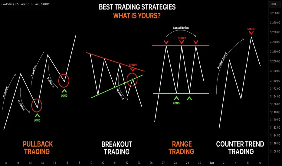
Learn the 4 Best Strategies to Maximize Your Profits in Trading
In the today's article, we will discuss 4 classic yet profitable forex and gold trading strategies.
1️⃣Pullback Trading
Pullback trading is a trend-following strategy where you open the positions after pullbacks.
If the market is trading in a bullish trend, your goal as a pullback trader is to wait for a completion of a bullish impulse and then let the market correct itself. Your entry should be the assumed completion point of a correctional movement. You expect a trend-following movement from there.
In a bearish trend, you wait for a completion of the bearish impulse, let the market retrace, and you look for short-entry after a completion of the retracement leg.
Here is the example of pullback trading.
On the left chart, we see the market that is trading in a bearish trend.
A pullback trader would short the market upon completion of the correctional moves.
On the right chart, I underlined the buy entry points of a pullback trader.
That strategy is considered to be one of the simplest and profitable and appropriate for newbie traders.
2️⃣Breakout Trading
Breakout trading implies buying or selling the breakout of a horizontal structure or a trend line.
If the price breaks a key support, it signifies a strong bearish pressure.
Such a violation will trigger a bearish continuation with a high probability.
Alternatively, a bullish breakout of a key resistance is a sign of strength of the buyers and indicates a highly probable bullish continuation.
Take a look, how the price broke a key daily resistance on a daily time frame. After a breakout, the market retested the broken structure that turned into a support. A strong bullish rally initiated from that.
With the breakout trading, the best entries are always on a retest of a broken structure.
3️⃣Range Trading
Range trading signifies trading the market that is consolidating .
Most of the time, the market consolidates within the horizontal ranges.
The boundaries of the range may provide safe points to buy and sell the market from.
The upper boundary of the range is usually a strong resistance and one may look for shorting opportunities from there,
while the lower boundary of the range is a safe place to buy the market from.
EURCAD pair is trading within a horizontal range on a daily.
The support of the range is a safe zone to buy the market from.
A bullish movement is anticipated to the resistance of the range from there.
Taking into considerations, that the financial instruments may consolidate for days, weeks and even months, range trading may provide substantial gains.
4️⃣Counter Trend Trading
Counter trend trading signifies trading against the trend.
No matter how strong is the trend, the markets always trade in zig-zags. After impulses follow the corrections , and after the corrections follow the impulses.
Counter trend traders looks for a completion of the bullish impulses in a bullish trend to short the market, and for a completion of bearish impulses in a downtrend to buy it.
Here is the example of a counter trend trade.
EURJPY is trading in a bullish trend. However, the last 3 bearish moves initiated from a rising trend line. For a trader, shorting the trend line was a perfect entry to catch a bearish move.
Such trading strategy is considered to be one of the most complicated , because one goes against the crowd and overall sentiment.
With the experience, traders may combine these strategies.
❤️Please, support my work with like, thank you!❤️
I am part of Trade Nation's Influencer program and receive a monthly fee for using their TradingView charts in my analysis.
PEPE - This is why price explode - Speed Index ReadingThere is always a reason why price explodes either true or fake. The criteria to look at are:
- Location - very important - where is the price locate - higher probability trades accomplished when the price leaves a significant location such us Fib, Sup/Res, AVWAP
- The volume waves - nothing moves without volume - sometimes is not so visible by the volume waves alone because they distribute or accumulate little by little, that's why we have Speed Index
- Reading Speed Index
- The proper entry signal
In the attached chart I will demonstrate how I read it using the above criteria (annotations are in sync with the chart):
1. Price entering Fib Area 50-61.8 - possibility of buyers to come in
2. Price touching AVWAP (three blue lines) coming from the bottom of a previous swing acting as resistance - another possibility of buyers to come in.
3. Speed Index 6.4, that's an abnormal speed index , that what I call first push up or PU, price never drops below the beginning of this wave
4. Speed Index 11.1, that's another abnormal speed index and that's what I call a hard to move down (HTMD) . What's happening here is that all the sell orders are absorbed by buy orders and price breaks on the up wave the origin of the HTMD wave.
5. Finally the entry Long with a PRL (Plutus Reversal Long) signal an up,up,up, we go!!!
I hope my years of work helps you out on reading charts!
Enjoy!

LTC Long - Learn to read Weis Wave with SI- Target hit overnightLearning to read the chart using Weis Wave with Speed Index will help you understand how the market works. Speed Index is very valuable to understand if there is absorption happening in the market. Remember that absorption takes time, it takes hours or sometimes days, so you have to be patient. In this chart I will explain how to read this 1HR LTC chart using Speed Index and why we had this explosion in price. I have entered long (my target was hit overnight). Annotations on chart are in sync with my below notes.
Reading:
1. We had a high volume down move (buyers could be in there but I am not sure yet)
2. We have touched 50-61.8 Fib area - If buyers would like to enter this is a great area.
3. Speed Index 29 that's an Abnormal Speed Index. Why is it abnormal? Because at that time the average Speed Index of 30 waves back was 15. I call this as the first Push or the first absorption. Buyers are entering.
4. Speed Index 78.7 another abnormal SI -> more buying
5. Speed Index 37 on a down wave that's what I call a HTMD (Hard to move down) more buying and finally a PL (Plutus Long signal) breaking by a bit the previous resistance level. This is where I have Entered Long.
6. Another HTMD , hard to move down wave with Speed Index 32.2, more buying and another Plutus long signal PRL.
Therefore the explosion is completely justified because it has a history of several hours of absorption. If you were to read just volume waves you would not be able to see this coming Speed Index alerts that something is cooking and when the time is right you enter (PL signal)
I hope my above explanations helped you.
Enjoy!

Bitcoin Stabilizes at $94,000 — What's Next?Following a strong rally in early 2025, Bitcoin is now showing signs of stabilization, hovering around the $94,000 mark. For a notoriously volatile asset, this steady price movement might seem unusual. However, this calm may be the calm before the storm—either a breakout or a pullback. So, what’s behind this current phase of Bitcoin’s price?
Firstly, all eyes are on the U.S. Federal Reserve. Investors are nervously anticipating its next interest rate decision. As always, monetary policy acts as a major catalyst for risk assets. A rate cut could boost inflows into the crypto market, while a hike might lead to capital outflows and dampen sentiment.
Secondly, retail investor activity appears to be cooling. Trading volumes have declined compared to the high levels seen in February and March, when the market was filled with euphoria. Now, we are witnessing a period of cautious waiting. The "Fear and Greed Index" reflects this, hovering around neutral territory, indicating market indecision.
From a technical standpoint, analysts identify two key levels: strong resistance near $100,000 and a support zone around $90,000. As long as Bitcoin remains within this range, short-term traders are operating in a sideways market while longer-term investors remain on standby.
Beyond macroeconomic factors, crypto-specific developments will also influence BTC’s price. Important upcoming events—such as Ethereum’s upgrade, potential regulatory changes in the UK and Japan, and global crypto conferences—could all act as catalysts.
Institutional investors are another major factor. Companies like MicroStrategy continue to accumulate Bitcoin, adding confidence to the asset’s long-term outlook. If more institutions follow suit, Bitcoin could see increased demand and stronger bullish momentum.
In the near term, market participants are advised to stay cautious. Bitcoin may continue consolidating until a clear macro or market-specific catalyst emerges.
All in all, $94,000 is more than just a number. It represents a temporary equilibrium of forces—bullish and bearish. The question is not whether Bitcoin will move again, but when and in which direction.

This is how to read the chart using Weis Wave with Speed IndexReading the chart:
1. We have bottom down and we pull back with high up volume waves, approaching the Fib area. Notice how SI is increasing on the up waves as we are reaching Fib from 13.3 to 15.7 to 18.4 and last not able to break previous resistance at 20.4. This means sellers are absorbing all buy orders of people entering long thinking that the trend will continue.
2. Notice the up volume wave with SI 20.4 and respective pip move right above it which is small compared to the amount of volume used - This is absorption.
3. The highest PVR bar at the beginning of the down wave - more sellers
4. Entry Short on the Plutus Short signal
Notice all the Short signals following confirming the continuation of the down move!
Simple as that, if you are able to read the chart and not just following signals from an indicator.
Enjoy!

Learn KEY PRINCIPLES of Technical Analysis in Gold Forex Trading
In the today's article, we will discuss the absolute basics of trading - 3 key principles of technical analysis in Forex & Gold Trading.
1️⃣History Repeats
History tends to repeat itself in the Forex market.
Certain trends are cyclical and may reemerge in a predictable manner, certain key levels are respected again and again over time.
Take a look at the example:
Silver perfectly respected a historical horizontal resistance in 2011 that was respected in 1980 already. Moreover, the price action before and after the tests of the underlined zone were absolutely identical.
2️⃣Priced In
All relevant information about a currency pair: economical and political events, rumors, and facts; is already reflected in a price.
When the FED increased the rate 26th of July by 25 bp, EURUSD bounced instead of falling. Before the rate hike, the market was going down on EXPECTATIONS of a rate hike. The release of the news was already price in.
3️⃣Pattern DO Work
Some specific price models can be applied for predicting the future price movements.
Technicians strongly believe that certain formations - being applied and interpreted properly, can give the edge on the market.
Depending on the trading style, different categories of patterns exist: harmonic patterns, price action patterns, wave patterns, candlestick patterns...
Above, I have listed various price action patterns that are applied by many traders and investors as the main tool for analyzing the financial markets.
If you believe in these 3 principles, you are an inborn technician!
Study technical analysis and learn to apply these principles to make money in trading.
b]❤️Please, support my work with like, thank you!❤️
I am part of Trade Nation's Influencer program and receive a monthly fee for using their TradingView charts in my analysis.

Gravions IG: Why Apple's Shift to India Could Trigger a Drop in Apple is betting heavily on changing its production geography, planning to move a significant portion of iPhone assembly from China to India by 2026. Analysts at Gravions IG have assessed the situation and concluded that this move could negatively impact the company’s stock value in the near term.
Key Risks of Production Relocation
Indian manufacturing facilities, although growing rapidly, have not yet achieved the level of quality and logistical efficiency seen at Chinese plants. Gravions IG emphasizes that reconfiguring production processes takes time, and potential disruptions in supply chains or reduced quality in the early batches could trigger dissatisfaction among consumers and partners.
According to their analysis, the transition could increase product costs and squeeze profit margins, putting pressure on Apple’s financial results over the next few quarters.
Investor Reactions
Current market behavior reflects investor caution: Apple's share price has already fallen nearly 17% since the start of the year, with technical indicators suggesting further declines. The formation of a "death cross" — where the 50-day moving average crosses below the 200-day moving average — heightens concerns about a prolonged downtrend.
Gravions IG stresses that until the Indian production lines are fully operational and stable, Apple's stock will likely remain under selling pressure.
Strategic Perspective: Opportunity or Risk?
In the long run, diversifying manufacturing could benefit Apple by reducing its dependence on China and insulating it from potential geopolitical or economic shocks. Additionally, the Indian government's efforts to bolster its manufacturing sector could provide Apple with a stronger foundation for future expansion.
Still, Gravions IG insists that until Indian facilities reach consistent quality and scale, Apple will be vulnerable to market sentiment swings and potential reputational risks.
Conclusion
Relocating production is a strategically sound but high-risk move for Apple in the short term. Gravions IG advises investors to closely monitor product quality and supply chain stability in India before making long-term investment decisions regarding Apple's stock.

Solvery IG Predicts Bitcoin to Reach $105,000 by May 10, 2025The cryptocurrency market continues to surprise even the most seasoned investors. Against this backdrop, the analytical firm Solvery IG has released an ambitious forecast: according to their calculations, Bitcoin's price could reach $105,000 by May 10, 2025.
Factors Supporting Bitcoin's Growth
In recent months, the market has shown strong positive momentum. Several key factors have contributed to this trend:
Institutional Investments: Major banks, funds, and corporations are increasingly incorporating Bitcoin into their portfolios as a hedge against risks.
Macroeconomic Instability: Inflationary pressures and weakening fiat currencies are driving investors to seek alternative assets.
According to Solvery IG experts, it is the combination of these factors that creates a "perfect storm" for the continued growth of the leading cryptocurrency.
Analysis and Potential Risks
Despite the optimistic forecast, potential threats should not be overlooked. The cryptocurrency market remains highly volatile. Possible tightening of regulations in the U.S. and Europe, as well as sudden shifts in Federal Reserve policies, could exert downward pressure on the market.
Nevertheless, Solvery IG highlights a crucial technical point: according to their data, Bitcoin has successfully held above key support levels between $60,000 and $65,000. This indicates strong buyer sentiment and supports expectations for a continued upward trend.
The impact of the halving event, which occurred in April 2024, should also be taken into account. Historically, Bitcoin has shown significant growth 12–18 months following a halving, and the current market behavior aligns closely with these cyclical patterns.
What This Means for Investors
If Solvery IG’s forecast comes true, Bitcoin would achieve more than a 50% increase compared to current levels. This presents significant opportunities for long-term investors. However, experts advise exercising caution, diversifying risks, and avoiding allocating all funds to a single asset.
Cryptocurrencies remain high-risk instruments, and successful investing requires a deep understanding of the market and a realistic assessment of all potential scenarios.
Conclusion
Solvery IG’s prediction of Bitcoin reaching $105,000 by May 10, 2025, sounds promising, especially given the positive momentum in recent months. However, investors should always remember: high returns come with high risks.

How to use Correlation for your tradingHello,
Understanding correlation is key to elevating your trading success for two main reasons:
Avoid Trading Against Yourself: When you buy one asset and sell another that is positively correlated, you risk offsetting your gains with losses. This often results in a zero-sum outcome, as one trade may profit while the other incurs a loss. Recognizing correlated pairs helps you avoid this pitfall and trade more strategically. Using the chart below its clear that it will be unwise to sell GBPUSD while buying EURUSD since both pairs move in the same direction.
Capitalize on Lagging Pairs:
Identifying correlated pairs and their movement patterns enables smarter trading decisions. By spotting which pair tends to lead and which lags, you can focus on trading the lagging pair to increase your probability of success. While risks remain, this approach allows for more calculated and potentially profitable trades.
The charts provided illustrate the positive correlation between GBPUSD and EURUSD, showing how they move in tandem. This insight allows you to confidently buy or sell one pair based on the movement of the other, optimizing your trading strategy.
Goodluck in your trading.
Disclosure: I am part of Trade Nation's Influencer program and receive a monthly fee for using their TradingView charts in my analysis.

Elliott Wave Principles: A Study on US Dollar IndexHello friends, today we'll attempt to analyze the (DXY) US Dollar Index chart using Elliott Wave theory. Let's explore the possible Elliott Wave counts with wave Principles (Rules).
We've used the daily time frame chart here, which suggests that the primary cycle degree in Black weekly wave ((A)) and ((B)) waves have already occurred. Currently, wave ((C)) is in progress.
Within wave ((C)) in Black which are Weekly counts, Subdivisions are on daily time frame, showing Intermediate degree in blue wave (1) & (2) are finished and (3) is near to completion. Post wave (3), we can expect wave (4) up in Blue and then wave (5) down in Blue, marking the end of wave ((C)) in Black.
Additionally, within blue wave (3) Intermediate degree, we should see 5 subdivisions in red of Minor degree, which is clearly showing that waves 1 & 2 are done and now we are near to completion of wave 3 in Red. followed by waves 4 and 5, which will complete blue wave (3).
Key Points to Learn:
When applying Elliott Wave theory, it's essential to follow specific rules and principles. Here are three crucial ones:
1. Wave 2 Retracement Rule: Wave two will never retrace more than 100% of wave one.
2. Wave 3 Length Rule: Wave three will never be the shortest among waves 1, 3, and 5. It may be the largest most of the time, but never the shortest.
3. Wave 4 Overlap Rule: Wave four will never enter into the territory of wave one, meaning wave four will not overlap wave one, except in cases of diagonals or triangles.
Invalidation level is a level which is decided based on these Elliott wave Principles only, Once its triggered, then counts are Invalidated so we have to reassess the chart study and other possible counts are to be plotted
The entire wave count is clearly visible on the chart, and this is just one possible scenario. Please note that Elliott Wave theory involves multiple possibilities and uncertainties.
The analysis we've presented focuses on one particular scenario that seems potentially possible. However, it's essential to keep in mind that Elliott Wave counts can have multiple possibilities.
I am not Sebi registered analyst.
My studies are for educational purpose only.
Please Consult your financial advisor before trading or investing.
I am not responsible for any kinds of your profits and your losses.
Most investors treat trading as a hobby because they have a full-time job doing something else.
However, If you treat trading like a business, it will pay you like a business.
If you treat like a hobby, hobbies don't pay, they cost you...!
Hope this post is helpful to community
Thanks
RK💕
Disclaimer and Risk Warning.
The analysis and discussion provided on in.tradingview.com is intended for educational purposes only and should not be relied upon for trading decisions. RK_Charts is not an investment adviser and the information provided here should not be taken as professional investment advice. Before buying or selling any investments, securities, or precious metals, it is recommended that you conduct your own due diligence. RK_Charts does not share in your profits and will not take responsibility for any losses you may incur. So Please Consult your financial advisor before trading or investing.

Elliott Wave Analysis of DLF: A Technical PerspectiveHello friends, let's analyze the DLF chart on a daily time frame. Currently, we're observing a corrective phase, where the stock has completed a flat correction pattern (A-B-C) with a 3-3-5 structure. Following this correction, we've seen a significant drop, accompanied by a strong double divergence in the RSI indicator. Where Fibonacci Retracement of last long Rally on Weekly is near 50% - 55% which is less than 61.8% should consider as a Healthy Retracement
As the price is currently moving upwards, completing wave counts, a breakout above the downward trend line would increase our conviction in the analysis.
This analysis is for educational purposes only and not a tip or advisory. If the price breaks out and stays above the trend line while maintaining the low of 601, we can expect further upside momentum. However, 601 would remain a crucial invalidation level, and a breakdown below it would require us to reassess our wave counts.
Key points:
1. DLF chart analysis on daily time frame
2. Flat correction pattern (A-B-C) with 3-3-5 structure
3. Healthy Retracement
4. Strong double divergence in RSI indicator
5. Breakout above trend line increases conviction (Which is pending yet)
6. 601 as invalidation level
Please note that this is a Educational technical analysis post and not a recommendation to buy or sell.
I am not Sebi registered analyst.
My studies are for educational purpose only.
Please Consult your financial advisor before trading or investing.
I am not responsible for any kinds of your profits and your losses.
Most investors treat trading as a hobby because they have a full-time job doing something else.
However, If you treat trading like a business, it will pay you like a business.
If you treat like a hobby, hobbies don't pay, they cost you...!
Hope this post is helpful to community
Thanks
RK💕
Disclaimer and Risk Warning.
The analysis and discussion provided on in.tradingview.com is intended for educational purposes only and should not be relied upon for trading decisions. RK_Charts is not an investment adviser and the information provided here should not be taken as professional investment advice. Before buying or selling any investments, securities, or precious metals, it is recommended that you conduct your own due diligence. RK_Charts does not share in your profits and will not take responsibility for any losses you may incur. So Please Consult your financial advisor before trading or investing.

This is where money is made — in the retrace, not the rally. Strategy Recommendation
Wait for:
Rejection or bullish reversal pattern in Buy Zone.
CHoCH or BOS in LTF (1H/4H).
Target: 1.1600–1.2000 supply zone (wave v completion).
Risk Management: Below the But Zone or trendline break.

Monitor Price action with Trendlines / Gan Fan*And over here, Sir/Madam, we have the 3.5L six-cylinder, 800-horsepower, 95-cubic feet
truck with a diesel engine. It goes 0 to 60 in 0.5 seconds and comes fully equipped with an 18-foot lift kit and did I mention the 80 inch strobe lights.”*
Some days, wave counting feels exactly like that—like you’ve been dragged to a dealership and hit with a barrage of numbers you didn’t ask for.
Information you have to painstakingly puzzle through.
All you really want to know is: Does it drive? *Where will it take me?*
That’s the heart of my wave counts. I don’t care about the extra fluff. I want clarity, direction, and purpose.
But doing the two-step between multiple asset classes—forex, indices, FANG stocks—feels like a dangerous tango. One where my precious money is on the line.
* *
There’s a Chinese proverb that sums it all up:
**“Life is really simple, but we insist on making it complicated.” — Confucius**
In this quick article, I’ll show you a dead-simple concept that can clear up your charts and your thinking. A quick read. Quick to understand. So for one night, you don’t have to do a dirty tango with crazy numbers.
**Cue: Gann Fans and Trend Lines.**
You’ve seen trend lines.
But have you seen *three*?
When you use three trend lines, you’re not just capturing the obvious. You’re measuring *acceleration*, *deceleration*, and *breakout momentum*. One line to show the base trend. One to catch the slowdown. And one to anticipate the breakout.
Pair that with s&r levels and suddenly you’re seeing *speed* and *time* like never before. A break of a key level or a sharp lift off your trend line isn’t random—it’s often the market shifting gears.
You didn’t think I’d drop all this without sprinkling in some wave counts, did you?
Welcome to the fiesta.
- Tango intensities*
Here’s where it ties in:
A **double bottom** formation near the end of a trend often isn’t just a reversal—it’s a *setup*.
What you’re likely seeing is a **Wave 3-4-5** squeeze into completion. That double bottom is the market catching its breath.
And when it breaks the trend line on the upside? That’s often the beginning of a brand new wave structure in the opposite direction.
If this breakout fails it is just as easy to exit the position with easy to identify stop out points.
It doesn’t have to be complicated.
Just structured.
Best,
Coi

LiteCoin (LTC) - Chart reading with Weis Wave with Speed Index
Lesson 15 Methodology:
1. Largest up volume wave at the bottom after while (probable buyers but let's confirm using AVWAP and Weis Wave with Speed Index and it's Plutus Signals.
2. Placed AVWAP at the beginning of the previous down wave and wait for price to pullback to it.
3. Price Respects AVWAP.
4. Abnormal Speed Index 40.8 is a sign that price has a hard time to move down.
5. Enter Long on PL signal.
... and up we go!!!!
Target Fib area which was reached!
No entries now - Fib could risky!

Trading A Divergence Trade (Breakdown) with Pivots and LiquidityTrading divergences was always a problem for me in the past. I did the same thing you did and got it wrong every time. I was trading divergences when i saw them instead of realizing a divergence is a flip of support and resistance levels. I just needed to know where they are.
In this video:
Internal vs External Pivot divergence confirmation:
You can have two types of pivots on your chart. One for long term and one for short term.
Using them to confirm short and long term price action is intuitive as youll be able to see the market squeezing on the short term while knowing where your long term price structure exists.
Price action to Divergence Confirmation:
A divergence on a short term pivot is an indication of short term loss of trend or reversal.
If the short term has no divergence but the long term does, you are about to end up with some pretty large price moves.
Youll be confirming the divergence by looking for highs, lows, and closes moving the wrong way from current price action.
This video will give you a method you can use to draw out your support zone / resistance zone / divergence zone and use them to your advantage.
The "Divergence Zone" that you draw out is the very reason why so many people fail at divergences.
Bare in mind that when you have a divergence, support and resistance are on the WRONG sides as their normally are so you'll learn here how to find those zones as well.
Then in the end of the video ill show you how to use lower timeframes to confirm the new move of the market.
Thanks, everyone. For coming through to the CoffeeShop.

Connecting Your Tickmill Account to TradingView: A Step-by-Step In this step-by-step guide, we’ll show you exactly how to connect your Tickmill account to TradingView in just a few seconds.
✅ Easy walkthrough
✅ Real-time trading from charts
✅ Tips for a smooth connection
Don’t forget to like, comment, and subscribe for more trading tutorials!
All Strategies Are Good; If Managed Properly!
~Richard Nasr

Swing Trading: Unique Features and StrategiesSwing Trading: Unique Features and Strategies
Swing trading stands out as a dynamic approach in the trading world, blending elements of both short-term and long-term strategies. In this article, we will explore the unique features of swing trading, including its reliance on technical analysis, the use of chart patterns, and the strategic timing of entries and exits. Whether you're new to trading or seeking to refine your approach, understanding the nuances of swing trading can provide valuable insights into navigating the financial markets.
The Basics of Swing Trading
Swing trading meaning refers to a style that involves holding short- and medium-term positions - usually from a couple of days to a few weeks - with the aim of capitalising on the “swings” in the market.
What is a swing trader? A swing trader’s definition is simple: swing traders are those who typically enter and exit markets at significant support and resistance levels, hoping to capture the bulk of expected moves.
These traders tend to look at hourly to weekly charts to guide their entries, although the timeframe used will depend on the swing trader’s individual approach and the asset being traded. Swing trading can be used across all asset classes, from stocks and forex to cryptocurrencies* and commodities. In the stock market, swing trading can be especially effective, as stocks tend to experience high volatility and are subject to frequent news and events that can drive prices.
Swing traders predominantly use technical analysis to determine their entries and exits, but fundamental analysis, like comparing the interest rates of two economies, can also play a significant role. It can help determine a price direction over the course of days or weeks.
Swing Trading vs Other Styles
To better understand the unique features of swing trading, let’s compare it with our styles.
Position trading involves holding trades for weeks and months, focusing on capturing long-term trends. Position traders are less concerned with short-term fluctuations and are more likely to use fundamental analysis, such as economic data and company earnings, to make their decisions. This style requires patience and a long-term perspective, with fewer trades but potentially larger returns per trade.
Swing trading involves holding trades for several days to a few weeks, aiming to capture short- and medium-term price movements within a larger trend. This style balances the need for active market participation with the flexibility to not monitor trades constantly. Swing traders primarily rely on technical analysis to identify entry and exit points, focusing on chart patterns and indicators.
Day trading requires traders to buy and sell assets within the same trading day, often holding positions for just minutes or hours. The goal is to capitalise on intraday price movements, and traders close all positions before the market closes to avoid overnight risk. This style demands constant market monitoring and quick decision-making, with a strong reliance on real-time technical analysis.
Scalping is an ultra-short-term trading style where positions are held for seconds to minutes, aiming to make small profits on numerous trades throughout the day. Scalpers rely almost entirely on technical analysis and need to act quickly, often executing dozens or hundreds of trades daily. The focus is on high-frequency trading with very tight stop-losses, requiring intense concentration.
Swing Trading: Benefits and Challenges
Although swing trading provides numerous opportunities which makes it popular among traders, it comes with a few challenges traders should be aware of.
Benefits:
- Lower Time Commitment. One of the most significant benefits for swing traders is the reduced time commitment. This style can be adapted to suit a trader’s individual schedule.
- Flexibility. It is often more flexible than other styles. Not only does it offer time flexibility, but it allows for a wider range of tools to be used to determine price swings. Also, it can be applied to many assets. The most common is swing trading in forex and swing trading in stocks.
- Technical Analysis Focus: Utilises technical indicators and chart patterns to identify entry and exit points, providing clear criteria for decision-making.
- More Opportunities Compared to Long-Term Techniques. Because swing traders usually hold positions for a few days to a few weeks, they have the ability to take advantage of shorter-term market movements that might not be reflected in longer-term price trends.
Challenges:
- Exposure to Overnight Risk. Positions held overnight or over weekends can be affected by unexpected news or events, leading to potential gaps or adverse price movements.
- Requires Patience: Effective swing trading requires waiting for trades to develop over days or weeks, which may test a trader's patience.
- Market Volatility: Performance can be impacted by periods of low volatility or choppy markets, where price movements may not align with your expectations.
Popular Tools to Use When Swing Trading
The effectiveness of a swing traders’ strategies will ultimately depend on their ability to correctly identify price movements. For this, traders use different chart patterns and technical indicators. Here are three common tools that can be used as part of a swing trading strategy.
Channels
Traders can use channels to take advantage of well-identified price trends that play out over days and weeks. To plot a channel, you first need to identify a trending asset that’s moving in a relative zig-zag pattern rather than one with large jumps in price. Traders will often use the channel to open a swing trade in the direction of the trend; in the example above, they might look to buy when the price tests the lower line and take profit when the price touches the upper line of the channel.
Moving Averages
Moving averages (MAs) are one of the commonly used indicators and they can help swing traders determine the direction of the trend at a glance. The options here are endless:
- You could pair fast and slow moving averages and wait for the two to cross; this is known as a moving average crossover. When a shorter MA crosses above a longer one, the price is expected to rise. Conversely, when a shorter MA breaks below a longer one, the price is supposed to decline.
- You could stick with one and observe whether the price is above or below its average to gauge the trend. When the price is above the MA, it’s an uptrend; when it’s below the MA, it’s a downtrend.
- You could use an MA as a support or resistance level, placing a buy order when the price falls to the MA in an uptrend and a sell order when it rises to the MA in a downtrend.
Fibonacci Retracements
Lastly, many swing traders look to enter pullbacks in a larger trend. One of the most popular ways to identify entry levels during these pullbacks is the Fibonacci Retracement tool. Traders typically wait for a shift in price direction, then apply the tool to a swing high and swing low. Then, they enter at a pullback, usually to the 0.5 or 0.618 levels, to take advantage of the continuation of the trend. As seen above, this strategy can offer entry points for those looking to get in early before a trend continues.
The Bottom Line
Swing trading stands out for its ability to balance the demands of active trading with the flexibility of longer-term investing. The unique features of swing trading, such as its moderate holding periods and strategic use of technical indicators, allow traders to potentially manage risk and adapt to various market conditions. Embracing swing trading strategies can help traders refine their approach. As with any trading style, continued learning and disciplined execution are key to achieving consistent results.
FAQ
What Is Swing Trading?
Swing trading is a style that involves holding positions over a period of several days to weeks to take advantage of price movements within a trend. Swing traders use technical analysis, including chart patterns and indicators, to identify potential entry and exit points, balancing the need for active participation with a longer-term perspective.
What Is Swing Trading vs Day Trading?
Swing trading and day trading are distinct methods. The former focuses on capturing price movements over several days to weeks, allowing for less frequent trading and requiring less constant market monitoring. In contrast, the latter involves buying and selling assets within the same trading day, often holding positions for minutes or hours, and requires continuous market observation and quick decision-making.
What Is the Downside of Swing Trading?
The downsides of swing trading include exposure to overnight and weekend risks, as positions held outside market hours can be affected by unexpected news or events. Additionally, this method requires patience and discipline, as trades may take time to develop, and performance can be impacted by periods of low volatility or choppy markets.
*Important: At FXOpen UK, Cryptocurrency trading via CFDs is only available to our Professional clients. They are not available for trading by Retail clients. To find out more information about how this may affect you, please get in touch with our team.
This article represents the opinion of the Companies operating under the FXOpen brand only. It is not to be construed as an offer, solicitation, or recommendation with respect to products and services provided by the Companies operating under the FXOpen brand, nor is it to be considered financial advice.

Dogecoin Daily Chart Analysis: A Fresh Start Ahead ?Hello friends, let's analyze Dogecoin, a cryptocurrency, from an Elliott Wave perspective. This study uses Elliott Wave theory and structures, involving multiple possibilities. The analysis focuses on one potential scenario and is for educational purposes only, not trading advice.
We're observing the daily chart, and it appears we're nearing the end of Wave II, a correction. The red cycle degree Wave I ended around 2024 December's peak. Currently, we're nearing the end of red Wave II, which consists of black ((W)), ((X)), and ((Y)) waves. Black ((W)) and ((X)) are complete, and black ((Y)) is nearing its end.
Within black ((Y)), we have Intermediate degree blue (W), (X), and (Y) waves. Blue (W) and (X) are complete, and blue (Y) is nearing its end. Inside blue (Y), red A and B are complete, and red C is nearing its end. Once red C completes, blue (Y) will end, Once blue (Y) completes, means black ((W)) will end that means higher degree cycle wave II in red will end.
If our view remains correct, the invalidation level for this Elliott Wave count is 0.04913. If this level holds and doesn't touch below it, we can expect a significant reversal to unfold wave III towards new highs. This is an educational analysis, and I hope you've learned something by observing the chart and its texture.
I am not Sebi registered analyst.
My studies are for educational purpose only.
Please Consult your financial advisor before trading or investing.
I am not responsible for any kinds of your profits and your losses.
Most investors treat trading as a hobby because they have a full-time job doing something else.
However, If you treat trading like a business, it will pay you like a business.
If you treat like a hobby, hobbies don't pay, they cost you...!
Hope this post is helpful to community
Thanks
RK💕
Disclaimer and Risk Warning.
The analysis and discussion provided on in.tradingview.com is intended for educational purposes only and should not be relied upon for trading decisions. RK_Charts is not an investment adviser and the information provided here should not be taken as professional investment advice. Before buying or selling any investments, securities, or precious metals, it is recommended that you conduct your own due diligence. RK_Charts does not share in your profits and will not take responsibility for any losses you may incur. So Please Consult your financial advisor before trading or investing.
