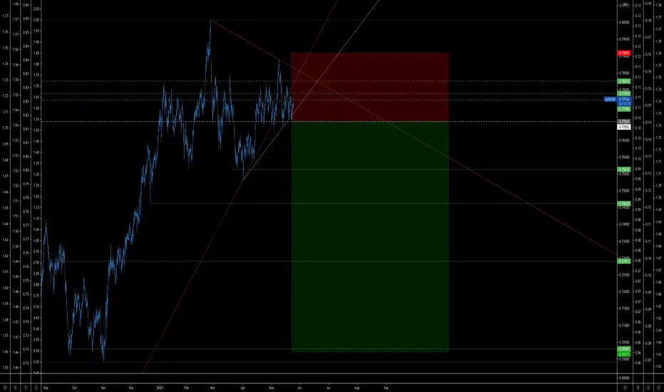
PLG 63% increase.PLG 63% increase. The analysis is based on an important ATR rule. It is the relationship between the ATR value and the resulting wave sequence. It is now accepted that the value of the ATR can give a predictive signal for subsequent movements. If the ATR is high, we expect high market volatility. What is less well known is the impact of ATR on the size of the wave sequence that will form later. The theory here is simple. The basic principle is : the percentage change in the ATR of the previous wave sequence gives the percentage size of the next wave sequence. In our case, this means that the size of the ATR change of the previous wave sequence is 23.71%. The size of the next corrective wave sequence will be 23.71% exactly according to the rule. Now we see this. We have reason to believe that the second wave section of 23.71% is the last corrective wave we saw. We therefore expect a rise from the local bottom of this. Even though the current fair value of PLG shares is 4.6 usd but the ATR based calculations give a primary target price of :7.6usd with a secondary target price of : 11.28 usd we are buying the stock considering the good return risk.
Wave Analysis

Wyckoff Basics part 2After my last educational wyckoff post - I had a lot of comments, questions and so on.
The idea was to post the basics and show the concept - there has been a lot of the overlay, breakdown and other people jumping on this. It was a move we called on the 18th of March (see the "they blew up the rocket" post).
In terms of some simple education, Wyckoff is deep and possibly too deep for newer traders. What I was trying to highlight was the existence of such techniques. In part one;
I only covered the point of how the distribution phase was playing out in Bitcoin.
In this post, I will share some additional depth - for those of you already familiar with Wyckoff techniques you already have this. So we are not covering here (volume, how to identify or any of the more advanced stuff or terms like creeks or mark-ups and downs) Just another simple intro to the basics & a step up from post one.
So if you have not seen the first post; check it out here by clicking the image.
4 Major types of schematics
The Accumulation and Distribution Schematics are a major part of Wyckoff’s work, These schematics are broken down into 2 patterns for accumulation and 2 for distribution. These sections are then divided into five Phases (A to E), along with multiple Wyckoff Events - we will cover this later.
Distribution schematics
So in the previous post & it was fortuitous that Bitcoin was a near textbook example of the distribution schematic #1.
The second type of distribution schematic looks like this;
As you can see, there are a lot of similarities & it can be confusing, but this is where it's best to dig deeper into the concept, why volume plays a big part in Wyckoff techniques and gain an understanding of the naming convention for each of the events inside.
** We have a naming convention key below **
Accumulation
As well as distribution you also have accumulation and this also has 2 (major) schematics;
#1
And #2
======================================================================================================================================
Key;
The first phase or ways to identify a schematic forming is with what is called a PS (Accumulation) or PSY (distribution) - this is basically the change of character as the trend moves towards a schematic; Preliminary Support (PS) and Preliminary Supply (PSY). The first significant reaction that occurs after a prolonged rally that
indicates budding supply showing up.
You then have a BC or SC - buyer climax / sellers Climax; the obvious BC in an uptrend suggesting institutional operators cashing out. and the inverse with the SC.
The next major event is the AR - Automatic reaction (rally) - The reaction that occurs after a Buying Climax. It occurs without previous preparation, hence the word “automatic.” and in layman terms it's the exit of large positions after a climax (SC and BC) event.
ST next - this is a second test (ST) A name given by Wyckoff to the reaction following Automatic Rally, (or rally following the Automatic reaction.) If that test is associated
with small range and light volume — it increases the likelihood that the previous trend is over.
Next a move down if it is accumulation would be a SOW - this is "Sign of Weakness" and inverse we have SOS "Sign of strength"
In distribution - you then have two major differences over the accumulation schematic; UT = Up Thrust and a UTAD = UP Thrust after Distribution.
For distribution you have a spring, think of this like the last drop before moving up rapidly out of a schematic on the Bullish side.
You then have "Test" phases usually of the support and resistance levels (zones) created by the schematic as shown in the images above.
And finally you have LPSY for distribution Last Point of Supply - A point at the end of the process of distribution where the Composite Man (Large operators) recognizes that demand forces have exhausted themselves and it is safe to start marking down prices.
Last Point of Support (LPS) which is the accumulation equivalent - A point at the end of the process of accumulation where the large operators recognizes that supply forces have exhausted themselves and it is safe to start marking up prices.
This is still only the basics, not looking at phases or volume or anything else yet. It's worth going away and studying this in a little more detail to get familiar with the concepts and terminology and in the next post I will cover the phases.
=======================================================================================================================================
I know a lot of you readers are here purely for the crypto/BTC calls made - and another logical reason we are still liking a slow move down at this level, comes in the current DXY situation. See this post below as to the current situation there. (the relevance might be small - But understanding the forces at work, with DXY to BTC. Is actually useful).
Shorter term strength = will aid BTC slow moves.
Disclaimer
This idea does not constitute as financial advice. It is for educational purposes only, our principle trader has over 20 years’ experience in stocks, ETF’s, and Forex. Hence each trade setup might have different hold times, entry or exit conditions, and will vary from the post/idea shared here. You can use the information from this post to make your own trading plan for the instrument discussed. Trading carries a risk; a high percentage of retail traders lose money. Please keep this in mind when entering any trade. Stay safe.

BTCUSD: 2 simplest strategies to buy & sell in any time frame1. Buy:
1.1. In any time frame we buy when price is seemingly plunging & RSI is gaining strength. Here we "MUST" watch only.
1.2. Then, a consolidation starts during which we can be almost sure that there will be no more descending move.
1.3. Being familiar with Harmonic Patterns during growth, consolidation & downturn cycles would of utmost help.
1.4. Next is a rhyming of HHs & HLs and RSI (14) is implicating the end of a previous cycle & the new coming one.
1.5. With RSI (2) you can see at least 2 very low figures less than 10 rising and falling followed by the 3rd HL which can be a trigger.
1.6. The latter is true in daily & weekly time frames when Elliot wave counting has been done. 2nd & 4th Elliot's Corrective waves out of 5 impulsive waves reacting to the most important corrective fib levels while price is so close to the "dynamic logarithmic support" of weekly time frame price channel.
2. Sell:
2.1. In any time frame, we sell when price is seemingly going higher while RSI (14) is getting weaker.
2.2. In weekly time frame price can touch or cannot touch the "dynamic logarithmic resistance" in the first nearest distance or a complete touch with price channel.
2.3. While in daily it is showing weakness specially in the second touch with channel.
2.4. This is most true when the latter is accompanied by price getting closer or touching "dynamic logarithmic resistance" of weekly price channel while in Elliots wave counting either 1st impulsive wave, or the 3rd & the 5th ones are formed.
2.5. This (RSI Weakness coinciding with the 1st, 3rd & 5th Elliots) can be rechecked by setting fib projection levels.
Volume & the total market index for weekly and daily time frames need to be checked as well. What has been said is very easy & obvious in a way while very complicated in another way. One needs to find its own trading/investing style which best suits his personal needs & capabilities.
Any strategy has to be addressed only if there is a plan in advance. A plan has a natural deviance from reality all the time & might not yield best returns on investment, but it guarantees survival & resiliency of the business.
This is for learning purposes only and is not a financial advice.

Trading Basics Part 1:How Candlesticks Work!
Hello,Traders!
Japanese Candlesticks are thought to have been invented by the Japanese rice traders
And then made their way into the West where they were used for stocks, forex and commodity trading.
Reading candlesticks is quite easy: the body represents an area that indicates the price distance between the open and close of the candle, while wick’s ends indicate the full magnitude of the movement in-between open and close. Thus, when picking the timeframe for your chart, you are deciding on how much time will be contained between open and close of each candle.
If open is below the close, the candle is bullish , and if open is above the close, the candle is bearish , which is usually represented by different colors of the bodies and wicks on the chart, typically, green and red.
Some of you might ask me, why am I explaining things that seems to be obvious and self evident, yet my experience of Coaching, paints a different picture, with thecandlesticks being undervalued and misunderstood by many, despite them being the staple of technical analysis .
In my trading strategy, which is based on multi timeframe top-down technical analysis ,
we examine multiple timeframes, from 1 week to 1 hour, going from higher to the lower timeframes. Looking for strong levels on weekly and daily and for patterns and confirmations on 4 hour and 1 hour charts. Which means that we are opening 1 week/1 day candle like a Russian doll, finding multiple candles inside the other. We enter the trade only if we are getting the same bias on all timeframes that were of our interest!
If you found my post helpful and interesting, please, like comment and subscribe!
Thank you!

How to Build up a Position Like a Pro!Hello Traders!
Green dashed lines represents Limit orders.
White Dashed line Is the original signal, a sell stop order below the last low.
Take profit levels are the green lines.
Stop loss is also could be a stop and reverse for an inverse head and shoulders pattern.
This helps you to eliminate FOMO.
Have a great day!
Regards,
Vitez
Example of Incorrect Elliott Wave CountingA commenter to my most recent SPX post asked why I didn't label the 09/02/20 peak as Intermediate wave (1).
The sub divisions of the SPX 03/23/20 to 09/02/20 movement can not be counted as an Elliott motive wave because the supposed third wave is the shortest of the three motive - sub waves.
Third waves can never be the shortest of the motive waves (1, 3, and 5).
Mark


Wyckoff Price Cycle ExplainedAccording to Wyckoff, the market can be understood and anticipated through detailed analysis of supply and demand, which can be ascertained from studying price action, volume and time. As a broker, he was in a position to observe the activities of highly successful individuals and groups who dominated specific issues; consequently, he was able to decipher, via the use of what he called vertical (bar) and figure (Point and Figure) charts, the future intentions of those large interests. An idealized schematic of how he conceptualized the large interests' preparation for and execution of bull and bear markets is depicted in the figure above. The time to enter long orders is towards the end of the preparation for a price markup or bull market (accumulation of large lines of stock), while the time to initiate short positions is at the end of the preparation for price markdown.

EURCAD NEXT MOVE ANALYSIS Price has been bearish for a couple of weeks now and we can now see a clear inverse H&S pattern formed on the 1h Tf. We are expecting a push to the upside upon seeing a divergence between price and RSI. price has also retraced to the 61.8% level of the current impulse. A lot of confluences for this trade to be a good one if not great. Good luck and even better RR ratio management.


Fib's channel, It's up to you how you will interpret itThere is a chance to go lower, be careful!
I like Fib's channel to predict next moves. Back in few weeks I was correct about moves of XRP but didn't published.
I saw that XRp gonna drop down to 1,3 and next to 1, what just happened last days, but instead earn money I lost much, cuz I thought that was for real too crazy that I could be right.
"Sometimes you eat the bear, and sometimes, well, the bear eats you."

Why The Rich Get Richer. It Is Your CHOICE
What is the difference between the rich vs poor mindset? How do the successful differ from the rest of us?
So many people do not obtain financial freedom because they do not have one thing: the right mindset . Everything starts with how you think about money, wealth, and success. It is not a matter of luck, birth, or connections.
The biggest differences between rich and poor people can be traced back to mindset, outlook, and behavior. The rich and the poor don’t only differ in how much they have in their pocket, but also in how they think. Rich people have a way of thinking that is different from poor and middle-class people.
They think differently about money, wealth, themselves, other people, and life . By doing so, you will have some alternative beliefs in your mind from which to choose. In this way, you can catch yourself thinking as poor people do and quickly switch over to how rich people think.
A positive attitude , focusing on doing the right thing overlooking good, becoming a continual learner and careful risk management are all differences between the rich and poor. This reduces their odds of becoming poor after disaster strikes, and it helps them achieve their financial goals over the long-term.
A rich mindset will tell you to be self-sufficient & build multiple streams of income. It will tell you to build a team of smarter people than you to leverage the efforts of talented people. The mindset of the rich is the most decisive reason why “the rich keep getting richer, while the poor get poorer.” Bill Gates has been quoted as saying, “If we weren't still hiring great people and pushing ahead at full speed, it would be easy to fall behind and become some mediocre company.”
So, which mindset do you have?
❗️Please, support this idea with like and comment!
Thank will help a lot!
Also, subscribe to my social networks,
the link is below!❗️

Eliot Wave Introduction: How To Think Like A Market Maker So guys this is An introduction to Eliot Theory, i was planing for it to be longer but it cut off on its own, tell me if you want to know more about this

MY best prediction on btc complete...as my old prediction btc rechead on spot..
after hit 2707.0 btc may go up but its hard to predict now we need to wait for some confirmation

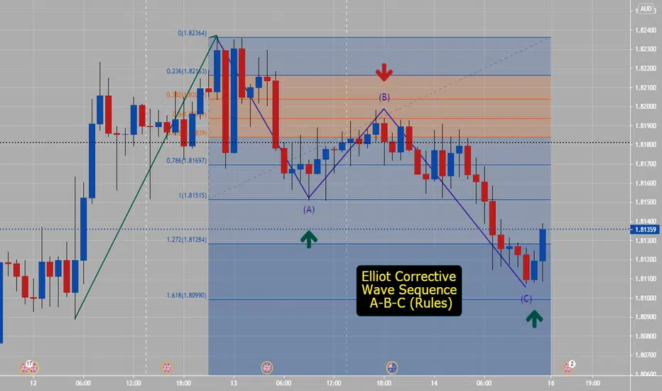
Elliot Correction Wave A-B-C (How To Draw)How to Construct A-B-C wave ?
The corrective wave sequence A-B-C has following Fibonacci rules:
Wave –A this is 0.618 retracement of the prior wave it must be against the prior trend. (Example: Trend was up)
Wave –B this is 0.618 retracement of wave – A and may expand till 1.272 retracement of the wave –A
Way To Get This Levels:
Wave A- To get Fib ret level- go from start of prior trend up(low point to high point on chart)- Price will drop to 0.618 level.
Wave B- To get 0.618 level - Take highest point on chart to bottom of A- price should retrace to Wave B level- this is a sell area which may expand to 1.272 level noted on Fib ret tool over example chart.
Please practice with how to construct 1-2-3-4-5 impulsive waves and how to construct A-B-C- waves on different time charts- if you are a beginner charts over 1 hour will be easier to see and practice on.. Look for entries during high liquidity and volume times of session- or in between end of Tokyo close to London close.
Trading a triangleI doubt that I am so fast to recognize the pattern but I think constant updating of 0-B or possible B-D trend lines can be helpful

Opening a profitable tradeI follow these simple steps to open a profitable trade. At worst cases you break even. I used to trade according to step 5 for several month but I was not profitable. At hourly time frames, I usually find 6 to 8 trades per week in the Forex market.
Please comment the post to improve this strategy, especially in terms of the use of RSI divergence.
Thank you

Be cautious! Inverse H & S at the end of wave A is a pitfallClassic tools are simple yet powerful tools but if and only if you know when to use them, otherwise they can be very misleading.
A good example of such pitfalls is inverse head and shoulders at the end of wave A. Traders who rely on this pattern regardless of its position in terms of Elliott waves may expect a new major high and become ready to make a nice profit but they get shocked by the market very soon in the case that they used inverse H&S at the end of wave A.
A clear example of this pitfall happened at the end of wave A on TSLA . Details are shown on the chart.
In fact, Head and Shoulders and inverse Head and Shoulders are nothing but some patterns forming in some types of Elliott wave cycles. You have to know when to use them. Inverse head and shoulders is a POWERFUL tool when you use it at the end of wave C .
I refer who may argue that this is an after the fact publication to my idea published on Apr 13th when most traders were bullish on TSLA. Link is also provided below.
Hope this to be useful and can help you in your trades.
Best wishes.

Why Ethereum?ETHEREUM
“The only thing that really worried me was the ether. There is nothing in the world more helpless and irresponsible and depraved than a man in the depths of an ether binge.”
Hunter S Thompson, Fear & Loathing in Las Vegas.
Why Ethereum?
Ethereum is an open-source platform based on blockchain technology, which allows new developers to create their own decentralized applications, called Smart Contracts.
Bitcoin stores data on transactions in Bitcoin
Ethereum stores data on transactions in Ether tokens, but also stores details of any Smart Contracts written and uploaded to its blockchain.
Smart contracts are just like regular contracts but in digital form.
This is kind of ideal for financial contracts, such that when certain criteria are met, the transaction occurs without further input. Additionally, the data is all decentralised, and therefore more secure.
Thanks to blockchain technology, smart contracts can be executed as programmed, without the possibility of delays, censorship or outside interference (which is the case with physical contracts). In other words, they allow efficient, safe operations and without intermediation.
Users pay for the use of the decentralised network using… you guessed it… Ether tokens.
While this is all a bit mumbo-jumbo sounding, but suffice it to say major companies rate it enough to get involved, and are currently developing applications using it, see this article .
This gives Ethereum a decent edge over Bitcoin going forward. It has intrinsic “crypto-value” and also an actual real-life use case.
You can facilitate exchanges of money, shares, property, content, or anything else of value.
This and the fact it is open source allows the community and private companies to trade it as well as use it for projects.
Ethereum was developed in 2013 by Russian Vitalik Buterin, but it wasn't until 2014 that he and his partners presented it at a Bitcoin conference in Miami.
From the funds raised in the subsequent crowd-sale to today (remember that it is ranked number 2 in the ranking of cryptocurrencies with a capitalization of almost half a trillion dollars), the history of Ethereum is a success which would not have been seen without the rise of BTC.
ETH is currently 67% correlated to Bitcoin.
TECHNICAL ANALYSIS
The weekly chart shows that it is very likely that Ethereum is in wave 3 as you may be able to see in the image. While ETH is very young in terms of how reliable Elliott Waves can possibly be in cases like this, there is no denying that the movement up has been impulsive. VERY impulsive! It’s not that often you are looking at a 10.618 extension.
After such an aggressive surge upwards, I would expect a pullback & given the correlation to Bitcoin, this would be a little after BTC has engaged on its own corrective move, which I expect imminently. I also think the pullback will be large.
I am long term bullish and believe that the price of Ethereum has the potential for appreciation, but needs to collect some liquidity from lower down. Possibly a lot lower down, and the size of the correction will be influenced by the correction in Bitcoin. So, the message for now is basically wait for a better opportunity.
This is not investment advice and in no case will I be responsible for possible losses caused by investing in an asset as volatile as cryptocurrencies.

the complete analysis for eur gbp - fibonacci extension tool
i will show you the complete multi time frameanalysis for eurgbp.
monthly, weekly and daily analysis for for getting the best chances and the lowest risk
#eurgbp #eurgbpanalysis #eurgbp_signal

My simple strategy that works in many times.I always wait for a correction to occur which is, for me, an area with multiple overlapping waves.
The blue trend line is my signal line and I enter when it breaks sharply. The Wave which breaks the blue trend line may be wave X, a new impulse (hopefully), or a failure 5 based on the Elliott Wave principles.

1 D Structure Trading Support and Resistance Hi Some notes to myself and hopefully something helpful to my fellow traders for trading longer term market structure without the use of lagging indicators.
Simply looking for reversal patterns like the double bottom seen here then waiting for a break out upwards of Structure Resistance and the decending trendline .. Retest of now hopefully support.. waiting for a successful Daily close above the Structure Support area and buying on the following days open.

Mastering Elliott Wave AnalysisHi, traders!
Today we gonna speak about Elliott wave principles. The Elliott wave principle is a form of technical analysis that finance traders use to analyze financial market cycles and forecast market trends by identifying extremes in investor psychology, highs and lows in prices, and other collective factors. Ralph Nelson Elliott (1871–1948), a professional accountant, discovered the underlying social principles and developed the analytical tools in the 1930s. He proposed that market prices unfold in specific patterns, which practitioners today call Elliott waves , or simply waves. Elliott published his theory of market behavior in the book The Wave Principle in 1938, summarized it in a series of articles in Financial World magazine in 1939, and covered it most comprehensively in his final major work, Nature's Laws: The Secret of the Universe in 1946. Elliott stated that "because man is subject to rhythmical procedure, calculations having to do with his activities can be projected far into the future with a justification and certainty heretofore unattainable." The empirical validity of the Elliott wave principle remains the subject of debate.
